

Android Material Design 对 EditText 输入框的交互设计定义了一个规范,详细设计细节可以参考官网介绍:Components/Text fields (需要 翻墙 )。android.support.design 包中恰好提供了一个实现这些设计细节的新控件:TextInputLayout,本文就来细细分析一下。
LinearLayout 的子类,专用于包裹 EditText 的一个 ViewGroup ,基本用法如下:
相比传统单独使用 EditText 的做法,新增的容器 TextInputLayout 拥有的一些独特属性能够实现如下功能:
hint 提示:输入框获取焦点时,EditText 通过 hint 属性设置的字符串内容将浮动显示在输入框左上方。用户进行输入操作时依旧能够看到提示信息。
error 提示:通常用户输入的内容需要经过验证,可以使用
TextInputLayout类提供的setErrorEnabled(boolean)和setError(CharSequence)方法控制输入框左下方错误信息的显示与隐藏。character counter:通过
counterEnabled和counterMaxLength属性可以统计输入内容的字数,并显示在输入框右下角。Password visibility toggling:当输入框内容为密码类信息时,可以通过
passwordToggleEnabled属性或者setPasswordVisibilityToggleEnabled(boolean)方法在输入框右侧 drawableRight 的位置显示一个切换按钮,控制输入内容的显示与隐藏。
这里我写了一个测试 Demo,layout 文件内容如下:
效果如图:
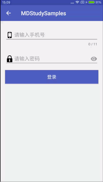
前面提到的 TextInputLayout 的四个功能在 Demo 中均有所体现。再补充几个值得注意的地方:
浮动 hint 、error 提示、字数提示和 EditText 的背景样式默认使用主题 style 中的
colorAccent属性定义的颜色;使用
TextInputLayout时,设置 EditText 的 drawable 图标时需要同时使用相对值 (start/end) 和 绝对值 (left/right),否则 drawable 存在显示兼容问题。控制密码显示状态的切换按钮的图标默认呈黑色眼睛状,TextInputLayout 提供了一些属性供开发人员自由设置其颜色与形状。比如「Nick Butcher」大神在他的项目 plaid 中利用 path 给图标做出了一个很炫酷的切换动画效果,再加上文字和小黑点的切换效果,简直完美,如下图所示 (图片源自 Twitter):
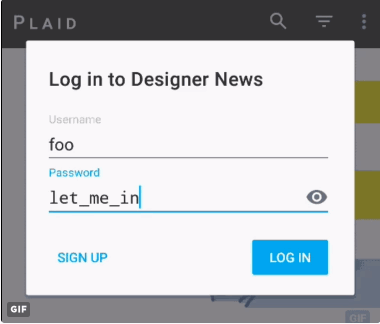
具体代码实现过程,可以直接参考:Plaid - Animated DN password visibility toggle。
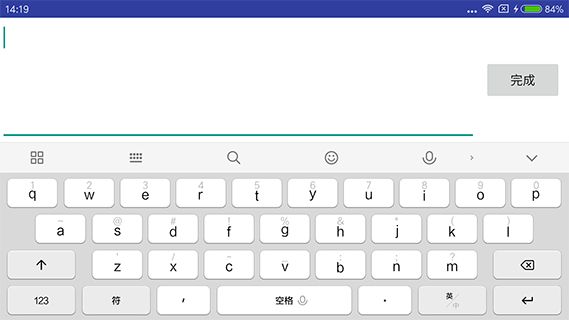
默认情况下,当设备处于横屏时,点击 EditText 输入框,会弹出一个新的输入界面并显示软键盘,即 「extract mode」(全屏模式),而不是在当前界面弹出软键盘。如果单独使用 EditText,进入「extract mode」并且在用户还没输入任何内容时,hint 信息会显示在输入框中。但是 EditText 和 TextInputLayout 一起使用时,hint 信息则不会显示。而 TextInputEditText 的出现刚好解决了这个问题。
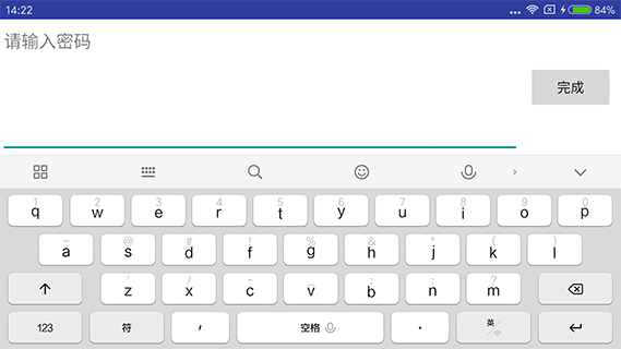
TextInputEditText 是 AppCompatEditText (继承自 EditText) 的子类,源码很简单,只是重写 onCreateInputConnection 方法,做了一个 hint 信息的传递,就是为了在「extract mode」中显示 hint 信息:
@Override
public InputConnection onCreateInputConnection(EditorInfo outAttrs) {
    final InputConnection ic = super.onCreateInputConnection(outAttrs);
    if (ic != null && outAttrs.hintText == null) {
        // If we don't have a hint and our parent is a TextInputLayout, use it's hint for the
        // EditorInfo. This allows us to display a hint in 'extract mode'.
        final ViewParent parent = getParent();
        if (parent instanceof TextInputLayout) {
            outAttrs.hintText = ((TextInputLayout) parent).getHint();
        }
    }
    return ic;
}
使用时,只需要将 TextInputLayout 中的 EditText 替换成 TextInputEditText 控件即可,属性和 EditText 一样,没有什么其他特殊用法,我们看一下效果图。
TextInputLayout 与 EditText:
TextInputLayout 与 TextInputEditText:
备注:如果不想使用 EditText 的「extract mode」,添加 android:imeOptions="flagNoExtractUi" 属性即可。
特殊说明:经测试发现,在目前最新版本 25.0.0 的 design 包中,TextInputLayout 与 TextInputEditText 的组合使用不能实现「extract mode」显示 hint 功能,而在旧版本中能够实现,比如 24.1.1 版本。目测这是新版 Design 包的一个 Bug,期待下个版本的修复吧。
最后,附上「Android Material Design」系列文章的 Demo 地址:MDStudySamples,欢迎 Star。
