

内容参考博客地址:
blog.csdn.net/jdsjlzx/art…
blog.csdn.net/lmj62356579…
本篇文章主要总结一下开发中的一些屏幕适配的方案,对于一些概念性的知识就略过了;
1.屏幕适配基础篇
布局文件中使用match_parent、wrap_content和weight软编码,组件的具体大小使用dp或者sp;
谷歌的标准dp是160dp,即1dp对应1个pixel,计算公式如:px = dp * (dpi / 160),屏幕密度越大,px越大。使用dp能够让同一数值在不同的分辨率展示出大致相同的尺寸大小。但是当设备的尺寸差异较大的时候,就无能为力了;比如在320dp宽度的设备和410dp的设备上,还是会有90dp的差别。所以要尽量使用match_parent和wrap_content,尽可能少的用dp来指定控件的具体长宽,再结合上权重,大部分的情况我们都是可以做到适配的。
既然dp不能满足所有的适配需求,那么将屏幕宽度用一个固定的值的单位来统计,即将屏幕纵横方向上分成若干份,在布局中直接写控件的像素。这样的话需要将要适配的手机屏幕的分辨率各自建立一个文件夹
(包含lax.xml和lay.xml)里面放在res目录下:
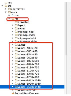
下面是生成的一个320*480分辨率的文件
<?xml version="1.0" encoding="utf-8"?>
<resources><dimen name="x1">1.0px</dimen>
<dimen name="x2">2.0px</dimen>
<dimen name="x3">3.0px</dimen>
<dimen name="x4">4.0px</dimen>
<dimen name="x5">5.0px</dimen>
<dimen name="x6">6.0px</dimen>
<dimen name="x7">7.0px</dimen>
<dimen name="x8">8.0px</dimen>
<dimen name="x9">9.0px</dimen>
<dimen name="x10">10.0px</dimen>
..................................
<dimen name="x307">307.0px</dimen>
<dimen name="x308">308.0px</dimen>
<dimen name="x309">309.0px</dimen>
<dimen name="x310">310.0px</dimen>
<dimen name="x311">311.0px</dimen>
<dimen name="x312">312.0px</dimen>
<dimen name="x313">313.0px</dimen>
<dimen name="x314">314.0px</dimen>
<dimen name="x315">315.0px</dimen>
<dimen name="x316">316.0px</dimen>
<dimen name="x317">317.0px</dimen>
<dimen name="x318">318.0px</dimen>
<dimen name="x319">319.0px</dimen>
<dimen name="x320">320px</dimen>
</resources>
那么1080*1960分辨率下是什么样子呢?我们可以看下,由于1080和320是3.37倍的关系,所以x1=3.37px
<?xml version="1.0" encoding="utf-8"?>
<resources><dimen name="x1">3.37px</dimen>
<dimen name="x2">6.75px</dimen>
<dimen name="x3">10.12px</dimen>
<dimen name="x4">13.5px</dimen>
<dimen name="x5">16.87px</dimen>
<dimen name="x6">20.25px</dimen>
<dimen name="x7">23.62px</dimen>
<dimen name="x8">27.0px</dimen>
<dimen name="x9">30.37px</dimen>
<dimen name="x10">33.75px</dimen>
...................................
<dimen name="x310">1046.25px</dimen>
<dimen name="x311">1049.62px</dimen>
<dimen name="x312">1053.0px</dimen>
<dimen name="x313">1056.37px</dimen>
<dimen name="x314">1059.75px</dimen>
<dimen name="x315">1063.12px</dimen>
<dimen name="x316">1066.5px</dimen>
<dimen name="x317">1069.87px</dimen>
<dimen name="x318">1073.25px</dimen>
<dimen name="x319">1076.62px</dimen>
<dimen name="x320">1080px</dimen>
</resources>
在布局中这样使用:
<FrameLayout >

    <Button
        android:layout_gravity="center"
        android:gravity="center"
        android:text="@string/hello_world"
        android:layout_width="@dimen/x160"
        android:layout_height="@dimen/x160"/>

</FrameLayout>
需要注意的是必须在values目录下建立默认的lax.xml和lay.xml文件,不然当程序找不到对应分辨率的lax.xml和lay.xml时,就会crash;
这里提供了生成各种分辨率的lax.xml和lay.xml文件
结合对平板的适配,使用使用限定符来进行:
- 使用尺寸限定符
res/layout/main.xml,单面板(默认)布局:
<LinearLayout xmlns:android="http://schemas.android.com/apk/res/android"
    android:orientation="vertical"
    android:layout_width="match_parent"
    android:layout_height="match_parent">

    <fragment android:id="@+id/headlines"
              android:layout_height="fill_parent"
              android:name="com.example.android.newsreader.HeadlinesFragment"
              android:layout_width="match_parent" />
</LinearLayout>
res/layout-large/main.xml,双面板布局:
<LinearLayout xmlns:android="http://schemas.android.com/apk/res/android"
    android:layout_width="fill_parent"
    android:layout_height="fill_parent"
    android:orientation="horizontal">
    <fragment android:id="@+id/headlines"
              android:layout_height="fill_parent"
              android:name="com.example.android.newsreader.HeadlinesFragment"
              android:layout_width="400dp"
              android:layout_marginRight="10dp"/>
    <fragment android:id="@+id/article"
              android:layout_height="fill_parent"
              android:name="com.example.android.newsreader.ArticleFragment"
              android:layout_width="fill_parent" />
</LinearLayout>
第二种布局名称目录中的 large 限定符,系统会在属于较大屏幕(例如 7 英寸或更大的平板电脑)的设备上选择此布局。系统会在较小的屏幕上选择其他布局(无限定符)。
2.使用最小宽度限定符
res/layout-sw600dp/main.xml,双面板布局:
<LinearLayout xmlns:android="http://schemas.android.com/apk/res/android"
    android:layout_width="fill_parent"
    android:layout_height="fill_parent"
    android:orientation="horizontal">
    <fragment android:id="@+id/headlines"
              android:layout_height="fill_parent"
              android:name="com.example.android.newsreader.HeadlinesFragment"
              android:layout_width="400dp"
              android:layout_marginRight="10dp"/>
    <fragment android:id="@+id/article"
              android:layout_height="fill_parent"
              android:name="com.example.android.newsreader.ArticleFragment"
              android:layout_width="fill_parent" />
</LinearLayout>
对于最小宽度大于等于 600 dp 的设备,系统会选择 layout-sw600dp/main.xml(双面板)布局,否则系统就会选择 layout/main.xml(单面板)布局。
但 Android 版本低于 3.2 的设备不支持此技术,原因是这些设备无法将 sw600dp 识别为尺寸限定符,因此我们仍需使用 large 限定符。为满足兼容低版本,就需要使用布局别名;
2.使用布局别名
可以定义以下布局:
res/layout/main.xml,单面板布局
res/layout/main_twopanes.xml,双面板布局
添加这两个文件:
res/values-large/layout.xml:
<resources>
    <item name="main" type="layout">@layout/main_twopanes</item>
</resources>
res/values-sw600dp/layout.xml:
<resources>
    <item name="main" type="layout">@layout/main_twopanes</item>
</resources>
后两个文件的内容相同,但它们并未实际定义布局。它们只是将 main 设置成了 main_twopanes 的别名。由于这些文件包含 large 和 sw600dp 选择器,因此无论 Android 版本如何,系统都会将这些文件应用到平板电脑和电视上(版本低于 3.2 的平板电脑和电视会匹配 large,版本高于 3.2 的平板电脑和电视则会匹配 sw600dp)。
2.使用屏幕方向限定符
某些布局会同时支持横向模式和纵向模式,但我们可以通过调整优化其中大部分布局的效果。每种屏幕尺寸和屏幕方向下的布局行为方式如下所示:
小屏幕,纵向:单面板,带徽标
小屏幕,横向:单面板,带徽标
7 英寸平板电脑,纵向:单面板,带操作栏
7 英寸平板电脑,横向:双面板,宽,带操作栏
10 英寸平板电脑,纵向:双面板,窄,带操作栏
10 英寸平板电脑,横向:双面板,宽,带操作栏
电视,横向:双面板,宽,带操作栏
因此,这些布局中的每一种都定义在了 res/layout/ 目录下的某个 XML 文件中。为了继续将每个布局分配给各种屏幕配置,该应用会使用布局别名将两者相匹配:
res/values/layouts.xml:
<resources>
    <item name="main_layout" type="layout">@layout/onepane_with_bar</item>
    <bool name="has_two_panes">false</bool>
</resources>
res/values-sw600dp-land/layouts.xml:
<resources>
    <item name="main_layout" type="layout">@layout/twopanes</item>
    <bool name="has_two_panes">true</bool>
</resources>
res/values-sw600dp-port/layouts.xml:
<resources>
    <item name="main_layout" type="layout">@layout/onepane</item>
    <bool name="has_two_panes">false</bool>
</resources>
res/values-large-land/layouts.xml:
@layout/twopanes
true
res/values-large-port/layouts.xml:
<resources>
    <item name="main_layout" type="layout">@layout/twopanes_narrow</item>
    <bool name="has_two_panes">true</bool>
</resources>
2.屏幕适配进阶篇
基础篇中对于手机的虽然能完成适配,但是应用的大小就会增大,并且可能会crash。对此谷歌推荐了百分比布局来适配:
这个库提供了PercentRelativeLayout、PercentFrameLayout两种布局,为什么没有LinearLayout呢,因为在开发中使用LinearLayout基本上能够完成适配;
支持的属性有:
layout_widthPercent、layout_heightPercent、
layout_marginPercent、layout_marginLeftPercent、
layout_marginTopPercent、layout_marginRightPercent、
layout_marginBottomPercent、layout_marginStartPercent、layout_marginEndPercent。
接下来看看怎样使用这个百分比布局:
添加依赖:
compile 'com.android.support:percent:22.2.0'布局文件中使用:
<?xml version="1.0" encoding="utf-8"?>
<android.support.percent.PercentFrameLayout
    xmlns:android="http://schemas.android.com/apk/res/android"
    xmlns:app="http://schemas.android.com/apk/res-auto"
    android:layout_width="match_parent"
    android:layout_height="match_parent">

    <TextView
        android:layout_width="0dp"
        android:layout_height="0dp"
        android:layout_gravity="left|top"
        android:background="#44ff0000"
        android:text="width:30%,height:20%"
        app:layout_heightPercent="20%"
        android:gravity="center"
        app:layout_widthPercent="30%"/>

    <TextView
        android:layout_width="0dp"
        android:layout_height="0dp"
        android:layout_gravity="right|top"
        android:gravity="center"
        android:background="#4400ff00"
        android:text="width:70%,height:20%"
        app:layout_heightPercent="20%"
        app:layout_widthPercent="70%"/>


    <TextView
        android:layout_width="0dp"
        android:layout_height="0dp"
        android:layout_gravity="bottom"
        android:background="#770000ff"
        android:text="width:100%,height:10%"
        android:gravity="center"
        app:layout_heightPercent="10%"
        app:layout_widthPercent="100%"/>


</android.support.percent.PercentFrameLayout>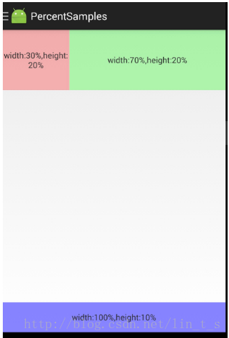
初次之外鸿洋大神对百分比库进行了扩展
百分比布局也 存在一些问题:设计图上标识的都是px,所以需要去计算百分比,然后这个百分比还是依赖父容器的,导致ScrollView,ListView等容器内高度无法使用百分比。
3.屏幕适配终结篇
这里也是鸿洋大神写的适配方案,Android AutoLayout
AutoLayout 的 用法:
- 拿到设计图,meta信息中填入设计图的尺寸,然后不需要额外计算,布局直接抄设计图上的尺寸,不产生任何多余的资源文件,完成各种分辨率的适配!
拿到一张设计图:
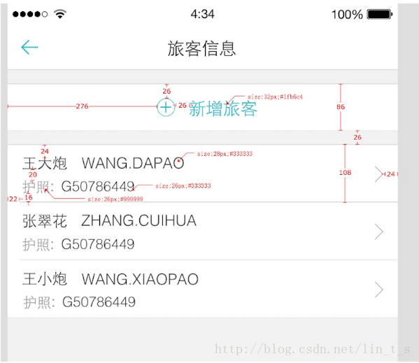
布局文件:
<RelativeLayout
android:layout_width="match_parent"
android:layout_height="86px"
android:layout_marginTop="26px"
android:background="#ffffffff">

<ImageView
    android:id="@+id/id_tv_add"
    android:layout_width="34px"
    android:layout_height="34px"
    android:layout_gravity="center_vertical"
    android:layout_marginLeft="276px"
    android:layout_marginTop="26px"
    android:src="@mipmap/add"
    />

<TextView
    android:layout_width="wrap_content"
    android:layout_height="wrap_content"
    android:layout_centerVertical="true"
    android:layout_marginLeft="26px"
    android:layout_toRightOf="@id/id_tv_add"
    android:text="新增旅客"
    android:textColor="#1fb6c4"
    android:textSize="32px"
    />
</RelativeLayout>
Item的布局文件,就是这么写:
<RelativeLayout
    android:layout_width="match_parent"
    android:layout_height="108px"
    android:layout_marginTop="26px"
    android:background="#ffffffff"
    >

    <TextView
        android:layout_width="wrap_content"
        android:layout_height="wrap_content"
        android:layout_marginLeft="22px"
        android:layout_marginTop="16px"
        android:text="王大炮 WANG.DAPAO"
        android:textColor="#333"
        android:textSize="28px"
        />
    <TextView
        android:layout_width="wrap_content"
        android:layout_height="wrap_content"
        android:layout_alignParentBottom="true"
        android:layout_marginBottom="16px"
        android:layout_marginLeft="22px"
        android:text="护照:G50786449"
        android:textColor="#999"
        android:textSize="26px"
        />

</RelativeLayout>
这样就适配ok了,是不是很easy!!!
这个px并不代表1像素,内部会进行百分比化处理,也就是说:720px高度的屏幕,你这里填写72px,占据10%;当这个布局文件运行在任何分辨率的手机上,这个72px都代表10%的高度,这就是AutoLayout适配的原理。
用法:
将autolayout引入:
compile project(':autolayout')在你的项目的AndroidManifest中注明你的设计稿的尺寸。
<meta-data android:name="design_width" android:value="768"></meta-data>
<meta-data android:name="design_height" android:value="1280"></meta-data>
Activity中开启设配:
让你的Activity去继承AutoLayoutActivity如果你不想继承AutoLayoutActivity,那么你就得像Google的百分比库一样,去用AutoXXXLayout代替系统原有的XXXLayout。当然,你可以放心的是,所有的系统属性原有的属性都会支持,不过根布局上就不支持px的自动百分比化了,但是一般根布局都是MATCH_PARENT,而上述的方式,根布局也是可以直接px的百分比化的。
动态修改设计稿的尺寸;
以上便是屏幕适配的发展历史。
