

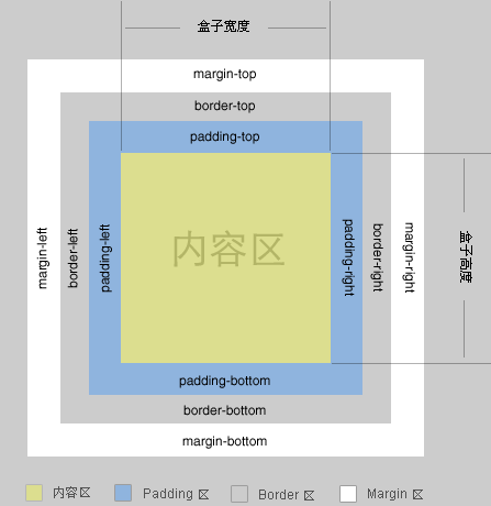
本篇讲解的是主要是BFC 可以解决的 margin 重叠问题 ,如对你有帮助 ,请点个赞给个鼓励,谢谢~ 先来一张W3C标准盒模型的图片.
margin 属性介绍
margin 的几种使用方法,简单带过.
-
margin : top right bottom right ;
-
margin : top leftright bottom;
-
margin : topbottom leftright;
-
margin : topbottomleftright;
1.普通流 margin 百分比设置
<!--css -->
    <style>
        .container{
            background-color: pink;
            width:300px;
            height:300px;
            margin:10px;
            display: inline-block;/*为什么这里使用display: inline-block,我在这里先卖个关子,下面会讲*/
        }
        .content{
            background-color: #000000;
            width:100px;
            height:100px;
            margin:10%;
        }
    </style>
<!--html -->
    <div class="container">
        <div class="content"></div>
    </div>
效果如下图所示
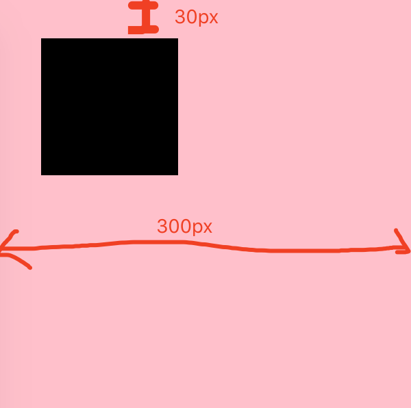
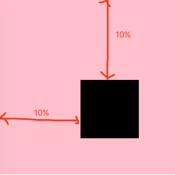
可以看出, top left 方向的 margin 都是30px ( 300 * 10% = 30)。父元素设置display是有原因的,会在下面小节提到,稍安勿躁。
注意,margin 四个方位的值都是依据父元素的 width(=300px) 计算!
2.绝对定位的 margin 百分比设置
    <style>
        .container{
            background-color: pink;
            width:300px;
            height:300px;
            margin:10px;
            display: inline-block;/*为什么这里使用display: inline-block,我在这里先卖个关子,下面会讲*/
        }
        .content{
            background-color: #000000;
            width:100px;
            height:100px;
            margin:10%;
            position:absolute;
        }
    </style>
在脱离文档流(absolute,fixed)的定位元素中(如:小黑块),则margin百分比值是最近一个有定位设置(relative,absolute,fixed)的父级对象进行绝对定位父元素的width 计算的,若对象父级没有设置定位属性(absolute,fixed,relative),则 margin 百分比值是依据 body的 width 计算的。
position:fixed: 固定的参照对像是
可视窗口而并非是body或是父级元素。可通过z-index进行层次分级
position:absolute: 脱离文档流,通过 top,bottom,left,right 定位。选取其最近一个有
定位设置(relative,absolute,fixed)的父级对象进行绝对定位,如果对象的父级没有设置定位属性,absolute元素将以body坐标原点进行定位,可以通过z-index进行层次分级。
relative(相对定位): 对象不可层叠、不脱离文档流,参考自身静态位置通过 top,bottom,left,right 定位,并且可以通过z-index进行层次分级。
margin重叠(Collapsing margins)
Collapsing margins,即外边距折叠,指的是相邻的两个或多个外边距 (margin) 会合并成一个外边距。margin 折叠 必须发生在普通流元素中。
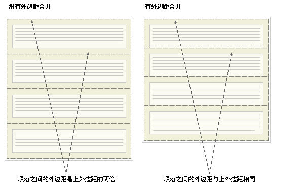
1.Collapsing margins 初衷
Collapsing margins 的初衷就是为了让段落显示的更加好看。以由几个段落组成的典型文本页面为例。第一个段落上面的空间等于段落的上外边距。如果没有外边距合并,后续所有段落之间的外边距都将是相邻上外边距和下外边距的和。这意味着段落之间的空间是页面顶部的两倍。如果发生外边距合并,段落之间的上外边距和下外边距就合并在一起,这样各处的距离就一致了。
2.Collapsing margins 类型
CSS 里面关于折叠的条件:
两个块元素要产生折叠现象,必须满足一个必备条件:这两个元素的 margin 必须是相邻的;那么如果定义相邻呢,w3c 规范,两个 margin 是邻接的必须满足以下条件:
- 必须是处于常规文档流(非float和绝对定位)的块级盒子,并且处于同一个 BFC 当中。
- 没有
inline盒子,没有空隙,没有padding和border将他们分隔开。- 都属于垂直方向上相邻的外边距
什么是 BFC? 如何触发 BFC, 大家可以阅读
margin 重叠的最直接的解决方法:
让元素处于不同的BFC属性下。
1.兄弟元素的 margin 重叠
发生的前提:在同一个父级块级容器下
<div class="box1"></div>
<div class="box2"></div>

.box1 {
  width: 300px;
  height: 300px;
  margin-bottom: 10px;
  background-color: lightpink;
}
.box2 {
  width: 300px;
  height: 300px;
  margin-top: 10px;
  background-color: lightgreen;
}

2.父子元素的 margin 重叠
这个就是刚刚卖关子的地方,可以回退上去看看. 它就属于父元素的margin重叠.
再举一个案例:
//style
.first-block {
    background: #F44336;
    width: 200px;
    height: 200px;
}
.second-block {
    background: #00BCD4;
    width: 200px;
    height: 200px;
}
//html
<div class="first-block"></div>
<div class="second-block">
    <h2>我是有默认 margin 的 H2元素</h2>
</div>
为什么 first-block 和 second-block 之间会有这么宽的间距?
原因是:外边距折叠,这个间距是 h2 的上外边距引起的。
那么我们就可以通过给元素加边框或者边距来解决啦(不满足条件2,来解决 margin 重叠问题),我是不是狠聪明呢?
解决办法 1:
.second-block {
    background: #00BCD4;
    width: 200px;
    height: 200px;
    border:1px solid rgba(0,0,0,0);
}
折叠问题解决了,但是由于有1px的边框,second-block 看起来会比 first-block 宽一点,没关系,添加 box-sizing: border-box 属性可以解决这个问题:再加一句:box-sizing:border-box,将盒子修改成怪异模式即(content+padding+border) ;
解决办法 2:
.second-block {
    background: #00BCD4;
    width: 200px;
    height: 200px;
    overflow:hidden;
}
通过把 overflow 把 second-block 元素形成一个 BFC,完美解决!
3.Collapsing margins 解决方法
解决方法有如下:
1:float、inline-block 元素、绝对定位元素的 margin 不会和垂直方向上其他元素的 margin 折叠 ( 针对 兄弟元素)
注意: float , inline-block元素 , 绝对定位元素 都属于 BFC元素。
2:创建了块级格式化上下文(BFC, blocking formatting context )的父元素,比如说overflow:hidden,不和它的子元素发生 margin 折叠 (针对 父子元素)。
3:给父元素添加以下内容之一都可以避免发生 margin 重叠 。如 添加 border或者使用 padding来代替 margin。(针对 父子元素)
案例解决方法:
        .container{
            background-color: pink;
            width:300px;
            height:300px;
            margin:10px;
            /*处理margin 重叠的方法*/
            /*overflow: hidden | scroll | auto;*/
            /*display: inline-block |flex | table | inline-block | inline-flex | inline-table | list-item | table-caption | table-cell*!*/
            /*float: left | right;*/
            /*position:absolute |fixed;*/
            display: inline-block;
        }
        .content{
            background-color: #000000;
            width:100px;
            height:100px;
            margin:10%;
        }
虽然有方法解决这个问题。但是目前最好的解决方案是回避这个问题。也就是,不要给指定元素添加具有指定宽度的内边距或外边距,而是尝试将内边距或外边距添加到元素的父元素和子元素。
本文对你有帮助?欢迎扫码加入前端学习小组微信群:

