


APP性能的优化,一直都是任重而道远,对于如今需要承载更多信息的APP来说更是突出,值得庆幸的苹果在这方面做得至少比安卓让开发者省心。UIKit 控件虽然在大多数情况下都能满足用户对于流畅性的需求,但有时候还是难以达到理想效果(因为我太菜)。
AsyncDisplayKit(以下简称ASDK) 的出现至少又给了开发者一个不错的选择。毕竟Paper(虽然 Facebook 已经关闭了这个应用)当年有着炫酷的效果的同时依然保持较好的流畅性也得益于 ASDK 的加入。在Paper发布的几个月后 Facebook 就干脆从中剥离出来成为一个独立的库,就在前两天 ASDK 刚好发布了 2.0 版本。
目前据我所知国内比较知名有 轻芒阅读(豌豆荚一览) 、 即刻 和 Yep 在用ASDK。 拿 即刻 来说包括 消息盒子、主题的详情页、动态通知、我的喜欢、 评论页、最近热门、即刻小报、他关注的人、关注他的人以及搜索页 都用到了 ADSK。
关于 ASDK 的实现和原理就不介绍了,可以参考博客,进入正题。
控件
ASDK 几乎涵盖了常用的控件,下面是 ASDK 和 UIKit 的对应关系,有些封装可以说非常良心。
Nodes:
| ASDK | UIKit |
|---|---|
| ASDisplayNode | UIView |
| ASCellNode | UITableViewCell/UICollectionViewCell |
| ASTextNode | UILabel |
| ASImageNode | UIImageView |
| ASNetworkImageNode | UIImageView |
| ASVideoNode | AVPlayerLayer |
| ASControlNode | UIControl |
| ASScrollNode | UIScrollView |
| ASControlNode | UIControl |
| ASEditableTextNode | UITextView |
| ASMultiplexImageNode | UIImageView |
Node Containers
| ASDK | UIKit |
|---|---|
| ASViewController | UIViewController |
| ASTableNode | UITableView |
| ASCollectionNode | UICollectionView |
| ASPagerNode | UICollectionView |
子父类关系:
- ASDisplayNode
- ASCellNode
- ASTextCellNode
- ASCollectionNode
- ASPagerNode
- ASControlNode
- ASButtonNode
- ASImageNode
- ASMapNode
- ASMultiplexImageNode
- ASNetworkImageNode
- ASVideoNode
- ASTextNode
- ASEditableTextNode
- ASScrollNode
- ASTableNode
- ASVideoPlayerNode
- ASCellNode
ASDisplayNode:
作用同等于UIView,是所有 Node 的父类,需要注意的是 ASDisplayNode 其实拥有一个view属性,所以ASDisplayNode及其子类都可以通过这个 view来添加UIKit控件,这样一来 ASDK 和 UIKit混用是完全没问题的。
ASDisplayNode 中添加 UIKit
UIView *otherView = [[UIView alloc] init];
otherView.frame = ...;
[self.view addSubview:otherView];
或
ASDisplayNode *gradientNode = [[ASDisplayNode alloc] initWithViewBlock:^UIView * _Nonnull{
    UIView *view = [[UIView alloc] init];
    return view;
}];
第二种的初始化最终生成的就是 block 返回的 UIKit 对象,但外部表现出来的是 ASDisplayNode。这样子的好处在于布局,关于布局,后面会讲到。
UIKit 中添加 ASDisplayNode
ASImageNode *imageNode = [[ASImageNode alloc] init];
imageNode.image = [UIImage imageNamed:@"iconShowMore"];
imageNode.frame = ...;
[self addSubnode:imageNode];
self.imageNode = imageNode;
ASCellNode:
作用同等于 UITableViewCell 或 UICollectionViewCell,自带 indexPath 属性,有些时候很有用。
ASTextNode
作用同等于UILabel,和 UILabel 不同的是 ASTextNode 必须通过 attributedText 添加文字。值得一提的是:UILabel 如果是通过 NSMutableParagraphStyle 来自定义行高,在一行的情况下总是会多加上行高的高度(或许是我还不知道怎么解决),就像这样: 
现在已经找到了解决办法:添加NSBaselineOffsetAttributeName
 NSDictionary *attributes = @{
                                     NSFontAttributeName:font,
                                     NSForegroundColorAttributeName : color,
                                     NSBaselineOffsetAttributeName : @0
                                     };
NSMutableAttributedString *attributedString = [[NSMutableAttributedString alloc] initWithString:string];
不过 ASTextNode 就没有这个问题。
ASImageNode
作用同等于 UIImageView,但是只能设置静态图片,如果需要使用网络图片,请使用 ASNetworkImageNode。
ASNetworkImageNode
作用同等于 UIImageView,如果使用网络图片请使用此类,ASDK 用的是第三方的图片加载库PINRemoteImage,ASNetworkImageNode 其实并不支持 gif,如果需要显示 gif 推荐使用FLAnimatedImage。
ASButtonNode
作用同等于 UIButton,需要注意的是下面这个两个属性
@property (nonatomic, assign) CGFloat contentSpacing;// 设置图片和文字的间距
@property (nonatomic, assign) ASButtonNodeImageAlignment imageAlignment;// 图片和文字的排列方式,
简直要抱头痛哭一下😭,imageAlignment 可以设置两个值:
ASButtonNodeImageAlignmentBeginning, // 图片在前,文字在后
ASButtonNodeImageAlignmentEnd// 文字在前,图片在后
ASTableNode
作用同等于 UITableView,但是实现上并没有采用 UITableView 的重用机制,而是通过用户滚动对需要显示的视图进行add 和 不需要的进行remove 的操作(我猜的)。另外重要的一点:ASTableNode 并没有像 UITableView 一样提供一个-tableView:heightForRowAtIndexPath:协议方法来决定每个
Cell 的高度,而是由 ASCellNode 本身决定。这样带来的另外一个好处是,动态高度的实现可谓是易如反掌,具体可以看官方 Demo 中的 Kittens。
如何正确的使用
对于现有的项目中出现的并不严重的性能问题,我的建议是用对应的 ASDK 控件代替即可。
比如把 UIImageView -> ASImageNode/ASNetworkImageNode,UILabel -> ASTextNode之类的,而不是把原有的 UITableView -> ASTableNode, UICollectionView -> ASCollectionNode。
在 Cell 中替换 UIImageView
ASImageNode *imageNode = [[ASImageNode alloc] init];
imageNode.image = [UIImage imageNamed:@"iconShowMore"];
imageNode.frame = ...;
[self.contentView addSubnode:imageNode];
self.imageNode = imageNode;
原因有以下几点:
ASCellNode内部的布局会用到 ASDK 本身有一套布局方案,然而这套布局学习成本略高。- 包括
ASTableNode和ASCollectionNode和原生的UITableView和UICollectionView有较大的 API 改变,侵略性较大,不太利于后期维护。 - 第三方的支持问题,例如 DZNEmptyDataSet 对于
ASTableNode和ASCollectionNode的支持还是有点问题。
所以当你还没有做好应付上面三个问题的准备,简单的 UIKit -> ASDK 替换才是正确选择。
布局
ASDK 拥有自己的一套成熟布局方案,虽然学习成本略高,但至少比原生的 AutoLayout 写起来舒服,重点是性能比起 AutoLayout 好的不是一点点。ASDK 文档上也指出了这套布局方案的的优点:
- Fast: As fast as manual layout code and significantly faster than Auto Layout
- Asynchronous & Concurrent: Layouts can be computed on background threads so user interactions are not interrupted.
- Declarative: Layouts are declared with immutable data structures. This makes layout code easier to develop, document, code review, test, debug, profile, and maintain.
- Cacheable: Layout results are immutable data structures so they can be precomputed in the background and cached to increase user perceived performance.
- Extensible: Easy to share code between classes.
首先这套布局都是基于 ASDK 组件的,所以当遇到要使用原生控件时,通过用 block 的方式包装一个原生组件再合适不过了,例如:
ASDisplayNode *animationImageNode = [[ASDisplayNode alloc] initWithViewBlock:^UIView * _Nonnull{
    FLAnimatedImageView *animationImageView = [[FLAnimatedImageView alloc] init];
    animationImageView.layer.cornerRadius = 2.0f;
    animationImageView.clipsToBounds = YES;
    return animationImageView;
}];
[self addSubnode:animationImageNode];
self.animationImageNode = animationImageNode;
ASDisplayNode 在初始化之后会检查是否有子视图,如果有就会调用
- (ASLayoutSpec *)layoutSpecThatFits:(ASSizeRange)constrainedSize
方法进行布局,所以对视图进行布局需要重写这个方法。看一个例子:
- (ASLayoutSpec *)layoutSpecThatFits:(ASSizeRange)constrainedSize{
    ASInsetLayoutSpec *inset = [ASInsetLayoutSpec insetLayoutSpecWithInsets:UIEdgeInsetsZero child:_childNode];
    return insetLayout;
}
_childNode 相对于父视图边距都为 0,也就是AutoLayout中 top bottom left right 都为 0。
-----------------------------父视图----------------------------
|  -------------------------_childNode---------------------  |
|  |                                                      |  |
|  |                                                      |  |
|  ---------------------------  ---------------------------  |
--------------------------------------------------------------
可以看到layoutSpecThatFits:方法返回的必须是 ASLayoutSpec, ASInsetLayoutSpec 是它的子类之一,下面是所有的子类及其关系:
- ASLayoutSpec
- ASAbsoluteLayoutSpec // 绝对布局
- ASBackgroundLayoutSpec // 背景布局
- ASInsetLayoutSpec // 边距布局
- ASOverlayLayoutSpec // 覆盖布局
- ASRatioLayoutSpec // 比例布局
- ASRelativeLayoutSpec // 顶点布局
- ASCenterLayoutSpec // 居中布局
- ASStackLayoutSpec // 盒子布局
- ASWrapperLayoutSpec // 填充布局
ASAbsoluteLayoutSpec
使用方法和原生的绝对布局类似
- (ASLayoutSpec *)layoutSpecThatFits:(ASSizeRange)constrainedSize{
  self.childNode.style.layoutPosition = CGPointMake(100, 100);
  self.childNode.style.preferredLayoutSize = ASLayoutSizeMake(ASDimensionMake(100), ASDimensionMake(100));

  ASAbsoluteLayoutSpec *absoluteLayout = [ASAbsoluteLayoutSpec absoluteLayoutSpecWithChildren:@[self.childNode]];
  return absoluteLayout;
}
不过官方文档明确指出应该尽量少用这种布局方式:
Absolute layouts are less flexible and harder to maintain than other types of layouts.
ASBackgroundLayoutSpec
- (ASLayoutSpec *)layoutSpecThatFits:(ASSizeRange)constrainedSize{
  ASBackgroundLayoutSpec *backgroundLayout = [ASBackgroundLayoutSpec backgroundLayoutSpecWithChild:self.childNodeB background:self.childNodeA];
  return backgroundLayout;
}
把childNodeA 做为 childNodeB 的背景,也就是 childNodeB 在上层,要注意的是 ASBackgroundLayoutSpec 事实上根本不会改变视图的层级关系,比如:
ASDisplayNode *childNodeB = [[ASDisplayNode alloc] init];
childNodeB.backgroundColor = [UIColor blueColor];
[self addSubnode:childNodeB];
self.childNodeB = childNodeB;

ASDisplayNode *childNodeA = [[ASDisplayNode alloc] init];
childNodeA.backgroundColor = [UIColor redColor];
[self addSubnode:childNodeA];
self.childNodeA = childNodeA;
那么即使使用上面的布局方式,childNodeB 依然在下层。它和之后会说到的 ASOverlayLayoutSpec 实际上更多的用来组合两个 Element 而已,后面的实战会讲到它们的作用。
ASInsetLayoutSpec
比较常用的一个类,看图应该能一目了然(图片来自于官方文档) 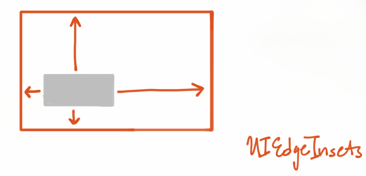
- (ASLayoutSpec *)layoutSpecThatFits:(ASSizeRange)constrainedSize{
    ASInsetLayoutSpec *inset = [ASInsetLayoutSpec insetLayoutSpecWithInsets:UIEdgeInsetsZero child:_childNode];
    return insetLayout;
}
_childNode 相对于父视图边距都为 0,相当于填充整个父视图。
ASOverlayLayoutSpec
参考 ASBackgroundLayoutSpec
ASRatioLayoutSpec
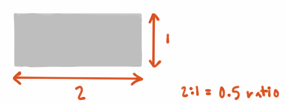 (图片来自于官方文档)
也是比较常用的一个类,作用是设置自身的高宽比,例如设置正方形的视图
- (ASLayoutSpec *)layoutSpecThatFits:(ASSizeRange)constrainedSize{
    ASRatioLayoutSpec *ratioLayout = [ASRatioLayoutSpec ratioLayoutSpecWithRatio:1.0f child:self.childNodeA];
    return ratioLayout;
}
ASRelativeLayoutSpec
把它称为顶点布局有点不恰当,实际上它可以把视图布局在:左上、左下、右上、右下四个顶点以外,还可以设置成居中布局。
- (ASLayoutSpec *)layoutSpecThatFits:(ASSizeRange)constrainedSize{
    self.childNodeA.style.preferredSize = CGSizeMake(100, 100);
    ASRelativeLayoutSpec *relativeLayout = [ASRelativeLayoutSpec relativePositionLayoutSpecWithHorizontalPosition:ASRelativeLayoutSpecPositionEnd verticalPosition:ASRelativeLayoutSpecPositionStart sizingOption:ASRelativeLayoutSpecSizingOptionDefault child:self.childNodeA];
    return relativeLayout;
}
上面的例子就是把 childNodeA 显示在右上角。
ASCenterLayoutSpec
绝大多数情况下用来居中显示视图
- (ASLayoutSpec *)layoutSpecThatFits:(ASSizeRange)constrainedSize{
    self.childNodeA.style.preferredSize = CGSizeMake(100, 100);
    ASCenterLayoutSpec *relativeLayout = [ASCenterLayoutSpec centerLayoutSpecWithCenteringOptions:ASCenterLayoutSpecCenteringXY sizingOptions:ASCenterLayoutSpecSizingOptionDefault child:self.childNodeA];
    return relativeLayout;
}
ASStackLayoutSpec
可以说这是最常用的类,而且相对于其他类来说在功能上是最接近于 AutoLayout 的。 之所以称之为盒子布局是因为它和 CSS 中 Flexbox 很相似,不清楚 Flexbox 的可以先看下阮一峰的这篇博客。
先看一个例子:
- (ASLayoutSpec *)layoutSpecThatFits:(ASSizeRange)constrainedSize{
    self.childNodeA.style.preferredSize = CGSizeMake(100, 100);
    self.childNodeB.style.preferredSize = CGSizeMake(200, 200);
    ASStackLayoutSpec *stackLayout = [ASStackLayoutSpec stackLayoutSpecWithDirection:ASStackLayoutDirectionVertical
                                                                             spacing:12
                                                                      justifyContent:ASStackLayoutJustifyContentStart
                                                                          alignItems:ASStackLayoutAlignItemsStart
                                                                            children:@[self.childNodeA, self.childNodeB]];
    return stackLayout;
}
简单的说明下各个参数的作用:
direction:主轴的方向,有两个可选值:- 纵向:
ASStackLayoutDirectionVertical - 横向:
ASStackLayoutDirectionHorizontal
- 纵向:
spacing: 主轴上视图排列的间距,比如有四个视图,那么它们之间的存在三个间距值都应该是spacingjustifyContent: 主轴上的排列方式,有五个可选值:ASStackLayoutJustifyContentStart从前往后排列ASStackLayoutJustifyContentCenter居中排列
ASStackLayoutJustifyContentEnd从后往前排列ASStackLayoutJustifyContentSpaceBetween间隔排列,两端无间隔ASStackLayoutJustifyContentSpaceAround间隔排列,两端有间隔
alignItems: 交叉轴上的排列方式,有五个可选值:ASStackLayoutAlignItemsStart从前往后排列ASStackLayoutAlignItemsEnd从后往前排列
ASStackLayoutAlignItemsCenter居中排列ASStackLayoutAlignItemsStretch拉伸排列ASStackLayoutAlignItemsBaselineFirst以第一个文字元素基线排列(主轴是横向才可用)ASStackLayoutAlignItemsBaselineLast以最后一个文字元素基线排列(主轴是横向才可用)
children: 包含的视图。数组内元素顺序同样代表着布局时排列的顺序,所以需要注意
主轴的方向设置尤为重要,如果主轴设置的是 ASStackLayoutDirectionVertical, 那么 justifyContent 各个参数的意义就是:
ASStackLayoutJustifyContentStart从上往下排列ASStackLayoutJustifyContentCenter居中排列ASStackLayoutJustifyContentEnd从下往上排列ASStackLayoutJustifyContentSpaceBetween间隔排列,两端无间隔ASStackLayoutJustifyContentSpaceAround间隔排列,两端有间隔
alignItems 就是:
ASStackLayoutAlignItemsStart从左往右排列ASStackLayoutAlignItemsEnd从右往左排列ASStackLayoutAlignItemsCenter居中排列ASStackLayoutAlignItemsStretch拉伸排列ASStackLayoutAlignItemsBaselineFirst无效ASStackLayoutAlignItemsBaselineLast无效
对于子视图间距不一样的布局方法,后面实战中会讲到。 ___
ASWrapperLayoutSpec
填充整个视图
- (ASLayoutSpec *)layoutSpecThatFits:(ASSizeRange)constrainedSize{
    ASWrapperLayoutSpec *wrapperLayout = [ASWrapperLayoutSpec wrapperWithLayoutElement:self.childNodeA];
    return wrapperLayout;
}
布局实战
案例一

简单的文件覆盖在图片上,文字居中。
- (ASLayoutSpec *)layoutSpecThatFits:(ASSizeRange)constrainedSize{
    ASWrapperLayoutSpec *wrapperLayout = [ASWrapperLayoutSpec wrapperWithLayoutElement:self.coverImageNode];

    ASCenterLayoutSpec *centerSpec = [ASCenterLayoutSpec centerLayoutSpecWithCenteringOptions:ASCenterLayoutSpecCenteringXY sizingOptions:ASCenterLayoutSpecSizingOptionDefault child:self.textNode];
    ASOverlayLayoutSpec *overSpec = [ASOverlayLayoutSpec overlayLayoutSpecWithChild:wrapperLayout overlay:centerSpec];
    return overSpec;
}
ASWrapperLayoutSpec把图片铺满整个视图ASCenterLayoutSpec把文字居中显示ASOverlayLayoutSpec把文字覆盖到图片上
注意第三步就是之前提到的 ASOverlayLayoutSpec/ASBackgroundLayoutSpec 的作用:用于组合两个 Element。
案例二

这个是轻芒阅读(豌豆荚一览) APP 内 AppSo 频道 Cell 的布局,应该也是比较典型的布局之一。为了方便理解先给各个元素定一下名称,从上至下,从左往右分别是:
- coverImageNode // 大图
- titleNode // 标题
- subTitleNode // 副标题
- dateTextNode // 发布时间
- shareImageNode // 分享图标
- shareNumberNode // 分享数量
- likeImageNode // 喜欢图标
- likeNumberNode // 喜欢数量
- (ASLayoutSpec *)layoutSpecThatFits:(ASSizeRange)constrainedSize{


    self.shareImageNode.style.preferredSize = CGSizeMake(15, 15);
    self.likeImageNode.style.preferredSize = CGSizeMake(15, 15);

    ASStackLayoutSpec *likeLayout = [ASStackLayoutSpec stackLayoutSpecWithDirection:ASStackLayoutDirectionHorizontal
                                                                            spacing:4.0f
                                                                     justifyContent:ASStackLayoutJustifyContentStart
                                                                         alignItems:ASStackLayoutAlignItemsCenter
                                                                           children:@[self.likeImageNode, self.likeNumberNode]];


    ASStackLayoutSpec *shareLayout = [ASStackLayoutSpec stackLayoutSpecWithDirection:ASStackLayoutDirectionHorizontal
                                                                            spacing:4.0f
                                                                     justifyContent:ASStackLayoutJustifyContentStart
                                                                         alignItems:ASStackLayoutAlignItemsCenter
                                                                           children:@[self.shareImageNode, self.shareNumberNode]];

    ASStackLayoutSpec *otherLayout = [ASStackLayoutSpec stackLayoutSpecWithDirection:ASStackLayoutDirectionHorizontal
                                                                             spacing:12.0f
                                                                      justifyContent:ASStackLayoutJustifyContentStart
                                                                          alignItems:ASStackLayoutAlignItemsCenter
                                                                            children:@[likeLayout, shareLayout]];


    ASStackLayoutSpec *bottomLayout = [ASStackLayoutSpec stackLayoutSpecWithDirection:ASStackLayoutDirectionHorizontal
                                                                              spacing:0.0f
                                                                       justifyContent:ASStackLayoutJustifyContentSpaceBetween
                                                                       alignItems:ASStackLayoutAlignItemsCenter
                                                                             children:@[self.dateTextNode, otherLayout]];


    self.titleNode.style.spacingBefore = 12.0f;

    self.subTitleNode.style.spacingBefore = 16.0f;
    self.subTitleNode.style.spacingAfter = 20.0f;


    ASRatioLayoutSpec *rationLayout = [ASRatioLayoutSpec ratioLayoutSpecWithRatio:0.5 child:self.coverImageNode];

    ASStackLayoutSpec *contentLayout = [ASStackLayoutSpec stackLayoutSpecWithDirection:ASStackLayoutDirectionVertical
                                                                               spacing:0.0f
                                                                        justifyContent:ASStackLayoutJustifyContentStart
                                                                            alignItems:ASStackLayoutAlignItemsStretch
                                                                              children:@[
                                                                                         rationLayout,
                                                                                         self.titleNode,
                                                                                         self.subTitleNode,
                                                                                         bottomLayout
                                                                                         ]];

//    ASWrapperLayoutSpec *wrapperLayout = [ASWrapperLayoutSpec wrapperWithLayoutElement:contentLayout];

    ASInsetLayoutSpec *insetLayout = [ASInsetLayoutSpec insetLayoutSpecWithInsets:UIEdgeInsetsMake(16, 16, 16, 16) child:contentLayout];
    return insetLayout;
}
下面详细解释下为什么这么布局,不过首先要明确的是,ASDK 的这套布局方式必须遵守从里到外的布局原则,使用起来才会得心应手。
- 根据布局的原则,首先利用
ASStackLayoutSpec布局分享图标和分享数量、喜欢图标和喜欢数量。 - 还是通过
ASStackLayoutSpec包装第一步的两个的布局得到otherLayout布局对象。 - 依然是
ASStackLayoutSpec包装otherLayout和发布时间。注意这里设置横向的排列方式ASStackLayoutJustifyContentSpaceBetween已到达两端布局的目的,最终返回bottomLayout。 - 由于
大图是网络图片,对于 Cell 来说,子视图的布局必能能决定其高度(Cell 宽度是默认等于 TableNode 的宽度),所以这里必须设置大图的高度,ASRatioLayoutSpec设置了图片的高宽比。 - 接下来布局应该就是
大图、标题、副标题、bottomLayout的一个纵向布局,可以发现这里的视图间距并不相同,这时候spacingBefore和spacingAfter就会很有用,它们用来分别设置元素在主轴上的前后间距。self.titleNode.style.spacingBefore = 12.0f;意思就是标题相对于大图间距为 12。 - 最后通过一个
ASInsetLayoutSpec设置一个边距。
可以看到不仅是 Node,ASLayoutSpec 本身也可以作为布局元素,这是因为只要是遵守了 <ASLayoutElement> 协议的对象都可以作为布局元素。
其他
刷新列表
无论是 ASTableNode 还是 ASCollectionNode 当列表中已经有数据显示了,调用 reloadData 你会发现列表会闪一下。最常见的案例是上拉加载更多获取到新数据后调用 reloadData 刷新列表用户体验会比较差,事实上官方文档在 [Batch Fetching API]
给出了解决办法:
- (void)tableNode:(ASTableNode *)tableNode willBeginBatchFetchWithContext:(ASBatchContext *)context
{
  // Fetch data most of the time asynchronoulsy from an API or local database
  NSArray *newPhotos = [SomeSource getNewPhotos];

  // Insert data into table or collection node
  [self insertNewRowsInTableNode:newPhotos];

  // Decide if it's still necessary to trigger more batch fetches in the future
  _stillDataToFetch = ...;

  // Properly finish the batch fetch
  [context completeBatchFetching:YES];
}
获取新数据后直接插入到列表中,而不是刷新整个列表,比如:
- (void)insertSections:(NSIndexSet *)sections withRowAnimation:(UITableViewRowAnimation)animation;
和
- (void)insertRowsAtIndexPaths:(NSArray<NSIndexPath *> *)indexPaths withRowAnimation:(UITableViewRowAnimation)animation;
加载数据
细心的同学可能发现了前面提到内容中的就有相关的方法:
- (void)tableNode:(ASTableNode *)tableNode willBeginBatchFetchWithContext:(ASBatchContext *)context;
现在绝大多数APP加载更多数据的方法都是通过下拉到列表底部再去请求数据然后添加到列表中,但是 ASDK 提供了另外一种更“合理”的方式,原文是这样描述的:
By default, as a user is scrolling, when they approach the point in the table or collection where they are 2 “screens” away from the end of the current content, the table will try to fetch more data.
当列表滚到到距离底部还有两个屏幕高度请求新的数据,这个阈值是可以调整的。一旦距离底部达到两个屏幕的高度的时候,就会调用前面提到的方法。所以用起来大概是这样的:
- (void)tableNode:(ASTableNode *)tableNode willBeginBatchFetchWithContext:(ASBatchContext *)context{
    [context beginBatchFetching];
    [listApi startWithBlockSuccess:^(HQHomeListApi *request) {
        @strongify(self);
        NSArray *array = [request responseJSONObject];
        [self.dataSourceArray addObjectsFromArray:array];
        [self.tableNode insertSections:[NSIndexSet indexSetWithIndexesInRange:rang] withRowAnimation:UITableViewRowAnimationNone];
        [self updateHavMore:array];
        [context completeBatchFetching:YES];
    } failure:NULL];
}

- (BOOL)shouldBatchFetchForTableNode:(ASTableNode *)tableNode{
    return self.haveMore;
}
shouldBatchFetchForTableNode 用来控制是否需要获取更多数据。这种方式优点在于在网络状况好的情况下用户都不会感受到已经加载了其他数据并显示,缺点在于网络状况不好的情况下用于即使列表已经下拉到底部也没有任何提示。
未完待续…
最近的文章微信小程序
实现原理之前一直猜测微信小程序的实现是类似于 react-native 的技术,但事实上生成的并不是 native 的视图,而是 Html + CSS 的形式,最终呈现给用户就是 WebView。不过页面跳转还是基于 native 做的,拿 iOS 来说也就是一个 ViewController 包含了一个 WebView,然后通过 UINavigationController 来做页面的跳转,当然页面的切换用的是UITabBarController 。下图是京东购物的小程序的视图结构,可以...…
• iOSWeChat继续阅读 更早的文章React Native杂谈
和reactivecocoa一样,react-native也很早就开始关注了,之所以到前段时间才学习,原因有几点 整个项目已经相对成熟 国内外社区比较活跃 JavaScript和React学习成本并没有想象的那么高对前两个原因我觉得有必要详细说明下,下面的内容我会用RN缩写来代替react-nativeRN的更新频率很高,从目前来看差不多半个多月一个版本,从去年的3月底发布一个版本0.1.0以来到现在的0.25.0为止一共发布了多达82个版本,当然这里面包含很多rc版,可见faceb...…
• iOSReact Native继续阅读 要查看&amp;amp;lt;a href="http://disqus.com/?ref_noscript"&amp;amp;gt; Disqus &amp;amp;lt;/a&amp;amp;gt;评论,请启用 JavaScript
