

AppBarLayout
这个玩意去年就特别火了,主要是因为好用,反正我已经在 app 里面用CoordinatorLayout+AppBarLayout+CollapsingToolbarLayout+Toolbar实现了好多让 iOS 目瞪狗呆的效果。不过话说回来,实现归实现,每次实现都是去找别人的博客,然后一顿 CV 大法,然后属性参数到处乱配置,最终效果达到,然后提交代码不管。 至于各个类是干嘛的,有哪些方法,我都不 care。当然咯,程序员首先得先满足产品的需求,CV 大法的前提也是你知道CoordinatorLayout+AppBarLayout+CollapsingToolbarLayout+Toolbar这些东西能够实现你的需求。所以,程序员的见识很重要。这里我给广大的 Android 猿们推荐一款Chrome浏览器插件“掘金”。对,没错,就是稀土掘金发布的,我觉得这个插件用起来别稀土掘金的官网简洁多了,主要是便捷,节省信息检索时间。扯远了,会用是程序员的最低要求,想要更进一步,当然是去看源码,理解如何实现。
* AppBarLayout is a vertical {@link LinearLayout} which implements many of the features of
* material designs app bar concept, namely scrolling gestures.
* <p>
* Children should provide their desired scrolling behavior through
* {@link LayoutParams#setScrollFlags(int)} and the associated layout xml attribute:
* {@code app:layout_scrollFlags}.
*
* <p>
* This view depends heavily on being used as a direct child within a {@link CoordinatorLayout}.
* If you use AppBarLayout within a different {@link ViewGroup}, most of it's functionality will
* not work.
* <p>
* AppBarLayout also requires a separate scrolling sibling in order to know when to scroll.
* The binding is done through the {@link ScrollingViewBehavior} behavior class, meaning that you
* should set your scrolling view's behavior to be an instance of {@link ScrollingViewBehavior}.
* A string resource containing the full class name is available.
……省略了一个 xml 布局 demo
简单翻译一下吧,反正我英语不好,翻译的也不一定对~ AppBarLayout是一个实现了许多 MaterialDesign app bar 思想(即滚动手势)的垂直布局。子控件需要通过setScrollFlags()或 app:"layout_scrollFlags"来提供他们的滑动行为。这个 View 作为一个子 View,对 CoordinatorLayout 依赖性很强,如果CoordinatorLayout不是父View,很多功能会失效。最后一句话翻译起来有点别扭,就是说 AppBarLayout 需要给他依赖度 View 设置 ScrollingViewBehavoir 来监听依赖的 View 什么时候滚动。
按照国际惯例,我们先看一下 attrs 和 public 方法把
attributes
<declare-styleable name="AppBarLayout">
    <attr name="elevation"/>
    <attr name="android:background"/>
    <attr format="boolean" name="expanded"/>
</declare-styleable>
<declare-styleable name="AppBarLayoutStates">
    <attr format="boolean" name="state_collapsed"/>
    <attr format="boolean" name="state_collapsible"/>
</declare-styleable>
<declare-styleable name="AppBarLayout_Layout">
    <attr name="layout_scrollFlags">
        <flag name="scroll" value="0x1"/>
        <flag name="exitUntilCollapsed" value="0x2"/>
        <flag name="enterAlways" value="0x4"/>
        <flag name="enterAlwaysCollapsed" value="0x8"/>
        <flag name="snap" value="0x10"/>
    </attr>
    <attr format="reference" name="layout_scrollInterpolator"/>
</declare-styleable>
- expanded 是否展开
- AppBarLayoutStates 我也不知道这玩意是干嘛的,以后知道了再来修改
- layout_scrollFlags 这个属性是用来控制子 view 的伴随滚动处理,一共有5个值,5个值之间是可以进行或运算的,也就是说可以同时设置多种状态。
为了便于理解这5个值得效果,我从源码里面找到了这5个值的解释
/**
  * The view will be scroll in direct relation to scroll events. This flag needs to be
  * set for any of the other flags to take effect. If any sibling views
  * before this one do not have this flag, then this value has no effect.
  * 1.view 会和滚动事件关联。
  * 2.如果要设置其他任何flag,必须同时设置这个 flag
  * 3.如果在这个 view 之前,没有任何同层级 view 设置过这个 flag,那么这个值也没有任何效果
  */
 public static final int SCROLL_FLAG_SCROLL = 0x1;

/**
  * When exiting (scrolling off screen) the view will be scrolled until it is
  * 'collapsed'. The collapsed height is defined by the view's minimum height.
  *当上拉的时候,这个 view 也会滚动,直到滚动到最小高度,固定在屏幕顶部
  * @see ViewCompat#getMinimumHeight(View)
  * @see View#setMinimumHeight(int)
  */
 public static final int SCROLL_FLAG_EXIT_UNTIL_COLLAPSED = 0x2;

/**
  * When entering (scrolling on screen) the view will scroll on any downwards
  * scroll event, regardless of whether the scrolling view is also scrolling. This
  * is commonly referred to as the 'quick return' pattern.
  * 当下拉的时候,优先显示被隐藏的 view
  */
 public static final int SCROLL_FLAG_ENTER_ALWAYS = 0x4;

/**
  * An additional flag for 'enterAlways' which modifies the returning view to
  * only initially scroll back to it's collapsed height. Once the scrolling view has
  * reached the end of it's scroll range, the remainder of this view will be scrolled
  * into view. The collapsed height is defined by the view's minimum height.
  * 下拉的时候优先显示被隐藏的 view
  * @see ViewCompat#getMinimumHeight(View)
  * @see View#setMinimumHeight(int)
  */
 public static final int SCROLL_FLAG_ENTER_ALWAYS_COLLAPSED = 0x8;

/**
  * Upon a scroll ending, if the view is only partially visible then it will be snapped
  * and scrolled to it's closest edge. For example, if the view only has it's bottom 25%
  * displayed, it will be scrolled off screen completely. Conversely, if it's bottom 75%
  * is visible then it will be scrolled fully into view.
  * 就是一个自动回滚的效果,比如说滑动到25%松手,就会自动滚回0
  */
 public static final int SCROLL_FLAG_SNAP = 0x10;
这里的设计挺棒的,我简单提一下,用位运算,一个 int 值记录了5种状态的排列组合。一共五个状态,五个不同的 flag,但是源码里面,就用了一个 int 型的变量就记录了五个不同状态的排列与组合。正常如果是我们自己写的话,是不是一不小心就定义了5个变量去记录这些值,比如说:mCanScroll,mSnap,然后代码里面会有类似的代码:“if(mSnap)do sth”。好了,不扯远了,五个 flag 的值分别是1、2、4、8、16,转换成二进制分别占了第0、1、2、3、4个位数,第 n 个位数如果为0,则没有这个
flag,为1则表示有。比如scroll|enterAlways 这个flag,位运算|就是1|4,得到的值是5,然后赋值给了 mFlag,这个 mFlag 则表示scroll、enterAlways两种状态,然后如果要判断是否可以 scroll,则只需要 mFlag&scroll==scroll即可。
类似的代码设计还有 manifeast里面的 android:windowSoftInputMode="adjustPan|adjustResize|stateVisible"
不知道我说明百了没,没看懂的小伙伴可以跳过。。。。。
Public methods
- addOnOffsetChangedListener 添加便宜量监听,就是监听 AppBarLayout 的可见高度变化
- removeOnOffsetChangedListener 移除
- setExpanded 设置展开或者收缩
- generateLayoutParams 生成 LayoutParams。一般用不到
- setOrientation 不用关心的方法,方向只能是 vertical
- getTotalScrollRange 获取最大滚动偏移量
- setTargetElevation 设置 Z 轴高度
CollapsingToolbarLayout
- CollapsingToolbarLayout is a wrapper for {@link Toolbar} which implements a collapsing app bar.
- It is designed to be used as a direct child of a {@link AppBarLayout}.
- CollapsingToolbarLayout contains the following features:
- <h4>Collapsing title</h4>
- A title which is larger when the layout is fully visible but collapses and becomes smaller as
- the layout is scrolled off screen. You can set the title to display via
- {@link #setTitle(CharSequence)}. The title appearance can be tweaked via the
- {@code collapsedTextAppearance} and {@code expandedTextAppearance} attributes.
- <h4>Content scrim</h4>
- A full-bleed scrim which is show or hidden when the scroll position has hit a certain threshold.
- You can change this via {@link #setContentScrim(Drawable)}.
- <h4>Status bar scrim</h4>
- A scrim which is show or hidden behind the status bar when the scroll position has hit a certain
- threshold. You can change this via {@link #setStatusBarScrim(Drawable)}. This only works
- on {@link android.os.Build.VERSION_CODES#LOLLIPOP LOLLIPOP} devices when we set to fit system
- windows.
- <h4>Parallax scrolling children</h4>
- Child views can opt to be scrolled within this layout in a parallax fashion.
- See {@link LayoutParams#COLLAPSE_MODE_PARALLAX} and
- {@link LayoutParams#setParallaxMultiplier(float)}.
- <h4>Pinned position children</h4>
- Child views can opt to be pinned in space globally. This is useful when implementing a
- collapsing as it allows the {@link Toolbar} to be fixed in place even though this layout is
- moving. See {@link LayoutParams#COLLAPSE_MODE_PIN}.
- <p><strong>Do not manually add views to the Toolbar at run time</strong>.
- We will add a 'dummy view' to the Toolbar which allows us to work out the available space
- for the title. This can interfere with any views which you add.</p>
咦,copy 出来的类注释竟然支持 MarkDown 排版,哈哈哈哈
好了,不说题外话,先看类注释吧~
一共五个小标题
- Collapsing title 折叠标题
- Content scrim 内容布
- Status bar scrim 状态栏布
- parallax scrolling children 视差滚动子 View
- pinned position children 固定子 view 的位置
总结:如果需要折叠标题之类的如上功能,则把 AppBarLayout 里面的所有子 view 移到CollapsingToolbarLayout节点下,然后把CollapsingToolbarLayout作为 AppBarLayout 的唯一子节点。
attributes
<declare-styleable name="CollapsingToolbarLayout">
    <attr format="dimension" name="expandedTitleMargin"/>
    <attr format="dimension" name="expandedTitleMarginStart"/>
    <attr format="dimension" name="expandedTitleMarginTop"/>
    <attr format="dimension" name="expandedTitleMarginEnd"/>
    <attr format="dimension" name="expandedTitleMarginBottom"/>
    <attr format="reference" name="expandedTitleTextAppearance"/>
    <attr format="reference" name="collapsedTitleTextAppearance"/>
    <attr format="color" name="contentScrim"/>
    <attr format="color" name="statusBarScrim"/>
    <attr format="reference" name="toolbarId"/>
    <attr format="dimension" name="scrimVisibleHeightTrigger"/>
    <attr format="integer" name="scrimAnimationDuration"/>
    <attr name="collapsedTitleGravity">
        <flag name="top" value="0x30"/>
        <flag name="bottom" value="0x50"/>
        <flag name="left" value="0x03"/>
        <flag name="right" value="0x05"/>
        <flag name="center_vertical" value="0x10"/>
        <flag name="fill_vertical" value="0x70"/>
        <flag name="center_horizontal" value="0x01"/>
        <flag name="center" value="0x11"/>
        <flag name="start" value="0x00800003"/>
        <flag name="end" value="0x00800005"/>
    </attr>
    <attr name="expandedTitleGravity">
        <flag name="top" value="0x30"/>
        <flag name="bottom" value="0x50"/>
        <flag name="left" value="0x03"/>
        <flag name="right" value="0x05"/>
        <flag name="center_vertical" value="0x10"/>
        <flag name="fill_vertical" value="0x70"/>
        <flag name="center_horizontal" value="0x01"/>
        <flag name="center" value="0x11"/>
        <flag name="start" value="0x00800003"/>
        <flag name="end" value="0x00800005"/>
    </attr>
    <attr format="boolean" name="titleEnabled"/>
    <attr name="title"/>
</declare-styleable>
<declare-styleable name="CollapsingToolbarLayout_Layout">
    <attr name="layout_collapseMode">
        <enum name="none" value="0"/>
        <enum name="pin" value="1"/>
        <enum name="parallax" value="2"/>
    </attr>
    <attr format="float" name="layout_collapseParallaxMultiplier"/>
</declare-styleable>
- expandedTitleMargin 展开时 title 的 margin
- expandedTitleTextAppearance 展开时候title 的文字 style
- contentScrim 在缩放时,内容遮盖的颜色
- statusBarScrim 状态栏颜色
- toolbarId 指定了 toolbar 而已,用不用无所谓,源码里面有就用,没有就遍历子 View 找到 toolbar。
- scrimVisibleHeightTrigger 设置收起多少高度时,显示内容遮盖颜色
- scrimAnimationDuration 内容遮盖颜色动画持续时间
- collapsedTitleGravity 折叠时,title 的位置
- expandedTitleGravity 展开时,title 的位置
- titleEnabled 是否开启折叠 title
- layout_collapseMode
- none 跟随滚动的手势进行折叠
- parallax 视差滚动
- pin 不动
- layout_collapseParallaxMultiplier 滚动因子,取值0-1,1是完全不动
public methods
此处省略 N 个方法,都是和 attrs对应的属性修改/获取方法。
问题
可能有些同学会遇到statusBarScrim不生效的情况,反正我是碰到过,原因是因为被系统的 statusBar 覆盖了,在 style 里面或者 activity 里面把状态栏设为透明的就好。
Demo
说了这么久,写个 demo 吧,把上面讲到的东西尽量用一个 demo 演示出来,不过我感觉效果大家应该都看到过~~~
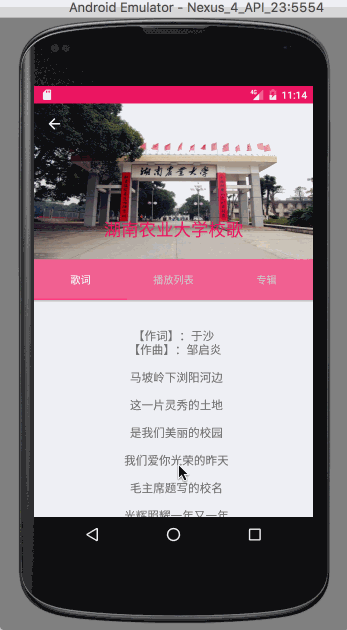
AppBarLayout.gif
就一个这样的效果吧,没有什么特别的特色,当然如果让我自己手撸我表示很操蛋~~
1.滑动 ScrollView/RecyclerView 的时候 优先把顶部的图片顶上去,然后固定TabLayout ,再滚动 ScrollView/RecyclerView 的内容,下拉的时候可以设置优先拖出图片或者拉到顶部在拖出图片。
2.Toolbar 的 title 伴随滚动移动位置和改变颜色,图片滚动到一定位置的时候会渐变一个主题色的蒙版遮盖住。
xml 代码实现
<android.support.design.widget.CoordinatorLayout
xmlns:android="http://schemas.android.com/apk/res/android"
xmlns:app="http://schemas.android.com/apk/res-auto"
android:layout_width="match_parent"
android:layout_height="match_parent">


<android.support.v4.widget.NestedScrollView
    android:layout_width="match_parent"
    android:layout_height="match_parent"
    app:layout_behavior="@string/appbar_scrolling_view_behavior">

    ...省略内容

</android.support.v4.widget.NestedScrollView>

<android.support.design.widget.AppBarLayout
    android:id="@+id/app_bar_layout"
    android:layout_width="match_parent"
    android:layout_height="wrap_content">

    <android.support.design.widget.CollapsingToolbarLayout
        android:layout_width="match_parent"
        android:layout_height="wrap_content"
        app:collapsedTitleTextAppearance="@style/ToolbarTextAppearanceTitle"
        app:contentScrim="@color/colorPrimary_pinkDark"
        app:expandedTitleGravity="center_horizontal|bottom"
        app:expandedTitleTextAppearance="@style/expandedToolbarTextAppearance"
        app:layout_scrollFlags="scroll|snap|enterAlways"
        app:scrimAnimationDuration="2000"
        app:scrimVisibleHeightTrigger="40dp"
        app:titleEnabled="true">

        <ImageView
            android:layout_width="match_parent"
            android:layout_height="wrap_content"
            android:background="@mipmap/material_img"
            app:layout_collapseMode="parallax"
            app:layout_collapseParallaxMultiplier="0.5"/>


        <android.support.v7.widget.Toolbar
            android:id="@+id/toolbar"
            android:layout_width="match_parent"
            android:layout_height="?attr/actionBarSize"
            app:layout_scrollFlags="scroll"
            app:navigationIcon="@mipmap/abc_ic_ab_back_mtrl_am_alpha"
            app:title="湖南农业大学校歌"/>

    </android.support.design.widget.CollapsingToolbarLayout>

    <android.support.design.widget.TabLayout
        android:id="@+id/tabLayout"
        android:layout_width="match_parent"
        android:layout_height="?attr/actionBarSize"
        />

</android.support.design.widget.AppBarLayout>

</android.support.design.widget.CoordinatorLayout>
源码分析
还是写点源码分析吧,感觉不分析一下源码就相当于只学了一个 api,以后出现类似的特效,然后现有的东西不能满足定制,我们也能模仿这些效果自己手撸出来。
好了,说正事~
今天的源码分析就不一行一行的看代码了,我们就根据上面的效果来分析怎么实现的把
1.滑动 ScrollView/RecyclerView 的时候 优先把顶部的图片顶上去,然后固定TabLayout ,再滚动 ScrollView/RecyclerView 的内容,下拉的时候可以设置优先拖出图片或者拉到顶部在拖出图片。 2.Toolbar 的 title 伴随滚动移动位置和改变颜色,图片滚动到一定位置的时候会渐变一个主题色的蒙版遮盖住。
额,这里不止两个点,不纠结了,一个一个来吧
- 我们给 ScrollView/RecyclerView 设置了 Behavior,在滑动的过程中,会调用 Behavior 里面的onStartNestedScroll、onNestedPreScroll、onNestedScroll、onStopNestedScroll等方法,然后 Behavior 持有对 AppBarLayout 的引用,会在这些方法里面根据状态做一系列的事情。至于这个 Behavior 是怎么调用的,我会在下一篇里面重点讲 Behavior。
- 这里的效果实现全部由CollapsingToolbarLayout,主要是 title 的位置和颜色, 然后就是mContentScrim和 mStatusBarScrim 这两个遮盖布的绘制,方法很简单
    @Override
    public void draw(Canvas canvas) {
    super.draw(canvas);

    // If we don't have a toolbar, the scrim will be not be drawn in drawChild() below.
    // Instead, we draw it here, before our collapsing text.
    ensureToolbar();
    if (mToolbar == null && mContentScrim != null && mScrimAlpha > 0) {
        mContentScrim.mutate().setAlpha(mScrimAlpha);
        mContentScrim.draw(canvas);
    }

    // Let the collapsing text helper draw its text
    if (mCollapsingTitleEnabled && mDrawCollapsingTitle) {
        mCollapsingTextHelper.draw(canvas);
    }

    // Now draw the status bar scrim
    if (mStatusBarScrim != null && mScrimAlpha > 0) {
        final int topInset = mLastInsets != null ? mLastInsets.getSystemWindowInsetTop() : 0;
        if (topInset > 0) {
            mStatusBarScrim.setBounds(0, -mCurrentOffset, getWidth(),
                    topInset - mCurrentOffset);
            mStatusBarScrim.mutate().setAlpha(mScrimAlpha);
            mStatusBarScrim.draw(canvas);
        }
    }
    }
ensureToolbar()再次确保了有一次对子 view toolbar 的引用。然后就是三个 if 控制绘制 contentScrim、CollapsingText、statusBarScrim。
其中CollapsingTextHelper保存了折叠 TextTitle 的各种绘制信息。
可能有人会问,如何控制 contentScrim,刚刚我们在 draw()的方法里面看到了判断条件,如果mScrimAlpha>0 则绘制,那么我们可以大胆的猜测,肯定是在收缩的过程中根据高度设置
mScrimAlpha来控制颜色布的显示与隐藏。
    final void updateScrimVisibility() {
    if (mContentScrim != null || mStatusBarScrim != null) {
        setScrimsShown(getHeight() + mCurrentOffset < getScrimVisibleHeightTrigger());
        }
    }
这个方法控制了 mScrimAlpha,getScrimVisibleHeightTrigger()方法获取scrimVisibleHeightTrigger这个属性大家肯定也不陌生。然后我们通过搜索发现updateScrimVisibility的调用在onLayout里面。 熟悉 view 绘制流程的童鞋肯这时候应该都懂了吧。我们在滚动的时候高度是不断发生变化的,而我们的高度发生变化则会重新 onMeasure,onMeasure 之后则会调用 onLayout,然后 onLayout里面调用updateScrimVisibility修改了 mScrimAlpha 的值,最后在 draw 方法里面绘制出来。
好了,就到这里吧,这里没有酷炫的 demo,什么防简书首页、仿知乎等等,但是看懂了这些api,我相信都能够自己动手防一个。
有点懒,很多应该录 gif 图的都没录,还请谅解~
不谅解也没事,反正你也打不到我
