

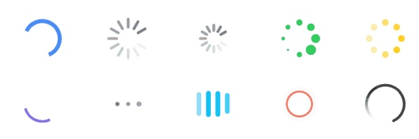
Ajax的使用,从客户端到服务端的数据请求之间的时间间隔,我们往往用一个loading图来提示用户数据正在加载来改善用户体验,就是我们经常用的菊花图:

以及多种样式的loading图:
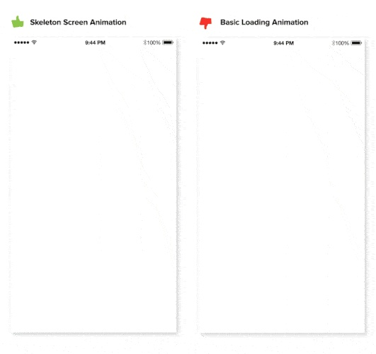
这种方式只能给提示用户,数据正在加载,但是这个时候页面往往是一片空白,视觉效果不是很好,在这里可以用另外一种方式来改善体验:Skeleton Screen,又称为骨架屏;际下面这种方式:

来一个直观的对比:
当然,你可以按照自己的具体数据列表样式做自己的骨架屏,使得数据真实渲染的时候,过度近乎自然平滑,下面我们通过html来写一个骨架屏,当然你也可以用图片,或者svg来代替:
<div class="skeleton-article skeleton-list">
   <h2 class="skeleton-header"></h2>
   <div class="skeleton-con">
        <div class="skeleton-img"></div>
        <ul class="skeleton-text">
            <li class="skeleton-textline"></li>
            <li class="skeleton-textline"></li>
            <li class="skeleton-textline"></li>
            <li class="skeleton-textline"></li>
            <li class="skeleton-textline"></li>
        </ul>
   </div>
   <div class="skeleton-bottom"></div>
</div>
<style>
    *{margin: 0;padding: 0}
    .skeleton-article.skeleton-list{
        position: relative;
        width: 640px;
        margin: 20px;
        border-style: solid;
        border-width: 5px 20px;
        border-color: #fff;
        animation: shimmer 1s linear 0s infinite normal forwards;
        background: #f6f7f8;
        background: linear-gradient(to right, #eeeeee 8%, #dddddd 18%, #eeeeee 33%);
        background-size: 200% 100%;
    }
    .skeleton-header{
        height: 20px;
        border-right: 350px solid #fff;
        border-top: 10px solid #fff;
        border-bottom: 10px solid #fff;
        background: transparent;
    }
    .skeleton-con{
        display: flex;
     }
     .skeleton-img{
        width: 200px;
        height: 120px;
        background: transparent;
        border-right: 20px solid #fff;
     }
     .skeleton-text{
        flex-grow: 1;
        height: 120px;
        display: flex;
        flex-flow: column nowrap;
        justify-content: space-between;
        list-style: none;
        background: transparent;
     }
     .skeleton-textline{
        height: 10px;
        background: #fff;
        list-style: none;
     }
     .skeleton-bottom{
        height: 20px;
        border-top: 10px solid #fff;
        border-bottom: 10px solid #fff;
        background: transparent;
     }
     @keyframes shimmer{
        0%{
             background-position: 120% 0;
        }
        100%{
             background-position: -120% 0;
        }
     }
</style>
使用Skeleton Screen可以在弱网络环境下,使用一些视觉元素展现内容的轮廓,给用户一些等待预期,现在在SPA和App上,比如知乎,淘宝(就不截图了,万一暴露自己的一些什么的就不好了)上都有很多的运用。
tip : Skeleton Screen是为了改善内容的渲染体验,如或是一些具体的操作等待,请不要使用Skeleton Screen,应该使用菊花图
