

前言
在 html 中使用 checkbox 时,可能会由于默认 checkbox 的样式不符合页面风格,或是在不同浏览器样式不同而需要自定义。
常见的自定义 checkbox 的方法有:
- 为不同状态的 checkbox 定义不同的背景图。
- 定义 CSS 的 before、after,设置 font-icon 或通过 CSS 样式的方式来模拟 checkbox 的几种状态。
第一种方式,使用起来比较简单,但是需要增加对图片资源的引用,略微延长加载时间,并且无法方便的实现样式的定制和修改。
第二种方式则略优一些,定制起来较为方便,但是 before 和 after 只有两个元素,对于样式复杂的 checkbox,绘制起来可能会捉襟见肘;同时,部分浏览器不支持在 checkbox 中定义 before、after,这样就需要增加额外的 dom 结构。
对于上面的两个问题,使用 Houdini 提供的功能实现自定义 checkbox 则可以完美解决。在开始编写代码之前,先简单介绍一下 Houdini。
什么是 Houdini ?
CSS Houdini 是一个新的 W3C 工作组,志在通过提供一系列 API,使开发者能够拥有访问 CSS 引擎的能力,可以不局限于原来的 CSS 属性,有能力创建自定义的 CSS 特性并高效的使用在浏览器中;同时,Houdini 的出现使得浏览器的行为得到统一,新特性能够更快的使用到项目中。
通过浏览这篇草案,我们可以了解到关于 CSS Houdini 的详细内容。
下面介绍一下在自定义 checkbox 时需要用到的 API:
CSS Painting API
如果你熟悉了在 canvas 中绘图,那么使用这个 API 对你来说就不陌生了。Painting API 提供了为 CSS 属性绘图的能力,可以将其应用到 mask-image、background-image、list-style-image、border-image 中。
class Checkbox {
  static get inputArguments() { return ['<length>'] }

  static get inputProperties() { return ['--color'] }

  paint (ctx, size, styleMap, args) {
    // ...
  }
}
registerPaint('checkbox', Checkbox)

// .a { background-image: paint(checkbox, 1px) }
绘制主要在 paint 函数中完成,paint 函数有四个参数,分别是:
- ctx:PaintRenderingContext2D,是 CanvasRenderingContext2D 的一个子集,实现了 canvas 的大部分功能。
- size:PaintSize,包括元素的宽高信息。
- styleMap:StylePropertyMapReadOnly,可以通过这个参数来获取 CSS 变量或其他信息。
- args:来自 CSS 中传递的参数。
CSS Properties and Values API
通过这个 API,开发者可以对 CSS 变量定义类型、继承行为和初始值,从而可以使用 CSS 变量制作一些动态效果。
CSS.registerProperty({
  name: "--my-color",
  syntax: "<color>",
  inherits: false,
  initialValue: "#fff"
});
syntax 声明了引擎需要如何解析这个 CSS 变量,可以设置的值有:length、number、percentage、length-percentage、color、angle 等。
Worklets
使用 Painting API 时,为了绘制图像,需要撰写 JS 文件,这个 JS 文件并不是通过常规的 Web 嵌入 JS 的方式引入,而是使用如下的方式,通过 Worksles 引入该文件。
CSS.paintWorklet.addModule('checkbox.js')
你可能会觉得这种方式很像 Web Workers,引用 Web Workers 文档中的一段文字:
Workers (as these background scripts are called herein) are relatively heavy-weight, and are not intended to be used in large numbers. For example, it would be inappropriate to launch one worker for each pixel of a four megapixel image. The examples below show some appropriate uses of workers.
可以看出,Web Workers 并不适合应用在此处。Worklets 与 Web Workers 十分相似,使用独立于主线程的方式,同时具有轻量及生命周期短的特点。
支持性
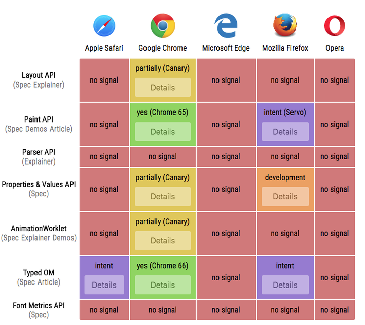
查看 Houdini 的支持性可以到 ishoudinireadyyet.com/ ,截止笔者发布这篇文章,下文用到的特性已经全部被最新版本的 Chrome 支持。
如何使用 Houdini 实现自定义 checkbox
checkbox 共有 6 种状态,分别为 checked、unchecked、indeterminate,以及分别对应的 disabled 状态。首先实现 unchecked 及 unchecked disabled,使用 CSS Painting API 绘制样式,并将其赋给 background-image。
<!DOCTYPE html>
<html lang="en">
<head>
  <title>Houdini</title>
  <style>
    .custom-checkbox {
      -webkit-appearance: none;
      width: 100px;
      height: 100px;
      background-image: paint(checkbox);
      outline: 0;
      --status: unchecked;
      --border-color: #dcdfe6;
      --bg-color: #fff;
      --line-color: #fff;
    }
    .custom-checkbox:checked {
      --status: checked;
      --bg-color: #409eff;
      --line-color: #fff;
      --border-color: #fff;
    }
    .custom-checkbox:indeterminate {
      --status: indeterminate;
      --bg-color: #409eff;
      --line-color: #fff;
    }
    .custom-checkbox:disabled {
      --disabled: disabled;
      --bg-color: #edf2fc;
      --line-color: #c0c4cc;
      --border-color: #dcdfe6;
    }
  </style>
</head>
<body>
  <input type="checkbox" class="custom-checkbox">
  <input type="checkbox" disabled class="custom-checkbox">
  <script>
    CSS.paintWorklet.addModule('checkbox.js')
  </script>
</body>
</html>
class Checkbox {
  constructor () {
    this.borderColor = null
    this.bgColor = null
    this.lineColor = null
  }

  static get inputProperties() {
    return ['--status', '--disabled', '--bg-color', '--border-color', '--line-color']
  }

  paint (ctx, geom, properties) {
    const { width, height } = geom
    const status = this.getProp(properties, '--status')
    const disabled = this.getProp(properties, '--disabled')
    const borderRadius = width * 0.2
    this.borderColor = this.getProp(properties, '--border-color')
    this.bgColor = this.getProp(properties, '--bg-color')
    this.lineColor = this.getProp(properties, '--line-color')
    switch (status) {
      case 'unchecked': return this.drewUnChecked(ctx, width, height, borderRadius, disabled)
    }
  }

  drewUnChecked (ctx, width, height, borderRadius, disabled) {
    this.drewRoundRect(ctx, 0, 0, width, height, borderRadius)
    if (disabled === 'disabled') {
      ctx.fillStyle = this.bgColor
      ctx.fill()
    }
    ctx.strokeStyle = this.borderColor
    ctx.lineWidth = width / 7
    ctx.stroke()
  }

  drewRoundRect (ctx, x, y, w, h, r) {
    const min_size = Math.min(w, h)
    if (r > min_size / 2) r = min_size / 2
    ctx.beginPath()
    ctx.moveTo(x + r, y)
    ctx.arcTo(x + w, y, x + w, y + h, r)
    ctx.arcTo(x + w, y + h, x, y + h, r)
    ctx.arcTo(x, y + h, x, y, r)
    ctx.arcTo(x, y, x + w, y, r)
    ctx.closePath()
  }

  getProp (properties, item) {
    return properties.get(item) && properties.get(item).toString().trim()
  }
}

registerPaint('checkbox', Checkbox)
下一步是使用与上面相同的方式实现 checked、indeterminate及对应的 disabled status。
class Checkbox {
  // ...
  paint (ctx, geom, properties) {
    // ...
    switch (status) {
      case 'unchecked': return this.drewUnChecked(ctx, width, height, borderRadius, disabled)
      case 'checked': return this.drewChecked(ctx, width, height, borderRadius, disabled)
      case 'indeterminate': return this.drewIndeterminate(ctx, width, height, borderRadius, disabled)
    }
  }

  drewChecked (ctx, width, height, borderRadius, disabled) {
    this.drewRoundRect(ctx, 0, 0, width, height, borderRadius)
    ctx.fillStyle = this.bgColor
    ctx.fill()
    if (disabled === 'disabled') {
      ctx.lineWidth = width / 7
      ctx.strokeStyle = this.borderColor
      ctx.stroke()
    }
    this.drewCheckmark(ctx, width, height)
    ctx.lineWidth = width / 14
    ctx.strokeStyle = this.lineColor
    ctx.stroke()
  }

  drewUnChecked (ctx, width, height, borderRadius, disabled) {
    // ...
  }

  drewIndeterminate (ctx, width, height, borderRadius, disabled) {
    this.drewRoundRect(ctx, 0, 0, width, height, borderRadius)
    ctx.fillStyle = this.bgColor
    ctx.fill()
    if (disabled === 'disabled') {
      ctx.lineWidth = width / 7
      ctx.strokeStyle = this.borderColor
      ctx.stroke()
    }
    const lineWidth = width / 14
    const y = height * 0.5
    this.drewLine(ctx, width * 0.25, y, width * 0.75, y)
    ctx.lineWidth = lineWidth
    ctx.strokeStyle = this.lineColor
    ctx.stroke()
  }

  drewRoundRect (ctx, x, y, w, h, r) {
    // ...
  }

  drewCheckmark (ctx, width, height) {
    ctx.beginPath()
    ctx.save()
    ctx.translate(width * 0.5, height * 0.5)
    ctx.rotate(45 * Math.PI / 180)
    ctx.translate(-width * 0.5, -height * 0.5)
    ctx.moveTo(width * 0.3, height * 0.7)
    ctx.lineTo(width * 0.55, height * 0.7)
    ctx.lineTo(width * 0.55, height * 0.15)
    ctx.restore()
  }

  drewLine (ctx, x1, y1, x2, y2) {
    ctx.beginPath()
    ctx.moveTo(x1, y1)
    ctx.lineTo(x2, y2)
    ctx.closePath()
  }
  // ...
}

registerPaint('checkbox', Checkbox)
最后,为 checkbox 增加颜色的渐变效果。这里使用了 CSS Properties and Values API,注册 CSS 变量的类型以及默认值,然后增加 transition 就可以实现渐变了。
  <style>
    .custom-checkbox {
    // ...
      transition: --border-color 500ms, --bg-color 500ms, --line-color 500ms;
    }
  </style>
  <script>
    CSS.paintWorklet.addModule('checkbox.js');
    CSS.registerProperty({
      name: "--bg-color",
      syntax: "<color>",
      initialValue: "#fff"
    });
    CSS.registerProperty({
      name: "--border-color",
      syntax: "<color>",
      initialValue: "#fff"
    });
    CSS.registerProperty({
      name: "--line-color",
      syntax: "<color>",
      initialValue: "#fff"
    });
  </script>
最终的效果可以在 示例 中查看。
总结
上文中介绍了如何使用 Houdini 实现自定义 checkbox ,对于支持 Houdini 的浏览器而言,在不同的浏览器中都能够得到统一的样式,定制起来非常方便。并且,通过相同的方式,还可以方便的实现 radio, switcher 等页面组件,实现动态的背景及绚丽的页面动画。随着浏览器对 Houdini 的支持性不断提升,开发将会拥有更多有趣且使用的解决方案,让我们一起期待吧!
