

[译] 探索 Android Design Support Library v28 新增内容
Android Support Library v28 版本最近被宣布推出 – 在当前的 alpha 版本中, 我们又有了一系列令人兴奋的新组件. 在这篇文章中, 我想要看看以 Material 视图组件形式添加进入 Support Library 的新增部分.
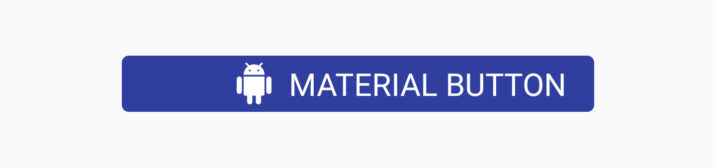
Material Button
Material Button 是一个小部件, 可用于在你的应用程序的用户界面中显示材质样式的按钮. 这个类从你可能已经使用的 AppCompatButton 类继承而来. 它们之间有什么不同呢? 这个按钮开箱即用, 它被设计成具有物质本质外观和质感, 而无需使用样式标志定义. 我们按照原样使用 MaterialButton 类, 并且在我们的视图中, 它将具有我们所追求的材质外观和质感 – 将其视为一个提供方便的类.
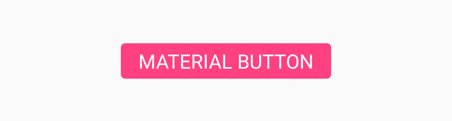
我们可以像这样将这个按钮添加进布局文件中:
<android.support.design.button.MaterialButton
    android:layout_width="wrap_content"
    android:layout_height="wrap_content"
    android:text="MATERIAL BUTTON"
    android:textSize="18sp"
    app:icon="@drawable/ic_android_white_24dp" />
默认情况下, 此类将使用主题的 accent colour 填充按钮的背景颜色, 同时使用白色作为按钮的文字颜色. 如果该按钮未被填充, 则主题的 accent colour 将作为按钮的文本颜色, 透明背景色.
如果我们希望自己添加一些更高级的样式, 那么我们可以通过使用 MaterialButton 样式中的一组属性来完成此操作.
app:icon: 用于定义在按钮开始时显示的 drawable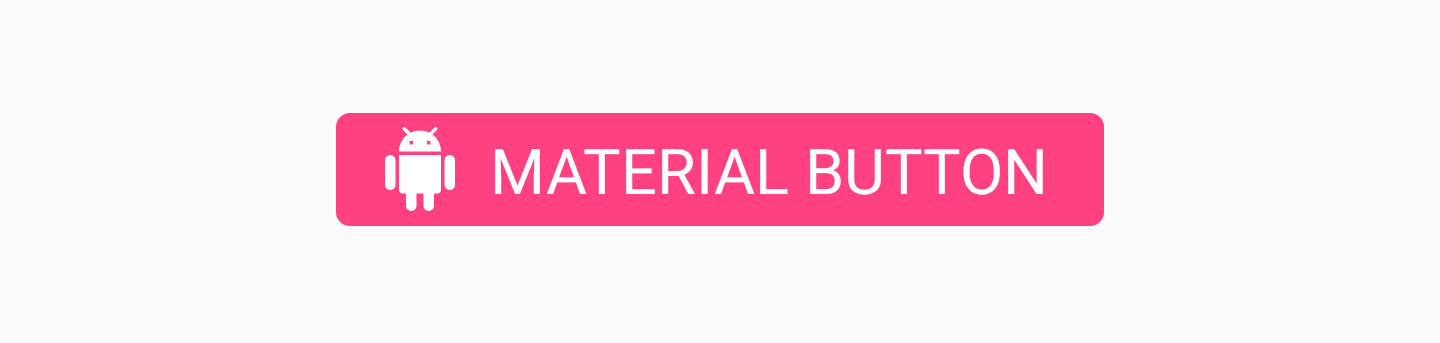
app:iconTint: 用于给指定了app:icon属性的图标着色app:iconTintMode: 定义了图标的着色模式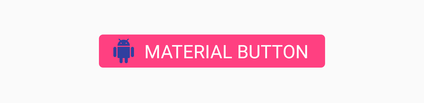
app:iconPadding: 用于给指定了app:icon属性的图标产生内边距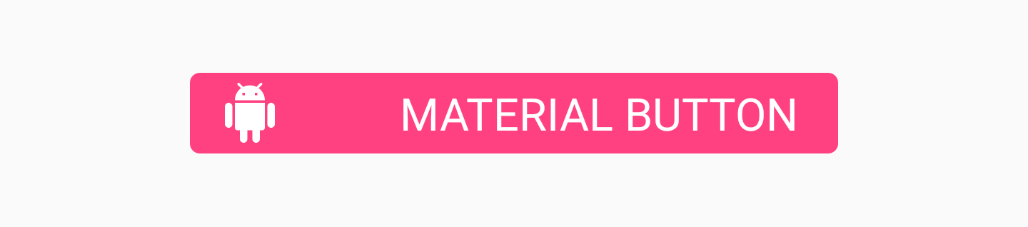
app:additionalPaddingLeftForIcon: 用于给指定了app:icon属性的图标产生左内边距
app:additionalPaddingRightForIcon: 用于给指定了app:icon属性的图标产生右内边距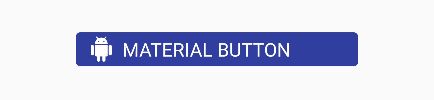
app:rippleColor: 使用此颜色定义按钮的水波纹效果的颜色app:backgroundTint: 用于给按钮的背景着色.如果你想要改变按钮的背景颜色, 使用这个属性而不是 background 以避免破坏按钮的样式app:backgroundTintMode: 用于定义背景色的着色样式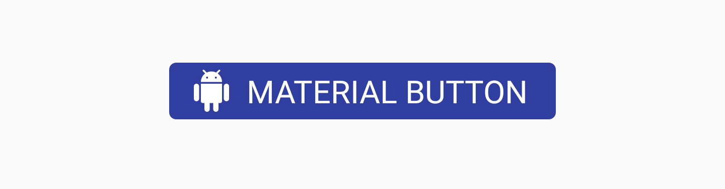
app:strokeColor: 用于按钮边框的颜色app:strokeWidth: 用于按钮边框的宽度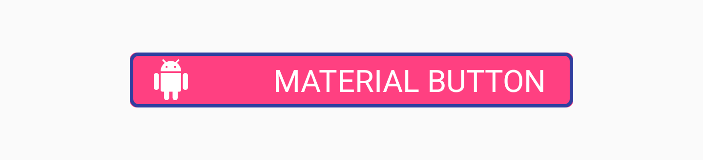
app:cornerRadius: 用于定义按钮圆角的半径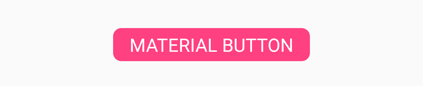


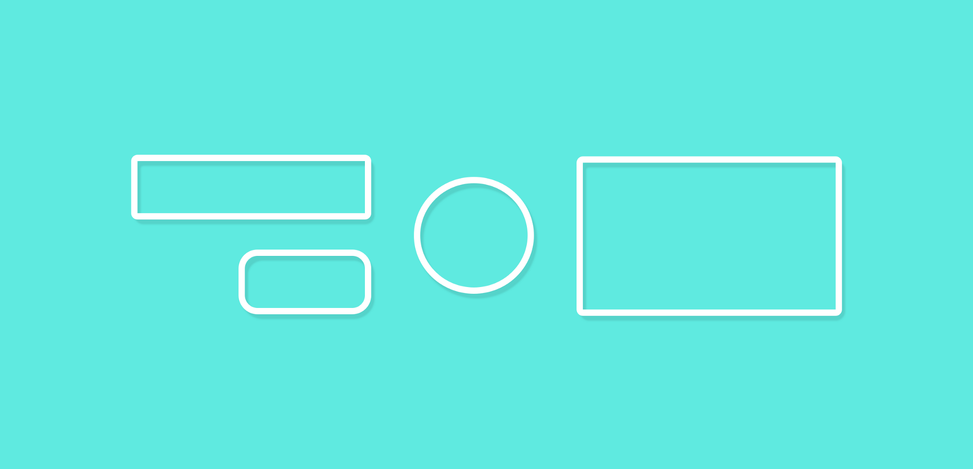
Chip
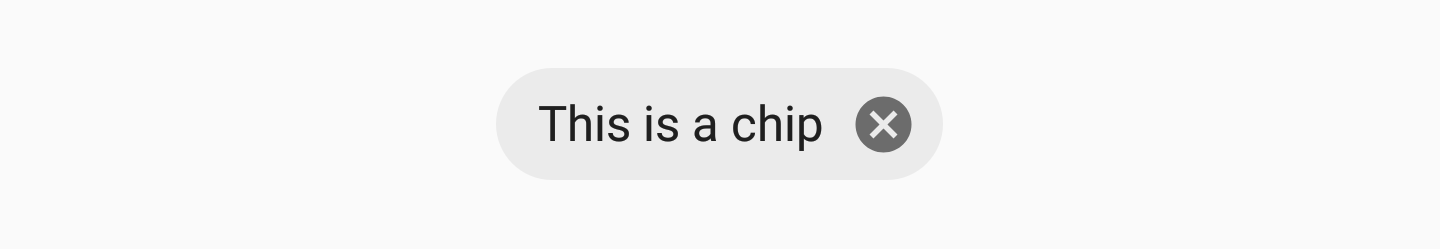
Chip 组件允许我们在布局中展示一个纸片组件. 其本质上一些文字被赋予一个圆形背景 – 这样做的目的是向用户显示某种形式的文本集合, 可能被选择也可能不被选择. 例如, Chip 可用于根据应用程序中的当前上下文向用户显示可选建议的列表. 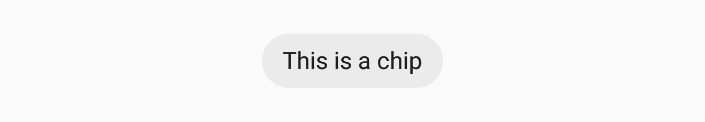
我们可以像这样在布局中添加一个 Chip , 使用 app:chipText 属性设置 Chip 中显示的文本:
<android.support.design.chip.Chip
    android:id="@+id/some_chip"
    android:layout_width="wrap_content"
    android:layout_height="wrap_content"
    app:chipText="This is a chip" />
Chip 还有其他的属性集合用于进一步的定义样式:
app:checkable: 用于声明 Chip 是否能被切换为选中或未选中. 如果禁用, 则 检查行为与 Button 相同app:chipIcon: 用于在 Chip 中显示一个图标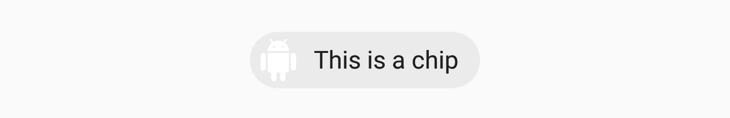
app:closeIcon: 用于在 Chip 中显示一个关闭按钮

我们也可以为 Chip 实例添加监听器, 用于倾听来自用户的交互. 如果我们的 Chip 是可检查的, 那么当这个检查状态发生改变时, 我们可能会希望听到. 我们可以使用 setOnCheckedChangeListener 设置监听器:
some_chip.setOnCheckedChangeListener { button, checked -> }
这同样适用于当我们想要在使用时关闭与关闭图标(CloseIcon)的交互. 为此, 我们可以利用 setOnCloseIconClickListener 函数注册关闭交互事件:
some_chip.setOnCloseIconClickListener { }
Chip Group
如果我们向用户展示一系列 Chip , 我们希望确保它们在我们的视图中能正确分组. 为此, 我们可以使用 ChipGroup 视图组件: 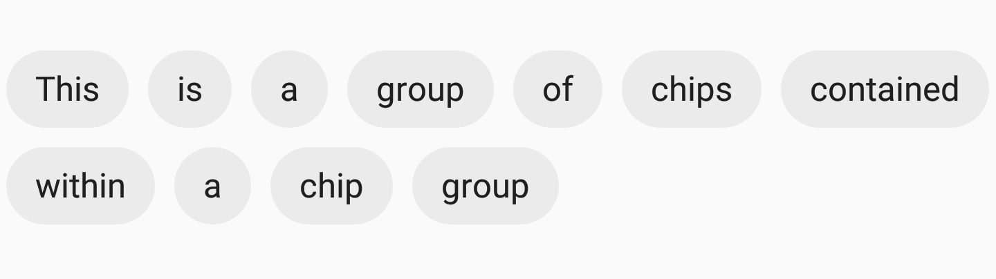
如果我们想要使用 ChipGroup 组件, 我们仅仅只需要将 Chip 视图包裹在一个父 ChipGroup 组件中:
<android.support.design.chip.ChipGroup
    android:layout_width="wrap_content"
    android:layout_height="wrap_content">

    <android.support.design.chip.Chip
        android:layout_width="wrap_content"
        android:layout_height="wrap_content"
        app:chipText="This" />

    <android.support.design.chip.Chip
        android:layout_width="wrap_content"
        android:layout_height="wrap_content"
        app:chipText="is" />

    // more chips...

</android.support.design.chip.ChipGroup>
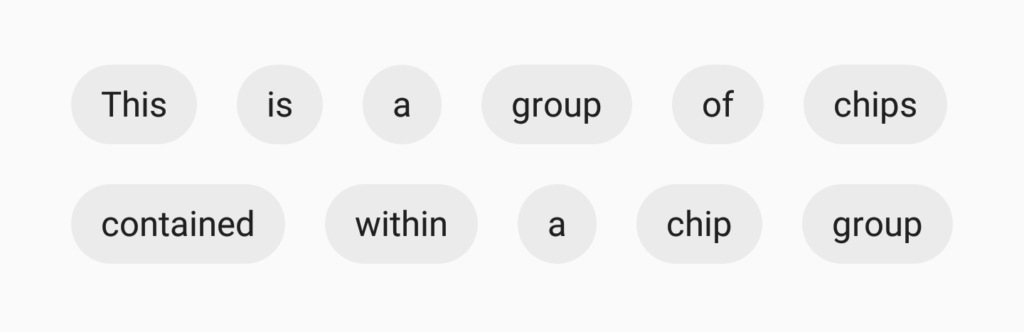
默认情况下, 你的 Chip 视图看起来有些拥挤. 如果的确如此, 你可以使用如下的 ChipGroup 本身的属性为子 Chip 视图添加一些间距:
app:chipSpacing: 在横纵轴方向均添加间距app:chipSpacingHorizontal: 仅在横轴(水平轴)方向添加间距app:chipSpacingVertical: 仅在纵轴(垂直轴)方向添加间距
我们也可以声明子 Chip 视图在 ChipGroup 容器中单行显示. 使用 app:singleLine 属性: 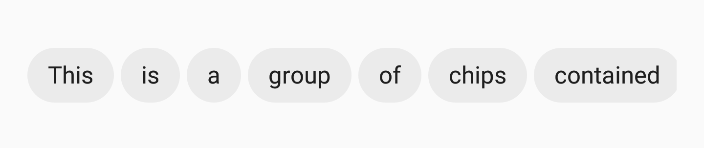
这样做时, 你需要将 ChipGroup 封装在滚动视图(如 HorizontalScrollView )中, 以便用户可以滑动正在显示的 Chip.
<HorizontalScrollView
    android:layout_width="wrap_content"
    android:layout_height="wrap_content">

    <android.support.design.chip.ChipGroup
        android:layout_width="wrap_content"
        android:layout_height="wrap_content"
        app:singleLine="true">

        <android.support.design.chip.Chip
            android:layout_width="wrap_content"
            android:layout_height="wrap_content"
            app:chipText="Some chip" />

        // more chips...
    </android.support.design.chip.ChipGroup>

</HorizontalScrollView>
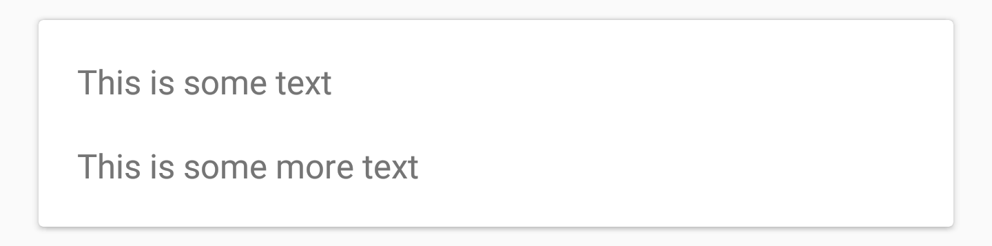
Material Card View
在我们的应用程序中, 我们可能在某些时候使用了 CardView 组件. Support Library 现在包含了一个名为 Material Card View 的组件, 它为我们提供了开箱即用的 Material 风格的 CardView 实现.
MaterialCardView 可以通过类似于下面的方式添加到你的布局中:
<android.support.design.card.MaterialCardView
    android:layout_width="match_parent"
    android:layout_height="wrap_content"
    android:layout_margin="16dp">
    ... child views ...
</android.support.design.card.MaterialCardView>
你可以使用其中的两个属性进一步设置卡片视图的样式:
app:strokeColor: 用于给定的边框的颜色, 如果要展示边框的话, 此属性必须设置app:strokeWidth: 要应用于视图边框的宽度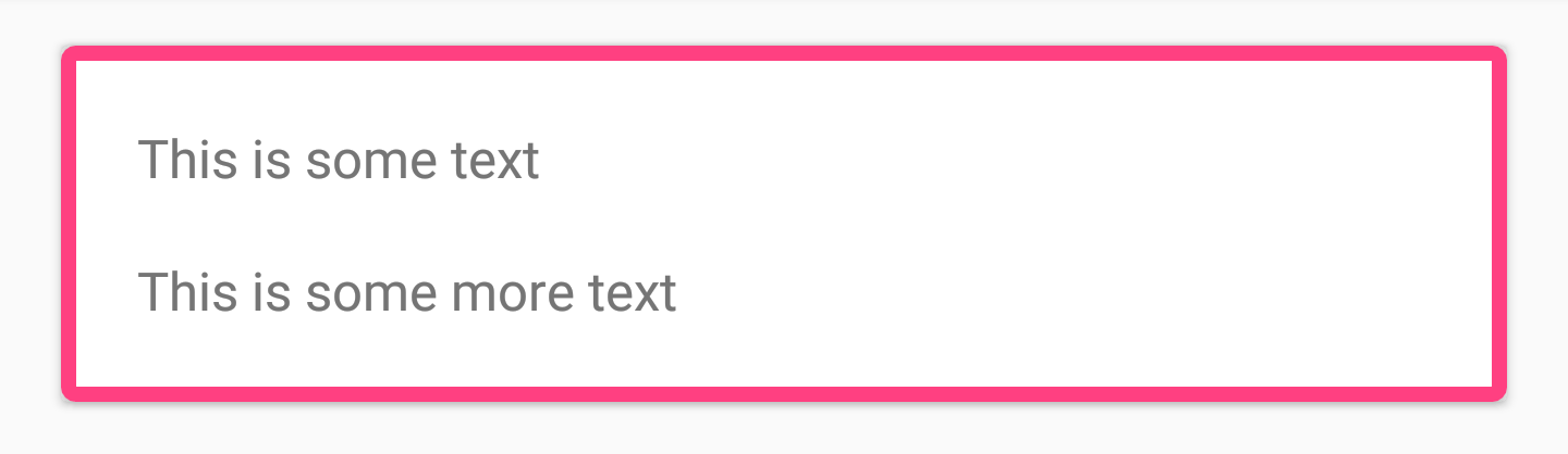

除了这两个属性之外, 还可以使用最初可用的属性(如 app:cardBackgroundColor 等)设置卡片视图的样式.
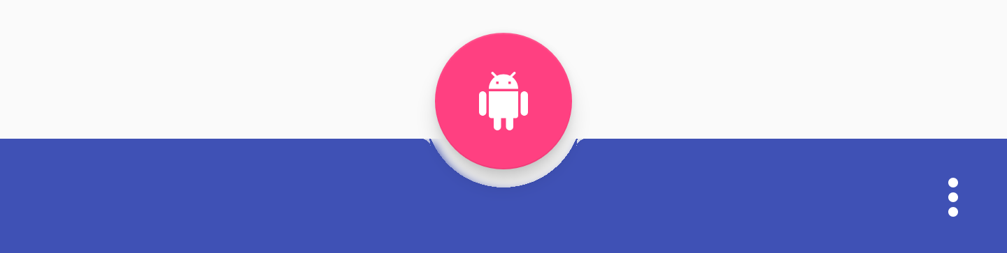
Bottom App Bar
底部应用栏是一个新的组件, 它允许我们在布局的底部显示一个类似工具栏的组件. 这使我们能够以比标准工具栏更容易交互的方式向用户显示组件.
BottomAppBar 可以通过类似于下面的方式添加到你的布局中:
<android.support.design.bottomappbar.BottomAppBar
    android:layout_width="match_parent"
    android:layout_height="wrap_content"
    android:layout_gravity="bottom"
    app:backgroundTint="@color/colorPrimary"
    app:popupTheme="@style/ThemeOverlay.AppCompat.Light"
    app:theme="@style/ThemeOverlay.AppCompat.Dark.ActionBar">
似乎底部应用栏 必须 有一个分配给它的菜单才能显示在屏幕上. 这可以通过编码方式完成,如下所示:
bottom_app_bar.replaceMenu(R.menu.main)
当涉及到定义底部应用栏的样式时, 可以使用几个属性来完成此操作.
-
app:fabAttached: FAB (Floating Action Button) 是否已经附加到底部应用栏. 你可以使用底部应用栏的 ID, 在你希望附加 FAB 组件上使用app:layout_anchor来附加一个 FAB. 如果附加了 FAB, 它将插入底部应用栏, 否则 FAB 将保持在底部应用栏上方.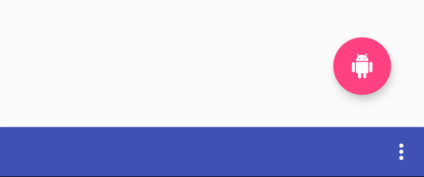
-
app:fabAlignmentMode: 声明已附加到底部应用栏的FAB的位置. 可以为 end:
或者是 center:

-
app:fabCradleVerticalOffset: 声明要用于附加 FAB 的垂直偏移量. 默认情况下为0dp: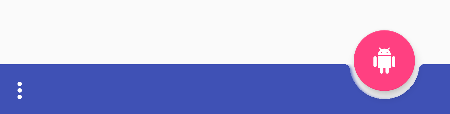 但是设置值会允许 FAB 垂直向上移动.
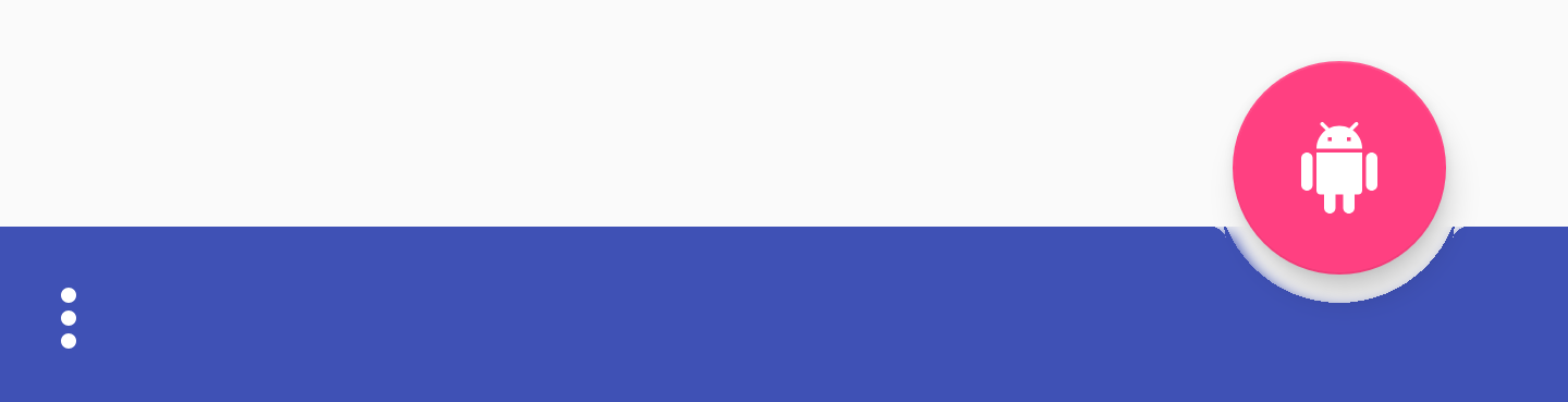
-
app:backgroundTint: 用于为视图的背景上色. 如果你想要设置视图的背景颜色, 那么应该用 android:background 属性. 这样会确保视图样式的稳定性.


 但是设置值会允许 FAB 垂直向上移动.
结论
在我看来, 这些是对 Support Library 的一些简洁补充 – 我期待着能够立即使用材质主题组件. 我也很高兴能够找到一个可以使用底部应用栏的用例, 但我确信在 Support Library 版本稳定之前还有一段时间才能实现. 按照惯例, 我很乐意听到您对这些新组件的想法或评论!
原文地址: medium.com/exploring-a…
原文作者为 Joe Birch, 他是 GDE (Google Developer Expert) for Android 成员, 他的 Twitter 主页: twitter.com/hitherejoe
本文由 TonnyL 翻译, 文章发表在 tonnyl.github.io/2018/04/22/… . 如果你发现了有翻译的不合适的地方, 欢迎指出. 转载文章请注明原文, 本文地址以及作者.
你可以通过以下方式联系我:
GitHub: github.com/TonnyL
知乎: www.zhihu.com/people/lizh…
Instagram: www.instagram.com/tonny_lztl/
以下为原文:
Exploring the v28 Android Design Support Library Additions
Version 28 of the Android support library was recently announced — within the current alpha version there is a collection of exciting new components that we now have access to. In this article, I want to take a look at the additions which have been made to the Support library in the form of Material view components.
Material Button
The Material Button is a widget that can be used to display a material style button within your applications user interface. This class extends from the AppCompatButton class which you’re likely already using in you projects, but what makes this any different? Out of the box this button will be styled with the look-and-feel of a material nature without the need to customise it yourself using the style flag. We can use the MaterialButton class as it is and our within our view it will already have the material look and feel which we are after — see it as a convenience class.
We can add this button to our layout file like so:
<android.support.design.button.MaterialButton
    android:layout_width="wrap_content"
    android:layout_height="wrap_content"
    android:text="MATERIAL BUTTON"
    android:textSize="18sp"
    app:icon="@drawable/ic_android_white_24dp" />
By default this class will use the accent colour of your theme for the buttons filled background colour along with white for the buttons text colour. If the button is not filled, then the accent colour of your theme will be used for the button text colour instead along with a transparent background.
If we wish to add some further styling to this ourselves then we can do so by using a collection of attributes from the MaterialButton style.
app:icon— Used to define a drawable to be displayed at the start of the buttonapp:iconTint: Used to tint the icon in use from the app:icon attributeapp:iconTintMode: Defines the the mode to be used for the icon tintapp:iconPadding: Padding to be applied to the icon in use from the app:icon attributeapp:additionalPaddingLeftForIcon: Defines the padding to be applied to the left of the icon in use from the app:icon attributeapp:additionalPaddingRightForIcon: Defines the padding to be applied to the right of the icon in use from the app:icon attributeapp:rippleColor: The colour to be used for the button ripple effect, this colour will be usedapp:backgroundTint: Used to apply a tint to the background of the button. If you wish to change the background color of the button, use this attribute instead of background to avoid breaking the button styleapp:backgroundTintMode: Used to define the mode to be used for the background tintapp:strokeColor: The color to be used for the button strokeapp:strokeWidth: The width to be used for the button strokeapp:cornerRadius: Used to define the radius used for the corners of the button
Chip
The chip component allows us to display a chip view within our layout. This is essentially some text that is given a rounded background — the purpose of these is to display some form of textual collection to the user that may or may not be selectable. For example, these could be used to show a list of selectable suggestions to the user based on the current context within your app.
We can add a Chip to our layout like so, using the app:chipText attribute to set the text to be displayed on the chip:
<android.support.design.chip.Chip
    android:id="@+id/some_chip"
    android:layout_width="wrap_content"
    android:layout_height="wrap_content"
    app:chipText="This is a chip" />
There is also a collection of other attributes which can be used to further style the chip:
app:checkable: Used to declare whether the chip can be toggled as selected / not selected. If disabled, the check behaves in the same way as a buttonapp:chipIcon: Used to display an icon within the chipapp:closeIcon: Used to display a close icon within the chip
We can also set some listeners on our chip instances, these can be useful for listening out for interactions from our users. If our chip is checkable, it is likely we’ll want to listen out for when this check state has been changed. We can do so using
the setOnCheckedChangeListener listener:
some_chip.setOnCheckedChangeListener { button, checked -> }
The same applies for when we want to listen out for interaction with the close icon when it is in use. For this we can utilise the setOnCloseIconClickListener function to register for close interaction events:
some_chip.setOnCloseIconClickListener { }
Chip Group
If we’re displaying a collection of chips to our users, we want to ensure that they are correctly grouped together within our view. For this we can make use of the ChipGroup view component:
If we wish to use the ChipGroup we just need to wrap our Chip views in a parent ChipGroup component:
<android.support.design.chip.ChipGroup
    android:layout_width="wrap_content"
    android:layout_height="wrap_content">

    <android.support.design.chip.Chip
        android:layout_width="wrap_content"
        android:layout_height="wrap_content"
        app:chipText="This" />

    <android.support.design.chip.Chip
        android:layout_width="wrap_content"
        android:layout_height="wrap_content"
        app:chipText="is" />

    // more chips...

</android.support.design.chip.ChipGroup>
By default your Chip views may appear a little cramped together. If so, you can add some spacing to the child views by using the following attributes on the chip group itself:
app:chipSpacing: Adds spacing to both the horizontal and vertical axisapp:chipSpacingHorizontal: Adds spacing to the horizontal axisapp:chipSpacingVertical: Adds spacing to the vertical axis
We can also declare our child Chip views to be displayed within a single line inside of our ChipGroup container. Using the app:singleLine attribute:
When doing so, you’ll need to wrap the ChipGroup in a scrolling view such as the HorizontalScrollView so that your users can scroll through the displayed Chips:
<HorizontalScrollView
    android:layout_width="wrap_content"
    android:layout_height="wrap_content">

    <android.support.design.chip.ChipGroup
        android:layout_width="wrap_content"
        android:layout_height="wrap_content"
        app:singleLine="true">

        <android.support.design.chip.Chip
            android:layout_width="wrap_content"
            android:layout_height="wrap_content"
            app:chipText="Some chip" />

        // more chips...
    </android.support.design.chip.ChipGroup>

</HorizontalScrollView>
Material Card View
It’s likely within our apps that we’ve used the CardView component at some point. The support library now contains a component called the Material Card View, which provides us with a material styled cardview implementation out of the box.
The cardview can be added to your layout like so:
<android.support.design.card.MaterialCardView
    android:layout_width="match_parent"
    android:layout_height="wrap_content"
    android:layout_margin="16dp">
    ... child views ...
</android.support.design.card.MaterialCardView>
You can further style the cardview by using two of the attributes that come with it:
app:strokeColor: The colour to be used for the given stroke, this must be set in order to display a strokeapp:strokeWidth: The width to be applied to the stroke of the view
As well as these two attributes, you can still style the cardview using the originally available attributes such as app:cardBackgroundColor etc.
Bottom App Bar
The bottom app bar is a new component that allows us to show a toolbar-like component at the bottom of our layout. This allows us to display components to our user in a manner that makes them easier to interact with than a standard toolbar might.
You can add the BottomAppBar to your layout file like so:
<android.support.design.bottomappbar.BottomAppBar
    android:layout_width="match_parent"
    android:layout_height="wrap_content"
    android:layout_gravity="bottom"
    app:backgroundTint="@color/colorPrimary"
    app:popupTheme="@style/ThemeOverlay.AppCompat.Light"
    app:theme="@style/ThemeOverlay.AppCompat.Dark.ActionBar">
It appears as though the bottom app bar must have a menu assigned to it in-order for it to be displayed on screen. This can be done programatically like so:
bottom_app_bar.replaceMenu(R.menu.main)
When it comes to styling the bottom app bar there are several attributes you can make use of to do so.
-
app:fabAttached: States whether or not a FAB has been attached to the bottom app bar. You can attach a fab by using app:layout_anchor on the FAB component which you wish to attach, using the ID of the bottom app bar. If a FAB is attached it will be inset into the bottom app bar, otherwise the FAB will remain above the bottom app bar. -
app:fabAlignmentMode: Declares the position of the FAB which has been attached to the bottom app bar. This can be either end:or center:
-
app:fabCradleVerticalOffset: Declares the vertical offset to be used for the attached fab. By default this is 0dp: However, setting a dp value will allow the FAB to be shifting upwards vertically: -
app:backgroundTint: Used to apply a tint to the background of the view. If you wish to set the background color of the view then this should be used over the android:background attribute. Doing so will ensure the theming of the view remains stable.
Conclusion
In my opinion these are some neat additions to the support library — I’m looking forward to being able to use material themed components right out of the box. I’m also excited to find a use case for where the bottom app bar may be used, but I am sure there is some time before the support library version is stable before doing so. As per usual, I’d love to hear your thoughts or comments on these new components!
