Maps are based on our physical world. We create maps using abstract shapes and colors to reveal geographic patterns and tell stories about human existence.
At Uber, we leverage data visualization to better understand how our cities move. Our solutions enable us to embed maps with rich location data, render millions of GPS points in the blink of an eye, and, most importantly, derive insights from them.
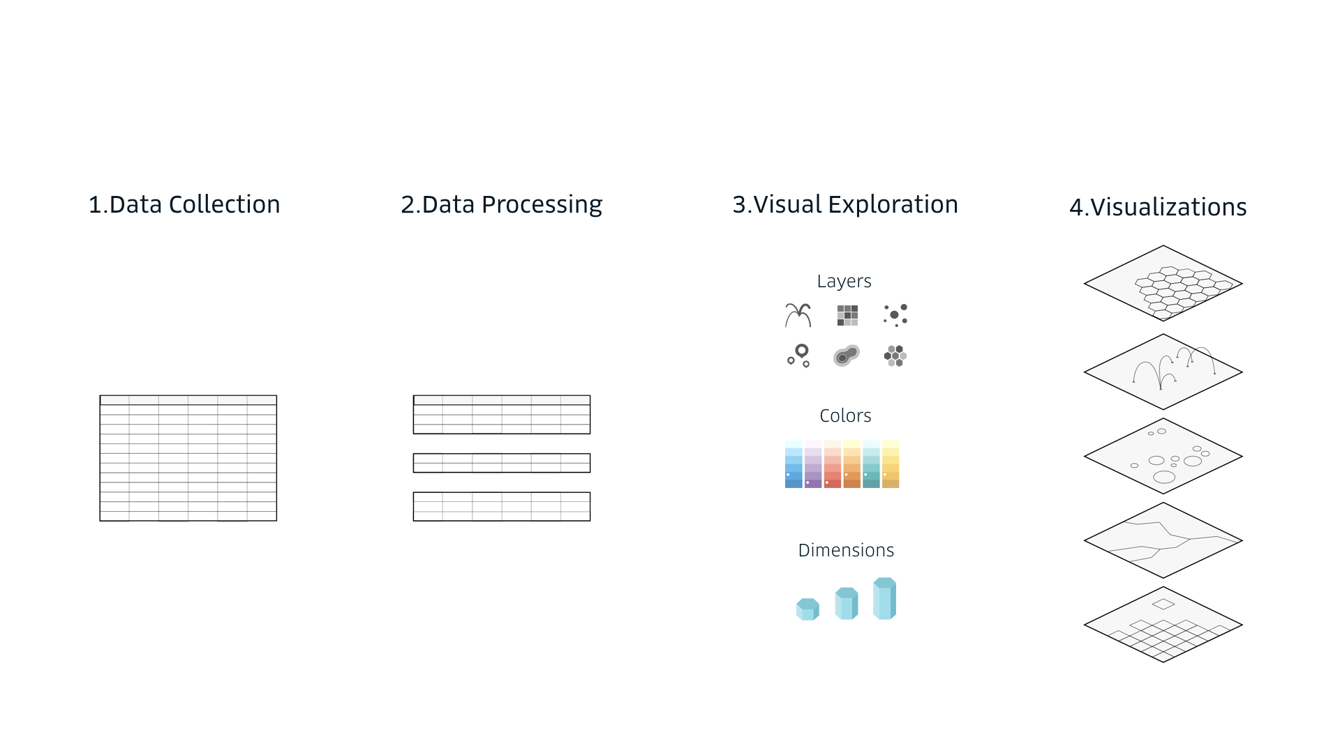
Figure 1: The common process of creating a data visualization includes data collection, data processing, visual exploration, and then layering.
No matter the frameworks or tools used, creating interactive visualizations follows a similar process: data collection, data processing, visualization exploration via web-based tools such as QGIS , Carto, and Mapbox Studio , and then porting the visualizations into Javascript with React, D3.js , and Three.js to build prototypes. Not only is the process tedious, but it may or may not reap useful visualizations. In many cases, there are more visualization ideas than there is time and people to make them.
To make it easier for users with a variety of experience and skill levels to create meaningful data visualizations, we are proud to announce the launch of kepler.gl , our open source geoanalytics tool. Built on top of the deck.gl WebGL data visualization framework, kepler.gl scales the map creation process by quickly gaining insights and validating visualization ideas from geospatial data.
What is kepler.gl?
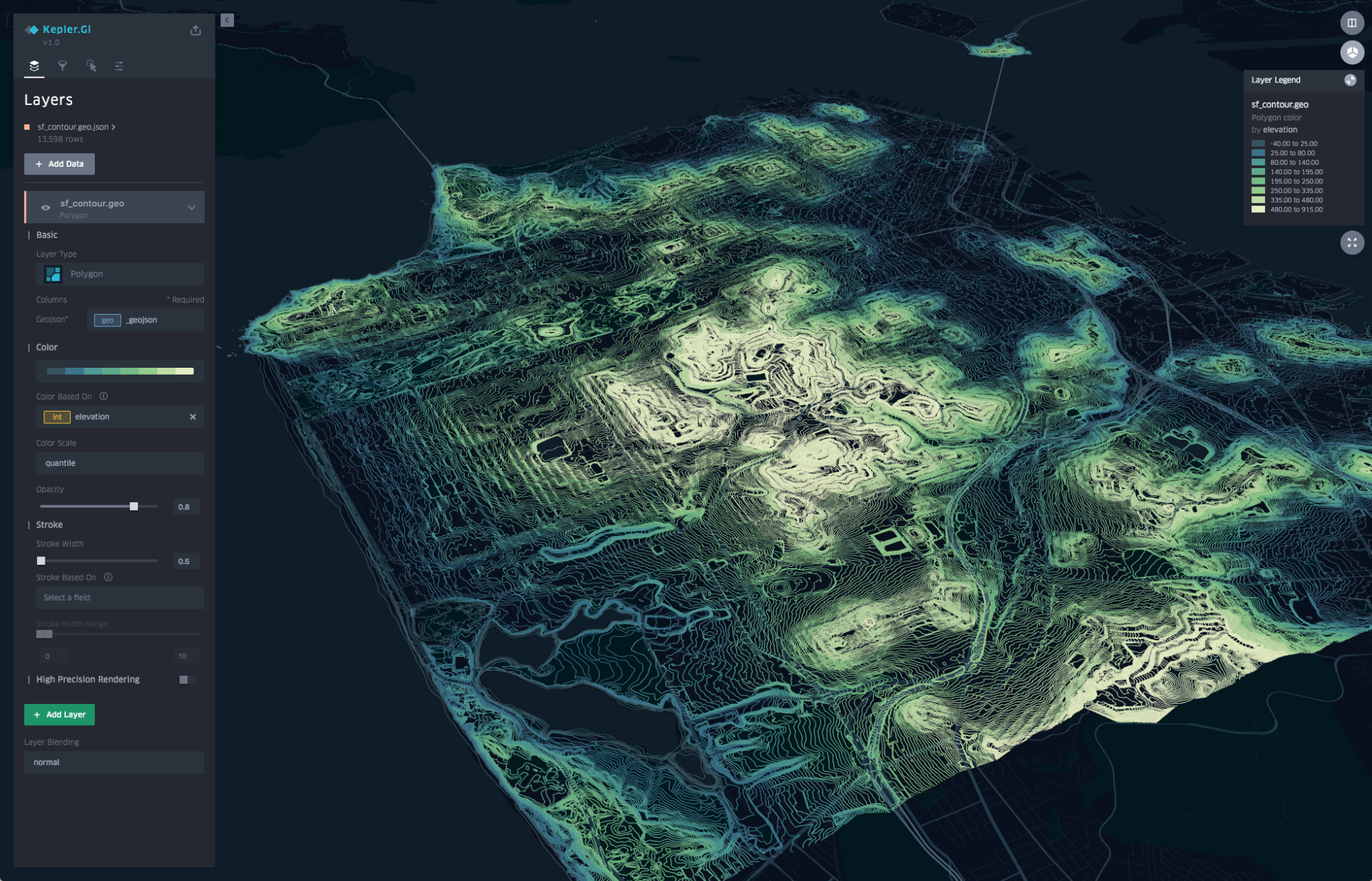
Figure 2: kepler.gl is a data agnostic, high-performance web-based application for large-scale geospatial visualizations.
kepler.gl is a data-agnostic, high-performance web-based application for visual exploration of large-scale geolocation data sets. Built on top of deck.gl , kepler.gl can render millions of points representing thousands of trips and perform spatial aggregations on the fly, as shown in Figure 4, below:
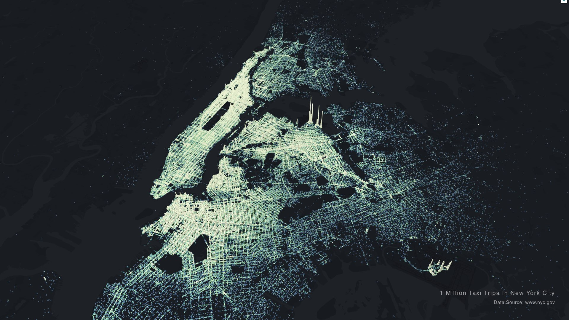
Figure 3: kepler.gl can render millions of points and perform spatial aggregations on the fly.
Showing geospatial data in a single web interface, kepler.gl helps users quickly validate ideas and glean insights from these visualizations. Using kepler.gl, a user can drag and drop a CSV or GeoJSON file into the browser, visualize it with different map layers, explore it by filtering and aggregating it, and eventually export the final visualization as a static map or an animated video. Instead of spanning multiple browsers and consuming weeks of work at a time, the entire trial and error process occurs place in one user interface and can take as little as 10 minutes!
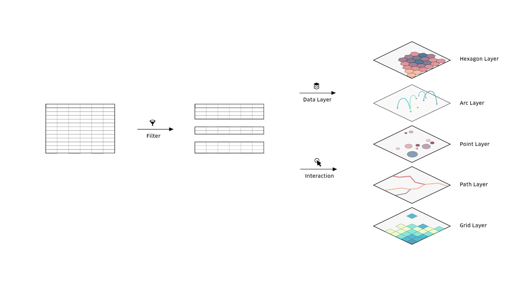
Figure 4: The kepler.gl UX flow is composed of five layers, including hexagon, arc, and point.
kepler.gl uses layers as building blocks to create interactive maps, supporting customizable layer creation and encoding data (e.g., fares, ETA, and timestamps) to visual channels (e.g., circle size, arc color, and circle color) with scale functions (e.g., linear, quantile, and quantize).
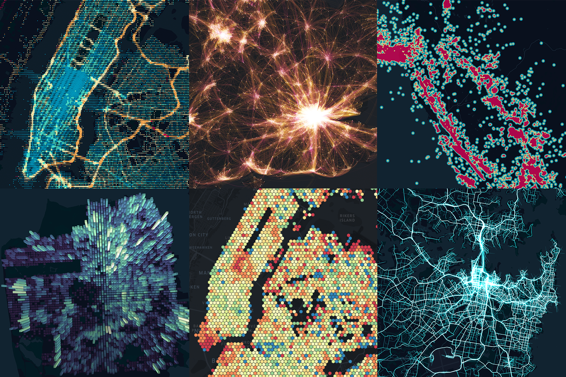
Figure 5: kepler.gl’s point, arc, and heatmap layers (top) and grid, hexbin, and polygon layers (below) provide rich geospatial data analysis.
In kepler.gl, mapping layers, common visualization types used to encode location data, enable users to conduct geospatial analysis and exploration. The taxonomy of mapping layers kepler.gl offers include basic points, arcs, paths, polygons, grids, and hexbins in both 2D and 3D, as shown in Figure 6, above. For example, a point layer can be used to plot locations of events and places; an arc layer can be used to visualize origin-destination correlations; a hexbin or grid layer can be used to aggregate a collection of points showing its distribution; and a polygon layer can be used to visualize a choropleth map showing aggregate statistics of geographic regions.
All layer geometry calculations are GPU-accelerated, enabling us to smoothly render millions of points and making kepler.gl a much more powerful web tool than traditional cartography software.
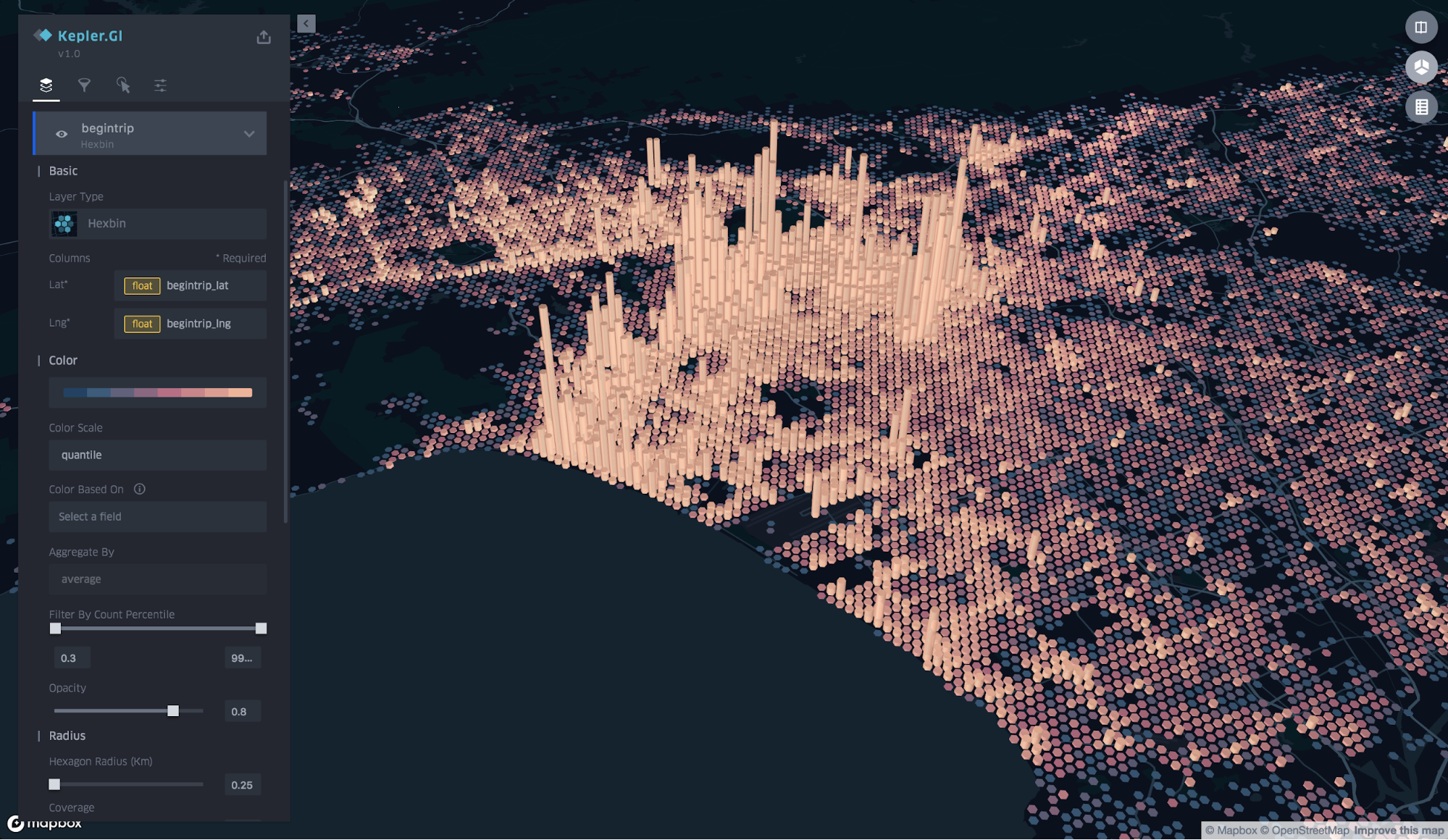
Figure 6: kepler.gl aggregates points with a 3D hexbin layer.
Beyond the traditional 2D x and y cartographic plane, kepler.gl introduces a third dimension to encode data that supports point altitude and grid / hexagon / polygon height in an isometric perspective view. With height enabled, a user can more quickly detect anomalies in an aggregation map, as shown in Figure 7, below:
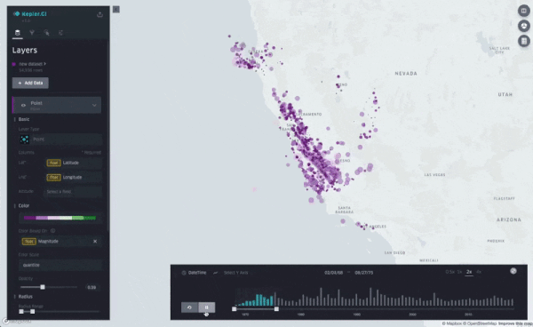
Figure 7: kepler.gl enables you playback time series’ to visualize spatio-temporal data.
kepler.gl lets users apply filters to any metric in their dataset. Typical uses of filtering include adding time playbacks to visualize spatio-temporal data, excluding outliers using histograms, and refining data to a smaller set for comparison. Figure 8, below, shows how a filter enables a time playback of data on a map:
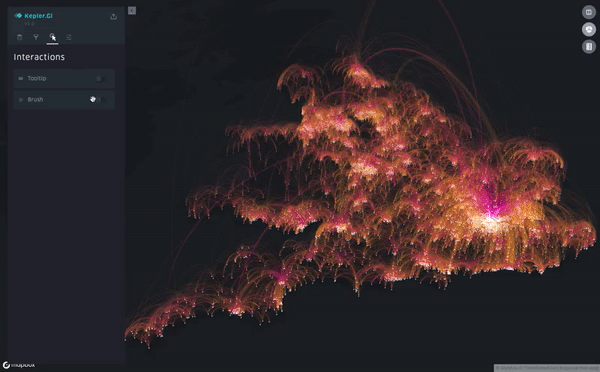
Figure 8: kepler.gl lets you use brushing to explore origin-destination correlations.
Besides common metric-based filtering, kepler.gl offers a unique geographic filtering function: brushing, as depicted in Figure 8. With brushing, users can highlight arcs and points originating within a certain radius of the current mouse location on the map. This function is specifically useful for visualizing origin-destination correlations to better understand how different regions connect to each other.
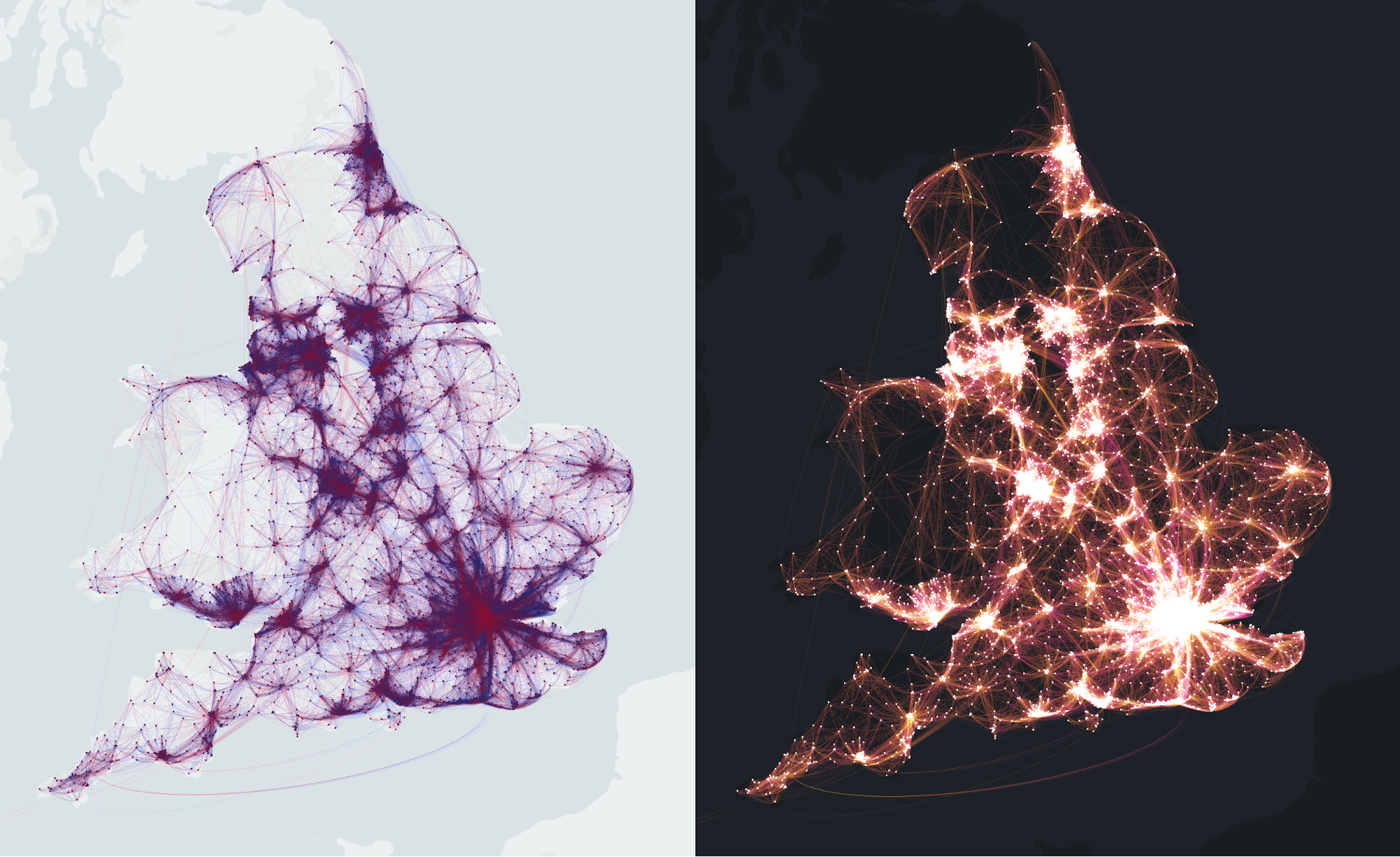
Figure 9: Users can render layers with subtractive blending (left) and additive blending (right).
Not only does kepler.gl let users quickly explore data, but it also empowers them to create beautiful maps. The software provides a set of low-contrast base maps suited for map-based visualizations, and a variety of color palettes including colors from ColorBrewer. Similar to photo editing tools, kepler.gl uses different color blending techniques (e.g., normal, additive, and subtractive blending) to add cinematic effects to maps, as shown in Figure 9.
kepler.gl also gives users the freedom to customize base maps by selectively hiding and showing features (including labels, roads, and terrains), or moving them on top of existing data layers. This array of techniques and special effects makes map creation with kepler.gl incredibly fun and full of surprises.
Behind kepler.gl
kepler.gl is built on top of deck.gl, a WebGL-powered data visualization library, and react-map-gl, a React wrapper for Mapbox-gl, both of which are included in the open source Vis.gl suite developed in-house by Uber ‘s Data Visualization team.
kepler.gl is a React component that uses Redux to manage its state and data flow. It can easily be embedded into other React-Redux applications and customized like any other Redux state.
Developers can build apps with kepler.gl simply by mounting the kepler.gl React component in the UI and kepler.gl reducer in its root reducer. Its forward dispatching system allows multiple kepler.gl components to be mounted into a single app and supports the dispatching of custom actions from outside the kepler.gl component itself. kepler.gl is built on top of a component dependency injection system, which lets the developer swap default UI components with customized ones at initialization.
At Uber, kepler.gl is used as the map component in several dashboarding apps, around which developers can build other components based on their needs. We hope others find kepler.gl as versatile and useful, too!
Sample maps created with kepler.gl
Geo-analytics requires domain-specific knowledge and consists of many abstract terms. Sometimes it can be difficult for data visualization beginners and non-technical practitioners to get their heads around working with their data. To help users get started, kepler.gl provides a set of sample maps created by our team.
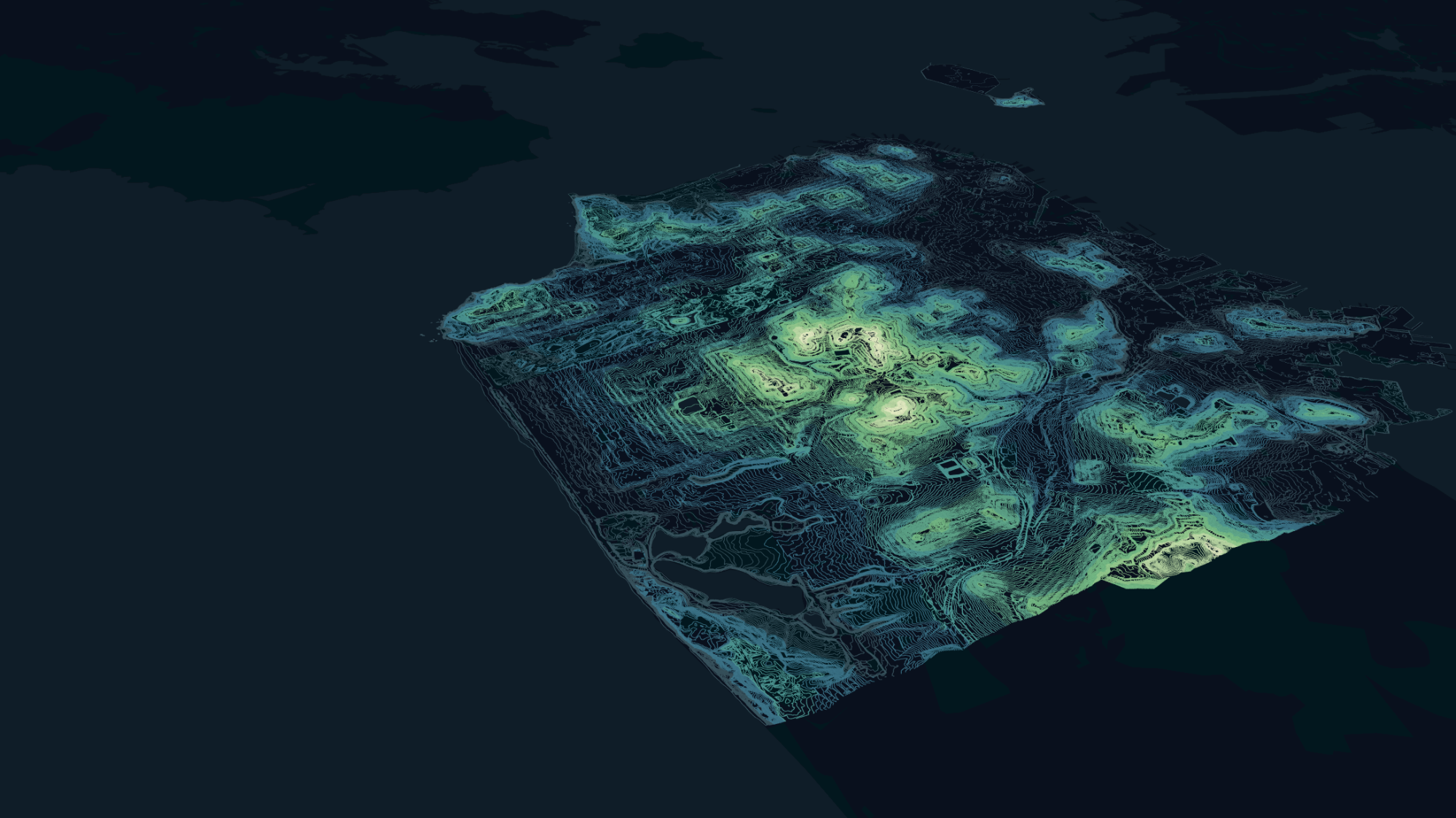
Figure 10: kepler.gl depicts elevation contours of San Francisco and Treasure Island/Yerba Island.
Our San Francisco contour map was created with contour data from sfdata.org. It utilizes a polygon layer to plot contour lines and colors them by elevation, as shown in Figure 11. This example represents the creation of a typical cartographic map commonly used in geographic information system (GIS) studies.
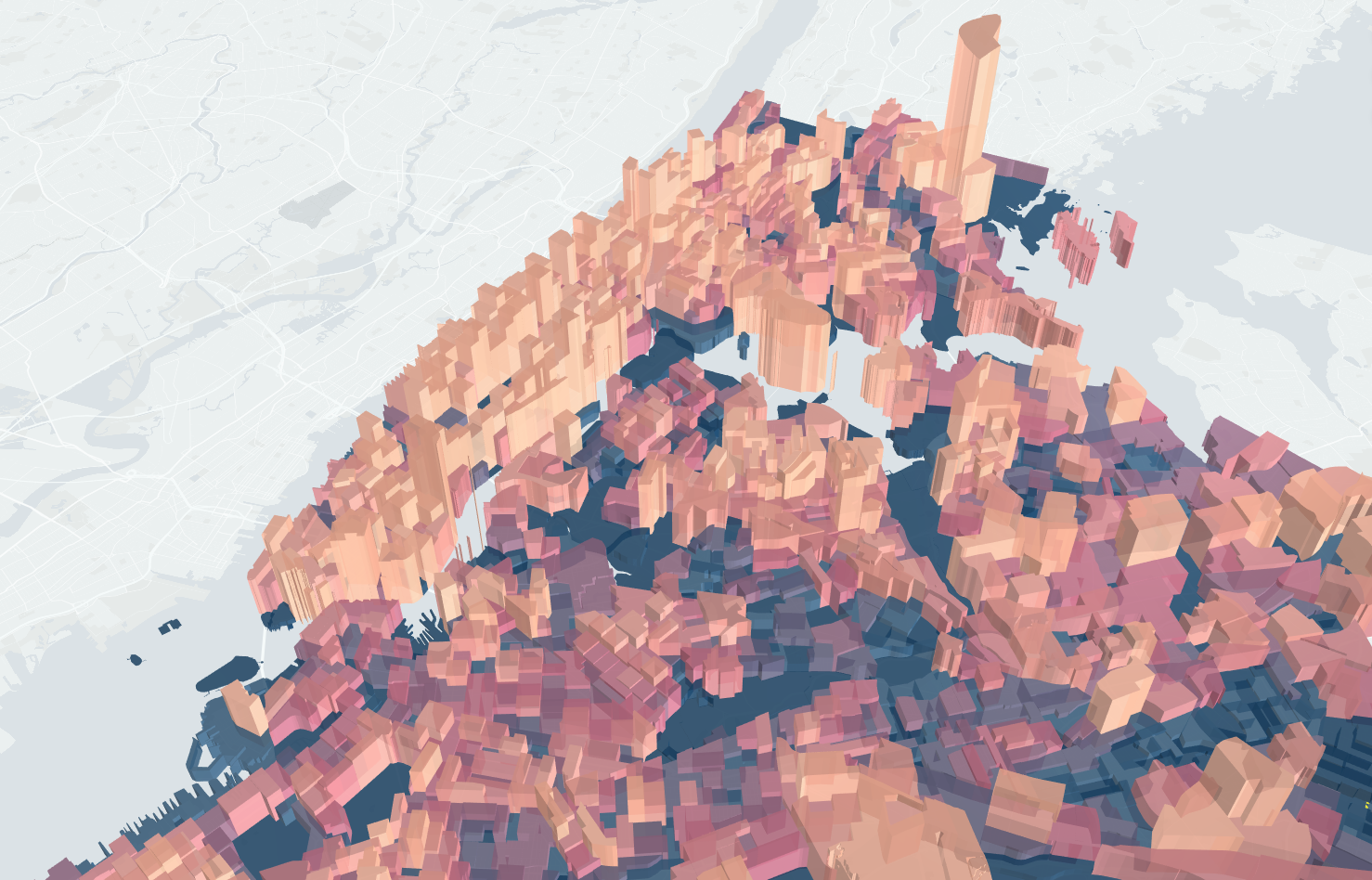
Figure 11: A New York City Census tract population map depicts how populous certain area of the cities were in 2010.
An NYC Population map, shown in Figure 12, above, is made with 2010 Census tract data. Its blue to orange quantile color scale correlates with size of population from smallest to largest. This map also adds height to polygons based on population, making it much easier to spot outliers.
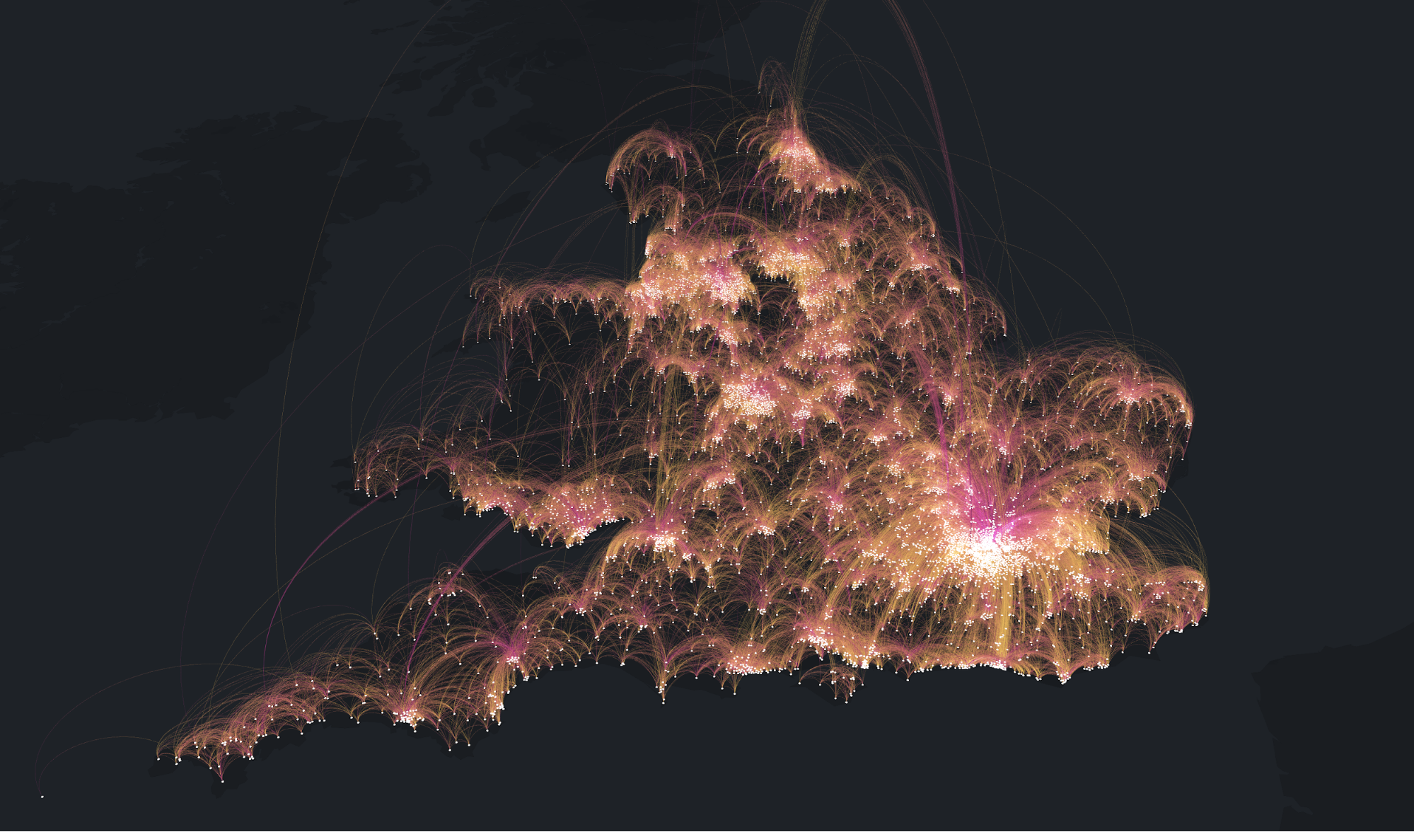
Figure 12: An origin-destination map of residents in England and Wales uses 3D arcs to visualize commute patterns.
Another origin-destination map was created using the commute data of residents in England and Wales, shown in figure 13. This map uses bi-color arcs to connect the locations of citizens’ residences (in yellow) and workplaces (in magenta). Its bird’s eye view reveals some surprisingly long commutes, such as those from London to towns 300-400 kilometers north.
Moving forward
Following its creation as an internal product two years ago, kepler.gl has evolved from a single page app to a powerful geo-analytics and visualization framework. It creates an all-in-one geospatial data exploration and visualization environment, and has been widely used inside Uber to power advanced geospatial analytics by engineers, analysts, and data scientists.
By open sourcing kepler.gl, users of different experience and technical skill levels now have access to free software that helps them build and customize impactful, data-driven maps. More importantly, giving back the software enables us to foster a developer community that can support kepler.gl’s future development.
Over the next several months, we envision two major enhancements for kepler.gl:
- More robust exploration functionality: To generate deeper insights, we plan to build out the framework to support additional customized charts and widgets on the visualization dashboard. This added functionality will facilitate tableau-like exploration, linking interactions between maps and charts.
- Expand its geo-analytics capabilities: By adding geospatial data operations such as joining, buffering, intersecting, and unioning; supporting layer operations like point aggregation by polygon; and filtering features by drawing on the map, kepler.gl will be able to support even larger data sets.
During our beta release earlier this year, companies across the world adopted kepler.gl for their own research.
Data scientists, architects, visualization specialists, and engineers from companies such as Mapbox, Limebike, Airbnb, Sidewalk Labs, HERE technologies, Atkins Global, Cityswifter, UBILabs, and 300000kms have found tremendous value in kepler.gl’s simplicity, capabilities, and speed.
We’ve also seen academics use the software, such as architecture student Diego Crescêncio from Estácio de Sá in Rio De Janeiro. For his research, Diego works with open crime data in kepler.gl to better understand the built environment for urban design research. He’s been using 2D and 3D visualizations of data pertaining to city-wide crime rates to understand how urban design can improve safety within favelas. According to Diego, urbanists in Brazil rarely use geo-analytics software. Since adopting kepler.gl, Diego, his professors, and other collaborators on the UNIGIS network have been able to achieve powerful and quick data analysis for this project.
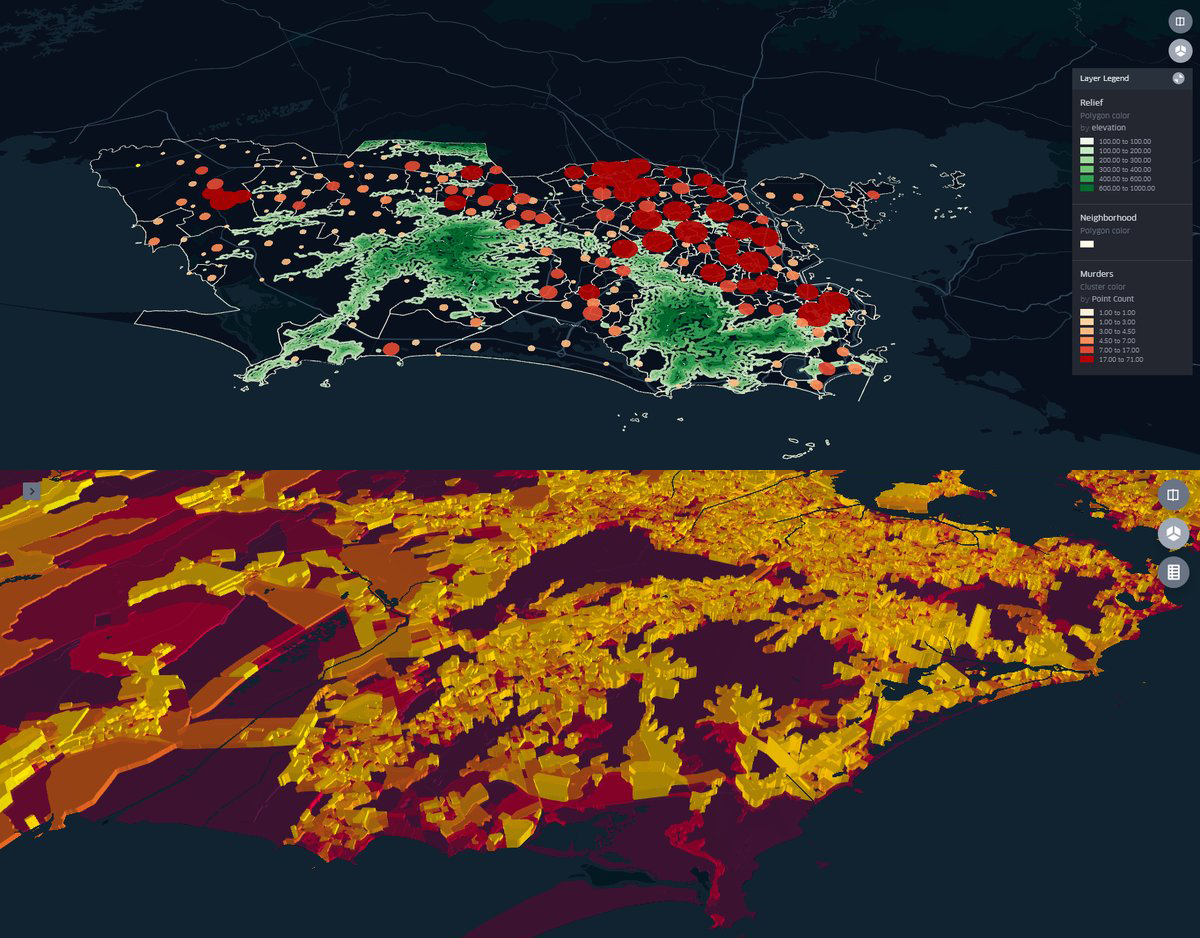
Figure 13: Diego and his team use kepler.gl to visualize open data in Brazil for their urban design research:
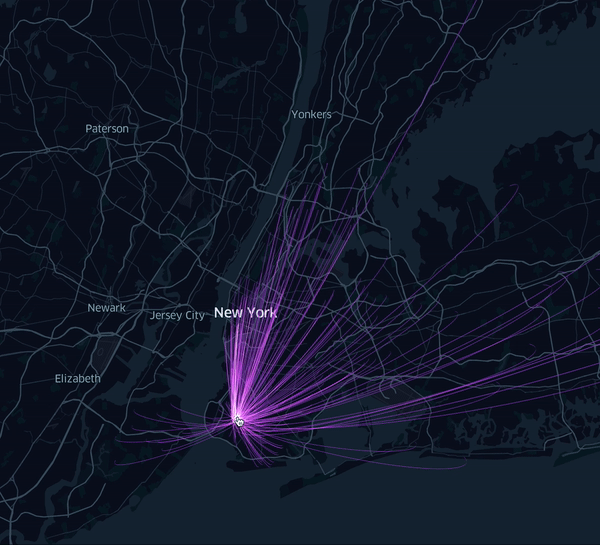
Figure 14: Will Geary, a data scientist at CitySwifter, uses kepler.gl’s brushing interaction to explore home to work commutes in New York City.
We hope you enjoy using kepler.gl and are looking forward to creating beautiful, data-driven maps! Please join the kepler.gl community by following our GitHub repository and using the #keplergl hashtag on Twitter.
If you are interested in helping us create the next generation of Uber’s data visualization suite, consider applying for a role on our team.
Happy mapping!
Acknowledgements
Building kepler.gl would not have been possible without the contributions of the entire Uber Visualization team.
Uber’s Visualization team has open sourced the following projects: deck.gl, kepler.gl, luma.gl, react-vis, and react-map-gl. If you want to learn about all of Uber’s open source projects, check out our Github page, and, if you are interested in joining our team, visit the Uber Careers page.