

Why I build my apps using Texture (and why you should too)
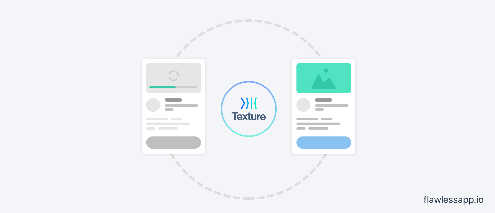
I’ve been using Texture in my apps for a long time (and it’s also used by giants like Facebook, Pinterest and Buffer). It’s an iOS framework built on top of UIKit that keeps even the most complex user interfaces smooth and responsive.
In this tutorial, I want to share my experience with Texture and all useful tips on how you can get the most out of this tool. Together we will implement several interfaces in Texture and will see how it actually works.
Origin
Texture originated inside of Facebook while they were building the Facebook Paper app. One of the lead engineers on the project, Scott Goodson initially worked on the first iPhone building apps like Calculator, Stocks, Clock etc.

Scott later worked on Facebook Paper and the UI concepts the designers were building simply couldn’t work on current gen iPhone hardware (~4/4s at the time). The main thread would get blocked up, making stalls and frame drops leading to a bad user experience. In order to solve these problems, they had to take advantage of multiple cores on these devices. And to do that, they engineered a framework from the ground up. Here’s a video.
Texture tries to optimize various parts of the rendering pipeline to achieve smooth user interfaces everywhere. For example, Auto Layout usually ends up being a bottleneck for scrolling performance and smoothness, especially in scrolling lists.This is because the autolayout resolver is based on the cassowary algorithm for inequality solving: which is order n³(for an intro to Big-O notation, refer here). Texture solves this problem using a flex-based layout system that’s a lot faster and easier to use.
In addition, things like image decoding and text sizing usually happen on the main thread, further eating into the time taken to render a frame (at 60fps, you have only ~16ms to render a frame in a typical device, even less on the newer iPads with Pro-Motion displays). Texture tries to solve these problems typically by pushing all these operations to the background.
Let’s try implementing a few user interfaces in Texture to see the differences. We will try implementing Slack’s sidebar, a simple UI for tags, and Slack messages’ cells. So bear with me to find out if Texture actually work better!
Slack’s Sidebar
Let’s start with Slack’s sidebar (slack uses Texture too, btw 😉).

In the ideal world, we’d like the pills to expand with the number without resorting to approximations (like showing a 999+ in the indicator). At the same time, we’d like to support things like dynamic type for accessibility. The most obvious way
to solve this problem is to use a horizontal UIStackViewand keep the labels and pill in the stack.
One problem though!
UIStackView is hilariously unreliable in these sorts of situations... In addition,
you would also have to set contentHuggingPriority and contentCompressionResistance and play around with a bunch of other properties (I need a coffee after just reading that sentence 😓). Fiddling with all these properties and figuring
them out would easily take me an afternoon of work. In contrast, let’s look at the Texture implementation:

There you have it. <100 lines of code, and now we can support very large numbers, dynamic type and single/multi line labels!

UI for tags
Let’s look at another example — tags! Tags are everywhere, typically in CMS’s and Admin interfaces and displaying tags inside of UI(Table | Collection)ViewCells is always a pain. You can wrap them in a UICollectionView, KVO the height
and hope for the best (which is a bad idea), ditch reusability and layout manually (worse idea). Texture makes this Swift(ha!) and painless via a flex-wrap property. Just check here:

Again, we see here that the solution was far smaller than the same view would be in “pure” UIKit.
Slack messages cells
Continuing with the theme, let’s try building another UI from Slack — their messages cells. Building this UI using either nested stack views or Texture would be roughly equally difficult. However, Texture gives us a 60fps UI for free (the phone in the video is an ancient iPhone 4s).

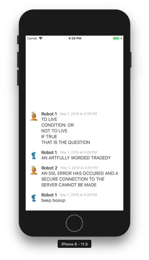
In addition, Texture has a nice `inverted` property on `ASTableNode` that is really convenient for chat/messaging apps. It basically makes sure the cells are reversed so they start from the bottom!
But, there’s one thing which AutoLayout can achieve that Texture cannot. Suppose you wanted the avatar image to “scale with the text”. It makes sense from a design perspective that visually impaired users who use the “Larger Text” setting in iOS. There’s no way (that I know of) that lets us easily set the height of the image equal to a label. Doing this would’ve been easy with autolayout constrains — simply constrain the height==width of the image and height of the text == height of the image
To summarize
All in all, from the above examples, I think it’s clear that Texture is an amazing framework to build great user interfaces with.
You know how we feel every time we have to build a custom cell? And it takes 4 tries of the right combination of Auto Layout properties to work? (maxnooflines=0 for a label, UITableViewAutomaticDimensionand God knows
what else). And then, on top of that, you can have broken constraints where sometimes a UITableViewCellContentView wants to have its width constrained to 0 🤬.
As Soroush Khanlou says, “You deserve Nice Things!”, and I honestly think we deserve better. Texture makes easy things easy, and hard things possible. It has conveniences that are battle tested and easy to use. And I can’t wait to see it in your apps in the future.

