

前言
每过一段时间呀,我都会给大家带来一些从Github上收集的一些开源库,有的是炫酷动效,有的则是实用的工具和类库。以前没看过或者没有收藏的同学,建议先收藏,以下是链接:
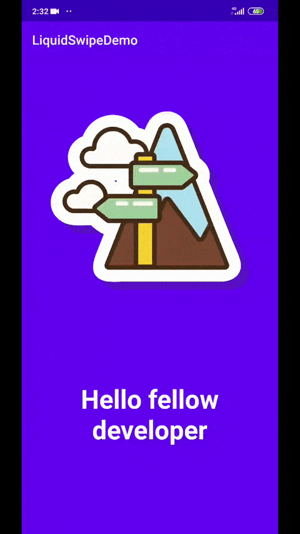
2020年有哪些优秀的开源库呢?本期就为大家带精选的10个,排名不分先后。No1. LiquidSwipe
这是一个很棒的ViewPager库,它在浏览ViewPager的不同页面时,显示波浪的滑动动画,效果非常炫酷。该库的USP是触摸交互的。这意味着在视图中显示类似液体的显示过渡时,应考虑触摸事件。
1.1如何使用呢?
导入以下Gradle依赖项:
implementation 'com.github.Chrisvin:LiquidSwipe:1.3'
然后将LiquidSwipeLayout添加为保存fragment布局的容器的根布局:
<androidx.constraintlayout.widget.ConstraintLayout
    xmlns:android="http://schemas.android.com/apk/res/android"
    android:layout_width="match_parent"
    android:layout_height="match_parent">

    <com.jem.liquidswipe.LiquidSwipeViewPager
        android:id="@+id/viewpager"
        android:layout_width="match_parent"
        android:layout_height="match_parent"/>

</androidx.constraintlayout.widget.ConstraintLayout>
1.2 效果图
| 效果1 | 效果2 |
|---|---|
 |
 |
更多详细使用方法请看Github: github.com/Chrisvin/Li…
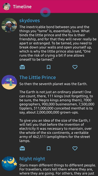
No2. Flourish
Flourish提供了一个炫酷的方式来显示或者隐藏一个布局,实现方式也很简单,就是对View或者布局进行了包装,通过构建者模式来提供api给上层调用。就像使用dialog一样,调用show和dissmiss方法来显示和隐藏。此外,通过这些类,我们还可以自定义动画(正常,加速,反弹),或为布局方向设置我们自己的起点(左上,右下等)。
2.1 如何使用?
在build.gradle 中添加如下依赖:
dependencies {
    implementation "com.github.skydoves:flourish:1.0.0"
}
然后在代码中,构建布局:
Flourish flourish = new Flourish.Builder(parentLayout)
    // sets the flourish layout for showing and dismissing on the parent layout.
    .setFlourishLayout(R.layout.layout_flourish_main)
    // sets the flourishing animation for showing and dismissing.
    .setFlourishAnimation(FlourishAnimation.BOUNCE)
    // sets the orientation of the starting point.
    .setFlourishOrientation(FlourishOrientation.TOP_LEFT)
    // sets a flourishListener for listening changes.
    .setFlourishListener(flourishListener)
    // sets the flourish layout should be showed on start.
    .setIsShowedOnStart(false)
    // sets the duration of the flourishing.
    .setDuration(800L)
    .build();
还提供有更简介的DSL:
val myFlourish = createFlourish(parentLayout) {
  setFlourishLayout(R.layout.layout_flourish_main)
  setFlourishAnimation(FlourishAnimation.ACCELERATE)
  setFlourishOrientation(FlourishOrientation.TOP_RIGHT)
  setIsShowedOnStart(true)
  setFlourishListener {  }
}
2.2 效果图
| 效果1 | 效果2 |
|---|---|
 |
 |
更多详细使用请看Github:github.com/skydoves/Fl…
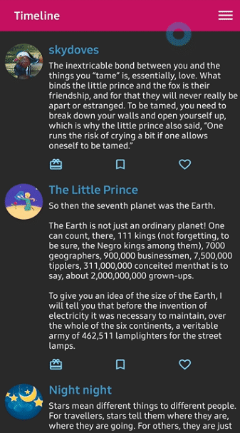
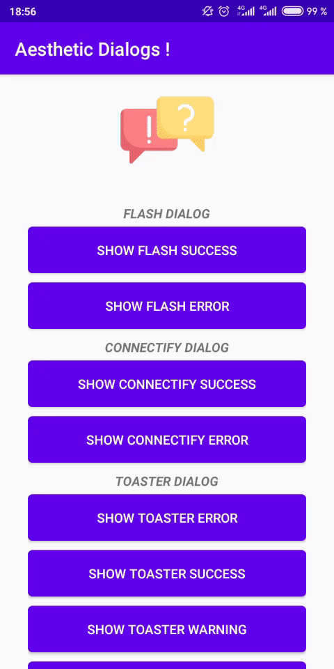
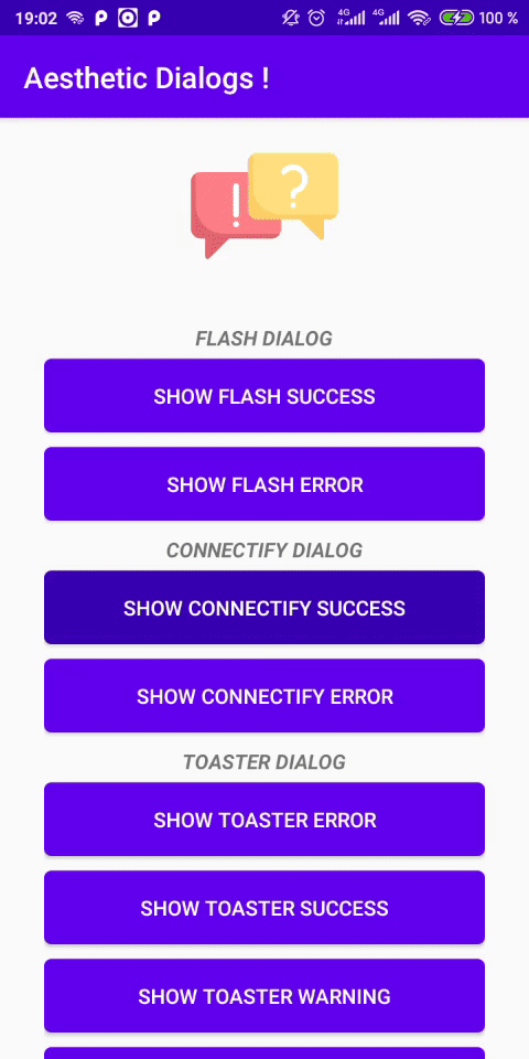
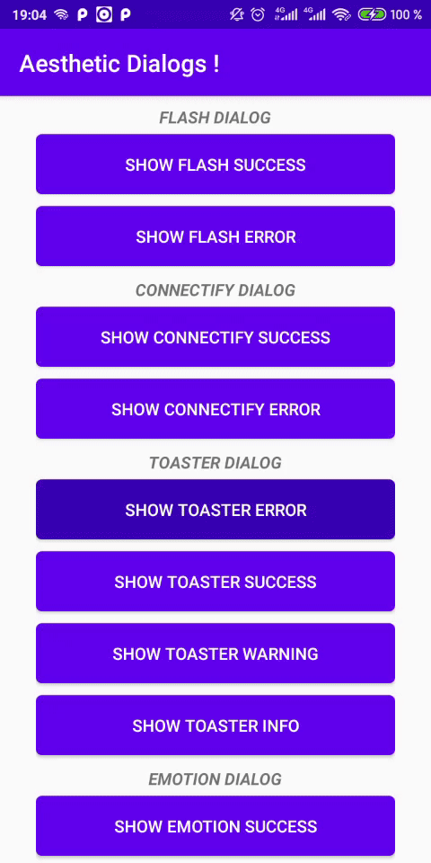
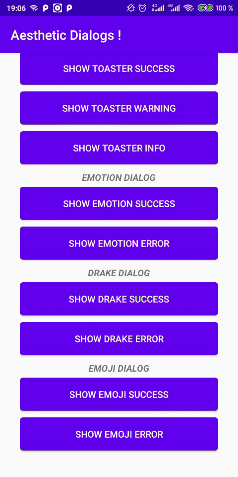
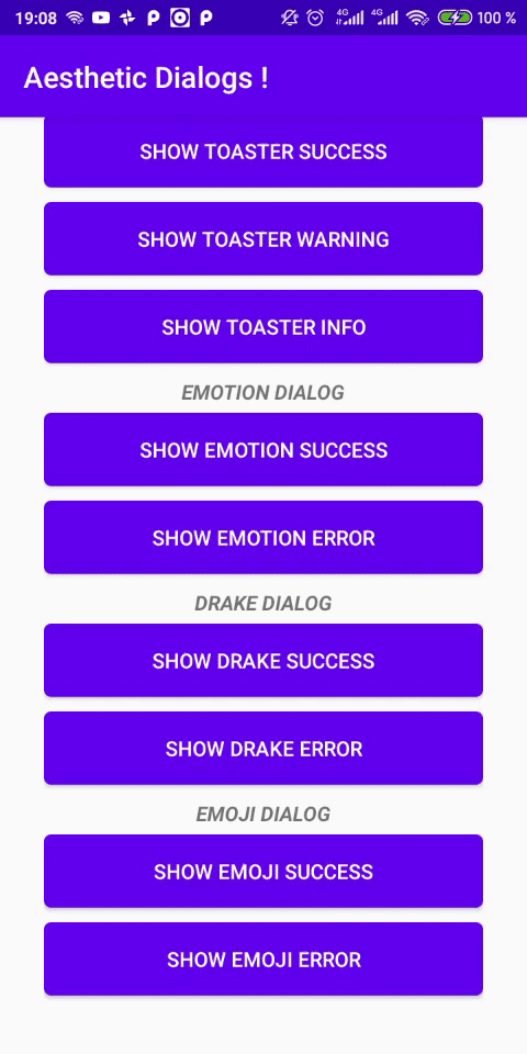
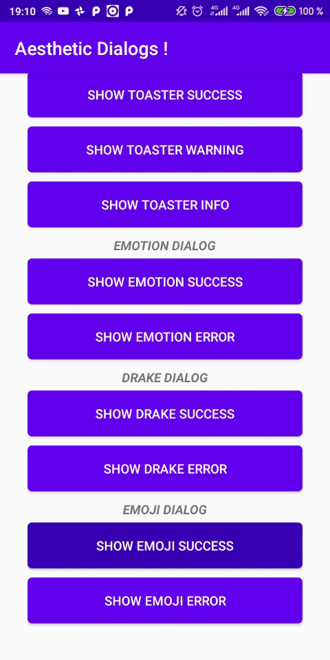
No3. AestheticDialogs
这是一个美观而时尚的AlterDialog库,目前可支持六种不同的对话框,如:
- Flash Dialog
- Connectify Dialog
- Toaster Dialog
- Emotion Dialog
- Drake Dialog
- Emoji Dialog 并且啊,还提供了暗黑模式的适配。
3.1 如何使用?
在build.gradle 中添加如下依赖:
dependencies {
 ...
 implementation 'com.github.gabriel-TheCode:AestheticDialogs:1.1.0'
}
代码中,显示不同种类的对话框则调用对应的方法就好
Flash:
AestheticDialog.showFlashDialog(this, "Your dialog Title", "Your message", AestheticDialog.SUCCESS);
AestheticDialog.showFlashDialog(this, "Your dialog Title", "Your message", AestheticDialog.ERROR);
Connectify:
AestheticDialog.showConnectify(this,"Your message", AestheticDialog.SUCCESS);
AestheticDialog.showConnectify(this, "Your message", AestheticDialog.ERROR);

 /// Dark Theme
 AestheticDialog.showConnectifyDark(this,"Your message",AestheticDialog.SUCCESS);
 AestheticDialog.showConnectifyDark(this, "Your message", AestheticDialog.ERROR);
Toaster:
 AestheticDialog.showToaster(this, "Your dialog Title", "Your message", AestheticDialog.ERROR);
AestheticDialog.showToaster(this, "Your dialog Title", "Your message", AestheticDialog.SUCCESS);
AestheticDialog.showToaster(this, "Your dialog Title", "Your message", AestheticDialog.WARNING);
 AestheticDialog.showToaster(this, "Your dialog Title", "Your message", AestheticDialog.INFO);

 /// Dark Theme
 AestheticDialog.showToasterDark(this, "Your dialog Title", "Your message", AestheticDialog.ERROR);
AestheticDialog.showToasterDark(this, "Your dialog Title", "Your message", AestheticDialog.SUCCESS);
AestheticDialog.showToasterDark(this, "Your dialog Title", "Your message", AestheticDialog.WARNING);
 AestheticDialog.showToasterDark(this, "Your dialog Title", "Your message", AestheticDialog.INFO);
Drake :
 AestheticDialog.showDrake(this, AestheticDialog.SUCCESS);
AestheticDialog.showDrake(this, AestheticDialog.ERROR);
Emoji :
 AestheticDialog.showEmoji(this,"Your dialog Title", "Your message", AestheticDialog.SUCCESS);
AestheticDialog.showEmoji(this, "Your dialog Title", "Your message", AestheticDialog.ERROR);

/// Dark Theme
 AestheticDialog.showEmojiDark(this,"Your dialog Title", "Your message", AestheticDialog.SUCCESS);
AestheticDialog.showEmojiDark(this, "Your dialog Title", "Your message", AestheticDialog.ERROR);
Emotion :
 AestheticDialog.showEmotion(this,"Your dialog Title", "Your message", AestheticDialog.SUCCESS);
AestheticDialog.showEmotion(this, "Your dialog Title", "Your message", AestheticDialog.ERROR);
Rainbow :
 AestheticDialog.showRainbow(this,"Your dialog Title", "Your message", AestheticDialog.SUCCESS);
 AestheticDialog.showRainbow(this,"Your dialog Title", "Your message", AestheticDialog.ERROR);
 AestheticDialog.showRainbow(this,"Your dialog Title", "Your message", AestheticDialog.WARNING);
AestheticDialog.showRainbow(this,"Your dialog Title", "Your message", AestheticDialog.INFO);
3.2 效果如下
| Flash Dialog | Connectify Dialog | Toaster Dialog |
|---|---|---|
 |
 |
 |
| Emotion Dialog | Drake Dialog | Emoji Dialog |
|---|---|---|
 |
 |
 |
更多详情使用方法请看Github:github.com/gabriel-The…
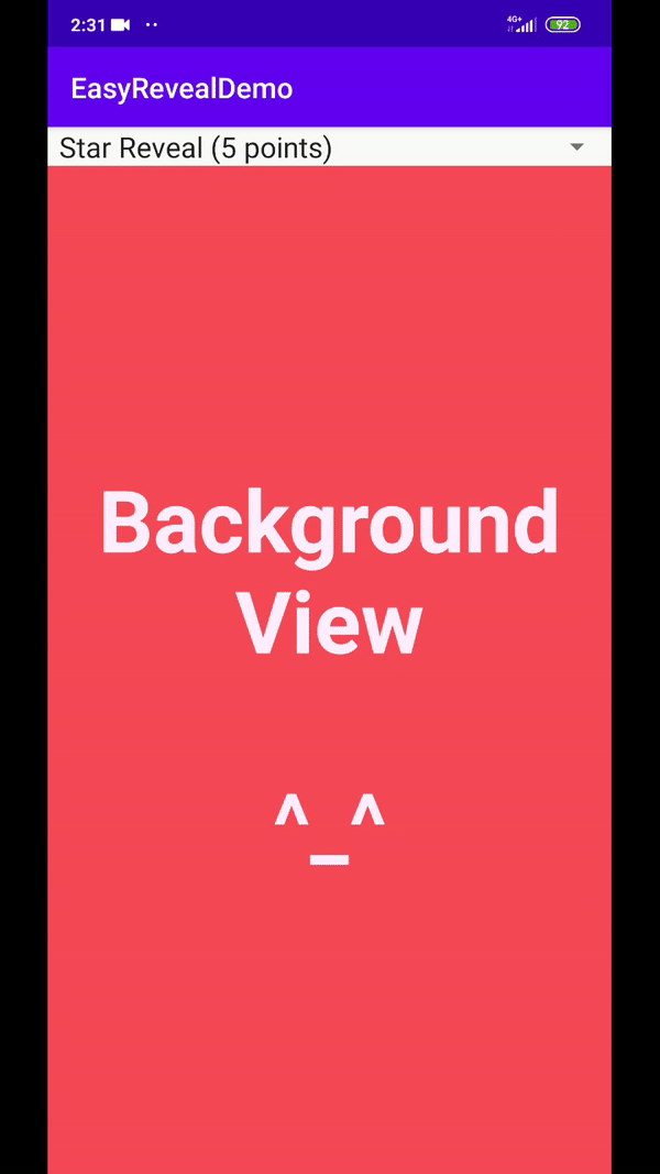
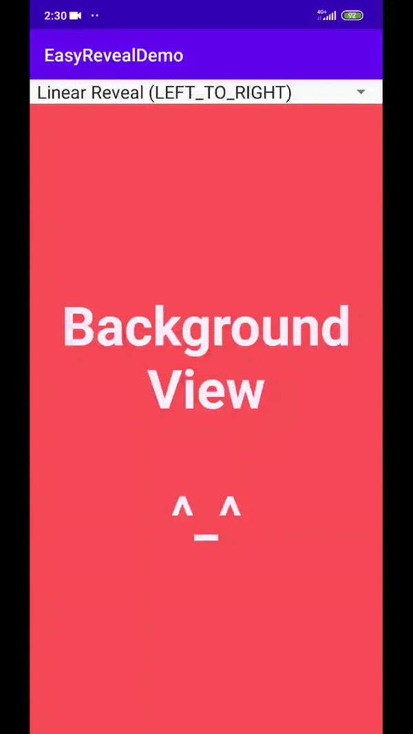
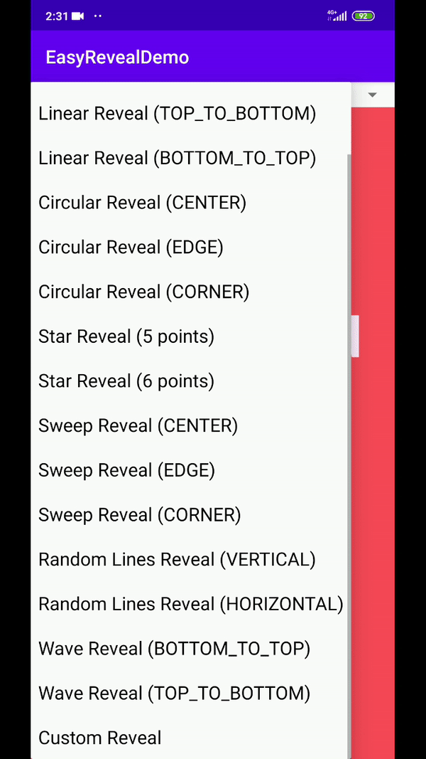
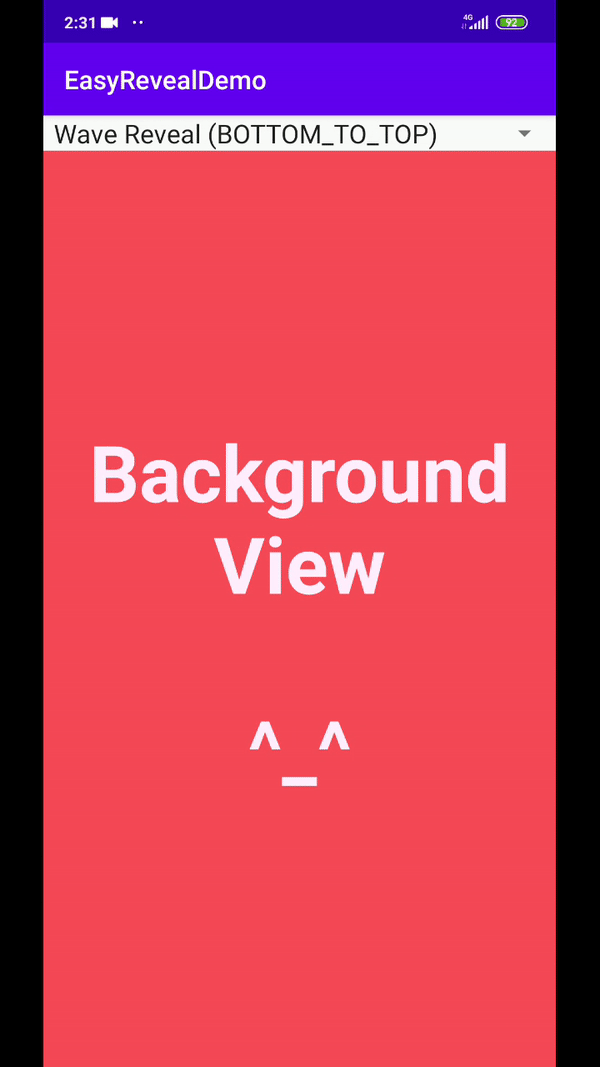
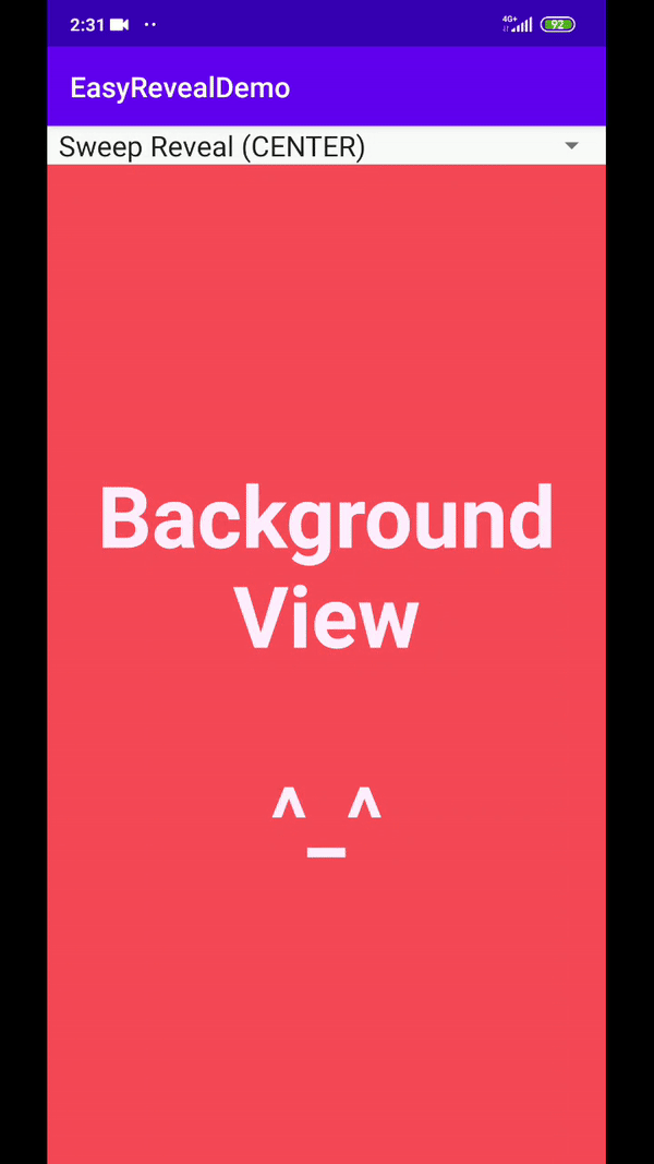
N4. EasyReveal
从名字就知道,这是一个提供reveal动画效果的库,它的厉害之处在于可以提供不同尺寸、不同形状的reveal动画,并且还可以在定义它在屏幕任意位置开始和结束动画。
4.1 如何使用?
在build.gradle 中添加如下依赖:
dependencies {
 ...
 implementation 'com.github.Chrisvin:EasyReveal:1.2'
}
然后,xml中,需要添加显示或者隐藏动画的View应该包裹在EasyRevealLinearLayout中:
<com.jem.easyreveal.layouts.EasyRevealLinearLayout
    ...
    app:clipPathProvider="star" // possible values: circular, linear, random_line, star, sweep & wave
    app:revealAnimationDuration="2000"
    app:hideAnimationDuration="1500" >

    <!-- The views to be revealed/hidden go here -->

</com.jem.easyreveal.layouts.EasyRevealLinearLayout>
<!-- Similarly for com.jem.easyreveal.layouts.EasyRevealConstraintLayout & com.jem.easyreveal.layouts.EasyRevealFrameLayout -->
也可以在代码中添加:
val revealLayout = EasyRevealLinearLayout(this)
// Set the ClipPathProvider that is used to clip the view for reveal animation
revealLayout.clipPathProvider = StarClipPathProvider(numberOfPoints = 6)
// Set the duration taken for reveal animation
revealLayout.revealAnimationDuration = 1500
// Set the duration taken for hide animation
revealLayout.hideAnimationDuration = 2000
// Set listener to get updates during reveal/hide animation
revealLayout.onUpdateListener = object: RevealLayout.OnUpdateListener {
    override fun onUpdate(percent: Float) {
        Toast.makeText(this@MainActivity, "Revealed percent: $percent", Toast.LENGTH_SHORT).show()
    }
}
// Start reveal animation
revealLayout.reveal()
// Start hide animation
revealLayout.hide()
4.2效果图
| Emotion Dialog | Drake Dialog | Emoji Dialog |
|---|---|---|
 |
 |
 |
 |
 |
 |
更多详细使用信息请看Github: github.com/Chrisvin/Ea…
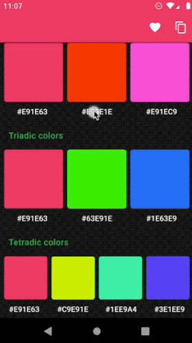
No5. Android ColorX
Android ColorX 以Kotlin 扩展函数的形式提供了一些重要的获取颜色的方法。
通过提供不同颜色格式(RGB,HSV,CYMK等)的转换功能,它使开发变得更加轻松。该库的USP具有以下功能:
- 颜色的不同阴影和色调。
- 较深和较浅的阴影。
- 颜色的补码
5.1 如何使用?
在build.gradle 中添加如下依赖:
dependencies {
    implementation 'me.jorgecastillo:androidcolorx:0.2.0'
}
在代码中,一系列的转换方法:
val color = Color.parseColor("#e91e63")

val rgb = color.asRgb()
val argb = color.asArgb()
val hex = color.asHex()
val hsl = color.asHsl()
val hsla = color.asHsla()
val hsv = color.asHsv()
val cmyk = color.asCmyk()

val colorHsl = HSLColor(hue = 210f, saturation = 0.5f, lightness = 0.5f)

val colorInt = colorHsl.asColorInt()
val rgb = colorHsl.asRgb()
val argb = colorHsl.asArgb()
val hex = colorHsl.asHex()
val cmyk = colorHsl.asCmyk()
val hsla = colorHsl.asHsla()
val hsv = colorHsl.asHsv()
5.2 效果图
更多详细使用信息请看Github:github.com/JorgeCastil…
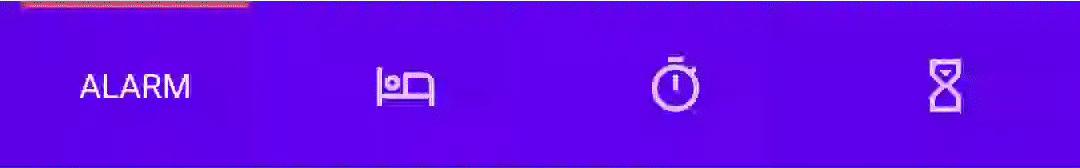
No6. AnimatedBottomBar
这是一个带动画的底部导航栏库。它使你可以以编程方式以及通过XML添加和删除选项卡。此外,我们可以轻松地从BottomBar拦截选项卡。限制访问应用程序导航中的高级区域时,“拦截”标签非常有用。流畅的动画提供了许多自定义选项,从动画插值器到设置波纹效果。
6.1 如何使用?
在build.gradle 中添加如下依赖:
dependencies {
  implementation 'nl.joery.animatedbottombar:library:1.0.8'
}
在xml文件中添加AnimatedBottomBar和自定义属性
<nl.joery.animatedbottombar.AnimatedBottomBar
    android:id="@+id/bottom_bar"
    android:background="#FFF"
    android:layout_width="match_parent"
    android:layout_height="wrap_content"
    app:abb_selectedTabType="text"
    app:abb_indicatorAppearance="round"
    app:abb_indicatorMargin="16dp"
    app:abb_indicatorHeight="4dp"
    app:abb_tabs="@menu/tabs"
    app:abb_selectedIndex="1" />
在res/menu目录下定义tabs.xml文件:
<menu xmlns:android="http://schemas.android.com/apk/res/android">
    <item
        android:id="@+id/tab_home"
        android:icon="@drawable/home"
        android:title="@string/home" />
    <item
        android:id="@+id/tab_alarm"
        android:icon="@drawable/alarm"
        android:title="@string/alarm" />
    <item
        android:id="@+id/tab_bread"
        android:icon="@drawable/bread"
        android:title="@string/bread" />
    <item
        android:id="@+id/tab_cart"
        android:icon="@drawable/cart"
        android:title="@string/cart" />
</menu>
最后,代码中添加tab
// Creating a tab by passing values
val bottomBarTab1 = AnimatedBottomBar.createTab(drawable, "Tab 1")

// Creating a tab by passing resources
val bottomBarTab2 = AnimatedBottomBar.createTab(R.drawable.ic_home, R.string.tab_2, R.id.tab_home)
6.2 效果图
| tab1 | tab2 |
|---|---|
 |
 |
详情信息请看Github: github.com/Droppers/An…
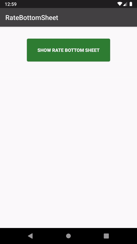
No7. RateBottomSheet
有时候,为了推广我们的应用,我们需要让用户跳转到应用商店为我们的APP打分,传统的对话框用户体验很不好,而本库则是用BottomSheet来进行提示,它位于底部缩略区域,用户体验很好。
7.1 如何使用呢?
在build.gradle 中添加如下依赖:
dependencies {
implementation 'com.mikhaellopez:ratebottomsheet:1.1.0'
}
然后修改默认的string资源文件来改变显示文案:
<resources>
    <string name="rate_popup_ask_title">Like this App?</string>
    <string name="rate_popup_ask_message">Do you like using this application?</string>
    <string name="rate_popup_ask_ok">Yes I do</string>
    <string name="rate_popup_ask_no">Not really</string>

    <string name="rate_popup_title">Rate this app</string>
    <string name="rate_popup_message">Would you mind taking a moment to rate it? It won\'t take more than a minute. Thanks for your support!</string>
    <string name="rate_popup_ok">Rate it now</string>
    <string name="rate_popup_later">Remind me later</string>
    <string name="rate_popup_no">No, thanks</string>
</resources>
代码中使用:
RateBottomSheetManager(this)
    .setInstallDays(1) // 3 by default
    .setLaunchTimes(2) // 5 by default
    .setRemindInterval(1) // 2 by default
    .setShowAskBottomSheet(false) // True by default
    .setShowLaterButton(false) // True by default
    .setShowCloseButtonIcon(false) // True by default
    .monitor()

// Show bottom sheet if meets conditions
// With AppCompatActivity or Fragment
RateBottomSheet.showRateBottomSheetIfMeetsConditions(this)
7.2 效果图
更多详情请看Github:github.com/lopspower/R…
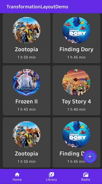
No8. TransformationLayout
这是一个用于Activity或者Fragment 以及View切换的过渡动画库,效果非常炫,它使用Material Design的运动系统过渡模式来创建变形动画。该库提供了用于绑定目标视图,设置淡入淡出和路径运动方向以及许多其他自定义选项的属性。
8.1 如何使用?
在build.gradle 中添加如下依赖:
dependencies {
    implementation "com.github.skydoves:transformationlayout:1.0.4"
}
然后,需要将我们需要添加过渡动画的View包裹到 TransformationLayout:
<com.skydoves.transformationlayout.TransformationLayout
  android:layout_width="wrap_content"
  android:layout_height="wrap_content"
  app:transformation_targetView="@+id/my_cardView" // sets a target view.
  app:transformation_duration="450" // sets a duration of the transformation.
  app:transformation_direction="auto" // auto, entering, returning
  app:transformation_fadeMode="in" // in, out, cross, through
  app:transformation_fitMode="auto" // auto, height, width
  app:transformation_pathMode="arc" // arc, linear
>

   <!-- other views -->

</com.skydoves.transformationlayout.TransformationLayout>
比如我们要将一个fab 过渡到一个card卡片,布局如下:
<com.skydoves.transformationlayout.TransformationLayout
    android:id="@+id/transformationLayout"
    android:layout_width="wrap_content"
    android:layout_height="wrap_content"
    app:transformation_duration="550"
    app:transformation_targetView="@+id/myCardView">

  <com.google.android.material.floatingactionbutton.FloatingActionButton
      android:id="@+id/fab"
      android:layout_width="wrap_content"
      android:layout_height="wrap_content"
      android:backgroundTint="@color/colorPrimary"
      android:src="@drawable/ic_write"/>
</com.skydoves.transformationlayout.TransformationLayout>

<com.google.android.material.card.MaterialCardView
    android:id="@+id/myCardView"
    android:layout_width="240dp"
    android:layout_height="312dp"
    android:layout_marginLeft="30dp"
    android:layout_marginTop="30dp"
    app:cardBackgroundColor="@color/colorPrimary" />
重点来了,绑定视图,将一个targetView绑定到TransformationLayout有2种方式:
- 通过在xml中指定属性:
app:transformation_targetView="@+id/myCardView"
- 在代码中绑定
transformationLayout.bindTargetView(myCardView)
当我们点击fab时,在监听器中调用startTransform()开始过渡动画,finishTransform()开始结束动画。
// start transformation when touching the fab.
fab.setOnClickListener {
  transformationLayout.startTransform()
}

// finish transformation when touching the myCardView.
myCardView.setOnClickListener {
  transformationLayout.finishTransform()
}
8.2 效果图
更多使用方式请看Github: github.com/skydoves/Tr…
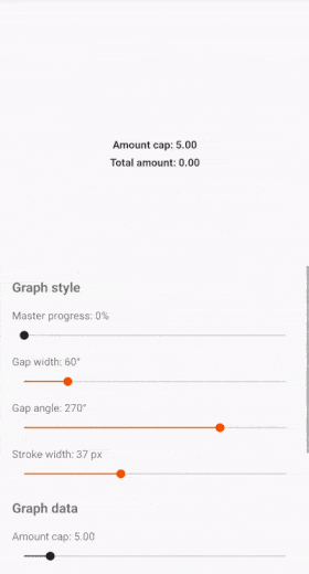
No9. Donut
这个一个可以展示多个数据集的圆弧形控件,具有精细的颗粒控制、间隙功能、动画选项以及按比例缩放其值的功能。可以用于项目中的一些数据统计。
9.1 如何使用?
在build.gradle 中添加如下依赖:
dependencies {
    implementation("app.futured.donut:library:$version")
}
然后在布局文件中添加View:
<app.futured.donut.DonutProgressView
    android:id="@+id/donut_view"
    android:layout_width="wrap_content"
    android:layout_height="wrap_content"
    app:donut_bgLineColor="@color/cloud"
    app:donut_gapWidth="20"
    app:donut_gapAngle="270"
    app:donut_strokeWidth="16dp"/>
然后在代码中设置数据:
val dataset1 = DonutDataset(
    name = "dataset_1",
    color = Color.parseColor("#FB1D32"),
    amount = 1f
)

val dataset2 = DonutDataset(
    name = "dataset_2",
    color = Color.parseColor("#FFB98E"),
    amount = 1f
)

donut_view.cap = 5f
donut_view.submitData(listOf(dataset1, dataset2))
9.2 效果图
更多用法请看Github: github.com/futuredapp/…
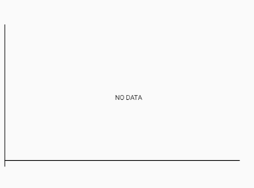
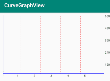
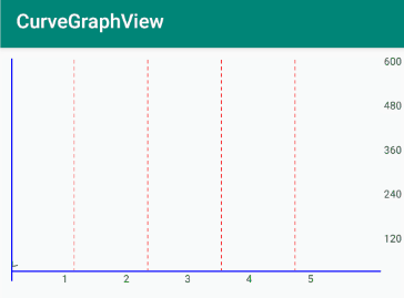
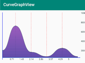
No10. CurveGraphView
CurveGraphView 是一个带有炫酷动画统计图表库,除了性能出色并具有许多样式选项之外,该库还支持单个平面内的多个线图。
多个折线图对于比较不同股票,共同基金,加密货币等的价格非常有用。
10.1 如何使用?
1、在build.gradle 中添加如下依赖:
dependencies {
    implementation 'com.github.swapnil1104:CurveGraphView:{current_lib_ver}'
}
2、在xml文件中添加布局:
 <com.broooapps.graphview.CurveGraphView
        android:id="@+id/cgv"
        android:layout_width="0dp"
        android:layout_height="250dp"
        app:layout_constraintBottom_toBottomOf="parent"
        app:layout_constraintEnd_toEndOf="parent"
        app:layout_constraintStart_toStartOf="parent"
        app:layout_constraintTop_toTopOf="parent" />
然后在代码中添加各种配置项
curveGraphView = findViewById(R.id.cgv);

curveGraphView.configure(
        new CurveGraphConfig.Builder(this)
                .setAxisColor(R.color.Blue)                                             // Set X and Y axis line color stroke.
                .setIntervalDisplayCount(7)                                             // Set number of values to be displayed in X ax
                .setGuidelineCount(2)                                                   // Set number of background guidelines to be shown.
                .setGuidelineColor(R.color.GreenYellow)                                 // Set color of the visible guidelines.
                .setNoDataMsg(" No Data ")                                              // Message when no data is provided to the view.
                .setxAxisScaleTextColor(R.color.Black)                                  // Set X axis scale text color.
                .setyAxisScaleTextColor(R.color.Black)                                  // Set Y axis scale text color
                .build()
        ););
3、 提供数据集
PointMap pointMap = new PointMap();
        pointMap.addPoint(0, 100);
        pointMap.addPoint(1, 500);
        pointMap.addPoint(5, 800);
        pointMap.addPoint(4, 600);
10.2 效果图
| 效果1 | 效果2 |
|---|---|
 |
 |
 |
 |
更多详细使用方式请看Github: github.com/swapnil1104…
总结
以上就是本期的开源库推荐,别忘了添加到你的收藏夹哟!如果你觉得还不错,就三连支持一下吧!如果你还有一些有意思的,效果特别炫酷的库,也欢迎评论区留言推荐,感谢阅读,祝编码愉快!
每天都有干货文章持续更新,可以微信搜索
「 技术最TOP 」第一时间阅读,回复【思维导图】【面试】【简历】有我准备一些Android进阶路线、面试指导和简历模板送给你

