

之前写了一篇Canvas画图-一个比想象中更骚气的圆(渐变圆环),其实SVG也可以实现类似的效果,而且两者api惊人的相似。
关于SVG
SVG是一种矢量图形,在图形改变尺寸的情况下质量不会损失。
相比canvas,svg有一个很大的优势就是内联进html的时候可以像操作dom一样操作svg,这样做起动画来非常方便。
本文不会介绍svg的基础知识,不过也没涉及什么复杂的东西,基于xml的语法还是比较好理解的。
期望实现的效果和Canvas一样是颜色非对称的沿着圆周进行渐变。
SVG的渐变
和之前讲canvas一样,svg也有线性渐变和径向渐变,这里主要讲线性渐变,径向渐变api差别不大。
老规矩,上代码:
    <svg version="1.1" id="图层_1" xmlns="http://www.w3.org/2000/svg" xmlns:xlink="http://www.w3.org/1999/xlink" x="0px" y="0px"
         width="595.28px" height="841.89px" viewBox="0 0 595.28 841.89" enable-background="new 0 0 595.28 841.89" xml:space="preserve">
    <linearGradient id="SVGID_1_" gradientUnits="userSpaceOnUse" x1="213.0787" y1="303.3227" x2="384.1807" y2="303.3227">
        <stop  offset="0.107" style="stop-color:#00A29A"/>
        <stop  offset="0.1301" style="stop-color:#28A891"/>
        <stop  offset="0.1968" style="stop-color:#76B874"/>
        <stop  offset="0.2649" style="stop-color:#9FC758"/>
        <stop  offset="0.3339" style="stop-color:#BBD338"/>
        <stop  offset="0.4041" style="stop-color:#CDDA06"/>
        <stop  offset="0.4761" style="stop-color:#D7DE00"/>
        <stop  offset="0.5527" style="stop-color:#DAE000"/>
        <stop  offset="0.9265" style="stop-color:#F39800"/>
    </linearGradient>
    <circle fill="none" stroke="url(#SVGID_1_)" stroke-width="16" stroke-miterlimit="10" cx="306.385" cy="355.208" r="77.551"/>
</svg>这个是直接从AI里导出的,也可以尝试使用别的SVG编辑器,其中linearGradient就是定义一个线性渐变,和Canvas中的ctx.createLinearGradient一个意思,stop标签就类似Canvas中的grd.addColorStop方法,同样是设置渐变点,这里给这个渐变设置了一个id,id="SVGID_1_"。
下面的那个circle标签就是定义一个圆,cx,cy,r分别是圆心坐标和半径,fill和stroke分辨对应canvas中的fillStyle和strokeStyle,stroke-width对应canvas中的lineWidth。
和之前给canvas版的骚气圆环用渐变一样,svg的实现也是定义一个线性渐变,然后让圆用这个渐变来描边stroke="url(#SVGID_1_)"
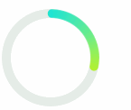
实际上出来的效果,和Canvas渐变是异曲同工,即使svg有路径的概念,渐变也没有按照路径来渐变,而是和canvas一样从左到右,上下颜色是对称的。
如图:
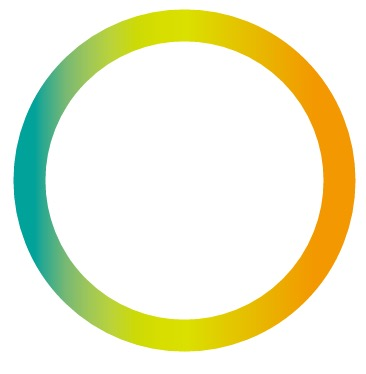
SVG非对称的渐变圆环
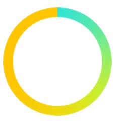
Canvas的非对称渐变圆环我们借助了ctx.createPattern,google一下,svg里同样有个<pattern>。
这里为了方便,我把要用到的图片base64进去了,实际上用线上图片也可以。
代码如下,省略base64的内容:
    <svg height="108" width="108" xmlns="http://www.w3.org/2000/svg" xmlns:xlink="http://www.w3.org/1999/xlink" version="1.1">
      <defs>
        <pattern id="fill-img" patternUnits="userSpaceOnUse" width="108" height="108">
          <image xlink:href="data:image/png;base64,xxxxxxxxxxx"
            x="0" y="0" width="108" height="108">
          </image>
        </pattern>
      </defs>
       <circle fill="none" stroke="url(#fill-img)" stroke-width="10" stroke-miterlimit="1" cx="54" cy="54" r="49" >
       </circle>
</svg>和canvas一样,定一个<pattern>,然后给圆描边的时候用这个东东。
出来的效果:
看了之前Canvas的文章的话,svg代码还是比较简单的,然后我们来加个动画。
SVG动画
SVG动画实际上是让路径动起来,要让路径动起来首先要了解stroke-dasharray和stroke-dashoffset这两个属性。
stroke-dasharray 表示用虚线描边。可选值为none, , inherit。
- none 表示不用虚线描边
- inherit 表示继承
- 可就厉害了,基本上路径动画都需要用到,这是一个逗号或者空格分隔的数值列表,第一个值表示线段的长度,第二个值表示线段间空白的长度,举个例子
stroke-dasharray="308 1000"中,308表示虚线中的线段的长度,而1000表示两个线段间的长度是1000px。其实这个dasharray可以不只两个值,可以有很多个,会循环依次用到线段和空白之间。
stroke-dashoffset 表示虚线的起始偏移。可选值为:, , inherit. 分别表示:百分比值,长度值,继承。这个dashoffset和上面那个结合起来用,一般来说虚线的第一段是实线线段,如果我想要第一段是空白怎么办,设置这个dashoffset就可以了。
现在就来试一试,只需要修改circle元素的代码就可以了:
    <circle fill="none" stroke="url(#fill-img)" stroke-width="10" stroke-miterlimit="1" cx="54" cy="54" r="49"  stroke-dasharray="308 1000" stroke-dashoffset="100">
    </circle>
如下图:
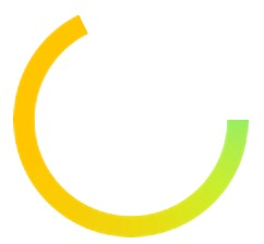
缺的那一块就是因为虚线的空白部分被移出来了,这里r设置49和Canvas的原理一样,想画看起来半径54的圆,需要用54减去描边宽度的一半,54-10/2,而这里stroke-dasharray的第一个数,我这里设置的是圆的周长,2Math.PI49=307.8760800517997 约等于308啦,至于第二个数,设大一点就好,大过圆的周长就可以了。
想要做动画就不断的改变stroke-dashoffset的值让虚线的空隙动起来就可以了,svg本身支持属性的动画,稍微改动一下代码:
    <circle fill="none" stroke="#e5ece7" stroke-width="10" stroke-miterlimit="1" cx="54" cy="54" r="49"/>

    <circle fill="none" stroke="url(#fill-img)" stroke-width="10" stroke-miterlimit="1" cx="54" cy="54" r="49"  stroke-dasharray="308 1000" stroke-dashoffset="308" stroke-linecap="round" transform="rotate(-88 54 54)">
        <animate attributeName="stroke-dashoffset" begin="0s" dur="1.5s" from="308" to="0" repeatCount="indefinite" />
</circle>这里我把circle的初始stroke-dashoffset改成308,表示从空白开始,animate标签中attributeName表示动画属性是stroke-dashoffset,begin表示开始的延时,dur表示时间整个动画的时间,frome和to表示初始值和最终值,repeatCount表示重复次数,这里是无限次。整体和CSS3动画还是很像的。
这里还有一个stroke-linecap="round"和Canvas的ctx2.lineCap="round";作用一样,是设置描边的两头是圆形。
另外我还在上面加了一个圆,用来做底色,同时给做动画的圆做了一个旋转transform="rotate(-88 54 54)"用来改变起始点。
效果如下:
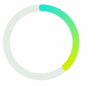
SVG动画2
大致了解了SVG动画的原理之后,其实SVG还可以用CSS3的transition和animation来做动画。
添加css:
    .animate-item {
        transition: stroke-dashoffset 1.5s ease;
    }
添加js:
    setTimeout(function(){
        $(".animate-item").css("stroke-dashoffset",94);
}, 1000)前面说过svg联进html的时候可以像操作dom一样操作svg,这里修改了一下圆环,给了一个class.animate-item
修改圆环:
    <circle class="animate-item" fill="none" stroke="url(#fill-img)" stroke-width="10" stroke-miterlimit="1" cx="54" cy="54" r="49"  stroke-dasharray="308 1000" stroke-dashoffset="308" stroke-linecap="round" transform="rotate(-88 54 54)">
    </circle>
效果如下:
至此,骚气圆环SVG版也就完成了,总体上来说svg的实现更简单,做动画的代码也比较少,相对于canvas需要占用js线程进行一定量的计算来说,svg的性能要好一些。
不过svg在android4.3以上才有比较好的支持,相对来说canvas的支持就比较好了。
完整代码: github.com/bob-chen/ca…
