不知不觉,这已经是『Material Design入门学习笔记』专题第六篇文章了,结束了这篇文章,这个专题,会暂时告一段落。但不是结束,也许仅仅是另一个开始。
『Material Design入门学习笔记』前言
『Material Design入门学习笔记』动画(含demo)
『Material Design 入门学习笔记』主题与 AppCompatActivity(附 demo)
『Material Design入门学习笔记』RecyclerView与CardView(附demo)
『Material Design 入门学习笔记』CollapsingToolbarLayout 与 AppBarLayout(附 demo)
demo下载
前言
首先要说明,这篇文章同样会用到CoordinatorLayout和AppBarLayout,这两个组件的相关知识,可以参考上一篇文章:
[『Material Design 入门学习笔记』CollapsingToolbarLayout 与 AppBarLayout(附 demo)]
TabLayout
布局文件
与之前的CollapsingToolbarLayout类似:
<android.support.design.widget.CoordinatorLayout xmlns:android="http://schemas.android.com/apk/res/android"
                                                 xmlns:app="http://schemas.android.com/apk/res-auto"
                                                 android:id="@+id/main_content"
                                                 android:layout_width="match_parent"
                                                 android:layout_height="match_parent">

    <android.support.design.widget.AppBarLayout
        android:id="@+id/appbar"
        android:layout_width="match_parent"
        android:layout_height="wrap_content"
        android:theme="@style/ThemeOverlay.AppCompat.Dark.ActionBar">

        <android.support.v7.widget.Toolbar
            android:id="@+id/toolbar"
            android:layout_width="match_parent"
            android:layout_height="?attr/actionBarSize"
            android:background="?attr/colorPrimary"
            app:popupTheme="@style/ThemeOverlay.AppCompat.Light"
            app:layout_scrollFlags="scroll|enterAlways" />

        <android.support.design.widget.TabLayout
            android:id="@+id/tabs"
            android:layout_width="match_parent"
            android:layout_height="wrap_content"
            app:tabIndicatorColor="#ffffff"
            app:tabMode="scrollable"/>

    </android.support.design.widget.AppBarLayout>


    <android.support.v4.view.ViewPager
        android:id="@+id/viewpager"
        android:layout_width="match_parent"
        android:layout_height="match_parent"
        app:layout_behavior="@string/appbar_scrolling_view_behavior"
        />


</android.support.design.widget.CoordinatorLayout>
具体介绍一下TabLayout中的一些参数:
app:tabIndicatorColor="@color/white"下方滚动条的下划线颜色app:tabSelectedTextColor="@color/gray"tab被选中后,文字的颜色app:tabTextColor="@color/white"tab默认的文字颜色app:tabMode可以设置为fixed和scrollable。当设置为scrollable表示此TabLayout中当子view数量过多,超出屏幕边界时候,可以通过滑动见到那些不可见的子view,fix则不可以滑动。app:tabGravity可以设置为fill和center。如果TabLayout中的子view数量较少时,如果选择fill是自动充满,如果选择center则居中显示。代码
首先先看一下Activity中的代码:
private void initViews(){
      mTabLayout = (TabLayout)findViewById(R.id.tabs);
      mViewPager = (ViewPager)findViewById(R.id.viewpager);
      nestedFragment = new NestedScrollFragment();
      emptyFragment1 = new FirstEmptyFragment();
      emptyFragment2 = new FirstEmptyFragment();
      ArrayList<Fragment> fragments = new ArrayList<>();
      fragments.add(nestedFragment);
      fragments.add(emptyFragment1);
      fragments.add(emptyFragment2);
      ArrayList<String> titles = new ArrayList<>();
      titles.add("NestedScroll");
      titles.add("empty1");
      titles.add("empty2");
      FragmentsAdapter mAdapter = new FragmentsAdapter(getSupportFragmentManager(),fragments,titles);
      mTabLayout.addTab(mTabLayout.newTab().setText(titles.get(0)));
      mTabLayout.addTab(mTabLayout.newTab().setText(titles.get(1)));
      mTabLayout.addTab(mTabLayout.newTab().setText(titles.get(2)));
      mViewPager.setAdapter(mAdapter);
      mTabLayout.setupWithViewPager(mViewPager);
      mTabLayout.setupWithViewPager(mViewPager,false);
  }
首先viewpager需要一个Adapter,这个等下说。然后我们需要一个tab的名字,这个可以通过
mTabLayout.newTab().setText进行设置,同样还可以通过mTabLayout.newTab().setIcon()设置图片。然后通过TabLayout的addTab方法进行添加。
然后为TabLayout设置对应的viewpager即可。
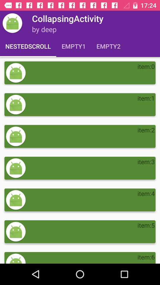
这里给出FragmentsAdapter中的代码:public class FragmentsAdapter extends FragmentPagerAdapter { private List<Fragment> list_fragment; private List<String> list_Title; public FragmentsAdapter(FragmentManager fm, List<Fragment> list_fragment, List<String> list_Title) { super(fm); this.list_fragment = list_fragment; this.list_Title = list_Title; } @Override public Fragment getItem(int position) { return list_fragment.get(position); } @Override public int getCount() { return list_Title.size(); } @Override public CharSequence getPageTitle(int position) { return list_Title.get(position % list_Title.size()); } }对于代码中提到过的fragment可以自己写,也可以参考我的demo,下面给一张图:
NestedScrollView
关于NestedScrollView,我并没有发现与ScrollView有什么明显的差别或优势,NestedScrollView的存在是指为了适配MD的其他组件而存在的,RecyclerView代替了ListView,而NestedScrollView代替了ScrollView,他们两个都可以用来跟ToolBar交互,在CoordinatorLayout中实现折叠滑动等效果。
使用NestedScrollView
<?xml version="1.0" encoding="utf-8"?>

<android.support.design.widget.CoordinatorLayout xmlns:android="http://schemas.android.com/apk/res/android"
                                                 xmlns:app="http://schemas.android.com/apk/res-auto"
                                                 android:id="@+id/main_content"
                                                 android:layout_width="match_parent"
                                                 android:layout_height="match_parent"
                                                 android:fitsSystemWindows="true">

    <android.support.design.widget.AppBarLayout
        android:id="@+id/appbar"
        android:layout_width="match_parent"
        android:layout_height="256dp"
        android:theme="@style/ThemeOverlay.AppCompat.Dark.ActionBar"
        android:fitsSystemWindows="true">

        <android.support.design.widget.CollapsingToolbarLayout
            android:id="@+id/collapsing_toolbar"
            android:layout_width="match_parent"
            android:layout_height="match_parent"
            app:layout_scrollFlags="scroll|exitUntilCollapsed"
            android:fitsSystemWindows="true"
            app:contentScrim="?attr/colorPrimary"
            app:expandedTitleMarginStart="48dp"
            app:expandedTitleMarginEnd="64dp">

            <ImageView
                android:id="@+id/backdrop"
                android:layout_width="match_parent"
                android:layout_height="match_parent"
                android:scaleType="centerCrop"
                android:fitsSystemWindows="true"
                android:src="@drawable/logo"
                app:layout_collapseMode="parallax"
                />

            <android.support.v7.widget.Toolbar
                android:id="@+id/toolbar"
                android:layout_width="match_parent"
                android:layout_height="?attr/actionBarSize"
                app:popupTheme="@style/ThemeOverlay.AppCompat.Light"
                app:layout_collapseMode="pin" />

        </android.support.design.widget.CollapsingToolbarLayout>

    </android.support.design.widget.AppBarLayout>

    <android.support.v4.widget.NestedScrollView
        android:layout_width="match_parent"
        android:layout_height="match_parent"
        android:fillViewport="true"
        android:layout_marginTop="2dp"
        android:id="@+id/nestedscroll"
        app:layout_behavior="@string/appbar_scrolling_view_behavior">
        <android.support.v7.widget.RecyclerView
            android:layout_width="match_parent"
            android:id="@+id/recycler_nested"
            android:layout_height="match_parent"></android.support.v7.widget.RecyclerView>
    </android.support.v4.widget.NestedScrollView>

</android.support.design.widget.CoordinatorLayout>
这次还是用了CollapsingToolbarLayout,因为这个的折叠效果比较明显。然后看下代码:
     for (int i = 0 ; i< 200;i++){
            list.add("item:"+i);
        }
        adapter = new CardListAdapter(this,list);
        recyclerView = (RecyclerView)findViewById(R.id.recycler_nested);
        recyclerView.setAdapter(adapter);
        recyclerView.setLayoutManager(new LinearLayoutManager(this));
        recyclerView.setItemAnimator(new DefaultItemAnimator());
这些代码在前面的例子中都介绍过,没见过的可以参考:
『Material Design入门学习笔记』RecyclerView与CardView(附demo)
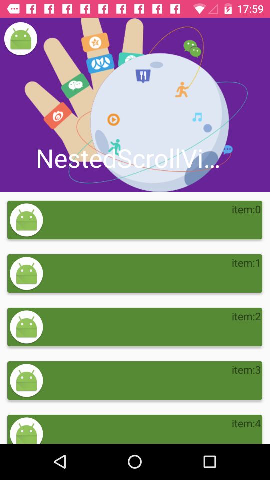
下面看一下样图:
不使用NestedScrollView
如果不使用的情况下,会是什么样呢,首先需要修改一下布局文件:
<?xml version="1.0" encoding="utf-8"?>

<android.support.design.widget.CoordinatorLayout xmlns:android="http://schemas.android.com/apk/res/android"
                                                 xmlns:app="http://schemas.android.com/apk/res-auto"
                                                 android:id="@+id/main_content"
                                                 android:layout_width="match_parent"
                                                 android:layout_height="match_parent"
                                                 android:fitsSystemWindows="true">

    <android.support.design.widget.AppBarLayout
        android:id="@+id/appbar"
        android:layout_width="match_parent"
        android:layout_height="256dp"
        android:theme="@style/ThemeOverlay.AppCompat.Dark.ActionBar"
        android:fitsSystemWindows="true">

        <android.support.design.widget.CollapsingToolbarLayout
            android:id="@+id/collapsing_toolbar"
            android:layout_width="match_parent"
            android:layout_height="match_parent"
            app:layout_scrollFlags="scroll|exitUntilCollapsed"
            android:fitsSystemWindows="true"
            app:contentScrim="?attr/colorPrimary"
            app:expandedTitleMarginStart="48dp"
            app:expandedTitleMarginEnd="64dp">

            <ImageView
                android:id="@+id/backdrop"
                android:layout_width="match_parent"
                android:layout_height="match_parent"
                android:scaleType="centerCrop"
                android:fitsSystemWindows="true"
                android:src="@drawable/logo"
                app:layout_collapseMode="parallax"
                />

            <android.support.v7.widget.Toolbar
                android:id="@+id/toolbar"
                android:layout_width="match_parent"
                android:layout_height="?attr/actionBarSize"
                app:popupTheme="@style/ThemeOverlay.AppCompat.Light"
                app:layout_collapseMode="pin" />

        </android.support.design.widget.CollapsingToolbarLayout>

    </android.support.design.widget.AppBarLayout>


        <android.support.v7.widget.RecyclerView
            android:layout_width="match_parent"
            android:id="@+id/recycler_nested"
            app:layout_behavior="@string/appbar_scrolling_view_behavior"
            android:layout_height="match_parent"></android.support.v7.widget.RecyclerView>


</android.support.design.widget.CoordinatorLayout>去掉了NestedScrollView,并把RecyclerView添加了app:layout_behavior="@string/appbar_scrolling_view_behavior"。
这是发现也没什么问题,跟刚才区别不大,这是因为RecyclerView自带了ScrollView。但是如果放一个线性布局呢?
试一下,建立一个线性布局,里面添加多个TextView。布局如下:
<?xml version="1.0" encoding="utf-8"?>

<android.support.design.widget.CoordinatorLayout xmlns:android="http://schemas.android.com/apk/res/android"
                                                 xmlns:app="http://schemas.android.com/apk/res-auto"
                                                 android:id="@+id/main_content"
                                                 android:layout_width="match_parent"
                                                 android:layout_height="match_parent"
                                                 android:fitsSystemWindows="true">

    <android.support.design.widget.AppBarLayout
        android:id="@+id/appbar"
        android:layout_width="match_parent"
        android:layout_height="256dp"
        android:theme="@style/ThemeOverlay.AppCompat.Dark.ActionBar"
        android:fitsSystemWindows="true">

        <android.support.design.widget.CollapsingToolbarLayout
            android:id="@+id/collapsing_toolbar"
            android:layout_width="match_parent"
            android:layout_height="match_parent"
            app:layout_scrollFlags="scroll|exitUntilCollapsed"
            android:fitsSystemWindows="true"
            app:contentScrim="?attr/colorPrimary"
            app:expandedTitleMarginStart="48dp"
            app:expandedTitleMarginEnd="64dp">

            <ImageView
                android:id="@+id/backdrop"
                android:layout_width="match_parent"
                android:layout_height="match_parent"
                android:scaleType="centerCrop"
                android:fitsSystemWindows="true"
                android:src="@drawable/logo"
                app:layout_collapseMode="parallax"
                />

            <android.support.v7.widget.Toolbar
                android:id="@+id/toolbar"
                android:layout_width="match_parent"
                android:layout_height="?attr/actionBarSize"
                app:popupTheme="@style/ThemeOverlay.AppCompat.Light"
                app:layout_collapseMode="pin" />

        </android.support.design.widget.CollapsingToolbarLayout>

    </android.support.design.widget.AppBarLayout>

    <!--<android.support.v4.widget.NestedScrollView-->
        <!--android:layout_width="match_parent"-->
        <!--android:layout_height="match_parent"-->
        <!--android:fillViewport="true"-->
        <!--android:layout_marginTop="2dp"-->
        <!--android:id="@+id/nestedscroll"-->
        <!--app:layout_behavior="@string/appbar_scrolling_view_behavior">-->
        <!--<android.support.v7.widget.RecyclerView-->
            <!--android:layout_width="match_parent"-->
            <!--android:id="@+id/recycler_nested"-->
            <!--app:layout_behavior="@string/appbar_scrolling_view_behavior"-->
            <!--android:layout_height="match_parent"></android.support.v7.widget.RecyclerView>-->
    <!--</android.support.v4.widget.NestedScrollView>-->
    <ScrollView
        android:layout_width="match_parent"
        android:layout_height="match_parent"
        app:layout_behavior="@string/appbar_scrolling_view_behavior">
<LinearLayout
    android:layout_width="match_parent"
    android:layout_height="match_parent"
    android:orientation="vertical"

    >
    <TextView
        android:layout_width="match_parent"
        android:layout_height="300dp"
        android:text="test"/>
    <TextView
        android:layout_width="match_parent"
        android:layout_height="300dp"
        android:text="test"/>
    <TextView
        android:layout_width="match_parent"
        android:layout_height="300dp"
        android:text="test"/>
    <TextView
        android:layout_width="match_parent"
        android:layout_height="300dp"
        android:text="test"/>
    <TextView
        android:layout_width="match_parent"
        android:layout_height="300dp"
        android:text="test"/>
    <TextView
        android:layout_width="match_parent"
        android:layout_height="300dp"
        android:text="test"/>
    <TextView
        android:layout_width="match_parent"
        android:layout_height="300dp"
        android:text="test"/>
    <TextView
        android:layout_width="match_parent"
        android:layout_height="wrap_content"
        android:text="test"/>
    <TextView
        android:layout_width="match_parent"
        android:layout_height="wrap_content"
        android:text="test"/>
    <TextView
        android:layout_width="match_parent"
        android:layout_height="wrap_content"
        android:text="test"/>
</LinearLayout>
    </ScrollView>
</android.support.design.widget.CoordinatorLayout>
效果如图:
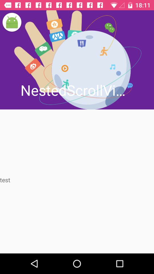
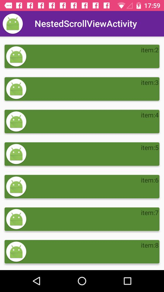
这是我们发现,向上滑动,由于ScrollView的原因也会滚动,但是跟AppBarLayout的交互动画没有了。只能在AppBarLayout上向上互动,才能有折叠的效果。
所以这也就说明了NestedScrollView与ScrollView的区别,那就是,对于Material Design动画和组件的适配。
总结
『Material Design入门学习笔记』暂时就写到这,后面如果发现好的东西还会进行补充,但是近期内,就写到这里了,有疑问的朋友欢迎给我留言指正,或者关注我的公众号留言: