

每个制作出来的css3动画都凝结了设计者和创作者智慧的结晶,以此,我们要向前辈致敬;动画的出现给单调的网页平添了活性,是单纯的展示页面变得不再那么枯燥,所以,作为一个web前端的开发者能够创作出属于自己的特有的动画,我感到很高兴。
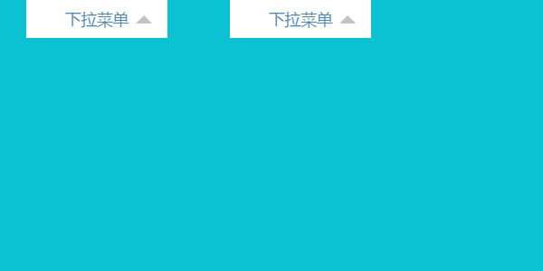
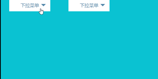
今天,我向大家介绍实现css下拉菜单的动画制作的不同方法,希望能给大家有所帮助和启示。首先,先来个效果图给大家看一看:


那么接下来我就给大家介绍一下这个动画的组成,它主要包括三个小动画组成。第一部分就是鼠标的滑过的渐变动画;第二部分,就是右边的三角小箭头的动画,这个说起来也很简单,这个三角形是使用css样式写的控制元素的四条边的颜色和各边的显隐来形成;第三部分,就是展开的下拉框。
根据我之前写过的一篇文章《transform,transition,animation的混合使用——进阶》中对动画的组合形式的分类,将动画的实现分类有transform和transition组合,transform和animation组合,再结合动画的触发形式,pc端常见的鼠标滑过、鼠标单击,wap端的触摸形式,该动画的最终的呈现形式将以下四种常见形式:
第一种,实现方案用transition(鼠标滑过)
第二种,实现方案用animation(鼠标滑过)
第三种,实现方案用transition(鼠标单击或触摸)
第四种,实现方案用animation(鼠标单击或触摸)
我将详细讲解前两种的实现,后两种的实现(略讲),由于是触发方式的改变,所以对于javascript有一定使用经验的同学将会根据自己的使用习惯很容易的形成自己所需要的代码,进而形成自己的css动画下拉菜单的解决方案。
鼠标滑过--下拉菜单动画
transition和transform组合
html代码:
<div class="l-drop-menu l-menu-1">
        <span>下拉菜单</span>
        <ul class="l-list">
            <li class="l-list-item"><a href="http://www.baidu.com">百度一下</a></li>
            <li class="l-list-item"><a href="http://www.bing.com">bing搜索</a></li>
            <li class="l-list-item"><a href="http://www.iconfont.cn/">iconfont</a></li>
        </ul>
    </div>
css代码:
.l-list {
    position: absolute;
    top: 100%;
    z-index: -1;
    width: 100%;
    padding: 4px 0;
    background-color: #fff;
    border: 1px solid #cecece;
    box-sizing: border-box;
    opacity: 0;
}

.l-list-item {
    list-style: none;
    padding: 4px 8px;
}

.l-list-item a {
    display: block;
    padding: 4px 0;
    font-size: 16px;
    color: #000;
    text-align: center;
    text-decoration: none;
    transition: all 0.2s linear;
}

.l-list-item a:hover {
    color: #fff;
    background-color: #cecece;
}

.l-drop-menu {
    position: relative;
    width: 142px;
    height: auto;
    margin: 0 auto;
}

.l-drop-menu>span {
    position: relative;
    display: block;
    padding: 8px 20px;
    text-align: center;
    color: #58a;
    background-color: #fff;
    cursor: pointer;
}

.l-drop-menu>span::after {
    position: absolute;
    top: 8px;
    right: 16px;
    content: '';
    width: 0;
    height: 0;
    overflow: hidden;
    border-width: 8px;
    border-style: dashed dashed solid;
    border-color: transparent transparent #c2c2c2;
    transition: all 0.3s linear;
}

.l-drop-menu>span:hover {
    color: #fff;
    background-color: #cecece;
}

.l-drop-menu>span:hover::after {
    top: 16px;
    border-style: solid dashed dashed;
    border-color: #ffffff transparent transparent;
}
以上是animation和transition两种不同实现形式的公用代码。
transiton实现形式的代码
.l-menu-1 .l-list {
     transform: translate3d(0, 10px, 0);
    backface-visibility: hidden;
    transition: all 0.3s linear;
}

.l-menu-1:hover .l-list {
    z-index: 2;
    overflow: auto;
    opacity: 1;
    transform: translate3d(0, 0, 0);
}
animation实现形式的css代码
.l-menu-2 .l-list{
    animation: l-animation-up 0.5s;
}

.l-menu-2:hover .l-list{
    z-index: 2;
    opacity: 1;
    animation: l-animation-down 0.5s;
}

@-webkit-keyframes l-animation-down {
    from {
        -webkit-transform: translate3d(0, 10px, 0);
        opacity: .1
    }
    to {
        -webkit-transform: translate3d(0, 0, 0);
        opacity: 1
    }
}

@keyframes l-animation-down {
    from {
        transform: translate3d(0, 10px, 0);
        opacity: .1
    }
    to {
        transform: translate3d(0, 0, 0);
        opacity: 1
    }
}

@-webkit-keyframes l-animation-up {
    from {
        -webkit-transform: translate3d(0, 0, 0);
        opacity: 1
    }
    to {
        -webkit-transform: translate3d(0, 10px, 0);
        opacity: .1
    }
}

@keyframes l-animation-up {
    from {
        transform: translate3d(0, 0, 0);
        opacity: 1
    }
    to {
        transform: translate3d(0, 10px, 0);
        opacity: .1
    }
}
代码晒完了,我们就来说一说做这个动画的注意点吧!
1.第一种用transition和transform的形式,下拉框我们通常的实现形式通过定位来实现,本案例的实现形式和传统的实现形式并无二样;
2.第一种用transition和transform的形式,我们传统的控制显隐我们使用的是display:none,display:block;但明显这种方案用在这里不合适,使用这种解决方案的结果就是没用过渡效果,也即是没有了动画效果,我采用了opacity和z-index来解决这种问题(详情查看和分析代码);
3.第二种用animation和transform的形式,这种实现形式我相信大家在学习和工作中都看过,但这种形式要实现的动画效果和第一种之间,我觉得地址用实现形式更好,因为这个第二种,只有展开时的过渡效果,而没有闭合时的过渡效果,对于要求并不高的同学来说,或许这样的效果还不错,但是对于我这种追求极客的来说,我还是不满足,所以,我就试着有加入了一个移开时的动画,实现了跟第一种一样的动画效果(有一个刷新页面的问题),但我要接着说的是在第二点中我有提过有opacity和z-index解决transition形式动画没有过渡的情况,在第二种形式,display:none,display:block这种控制显隐的方式也可用。
综上,下拉菜单动画最优选择第一种,其次,选择第二种。
演示地址:lvzhenbang.github.io/css3-animat…
单击--下拉菜单动画
单击的动画和鼠标滑过的动画效果区别就是触发形式的不同,从而造成了css代码的相应差异,transition通过单击实现就是通过改变在元素中添加.l-menu-active来实现;animation通过单击实现就是通过在元素中添加.l-menu-in, .l-menu-out来实现的。
html代码同上
css代码 公用和上面两个例子重合的代码如下:
.l-list {
    position: absolute;
    top: 100%;
    display: none;
    width: 100%;
    background-color: #fff;
    box-sizing: border-box;
}

.l-list-item {
    list-style: none;
    padding: 4px 8px;
    border-top: 1px solid #cecece;
}

.l-list-item a {
    display: block;
    padding: 4px 0;
    font-size: 16px;
    color: #000;
    text-align: center;
    text-decoration: none;
    -webkit-transition: all 0.2s linear;
}

.l-list-item a:hover {
    color: #fff;
    background-color: #cecece;
}

.l-drop-menu {
    position: relative;
    width: 142px;
    height: auto;
    margin: 0 auto;
}

.l-drop-menu>span {
    position: relative;
    display: block;
    padding: 10px 20px;
    text-align: center;
    color: #58a;
    background-color: #fff;
    cursor: pointer;
}

.l-drop-menu>span::after {
    position: absolute;
    top: 16px;
    right: 16px;
    content: '';
    width: 0;
    height: 0;
    overflow: hidden;
    border-width: 8px;
    border-style: solid dashed dashed;
    border-color: #58a transparent transparent;
    -webkit-transition: all 0.3s linear;
    transition: all 0.3s linear;
}
transition实现的代码:
.l-drop-menu.l-menu-active>span, .l-drop-menu.l-menu-in>span {
    color: #fff;
    background-color: #cecece;
}

.l-drop-menu.l-menu-active>span::after, .l-drop-menu.l-menu-in>span::after {
    top: 8px;
    border-style: dashed dashed solid;
    border-color: transparent transparent #58a;
}

.l-menu-1.l-menu-active .l-list {
    display: block;
    -webki-transform: translate3d(0, 0, 0);
    transform: translate3d(0, 0, 0);
}

.l-menu-1 .l-list {
    -webkit-transform: translate3d(0, 10px, 0);
    transform: translate3d(0, 10px, 0);
    -webkit-transition: all 0.3s linear;
    transition: all 0.3s linear;
}
animation的代码:
.l-menu-2.l-menu-out .l-list {
    display: none;
    -webkit-animation: l-animation-up 0.5s;
    animation: l-animation-up 0.5s;
}

.l-menu-2.l-menu-in .l-list {
    display: block;
    -webkit-animation: l-animation-down 0.5s;
    animation: l-animation-down 0.5s;
}

@-webkit-keyframes l-animation-down {
    from {
        -webkit-transform: translate3d(0, 10px, 0);
    }
    to {
        -webkit-transform: translate3d(0, 0, 0);
    }
}

@keyframes l-animation-down {
    from {
        transform: translate3d(0, 10px, 0);
    }
    to {
        transform: translate3d(0, 0, 0);
    }
}

@-webkit-keyframes l-animation-up {
    from {
        -webkit-transform: translate3d(0, 0, 0);
    }
    to {
        -webkit-transform: translate3d(0, 10px, 0);
    }
}

@keyframes l-animation-up {
    from {
        transform: translate3d(0, 0, 0);
    }
    to {
        transform: translate3d(0, 10px, 0);
    }
}
综上,你会发现transition实现的动画,当你单击时发现动画用display:none,display:block;这种方式依然不能达到预期的效果,所以还是应该采用opacity和z-index的方案;但是使用animation测没有任何问题,与此同时当你刷新网页时,不会出现问题。
所以,当单击实现下拉菜单这两种方案都不错,但是理解起来相对简单的是animation的形式。
关于如何改transition的单击实现方案,各位同学可以当作一个小例子来实践一下。
transition的js代码:
var menu1 = document.getElementsByClassName('l-menu-1')[0];

menu1.onclick = function() {
    var className = menu1.className;
    if (~className.indexOf('l-menu-active')) {
        menu1.className = className.replace(' l-menu-active', '');
    } else {
        menu1.className += ' l-menu-active';
    }
}
animation的js代码:
var menu2 = document.getElementsByClassName('l-menu-2')[0];
menu2.onclick = function() {
    var className = menu2.className;
    if (~className.indexOf('l-menu-in')) {
        menu2.className = className.replace('l-menu-in', 'l-menu-out');
    } else {
        menu2.className += ' l-menu-in';
    }
}演示地址:lvzhenbang.github.io/css3-animat…
接下来的文章我会给大家带来一些我自己的做css动画的
源代码下载地址:github地址:https://github.com/lvzhenbang/css3-animate/tree/gh-pages
