- 有时对于响应式布局,我们需要根据组件的宽度自适应高度。CSS无法实现这种动态变化,传统是用jQuery实现。
- 而在React中无需依赖于JQuery,实现相对比较简单,只要在DidMount后更改width即可
- Try on Codepen
- 需要注意的是在resize时候也要同步变更,需要注册个监听器
class Card extends React.Component {
constructor(props) {
super(props);
this.state = {
width: props.width || -1,
height: props.height || -1,
}
}
componentDidMount() {
this.updateSize();
window.addEventListener('resize', this.updateSize.bind(this));
}
componentWillUnmount() {
window.removeEventListener('resize', this.updateSize.bind(this));
}
updateSize() {
try {
const parentDom = ReactDOM.findDOMNode(this).parentNode;
let { width, height } = this.props;
if (!width) {
width = parentDom.offsetWidth;
}
if (!height) {
height = width * 0.38;
}
this.setState({ width, height });
} catch (ignore) {
}
}
render() {
return (
<div className="test" style={ { width: this.state.width, height: this.state.height } }>
{`${this.state.width} x ${this.state.height}`}
</div>
);
}
}
ReactDOM.render(
<Card/>,
document.getElementById('root')
);
参考资料
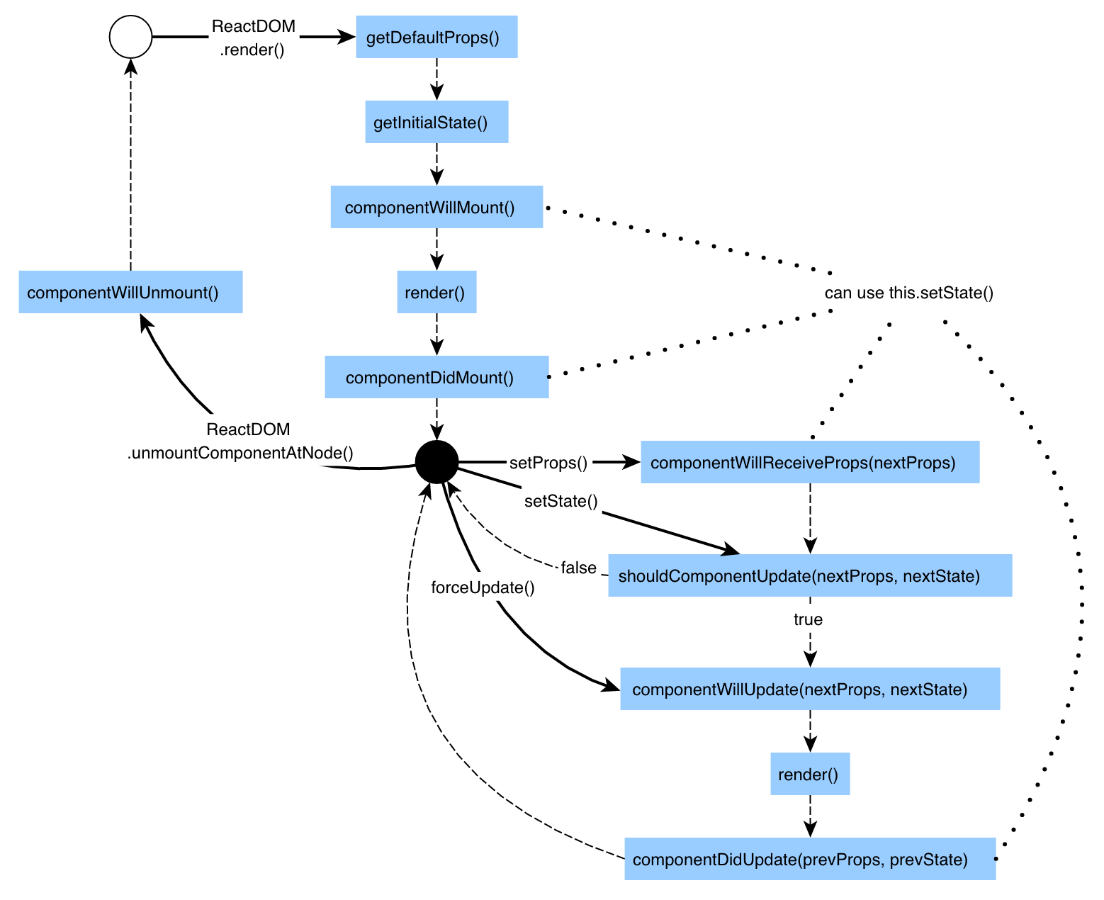 React生命周期


