

前言
Vue.js是一套构建用户界面的渐进式框架(官方说明)。通俗点来说,Vue.js是一个轻量级的,易上手易使用的,便捷,灵活性强的前端MVVM框架。简洁的API,良好健全的中文文档,使开发者能够较容易的上手Vue框架。
本系列文章将结合个人在使用Vue中的一些经(cai)验(keng)和一些案例,对Vue框架掌握的部分知识进行输出,同时也巩固对Vue框架的理解。
认识组件
组件是 Vue 强大的功能之一。Vue组件具有封装可复用的特点,能够让你在复杂的应用中拆分成独立模块使用。注意,所有的 Vue 组件同时也都是 Vue 的实例,可接受相同的选项对象。
Vue组件的注册
我们可以通过全局注册和局部注册的方式来注册一个 Vue 组件,两种方式的区别在于,全局注册的组件能够在任何地方使用,其实就是所有的 Vue 实例化的时候都会去渲染这个全局组件;而局部组件只是注册在某一个 Vue 实例化对象上,只能在这个 Vue 实例化的时候会渲染,其他地方使用会被当成普通的Html标签渲染。我们就先来了解下全局组件的注册。
Vue 组件全局注册时通过 Vue.component(tagName, options) 方式注册。 看一个简单的示例。
<div id="app" class="demo">
    <!-- Vue组件 -->
    <simple-component></simple-component>
</div>
<script>
    Vue.component("simple-component", {
        template: "<span>我是一个最简单的Vue组件示例</span>"
    })
    new Vue({
        el: "#app"
    })
</script>
Vue.component 方法中传入两个参数,一个参数是组件的自定义标签名,另一个参数是一个对象,里面的template属性的值就是组件的模板。
可能你会想,组件的内容太简单了吧,只有一个标签,要是内容复杂点的组件,难道也要像以前一样用字符串把内容都拼接起来吗?感觉太恐怖了,就算是使用了es6的字符串语法,写下去也是一大推,很不优雅感觉。嗯,是的,针对这个问题,在 Vue 中给出了良好的解决方案,可以使用 <script type="x-template"> 标签来处理复杂的组件模板。
<div id="app2" class="demo">
    <vut-button></vut-button>
</div>
<script type="x-template" id="vComponent">
    <div class="vut-button">
        <span>我是Button组件</span>
    </div>
</script>

<script>
    Vue.component("vut-button", {
        template: "#vComponent"
    })
    new Vue({
        el: "#app2"
    })
</script>
当然,为了能够让代码看起来更加清晰明了点,你可以使用 template 标签来包裹组件模板,template 标签在浏览器渲染过程中不会被渲染出来。
<div id="app-test" class="demo">
    <vut-button></vut-button>
</div>
<template id="vComponent">
    <div class="vut-button">
        <span>我是Button组件</span>
    </div>
</template>

<script>
    Vue.component("vut-button", {
        template: "#vComponent"
    })
    new Vue({
        el: "#app-test"
    })
</script>
好了,那么局部组件应该怎么注册呢?你可以通过在Vue实例选项components注册仅在其作用域中可用的局部组件。
<div id="app-local" class="demo">
    <!-- Vue组件 -->
    <simple-component></simple-component>
</div>
<script>
    new Vue({
        el: "#app-local",
        components: {
            "simple-component": {
                template: "<span>我是一个最简单的局部Vue组件示例</span>"
            }
        }
    })
</script>
Vue实例选项components包含了一个属性,键是组件的名称,值是一个对象,包含了组件的模板等属性。
使用 Prop 传递数据
每个Vue组件实例都有独立范围的作用域的,这意味着子组件的模板中无法获取到父组件的数据,那么Vue可以通过使用props参数来实现父组件向子组件传递数据。
<div id="app" class="demo">
    <simple-component link="https://github.com/vuejs/vue"></simple-component>
</div>
<script>
    Vue.component("simple-component", {
        template: "<span>Vue的github地址是:{{ link }}</span>",
        props: ["link"]
    })
    new Vue({
        el: "#app"
    })
</script>
可以看到,我们定义了一个props数组接收来自父组件传递的数据,因为父组件传递的数据可能是多个。而事实上,props不一定是数组,也可以是对象,可以详细的指定父组件传递的数据规则,包括默认值,数据类型等。
props: {
    link: {
        type: String, //数据类型
        defalut: "https://www.baidu.com/" //默认值
    }
}
那么父组件如何动态的传递数据给子组件呢?还记得v-bind指令的作用吗,其作用是用于动态绑定html属性或者是组件的props值,所以应该使用v-bind指令来动态传递数据。
<template id="userComponent">
    <div>
        <p>用户名:{{ userName }}</p>
        <p>性别:{{ sex }}</p>
        <p>年龄:{{ age }}</p>
    </div>
</template>
<script type="text/javascript">
    Vue.component("user-component", {
        template: "#userComponent",
        props: ["userName", "sex", "age"]
    })
</script>
<div id="app2" class="demo">
    <div>
        <input type="text" v-model="userName" placeholder="请输入用户名">
        <input type="text" v-model="sex" placeholder="请输入性别">
        <input type="text" v-model="age" placeholder="请输年龄">
    </div>
    <user-component
    :user-name="userName"
    :sex="sex"
    :age="age"
    >
    </user-component>
</div>
<script type="text/javascript">
    new Vue({
        el: "#app2",
        data: {
            userName: "",
            sex: "",
            age: ""
        }
    })
</script>
使用自定义事件实现子组件向父组件通信
我们知道,父组件使用 prop 传递数据给子组件。但子组件怎么跟父组件通信呢?这个时候 Vue 的自定义事件系统就派得上用场了。
假设我们在写一个评论系统,评论部分是Vue组件,评论提交之后我们要将评论的内容展示出来。
先来写出评论组件吧
<template id="comment-component">
    <div class="i-comment-area">
        <textarea rows="5" class="i-textarea" placeholder="请输入内容" v-model="commentValue"></textarea>
        <div class="i-comment-submit" @click="handleSubmit">
            <span>提交</span>
        </div>
    </div>
</template>
评论组件模板包含了一个输入框和一个提交评论的按钮,就这么简单,然后,就全局注册这个组件
Vue.component("i-comment", {
    template: "#comment-component",
    data: function(){
        return {
            commentValue: ""
        }
    },
    methods: {
      handleSubmit: function(){
          if(this.commentValue.length < 1){
              alert("评论不能为空");
              return;
          }
          this.$emit("content", this.commentValue);
          this.commentValue = "";
      }
    }
})
可能你会发现,组件里的data实例选项跟之前的写法不一样,是的,这个在写组件的时候要注意的地方,Vue规定了组件中的data选项必须是函数。然后给提交按钮绑定了一个点击事件handleSubmit,当你填写了评论内容,并点击提交评论的时候,组件会通过 $emit(eventName) 触发事件,并带有一个参数,就是把评论的内容传递给父组件。
既然子组件是通过 $emit(eventName)来和父组件通信,那么父组件如何接收子组件传递过来的数据呢,答案是,使用 $on(eventName) 监听事件。
<div id="simple-comment" class="demo">
    <i-comment v-on:content="commentData"></i-comment>
    <label class="title">评论列表</label>
    <ul class="comment-list">
        <li v-for="(item,index) in commentList">
            <span>{{ item.time }}</span>
            <span>{{ item.content }}</span>
        </li>
    </ul>
</div>
在父组件中,监听子组件中定义的事件名,并调用一个方法 commentData。commentData方法用来获取子组件传递给父组件的参数,这样就是一个子组件向父组件通信的过程。 可以查看完整的例子 。
实现一个 Switch UI 组件
接下来,通过实际动手来实现一个 Switch UI 组件。首先思考下Switch组件需要有哪些基本的API。
- 考虑到使用场景,需要制定不同尺寸的Switch组件,所以需要
sizeAPI。- 考虑到会出现禁止使用的场景,需要禁止和启用组件的功能,所以需要
disabledAPI。- 考虑到需要自定义开启和关闭时的背景颜色,所以需要
on-color和off-colorAPI来自定义背景色。- 同理,可能需要自定义开启和关闭时显示的文字,所以需要
on-text和off-textAPI来自定义显示的文字。- 可能还会需要通过事件监听来获取当前的状态,并根据状态做一些操作,所以需要一个事件来监听状态的变化,所以需要
on-changeAPI。
那么基本的API都列出来了,现在就可以开始一步步实现这些功能了。首先写出组件模板的基本框架。
<span :class="wrapClass">
    <span :class="switchClass" @click="handleChangeFn" ref="switch">
        <input type="hidden" :value="currentValue">
    </span>
</span>
然后得注册这个组件吧。
var prefixClass = "vut-switch";
Vue.component("vut-switch",{
    template: "#switch-component",
    props: {
        value: {
            type: Boolean,
            default: false
        }
    },
    data: function(){
        return {
            currentValue: this.value //当前状态
        }
    },
    computed: {
        wrapClass: function(){
            return prefixClass + "-wrap";
        },
        switchClass: function(){
            return [
                prefixClass,
                {
                    [prefixClass + "-checked"]: this.currentValue
                }
            ];
        }
    }
})
基本上架子就搭建好了。 然后就开始实现那些列出来的API。先来看如何实现size尺寸。
size尺寸的值肯定是通过父组件传递过来的,所以就先在子组件中的props选项中定义好size对象。
props: {
    value: {
        type: Boolean,
        default: false
    },
    size: String //尺寸
}
然后我们的思路是通过不同的样式来控制渲染出来的Switch组件。我们根据传入的不同尺寸的值来添加不同的Class值,制定不同的样式,所以switchClass计算属性中可这么写:
switchClass: function(){
    return [
        prefixClass,
        {
            [prefixClass + "-checked"]: this.currentValue,
            [prefixClass +"-"+ this.size]: this.size
        }
    ];
}
然后就是添加对应的样式。
/*小尺寸*/
.vut-switch-small{
    width: 40px;
    height: 20px;
}
.vut-switch-small:after{
    width: 16px;
    height: 16px;
}
.vut-switch-small.vut-switch-checked:after{
    left: 22px;
}

/*大尺寸*/
.vut-switch-large{
    width: 60px;
}
.vut-switch-large.vut-switch-checked:after{
    left: 38px;
}
最后我们就在Vue实例初始化模板中使用Switch组件。
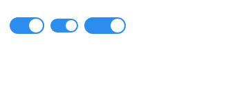
<vut-switch size="small"></vut-switch>
<vut-switch size="large"></vut-switch>
这样我们就可以控制显示Switch组件的尺寸了,效果如下:
然后来看看如何实现自定义背景色的。同样也是先在子组件的props选项中定义好传递过来的数据。
props: {
    value: {
        type: Boolean,
        default: false
    },
    size: String, //尺寸
    onColor: String, //开启时的自定义背景色
    ofColor: String //关闭时的自定义背景色
}
然后我们通过当前的状态来控制显示不同的背景色,也就是要关注 currentValue 值。先来写一个设置背景色的函数,根据currentValue值的变化来设置背景色。
setBackgroundColor: function(){
    let customColor = this.currentValue ? this.onColor : this.offColor;
    this.$refs.switch.style.backgroundColor = customColor;
}
然后监听currentValue值的变化来调用这个函数。
watch: {
    currentValue: function(){
        this.setBackgroundColor();
    }
}
最后我们就在Vue实例初始化模板中使用Switch组件。
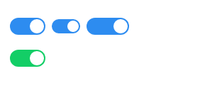
<vut-switch on-color="#13ce66" off-color="#ff4949"></vut-switch>
效果如下:
完整的例子请查看 switch组件 。
后记
本着学习和总结的态度写的文章,文中有任何错误和问题,可以在github上指出 issues 。文中的案例都放置在github上,地址:github.com/webproblem/…。
