

各种页面常见布局+知名网站实例分析+相关阅读推荐
阅前必看:本文总结了各种常见的布局实现,每个方法的优缺点分析往后在github上陆续补充。还有就是这篇文章没提到的其他布局,待本人后续想到或遇到定会在github上及时更新。
由于文章篇幅较长,排版有些混乱,希望别介意哈。掘金PC端是会自动生成目录的,为了方便移动端阅读,还特意做了个锚点目录,一个个标题重写,真心累!(==后来发现掘金对文章的标题经过处理的,锚点不生效,在其他网站没问题的,移动端可以进去github的在线demo阅读)。各位读者如果发现问题或者有什么意见,欢迎提出!——欢迎收藏!欢迎Star!
from github github.com/Sweet-KK/cs…
本文原创,转载请标明出处,摘要引流则随意。
目录
注:PC端推荐用法后面加▲,至于移动端在兼容性允许的情况下优先考虑flex
一、水平居中
(1)文本/行内元素/行内块级元素▲
(2)单个块级元素▲
(3)多个块级元素
(4)使用绝对定位实现▲
(5)任意个元素(flex)
★本章小结:
二、垂直居中
(1)单行文本/行内元素/行内块级元素▲
(2)多行文本/行内元素/行内块级元素
(3)图片▲
(4)单个块级元素
--(1) 使用tabel-cell实现:
--(2) 使用绝对定位实现:▲
--(3) 使用flex实现:
(5)任意个元素(flex)
★本章小结:
三、水平垂直居中
(1)行内/行内块级/图片▲
(2)table-cell
(3)button作为父元素
(4)绝对定位▲
(5)绝对居中▲
(6)flex
(7)视窗居中
★本章小结:
四、两列布局
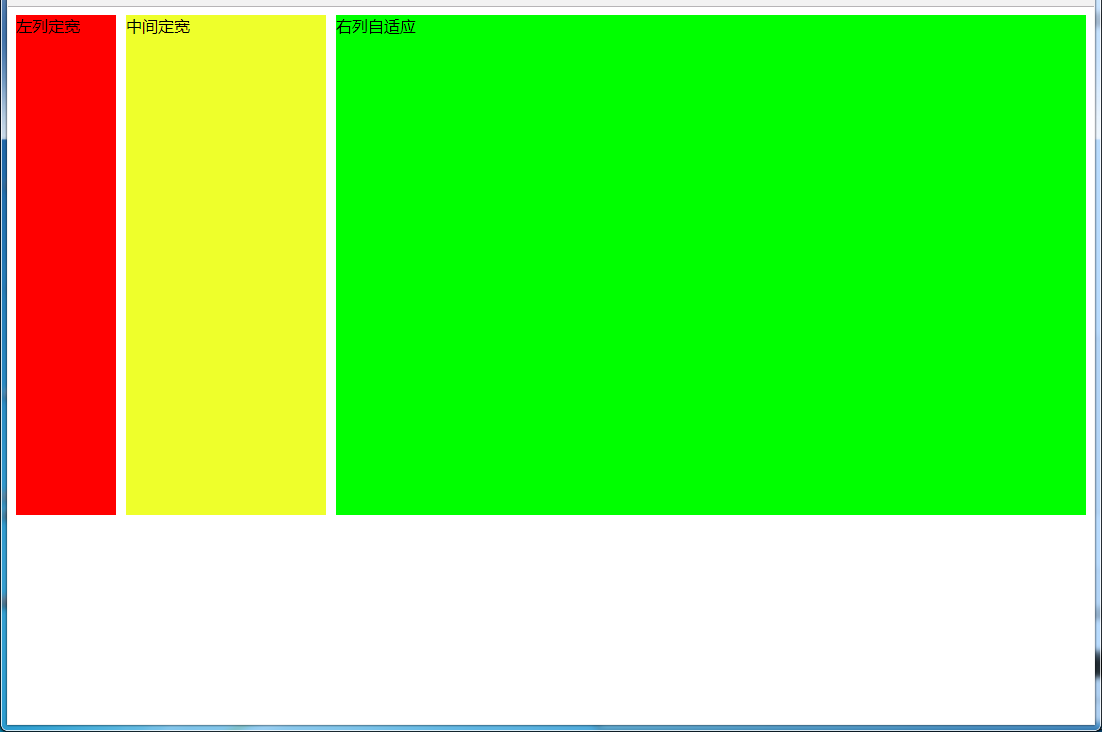
4.1 左列定宽,右列自适应
--(1)利用float+margin实现
--(2)利用float+margin(fix)实现
--(3)使用float+overflow实现▲
--(4)使用table实现▲
--(5)使用绝对定位实现
--(6)使用flex实现
--(7)使用Grid实现
4.2 左列自适应,右列定宽
--(1)使用float+margin实现
--(2)使用float+overflow实现▲
--(3)使用table实现▲
--(4)使用绝对定位实现
--(5)使用flex实现
--(6)使用Grid实现
4.3 一列不定,一列自适应
--(1)使用float+overflow实现▲
--(2)使用flex实现
--(3)使用Grid实现
五、三列布局
5.1 两列定宽,一列自适应
--(1)使用float+margin实现
--(2)使用float+overflow实现▲
--(3)使用table实现▲
--(4)使用flex实现
--(5)使用Grid实现
5.2 两侧定宽,中间自适应
5.2.1 双飞翼布局方法
5.2.2 圣杯布局方法
5.2.3 使用Grid实现
5.2.4 其他方法
--(1)使用table实现▲
--(2)使用flex实现
--(3)使用position实现▲
六、多列布局
6.1 等宽布局
6.1.1四列等宽
--(1)使用float实现▲
--(2)使用table实现▲
--(3)使用flex实现
6.1.2多列等宽
--(1)使用float实现▲
--(2)使用table实现▲
--(3)使用flex实现
--(4)使用Grid实现
6.2 九宫格布局
--(1)使用table实现▲
--(2)使用flex实现
--(3)使用Grid实现
6.3 栅格系统▲
--(1)用Less生成
七、全屏布局
(1)使用绝对定位实现▲
(2)使用flex实现
(3)使用Grid实现
八、网站实例布局分析:
8.1 小米官网
8.1.1 兼容IE9+的方法
--(1)页面整体
--(2)局部——header
--(3)局部——top
--(4)局部——center
--(5)局部——bottom
--(6)局部——footer
--(7)全部代码(优化后)
8.1.2 Flexbox+Grid搭配用法(未来...)
九、其他补充:
9.1 移动端viewport
--设置viewport:
--阅读推荐:
9.2 媒体查询
--代码示例:
--阅读推荐:
9.3 REM
--阅读推荐:
9.4 Flexbox
--阅读推荐:
9.5 CSS Grid
--阅读推荐:
End:感谢
一、水平居中
一,二,三章都是parent+son的简单结构,html代码和效果图就不贴出来了,第四章以后才有
(1)文本/行内元素/行内块级元素▲
原理:text-align只控制行内内容(文字、行内元素、行内块级元素)如何相对他的块父元素对齐
#parent{
    text-align: center;
}
优缺点
- 优点:简单快捷,容易理解,兼容性非常好
- 缺点:只对行内内容有效;属性会继承影响到后代行内内容;如果子元素宽度大于父元素宽度则无效,只有后代行内内容中宽度小于设置text-align属性的元素宽度的时候,才会水平居中
(2)单个块级元素▲
原理:根据规范介绍得很清楚了,有这么一种情况:在margin有节余的同时如果左右margin设置了auto,将会均分剩余空间。另外,如果上下的margin设置了auto,其计算值为0
#son{
    width: 100px; /*必须定宽*/
    margin: 0 auto;
}
优缺点
- 优点:简单;兼容性好
- 缺点:必须定宽,并且值不能为auto;宽度要小于父元素,否则无效
(3)多个块级元素
原理:text-align只控制行内内容(文字、行内元素、行内块级元素)如何相对他的块父元素对齐
#parent{
    text-align: center;
}
.son{
    display: inline-block; /*改为行内或者行内块级形式,以达到text-align对其生效*/
}
优缺点
- 优点:简单,容易理解,兼容性非常好
- 缺点:只对行内内容有效;属性会继承影响到后代行内内容;块级改为inline-block换行、空格会产生元素间隔
(4)使用绝对定位实现▲
原理:子绝父相,top、right、bottom、left的值是相对于父元素尺寸的,然后margin或者transform是相对于自身尺寸的,组合使用达到水平居中的目的
#parent{
    height: 200px;
    width: 200px;  /*定宽*/
    position: relative;  /*父相*/
    background-color: #f00;
}
#son{
    position: absolute;  /*子绝*/
    left: 50%;  /*父元素宽度一半,这里等同于left:100px*/
    transform: translateX(-50%);  /*自身宽度一半,等同于margin-left: -50px;*/
    width: 100px;  /*定宽*/
    height: 100px;
    background-color: #00ff00;
}
优缺点
- 优点:使用margin-left兼容性好;不管是块级还是行内元素都可以实现
- 缺点:代码较多;脱离文档流;使用margin-left需要知道宽度值;使用transform兼容性不好(ie9+)
(5)任意个元素(flex)
原理:就是设置当前主轴对齐方式为居中。说不上为什么,flex无非就是主轴侧轴是重点,然后就是排列方式的设置,可以去看看文末的flex阅读推荐
#parent{
    display: flex;
    justify-content: center;
}
优缺点
- 优点:功能强大;简单方便;容易理解
- 缺点:PC端兼容性不好,移动端(Android4.0+)
本章小结:
- 对于水平居中,我们应该先考虑,哪些元素有自带的居中效果,最先想到的应该就是
text-align:center了,但是这个只对行内内容有效,所以我们要使用text-align:center就必须将子元素设置为display: inline;或者display: inline-block;; - 其次就是考虑能不能用
margin: 0 auto;,因为这都是一两句代码能搞定的事,实在不行就是用绝对定位去实现了。 - 移动端能用flex就用flex,简单方便,灵活并且功能强大,无愧为网页布局的一大利器!
二、垂直居中
一,二,三章都是parent+son的简单结构,html代码和效果图就不贴出来了,第四章以后才有
(1)单行文本/行内元素/行内块级元素▲
原理:line-height的最终表现是通过inline box实现的,而无论inline box所占据的高度是多少(无论比文字大还是比文字小),其占据的空间都是与文字内容公用水平中垂线的。
#parent{
    height: 150px;
    line-height: 150px;  /*与height等值*/
}
优缺点
- 优点:简单;兼容性好
- 缺点:只能用于单行行内内容;要知道高度的值
(2)多行文本/行内元素/行内块级元素
原理同上
#parent{  /*或者用span把所有文字包裹起来,设置display:inline-block转换成图片的方式解决*/
    height: 150px;
    line-height: 30px;  /*元素在页面呈现为5行,则line-height的值为height/5*/
}
优缺点
- 优点:简单;兼容性好
- 缺点:只能用于行内内容;需要知道高度和最终呈现多少行来计算出line-height的值,建议用span包裹多行文本
(3)图片▲
原理:vertical-align和line-height的基友关系
#parent{
    height: 150px;
    line-height: 150px;
    font-size: 0;
}
img#son{vertical-align: middle;} /*默认是基线对齐,改为middle*/
优缺点
- 优点:简单;兼容性好
- 缺点:需要添加font-size: 0; 才可以完全的垂直居中;不过需要主要,html#parent包裹img之间需要有换行或空格
(4)单个块级元素
html代码:
<div id="parent">
    <div id="son"></div>
</div>
(4-1) 使用tabel-cell实现:
原理:CSS Table,使表格内容对齐方式为middle#parent{
display: table-cell;
vertical-align: middle;
}
优缺点
- 优点:简单;宽高不定;兼容性好(ie8+)
- 缺点:设置tabl-cell的元素,宽度和高度的值设置百分比无效,需要给它的父元素设置display: table; 才生效;table-cell不感知margin,在父元素上设置table-row等属性,也会使其不感知height;设置float或position会对默认布局造成破坏,可以考虑为之增加一个父div定义float等属性;内容溢出时会自动撑开父元素
(4-2) 使用绝对定位实现:▲
/*原理:子绝父相,top、right、bottom、left的值是相对于父元素尺寸的,然后margin或者transform是相对于自身尺寸的,组合使用达到水平居中的目的*/
#parent{
    height: 150px;
    position: relative;  /*父相*/
}
#son{
    position: absolute;  /*子绝*/
    top: 50%;  /*父元素高度一半,这里等同于top:75px;*/
    transform: translateY(-50%);  /*自身高度一半,这里等同于margin-top:-25px;*/
    height: 50px;
}

/*优缺点
- 优点:使用margin-top兼容性好;不管是块级还是行内元素都可以实现
- 缺点:代码较多;脱离文档流;使用margin-top需要知道高度值;使用transform兼容性不好(ie9+)*/

或

/*原理:当top、bottom为0时,margin-top&bottom会无限延伸占满空间并且平分*/
#parent{position: relative;}
#son{
    position: absolute;
    margin: auto 0;
    top: 0;
    bottom: 0;
    height: 50px;
}

/*优缺点
- 优点:简单;兼容性较好(ie8+)
- 缺点:脱离文档流*/
(4-3) 使用flex实现:
原理:flex设置对齐方式罢了,请查阅文末flex阅读推荐
#parent{
    display: flex;
    align-items: center;
}

或

#parent{display: flex;}
#son{align-self: center;}

或
/*原理:这个尚未搞清楚,应该是flex使margin上下边界无限延伸至剩余空间并平分了*/
#parent{display: flex;}
#son{margin: auto 0;}
优缺点
- 优点:简单灵活;功能强大
- 缺点:PC端兼容性不好,移动端(Android4.0+)
(5)任意个元素(flex)
原理:flex设置对齐方式罢了,请查阅文末flex阅读推荐
#parent{
    display: flex;
    align-items: center;
}

或

#parent{
    display: flex;
}
.son{
    align-self: center;
}

或

#parent{
    display: flex;
    flex-direction: column;
    justify-content: center;
}
优缺点
- 优点:简单灵活;功能强大
- 缺点:PC端兼容性不好,移动端(Android4.0+)
★本章小结:
- 对于垂直居中,最先想到的应该就是
line-height了,但是这个只能用于行内内容; - 其次就是考虑能不能用
vertical-align: middle;,不过这个一定要熟知原理才能用得顺手,建议看下vertical-align和line-height的基友关系 ; - 然后便是绝对定位,虽然代码多了点,但是胜在适用于不同情况;
- 移动端兼容性允许的情况下能用flex就用flex
三、水平垂直居中
一,二,三章都是parent+son的简单结构,html代码和效果图就不贴出来了,第四章以后才有
(1)行内/行内块级/图片▲
原理:text-align: center; 控制行内内容相对于块父元素水平居中,然后就是line-height和vertical-align的基友关系使其垂直居中,font-size: 0; 是为了消除近似居中的bug
#parent{
    height: 150px;
    line-height: 150px;  /*行高的值与height相等*/
    text-align: center;
    font-size: 0;   /*消除幽灵空白节点的bug*/
}
#son{
    /*display: inline-block;*/  /*如果是块级元素需改为行内或行内块级才生效*/
    vertical-align: middle;
}
优缺点
- 优点:代码简单;兼容性好(ie8+)
- 缺点:只对行内内容有效;需要添加
font-size: 0;才可以完全的垂直居中;不过需要注意html中#parent包裹#son之间需要有换行或空格;熟悉line-height和vertical-align的基友关系较难
(2)table-cell
原理:CSS Table,使表格内容垂直对齐方式为middle,然后根据是行内内容还是块级内容采取不同的方式达到水平居中
#parent{
    height: 150px;
    width: 200px;
    display: table-cell;
    vertical-align: middle;
    /*text-align: center;*/   /*如果是行内元素就添加这个*/
}
#son{
    /*margin: 0 auto;*/    /*如果是块级元素就添加这个*/
    width: 100px;
    height: 50px;
}
优缺点
- 优点:简单;适用于宽度高度未知情况;兼容性好(ie8+)
- 缺点:设置tabl-cell的元素,宽度和高度的值设置百分比无效,需要给它的父元素设置
display: table;才生效;table-cell不感知margin,在父元素上设置table-row等属性,也会使其不感知height;设置float或position会对默认布局造成破坏,可以考虑为之增加一个父div定义float等属性;内容溢出时会自动撑开父元素
(3)button作为父元素
原理:button的默认样式,再把需要居中的元素表现形式改为行内或行内块级就好button#parent{ /*改掉button默认样式就好了,不需要居中处理*/
height: 150px;
width: 200px;
outline: none;
border: none;
}
#son{
display: inline-block; /*button自带text-align: center,改为行内水平居中生效*/
}
优缺点
- 优点:简单方便,充分利用默认样式
- 缺点:只适用于行内内容;需要清除部分默认样式;水平垂直居中兼容性很好,但是ie下点击会有凹陷效果!
(4)绝对定位
原理:子绝父相,top、right、bottom、left的值是相对于父元素尺寸的,然后margin或者transform是相对于自身尺寸的,组合使用达到几何上的水平垂直居中
#parent{
    position: relative;
}
#son{
    position: absolute;
    top: 50%;
    left: 50%;
    /*定宽高时等同于margin-left:负自身宽度一半;margin-top:负自身高度一半;*/
    transform: translate(-50%,-50%);
}
优缺点
- 优点:使用margin兼容性好;不管是块级还是行内元素都可以实现
- 缺点:代码较多;脱离文档流;使用margin需要知道宽高;使用transform兼容性不好(ie9+)
(5)绝对居中
原理:当top、bottom为0时,margin-top&bottom设置auto的话会无限延伸占满空间并且平分;当left、right为0时,margin-left&right设置auto的话会无限延伸占满空间并且平分
#parent{
    position: relative;
}
#son{
    position: absolute;
    margin: auto;
    width: 100px;
    height: 50px;
    top: 0;
    bottom: 0;
    left: 0;
    right: 0;
}
优缺点
- 优点:无需关注宽高;兼容性较好(ie8+)
- 缺点:代码较多;脱离文档流
(6)flex
原理:flex设置对齐方式罢了,请查阅文末flex阅读推荐#parent{
display: flex;
}
#son{
margin: auto;
}
或
#parent{
display: flex;
justify-content: center;
align-items: center;
}
或
#parent{
display: flex;
justify-content: center;
}
#son{
align-self: center;
}
优缺点
- 优点:简单灵活;功能强大
- 缺点:PC端兼容性不好,移动端(Android4.0+)
(7)视窗居中
原理:vh为视口单位,视口即文档可视的部分,50vh就是视口高度的50/100,设置50vh上边距再
#son{
	/*0如果去掉,则会多出滚动条并且上下都是50vh的margin。如果去掉就给body加上overflow:hidden;*/
    margin: 50vh auto 0;
    transform: translateY(-50%);
}
优缺点
- 优点:简单;容易理解;两句代码达到屏幕水平垂直居中
- 缺点:兼容性不好(ie9+,Android4.4+)
★本章小结:
- 一般情况下,水平垂直居中,我们最常用的就是绝对定位加负边距了,缺点就是需要知道宽高,使用transform倒是可以不需要,但是兼容性不好(ie9+);
- 其次就是绝对居中,绝对定位设置top、left、right、bottom为0,然后
margin:auto;让浏览器自动平分边距以达到水平垂直居中的目的; - 如果是行内/行内块级/图片这些内容,可以优先考虑
line-height和vertical-align结合使用,不要忘了还有text-align,这个方法代码其实不多,就是理解原理有点困难,想要熟练应对各种情况还需好好研究; - 移动端兼容性允许的情况下能用flex就用flex。
四、两列布局
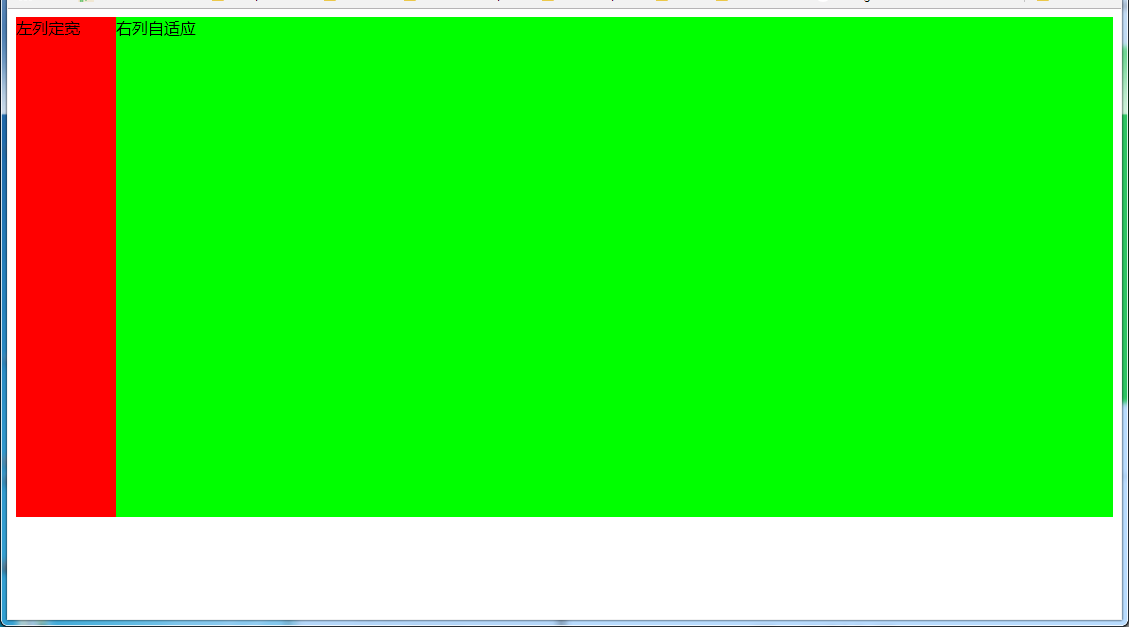
4.1 左列定宽,右列自适应
效果:
(1)利用float+margin实现
html代码:
<body>
<div id="left">左列定宽</div>
<div id="right">右列自适应</div>
</body>
css代码:
#left {
    background-color: #f00;
    float: left;
    width: 100px;
    height: 500px;
}
#right {
    background-color: #0f0;
    height: 500px;
    margin-left: 100px; /*大于等于#left的宽度*/
}
(2)利用float+margin(fix)实现
html代码:
<body>
<div id="left">左列定宽</div>
<div id="right-fix">
    <div id="right">右列自适应</div>
</div>
</body>
css代码:
#left {
    background-color: #f00;
    float: left;
    width: 100px;
    height: 500px;
}
#right-fix {
    float: right;
    width: 100%;
    margin-left: -100px; /*正值大于或等于#left的宽度,才能显示在同一行*/
}
#right{
    margin-left: 100px; /*大于或等于#left的宽度*/
    background-color: #0f0;
    height: 500px;
}
(3)使用float+overflow实现
html代码:
<body>
<div id="left">左列定宽</div>
<div id="right">右列自适应</div>
</body>
css代码:
#left {
    background-color: #f00;
    float: left;
    width: 100px;
    height: 500px;
}
#right {
    background-color: #0f0;
    height: 500px;
    overflow: hidden; /*触发bfc达到自适应*/
}
优缺点:
- 优点:代码简单,容易理解,无需关注定宽的宽度,利用bfc达到自适应效果
- 缺点:浮动脱离文档流,需要手动清除浮动,否则会产生高度塌陷;不支持ie6
(4)使用table实现
html代码:
<div id="parent">
    <div id="left">左列定宽</div>
    <div id="right">右列自适应</div>
</div>
css代码:
#parent{
    width: 100%;
    display: table;
    height: 500px;
}
#left {
    width: 100px;
    background-color: #f00;
}
#right {
    background-color: #0f0;
}
#left,#right{
    display: table-cell;  /*利用单元格自动分配宽度*/
}
优缺点:
- 优点:代码简单,容易理解,无需关注定宽的宽度,利用单元格自动分配达到自适应效果
- 缺点:margin失效;设置间隔比较麻烦;不支持ie8-
(5)使用绝对定位实现
html代码:
<body>
<div id="parent">
    <div id="left">左列定宽</div>
    <div id="right">右列自适应</div>
</div>
</body>
css代码:
#parent{
    position: relative;  /*子绝父相*/
}
#left {
    position: absolute;
    top: 0;
    left: 0;
    background-color: #f00;
    width: 100px;
    height: 500px;
}
#right {
    position: absolute;
    top: 0;
    left: 100px;  /*值大于等于#left的宽度*/
    right: 0;
    background-color: #0f0;
    height: 500px;
}
(6)使用flex实现
html代码:
<body>
<div id="parent">
    <div id="left">左列定宽</div>
    <div id="right">右列自适应</div>
</div>
</body>
css代码:
#parent{
    width: 100%;
    height: 500px;
    display: flex;
}
#left {
    width: 100px;
    background-color: #f00;
}
#right {
    flex: 1; /*均分了父元素剩余空间*/
    background-color: #0f0;
}
(7)使用Grid实现
html代码:
<body>
<div id="parent">
    <div id="left">左列定宽</div>
    <div id="right">右列自适应</div>
</div>
</body>
css代码:
#parent {
    width: 100%;
    height: 500px;
    display: grid;
    grid-template-columns: 100px auto;  /*设定2列就ok了,auto换成1fr也行*/
}
#left {
    background-color: #f00;
}
#right {
    background-color: #0f0;
}
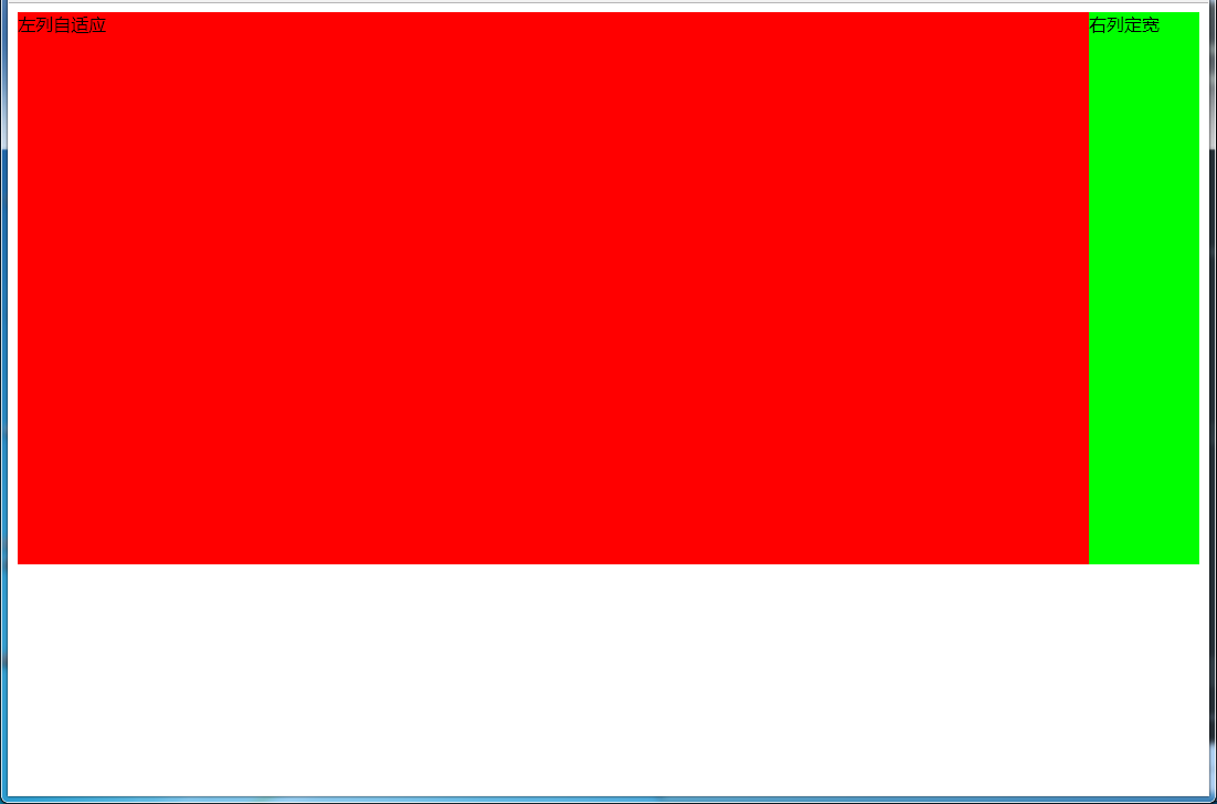
4.2 左列自适应,右列定宽
效果:
(1)使用float+margin实现
html代码:
<body>
<div id="parent">
    <div id="left">左列自适应</div>
    <div id="right">右列定宽</div>
</div>
</body>
css代码:
#parent{
    height: 500px;
    padding-left: 100px;  /*抵消#left的margin-left以达到#parent水平居中*/
}
#left {
    width: 100%;
    height: 500px;
    float: left;
    margin-left: -100px; /*正值等于#right的宽度*/
    background-color: #f00;
}
#right {
    height: 500px;
    width: 100px;
    float: right;
    background-color: #0f0;
}
(2)使用float+overflow实现
html代码:
<body>
<div id="parent">
    <div id="right">右列定宽</div>
    <div id="left">左列自适应</div>   <!--顺序要换一下-->
</div>
</body>
css代码:
#left {
    overflow: hidden;  /*触发bfc*/
    height: 500px;
    background-color: #f00;
}
#right {
    margin-left: 10px;  /*margin需要定义在#right中*/
    float: right;
    width: 100px;
    height: 500px;
    background-color: #0f0;
}
优缺点:
- 优点:代码简单,容易理解,无需关注定宽的宽度,利用bfc达到自适应效果
- 缺点:浮动脱离文档流,需要手动清除浮动,否则会产生高度塌陷;不支持ie6
(3)使用table实现
html代码:
<body>
<div id="parent">
    <div id="left">左列自适应</div>
    <div id="right">右列定宽</div>
</div>
</body>
css代码:
#parent{
    width: 100%;
    height: 500px;
    display: table;
}
#left {
    background-color: #f00;
    display: table-cell;
}
#right {
    width: 100px;
    background-color: #0f0;
    display: table-cell;
}
优缺点:
- 优点:代码简单,容易理解,无需关注定宽的宽度,利用单元格自动分配达到自适应效果
- 缺点:margin失效;设置间隔比较麻烦;不支持ie8-
(4)使用绝对定位实现
html代码:
<body>
<div id="parent">
    <div id="left">左列自适应</div>
    <div id="right">右列定宽</div>
</div>
</body>
css代码:
#parent{
    position: relative;  /*子绝父相*/
}
#left {
    position: absolute;
    top: 0;
    left: 0;
    right: 100px;  /*大于等于#rigth的宽度*/
    background-color: #f00;
    height: 500px;
}
#right {
    position: absolute;
    top: 0;
    right: 0;
    background-color: #0f0;
    width: 100px;
    height: 500px;
}
(5)使用flex实现
html代码:
<body>
<div id="parent">
    <div id="left">左列自适应</div>
    <div id="right">右列定宽</div>
</div>
</body>
css代码:
#parent{
    height: 500px;
    display: flex;
}
#left {
    flex: 1;
    background-color: #f00;
}
#right {
    width: 100px;
    background-color: #0f0;
}
(6)使用Grid实现
html代码:
<body>
<div id="parent">
    <div id="left">左列自适应</div>
    <div id="right">右列定宽</div>
</div>
</body>
css代码:
#parent {
    height: 500px;
    display: grid;
    grid-template-columns: auto 100px;  /*设定2列,auto换成1fr也行*/
}
#left {
    background-color: #f00;
}
#right {
    background-color: #0f0;
}
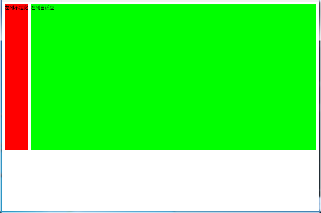
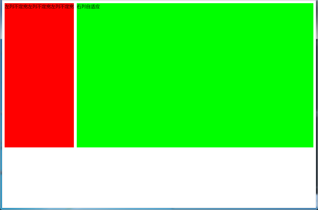
4.3 一列不定,一列自适应
(盒子宽度随着内容增加或减少发生变化,另一个盒子自适应)
效果图:
变化后:
(1)使用float+overflow实现
html代码:
<body>
<div id="parent">
    <div id="left">左列不定宽</div>
    <div id="right">右列自适应</div>
</div>
</body>
css代码:
#left {
    margin-right: 10px;
    float: left;  /*只设置浮动,不设宽度*/
    height: 500px;
    background-color: #f00;
}
#right {
    overflow: hidden;  /*触发bfc*/
    height: 500px;
    background-color: #0f0;
}
优缺点:
- 优点:代码简单,容易理解,无需关注宽度,利用bfc达到自适应效果
- 缺点:浮动脱离文档流,需要手动清除浮动,否则会产生高度塌陷;不支持ie6
(2)使用flex实现
html代码:
<body>
<div id="parent">
    <div id="left">左列不定宽</div>
    <div id="right">右列自适应</div>
</div>
</body>
css代码:
#parent{
    display: flex;
}
#left { /*不设宽度*/
    margin-right: 10px;
    height: 500px;
    background-color: #f00;
}
#right {
    height: 500px;
    background-color: #0f0;
    flex: 1;  /*均分#parent剩余的部分*/
}
(3)使用Grid实现
html代码:
<body>
<div id="parent">
    <div id="left">左列不定宽</div>
    <div id="right">右列自适应</div>
</div>
</body>
css代码:
#parent{
    display: grid;
    grid-template-columns: auto 1fr;  /*auto和1fr换一下顺序就是左列自适应,右列不定宽了*/
}
#left {
    margin-right: 10px;
    height: 500px;
    background-color: #f00;
}
#right {
    height: 500px;
    background-color: #0f0;
}
左列自适应,右列不定宽同理(参考4.1和4.3对应代码示例)
五、三列布局
5.1 两列定宽,一列自适应
效果图:
(1)使用float+margin实现
html代码:
<body>
<div id="parent">
    <div id="left">左列定宽</div>
    <div id="center">中间定宽</div>
    <div id="right">右列自适应</div>
</div>
</body>
css代码:
#parent{
    min-width: 310px; /*100+10+200,防止宽度不够,子元素换行*/
}
#left {
    margin-right: 10px;  /*#left和#center间隔*/
    float: left;
    width: 100px;
    height: 500px;
    background-color: #f00;
}
#center{
    float: left;
    width: 200px;
    height: 500px;
    background-color: #eeff2b;
}
#right {
    margin-left: 320px;  /*等于#left和#center的宽度之和加上间隔,多出来的就是#right和#center的间隔*/
    height: 500px;
    background-color: #0f0;
}
(2)使用float+overflow实现
html代码:
<body>
<div id="parent">
    <div id="left">左列定宽</div>
    <div id="center">中间定宽</div>
    <div id="right">右列自适应</div>
</div>
</body>
css代码:
#parent{
    min-width: 320px; /*100+10+200+20,防止宽度不够,子元素换行*/
}
#left {
    margin-right: 10px; /*间隔*/
    float: left;
    width: 100px;
    height: 500px;
    background-color: #f00;
}
#center{
    margin-right: 10px; /*在此定义和#right的间隔*/
    float: left;
    width: 200px;
    height: 500px;
    background-color: #eeff2b;
}
#right {
    overflow: hidden;  /*触发bfc*/
    height: 500px;
    background-color: #0f0;
}
优缺点:
- 优点:代码简单,容易理解,无需关注定宽的宽度,利用bfc达到自适应效果
- 缺点:浮动脱离文档流,需要手动清除浮动,否则会产生高度塌陷;不支持ie6
(3)使用table实现
html代码:
<body>
<div id="parent">
    <div id="left">左列定宽</div>
    <div id="center">中间定宽</div>
    <div id="right">右列自适应</div>
</div>
</body>
css代码:
#parent {
    width: 100%;
    height: 520px; /*抵消上下间距10*2的高度影响*/
    margin: -10px 0;  /*抵消上下边间距10的位置影响*/
    display: table;
    /*左右两边间距大了一点,子元素改用padding设置盒子间距就没有这个问题*/
    border-spacing: 10px;  /*关键!!!设置间距*/
}
#left {
    display: table-cell;
    width: 100px;
    background-color: #f00;
}
#center {
    display: table-cell;
    width: 200px;
    background-color: #eeff2b;
}
#right {
    display: table-cell;
    background-color: #0f0;
}
优缺点:
- 优点:代码简单,容易理解,无需关注定宽的宽度,利用单元格自动分配达到自适应效果
- 缺点:margin失效;设置间隔比较麻烦;不支持ie8-
(4)使用flex实现
html代码:
<body>
<div id="parent">
    <div id="left">左列定宽</div>
    <div id="center">中间定宽</div>
    <div id="right">右列自适应</div>
</div>
</body>
css代码:
#parent {
    height: 500px;
    display: flex;
}
#left {
    margin-right: 10px;  /*间距*/
    width: 100px;
    background-color: #f00;
}
#center {
    margin-right: 10px;  /*间距*/
    width: 200px;
    background-color: #eeff2b;
}
#right {
    flex: 1;  /*均分#parent剩余的部分达到自适应*/
    background-color: #0f0;
}
(5)使用Grid实现
html代码:
<body>
<div id="parent">
    <div id="left">左列定宽</div>
    <div id="center">中间定宽</div>
    <div id="right">右列自适应</div>
</div>
</body>
css代码:
#parent {
    height: 500px;
    display: grid;
    grid-template-columns: 100px 200px auto; /*设置3列,固定第一第二列的宽度,第三列auto或者1fr*/
}
#left {
    margin-right: 10px;  /*间距*/
    background-color: #f00;
}
#center {
    margin-right: 10px;  /*间距*/
    background-color: #eeff2b;
}
#right {
    background-color: #0f0;
}
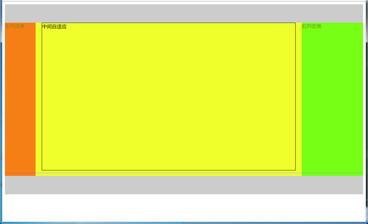
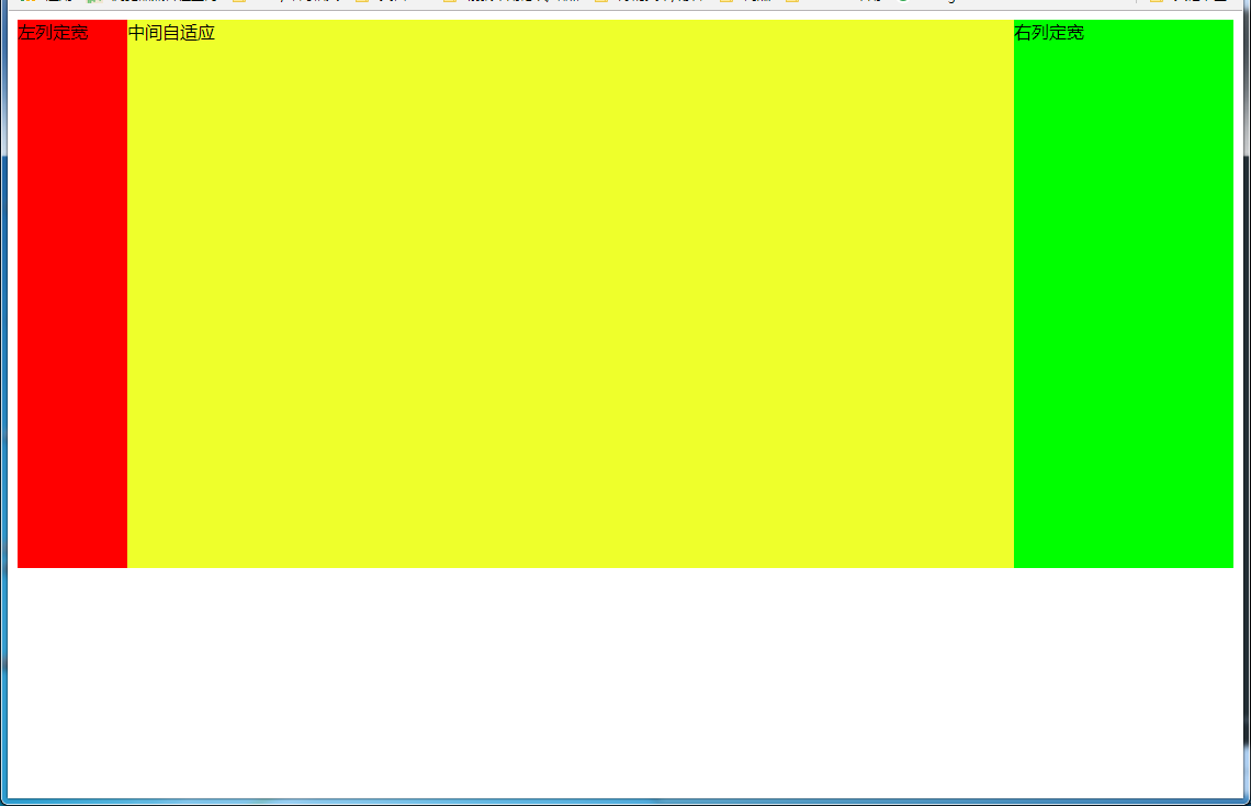
5.2 两侧定宽,中间自适应
5.2.1 双飞翼布局方法
效果图:
html代码:
<body>
<div id="header"></div>
<!--中间栏需要放在前面-->
<div id="parent">
    <div id="center">
        <div id="center_inbox">中间自适应</div>
        <hr>  <!--方便观察原理-->
    </div>
    <div id="left">左列定宽</div>
    <div id="right">右列定宽</div>
</div>
<div id="footer"></div>
</body>
css代码:
#header {
    height: 60px;
    background-color: #ccc;
}
#left {
    float: left;
    width: 100px;
    height: 500px;
    margin-left: -100%; /*调整#left的位置,值等于自身宽度*/
    background-color: #f00;
    opacity: 0.5;
}
#center {
    height: 500px;
    float: left;
    width: 100%;
    background-color: #eeff2b;
}
#center_inbox{
    height: 480px;
    border: 1px solid #000;
    margin: 0 220px 0 120px;  /*关键!!!左右边界等于左右盒子的宽度,多出来的为盒子间隔*/
}
#right {
    float: left;
    width: 200px;
    height: 500px;
    margin-left: -200px;  /*使right到指定的位置,值等于自身宽度*/
    background-color: #0f0;
    opacity: 0.5;
}
#footer {
    clear: both;  /*注意清除浮动!!*/
    height: 60px;
    background-color: #ccc;
}
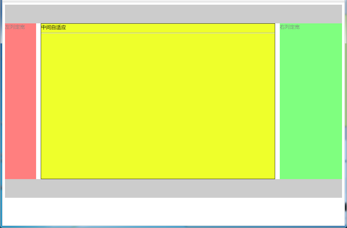
5.2.2 圣杯布局方法
效果图:
html代码:
<body>
<div id="header"></div>
<div id="parent">
    <!--#center需要放在前面-->
    <div id="center">中间自适应
        <hr>
    </div>
    <div id="left">左列定宽</div>
    <div id="right">右列定宽</div>
</div>
<div id="footer"></div>
</body>
css代码:
#header{
    height: 60px;
    background-color: #ccc;
}
#parent {
    box-sizing: border-box;
    height: 500px;
    padding: 0 215px 0 115px;  /*为了使#center摆正,左右padding分别等于左右盒子的宽,可以结合左右盒子相对定位的left调整间距*/
}
#left {
    margin-left: -100%;  /*使#left上去一行*/
    position: relative;
    left: -115px;  /*相对定位调整#left的位置,正值大于或等于自身宽度*/
    float: left;
    width: 100px;
    height: 500px;
    background-color: #f00;
    opacity: 0.5;
}
#center {
    float: left;
    width: 100%;  /*由于#parent的padding,达到自适应的目的*/
    height: 500px;
    box-sizing: border-box;
    border: 1px solid #000;
    background-color: #eeff2b;
}
#right {
    position: relative;
    left: 215px; /*相对定位调整#right的位置,大于或等于自身宽度*/
    width: 200px;
    height: 500px;
    margin-left: -200px;  /*使#right上去一行*/
    float: left;
    background-color: #0f0;
    opacity: 0.5;
}
#footer{
    height: 60px;
    background-color: #ccc;
}
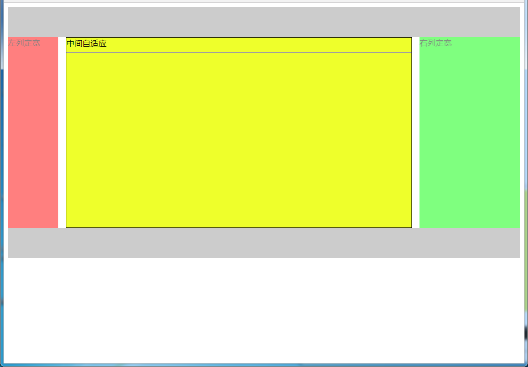
5.2.3 使用Grid实现
效果图:
html代码:
<body>
<div id="parent">
    <div id="header"></div>
    <!--#center需要放在前面-->
    <div id="center">中间自适应
        <hr>
    </div>
    <div id="left">左列定宽</div>
    <div id="right">右列定宽</div>
    <div id="footer"></div>
</div>
</body>
css代码:
#parent {
    height: 500px;
    display: grid;
    grid-template-columns: 100px auto 200px; /*设定3列*/
    grid-template-rows: 60px auto 60px; /*设定3行*/
    /*设置网格区域分布*/
    grid-template-areas:
        "header header header"
        "leftside main rightside"
        "footer footer footer";
}
#header {
    grid-area: header; /*指定在哪个网格区域*/
    background-color: #ccc;
}
#left {
    grid-area: leftside;
    background-color: #f00;
    opacity: 0.5;
}
#center {
    grid-area: main; /*指定在哪个网格区域*/
    margin: 0 15px; /*设置间隔*/
    border: 1px solid #000;
    background-color: #eeff2b;
}
#right {
    grid-area: rightside; /*指定在哪个网格区域*/
    background-color: #0f0;
    opacity: 0.5;
}
#footer {
    grid-area: footer; /*指定在哪个网格区域*/
    background-color: #ccc;
}
5.2.4 其他方法
效果图:
(1)使用table实现
html代码:
<body>
<div id="parent">
    <div id="left">左列定宽</div>
    <div id="center">中间自适应</div>
    <div id="right">右列定宽</div>
</div>
</body>
css代码:
#parent {
    width: 100%;
    height: 500px;
    display: table;
}
#left {
    display: table-cell;
    width: 100px;
    background-color: #f00;
}
#center {
    display: table-cell;
    background-color: #eeff2b;
}
#right {
    display: table-cell;
    width: 200px;
    background-color: #0f0;
}
优缺点:
- 优点:代码简洁,容易理解;
- 缺点:margin失效,采用border-spacing表格两边的间隔无法消除;不支持ie8-
(2)使用flex实现
html代码:
<body>
<div id="parent">
    <div id="left">左列定宽</div>
    <div id="center">中间自适应</div>
    <div id="right">右列定宽</div>
</div>
</body>
css代码:
#parent {
    height: 500px;
    display: flex;
}
#left {
    width: 100px;
    background-color: #f00;
}
#center {
    flex: 1;  /*均分#parent剩余的部分*/
    background-color: #eeff2b;
}
#right {
    width: 200px;
    background-color: #0f0;
}
(3)使用position实现
html代码:
<body>
<div id="parent">
    <div id="left">左列定宽</div>
    <div id="center">中间自适应</div>
    <div id="right">右列定宽</div>
</div>
</body>
css代码:
#parent {
    position: relative; /*子绝父相*/
}
#left {
    position: absolute;
    top: 0;
    left: 0;
    width: 100px;
    height: 500px;
    background-color: #f00;
}
#center {
    height: 500px;
    margin-left: 100px; /*大于等于#left的宽度,或者给#parent添加同样大小的padding-left*/
    margin-right: 200px;  /*大于等于#right的宽度,或者给#parent添加同样大小的padding-right*/
    background-color: #eeff2b;
}
#right {
    position: absolute;
    top: 0;
    right: 0;
    width: 200px;
    height: 500px;
    background-color: #0f0;
}
优缺点:
- 优点:容易理解,兼容性比较好
- 缺点:需手动计算宽度确定边距;脱离文档流;代码繁多
六、多列布局
6.1 等宽布局
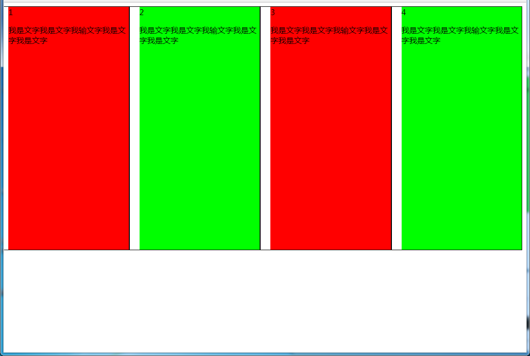
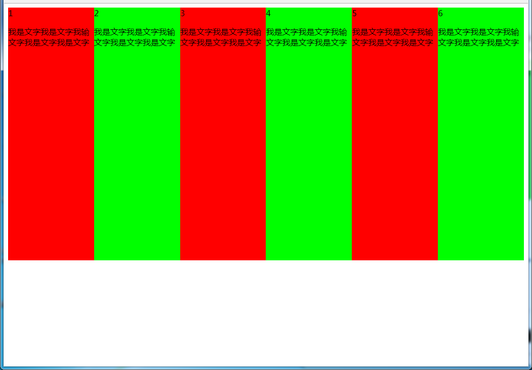
6.1.1 四列等宽
(1)使用float实现
效果图:
html代码:
<body>
<div id="parent">
    <div class="column">1 <p>我是文字我是文字我输文字我是文字我是文字</p></div>
    <div class="column">2 <p>我是文字我是文字我输文字我是文字我是文字</p></div>
    <div class="column">3 <p>我是文字我是文字我输文字我是文字我是文字</p></div>
    <div class="column">4 <p>我是文字我是文字我输文字我是文字我是文字</p></div>
</div>
</body>
css代码:
#parent {
    margin-left: -20px; /*使整体内容看起来居中,抵消padding-left的影响*/
}
.column{
    padding-left: 20px;  /*盒子的边距*/
    width: 25%;
    float: left;
    box-sizing: border-box;
    border: 1px solid #000;
    background-clip: content-box; /*背景色从内容开始绘制,方便观察*/
    height: 500px;
}
.column:nth-child(odd){
    background-color: #f00;
}
.column:nth-child(even){
    background-color: #0f0;
}
优缺点:
- 优点:代码简单,容易理解;兼容性较好
- 缺点:需要手动清除浮动,否则会产生高度塌陷
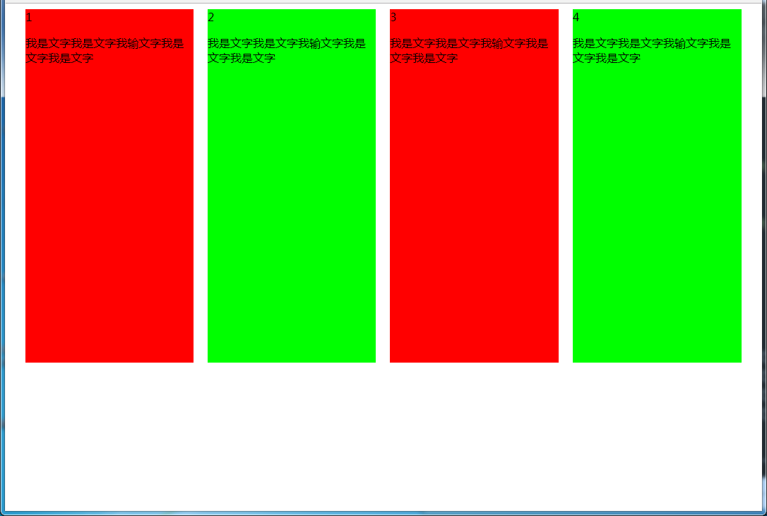
(2)使用table实现
效果图:
html代码:
<body>
<div id="parent">
    <div class="column">1 <p>我是文字我是文字我输文字我是文字我是文字</p></div>
    <div class="column">2 <p>我是文字我是文字我输文字我是文字我是文字</p></div>
    <div class="column">3 <p>我是文字我是文字我输文字我是文字我是文字</p></div>
    <div class="column">4 <p>我是文字我是文字我输文字我是文字我是文字</p></div>
</div>
</body>
css代码:
#parent {
    height: 540px;  /*抵消上下边20*2间距的高度影响*/
    display: table;
    margin: -20px 0;  /*抵消上下边20*2间距的位置影响*/
    /*两边离页面间距较大,改用子元素设置padding来当成间隔就不会有这样的问题*/
    border-spacing: 20px;  /*设置间距*/
}
.column{
    display: table-cell;
}
.column:nth-child(odd){
    background-color: #f00;
}
.column:nth-child(even){
    background-color: #0f0;
}
优缺点:
- 优点:代码简单,容易理解;无需关注宽度,单元格自动等分
- 缺点:margin失效;设置间隔比较麻烦;不支持ie8-
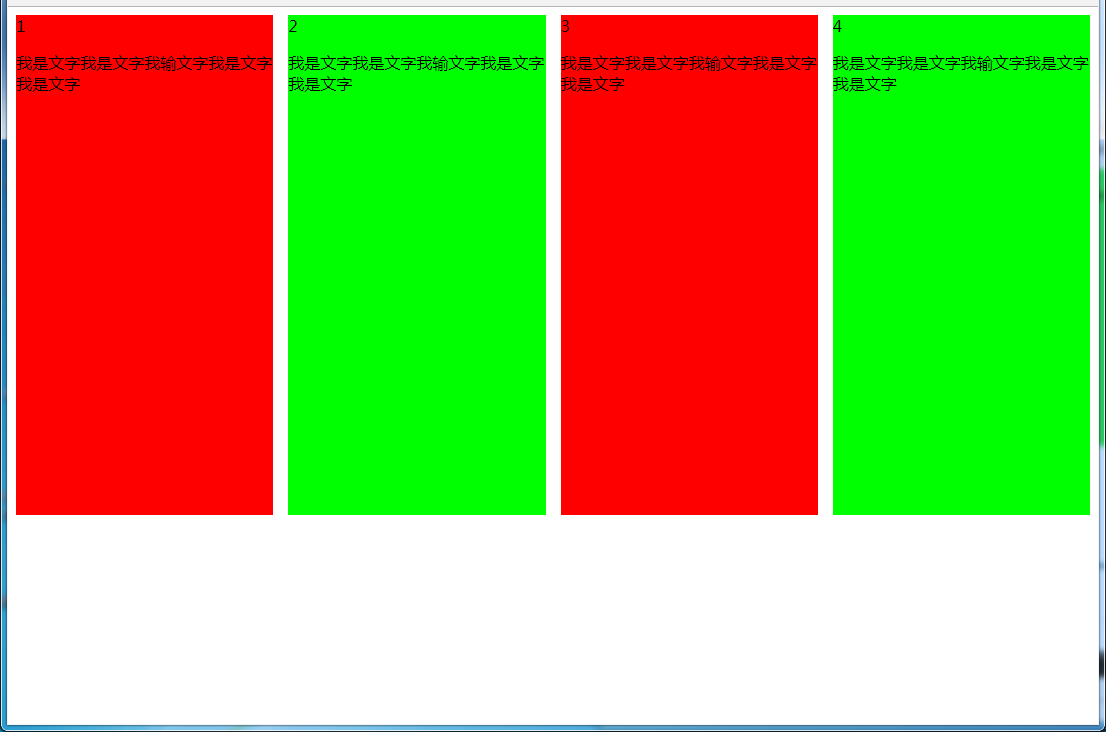
(3)使用flex实现
效果图:
html代码:
<body>
<div id="parent">
    <div class="column">1 <p>我是文字我是文字我输文字我是文字我是文字</p></div>
    <div class="column">2 <p>我是文字我是文字我输文字我是文字我是文字</p></div>
    <div class="column">3 <p>我是文字我是文字我输文字我是文字我是文字</p></div>
    <div class="column">4 <p>我是文字我是文字我输文字我是文字我是文字</p></div>
</div>
</body>
css代码:
#parent {
    margin-left: -15px;  /*使内容看起来居中*/
    height: 500px;
    display: flex;
}
.column{
    flex: 1; /*一起平分#parent*/
    margin-left: 15px; /*设置间距*/
}
.column:nth-child(odd){
    background-color: #f00;
}
.column:nth-child(even){
    background-color: #0f0;
}
多列等宽
效果图:
(1)使用float实现
html代码:
<body>
<div id="parent">
    <div class="column">1 <p>我是文字我是文字我输文字我是文字我是文字</p></div>
    <div class="column">2 <p>我是文字我是文字我输文字我是文字我是文字</p></div>
    <div class="column">3 <p>我是文字我是文字我输文字我是文字我是文字</p></div>
    <div class="column">4 <p>我是文字我是文字我输文字我是文字我是文字</p></div>
    <div class="column">5 <p>我是文字我是文字我输文字我是文字我是文字</p></div>
    <div class="column">6 <p>我是文字我是文字我输文字我是文字我是文字</p></div>
</div>
</body>
css代码:
#parent {
    height: 500px;
}
.column{
    float: left;  /*添加浮动*/
    width: 16.66666666666667%;  /*100÷列数,得出百分比*/
    height: 500px;
}
.column:nth-child(odd){
    background-color: #f00;
}
.column:nth-child(even){
    background-color: #0f0;
}
优缺点:
- 优点:代码简单,容易理解;兼容性较好
- 缺点:需要手动清除浮动,否则会产生高度塌陷
(2)使用table实现
html代码
<body>
<div id="parent">
    <div class="column">1 <p>我是文字我是文字我输文字我是文字我是文字</p></div>
    <div class="column">2 <p>我是文字我是文字我输文字我是文字我是文字</p></div>
    <div class="column">3 <p>我是文字我是文字我输文字我是文字我是文字</p></div>
    <div class="column">4 <p>我是文字我是文字我输文字我是文字我是文字</p></div>
    <div class="column">5 <p>我是文字我是文字我输文字我是文字我是文字</p></div>
    <div class="column">6 <p>我是文字我是文字我输文字我是文字我是文字</p></div>
</div>
</body>
css代码:
#parent {
    width: 100%;
    height: 500px;
    display: table;
}
.column{
    display: table-cell; /*无需关注列数,单元格自动平分*/
}
.column:nth-child(odd){
    background-color: #f00;
}
.column:nth-child(even){
    background-color: #0f0;
}
优缺点:
- 优点:代码简单,容易理解;无需关注宽度。单元格自动等分
- 缺点:margin失效;设置间隔比较麻烦;不兼容ie8-
(3)使用flex实现
html代码:
<body>
<div id="parent">
    <div class="column">1 <p>我是文字我是文字我输文字我是文字我是文字</p></div>
    <div class="column">2 <p>我是文字我是文字我输文字我是文字我是文字</p></div>
    <div class="column">3 <p>我是文字我是文字我输文字我是文字我是文字</p></div>
    <div class="column">4 <p>我是文字我是文字我输文字我是文字我是文字</p></div>
    <div class="column">5 <p>我是文字我是文字我输文字我是文字我是文字</p></div>
    <div class="column">6 <p>我是文字我是文字我输文字我是文字我是文字</p></div>
</div>
</body>
css代码:
#parent {
    height: 500px;
    display: flex;
}
.column{
    flex: 1;  /*无需关注列数,一起平分#parent*/
}
.column:nth-child(odd){
    background-color: #f00;
}
.column:nth-child(even){
    background-color: #0f0;
}
(4)使用Grid实现
html代码:
<body>
<div id="parent">
    <div class="column">1 <p>我是文字我是文字我输文字我是文字我是文字</p></div>
    <div class="column">2 <p>我是文字我是文字我输文字我是文字我是文字</p></div>
    <div class="column">3 <p>我是文字我是文字我输文字我是文字我是文字</p></div>
    <div class="column">4 <p>我是文字我是文字我输文字我是文字我是文字</p></div>
    <div class="column">5 <p>我是文字我是文字我输文字我是文字我是文字</p></div>
    <div class="column">6 <p>我是文字我是文字我输文字我是文字我是文字</p></div>
</div>
</body>
css代码:
#parent {
    height: 500px;
    display: grid;
    grid-template-columns: repeat(6,1fr);  /*6就是列数*/
}
.column{}
.column:nth-child(odd){
    background-color: #f00;
}
.column:nth-child(even){
    background-color: #0f0;
}
6.2 九宫格布局
效果图:
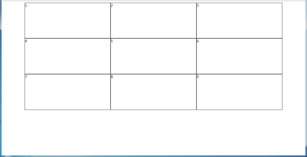
(1)使用table实现
html代码:
<body>
<div id="parent">
    <div class="row">
        <div class="item">1</div>
        <div class="item">2</div>
        <div class="item">3</div>
    </div>
    <div class="row">
        <div class="item">4</div>
        <div class="item">5</div>
        <div class="item">6</div>
    </div>
    <div class="row">
        <div class="item">7</div>
        <div class="item">8</div>
        <div class="item">9</div>
    </div>
</div>
</body>
css代码:
#parent {
    width: 1200px;
    height: 500px;
    margin: 0 auto;
    display: table;
}
.row {
    display: table-row;
}
.item {
    border: 1px solid #000;
    display: table-cell;
}
优缺点:
- 优点:代码简洁,容易理解;
- 缺点:margin失效,采用border-spacing表格两边的间隔无法消除;不支持ie8-
(2)使用flex实现
html代码:
<body>
<div id="parent">
    <div class="row">
        <div class="item">1</div>
        <div class="item">2</div>
        <div class="item">3</div>
    </div>
    <div class="row">
        <div class="item">4</div>
        <div class="item">5</div>
        <div class="item">6</div>
    </div>
    <div class="row">
        <div class="item">7</div>
        <div class="item">8</div>
        <div class="item">9</div>
    </div>
</div>
</body>
css代码:
#parent {
    width: 1200px;
    height: 500px;
    margin: 0 auto;
    display: flex;
    flex-direction: column;
}
.row {
    display: flex;
    flex: 1;
}
.item {
    flex: 1;
    border: 1px solid #000;
}
(3)使用Grid实现
CSS Grid非常强大,可以实现各种各样的三维布局,可查阅本文结尾的阅读推荐
html代码:
<body>
<div id="parent">
    <div class="item">1</div>
    <div class="item">2</div>
    <div class="item">3</div>
    <div class="item">4</div>
    <div class="item">5</div>
    <div class="item">6</div>
    <div class="item">7</div>
    <div class="item">8</div>
    <div class="item">9</div>
</div>
</body>
css代码:
#parent {
    width: 1200px;
    height: 500px;
    margin: 0 auto;
    display: grid;
    grid-template-columns: repeat(3, 1fr); /*等同于1fr 1fr 1fr,此为重复的合并写法*/
    grid-template-rows: repeat(3, 1fr);  /*等同于1fr 1fr 1fr,此为重复的合并写法*/
}
.item {
    border: 1px solid #000;
}
6.3 栅格系统
优缺点:
- 优点:代码简洁,容易理解;提高页面内容的流动性,能适应多种设备;
(1)用Less生成
/*生成栅格系统*/
@media screen and (max-width: 768px){
  .generate-columns(12);     /*此处设置生成列数*/
  .generate-columns(@n, @i: 1) when (@i <= @n) {
    .column-xs-@{i} {
      width: (@i * 100% / @n);
    }
    .generate-columns(@n, (@i+1));
  }
}
@media screen and (min-width: 768px){
  .generate-columns(12);    /*此处设置生成列数*/
  .generate-columns(@n, @i: 1) when (@i <= @n) {
    .column-sm-@{i} {
      width: (@i * 100% / @n);
    }
    .generate-columns(@n, (@i+1));
  }
}
div[class^="column-xs-"]{
	float: left;
}
div[class^="column-sm-"]{
	float: left;
}
编译后的CSS代码:
@media screen and (max-width: 768px) {
  .column-xs-1 {  width: 8.33333333%;  }
  .column-xs-2 {  width: 16.66666667%;  }
  .column-xs-3 {  width: 25%;  }
  .column-xs-4 {  width: 33.33333333%;  }
  .column-xs-5 {  width: 41.66666667%;  }
  .column-xs-6 {  width: 50%;  }
  .column-xs-7 {  width: 58.33333333%;  }
  .column-xs-8 {  width: 66.66666667%;  }
  .column-xs-9 {  width: 75%;  }
  .column-xs-10 {  width: 83.33333333%;  }
  .column-xs-11 {  width: 91.66666667%;  }
  .column-xs-12 {  width: 100%;  }
}
@media screen and (min-width: 768px) {
  .column-sm-1 {  width: 8.33333333%;  }
  .column-sm-2 {  width: 16.66666667%;  }
  .column-sm-3 {  width: 25%;  }
  .column-sm-4 {  width: 33.33333333%;  }
  .column-sm-5 {  width: 41.66666667%;  }
  .column-sm-6 {  width: 50%;  }
  .column-sm-7 {  width: 58.33333333%;  }
  .column-sm-8 {  width: 66.66666667%;  }
  .column-sm-9 {  width: 75%;  }
  .column-sm-10 {  width: 83.33333333%;  }
  .column-sm-11 {  width: 91.66666667%;  }
  .column-sm-12 {  width: 100%;  }
}
div[class^="column-xs-"]{
	float: left;
}
div[class^="column-sm-"]{
	float: left;
}
七、全屏布局
效果图:
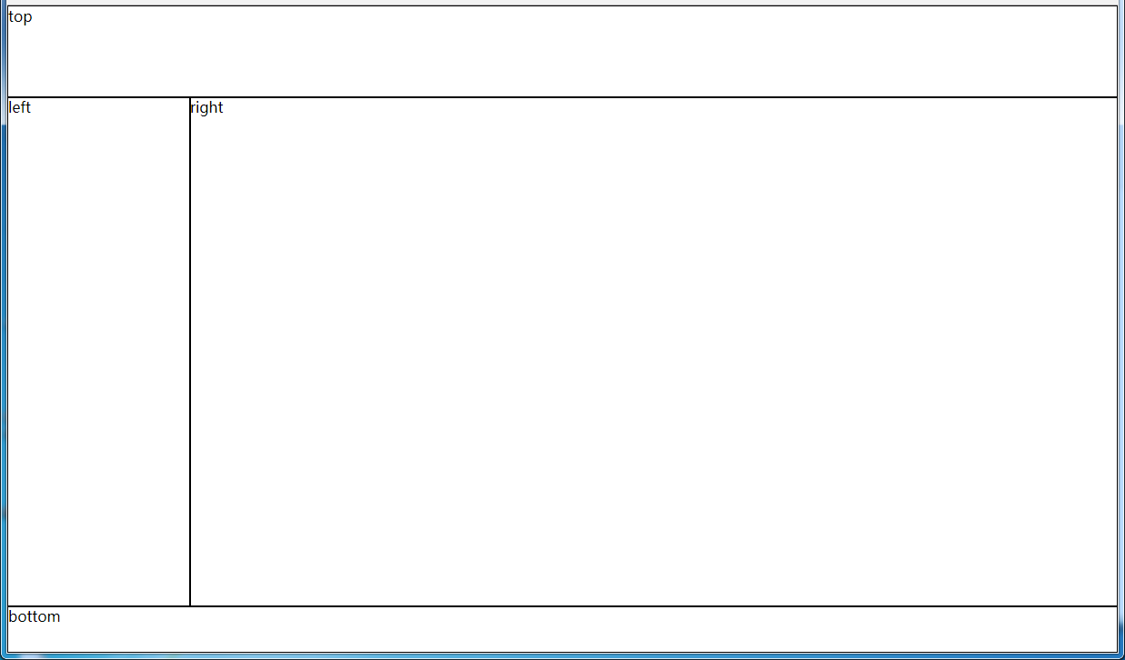
(1)使用绝对定位实现
html代码:
<body>
<div id="parent">
    <div id="top">top</div>
    <div id="left">left</div>
    <div id="right">right</div>
    <div id="bottom">bottom</div>
</div>
</body>
css代码:
html, body, #parent {height: 100%;overflow: hidden;}
#parent > div {
    border: 1px solid #000;
}
#top {
    position: absolute;
    top: 0;
    left: 0;
    right: 0;
    height: 100px;
}
#left {
    position: absolute;
    top: 100px;  /*值大于等于#top的高度*/
    left: 0;
    bottom: 50px;  /*值大于等于#bottom的高度*/
    width: 200px;
}
#right {
    position: absolute;
    overflow: auto;
    left: 200px;  /*值大于等于#left的宽度*/
    right: 0;
    top: 100px;  /*值大于等于#top的高度*/
    bottom: 50px;  /*值大于等于#bottom的高度*/
}
#bottom {
    position: absolute;
    left: 0;
    right: 0;
    bottom: 0;
    height: 50px;
}
优缺点:
- 优点:容易理解
- 缺点:代码繁多;需要计算好各个盒子的宽高;
(2)使用flex实现
html代码:
<body>
<div id="parent">
    <div id="top">top</div>
    <div id="middle">
        <div id="left">left</div>
        <div id="right">right</div>
    </div>
    <div id="bottom">bottom</div>
</div>
</body>
css代码:
*{
    margin: 0;
    padding: 0;
}
html,body,#parent{
    height:100%;
}
#parent {
    display: flex;
    flex-direction: column;
}
#top {
    height: 100px;
}
#bottom {
    height: 50px;
}
#middle {
    flex: 1;
    display: flex;
}
#left {
    width: 200px;
}
#right {
    flex: 1;
    overflow: auto;
}
(3)使用Grid实现
html代码:
<body>
<div id="parent">
    <div id="top">top</div>
    <div id="left">left</div>
    <div id="right">right</div>
    <div id="bottom">bottom</div>
</div>
</body>
css代码:
*{
    margin: 0;
    padding: 0;
}
html, body, #parent {
    height: 100%;
}
#parent {
    width: 100%;
    height: 100%;
    display: grid;
    /*分成2列,第一列宽度200px,第二列1fr平分剩余的部分,此处换成auto也行*/
    grid-template-columns: 200px 1fr;
    /*分成3行,第一行高度100px,第二行auto为自适应,此处换成1fr也行,第3行高度为50px*/
    grid-template-rows: 100px auto 50px;
    /*定义网格区域分布*/
    grid-template-areas:
        "header header"
        "aside main"
        "footer footer";
}
#parent>div{
    border: 1px solid #000;
}
#top{
    grid-area: header;  /*指定在哪个网格区域*/
}
#left{
    grid-area: aside;  /*指定在哪个网格区域*/
}
#right{
    grid-area: main;  /*指定在哪个网格区域*/
}
#bottom{
    grid-area: footer;  /*指定在哪个网格区域*/
}
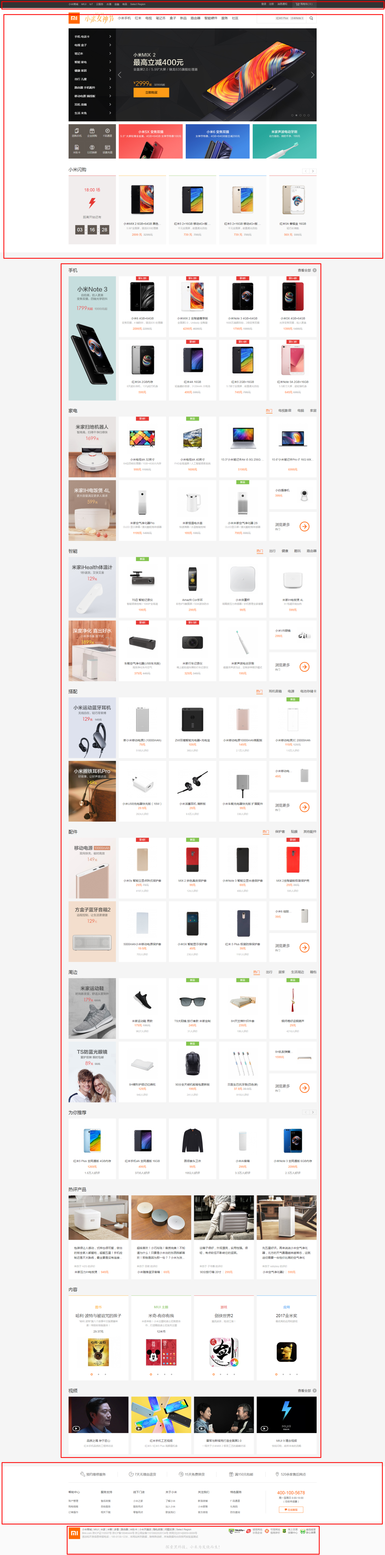
八、网站实例布局分析:
由于方法众多,分析的时候想到哪种用哪种了,只要IE9和谷歌上表现一致,我就不一一测试其他浏览器了,如果有什么问题或意见,请留言!
8.1 小米官网
https://www.mi.com/
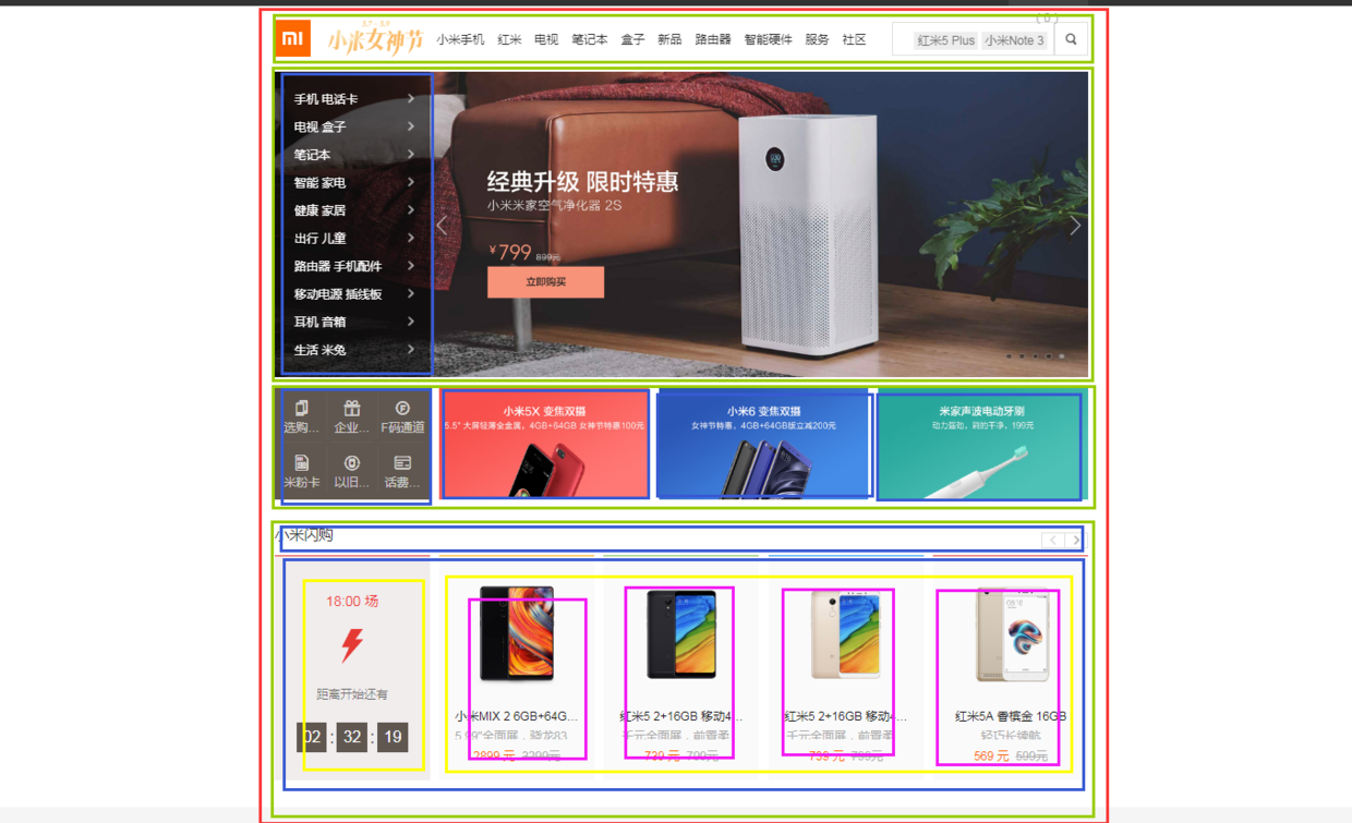
8.1.1 兼容IE9+的方法
(1)页面整体
整个页面我们可以分成顶、上、中、下、底五个结构,如图所示:
html代码:
<body>
<div class="header"></div>
<div class="top"></div>
<div class="center"></div>
<div class="bottom"></div>
<div class="footer"></div>
</body>
css代码:
*{  /*为了方便,就这样清空默认样式了*/
    margin: 0;
    padding: 0;
    box-sizing: border-box;
    list-style: none;
}
body{
    background-color: #f5f5f5;
}
.header{
    margin-bottom: 20px;
    height: 40px;
    background-color: #333;
}
.top{
    height: 1210px;
    background-color: #fff;
}
.center{
    width: 1226px;
    margin: 0 auto;
    margin-bottom: 60px;
    height: 1791px;
    background-color: #fff;
}
.bottom{
    height: 274px;
    background-color: #fff;
}
.footer{
    margin: 0 auto;
    width: 1226px;
    height: 166px;
    border: 1px solid #000;
}
(2)局部——header
header部分首先是一个水平居中的内容,内容盒子可以分成左右两个部分,如图所示:

html代码:
<div class="header">
    <div class="container">
        <div class="header-left"></div>
        <div class="header-rigth"></div>
    </div>
</div>
css代码:
.container{  /*后面会继续用到*/
    width: 1226px;
    height: 100%;
    margin: 0 auto;
    border: 1px solid #f00;
}
.header-left{
    width: 380px;
    height: 100%;
    float: left;
    background-color: #0f0;
}
.header-rigth{
    width: 260px;
    height: 100%;
    float: right;
    background-color: #0f0;
}
(3)局部——top
top部分先有一个水平居中的内容,再就是内容由上到下可以分成四个部分,然后每个部分再细分......说不下去了,直接上图:
html代码:
<div class="top">
    <div class="container">
        <div class="top-nav"></div>
        <div class="top-slider">
            <div class="slider-navbar"></div>
        </div>
        <div class="top-recommend">
            <div class="recommend-left"></div>
            <div class="recommend-right">
                <ul>
                    <li></li>
                    <li></li>
                    <li></li>
                </ul>
            </div>
        </div>
        <div class="top-flashsale">
            <div class="flashsale-title"></div>
            <div class="flashsale-content">
                <div class="content-timer"></div>
                <ul class="content-shops">
                    <li></li>
                    <li></li>
                    <li></li>
                    <li></li>
                </ul>
            </div>
        </div>
    </div>
</div>
css代码:
.top {
    height: 1210px;
    background-color: #fff;
}
.top-nav {
    height: 100px;
    background-color: #f00;
}
.top-slider {
    margin-bottom: 14px;
    position: relative;
    height: 460px;
    background-color: #00f;
}
.slider-navbar {
    position: absolute;
    top: 0;
    left: 0;
    width: 234px;
    height: 100%;
    background-color: black;
    opacity: .5;
}
.top-recommend {
    margin-bottom: 26px;
    height: 170px;
    background-color: #0f0;
}
.recommend-left {
    float: left;
    height: 100%;
    width: 234px;
    background-color: skyblue;
}
.recommend-right {
    float: right;
    width: 978px;
    height: 100%;
    border: 1px solid #000;
}
.recommend-right > ul {
    height: 100%;
}
.recommend-right > ul li {
    float: left;
    width: 316px;
    height: 100%;
    background-color: deepskyblue;
}
.recommend-right > ul li + li {
    margin-left: 14px;
}
.top-flashsale {
    height: 438px;
    background-color: #ff4455;
}
.flashsale-title {
    height: 58px;
    background-color: purple;
}
.flashsale-content {
    border: 1px solid #000;
    padding-bottom: 40px;
    height: 380px;
}
.content-timer {
    margin-right: 14px;
    float: left;
    width: 234px;
    height: 100%;
    background-color: #fff;
}
.content-shops {
    overflow: hidden;
    height: 100%;
    background-color: #6effb1;
}
.content-shops > li {
    float: left;
    width: 234px;
    height: 100%;
    background-color: #fff;
}
.content-shops > li+li {
    margin-left: 12.5px;
}
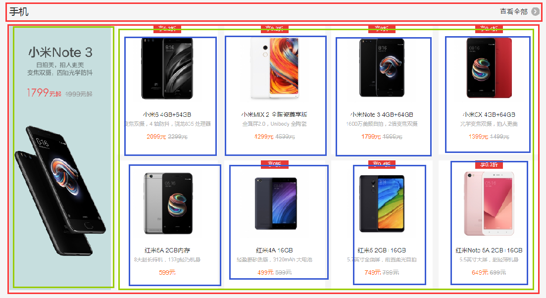
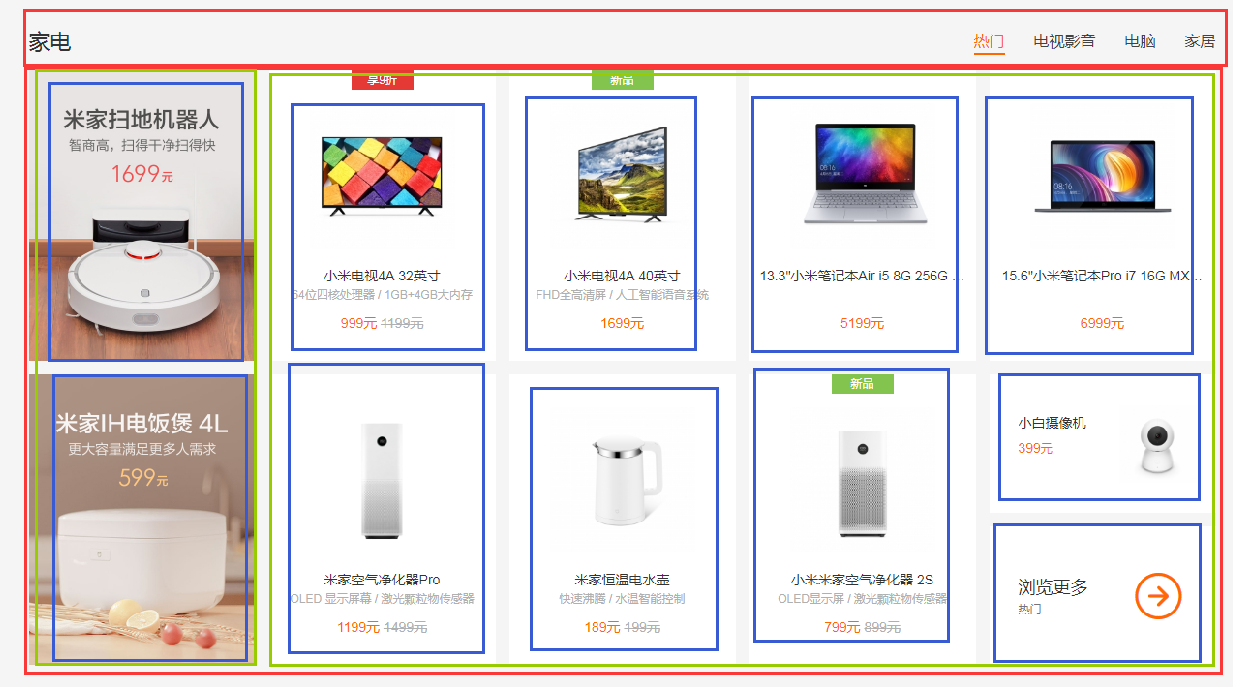
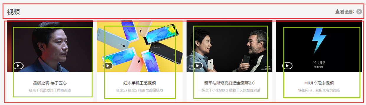
(4)局部——center
center部分都是一些单元格展示,有很多类似的模块,就挑几个来实现了,直接看图吧:
html代码:
<div class="center">
    <div class="center-phone">
        <div class="phone-title"></div>
        <div class="phone-content">
            <div class="phone-left"></div>
            <ul class="phone-right">
                <li></li>
                <li></li>
                <li></li>
                <li></li>
                <li></li>
                <li></li>
                <li></li>
                <li></li>
            </ul>
        </div>
    </div>

    <div class="center-household">
        <div class="household-title"></div>
        <div class="household-content">
            <li></li>
            <li></li>
            <li></li>
            <li></li>
            <li></li>
            <li></li>
            <li></li>
            <li></li>
            <li></li>
            <li>
                <p></p>
                <p></p>
            </li>
        </div>
    </div>

    <div class="center-video">
        <div class="video-title"></div>
        <ul class="video-content">
            <li></li>
            <li></li>
            <li></li>
            <li></li>
        </ul>
    </div>
</div>
css代码:
.center {
    margin: 0 auto;
    margin-bottom: 60px;
    padding-top: 60px;
    width: 1226px;
    height: 1791px;
    background-color: #fff;
}
.center-phone{
    margin-bottom: 8px;
    height: 686px;
    background-color: yellow;
}
.phone-title{
    height: 58px;
    background-color: black;
}
.phone-content{
    height: 628px;
    background-color: pink;
}
.phone-left{
    margin-right: 14px;
    float: left;
    width: 234px;
    height: 100%;
    background-color: darkseagreen;
}
.phone-right{
    overflow: hidden;
    height: 100%;
    background-color: #ccc;
}
.phone-right>li{
    margin-bottom: 28px;
    padding-left: 14px;
    float: left;
    width: 25%;
    height: 300px;
    border: 1px solid #000;
    background-color: #f00;
    background-clip: content-box;
}
.phone-right>li:nth-child(1),
.phone-right>li:nth-child(5){
    margin-left: 0;
}
.center-household{
    margin-bottom: 8px;
    height: 686px;
    background-color: yellow;
}
.household-title{
    height: 58px;
    background-color: black;
}
.household-content{
    height: 614px;
}
.household-content>li{
    position: relative;
    margin-left: 14px;
    margin-bottom: 28px;
    float: left;
    width: 234px;
    height: 300px;
    background-color: #d7d7d7;
}
.household-content>li:nth-child(1),
.household-content>li:nth-child(6){
    margin-left: 0;
}
.household-content>li:last-child p:first-child{
    position: absolute;
    top: 0;
    left: 0;
    right: 0;
    height: 143px;
    border: 1px solid #000;
}
.household-content>li:last-child p:last-child{
    position: absolute;
    bottom: 0;
    left: 0;
    right: 0;
    height: 143px;
    border: 1px solid #000;
}
.center-video{
    height: 343px;
    background-color: pink;
}
.video-title{
    height: 58px;
    background-color: black;
}
.video-content{
    height: 285px;
}
.video-content>li{
    float: left;
    width: 296px;
    height: 100%;
    border: 1px solid #000;
}
.video-content>li+li{
    margin-left: 14px;
}
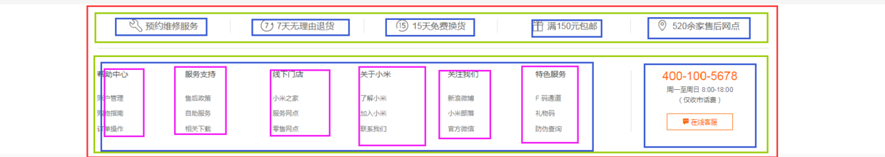
(5)局部——bottom
bottom部分首先是一个水平居中的内容,然后内容可以划分为上下两部分,每个部分都是浮动的li,如图:
html代码:
<div class="bottom">
    <div class="container">
        <div class="bottom-service">
            <ul>
                <li></li>
                <li></li>
                <li></li>
                <li></li>
                <li></li>
            </ul>
        </div>
        <div class="bottom-links">
            <div class="links-left">
                <ul>
                    <li></li>
                    <li></li>
                    <li></li>
                    <li></li>
                    <li></li>
                    <li></li>
                </ul>
            </div>
            <div class="links-right"></div>
        </div>
    </div>
</div>
css代码:
.bottom {
    height: 274px;
    background-color: #fff;
}
.bottom-service{
    height: 80px;
    background-color: seagreen;
}
.bottom-service>ul{
    height: 100%;
}
.bottom-service>ul li{
    position: relative;
    padding: 0 50px;
    float: left;
    width: 20%;
    height: 100%;
    background-color: goldenrod;
    background-clip: content-box;
}
.bottom-service>ul li+li::before{
    position: absolute;
    top: 28px;
    left: 0;
    content: '';
    width: 1px;
    height: 24px;
    background-color: #999;
}
.bottom-links{
    height: 192px;
    background-color: #8545e0;
}
.links-left{
    float: left;
    width: 960px;
    height: 100%;
    background-color: yellow;
}
.links-left>ul{
    height: 100%;
}
.links-left>ul li{
    padding-right: 60px;
    float: left;
    width: 16.666666666666667%;
    height: 100%;
    border: 1px solid #000;
    background-color: #ff0000;
    background-clip: content-box;
}
.links-right{
    float: right;
    width: 252px;
    height: 100%;
    background-color: yellow;
}
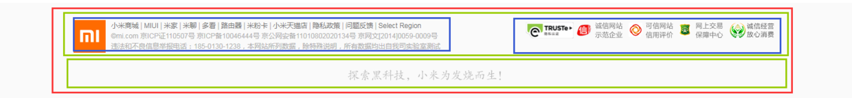
(6)局部——footer
footer划分如图:
html代码:
<div class="footer">
    <div class="footer-info">
        <div class="info-left"></div>
        <div class="info-right"></div>
    </div>
    <div class="footer-slogan"></div>
</div>
css代码:
.footer {
    margin: 0 auto;
    padding: 30px 0;
    width: 1226px;
    height: 166px;
    border: 1px solid #000;
}
.footer-info{
    height: 57px;
    background-color: #6effb1;
}
.info-left{
    float: left;
    width: 630px;
    height: 100%;
    border: 1px solid #000;
}
.info-right{
    float: right;
    width: 436px;
    height: 100%;
    border: 1px solid #000;
}
.footer-slogan{
    margin-top: 30px;
    height: 19px;
    background-color: #8545e0;
}
(7)全部代码(优化后)
html代码:
<body>
<div class="header">
    <div class="container">
        <div class="header-left fl"></div>
        <div class="header-rigth fr"></div>
    </div>
</div>
<div class="top">
    <div class="container">
        <div class="top-nav"></div>
        <div class="top-slider">
            <div class="slider-navbar"></div>
        </div>
        <div class="top-recommend">
            <div class="recommend-left fl"></div>
            <div class="recommend-right fr">
                <ul>
                    <li></li>
                    <li></li>
                    <li></li>
                </ul>
            </div>
        </div>
        <div class="top-flashsale">
            <div class="flashsale-title common-title"></div>
            <div class="flashsale-content">
                <div class="content-timer fl"></div>
                <ul class="content-shops">
                    <li></li>
                    <li></li>
                    <li></li>
                    <li></li>
                </ul>
            </div>
        </div>
    </div>
</div>
<div class="center">
    <div class="center-phone module-box">
        <div class="phone-title common-title"></div>
        <div class="phone-content">
            <div class="phone-left fl"></div>
            <ul class="phone-right">
                <li></li>
                <li></li>
                <li></li>
                <li></li>
                <li></li>
                <li></li>
                <li></li>
                <li></li>
            </ul>
        </div>
    </div>

    <div class="center-household module-box">
        <div class="household-title common-title"></div>
        <div class="household-content">
            <li></li>
            <li></li>
            <li></li>
            <li></li>
            <li></li>
            <li></li>
            <li></li>
            <li></li>
            <li></li>
            <li>
                <p></p>
                <p></p>
            </li>
        </div>
    </div>

    <div class="center-video">
        <div class="video-title common-title"></div>
        <ul class="video-content">
            <li></li>
            <li></li>
            <li></li>
            <li></li>
        </ul>
    </div>
</div>
<div class="bottom">
    <div class="container">
        <div class="bottom-service">
            <ul>
                <li></li>
                <li></li>
                <li></li>
                <li></li>
                <li></li>
            </ul>
        </div>
        <div class="bottom-links">
            <div class="links-left fl">
                <ul>
                    <li></li>
                    <li></li>
                    <li></li>
                    <li></li>
                    <li></li>
                    <li></li>
                </ul>
            </div>
            <div class="links-right fr"></div>
        </div>
    </div>
</div>
<div class="footer">
    <div class="footer-info">
        <div class="info-left fl"></div>
        <div class="info-right fr"></div>
    </div>
    <div class="footer-slogan"></div>
</div>
</body>
css代码:
/*-------------------抽取公共样式-----------------*/
* { /*为了方便,就这样清空默认样式了*/
    margin: 0;
    padding: 0;
    box-sizing: border-box;
    list-style: none;
}
body {
    background-color: #f5f5f5;
}
.container {  /*水平居中的内容盒子*/
    width: 1226px;
    height: 100%;
    margin: 0 auto;
    border: 1px solid #f00;
}
.common-title {
    height: 58px;
    background-color: #000;
}
.fl {float: left;}
.fr {float: right;}
.recommend-right,
.flashsale-content,
.phone-right > li,
.household-content > li:last-child > p,
.video-content > li,
.links-left > ul li,
.footer,
.info-left,
.info-right {border: 1px solid #000;}  /*添加边框样式只是为了方便观察,不是布局必须,可删*/


/*-----header部分-----*/
.header {
    margin-bottom: 20px;
    height: 40px;
    background-color: #333;
}
.header-left {
    width: 380px;
    height: 100%;
    background-color: #0f0;
}
.header-rigth {
    width: 260px;
    height: 100%;
    background-color: #0f0;
}


/*--------top部分--------*/
.top {
    /*height: 1210px;*/
    background-color: #fff;
}
.top-nav {
    height: 100px;
    background-color: #f00;
}
.top-slider {
    margin-bottom: 14px;
    position: relative; /*父相*/
    height: 460px;
    background-color: #00f;
}
.slider-navbar {
    position: absolute; /*子绝*/
    top: 0;
    left: 0;
    width: 234px;
    height: 100%;
    background-color: black;
    opacity: .5;
}
.top-recommend {
    margin-bottom: 26px;
    height: 170px;
    background-color: #0f0;
}
.recommend-left {
    height: 100%;
    width: 234px;
    background-color: skyblue;
}
.recommend-right {
    width: 978px;
    height: 100%;
}
.recommend-right > ul {height: 100%;}
.recommend-right > ul li {
    float: left; /*三列等宽,浮动布局*/
    width: 316px;
    height: 100%;
    background-color: deepskyblue;
}
.recommend-right > ul li + li { margin-left: 14px;}  /*设置浮动间隔*/
.top-flashsale {
    height: 438px;
    background-color: #ff4455;
}
.flashsale-title {}
.flashsale-content {
    padding-bottom: 40px;
    height: 380px;
}
.content-timer {
    margin-right: 14px;
    width: 234px;
    height: 100%;
    background-color: #fff;
}
.content-shops {
    overflow: hidden; /*触发bfc,以达到自适应*/
    height: 100%;
    background-color: #6effb1;
}
.content-shops > li {
    float: left; /*四列等宽,浮动布局*/
    width: 234px;
    height: 100%;
    background-color: #fff;
}
.content-shops > li + li {margin-left: 12.5px;}  /*设置浮动间隔*/


/*--------center部分--------*/
.module-box {  /*类似的模块*/
    margin-bottom: 8px;
    height: 686px;
}
.center {
    margin: 0 auto;
    margin-bottom: 60px;
    padding-top: 60px;
    width: 1226px;
    /*height: 1791px;*/
    background-color: #fff;
}
.center-phone {background-color: yellow;}
.phone-title {}
.phone-content {
    height: 628px;
    background-color: pink;
}
.phone-left {
    width: 234px;
    height: 100%;
    background-color: darkseagreen;
}
.phone-right {
    overflow: hidden; /*触发bfc以达到自适应*/
    height: 100%;
    background-color: #ccc;
}
.phone-right > li {
    margin-bottom: 28px; /*设置下边距*/
    padding-left: 14px; /*用padding模拟盒子间隔*/
    float: left; /*四列等宽,浮动布局*/
    width: 25%;
    height: 300px;
    background-color: #f00;
    background-clip: content-box; /*背景色从content开始绘起*/
}
.center-household {background-color: yellow;}
.household-title {}
.household-content {height: 614px;}
.household-content > li {
    position: relative; /*父相*/
    margin-left: 14px; /*设置浮动间隔*/
    margin-bottom: 28px; /*设置下边距*/
    float: left; /*五列等宽,浮动布局*/
    width: 234px;
    height: 300px;
    background-color: #d7d7d7;
}
.household-content > li:nth-child(1),
.household-content > li:nth-child(6) {margin-left: 0; }  /*消除每行第一个的间隔*/
.household-content > li:last-child p:first-child {
    position: absolute; /*子绝*/
    top: 0;
    left: 0;
    right: 0;
    height: 143px;
}
.household-content > li:last-child p:last-child {
    position: absolute; /*子绝*/
    bottom: 0;
    left: 0;
    right: 0;
    height: 143px;
}
.center-video {
    height: 343px;
    background-color: pink;
}
.video-title {}
.video-content {height: 285px;}
.video-content > li {
    float: left; /*四列等宽,浮动布局*/
    width: 296px;
    height: 100%;
}
.video-content > li + li {margin-left: 14px; }   /*设定浮动间隔*/


/*--------bottom部分--------*/
.bottom {
    /*height: 274px;*/
    background-color: #fff;
}
.bottom-service {
    height: 80px;
    background-color: seagreen;
}
.bottom-service > ul {height: 100%;}
.bottom-service > ul li {
    position: relative; /*父相*/
    padding: 0 50px; /*用padding模拟盒子间隔*/
    float: left; /*五列等宽,浮动布局*/
    width: 20%;
    height: 100%;
    background-color: goldenrod;
    background-clip: content-box; /*背景色从content开始绘起*/
}
.bottom-service > ul li + li::before { /*用伪元素模拟分割线*/
    position: absolute; /*子绝*/
    top: 28px;
    left: 0;
    content: ''; /*伪元素必须有content*/
    width: 1px;
    height: 24px;
    background-color: #999;
}
.bottom-links {
    height: 192px;
    background-color: #8545e0;
}
.links-left {
    width: 960px;
    height: 100%;
    background-color: yellow;
}
.links-left > ul {height: 100%;}
.links-left > ul li {
    padding-right: 60px;
    float: left; /*六列等宽,浮动布局*/
    width: 16.666666666666667%;
    height: 100%;
    background-color: #ff0000;
    background-clip: content-box; /*背景色从content开始绘起*/
}
.links-right {
    width: 252px;
    height: 100%;
    background-color: yellow;
}


/*--------footer部分---------*/
.footer {
    margin: 0 auto;
    padding: 30px 0;
    width: 1226px;
    height: 166px;
}
.footer-info {
    height: 57px;
    background-color: #6effb1;
}
.info-left {
    width: 630px;
    height: 100%;
}
.info-right {
    width: 436px;
    height: 100%;
}
.footer-slogan {
    margin-top: 30px;
    height: 19px;
    background-color: #8545e0;
}
以上就是优化后的代码了,由于在下才疏学浅,所用方法不敢保证是最简单的,优化也肯定不是最优的,仅仅是的我的一种思路而已,各位参考参考就好。
8.1.2 Flexbox+Grid搭配用法(未来...)
html代码:
<body>
<div class="header">
    <div class="container">
        <div class="header-left"></div>
        <div class="header-rigth"></div>
    </div>
</div>
<div class="top">
    <div class="container">
        <div class="top-nav"></div>
        <div class="top-slider">
            <div class="slider-navbar"></div>
        </div>
        <div class="top-recommend-left"></div>
        <div class="top-recommend-right">
            <ul>
                <li></li>
                <li></li>
                <li></li>
            </ul>
        </div>
        <div class="top-flashsale-title"></div>
        <div class="top-flashsale-timer"></div>
        <ul class="top-flashsale-shops">
            <li></li>
            <li></li>
            <li></li>
            <li></li>
        </ul>
    </div>
</div>
<div class="center">
    <div class="center-phone-title"></div>
    <div class="center-phone-content">
        <div class="phone-content-item1"></div>
        <div class="phone-content-item2"></div>
        <div class="phone-content-item3"></div>
        <div class="phone-content-item4"></div>
        <div class="phone-content-item5"></div>
        <div class="phone-content-item6"></div>
        <div class="phone-content-item7"></div>
        <div class="phone-content-item8"></div>
        <div class="phone-content-item9"></div>
    </div>

    <div class="center-household-title"></div>
    <div class="center-household-content">
        <div class="row">
            <div class="household-content-item"></div>
            <div class="household-content-item"></div>
            <div class="household-content-item"></div>
            <div class="household-content-item"></div>
            <div class="household-content-item"></div>
        </div>
        <div class="row">
            <div class="household-content-item"></div>
            <div class="household-content-item"></div>
            <div class="household-content-item"></div>
            <div class="household-content-item"></div>
            <div class="household-content-item">
                <p></p>
                <p></p>
            </div>
        </div>


    </div>

    <div class="center-video-title"></div>
    <ul class="center-video-content">
        <li></li>
        <li></li>
        <li></li>
        <li></li>
    </ul>
</div>
<div class="bottom">
    <div class="container">
        <div class="bottom-service">
            <div class="service-item"></div>
            <div class="service-item"></div>
            <div class="service-item"></div>
            <div class="service-item"></div>
            <div class="service-item"></div>
        </div>
        <div class="bottom-links-left">
            <div class="links-left-item"></div>
            <div class="links-left-item"></div>
            <div class="links-left-item"></div>
            <div class="links-left-item"></div>
            <div class="links-left-item"></div>
            <div class="links-left-item"></div>
        </div>
        <div class="bottom-links-right"></div>
    </div>
</div>
<div class="footer">
    <div class="footer-info">
        <div class="info-left"></div>
        <div class="info-right"></div>
    </div>
    <div class="footer-slogan"></div>
</div>
</body>
css代码:
/*-------------------抽取公共样式-----------------*/
* { /*为了方便,就这样清空默认样式了*/
    margin: 0;
    padding: 0;
    list-style: none;
}
body {
    background-color: #f5f5f5;
    display: grid;
    /*整体布局 设置网格列,设置网格行,再设定网格区域*/
    grid-template-columns: 1fr 1226px 1fr;
    grid-template-rows: 40px 20px auto auto 274px 166px;
    grid-template-areas:
        "header header header"
        ". . ."
        "top top top"
        ". center ."
        "bottom bottom bottom"
        ". footer .";
}
.container { /*水平居中的内容盒子*/
    width: 1226px;
    height: 100%;
    margin: 0 auto;
    border: 1px solid #f00;
}
.top-recommend-right,
.top-flashsale-timer,
.top-flashsale-shops li,
.center-phone-content > div,
.center-household-content .row,
.household-content-item:last-of-type p,
.center-video-content li,
.service-item,
.links-left-item,
.info-left,
.info-right,
.info-right {border: 1px solid #000;}  /*添加边框样式只是为了方便观察,不是布局必须,可删*/


/*-----header部分-----*/
.header {
    grid-area: header; /*指定网格区域*/
    background-color: #333;
}
.header .container {
    display: flex;
    justify-content: space-between;
}
.header-left {
    width: 380px;
    background-color: #0f0;
}
.header-rigth {
    width: 260px;
    background-color: #0f0;
}


/*--------top部分--------*/
.top {
    grid-area: top; /*指定网格区域*/
    background-color: #fff;
}
.top .container {
    display: grid;
    /*top部分布局 设置网格行,设置网格列,再设定网格区域*/
    grid-template-rows: 100px 460px 14px 170px 26px 58px 340px 40px;
    grid-template-columns: auto 14px 978px;
    grid-template-areas:
        "top-nav top-nav top-nav"
        "top-slider top-slider top-slider"
        ". . ."
        "recommend-left . recommend-right"
        ". . ."
        "flashsale-title flashsale-title flashsale-title"
        "flashsale-timer . flashsale-shops"
        ". . .";
}
.top-nav {
    grid-area: top-nav;
    background-color: #f00;
}
.top-slider {
    position: relative;
    grid-area: top-slider;
    background-color: #00f;
}
.top-slider .slider-navbar {
    position: absolute;
    top: 0;
    left: 0;
    bottom: 0;
    width: 234px;
    background-color: black;
    opacity: .5;
}
.top-recommend-left {
    grid-area: recommend-left;
    background-color: skyblue;
}
.top-recommend-right {grid-area: recommend-right;}
.top-recommend-right > ul {
    display: flex;
    justify-content: space-between;
    height: 100%;
}
.top-recommend-right li {
    width: 316px;
    background-color: deepskyblue;
}
.top-flashsale-title {
    grid-area: flashsale-title;
    background-color: #000;
}
.top-flashsale-timer {
    grid-area: flashsale-timer;
    background-color: #fff;
}
.top-flashsale-shops {
    display: flex;
    justify-content: space-between;
    grid-area: flashsale-shops;
    background-color: #6effb1;
}
.top-flashsale-shops li {width: 234px;}


/*--------center部分--------*/
.center {
    margin-bottom: 60px;  /*边距可以在网格分区的时候考虑进去,把边距设成一行或一列,不要放内容就好了*/
    padding-top: 60px;
    grid-area: center; /*指定网格区域*/
    display: flex;
    flex-direction: column;
    background-color: #fff;
}
.center-phone-title {
    height: 58px;
    background-color: black;
}
.center-phone-content {
    margin-bottom: 8px;
    display: grid;
    /*这里用flex分格更好,代码更少更简洁*/
    grid-template-columns: repeat(5, 1fr);
    grid-template-rows: repeat(2, 1fr);
    grid-template-areas:
        "big1 normal2 normal3 normal4 normal5"
        "big1 normal6 normal7 normal8 normal9";
    grid-gap: 14px; /*网格间隔*/
    height: 628px;
    background-color: pink;
}
.phone-content-item1 {grid-area: big1;}
.phone-content-item2 {grid-area: normal2;}
.phone-content-item3 {grid-area: normal3;}
.phone-content-item4 {grid-area: normal4;}
.phone-content-item5 {grid-area: normal5;}
.phone-content-item6 {grid-area: normal6;}
.phone-content-item7 {grid-area: normal7;}
.phone-content-item8 {grid-area: normal8;}
.phone-content-item9 {grid-area: normal9;}
.center-household-title {
    height: 58px;
    background-color: black;
}
.center-household-content {
    margin-bottom: 8px;
    display: flex;
    flex-direction: column;
    height: 614px;
    background-color: pink;
}
.center-household-content .row {
    display: flex;
    justify-content: space-between;
    flex: 1;
}
.row .household-content-item {
    display: flex;
    flex-direction: column;
    justify-content: space-between;
    width: 234px;
    background-color: #fff;
}
.household-content-item:last-of-type p {height: 143px;}
.center-video-title {
    height: 58px;
    background-color: black;
}
.center-video-content {
    display: flex;
    justify-content: space-between;
    height: 285px;
    background-color: pink;
}
.center-video-content li {width: 296px;}


/*--------bottom部分--------*/
.bottom {
    grid-area: bottom; /*指定网格区域*/
    background-color: #fff;
}
.bottom .container {
    display: grid;
    grid-template-columns: auto 252px;
    grid-template-rows: 80px auto;
    grid-template-areas: "service service" "links-left links-right";
}
.container .bottom-service {
    display: flex;
    grid-area: service;
    background-color: seagreen;
}
.service-item {flex: 1;}
.container .bottom-links-left {
    display: flex;
    grid-area: links-left;
    background-color: yellow;
}
.links-left-item {flex: 1;}
.container .bottom-links-right {
    grid-area: links-right;
    background-color: yellowgreen;
}


/*--------footer部分---------*/
.footer {
    padding: 30px 0;
    grid-area: footer; /*指定网格区域*/
}
.footer-info {
    display: flex;
    justify-content: space-between;
    height: 57px;
    background-color: #6effb1;
}
.info-left {width: 630px;}
.info-right {width: 436px;}
.footer-slogan {
    margin-top: 30px;
    height: 19px;
    background-color: #8545e0;
}
九、其他补充:
9.1 移动端viewport
设置viewport:
<meta name="viewport" content="width=device-width, initial-scale=1.0, maximum-scale=1.0, user-scalable=0">
阅读推荐:
解读 viewport—网页自适应移动 app 神器
https://juejin.cn/post/6844903473096441869
9.2 媒体查询
代码示例:
@media (max-width: 767px) { ...css代码... }
@media (min-width: 768px) and (max-width: 991px) { ...css代码... }
@media (min-width: 992px) and (max-width: 1199px) { ...css代码... }
@media (min-width: 1200px) { ...css代码... }
阅读推荐:
MDN文档介绍
https://developer.mozilla.org/zh-CN/docs/Web/Guide/CSS/Media_queries
随方逐圆 -- 全面理解 CSS 媒体查询
https://juejin.cn/post/6844903486258216967
9.3 REM
阅读推荐:
Rem布局的原理解析
http://yanhaijing.com/css/2017/09/29/principle-of-rem-layout/
rem是如何实现自适应布局的?
http://caibaojian.com/web-app-rem.html
9.4 Flexbox
阅读推荐
理解Flexbox:你需要知道的一切
https://www.w3cplus.com/css3/understanding-flexbox-everything-you-need-to-know.html
深入理解 flex 布局以及计算
https://www.w3cplus.com/css3/flexbox-layout-and-calculation.html?from=groupmessage
9.5 CSS Grid
阅读推荐
grid布局学习指南
http://blog.jirengu.com/?p=990
grid规范草稿
https://drafts.csswg.org/css-grid/
End:感谢
感谢大家阅读,喜欢的就点个收藏或者Star吧!各位的支持,就是本人的最大动力,谢谢!
