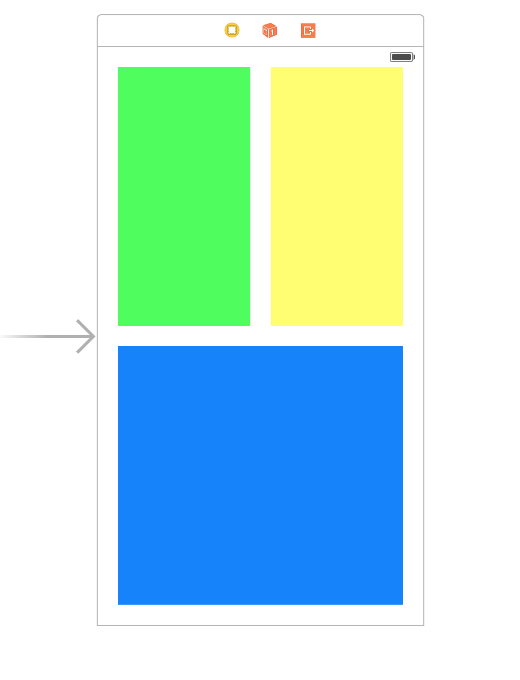
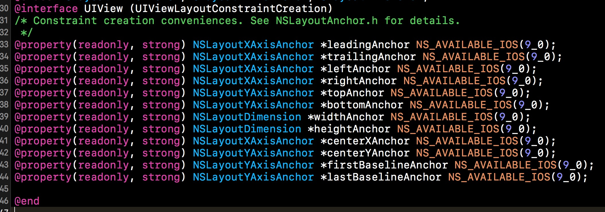
定义:Springs&Struts决定了当UIView的父View的bounds变化时,其自身的坐标如何变化:是有flexible or fixed margins (the struts), width and height (the springs)。UIView的autoresizingMask属性有如下枚举值:UIViewAutoresizingFlexibleLeftMargin、UIViewAutoresizingFlexibleWidth、UIViewAutoresizingFlexibleRightMargin、UIViewAutoresizingFlexibleTopMargin、UIViewAutoresizingFlexibleHeight和UIViewAutoresizingFlexibleBottomMargin(这些值可以取或进行合并)。
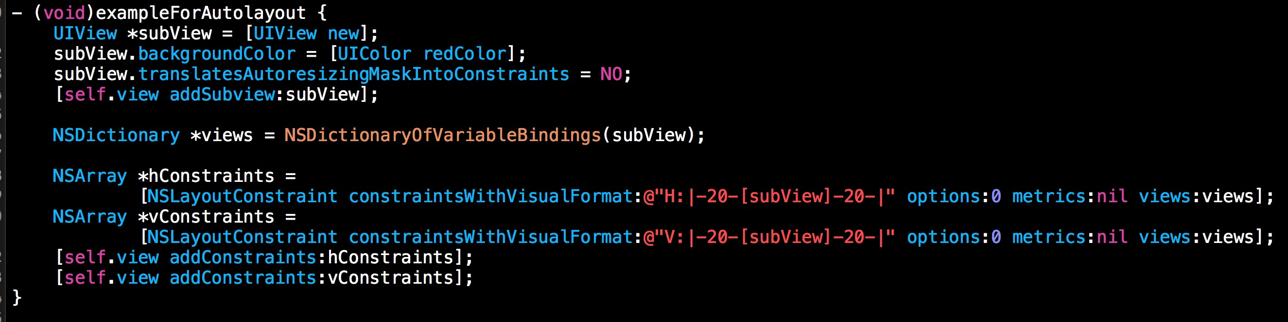
1.Designing by intent。 Autolayout最大的优点就是摆脱以前手写frame的烦恼,用constraints来描述view本身或者view和view之间的布局关系。这是完全不同的思维也即是Designing by intent。一旦constraints建立好,剩下的都由Autolayout来替我们解决。
3.在view多的时候或者对性能要求比较高的场合下性能会出现问题。这才是autolayout在应用到实践过程中最大的问题。这两篇文章定量的评测了autolayout在不同数量view下的性能表现Auto Layout Performance on iOS 和Optimising Autolayout
。而在实际应用过程中,的确也会有性能问题。搜狗iOS输入法在最初适配不同键盘尺寸的按键布局时,使用了 Autolayout 的解决方案,影响了键盘调起速度,后续针对键盘调起速度的优化过程中,通过Instruments的Time Profiler才定位到该问题,参考搜狗输入法性能优化实践。还有XING app的开发者在他们在项目初期,在列表的布局上使用了Autolayout。带来了无法解决的性能问题,所以放弃使用Autolayout,博客链接Auto Layout in Cells – Don’t!。还有LinkedIn团队也遇到了同样的问题,他们为此开发了LayoutKit来代替Autolayout,他们在介绍LayoutKit的时候,这样写道"LinkedIn created LayoutKit because we have found that Auto Layout is not performant enough for complicated view hierarchies in scrollable views."
6.Stack Views. UIStackView(iOS9+)class provides a streamlined interface for laying out a collection of views in either a column or a row. Stack views let you leverage the power of Auto Layout, creating user interfaces that can dynamically adapt to the device’s orientation, screen size, and any changes in the available space. The stack view manages the layout of all the views in its arrangedSubviews property. These views are arranged along the stack view’s axis, based on their order in the arrangedSubviews array. The exact layout varies depending on the stack view’s axis, distribution, alignment, spacing, and other properties. 其实Stack View和Android的Linear Layout类似,都是提供在同一方向(横向或者纵向)布局多个view的便捷方法。我觉得iOS中不仅仅是UIStackView,UICollectionView使用得当,在特定的应用场景下也可以简单地实现适配不同屏幕的作用。
1."ComponentKit takes a functional, declarative approach to building UI and emphasizes a one-way data flow from immutable models to immutable components that describe how views should be configured" "It was built to power Facebook's News Feed and is now used throughout the Facebook iOS app."
2."It performs layout on a background thread, creates the minimal view hierarchy to render the components on screen and has intelligent view reuse. This results in great scroll performance and a snappy system overall."
LayoutKit 官方介绍"LinkedIn created LayoutKit because we have found that Auto Layout is not performant enough for complicated view hierarchies in scrollable views."并且和autolayout做了对比:
LayoutKit has many benefits over using Auto Layout:
1.Fast: LayoutKit is as fast as manual layout code and significantly faster than Auto Layout.
2.Asynchronous: Layouts can be computed in a background thread so user interactions are not interrupted.
3.Declarative: Layouts are declared with immutable data structures. This makes layout code easier to develop, code review, debug, and maintain.
4.Cacheable: Layout results are immutable data structures so they can be precomputed in the background and cached to increase user perceived performance.
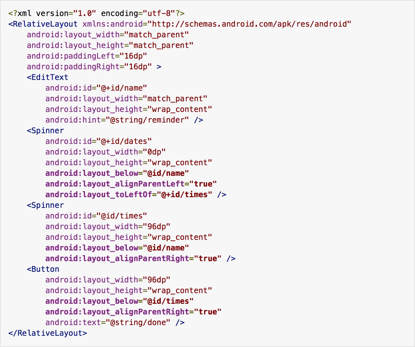
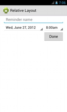
Relative Layout is a view group that displays child views in relative positions. The position of each view can be specified as relative to sibling elements (such as to the left-of or below another view) or in positions relative to the parent RelativeLayout area (such as aligned to the bottom, left or center).
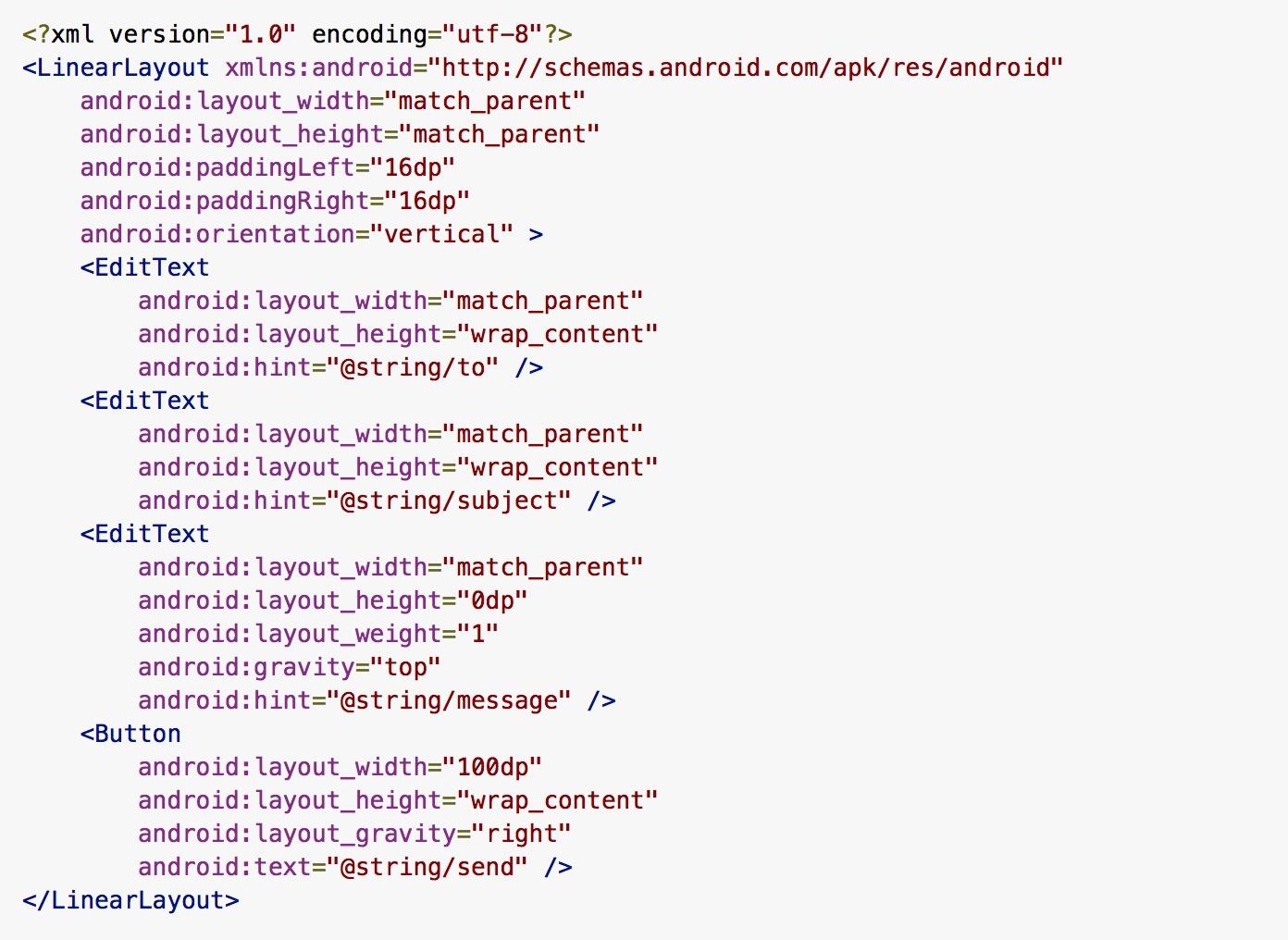
Linear Layout(和iOS中的UIStackView类似)LinearLayout is a view group that aligns all children in a single direction, vertically or horizontally. You can specify the layout direction with the android:orientation attribute.
Building Layouts with an Adapter, 比如List View(UITableView)和Grid View(UICollectionView)
Constraint Layout(Autolayout) ConstraintLayout allows you to create large and complex layouts with a flat view hierarchy (no nested view groups). It's similar to RelativeLayout in that all views are layed out according to relationships between sibling views and the parent layout, but it's more flexible than RelativeLayout and easier to use with Android Studio's Layout Editor.
The foundation of Android's support for multiple screens is its ability to manage the rendering of an application's layout and bitmap drawables in an appropriate way for the current screen configuration. The system handles most of the work to render your application properly on each screen configuration by scaling layouts to fit the screen size/density and scaling bitmap drawables for the screen density, as appropriate. To more gracefully handle different screen configurations, however, you should also:
Explicitly declare in the manifest which screen sizes your application supports
Provide different bitmap drawables for different screen densities
Using configuration qualifiers(Size、Density、Orientation和Aspect ratio等)
Designing alternative layouts and drawables
Best Practices
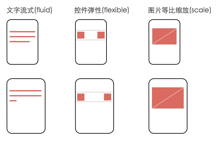
Use wrap_content, match_parent, or the dp(iOS中的point类似,) unit for layout dimensions. If you use "wrap_content"(iOS中的Intrinsic Content Size类似), the width or height of the view is set to the minimum size necessary to fit the content within that view, while "match_parent" makes the component expand to match the size of its parent view.
Use RelativeLayout. Do not use hard-coded pixel values in your application code.Do not use AbsoluteLayout
Use Size Qualifiers. Your application should also provide several alternative layouts to target different screen configurations. You do so by using configuration qualifiers, which allows the runtime to automatically select the appropriate resource based on the current device’s configuration (such as a different layout design for different screen sizes).
Use the Smallest-width Qualifier. The Smallest-width qualifier allows you to target screens that have a certain minimum width given in dp.
Use Orientation Qualifiers.
Use Layout Aliases 为了兼容性和减少重复布局,Layout Aliases可以是多个限定符描述对应同一个layout.xml
Use Nine-patch Bitmaps(.9.png), 和iOS中的resizable image类似,Xcode中的Image Slicing也可以帮助开发者用可视化的方式完成resizable image
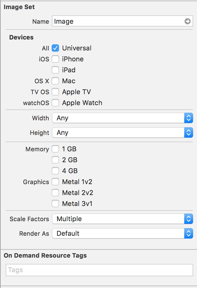
其中有几个选项大家可以关注下,一个是Width还有Height。这个就是可以指定Size Class的选项。还有Scale Factors,这个选项有Single Vector或Vector With Overrides(Vector With Overrides是Single Vector的增强, 可以在放置完矢量图之后继续放置@1x、@2x和@3x的png格式的图片。放置的png会优先覆盖矢量图, 未放置对应倍率图片的设备才会使用矢量图对应生成的图片),这个选项主要是为了支持矢量图,可以只放一张PDF的图片,编译后Xcode会自动生成1x,2x,3x的图,需要注意的是使用他并不会减少包的体积,因为不是运行时的特性。还有Slicing,可以在图形化界面里设置拉伸参数。虽然Image Asset有诸如使用方便等优点,但是我们在使用过程中还是需要衡量其带来的便捷性和问题。(1)比如Image Asset会生成1X图片,目前很多应用已经不支持1X的设备了,这样会带来包大小的问题。(2)Image Asset虽然支持矢量图,但是并不是运行时的特性,编译后仍然会生成1x 2x 3x图片,对安装包大小没有起到减少的作用,甚至会更大(一个是多了1x图片,另外一个是如果自己提供2x 3x图片可在添加前用一些工具用png图片压缩),在图片对安装包大小影响的优化上,一个优化点是可以自己实现对矢量图的支持,这样就提供一份PDF即可,另一个是使用工具对png图片压缩,还一个比较极端优化的方式是自己在代码里面画图片(可以第一次画然后本地化,之后就直接读取磁盘文件),在具体实施的过程中,可以借用PaintCode来节省自己编写绘图代码的时间。 (3)还有其Image Asset只支持imageNamed,这样如果一些应用想有自己的图片缓存策略的话就无法实现了。
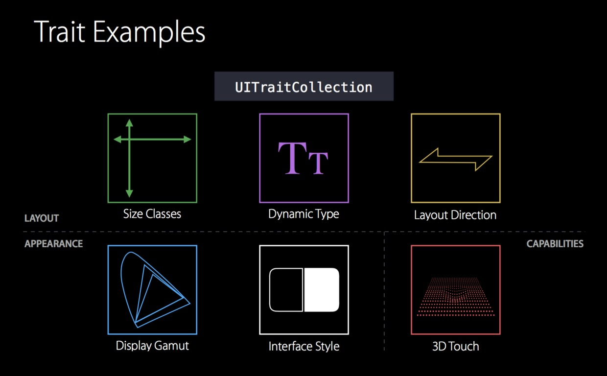
3.UITraitCollection。 Apple的API文档里面这样介绍UITraitCollection: A trait collection describes the iOS interface environment for your app, including traits such as horizontal and vertical size class, display scale, and user interface idiom. To create an adaptive interface, write code to adjust your app’s layout according to changes in these traits.
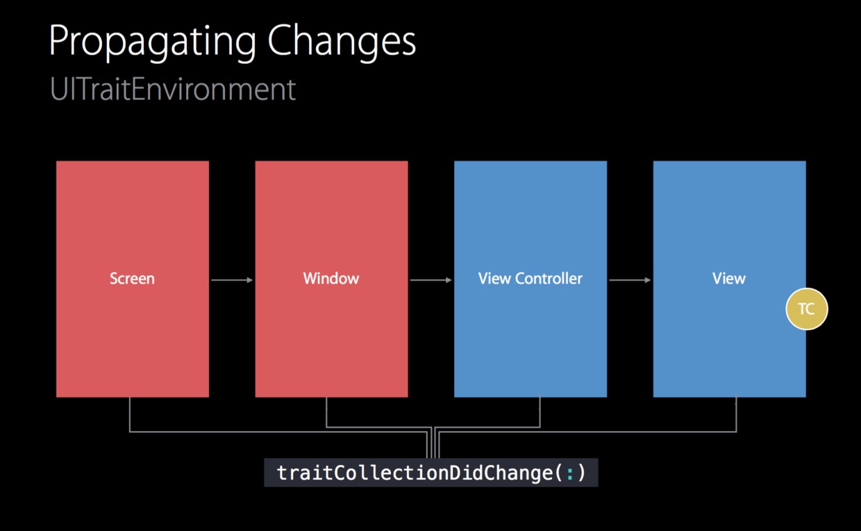
The iOS trait environment is exposed though the traitCollection property of the UITraitEnvironment protocol. This protocol is adopted by the following classes: UIScreen, UIWindow, UIViewController, UIPresentationController, and UIView. You access specific trait values using the UITraitCollection horizontalSizeClass, verticalSizeClass, displayScale, and userInterfaceIdiom properties. The values that express idiom and size traits are defined in the UIUserInterfaceIdiom and UIUserInterfaceSizeClass enumerations; the value for the display scale trait is expressed as a floating point number.
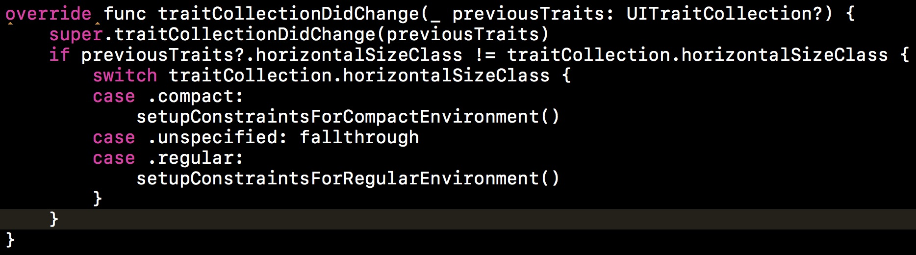
To make your view controllers and views responsive to changes in the iOS interface environment, override the traitCollectionDidChange: method from the trait environment protocol. To customize view controller animations in response to interface environment changes, override the willTransitionToTraitCollection:withTransitionCoordinator: method of the UIContentContainer protocol.
5.Layout Guides参考 The UILayoutGuide class defines a rectangular area that can interact with Auto Layout. Use layout guides to replace the dummy views you may have created to represent inter-view spaces or encapsulation in your user interface. Traditionally, there were a number of Auto Layout techniques that required dummy views. A dummy view is an empty view that does not have any visual elements of its own and serves only to define a rectangular region in the view hierarchy. For example, if you wanted to use constraints to define the size or location of an empty space between views, you needed to use a dummy view to represent that space. If you wanted to center a group of objects, you needed a dummy view to contain those objects. Similarly, dummy views could be used to contain and encapsulate part of your user interface. Dummy views let you break up a large, complex user interface into self-contained, modular chunks. When used properly, they could greatly simplify your Auto Layout constraint logic.
There are a number of costs associated with adding dummy views to your view hierarchy. First, there is the cost of creating and maintaining the view itself. Second, the dummy view is a full member of the view hierarchy, which means that it adds overhead to every task the hierarchy performs. Worst of all, the invisible dummy view can intercept messages that are intended for other views, causing problems that are very difficult to find.
The UILayoutGuide class is designed to perform all the tasks previously performed by dummy views, but to do it in a safer, more efficient manner. Layout guides do not define a new view. They do not participate in the view hierarchy. Instead, they simply define a rectangular region in their owning view’s coordinate system that can interact with Auto Layout.
Layout guides can be used to define an equal spacing between a series of views.
Layout guides can also act as a black box, containing a number of other views and controls. This lets you encapsulate part of your view, breaking your layout into modular chunks.