

1. content-box与border-box的区别及相关计算
当box-sizing:content-box时,boxwidth(盒子宽度)=contentwidth(盒子内容宽度)+2*padding+2 *border,
以下为实例
<div class="bc">
    <div class="bc1">
        <div class="bc2"></div>
    </div>
</div>
以下为css样式
.bc{
position: relative;
width:400px;
height:200px;
margin: 10px;
}

.bc1{
width:100%;
height:100%;
box-sizing:border-box;
display: flex;
flex-direction: row;
justify-content: center;
align-items: center;
margin: 0;
padding:20px;
}

.bc2{
box-sizing: border-box;
width: 50%;
height: 50%;
display: flex;
flex-direction: row;
justify-content: center;
align-items: center;
border: 5px solid #000;
margin: 8px;
padding: 20px;
}
下面进行盒模型的相关计算
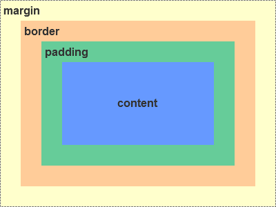
spacewidth(盒子空间宽度)=boxwidth+2*margin
spaceheight(盒子空间高度)=boxheight=2 *margin
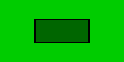
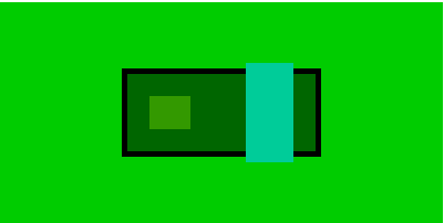
bc1:
box-sizing:border-box;margin:0
spaceWidth=boxwidth=400*100%=400,
spaceHeight=boxheight=200*100%=200,padding=20 ==>
contentWidth=400-2*20=360,contentHeight=200-2*20=160
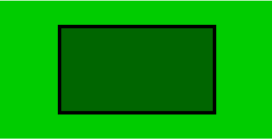
box2:
boxSizing=borderbox
container(contentWidth=360,contentHeight=160),width=50%,height=50% ==>
boxwidth:180,boxheight:80
padding=20;border=5 ==>
contentWidth=180-2*20-2*5=130,
contentHeight=80-2*20-2*5=30
margin=8 ==>
spaceWidth=180+2*8=196,spaceHeight=80+2*8=96
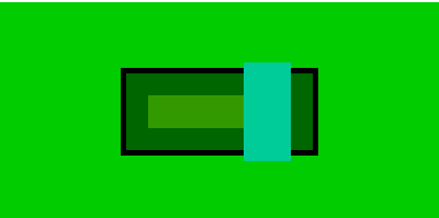
实际效果图:
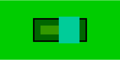
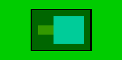
当box-sizing:content-box时,
bc1:
box-sizing:border-box;margin:0
spaceWidth=width=400,
spaceHeight=height=200,padding=20 ==>
contentWidth=400-2*20=360,
contentHeight=200-2*20=160

bc2
boxsizing=contentbox
container(contentWidth=360,
contentHeight=160),
width=50%,
height=50% ==>
contentWidth:180,contentHeight:80
padding=20;border=5 ==>
width=180+2*20+2*5=230,height=80+2*20+2*5=130
margin=8 ==> spaceWidth=230+2*8=246,spaceHeight=130+2*8=146
实际效果图:
由此可见当选择不同的box-sizing模型时,盒子的宽度是不同的
选择content-box时,contentwidth不变,当padding,border变大时,盒子可视宽度变大,撑大,影响整体布局
而选择border-box时,当padding,border变大时,contentwidth会被压缩,盒子可视宽度不变,不影响整体布局
而一般开发情况下,为了不影响整体布局,我们通常选择border-box 为盒模型
2.flex布局不常见规律总结
1.flex-direction 决定扩展方向
当flex-direction属性取值后,其width/height只能在row/column上进行扩展,当其含有多个子元素时,子元素的W/H按比例分配(margin也要计算在内),示例:
<div class="bc">

    <div class="bc1">
        <div class="bc2">
            <div class="bc3"></div>
            <div class="bc4"></div>
        </div>
    </div>
</div>
css
.bc{
position: relative;
width:400px;
height:200px;
margin: 10px;
}

.bc1{
width:100%;
height:100%;
box-sizing:border-box;
display: flex;
flex-direction: row;
justify-content: center;
align-items: center;
margin: 0;
padding:20px;
}

.bc2{
box-sizing: border-box;
width: 50%;
height: 50%;
display: flex;
flex-direction: row;
justify-content: center;
align-items: center;
border: 5px solid #000;
margin: 8px;
padding: 20px;
}

.bc3{
    width:140px;
    height:30px;
}

.bc4{
    width:160px;
    height:90px;
}
bc1:
box-sizing:border-box;margin:0
spaceWidth=width=400,
spaceHeight=height=200,padding=20 ==>
contentWidth=400-2*20=360,
contentHeight=200-2*20=160

bc2:
boxsizing=border-box
container(contentWidth=360,
contentHeight=160),
width=50%,
height=50% ==>
width=180,height=80
padding=20;border=5 ==>
contentWidth=180-2*20-2*5=130,contentHeight=80-2*20-2*5=30
margin=8 ==> spaceWidth=230+2*8=246,spaceHeight=130+2*8=146
计算
beacuse bc2(flex-direction:row) ==> bc2-contentWidth=bc3-Width+bc4-Width
bc3-Width:bc4-Width=7:8 ==>
bc3-width=130*0.46=60.672
bc4-Width=130*0.54=69.328
bc3-height,bc4-height be equal to defined vaule
当存在margin时,两个子元素宽度会被压缩
.bc4{
    margin-left:50px;
}
column方向同理
另外还可根据flex值分配W/H,示例如下
.bc3{
   flex:2
   height:30px;
}

.bc4{
   flex:1
   height:90px;
}
得到的效果如下:
2.子元素决定父元素尺寸,子元素一旦固定,父元素不会变化
当多个元素分配W/H时,有子元素的可根据其子元素的W/H确定其值(具有优先分配W/H的权力)。且子元素一旦固定,其值也不会变化。
实例
html:
<div style="position: relative;width:400px;height:200px;margin: 10px;">
    <div class="bc1">
          <div class="bc2">
            <div class="bc3"></div>
            <div class="bc4"></div>
            <div class="bc5">
                <div class="bc6"></div>
            </div>
        </div>
    </div>
</div>
css:
.bc{
position: relative;
width:400px;
height:200px;
margin: 10px;
}

.bc1{
width:100%;
height:100%;
box-sizing:border-box;
display: flex;
flex-direction: row;
justify-content: center;
align-items: center;
margin: 0;
padding:20px;
}

.bc2{
box-sizing: border-box;
width: 50%;
height: 50%;
display: flex;
flex-direction: row;
justify-content: center;
align-items: center;
border: 5px solid #000;
margin: 8px;
padding: 20px;
}

.bc3{
    width:140px;
    height:30px;
}

.bc4{
    width:160px;
    height:90px;
}

.bc5{
    display: flex;
    flex-direction: row;
    justify-content: center;
    align-items: center;
    margin-left: 10px;
}
.bc6{
    width:100px;
    height:100px;
}
计算:
bc1,bc2计算方式如上 ==>bc2-width=130
because bc6:width=100,height=100 ==>
bc5 width,height not defined ==>
bc5 width=100,height=100;
bc5: margin-left=10 ==>
bc3-width+bc4-width=bc2-width-100-10=20
bc3-width:bc4-width=7:8 ==>
bc3-width=9.328,bc4-width=10.672

height has defined vaule ==> height not change
实图
3.当父元素W/h未定义,子元素的最大w/h决定父元素的w/h
实例如下
html:
<div style="position: relative;width:400px;height:200px;margin: 10px;">
    <div class="bc1">
          <div class="bc2">
            <div class="bc3"></div>
            <div class="bc4"></div>
        </div>
    </div>
</div>
css
.bc{
position: relative;
width:400px;
height:200px;
margin: 10px;
}

.bc1{
width:100%;
height:100%;
box-sizing:border-box;
display: flex;
flex-direction: row;
justify-content: center;
align-items: center;
margin: 0;
padding:20px;
}

.bc2{
box-sizing: border-box;
display: flex;
flex-direction: row;
justify-content: center;
align-items: center;
border: 5px solid #000;
margin: 8px;
padding: 20px;
}

.bc3{
    width:50px;
    height:30px;
}

.bc4{
    width:100px;
    height:90px;
}
实图:以为flex-direction=row ==>bc2-width=100+50=150,height未定义,取子元素最大值(90px)
当换以下height以后
.bc3{
    width:50px;
    height:100px;
}
.bc4{
    width:100px;
    height:50px;
}
以下为新的实图

父元素的高度通过子元素变换后,取最大值(100px),宽度仍为子元素之和150px
---------------------我是分割线-------------------------
其实在布局中还有很多规律,希望大家多多细心发现后与大家共享,让大家少走坑!!!以上
