

入门介绍完,今天我们,先来分析几个官方提供的示例。
以下代码来源于 flutter_gallery中的pesto_demo示例
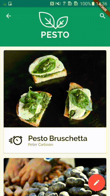
1. PESTO菜谱
0.需求分析
分析layout
- 有顶部的
appBar和floatingActionButton。 - 下面的列表是由
CardView组成的listView
分析动画
- 头部的
Toolbar是可以伸缩的头部,并且带有动画(重点和难点) - 转场动画
分析事件
- 点击搜索和
floatingActionButton弹出SnackBar - 保存菜单的喜欢的状态
1.动手
初始化
- 数据结构和假数据
//0.定义好数据结构
//从图中可以看到,列表页得需要得是下面几个字段
class Recipe {
  const Recipe(
      {this.name,
      this.author,
      this.ingredientsImagePath,
      this.description,
      this.imagePath,
      this.ingredients,
      this.steps});

  final String name;
  final String author;
  final String description;
  final String ingredientsImagePath;
  final String imagePath;

  //这两个字段是详情页需要得
  final List<RecipeIngredient> ingredients;
  final List<RecipeStep> steps;
}

//详情页需要得
class RecipeIngredient {
  const RecipeIngredient({this.amount, this.description});

  final String amount;
  final String description;
}

class RecipeStep {
  const RecipeStep({this.duration, this.description});

  final String duration;
  final String description;
}
- Theme 整体的主题风格是亮色系,颜色是绿色,accentColor是红色
//0.写好主题
final PestoHomeThemeData = ThemeData(
    brightness: Brightness.light,
    primaryColor: Colors.teal,
    accentColor: Colors.redAccent);
- 缓存喜欢的结果
//还需要一个保存是否喜欢得字段
final Set<Recipe> _favoriteRecipes = new Set<Recipe>();
- Scaffold
- 因为顶部的
appBar和floatingActionButton,所以要最完成需要使用Scaffold。而且 而它的body和appBar,一个是需要填充数据的列表,一个是需要动画的appBar。所以是一个StatefulWidget。 而整体是一个页面,因为要不断传递我们的_favoriteRecipes,所以又封装了一层StatelessWidget.
静态部分
我们暂时先不管滚动的部分。
- 将原来的Theme的platform保留
class PestoHome extends StatelessWidget {
  @override
  Widget build(BuildContext context) =>
      //传递_favoriteRecipes给它
      RecipeGridPage(recipes: _favoriteRecipes.toList());
}

class RecipeGridPage extends StatefulWidget {
  final List<Recipe> recipes;

  RecipeGridPage({Key key, @required this.recipes}) : super(key: key);

  @override
  State<StatefulWidget> createState() => _RecipeGridPageState();
}

class _RecipeGridPageState extends State<RecipeGridPage> {
  final GlobalKey<ScaffoldState> scaffoldKey = GlobalKey<ScaffoldState>();

  @override
  Widget build(BuildContext context) {
    //因为需要floatingActionButton,所以需要Scaffold
    return Theme(
         //将context中的platform信息保留
        data: _pTheme.copyWith(platform: Theme.of(context).platform),
        child: Scaffold(
          key: scaffoldKey,
          floatingActionButton: FloatingActionButton(
              onPressed: null),
          body: null,
        ));
  }
}
FloatingActionButton
先把FloatingActionButton 完成。就是简单的弹出SnackBar的功能。
弹出SnackBar,需要Scaffold的BuildContext。通过之前的学习,我们知道有3个可以得到的方式(Scaffold的GlobalKey,builder方法得到正确的BuildContext,或者直接写成子组件)。
- 这里采用的是
GlobalKey的方式 这种方式最简单了。使用GlobalKey的方式,其他要弹的,都可以快速拿到state。
 floatingActionButton: FloatingActionButton(
              child: Icon(Icons.edit),
              onPressed: () {
                //直接使用scaffoldKey.currentState弹出
                scaffoldKey.currentState
                    .showSnackBar(SnackBar(content: Text('Not supported.')));
              }),
Appbar(暂时)
- 代码 先添加一个暂时的AppBar,滑动动画的部分,我们会后面处理
class _RecipeGridPageState extends State<RecipeGridPage> {
  final GlobalKey<ScaffoldState> scaffoldKey = GlobalKey<ScaffoldState>();
  List<Recipe> items = kPestoRecipes;

  @override
  Widget build(BuildContext context) {
    print('items.length=${items.length}');
    //因为需要floatingActionButton,所以需要Scaffold
    return Theme(
        //将context中的platform信息保留
        data: _pTheme.copyWith(platform: Theme.of(context).platform),
        child: Scaffold(
            key: scaffoldKey,
            appBar: AppBar(
              title: Text('静态页面'),
              actions: <Widget>[
                GestureDetector(
                  onTap: () {
                    scaffoldKey.currentState.showSnackBar(
                        SnackBar(content: Text('Not supported.')));
                  },
                  child: Padding(
                    padding: const EdgeInsets.all(8.0),
                    child: Icon(Icons.search),
                  ),
                )
              ],
            ),
            floatingActionButton: FloatingActionButton(
                child: Icon(Icons.edit),
                onPressed: () {
                  //直接使用scaffoldKey.currentState弹出
                  scaffoldKey.currentState
                      .showSnackBar(SnackBar(content: Text('Not supported.')));
                }),
            body: null)
);
  }
- 结果
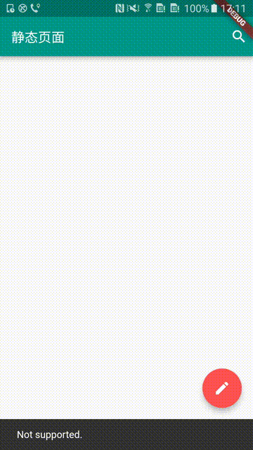
SnackBar。和预期一样。
body部分
- recipe card
写好字体的样式
class PestoStyle extends TextStyle {
  const PestoStyle({
    double fontSize: 12.0,
    FontWeight fontWeight,
    Color color: Colors.black87,
    double letterSpacing,
    double height,
  }) : super(
    inherit: false,
    color: color,
    fontFamily: 'Raleway',
    fontSize: fontSize,
    fontWeight: fontWeight,
    textBaseline: TextBaseline.alphabetic,
    letterSpacing: letterSpacing,
    height: height,
  );
}

 final TextStyle titleStyle = const PestoStyle(fontSize: 24.0, fontWeight: FontWeight.w600);
 final TextStyle authorStyle = const PestoStyle(fontWeight: FontWeight.w500, color: Colors.black54);
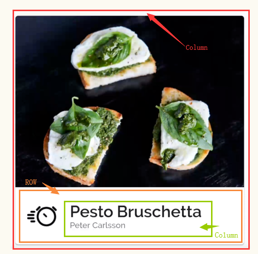
确定好整体的布局
- 如上图分析,大体的布局就是这样。
- 因为是MD中
Card的样式,所以需要在最外层包裹一层Card - 同时,图中未标注的是,
padding的部分。在Flutter中,要实现padding,只要在它包裹在外面一层布局下就可以了。
封装成Card组件
- 封装组件
class RecipeCard extends StatelessWidget {
  final TextStyle titleStyle =
      const PestoStyle(fontSize: 24.0, fontWeight: FontWeight.w600);
  final TextStyle authorStyle =
      const PestoStyle(fontWeight: FontWeight.w500, color: Colors.black54);

  RecipeCard({Key key, @required this.recipe}) : super(key: key);

  final Recipe recipe;

  @override
  Widget build(BuildContext context) {
    return Card(
      child: Column(
        crossAxisAlignment: CrossAxisAlignment.start,
        children: <Widget>[
          Image.asset(
            recipe.imagePath,
            fit: BoxFit.contain,
          ),
          Row(
            children: <Widget>[
              new Padding(
                padding: const EdgeInsets.all(16.0),
                child: new Image.asset(
                  recipe.ingredientsImagePath,
                  width: 48.0,
                  height: 48.0,
                ),
              ),
              new Expanded(
                child: new Column(
                  crossAxisAlignment: CrossAxisAlignment.start,
                  mainAxisAlignment: MainAxisAlignment.center,
                  children: <Widget>[
                    new Text(recipe.name,
                        style: titleStyle,
                        softWrap: false,
                        overflow: TextOverflow.ellipsis),
                    new Text(recipe.author, style: authorStyle),
                  ],
                ),
              ),
            ],
          )
        ],
      ),
    );
  }
}
然后我们先修改代码,先预览一下这个RecipeCard是否满足我们的需求。
//修改_RecipeGridPageState build方法
class _RecipeGridPageState extends State<RecipeGridPage> {
  final GlobalKey<ScaffoldState> scaffoldKey = GlobalKey<ScaffoldState>();
  List<Recipe> items = kPestoRecipes;

  @override
  Widget build(BuildContext context) {
    print('items.length=${items.length}');
    //因为需要floatingActionButton,所以需要Scaffold
    return Theme(
           //省去不需要修改的部分...
            //ListView相当于Android中的RecycleView
            body: ListView.builder(
                //显示的数量,就是item的数量
                itemCount: items.length,
                itemBuilder: (context, index) {
                  //将我们封装好的提供出去
                  return RecipeCard(recipe: items[index]);
                })));
  }
}
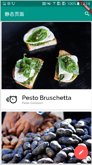
-
效果预览
-
添加
onTap事件监听 确实达到了我们的效果。 我们还预期点击item,跳转到详情页。那我们给RecipeCard添加手势,并将点击事件传入。
//省略不修改的代码
class RecipeCard extends StatelessWidget {
  //添加点击事件的回调
  RecipeCard({Key key, @required this.recipe,this.onTap}) : super(key: key);
  final VoidCallback onTap;
  @override
  Widget build(BuildContext context) {
    //使用GestureDetector来包裹,获取事件
    return GestureDetector(
      onTap: onTap,
      child: Card(//省略重复代码
       ),
    );
  }
}

class _RecipeGridPageState extends State<RecipeGridPage> {
  @override
  Widget build(BuildContext context) {
    return Theme(
        //将context中的platform信息保留
        data: _pTheme.copyWith(platform: Theme.of(context).platform),
        child: Scaffold(
            key: scaffoldKey,
            floatingActionButton: FloatingActionButton(
            //省略...
            ),
            body: ListView.builder(
                itemCount: items.length,
                itemBuilder: (context, index) {
                  return RecipeCard(
                    recipe: items[index],
                    //传入点击事件
                    onTap: () {
                      showRecipePage(context, items[index]);
                    },
                  );
                })));
  }
  //需要显示我们的商品详情页
  void showRecipePage(BuildContext context, Recipe item) {
  }
}
商品详情页

- 分析
- 我们发现,界面是由两个重叠的元素形成的。
一个是下面的列表,另一个是叠在上面的
floattingButton。 RecipeSheet离顶部有一般floattingButton高度的距离。floattingButton距离右边有一定距离。
这样我们就使用Stack和Position来完成我们的定位。
- 代码
class _RecipePageState extends State<RecipePage> {
  final GlobalKey<ScaffoldState> _scaffoldKey = new GlobalKey<ScaffoldState>();

  @override
  Widget build(BuildContext context) {
    final bool isFavorite = _favoriteRecipes.contains(widget.recipe);
    return new Scaffold(
      key: _scaffoldKey,
      body: new Stack(
        children: <Widget>[
          new ListView(
            children: <Widget>[
              new Stack(
                children: <Widget>[
                  new Container(
                    padding: const EdgeInsets.only(top: _kFabHalfSize),
                    child: new RecipeSheet(recipe: widget.recipe),
                  ),
                  new Positioned(
                    right: 16.0,
                    child: new FloatingActionButton(
                      child: new Icon(
                          isFavorite ? Icons.favorite : Icons.favorite_border),
                      onPressed: _toggleFavorite,
                    ),
                  ),
                ],
              )
            ],
          )
        ],
      ),
    );
  }
  void _toggleFavorite() {
    setState(() {
      if (_favoriteRecipes.contains(widget.recipe))
        _favoriteRecipes.remove(widget.recipe);
      else
        _favoriteRecipes.add(widget.recipe);
    });
  }
}

class RecipeSheet extends StatelessWidget {
  final TextStyle titleStyle = const PestoStyle(fontSize: 34.0);
  final TextStyle descriptionStyle = const PestoStyle(
      fontSize: 15.0, color: Colors.black54, height: 24.0 / 15.0);
  final TextStyle itemStyle =
      const PestoStyle(fontSize: 15.0, height: 24.0 / 15.0);
  final TextStyle itemAmountStyle = new PestoStyle(
      fontSize: 15.0, color: _pTheme.primaryColor, height: 24.0 / 15.0);
  final TextStyle headingStyle = const PestoStyle(
      fontSize: 16.0, fontWeight: FontWeight.bold, height: 24.0 / 15.0);

  RecipeSheet({Key key, this.recipe}) : super(key: key);

  final Recipe recipe;

  @override
  Widget build(BuildContext context) {
    return new Material(
      child: new Padding(
        padding: const EdgeInsets.symmetric(horizontal: 16.0, vertical: 40.0),
        child: new Table(
          columnWidths: const <int, TableColumnWidth>{
            0: const FixedColumnWidth(64.0)
          },
          children: <TableRow>[
            new TableRow(children: <Widget>[
              new TableCell(
                  verticalAlignment: TableCellVerticalAlignment.middle,
                  child: new Image.asset(recipe.ingredientsImagePath,
                      width: 32.0,
                      height: 32.0,
                      alignment: Alignment.centerLeft,
                      fit: BoxFit.scaleDown)),
              new TableCell(
                  verticalAlignment: TableCellVerticalAlignment.middle,
                  child: new Text(recipe.name, style: titleStyle)),
            ]),
            new TableRow(children: <Widget>[
              const SizedBox(),
              new Padding(
                  padding: const EdgeInsets.only(top: 8.0, bottom: 4.0),
                  child: new Text(recipe.description, style: descriptionStyle)),
            ]),
            new TableRow(children: <Widget>[
              const SizedBox(),
              new Padding(
                  padding: const EdgeInsets.only(top: 24.0, bottom: 4.0),
                  child: new Text('Ingredients', style: headingStyle)),
            ]),
          ]
            ..addAll(recipe.ingredients.map((RecipeIngredient ingredient) {
              return _buildItemRow(ingredient.amount, ingredient.description);
            }))
            ..add(new TableRow(children: <Widget>[
              const SizedBox(),
              new Padding(
                  padding: const EdgeInsets.only(top: 24.0, bottom: 4.0),
                  child: new Text('Steps', style: headingStyle)),
            ]))
            ..addAll(recipe.steps.map((RecipeStep step) {
              return _buildItemRow(step.duration ?? '', step.description);
            })),
        ),
      ),
    );
  }

  TableRow _buildItemRow(String left, String right) {
    return new TableRow(
      children: <Widget>[
        new Padding(
          padding: const EdgeInsets.symmetric(vertical: 4.0),
          child: new Text(left, style: itemAmountStyle),
        ),
        new Padding(
          padding: const EdgeInsets.symmetric(vertical: 4.0),
          child: new Text(right, style: itemStyle),
        ),
      ],
    );
  }
}
注意:
- 这里需要注意的是
..这种语法。这是dart的语法。相当于调用后面的方法,然后返回本身这样的操作。 TableTableRow和TableCell都是Flutter中提供的表格控件。
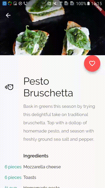
- 效果图
然后修改跳转的代码
void showRecipePage(BuildContext context, Recipe item) {
    Navigator.push(context, new MaterialPageRoute<void>(
      settings: const RouteSettings(name: '/pesto/recipe'),
      builder: (BuildContext context) {
        return new Theme(
          data: _pTheme.copyWith(platform: Theme.of(context).platform),
          child: new RecipePage(recipe: item),
        );
      },
    ));
  }
动态部分
理论认识
因为我们需要appBar进行滑动。所以需要使用CustomScrollView。结合SliverAppBar和SliverGrid来进行整体的绘制。
CustomScrollView
- 使用它,可以结合
Sliver来创造自定义的滚动效果。 比如说 做一个MD中常用的app bar 扩展的效果,就可以使用SliverAppBar,SliverList和SliverGrid来完成。 - 会创造
RenderSliver对象。 - 还可以通过
NotificationListener来监听滚动事件,或者通过ScrollController来监听和控制滚动事件。
很多经典的MD的appBar部分动画,都可以得到相应的实现。
观察动画
商品详情页
我们发现,商品详情页的动画效果,有点像是MD内,appbar放一张图片,然后完全滚动遮盖的效果。 所以,我们先用这个效果来尝试以下,实现效果
- 代码
class _RecipePageState extends State<RecipePage> {
  final GlobalKey<ScaffoldState> _scaffoldKey = new GlobalKey<ScaffoldState>();

  double _getAppBarHeight(BuildContext context) =>
      MediaQuery.of(context).size.height * 0.3;

  @override
  Widget build(BuildContext context) {
    final bool isFavorite = _favoriteRecipes.contains(widget.recipe);
    final double appBarHeight = _getAppBarHeight(context);

    return new Scaffold(
        key: _scaffoldKey,
        //将body直接改为CustomScrollView
        body: CustomScrollView(
          slivers: <Widget>[
            //分别返回`SliverAppBar`和`SliverToBoxAdapter`
            SliverAppBar(
              expandedHeight: appBarHeight - _kFabHalfSize,
              backgroundColor: Colors.transparent,
              //这个是决定appBar有多大的和里面放东西的控件
              flexibleSpace: FlexibleSpaceBar(
                  //创建一个stack
                  background: Stack(
                    fit: StackFit.expand,
                    children: <Widget>[
                      //先放一层图片在下面
                      Image.asset(
                        widget.recipe.imagePath,
                        fit: BoxFit.cover,
                        height: appBarHeight - _kFabHalfSize,
                      ),
                      //再盖一层渐变色
                      DecoratedBox(
                          decoration: BoxDecoration(
                            gradient: LinearGradient(
                                colors: <Color>[Color(0x60000000), Color(0x00000000)],
                                begin: Alignment(0.0, -1.0),
                                end: Alignment(0.0, -0.2)),
                          ))
                    ],
                  )),
            ),
            //因为child接受的是Sliver,我们可以将Box的控件,使用SliverToBoxAdapter来包括,简单的就可以显示了
            SliverToBoxAdapter(
              child: new Stack(
                children: <Widget>[
                  //这里和原来一样。同样是要叠两层。因为floattingActionBar是突出半个
                  Container(
                    width: _kRecipePageMaxWidth,
                    padding: const EdgeInsets.only(top: _kFabHalfSize),
                    child: new RecipeSheet(recipe: widget.recipe),
                  ),
                  Positioned(
                    right: 16.0,
                    child: new FloatingActionButton(
                      child: new Icon(isFavorite
                          ? Icons.favorite
                          : Icons.favorite_border),
                      onPressed: _toggleFavorite,
                    ),
                  ),
                ],
              ),
            )
          ],
        ));
  }
  //省略相同部分...
}
Scaffold的body下直接使用CustomScrollView。SliverAppBar中的flexibleSpace来存放appBar内显示的其他控件- 默认的
SliverAppBar的pined为false,故他会跟着滚上去。 - 因为
CustomScrollView的slivers接受的是sliver,我们可以将Box的控件,使用SliverToBoxAdapter来包括,简单的就可以显示了
- 运行效果
仔细看,有两点效果还是不满足我们预期的效果。
FloatingActionButton,需要压住一点上面的图片。- 滚动时,我们不需要图片进行透明度的渐变。
再次修改
既然这样,我们就不能用自带的来完成效果了。再次观察预期的效果,发现,关键点:背后的图片是不动的。 所以我们想,让图片整个放在背后,appBar只是一个透明的遮罩!
- 代码
class _RecipePageState extends State<RecipePage> {
//省略重复部分....
@override
Widget build(BuildContext context) {
//省略重复部分....
return new Scaffold(
key: _scaffoldKey,
//0.将body替换成一个Stack
body: Stack(
children: <Widget>[
//将图片跌在最下一层。并放在顶部
Positioned(
child: Image.asset(
widget.recipe.imagePath,
fit: BoxFit.cover,
height: appBarHeight+ _kFabHalfSize,
),
top: 0.0,
left: 0.0,
right: 0.0,
),
//然后再叠放我们的ScrollView
CustomScrollView(
slivers: <Widget>[
SliverAppBar(
expandedHeight: appBarHeight - _kFabHalfSize,
backgroundColor: Colors.transparent,
pinned: false,
//flexibleSpace 的background只是一个遮罩
flexibleSpace: FlexibleSpaceBar(
background: DecoratedBox(
decoration: BoxDecoration(
gradient: LinearGradient(
colors: <Color>[Color(0x60000000), Color(0x00000000)],
begin: Alignment(0.0, -1.0),
end: Alignment(0.0, -0.2)),
))),//Stack,FlexibleSpaceBar
), //SliverAppBar
SliverToBoxAdapter(//... ) //SliverToBoxAdatper
],//<Widget>[]
),//CustomScrollView
], //<WIdget>[]
)); //stack,Scaffold
}
}
- 运行效果
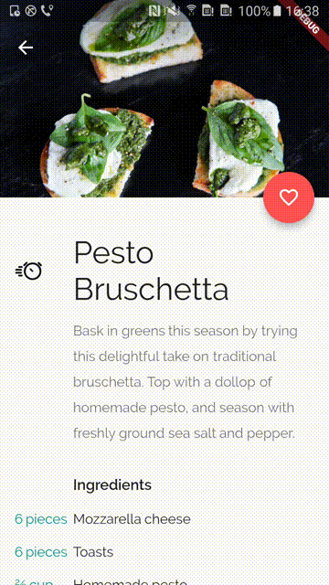
确认过眼神,就是我们要的效果。商品详情页的动画完成~
首页
同样的,我们发现默认的效果并不满足我们。我们这里需要根据滚动的量去改变FlexibleSpaceBar内我们创建的logo和图标的大小。
- 第一步,先改成经典的MD样式
class _RecipeGridPageState extends State<RecipeGridPage> {

  //省略代码...

  @override
  Widget build(BuildContext context) {
//得到状态栏高度
    final double statusBarHeight = MediaQuery.of(context).padding.top;

    return Theme(
        data: _pTheme.copyWith(platform: Theme.of(context).platform),
        child: Scaffold(
            key: scaffoldKey,
            floatingActionButton: FloatingActionButton(
                child: Icon(Icons.edit),
                onPressed: () {
                  //直接使用scaffoldKey.currentState弹出
                  scaffoldKey.currentState
                      .showSnackBar(SnackBar(content: Text('Not supported.')));
                }),
            //将body改为CustomScrollView
            body: CustomScrollView(
              slivers: <Widget>[
                SliverAppBar(
                  //pinned为true ,这样就不会随着继续往上滑动
                  pinned: true,
                  expandedHeight: _kAppBarHeight,
                  backgroundColor: Colors.teal,
                  //将原来放在appbar的action放在这里
                  actions: <Widget>[
                    GestureDetector(
                      onTap: () {
                        scaffoldKey.currentState.showSnackBar(
                            SnackBar(content: Text('Not supported.')));
                      },
                      child: Padding(
                        padding: const EdgeInsets.all(8.0),
                        child: Icon(Icons.search),
                      ),
                    )
                  ],
                  //这里添加。绘制出我们的图标
                  flexibleSpace: FlexibleSpaceBar(
                    background: Padding(
                      padding: new EdgeInsets.only(
                        top: statusBarHeight + 0.5 * 10.0,
                        bottom: 10.0,
                      ),
                      child: Center(
                       //固定宽度的居中处理
                        child: SizedBox(
                          width: kLogoWidth,
                          //使用stack展示上下布局。为什么不用column?
                          child: Stack(
                            overflow: Overflow.visible,
                            children: <Widget>[
                              Positioned.fromRect(
                                rect: Rect.fromLTWH(
                                    0.0, 0.0, kLogoWidth, kLogoHeight/5*2),
                                child: new Image.asset(
                                  'flutter_gallery_assets/pesto/logo_small.png',
                                  fit: BoxFit.contain,
                                ),
                              ),
                              Positioned.fromRect(
                                rect: Rect.fromLTWH(
                                    0.0, kLogoHeight/5*2, kLogoWidth, kTextHeight),
                                child: Center(
                                  child: new Text('PESTO',
                                      style: logoTitleStyle,
                                      textAlign: TextAlign.center),
                                ),
                              ),
                            ],
                          ),
                        ),
                      ),
                    ),
                  ),
                ),
              //下面是一个list.把原来的listView.builder改成这样就可以了
                SliverList(
                    delegate: SliverChildBuilderDelegate(
                  (context, index) {
                    return RecipeCard(
                      recipe: items[index],
                      onTap: () {
                        showRecipePage(context, items[index]);
                      },
                    );
                  },
                  childCount: items.length,
                )),
              ],
            )));
  }

//省略代码...
}
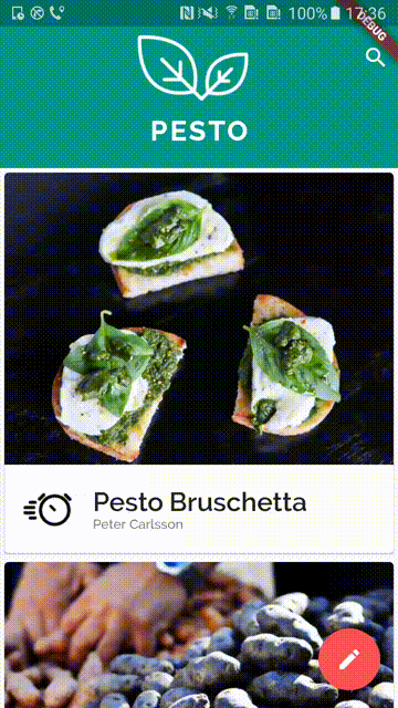
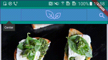
- 效果1
确实不符合我们的效果,接下来需要动画控制整个效果。
- 正在的技术 我们这里的效果是根据appBar的大小,进行图标的缩放,最后保留图标,停留在那。
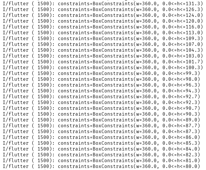
我们可以使用LayoutBuilder这个类,来传递变化的父组件的约束。
LayoutBuilder
还记得我们入门的第二遍文章介绍过的Builder吗(可以正确传入当前子控件的父组件的BuildContext)?与其类似的,还存在
LayoutBuilder。它可以传入父组件的大小,让我们的自组件跟着他进行变化。
将FlexibleSpaceBar修改成LayoutBuilder就可以得到变化的Contraints了。
题外话:FlexibleSpaceBar的实现方式和这种方式不同。这个我们后面再研究
- 代码
 flexibleSpace: LayoutBuilder(builder:
                        (BuildContext context, BoxConstraints constraints) {
                      print('constraints=' + constraints.toString());
                    return Padding(//...与原来相同的代码
                              );
}
- 效果2

FlexibleSpaceBar自带的渐变效果就消失了, 还可以可以看到这个constraints的高度在变化
这样,我们就根据这样的数值,来完成我们的动画效果
- 代码
flexibleSpace: LayoutBuilder(builder:
                        (BuildContext context, BoxConstraints constraints) {
                      //这是AppBar的总高度
                      double biggestHeight = constraints.biggest.height;
                      //当前的AppBar的真实高度,去掉了状态栏
                      final double appBarHeight = biggestHeight-statusBarHeight;
                      //appBarHeight - kToolbarHeight 代表的是当前的扩展量,_kAppBarHeight - kToolbarHeight表示最大的扩展量

                      //t就是,变化的Scale
                      final double t = (appBarHeight - kToolbarHeight) / (_kAppBarHeight - kToolbarHeight);
                      // begin + (end - begin) * t; lerp函数可以快速取到根据当前的比例中间值
                      final double extraPadding = new Tween<double>(begin: 10.0, end: 24.0).lerp(t);
                      final double logoHeight = appBarHeight - 1.5 * extraPadding;

                      //字体的样式没有发生变化。
                      final TextStyle titleStyle = const PestoStyle(fontSize: kTextHeight, fontWeight: FontWeight.w900, color: Colors.white, letterSpacing: 3.0);

                      //字体所占用的rect空间
                      final RectTween _textRectTween = new RectTween(
                          begin: new Rect.fromLTWH(0.0, kLogoHeight, kLogoWidth, kTextHeight),
                          end: new Rect.fromLTWH(0.0, kImageHeight, kLogoWidth, kTextHeight)
                      );
                      //透明度变化的曲线。这里是easeInOut
                      final Curve _textOpacity = const Interval(0.4, 1.0, curve: Curves.easeInOut);

                      //图片所占用的rect空间
                      final RectTween _imageRectTween = new RectTween(
                        begin: new Rect.fromLTWH(0.0, 0.0, kLogoWidth, kLogoHeight),
                        end: new Rect.fromLTWH(0.0, 0.0, kLogoWidth, kImageHeight),
                      );

                      return Padding(
                        padding: new EdgeInsets.only(
                          //这个padding就直接设置变化
                          top: statusBarHeight + 0.5 * extraPadding,
                          bottom:extraPadding,
                        ),
                        child: Center(
                          child: Transform(
                            //因为整体需要一个Scale的变化,所以就用transform.可以理解成css一样的transfrom动画。
                            //这里是使用单位矩阵*scale来计算.scale等于当前logo的高度占总共的高度
                            transform: new Matrix4.identity()..scale(logoHeight / kLogoHeight),
                            //布置在上中
                            alignment: Alignment.topCenter,
                            child: SizedBox(
                              width: kLogoWidth,
                              child: Stack(
                                overflow: Overflow.visible,
                                children: <Widget>[
                                  Positioned.fromRect(
                                    //这里传递的占用位置也是不断变化的,这里说明其实我们外层其实也可以用SizedBox来实现?
                                    rect: _imageRectTween.lerp(t),
                                    child: new Image.asset(
                                      'flutter_gallery_assets/pesto/logo_small.png',
                                      fit: BoxFit.contain,
                                    ),
                                  ),
                                  Positioned.fromRect(
                                    rect: _textRectTween.lerp(t),
                                    child: Center(
                                      //创建一个透明度来包裹
                                      child: Opacity(
                                        //找到这个曲线上t百分比占的位置
                                        opacity: _textOpacity.transform(t),
                                        child: new Text('PESTO',
                                            style: titleStyle,
                                            textAlign: TextAlign.center),
                                      ),
                                    ),
                                  ),
                                ],
                              ),
                            ),
                          ),
                        ),
                      );
                    })
- 最终效果
- 上下的
padding发生改变 通过直接改变包裹的padding值来改变。
 new EdgeInsets.only(
                          //这个padding就直接设置变化
                          top: statusBarHeight + 0.5 * extraPadding,
                          bottom:extraPadding,
                        ),
- 整体变小
通过在包裹一层,
Transfrom组件,改变其中的矩阵来完成。 还有一个就是SizedBox中定义的Rect来控制占用的控件。并不会Scale控件
child: Transform(
                            //因为整体需要一个Scale的变化,所以就用transform.可以理解成css一样的transfrom动画。
                            //这里是使用单位矩阵*scale来计算.scale等于当前logo的高度占总共的高度
                            transform: new Matrix4.identity()
                              ..scale(logoHeight / kLogoHeight),
                            //布置在上中
                            alignment: Alignment.topCenter,
                            child: SizedBox(
                              width: kLogoWidth,
                              child: Stack(
                                overflow: Overflow.visible,
                                children: <Widget>[
                                  Positioned.fromRect(
                                    //这里传递的占用位置也是不断变化的,这里说明其实我们外层其实也可以用SizedBox来实现?
                                    rect: _imageRectTween.lerp(t),
                                    child: new Image.asset(
                                      'flutter_gallery_assets/pesto/logo_small.png',
                                      fit: BoxFit.contain,
                                    ),
                                  ),
                                  Positioned.fromRect(
                                    rect: _textRectTween.lerp(t),
                                    child: Center(
                                      //创建一个透明度来包裹
                                      child: Opacity(
                                        //找到这个曲线上t百分比占的位置
                                        opacity: _textOpacity.transform(t),
                                        child: new Text('PESTO',
                                            style: titleStyle,
                                            textAlign: TextAlign.center),
                                      ),
                                    ),
                                  ),
                                ],
                              ),
                            ),
                          ),
- 下面的文字有一个透明度的改变 通过包裹一层透明度组件(Opacity),修改opacity的值,来完成。
Opacity(
                                        //找到这个曲线上t百分比占的位置
                                        opacity: _textOpacity.transform(t),
                                        child: new Text('PESTO',
                                            style: titleStyle,
                                            textAlign: TextAlign.center),
                                      ),
#####添加转场动画效果
使用Hero组件包裹Image,并且同时带有相同的tag
- RecipeCard
class RecipeCard extends StatelessWidget {
  //省略无用代码
  @override
  Widget build(BuildContext context) {
    return GestureDetector(
      onTap: onTap,
      child: Card(
        child: Column(
          crossAxisAlignment: CrossAxisAlignment.start,
          children: <Widget>[
          //这里进行包裹
            Hero(
              tag: "${recipe.imagePath}",
              child: Image.asset(
                recipe.imagePath,
                fit: BoxFit.contain,
              ),
            ),
            Row(
            //省略重复代码
           )
          ],
        ),
      ),
    );
  }
}
- _RecipePageState
//...省略
@override
  Widget build(BuildContext context) {
    return new Scaffold(
        key: _scaffoldKey,
        body: Stack(
          children: <Widget>[
            Positioned(
             //同样在这里包裹住图片
              child: Hero(
                tag: "${widget.recipe.imagePath}",
                child: Image.asset(
                  widget.recipe.imagePath,
                  fit: BoxFit.cover,
                  height: appBarHeight + _kFabHalfSize,
                ),
              ),
              top: 0.0,
              left: 0.0,
              right: 0.0,
            ),
            CustomScrollView(//...省略
            ),
          ],
        ));
  }
总结
最后总结一下。 看到这样一个,不属于自带效果的动画,我们刚刚开始确实无法入手。 遇到这样的方法,最简单的也是最耗时方式就是降维。就像本编文章一样,花了大量的事件,先完成静态简单的熟悉的页面。再完成动态的效果。
这边文章我们熟悉的知识点,可以简单做一下回顾
- 封装一个简单的Card组件
- 使用ListView.Builder来显示一个列表
- 使用
GestureDetector来监听手势事件 - Stack布局的使用。(可以理解成FrameLayout)
- dart的..的级联用法。(这个用法超级常见和方便)
- Table TableRow 和TableCell组件来显示简单的表单功能
- 使用CustomScrollView结合SliverAppBar和SliverList来实现经典的MD动画效果
- 使用CustomScrollView等组件,结合LayoutBuilder来实现自定义的动画效果。
LayoutBuilder会传入父组件的约束。我们就可以通过传入的约束,计算变化量。并利用一系列内置的动画组件
TransfromOpacity等,来进行变化。
