

最近闲暇时间在看鑫爷的《CSS世界》,内容真的是非常精彩,很多细节分析的非常透彻,值得推荐。在日常开发中实现某种效果有很多方式,但是下面的css code我以前都很少用到,原来css还可以这么玩 。。
实现hover改变成另一张图片效果
/**css**/
img: hover {
     content: url( laugh-tear.png);
 }

/**html code**/
< img src=" laugh.png">
局限性:content 属性 改变 的 仅仅是 视觉 呈现, 当 我们 以 右键 或 其他 形式 保存 这张 图片 的 时候, 所 保存 的 还是 原来 src 对应 的 图片。
显示网站logo
< h1>logo</ h1>
 h1{
   content: url( logo. svg);
 }
优点:
1,不会影响网站SEO。
2,使用.svg矢量图为了适应移动 端 retina 屏幕(如果用.svg会模 糊)。
注:千万不要自以为是地把重要的文本信息使用content 属性生成,因为这对可访问性和SEO都很不友好,content 属性只能用来生成 一些 无关紧要的内容, 如装饰性图形或者序号之类; 同样,也不要担心 原本重要的文字信息会被content替换,替换的仅仅是视觉层。
设置内容无法选中、无法复制
user-select: none
“三道 杠” 小 图标 示意
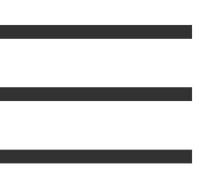
.icon-menu {
     display: inline-block;
     width: 140px;
     height: 10px;
     padding: 35px 0;
     border-top: 10px solid;
     border-bottom: 10px solid;
     background-color: currentColor;
     background-clip: content-box;
}
双层 圆点 图形 示意
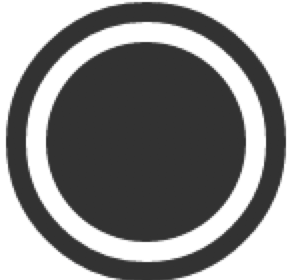
.icon-dot {
     display: inline-block;
      width: 100px;
      height: 100px;
      padding: 10px;
      border: 10px solid;
      border-radius: 50%;
      background-color: currentColor;
      background-clip: content-box;
}
去掉最右边的margin-right:20
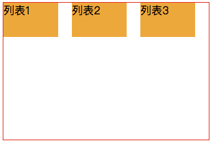
  /**方案一:使用css3 nth-of-type属性(不考虑兼容IE8**/
li: nth-of-type(3n) {
    margin-right: 0;
 }
  /**方案二:通过给父容器添加margin属性, 增加容器的可用宽度来实现**/
ul {
     margin-right: -20px;
}
 ul > li {
     float: left;
     width: 100px;
     margin-right: 20px;
 }
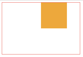
margin:auto的妙用
水平垂直居中
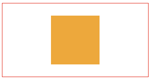
<!DOCTYPE html>
<html lang="en">
<head>
    <meta charset="UTF-8">
    <title>demo</title>
    <style>
        .father {
            position: relative;
            width: 300px;
            height: 150px;
            border: red solid 1px;
        }
        .son {
            position: absolute;  /**key code here**/
            background-color: orange;
            width: 100px;
            height: 100px;
            top: 0;
            right: 0;
            left: 0;
            bottom: 0;
            margin: auto;  /**key code here**/
        }
    </style>
</head>
<body>
    <div class="father">
        <div class="son"></div>
    </div>
</body>
</html>
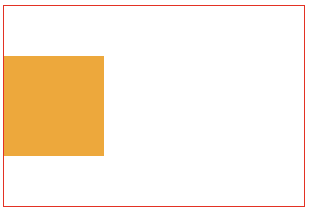
左/右对齐效果。
...
        .father {
            width: 300px;
            height: 200px;
            border: red solid 1px;
        }
        .son {
            width: 100px;
            height: 100px;
            background-color: orange;
            margin-right: 50px; /**左对齐margin-right、margin-left值交换**/
            margin-left: auto;  /**key code here**/
        }
...
水平居中
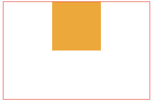
...
        .father {
            width: 300px;
            height: 200px;
            border: red solid 1px;
        }
        .son {
            width: 100px;
            height: 100px;
            background-color: orange;
            margin-right: auto; /**key code here**/
            margin-left: auto;  /**key code here**/
        }
...
###垂直居中
...
        .father {
            width: 300px;
            height: 200px;
            writing-mode: vertical-lr;  /**key code here**/
            border: red solid 1px;
        }
        .son {
            width: 100px;
            height: 100px;
            background-color: orange;
            margin: auto;  /**key code here**/
        }
...
实现最高渲染性能的去除下边框css
div {
    border: 1px solid;
    border-bottom: 0 none;  /**key code here**/
 }
优雅的增加icon按钮点击区域
点击 区域 大小 从 16 × 16 一下子 提升 到 38 × 38,
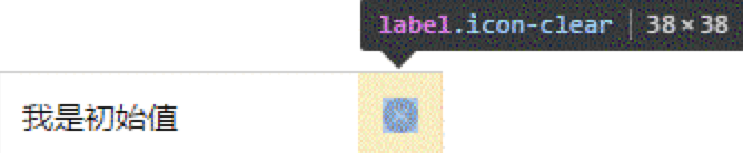
.icon-clear {
     width: 16px;
      height: 16px;
      border: 11px solid transparent; /**key code here**/
}
最高性能等边三角图形绘制
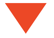
  div {
            width: 0;
            border-width: 50px 34px;
            border-style: solid;
            border-color: #f30 transparent transparent;
        }
最高性能等腰三角图形绘制

        div {
            width: 0;
            border-width: 20px 10px;
            border-style: solid;
            border-color: #f30 transparent transparent;
        }
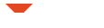
又或者是这种三角形(对话框气泡下的三角形)

        div {
            width: 0;
            border-width: 20px 10px;
            border-style: solid;
            border-color: #f30 #f30 transparent transparent;
        }
最高性能梯形图形绘制
        div {
            width: 10px;
            height: 10px;
            border: 10px solid;
            border-color: #f30 transparent transparent;
        }
逼真 的 3D 效果

        div {
            width: 10px;
            height: 10px;
            border: 10px solid;
            border-color: #f30 #00f #396 #0f0;
        }
被遗忘的ex单位
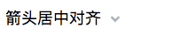
实现箭头居中文字垂直方向(不受字体、字号影响)
<!DOCTYPE html>
<html lang="en">
<head>
    <meta charset="UTF-8">
    <title>demo</title>
    <style>

        .icon-arrow {
            display: inline-block;
            width: 20px;
            height: 1ex;
            background: url(arrow.svg) no-repeat center/20px 20px;
        }

    </style>
</head>
<body>
    <div style="font-size: 18px">
       箭头居中对齐
        <i class="icon-arrow"></i>
    </div>

</body>
</html>
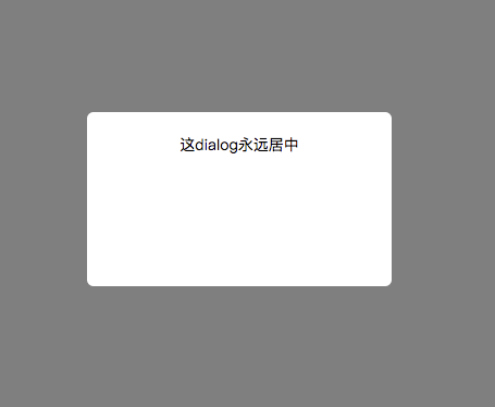
永远居中的dialog(可兼容到IE7)
<!DOCTYPE html>
<html lang="en">
<head>
    <meta charset="UTF-8">
    <title>demo</title>
    <style>

       .container {
           position: fixed;
           top:0;
           right: 0;
           left: 0;
           bottom: 0;
           background-color: rgba(0,0,0,.5);
           text-align: center;
           font-size: 0;
           white-space: nowrap;
           overflow: auto;

       }

       .container:after {
           content: '';
           display: inline-block;
           height: 100%;
           vertical-align: middle;
       }
       .content {
           width: 240px;
           height: 120px;
           padding: 20px;
       }

       .dialog {
           display: inline-block;
           vertical-align: middle;
           border-radius: 6px;
           background-color: #fff;
           font-size: 14px;
           white-space: normal;
       }

    </style>
</head>
<body>
    <div class="container">
        <div class="dialog">
            <div class="content">这dialog永远居中</div>
        </div>

    </div>

</body>
</html>
去除页面默认滚动条(PC端有效)
/**good code**/
 html {
            overflow: hidden;
        }

/**bad code**/
 html, body {
            overflow: hidden;
        }
本次写作到此,欢迎❤️⭐️👏指出错误或者发布自己的见解探讨,共勉。🤝
