

我们在日常开发中经常遇到布局问题,下面罗列几种常用的css布局方案 话不多说,上代码!
居中布局
以下居中布局均以不定宽为前提,定宽情况包含其中
1、水平居中
a) inline-block + text-align
.parent{
    text-align: center;
}
.child{
    display: inline-block;
}
tips:此方案兼容性较好,可兼容至IE8,对于IE567并不支持inline-block,需要使用css hack进行兼容
b) table + margin
.child{
    display: table;
    margin: 0 auto;
}
tips:此方案兼容至IE8,可以使用<table/>代替css写法,兼容性良好
c) absolute + transform
.parent{
    position: relative;
    height:1.5em;
}
.child{
    position: absolute;
    left: 50%;
    transform: translateX(-50%);
}
tips:此方案兼容至IE9,因为transform兼容性限制,如果.child为定宽元素,可以使用以下写法,兼容性极佳
.parent{
    position: relative;
    height:1.5em;
}
.child{
    position: absolute;
    width:100px;
    left: 50%;
    margin-left:-50px;
}
d) flex + justify-content
.parent{
    display: flex;
    justify-content: center;
}
.child{
    margin: 0 auto;
}
tips:flex是一个强大的css,生而为布局,它可以轻松的满足各种居中、对其、平分的布局要求,但由于现浏览器兼容性问题,此方案很少被使用,但是值得期待浏览器兼容性良好但那一天!
2、垂直
a) table-cell + vertial-align
.parent{
	display: table-cell;
	vertical-align: middle;
}
tips:可替换成<table />布局,兼容性良好
b) absolute + transform
.parent{
	position: relative;
}
.child{
	position: absolute;
	top: 50%;
	transform: translateY(-50%);
}
tips:存在css3兼容问题,定宽兼容性良好
c) flex + align-items
.parent{
	display: flex;
	align-items: center;
}
tips:高版本浏览器兼容,低版本不适用
3、水平垂直
a) inline-block + table-cell + text-align + vertical-align
.parent{
	text-align: center;
	display: table-cell;
	vertical-align: middle;
}
.child{
	display: inline-block;
}
tips:兼容至IE8 b) absolute + transform
.parent{
	position: relative;
}
.child{
	position: absolute;
	left: 50%;
	top: 50%;
	transform: translate(-50%,-50%);
}
tips:兼容性稍差,兼容IE10以上 c) flex
.parent{
	display: flex;
	justify-content: center;
	align-items: center;
}
tips:兼容差
多列布局
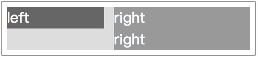
1、一列定宽,一列自适应
a) float + margin
.left{
	float: left;
	width: 100px;
}
.right{
	margin-left: 120px;
}
tips:此方案对于定宽布局比较好,不定宽布局推荐方法b b) float + overflow
.left{
	float: left;
	width: 100px;
	margin-right: 20px;
}
.right{
	overflow: hidden;
}
tips:个人常用写法,此方案不管是多列定宽或是不定宽,都可以完美实现,同时可以实现登高布局 c) table
.parent{
	display: table; width: 100%;
	table-layout: fixed;
}
.left,.right{
	display: table-cell;
}
.left{
	width: 100px;
	padding-right: 20px;
}
d) flex
.parent{
	display: flex;
}
.left{
	width: 100px;
	padding-right: 20px;
}
.right{
	flex: 1;
}
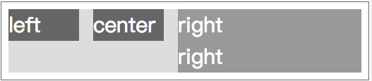
2、多列定宽,一列自适应
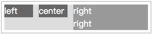
a) float + overflow
.left,.center{
	float: left;
	width: 100px;
	margin-right: 20px;
}
.right{
	overflow: hidden;
}
b) table
.parent{
	display: table; width: 100%;
	table-layout: fixed;
}
.left,.center,.right{
	display: table-cell;
}
.right{
	width: 100px;
	padding-right: 20px;
}
c) flex
.parent{
	display: flex;
}
.left,.center{
	width: 100px;
	padding-right: 20px;
}
.right{
	flex: 1;
}
3、一列不定宽,一列自适应
a) float + overflow
.left{
	float: left;
	margin-right: 20px;
}
.right{
	overflow: hidden;
}
.left p{width: 200px;}
b) table
.parent{
	display: table; width: 100%;
}
.left,.right{
	display: table-cell;
}
.left{
	width: 0.1%;
	padding-right: 20px;
}
.left p{width:200px;}
c) flex
.parent{
	display: flex;
}
.left{
	margin-right: 20px;
}
.right{
	flex: 1;
}
.left p{width: 200px;}
4、多列不定宽,一列自适应
a) float + overflow
.left,.center{
	float: left;
	margin-right: 20px;
}
.right{
	overflow: hidden;
}
.left p,.center p{
	width: 100px;
}
5、等分
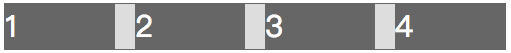
.parent{
	margin-left: -20px;
}
.column{
	float: left;
	width: 25%;
	padding-left: 20px;
	box-sizing: border-box;
}
b) table + margin
.parent-fix{
	margin-left: -20px;
}
.parent{
	display: table;
	width:100%;
	table-layout: fixed;
}
.column{
	display: table-cell;
	padding-left: 20px;
}
c) flex
.parent{
	display: flex;
}
.column{
	flex: 1;
}
.column+.column{
	margin-left:20px;
}
6、等高
.parent{
	overflow: hidden;
}
.left,.right{
	padding-bottom: 9999px;
	margin-bottom: -9999px;
}
.left{
	float: left; width: 100px;
}
.right{
	overflow: hidden;
}
b) table
.parent{
	display: table;
	width: 100%;
}
.left{
	display:table-cell;
	width: 100px;
	margin-right: 20px;
}
.right{
	display:table-cell;
}
c) flex
.parent{
	display:flex;
	width: 100%;
}
.left{
	width: 100px;
}
.right{
	flex:1;
}
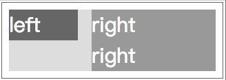
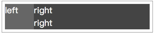
并排等分,单排对齐靠左布局
效果图
flex
.main {
    display: flex;
    flex-flow: row wrap;
    justify-content: space-between;
}
.item {
    display: inline-block;
}
.empty{
    height: 0;
    visibility: hidden;
}
具体详解请见下文 github.com/zwwill/blog…
圣杯布局&双飞翼布局
此处仅为代码展示,差别讲解请移驾下文 【方案】圣杯布局&双飞翼布局
圣杯布局
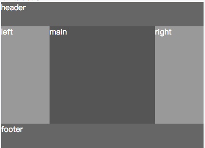
【demo】codepen.io/zwwill/pen/…
<div class="container">
    <div class="header">header</div>
    <div class="wrapper clearfix">
        <div class="main col">main</div>
        <div class="left col">left</div>
        <div class="right col">right</div>
    </div>
    <div class="footer">footer</div>
</div>
.container {width: 500px; margin: 50px auto;}
.wrapper {padding: 0 100px 0 100px;}
.col {position: relative; float: left;}
.header,.footer {height: 50px;}
.main {width: 100%;height: 200px;}
.left {width: 100px; height: 200px; margin-left: -100%;left: -100px;}
.right {width: 100px; height: 200px; margin-left: -100px; right: -100px;}
.clearfix::after {content: ""; display: block; clear: both; visibility: hidden; height: 0; overflow: hidden;}
双飞翼布局
ps: “这不是一样的图嘛?” “对!就是一样的,因为是解决同一种问题的嘛。”
【demo】codepen.io/zwwill/pen/…
<div class="container">
    <div class="header">header</div>
    <div class="wrapper clearfix">
        <div class="main col">
            <div class="main-wrap">main</div>
        </div>
        <div class="left col">left</div>
        <div class="right col">right</div>
    </div>
    <div class="footer">footer</div>
</div>
.col {float: left;}
.header {height: 50px;}
.main {width: 100%;}
.main-wrap {margin: 0 100px 0 100px;height: 200px;}
.left {width: 100px; height: 200px; margin-left: -100%;}
.right {width: 100px; height: 200px; margin-left: -100px;}
.footer {height: 50px;}
.clearfix::after {content: ""; display: block; clear: both; visibility: hidden; height: 0; overflow: hidden;}
定位布局
简单的绝对定位即可解决问题,为啥还要搞什么圣杯和双飞翼?原因
<div class="header">header</div>
<div class="wrapper">
    <div class="main col">
        main
    </div>
    <div class="left col">
        left
    </div>
    <div class="right col">
        right
    </div>
</div>
<div class="footer">footer</div>
.wrapper { position: relative; }
.main { margin:0 100px;}
.left { position: absolute; left: 0; top: 0;}
.right { position: absolute; right: 0; top: 0;}
以上所有demo的源码 github:github.com/zwwill/css-…
转载请标注出处
首发:github.com/zwwill/blog… 作者:木羽
