

前言
最近有一个新的项目,UI大佬不知道从哪里找来了一张GIF丢到蓝湖,
说作为全局的页面loading ,但是自己想了想,还是选择画一个。
一开始想过用svg,canvas,最终还是选择了css3+js来实现这个效果。
gif的缺点挺多,至于为什么又排除了svg和canvas,是因为css3+js可控性更强,
不管是大小还是颜色,还是响应式(我的项目走的vh,vw)那套来适配;
效果
UI大佬提供的GIF
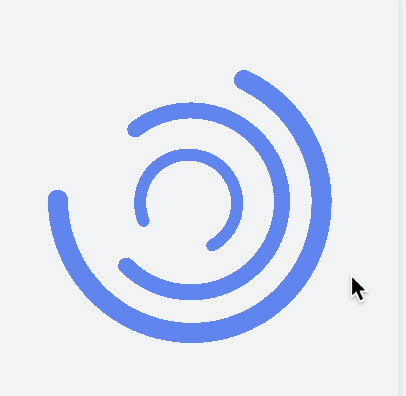
实现的效果【在线codesandbox预览】

- 支持环的颜色改变及整个展示大小
- 支持在
loading底部显示文字并控制其样式
实现思路
这个东东主要用了这么几个要点来实现完整的效果;
flex和position来布局- 伪类的颜色继承(
currentColor) - 边框结合圆角实现环
- 用了
transform和animation来实现了整个过渡
效果知道怎么实现了,剩下的就是我们需要实现的功能点了;
因为是面向移动端的,所以这些常规的东东也要考虑下
- 遮罩层可控
- 防止点击穿透滚动
body - 组件支持函数方法调用
源码
Loading.vue
<template>
  <div id="loading-wrapper">
    <div class="loading-ring" :style="ringStyle">
      <div class="outer" />
      <div class="middle" />
      <div class="inner" />
    </div>
    <div class="text" :style="textStyle" v-if="text">
      {{ text }}
    </div>
  </div>
</template>

<script>
export default {
  name: "Loading",
  props: {
    text: {
      type: String,
      default: ""
    },
    textStyle: {
      type: Object,
      default: function() {
        return {
          fontSize: "14px",
          color: "#fff"
        };
      }
    },
    ringStyle: {
      type: Object,
      default: function() {
        return {
          width: "100px",
          height: "100px",
          color: "#407af3"
        };
      }
    }
  },
  methods: {
    preventDefault(e) {
      // 禁止body的滚动
      console.log(e);
      e.preventDefault();
      e.stopPropagation();
    }
  },
  mounted() {
    document
      .querySelector("body")
      .addEventListener("touchmove", this.preventDefault);
  },
  destroyed() {
    document
      .querySelector("body")
      .removeEventListener("touchmove", this.preventDefault);
  }
};
</script>

<style lang="scss" scoped>
#loading-wrapper {
  position: fixed;
  left: 0;
  top: 0;
  height: 100vh;
  width: 100vw;
  background-color: rgba(0, 0, 0, 0.25);
  display: flex;
  justify-content: center;
  align-items: center;
  flex-direction: column;
  .loading-ring {
    position: relative;
    width: 200px;
    height: 200px;
    .outer,
    .inner,
    .middle {
      position: absolute;
      left: 50%;
      top: 50%;
      transform: translate(-50%, -50%);
      color: currentColor;
      &::after {
        content: "";
        display: block;
        width: 100%;
        height: 100%;
        border-radius: 100%;
        border-left: 10px solid currentColor;
        border-right: 10px solid currentColor;
        border-top: 10px solid currentColor;
        border-bottom: 10px solid transparent;
      }
    }

    .outer {
      width: 100%;
      height: 100%;
      &::after {
        animation: anticlockwise 1.5s infinite linear;
      }
    }
    .inner {
      width: calc(100% * 0.6);
      height: calc(100% * 0.6);
      &::after {
        animation: anticlockwise 1.5s infinite linear;
      }
    }
    .middle {
      width: calc(100% * 0.8);
      height: calc(100% * 0.8);
      &::after {
        animation: clockwise 1.5s infinite linear;
      }
    }
  }

  .text {
    color: #fff;
    font-size: 14px;
    padding: 30px;
    width: 250px;
    text-align: center;
  }
}

@keyframes clockwise {
  0% {
    transform: rotate(0deg);
  }
  100% {
    transform: rotate(360deg);
  }
}
@keyframes anticlockwise {
  0% {
    transform: rotate(0deg);
  }
  100% {
    transform: rotate(-360deg);
  }
}
</style>
index.js
import Loading from "./Loading.vue";
// 来保持实例,单例模式
let instance;
let el;

Loading.install = function(Vue, options = {}) {
  const defaultOptions = {
    text: "",
    textStyle: {
      fontSize: "14px",
      color: "#fff"
    },
    ringStyle: {
      width: "100px",
      height: "100px",
      color: "#407af3"
    },
    ...options
  };
  Vue.prototype.$loading = {
    show(options = {}) {
      if (!instance) {
        let LoadingInstance = Vue.extend(Loading);
        el = document.createElement("div");
        document.body.appendChild(el);
        instance = new LoadingInstance({
          propsData: { defaultOptions, ...options }
        }).$mount(el);
      } else {
        return instance;
      }
    },
    hide() {
      if (instance) {
        document.body.removeChild(document.getElementById("loading-wrapper"));
        instance = undefined;
      }
    }
  };
};

export default Loading;
选项及用法
选项
    text: {  // 这个不为空就在loading下面显示文字
      type: String,
      default: ""
    },
    textStyle: {  // loading text 的样式,颜色及字体大小
      type: Object,
      default: function() {
        return {
          fontSize: "14px",
          color: "#fff"
        };
      }
    },
    ringStyle: {  // 最外环的大小,内二环是比例换算的(百分比)
      type: Object,
      default: function() {
        return {
          width: "100px",
          height: "100px",
          color: "#407af3"
        };
      }
    }
用法
在主入口use一下便可全局使用
除了常规的引入使用,还支持函数调用,挂载了一个$loading。
this.$loading.show({
        text: "loading",
        textStyle: {
          fontSize: "18px",
          color: "#f00"
        }
      });

let st = setTimeout(() => {
        clearTimeout(st);
        this.$loading.hide();
    }, 1000);
总结
props的传递没有做增量合并(递归每个key赋值),直接浅复制合并的。
对于组件功能的概而全,拓展性,大小需要自己权衡;
到这里,我们业务需要的一个小组件,该有的功能都有了。
有不对之处请留言,会及时修正。
