

最近的学习中,对于svg实现的文字霓虹灯动画感到很是有趣,而且实现起来也相对着来说比较容易,效果也不错,比如下图。

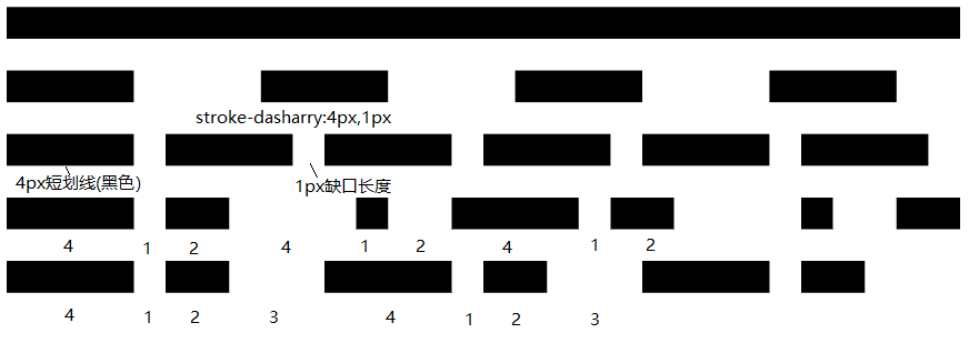
stroke-dasharray
官方解释为It's a list of comma and/or white space separated lengths and percentages that specify the lengths of alternating dashes and gaps. If an odd number of values is provided, then the list of values is repeated to yield an even number of values. Thus, 5,3,2 is equivalent to 5,3,2,5,3,2.;--MDN
翻译过来就是它是一个用逗号或者空白隔开的length和percentage数列,length指定了短划线的长度,percentage指定了缺口的长度。如果提供了奇数个值,则这个值的数列重复一次,从而变成偶数个值。所以,如果为4,等同于4, 4 ;5,3,2等同于5,3,2,5,3,2;如下面的示例所示。
<svg viewBox="0 0 30 15" xmlns="http://www.w3.org/2000/svg">
        <!-- 当没有两个属性时 -->
        <line x1="0" y1="1" x2="30" y2="1" stroke="black" />

        <!-- 当两个属性相等时,平分 -->
        <line x1="0" y1="3" x2="30" y2="3" stroke="black"
                stroke-dasharray="4" />

        <!-- 当两个属性不相同时-->
        <line x1="0" y1="5" x2="30" y2="5" stroke="black"
                stroke-dasharray="4 1" />

        <!-- 当属性个数为奇数时,4 1 2 会变为 4 1 2 4 1 2 这样的排布顺序 这些数值
            会按短划线长度 缺口的长度这样子排布下去 -->
        <line x1="0" y1="7" x2="30" y2="7" stroke="black"
                stroke-dasharray="4 1 2" />

        <!-- 当属性个数为偶数时,会按4 1 2 3 4 1 2 3 排布 -->
        <line x1="0" y1="9" x2="30" y2="9" stroke="black"
                stroke-dasharray="4 1 2 3" />
      </svg>
也可以这样子想象,这是一个数列,这个数列由循环的两个不同key构成,也就是 const dasharray = {length, percentage,length, percentage,length, percentage...},length指定了短划线的长度,percentage指定了缺口的长度,然后将stroke-dasharray后的数值循环的进行赋值。所以可以得出以下结论
stroke-dasharray:4 1 的话就是const dasharray = {length:4, percentage:1,length:4, percentage:1,length:4, percentage:1...}
stroke-dasharray:4 1 2 就是const dasharray = {length:4, percentage:1,length:2, percentage:4,length:1, percentage:2...}
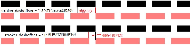
stroke-dashoffset
The stroke-dashoffset attribute is a presentation attribute defining an offset on the rendering of the associated dash array.--MDN
翻译过来简单来说就是这个属性设置了与之关联的dash数组的偏移量。也就是上面的stroke-dasharray属性中这个数列。这个属性相对于绘制的起点偏移的量,正值(向右或者顺时针偏移),负值(向左或者逆时针)。
以下是示例来表示红色相对于黑色的线段偏移。
<line x1="0" y1="7" x2="30" y2="7" stroke="black"
              stroke-dasharray="3 1" />
<line x1="0" y1="9" x2="30" y2="9" stroke="rgba(255,0,0,.5)"
              stroke-dasharray="3 1"
              stroke-dashoffset="-3" />

<line x1="0" y1="11" x2="30" y2="11" stroke="black"
              stroke-dasharray="3 1" />
<line x1="0" y1="13" x2="30" y2="13" stroke="rgba(255,0,0,.5)"
              stroke-dasharray="3 1"
              stroke-dashoffset="1" />
<svg viewBox="-3 0 33 20" xmlns="http://www.w3.org/2000/svg">
        <ellipse cx="10" cy="10" rx="5" ry="5" fill="none" stroke=#000
        stroke-dasharray="4" stroke-dashoffset= "0" stroke-width=1 ></ellipse>    <!--同等大小不同颜色红色的圆形顺时针环绕4份-->
        <ellipse cx="10" cy="10" rx="5" ry="5" fill="none" stroke=red
        stroke-dasharray="4" stroke-dashoffset= "4" stroke-width=1></ellipse>
</svg>

让我们动手做个线条动画吧
有了上面的知识, 我们还需要补充一点知识。
- d:这个标签后是整个路径的集合
- stroke:路径的颜色
- stroke-width:路径的宽度
- fill:形状的填充颜色
- polyline:标签用来创建仅包含直线的形状
现在我们就可以去制作一些线条动画了,这样也可以加深我们对上面两个属性的理解。 整体思路是这样的。先画好路径,然后量出这段路径的长度, 然后用css3的animation设置stroke-dasharray来使得svg图像发生动画。
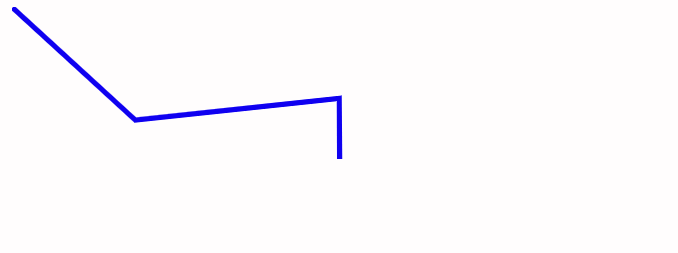
首先线条动画需要设置一个路径,这里我们可以自由设置。笔者是在AI上用钢笔画的一个路径。设置的是只用了直线的polyline标签。其他的可以用标签path来标记。
<svg width="400" height="400" viewBox="0 0 400 400" xmlns="http://www.w3.org/2000/svg">
    <!--设置画板为400*400,视窗左上角坐标为0 0,窗口为400*400-->
    <polyline stroke="black" stroke-width="3px" fill="none" points="0.34 0.37 70.47 64.62 187 52.19 187.34 128.87 298.03 122.44 357.85 11.93"></polyline>
</svg>
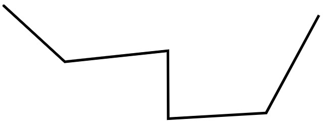
     var path = document.querySelector(.cls);
     var length = path.getTotalLength();
     console.log(length);// 控制台里得到长度为525.52
设置animation属性
.cls{
            animation: move 3s linear infinite;
    }
    @keyframes move{
            0%{
                    stroke-dasharray: 0 525.52px;
            }
            100%{
                    stroke-dasharray: 525.52px;
            }
    }
这样子我们的简单线条效果就出来了
.cls{
            animation: move 5s linear infinite;
    }
@keyframes move{
            0%{
                    stroke-dasharray: 0 525.52px;
                    stroke:red;
            }
            50%{
                    stroke-dasharray: 262.75px;
                    stroke: blue;
            }
            100%{
                    stroke-dasharray: 525.52px;
                    stroke: yellow;
            }
    }
而svg的霓虹灯效果也是借助stroke-dasharray与stroke-dashoffset来实现的。 这里用到了symbol和g标签
- symbol 类似于一个组合,但是拥有一些额外的特性。通常被置于 标签中便于复用。除了组合之外,你也可以使用模板来定义你的图标。模板几乎和组合一样,但是你可以获得额外的设置来控制视口(viewbox)和长宽比。
- g 将多种形状组合起来。将组合后的形状置于 中可以让它能够被复用。
<svg width="100%" height="100%" xmlns="http://www.w3.org/2000/svg"><!--xmlns命名空间,和html分离-->
       <symbol id="text">
            <text x="30%" y="35%" class="text">我爱你,如风走了几万里,不问归期</text>
       </symbol>
       <g>
           <use xlink:href="#text" class="use-text"></use>
           <use xlink:href="#text" class="use-text"></use>
           <use xlink:href="#text" class="use-text"></use>
           <use xlink:href="#text" class="use-text"></use>
           <use xlink:href="#text" class="use-text"></use>
       </g>
    </svg>
利用stroke-dasharray与stroke-dashoffset属性可以得到这样子的效果,这里面的五种颜色是利用stroke-dashoffset来控制偏移量总的为35%,然后每个颜色的偏移量为7%,而每个颜色占其中的35分之7.所以每个文字路径的每百分之35中有5种占比为7%的颜色存在。
        *{
            margin: 0;
            padding: 0;
        }
        .text{
            font-size: 100px;
        }
        svg{
            position: absolute;
            /* margin-left: 10px; */
            width: 100%;
            height: 100%;
            background-color: #000;
        }
        .use-text{
            fill: none;
            stroke: white;
            stroke-dashoffset: 35%;
            stroke-dasharray: 0 87.5%;
            stroke-width: 2px;
        }
        .use-text:nth-child(1) {
            stroke: #360745;
            animation: animation1 8s infinite ease-in-out forwards;

        }

        .use-text:nth-child(2) {
            stroke: #D61C59;
            animation: animation2 8s infinite ease-in-out forwards;

        }

        .use-text:nth-child(3) {
            stroke: #E7D84B;
            animation: animation3 8s infinite ease-in-out forwards;

        }

        .use-text:nth-child(4) {
            stroke: #EFEAC5;
            animation: animation4 8s infinite ease-in-out forwards;

        }

        .use-text:nth-child(5) {
            stroke: #1B8798;
            animation: animation5 8s infinite ease-in-out forwards;
        }

        @keyframes animation1 {
            50%{
                    stroke-dasharray: 7% 28%;
                    stroke-dashoffset: 7%;
            }
            70%{
                    stroke-dasharray: 7% 28%;
                    stroke-dashoffset: 7%;
            }
        }
        @keyframes animation2 {
            50%{
                stroke-dasharray: 7% 28%;
                stroke-dashoffset: 14%;
            }
            70%{
                    stroke-dasharray: 7% 28%;
                    stroke-dashoffset: 14%;
            }
        }
        @keyframes animation3 {
            50%{
                stroke-dasharray: 7% 28%;
                stroke-dashoffset: 21%;
            }
            70%{
                stroke-dasharray: 7% 28%;
                stroke-dashoffset: 21%;
            }
        }
        @keyframes animation4 {
            50%{
                    stroke-dasharray: 7% 28%;
                    stroke-dashoffset: 28%;
            }
            70%{
                    stroke-dasharray: 7% 28%;
                    stroke-dashoffset: 28%;
            }
        }
        @keyframes animation5 {
            50%{
                stroke-dasharray: 7% 28%;
                stroke-dashoffset: 35%;
            }
            70%{
                stroke-dasharray: 7% 28%;
                stroke-dashoffset: 35%;
            }
        }
    </style>
所以这就成为了这里的特效。
