

transition(过渡)
transition允许css的属性值在一定的时间区间内平滑地过渡。这种效果可以在鼠标单击、获得焦点、被点击或对元素任何改变中触发,并圆滑地以动画效果改变CSS的属性值
transition主要包含四个属性值:
执行变换的属性:transition-property,
变换延续的时间:transition-duration,
在延续时间段,变换的速率变化:transition-timing-function,
变换延迟时间:transition-delay。
<div class="box"></div>
<style>
    .box {
      width: 100px;
      height: 100px;
      background: cornsilk;
      margin: 200px auto;
      transition: all 2s ease-in-out;
    }
    .box:hover{
      width: 200px;
      height: 200px;
    }
  </style>
这里需要注意一个transition加在.box和.box:hover上的区别
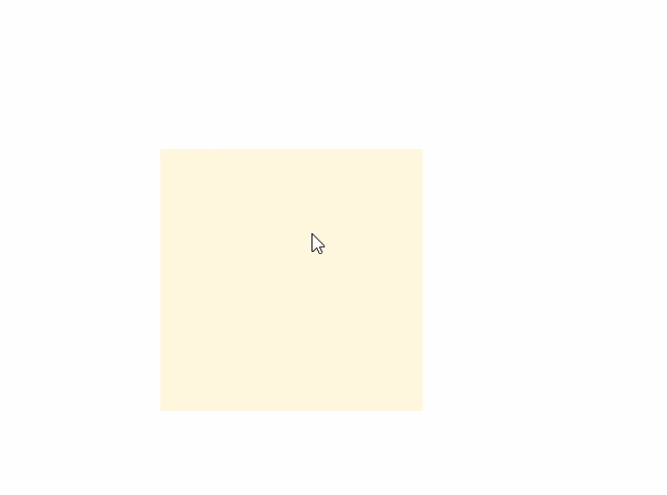
.box:直接上图
.box {
  transition: all 2s ease-in-out;
}
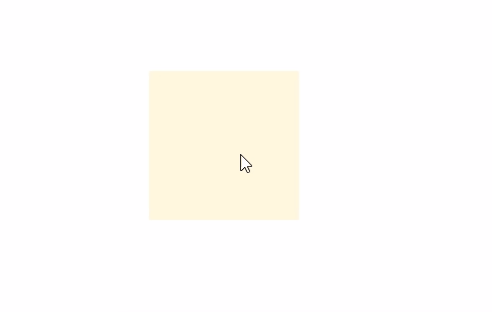
.box:hover直接上图(只在鼠标放上时有效果,离开时没有效果)
.box:hover {
    transition: all 2s ease-in-out;
}
注意事项
- 不是所有的CSS属性都支持transition。
- transition需要明确知道,开始状态和结束状态的具体数值,才能计算出中间状态。比如,height从0px变化到100px,transition可以算出中间状态。但是,transition没法算出0px到auto的中间状态,也就是说,如果开始或结束的设置是height: auto,那么就不会产生动画效果。
- transition需要事件触发,所以没法在网页加载时自动发生。
- transition是一次性的,不能重复发生,除非一再触发。
animation
| 值 | 描述 |
|---|---|
| name | 用来调用@keyframes定义好的动画,与@keyframes定义的动画名称一致 |
| duration | 指定元素播放动画所持续的时间 |
| timing-function | 规定速度效果的速度曲线,是针对每一个小动画所在时间范围的变换速率 |
| delay | 定义在浏览器开始执行动画之前等待的时间,值整个animation执行之前等待的时间 |
| iteration-count | 定义动画的播放次数,可选具体次数或者无限(infinite) |
| direction | 设置动画播放方向:normal(按时间轴顺序),reverse(时间轴反方向运行),alternate(轮流,即来回往复进行),alternate-reverse(动画先反运行再正方向运行,并持续交替运行) |
| play-state | 控制元素动画的播放状态,通过此来控制动画的暂停和继续,两个值:running(继续),paused(暂停) |
| fill-mode | 控制动画结束后,元素的样式,有四个值:none(回到动画没开始时的状态),forwards(动画结束后动画停留在结束状态),backwords(动画回到第一帧的状态),both(根据animation-direction轮流应用forwards和backwards规则),注意与iteration-count不要冲突(动画执行无限次) |
name 用来调用@keyframes定义好的动画,与@keyframes定义的动画名称一致
transform
transform就是变形,主要包括旋转rotate、扭曲skew、缩放scale和移动translate以及矩阵变形matrix。
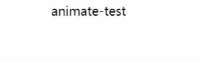
dom上的动画方法
之前学习的时候,看到animate方法就想到了jQuery,习惯了,以为animate就是属于jQuery。今天发现不是,至少不是jQuery的专属品,请看代码
<!DOCTYPE html>
<html lang="en">
<head>
  <meta charset="UTF-8">
  <meta name="viewport" content="width=device-width, initial-scale=1.0">
  <meta http-equiv="X-UA-Compatible" content="ie=edge">
  <title>Document</title>
</head>
<body>
<div id="animate-test">animate-test</div>
<script>
  document.getElementById("animate-test").animate({
    transform: ['translateX(0px)', "translateX(100px)"]
  }, {
    easing: 'linear',  //执行的动画
    duration: 3000, //执行的这个动作需要的时间
    iterations: Infinity, //执行的次数
    fill: 'forwards', //动画结束的状态
    direction: 'alternate' //方向
  });
</script>
transform: translateZ(0); 来开启硬件加速
