

基于vue-cli3从零开始开发个人博客
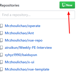
创建github仓库
- 点击github主面板new按钮
- 仓库预设
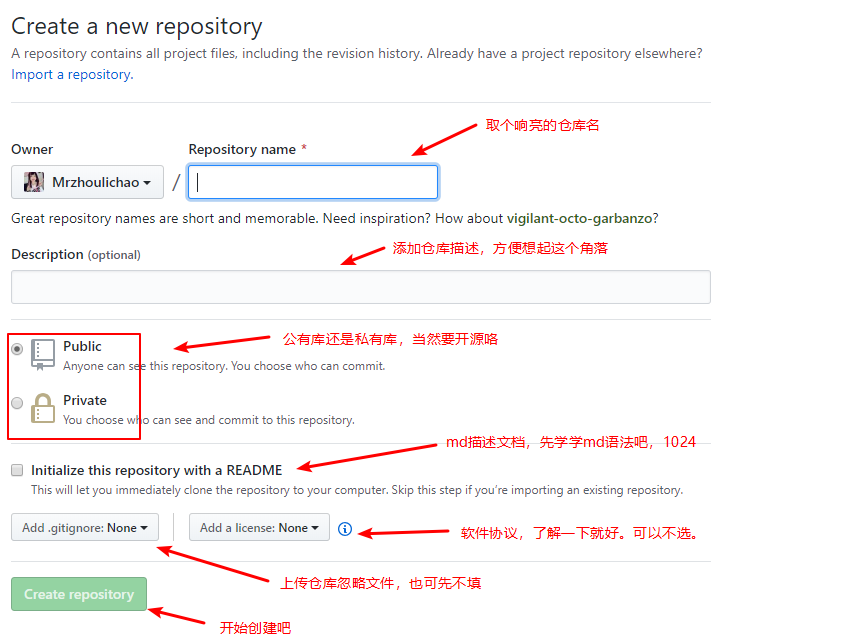
- 给仓库加点料
- 创建本地仓库
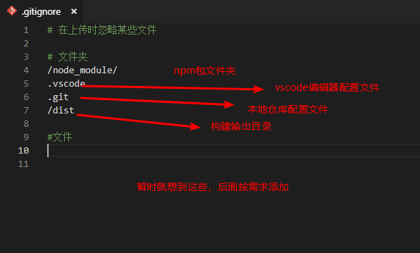
- 创建忽略文件
.gitignore
以上都是废话,现在开始构建vue-cli3的项目。
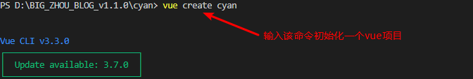
- 初始化一个项目
- 选择配置

-
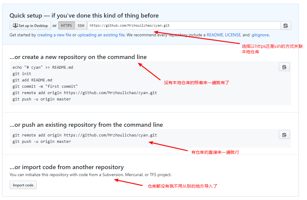
从第三步的給仓库加点料开始走一遍,当然你会发现
README.MD和.gitignore已经存在了,不要紧。因为上面写的都是废话。 -
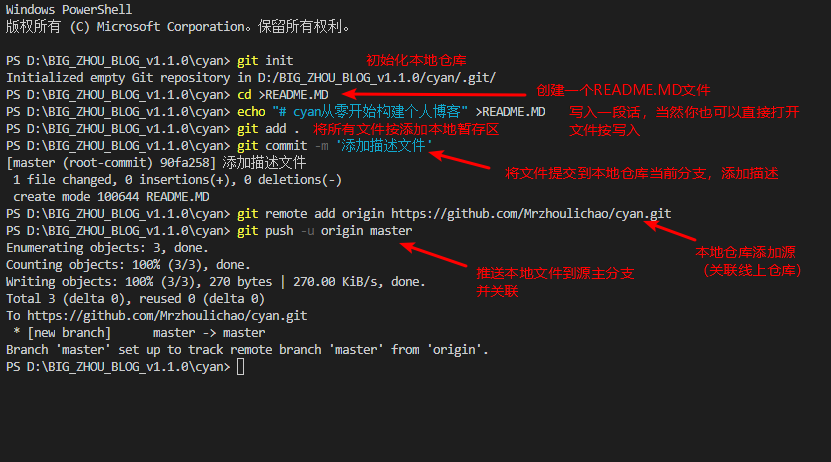
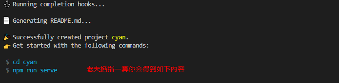
按提示输入命令进入项目
- 访问本地运行项目
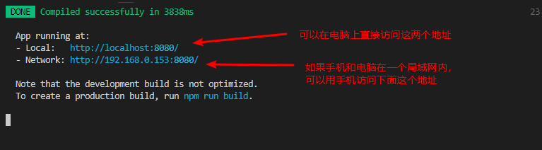
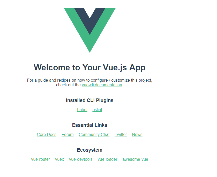
- 基本上你能看到如下页面
基本配置环节
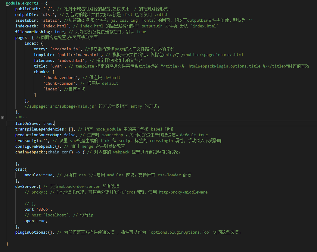
- 根目录下创建 vue.config.js
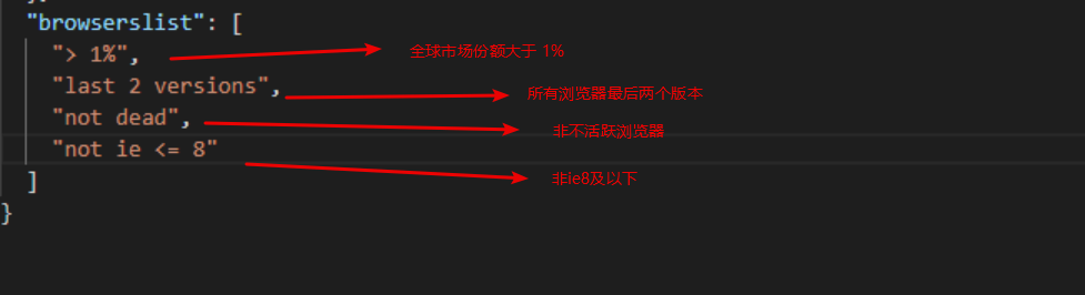
- 配置目标浏览器支持列表,用于不同环境下的浏览器支持同步,在
package.json中配置
使用命令查看你的支持的目标浏览器
npx browserslist
3.bable 通过浏览器列表获得用户产品对于浏览器的支持程度,从而进行语法支持。该选项目前采用预设,因为你不确定最终构建时将使用到的垫片支持
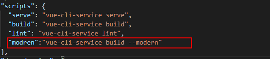
- 使用现代模式 在
package.json中添加 现代模式
- 添加样式预处理器,我用less 因为sass安装麻烦,二者语法比较相像
npm install -D less-loader less
- 根目录下创建全局变量配置文件

.env	//基本全局变量
.env.devlopment  //对应开发模式的全局变量
.env.production	// 生产模式
- 添加chain 和 conf的颗粒度控制文件
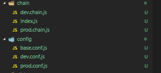
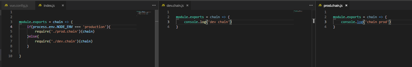
conf具有同等的配置
- 添加单元测试 mocha
vue add @vue/unit-mocha
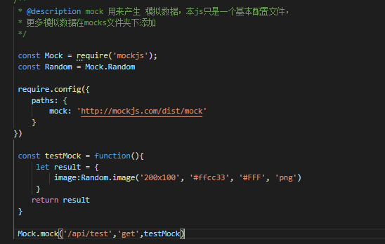
- 添加mockjs 分离开发模拟数据在easy mock上编写你的mock
npm i -D mockjs
src目录下创建 mock.js
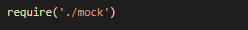
在项目根目录添加mocks文件夹
mock.js
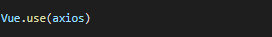
- 添加 vuex, vue-router,axios等文件与配置
axios 在src目录下创建 api文件夹,加入index.js文件
import Axios from 'axios'

const instance = Axios.create({
    // baseURL: 'http://localhost:4560',
    headers: {
        // 'Content-Type': 'application/json',
        'Content-Type':'application/x-www-form-urlencoded'
    }
})

// 请求拦截
instance.interceptors.request.use(function (conf) {
    window.console.log(conf)
    return conf
}, function (err) {
    window.console.log(err)
    return Promise.reject(err)
})

// 响应拦截
instance.interceptors.response.use(res => {
    window.console.log(res)
    return res
}, err => {
    window.console.log(err)
    return Promise.reject(err)
})


export default {
    /* eslint-disable */
    install(Vue, options) {

        Vue.prototype.$api = Object.create(null)

        Vue.prototype.$api.get = function(url, data){

            return new Promise((resolve, reject) => {

                instance.get(url,data).then(res => {

                    resolve(res)
                }).catch( err => {

                    reject(err)
                } )

            })

        }
    }
}
在main.js使用 Vue.use(axios)挂载插件
创建src/routers/router.js
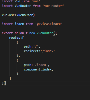
挂载vue-router
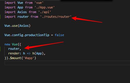
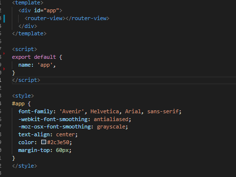
修改你的app.vue 并添加src/views/index.vue
app.vue
index.vue(主页面文件)
对于之前sass安装失败目前的解决方法是
npm install node-sass sass-loader scss-loader --save-dev
如果使用简写命令安装可能会报错,导致安装失败
编码环节
1. 在public文件夹下添加资源文件夹
├─fonts
├─icons
├─images
├─lib
└─svg
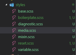
2. 在 styles 下添加各种scss文件,包括样式重置,兼容性,混入,变量,媒体查询等样式表
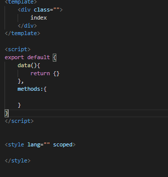
3. 在index.vue 页面划分页面结构
<template>
    <div class="index-container">
        <!-- 左侧边栏 -->
        <left-side-bar class="left-sidebar__comp">
        </left-side-bar>
        <!-- 右侧主体 -->
        <div class="content">

        </div>
    </div>
</template>

<script>

import SideBar from '@/components/LeftSidebar.vue';

export default {
    components:{
        /* eslint-enable */
        // eslint-disable-next-line
        "left-side-bar":SideBar,
    },
    data(){
        return {}
    },
    methods:{

    }
}
</script>

<style lang="scss" scoped>

.index-container{
    display: flex;
}

.left-sidebar__comp{
    background-color: $bg-cl;
    position: fixed;
    top:0;
    bottom: 0;
    left: 0;
}

.content{
    width: 100%;
    min-height: 100vh;
    margin-left: $left-wd;
}
</style>
采用组件的方式编写侧边栏 LeftSideBar.vue
<template>
  <div class="left-sidebar-container">
    <div class="sidebar__top">
      <div class="top__user-info">
        <div class="user-info__left">
          <img :src="user_face_url" alt class="user-info__left--user-face">
        </div>
        <div class="user-info__content">dwadwa</div>
        <div class="user-info__tip">dwawd</div>
      </div>
      <div class="top__search">
        <div class="search--bar">
          <div class="search__btn--bar">
            <img class="search__btn" src alt>
          </div>
          <div class="search__input--bar">
            <input type="text" name id class="search__input">
          </div>
        </div>
      </div>
    </div>
    <div class="sidebar__bottom">
      <div class="sidebar__option">
        <span class="option__btn" @click="option_btn = 0" :class="{'active':option_btn == 0}">卡片</span>
        <span class="option__btn" @click="option_btn = 1" :class="{'active':option_btn == 1}">时间线</span>
      </div>
      <div class="sidebar__cards" v-show="option_btn == 0">
        <about-card v-if="cards['about-card']"></about-card>
      </div>
      <div class="sidebar__time" v-show="option_btn == 1">sidebar__time</div>
    </div>
  </div>
</template>

<script>
import AboutCard from "@/components/AboutCard.vue";

export default {
  name: "side_bar",
  components: {
    "about-card": AboutCard
  },
  data() {
    return {
      user_info: {},
      option_btn: 0,
      cards: {}
    };
  },
  props: {
    user_face_url: {
      type: String,
      default: "https://secure.gravatar.com/avatar/3456813585?s=30&d=robohash"
    }
  },
  methods: {},
  created() {
    this.cards = {
      "about-card": true
    };
  }
};
</script>

<style lang="scss" scoped>

$base-height: $nav-height - $base-pd * 2;

.left-sidebar-container {
  background-color: $bg-cl;
  position: relative;
}

.sidebar__top {
  min-height: $nav-height * 2;
  background-color: $bg-fff;
}

.top__user-info {
  display: flex;
  padding: $base-pd;
  .user-info__left {
    display: inline-block;
    height: $base-height;
    width: $base-height;
  }
  .user-info__content {
    flex: 2;
  }
  .user-info__tip {
    flex: 1;
  }
  * {
    line-height: 30px;
  }

  .user-info__left--user-face {
    display: inline-block;
    height: 100%;
    width: 100%;
    border-radius: 50%;
  }
}

.top__search {
  padding: $base-pd;
  .search--bar {
    background-color: $bg-cl;
    border-radius: ($base-height)/2;
    display: flex;
    overflow: hidden;
  }
  .search__btn--bar {
    width: $base-height;
    height: $base-height;
  }
  .search__input--bar {
    height: $base-height;
    width: 100%;
    display: inline-block;
  }
  .search__btn,
  .search__input {
    display: inline-block;
    height: 100%;
    width: 100%;
    line-height: $base-height;
    height: $base-height;
    box-sizing: border-box;
    border: none;
    padding: $base-pd 10px;
    background-color: $bg-cl;
  }
}

.sidebar__bottom {
  top: 80px;
  position: absolute;
  left: 0;
  right: 0;
  bottom: 0;
  margin-top: 1px;
  .sidebar__option {
    background-color: $bg-fff;
    height: $nav-height;
    display: flex;
    .active {
      border-bottom-color: $active-bg-b;
    }
  }
  .option__btn {
    line-height: $nav-height;
    border-bottom: 5px solid $bg-fff;
    text-align: center;
    display: inline-block;
    flex: 1;
  }
}

.sidebar__cards {
  position: absolute;
  top: $nav-height + 1px;
  left: 0;
  bottom: 0;
  right: 0;
  padding: $base-pd * 2;
  @include touch;
}
</style>

<style lang="scss">
.sidebar__cards {
  .open-card {
    height: auto;
  }
}
</style>
添加侧边栏的子组件
<template>
    <div class="about-card-container">
        <!-- 大标题 -->
        <h1 class="card__head">
            <span class="card__head--title">
                最近
            </span>
            <span class="card__head--icon">
                ---
            </span>
        </h1>
        <!-- 图片 -->
        <div class="about__photo--bar">
            <div class="about__photo__overflow">
                <div :class="'photo__item-' + (index + 1)" v-for="(item,index) in photo_list" :key="index">
                    <img src="" alt="">
                </div>
            </div>
        </div>
        <!-- 留言 -->
        <div class="about__msg--bar">
            <div class="msg__item">
                <div class="msg__item--face">
                    <img src="" alt="">
                </div>
                <div class="msg__item--title">
                    飞啊飞肺癌共和国
                </div>
                <div class="msg__item--time">
                    12-24
                </div>
                <div class="msg__item--describe">
                    feahnfejnahfeaghfgaheF ehgafjae风格哈格环境
                </div>
            </div>
        </div>
        <div class="card__foolter">
            <div class="foolter__btn">
                展开
                <span class="foolter__btn--icon"></span>
            </div>
        </div>
    </div>
</template>

<script>
export default {
    name:'about_card',
    data(){
        return {
            photo_list:[]
        }
    },
    methods:{

    },
    created(){
        this.photo_list = [
            1,2,3,4,5
        ]
    }
}
</script>


<style lang="scss" scoped>

.about-card-container{
    padding-bottom: $base-pd * 2;
    padding: 0 ($base-pd * 2);
    background-color: $bg-fff;
}

.card__head{
    display: flex;
    .card__head--title,
    .card__head--icon{
        line-height: $nav-2;
        display: inline-block;
        flex: 1;
    }
    .card__head--title{
        text-align: left;
    }
    .card__head--icon{
        text-align: right;
    }
}

.about__photo--bar{
    height: $left-wd / 2;
    position: relative;
    .about__photo__overflow{
        width: $left-wd;
        position: absolute;
        top: 0;
        bottom: 0;
        left: - ($base-pd * 4);
        right:- ($base-pd * 4);
        background-color: $bg-fff;
        box-shadow: $base-shadow;
        display: grid;
        grid-gap: 0rem;
        grid-template-columns: 2fr 1fr 1fr;
        grid-template-rows: 1fr 1fr;
        grid-template-areas:
        "one two three"
        "one four five";
    }
    div[class^="photo__item"]{
        img{
            display: inline-block;
            border: 1px solid $bg-fff;
            width: 100%;
            height: 100%;
            box-sizing: border-box;
            border: 1px solid red;
        }
    }
    .photo__item-1{
        grid-area: one;
    }
    .photo__item-2{
        grid-area: two;
    }
    .photo__item-3{
        grid-area: three;
    }
    .photo__item-4{
        grid-area: four;
    }
    .photo__item-5{
        grid-area: five;
    }
}

.about__msg--bar{
    .msg__item{
        display: grid;
        grid-template-columns: $nav-height 3fr 1fr;
        grid-template-rows: ($nav-height/2) ($nav-height/2);
        grid-template-areas:
        "face title time"
        "face describe describe";
        margin: $base-mg;
    }
    .msg__item--face{
        grid-area: face;
    }
    .msg__item--title{
        grid-area: title;
    }
    .msg__item--time{
        grid-area: time;
    }
    .msg__item--describe{
        grid-area: describe;
    }
    .msg__item--title,
    .msg__item--time,
    .msg__item--describe{
        line-height: $nav-height / 2;
        overflow: hidden;
        text-overflow: ellipsis;
        white-space: nowrap;
    }
}

.card__foolter{
    padding: $base-pd $base-pd * 3;
    text-align: right;
    color: $active-bg-b;
    .foolter__btn{
        line-height: $nav-height - $base-pd * 2;
        padding: 0 $base-pd * 2;
        display: inline-block;
        overflow: hidden;
    }
    .foolter__btn--icon{
        width: $base-pd * 3;
        display: inline-block;
        height: $nav-height - $base-pd * 2;
        position: relative;
        vertical-align: middle;
        overflow: hidden;
        &::after{
            content: '';
            display: inline-block;
            box-sizing: border-box;
            border: 1px solid $active-bg-b;
            width: $base-pd * 2;
            height: $base-pd * 2;
            position: absolute;
            bottom: 52%;
            left: 55%;
            transform: rotateZ(45DEG);
            transform-origin: 0% 100%;
        }
    }
}
</style>
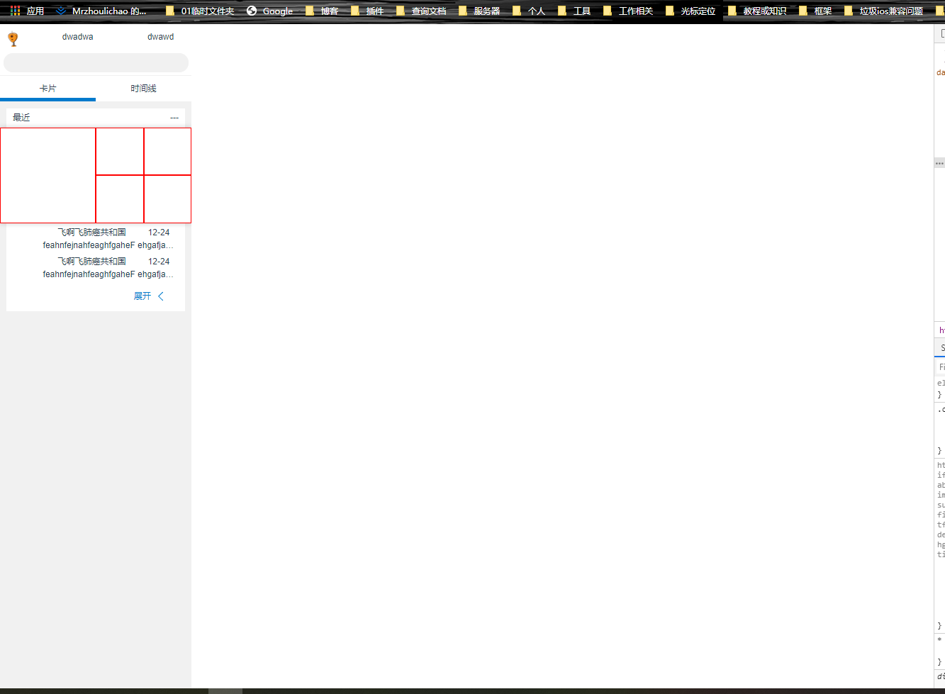
目前的基本效果图
避免篇幅过长后面将不展示源码
4. 使用easy开发api和模拟数据
-
打开easy mock 添加账号
-
创建项目
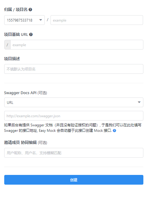
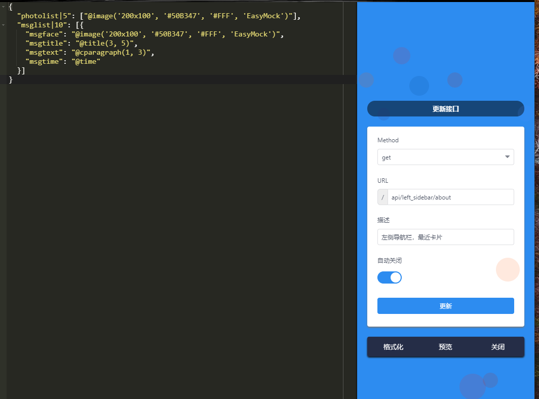
- 点击创建接口,左侧注入灵魂,右侧加入接口配置
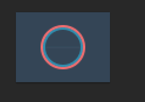
- 接下来编写 右侧主要内容区的nav组件,为组件添加动图 logo。
使用ps6 裁剪你要的图形大小,打开一个 80x60 的gif图
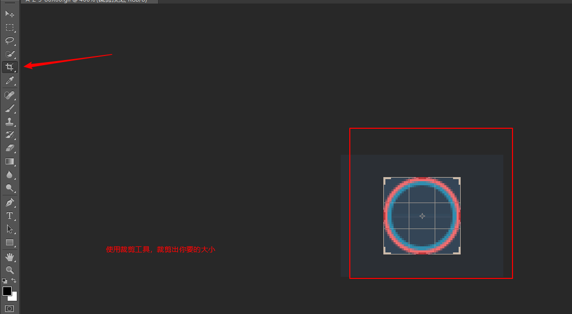
按enter应用裁剪
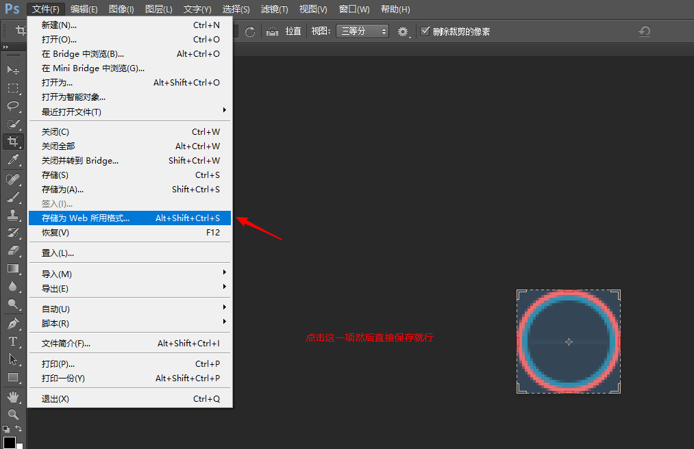
接下来使用 UGA5TBYB 压缩gif
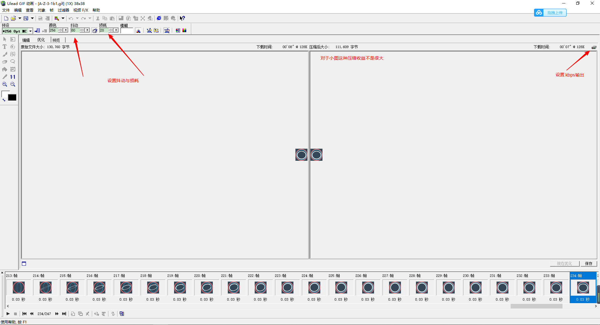
其实就缩小了20k,但是gif占字节比较大,不得不优化,另外使用该软件可以合并精灵图

妈耶,累死了,暂时出到这里。什么时候有时间了再写吧。
