

前言
Hello,大家好这里是一个苦逼的前Android开发,本来Android干的开开心心,但是受到一些影响转行了😂,不过我就是吃不起饭,找不到工作也不会放弃Android开发!,Flutter真香!!我个人自学Flutter以来受到了诸多大佬文章的启迪,所以也萌生了写一下分享文章给同样需要帮助的同学们。
TextField 文本输入框
TextField文本输入框相信大家都不陌生,本篇文章带你更加仔细的学习TextField的一切。
建议阅读时间: 没事可以多来看看啊😂
如何使用TextField
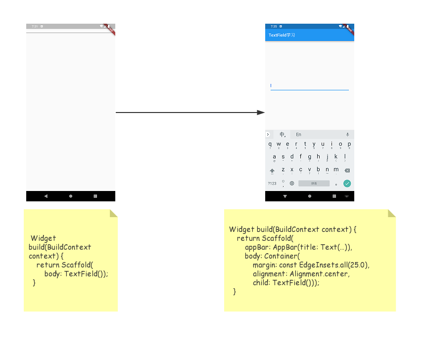
 Widget build(BuildContext context) {
    return Container(child: TextField());
}
大功告成?naive,这段代码收获的是一段报错,提炼之后的报错信息
I/flutter ( 7877): No Material widget found.`
I/flutter ( 7877): TextField widgets require a Material widget ancestor.
I/flutter ( 7877): Material itself, such as a Card, Dialog, Drawer, or Scaffold.
这个错误很好解决,TextField需要被Material组件包裹才能使用,我们可以用Card,Dialog,Drawer,Scaffold,甚至直接用Material。但是我们不需要直接包裹住,只要TextField渲染时向上查找可以找到Material组件就ok。
TextField可选参数
const TextField({
    Key key,
    this.controller,
    this.focusNode,
    this.decoration = const InputDecoration(),
    TextInputType keyboardType,
    this.textInputAction,
    this.textCapitalization = TextCapitalization.none,
    this.style,
    this.textAlign = TextAlign.start,
    this.textDirection,
    this.autofocus = false,
    this.obscureText = false,
    this.autocorrect = true,
    this.maxLines = 1,
    this.maxLength,
    this.maxLengthEnforced = true,
    this.onChanged,
    this.onEditingComplete,
    this.onSubmitted,
    this.inputFormatters,
    this.enabled,
    this.cursorWidth = 2.0,
    this.cursorRadius,
    this.cursorColor,
    this.keyboardAppearance,
    this.scrollPadding = const EdgeInsets.all(20.0),
    this.dragStartBehavior = DragStartBehavior.down,
    this.enableInteractiveSelection,
    this.onTap,
    this.buildCounter,
  })
maxLength/maxLengthEnforced/inputFormatters
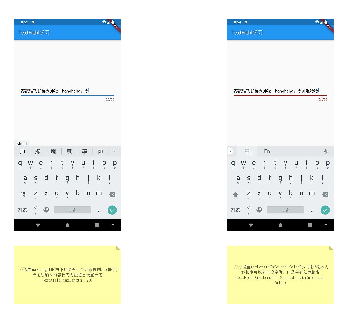
inputFormatters
inputFormatters: [LengthLimitingTextInputFormatter(20)]
inputFormatters用来限制输入内容,我们可以自定义一个只接受输入数字内容的inputFormatters
class NumberFormatter extends TextInputFormatter {

  bool isNumber(String value) {
    return RegExp('^[0-9]*\$').hasMatch(value);
  }

  @override
  TextEditingValue formatEditUpdate(
      TextEditingValue oldValue, TextEditingValue newValue) {
    String value = newValue.text;
    return isNumber(value) ? newValue : oldValue;
  }
}
obscureText/autofocus/focusNode
obscureText用来隐藏输入内容,一般输入密码时需要设置这个属性。autofocus用来设置是否自动获取焦点,默认为false。注意:设置focusNode后此属性失效。focusNode用来控制TextField焦点,也可控制软键盘弹出隐藏~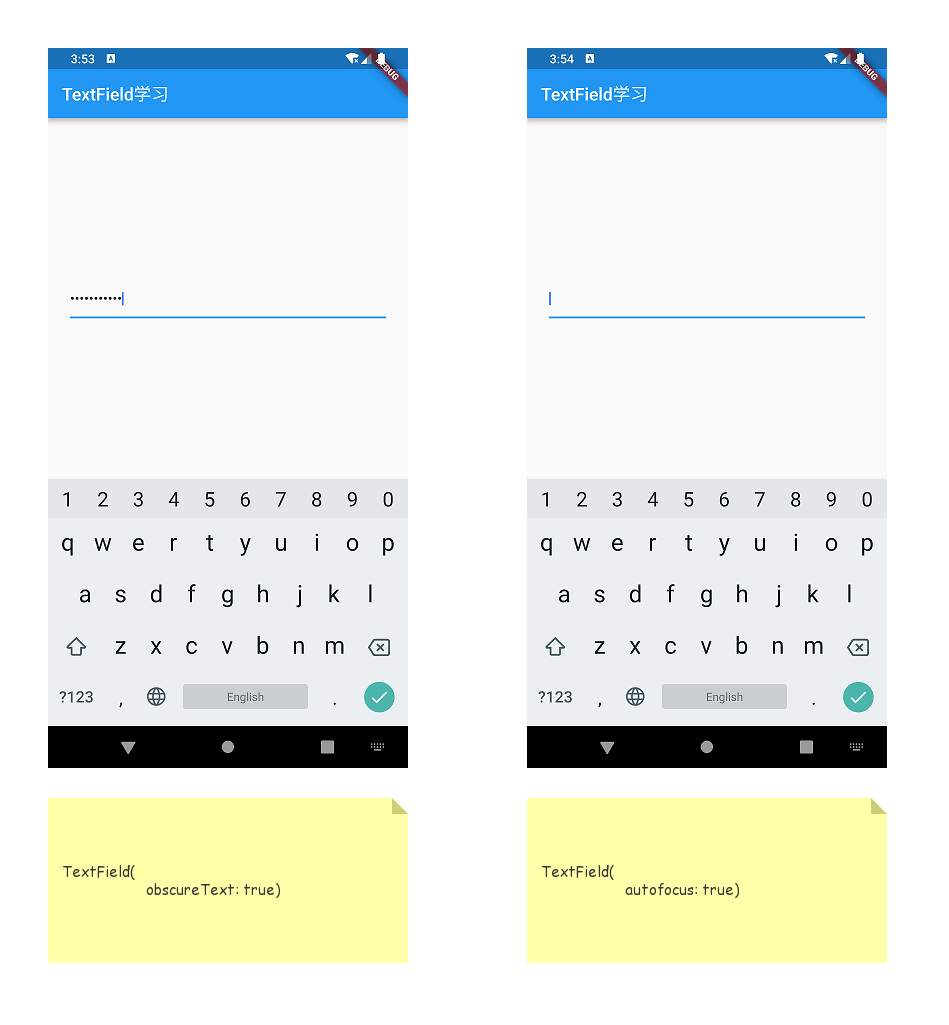
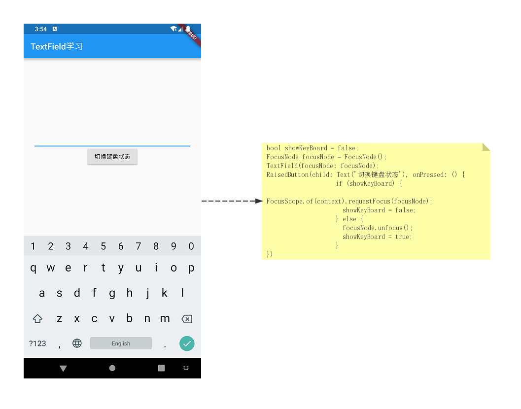
TextField还可以用focusNode来控制具体哪一个TextField获取焦点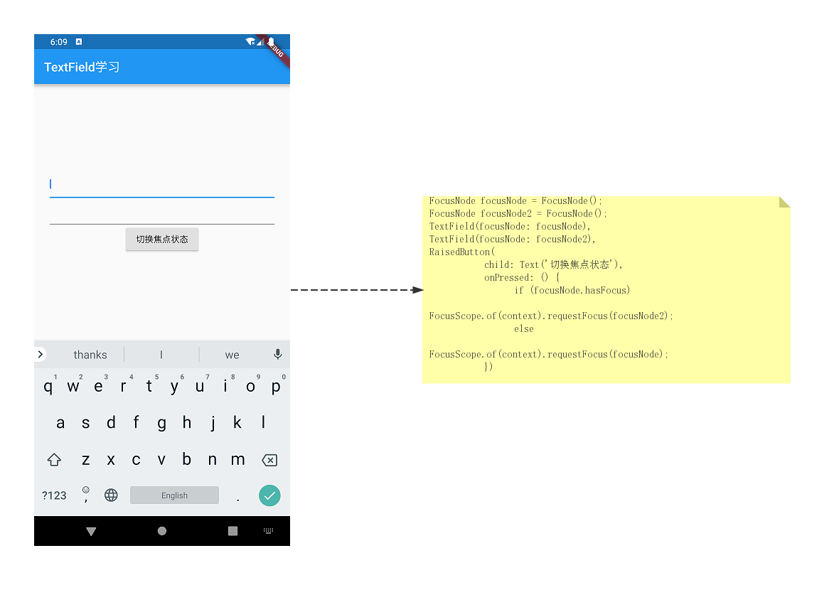
focusNode还可以获取焦点状态~
FocusNode focusNode = FocusNode();
focusNode.addListener(() {
      if (focusNode.hasFocus)
        print('获得焦点');
      else
        print('失去焦点');
});
cursorWidth/cursorRadius/cursorColor
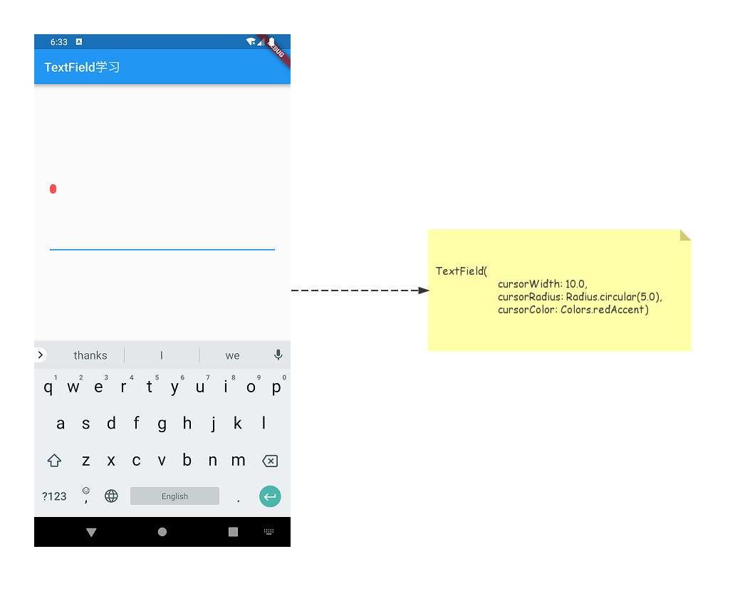
cursorWidth设置光标宽度cursorRadius设置光标圆角cursorColor设置光标颜色
enabled/enableInteractiveSelection
enabled是否禁用输入框enableInteractiveSelection值为true时可以长按选择复制粘贴,false时禁用。
onTap/onSubmitted/onEditingComplete
onTap单击输入框的回调
TextField(
    onTap: () {
       print('onTap()');
}
//单击时
I/flutter (14649): onTap()
I/flutter (14649): onTap()
onSubmitted点击软键盘确认按钮的回调 注意这里的确认可以是done、search、go等
TextField(
onSubmitted: (value) {
print('value:' + value);
})
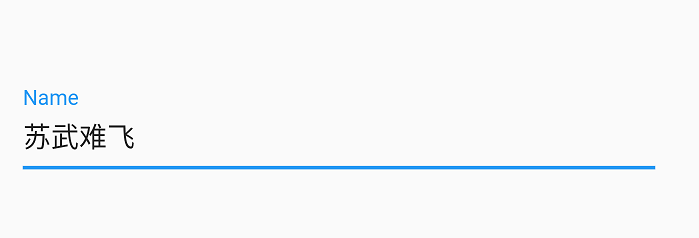
I/flutter (14978): value:苏武难飞
I/flutter (14978): value:苏武难飞
还需要注意的一点就是单独注册onSubmitted时点击后会关闭软键盘~
onEditingComplete点击软键盘确认按钮的回调😂 这个方法和上面的onSubmitted区别在于
- 没有
value回调 - 点击后不会关闭软键盘
适用场景例如:当前页面有两个
TextField一个负责用户名一个负责密码,用户输入完用户名后可以很自然的点击软键盘的按钮使焦点聚焦于密码框。
TextField(
    onEditingComplete: () {
       print('onEditingComplete()');
       FocusScope.of(context).requestFocus(focusNode);
},
    textInputAction: TextInputAction.next),
TextField(focusNode: focusNode)

I/flutter (15170): onEditingComplete()
I/flutter (15170): onEditingComplete()
textInputAction/textCapitalization/textAlign/textDirection
textInputAction用来设置软键盘图标可以设置为Search、Next、go、previous等等,需要注意的是部分InputAction可能只有Android平台有,部分InputAction可能只有iOS平台有。textCapitalization用来控制用户输入文字大小写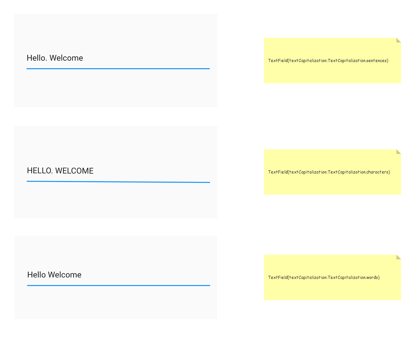
textAlign文本对齐方式 这个其实很好理解,就像原生Android中的Gravity,本章节就拿center举一个小例子。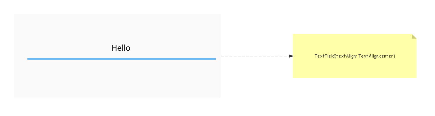
textDirection控制文本方向
style/decoration
style
逐渐到了重头戏了嗷~,style用来控制输入文本样式举个栗子
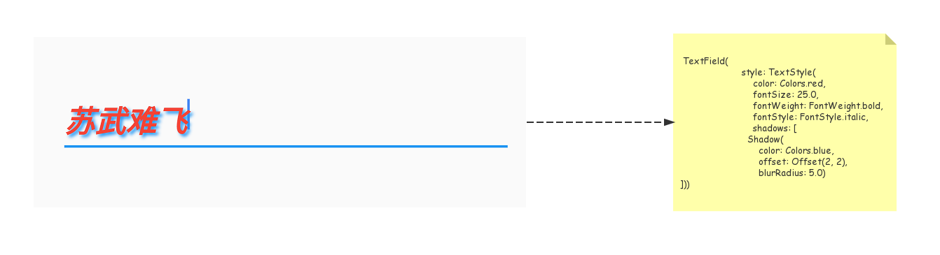
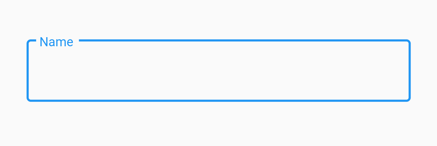
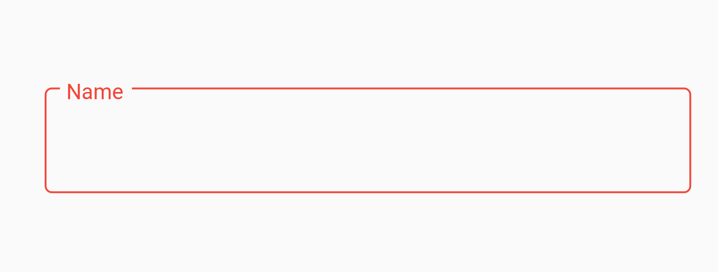
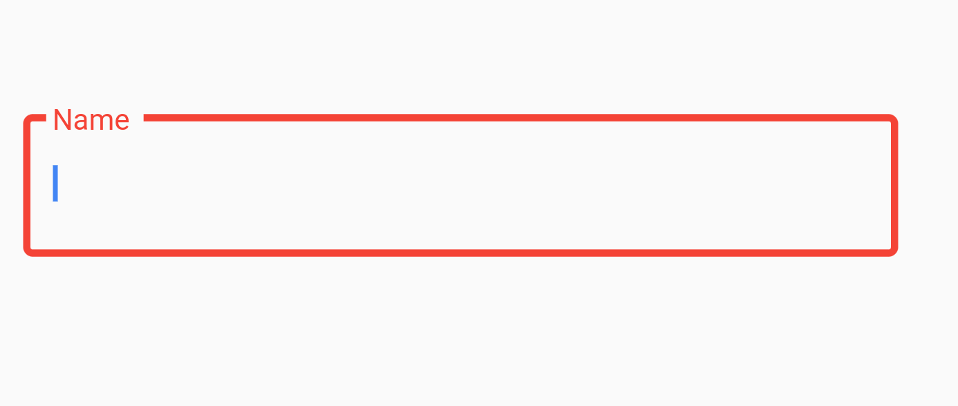
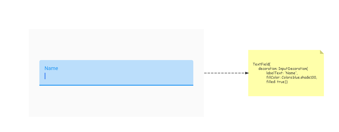
decoration用来控制输入框样式 我们先来做一个非常Material Design的输入框~
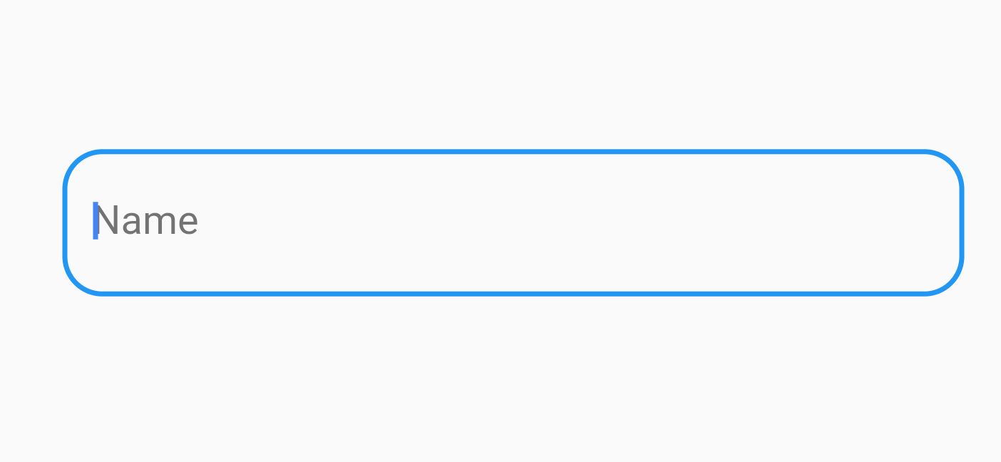
 TextField(
    decoration: InputDecoration(labelText: 'Name')
)
InputDecoration功能是非常丰富的,我们还可以添加border属性来让我们输入框更加有Material感觉。
border
OutlineInputBorder
TextField(
   decoration: InputDecoration(labelText: 'Name',border:OutlineInputBorder())
)
wow~奥搜!不喜欢花里胡哨就想要个圆角?没问题~
 TextField(
    decoration: InputDecoration(hintText: 'Name',border: OutlineInputBorder(borderRadius:BorderRadius.all(Radius.circular(16.0)))))
想要更改边框颜色?简单~有两种方式可以办到
- 通过属性更改
  TextField(
      decoration: InputDecoration(
          labelText: 'Name',
          labelStyle: TextStyle(color: Colors.red),
          focusedBorder: OutlineInputBorder(
              borderSide: const BorderSide(color:Colors.red)),
          enabledBorder: OutlineInputBorder(
              borderSide: const BorderSide(color:Colors.red))))

border是不生效的,会被enabledBorder和focusedBorder所覆盖。
- 通过
Theme更改
Theme(
   data: ThemeData(primaryColor: Colors.red),
   child: TextField(
       decoration: InputDecoration(
           labelText: 'Name', border: OutlineInputBorder())),
)
还要更改边框粗细?撒撒水啦~
TextField(
    decoration: InputDecoration(
        labelText: 'Name',
        labelStyle: TextStyle(color: Colors.red),
        focusedBorder: OutlineInputBorder(
            borderSide: const BorderSide(
                color: Colors.red, width: 3.0)),
        enabledBorder: OutlineInputBorder(
            borderSide: const BorderSide(
                color: Colors.red, width: 3.0))))
UnderlineInputBorder
表现形式与默认的样式相同,更改颜色和圆角粗细也与OutlineInputBorder一致~
Icon/prefixIcon/suffixIcon
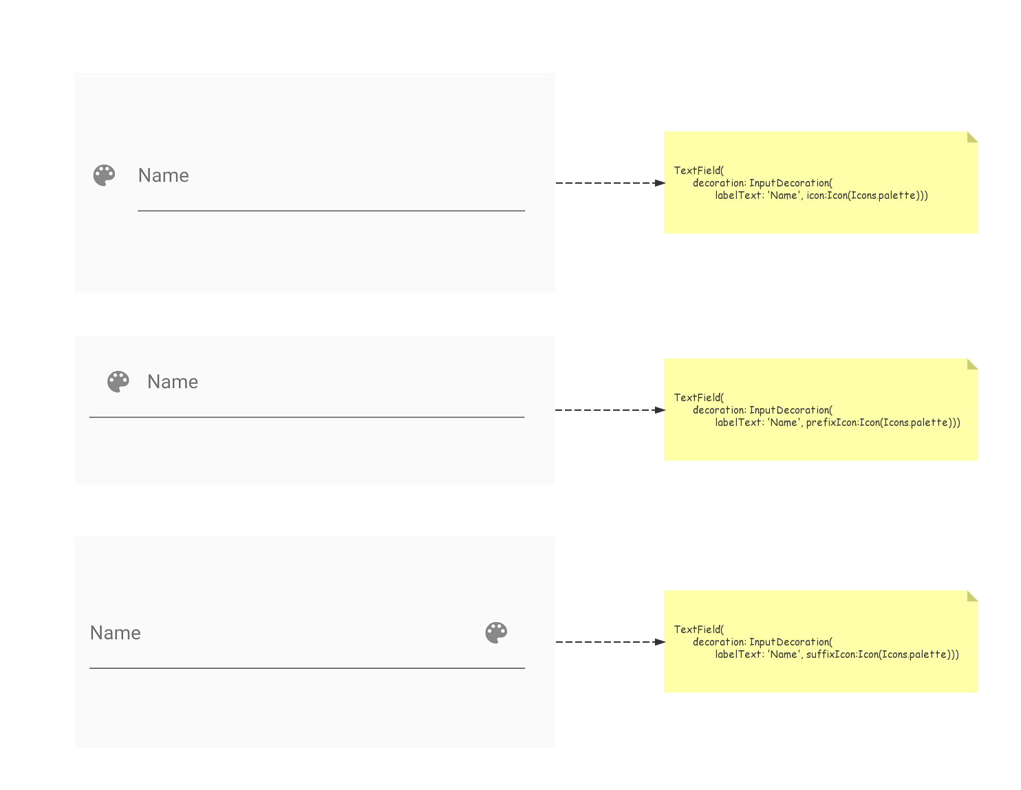
suffixIcon可以用来做清空输入框的×
suffixText/labelText/counterText/errorText/helperText/prefixText/hintText
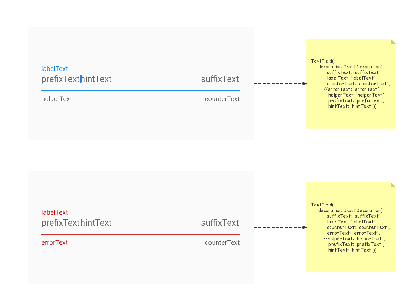
errorText与helperText都有内容时,只有errorText会生效
filled/fillColor
maxLines
Flutter中的TextField默认表现输入形式是单行输入,如果我们设置了maxLines呢?请看图😂~
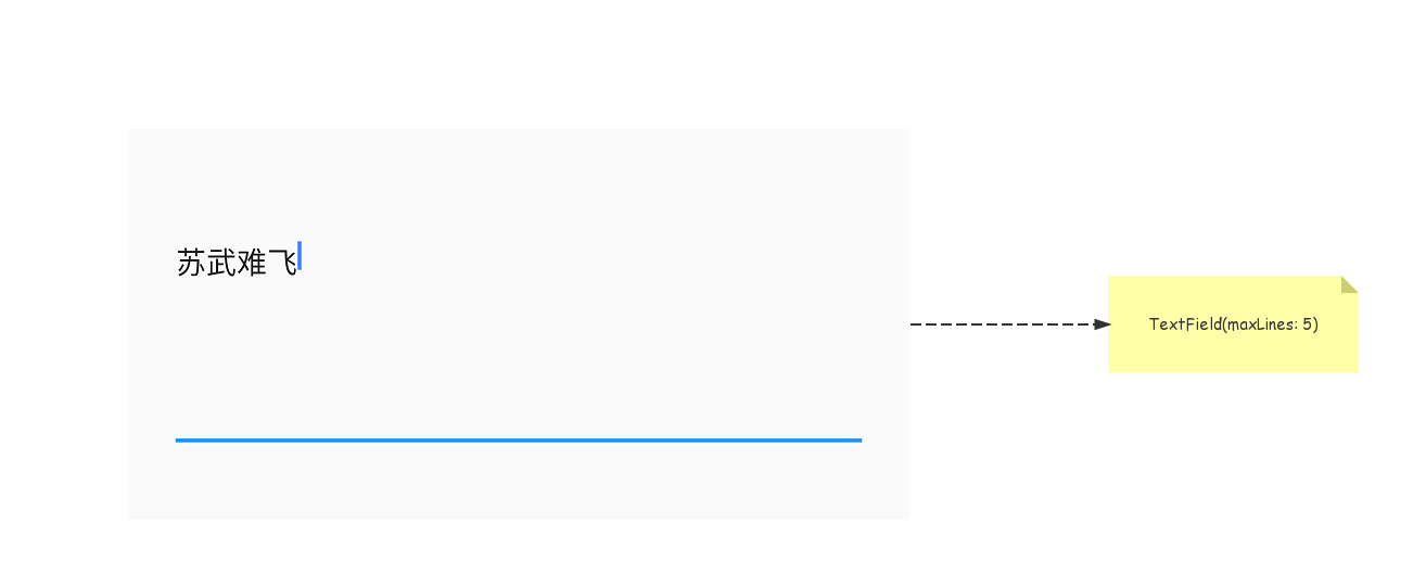
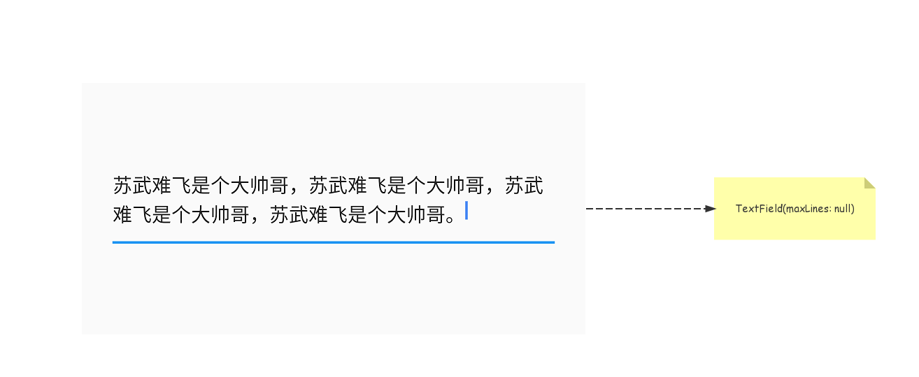
maxLines之后整体的高度都被放大了,这显然不是我们想要的效果,我们想要的应该是输入超出一行后会自动换行,像原生Android的EditText一样,怎么做呢,其实也很简单,看图┗|`O′|┛ 嗷~~
onChanged/TextEditingController
如何处理文本输入呢,我们有两个办法。
onChanged回调
每当用户输入时,TextField会调用它的onChanged回调。 您可以处理此回调以查看用户输入的内容。例如,如果您正在输入搜索字段,则可能需要在用户输入时更新搜索结果。
TextField(onChanged: (value) {
    print('value:  ${value}');
}

I/flutter (23802): value:苏
I/flutter (23802): value:苏武
I/flutter (23802): value:苏武难
I/flutter (23802): value:苏武难飞
一个更强大(但更精细)的方法是提供一个TextEditingController作为TextField的controller属性。 在用户输入时,controller的text和selection属性不断的更新。要在这些属性更改时得到通知,请使用controller的addListener方法监听控制器 。 (如果你添加了一个监听器,记得在你的State对象的dispose方法中删除监听器 )。
TextEditingController _controller = TextEditingController();
_controller.addListener(() {
    String text = _controller.text;
    int length = text.length;
    print('text: ${text} length:${length}');
    if (length >= 5) {
      _controller.clear();
    }
});

I/flutter (23802): text: 苏 length:1
I/flutter (23802): text: 苏武难飞 length:4
I/flutter (23802): text: 苏武难飞帅 length:5
I/flutter (23802): text:  length:0
后记
本篇内容到这里就结束了,虽然我不再做Android开发,但是我却依然喜爱怀念做开发的日子。给自己定个小目标,希望下半年可以在掘金社区有50个赞吧😂
