

分享一些在项目中好用的一些CSS辅助函数,可以直接应用到你自己的样式代码中,传送门。这些函数当然不是CSS原生写法,有分为sass语法和less语法两套,大家可以自行选择复制或者下载。
下面罗列的均是scss语法。less语法请查看传送门
1、_clearfix
%clearfix {
  &:after,
  &:before {
    content: " ";
    display: table;
  }
  &:after {
    clear: both;
  }
}
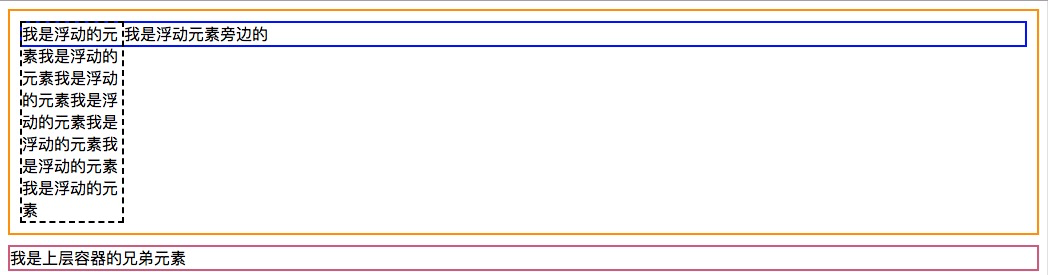
该函数可以直接用来清除浮动,比如(为了节省篇幅,后面的示例html代码就不罗列了,请参考源码):
<section class="clear-fix-demo">
  <div class="container clearfix">
    <div class="float-left">我是浮动的元素我是浮动的元素我是浮动的元素我是浮动的元素我是浮动的元素我是浮动的元素我是浮动的元素</div>
    <div class="text">我是浮动元素旁边的</div>
  </div>
  <div class="brother">我是上层容器的兄弟元素</div>
</section>
对应的scss:
.clear-fix-demo{
  .container{
    border: 2px solid orange;
    padding: 10px;
    .float-left{
      border: 2px dashed black;
      float: left;
      width: 100px;
    }
    .text {
      border: 2px solid blue;
    }
    &.clearfix{
      @extend %clearfix
    }
  }
  .brother{
    margin-top: 10px;
    border: 2px solid palevioletred;
  }
}
效果如下:
2、_ellipsis
// 文字溢出省略,仅webkit支持多
@mixin ellipsis($lines) {
  @if ($lines == 1) {
    overflow: hidden;
    text-overflow: ellipsis;
    white-space: nowrap;
  } @else {
    display: -webkit-box;
    -webkit-box-orient: vertical;
		-webkit-line-clamp:$lines;
    overflow: hidden;
    text-overflow: ellipsis;
		word-break:break-all;
  }
}
%ellipsis{
  @include ellipsis(1);
}
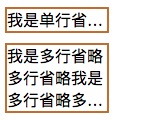
该函数可以用来实现一行省略或者多行省略,使用如下:
.ellipsis-demo{
  .one-line-ellipsis{
    margin-top: 10px;
    width: 100px;
    @extend %ellipsis;
    border: 2px solid peru;
  }
  .multiple-line-ellipsis{
    margin-top: 10px;
    width: 100px;
    @include ellipsis(3);
    border: 2px solid peru;
  }
}
效果如下:
3、_no-scrollbar
%no-scrollbar {
  &::-webkit-scrollbar {
    display: none !important;
    width: 0 !important;
    height: 0 !important;
    -webkit-appearance: none;
    opacity: 0 !important;
  }
}
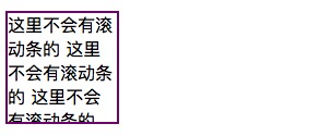
该函数是用来去掉滚动条的,这里支持的是webkit内核的浏览器,使用如下:
.noscrollbar-demo{
  margin-top: 10px;
  overflow: scroll;
  height: 100px;
  width: 100px;
  border: 2px solid purple;
  @extend %no-scrollbar;
}
效果对比如下:
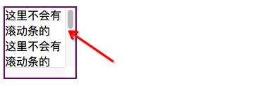
vs
4、_one-px-border
%_onepxElement {
  content: '';
  position: absolute;
}

%_onepxTopBottom {
  @extend %_onepxElement;
  left: 0;
  right: 0;
}

%_onepxLeftRight {
  @extend %_onepxElement;
  top: 0;
  bottom: 0;
}

@mixin setDprBorder($direction: tb) {
  @for $i from 1 through 4 {
    @media screen and (-webkit-min-device-pixel-ratio: $i) {
      @if($direction == tb){
        transform: scaleY(1 / $i);
      } @else if($direction == lr) {
        transform: scaleX(1 / $i);
      } @else if($direction == full) {
        transform: scale(1 / $i);
      }
    }
  }
}

/*
 * 一像素边框
 * $direction: 边框方向,默认底边框
 * $style: 线条样式,默认solid
 * $color: 边框颜色
 */
@mixin one-px-border($direction: bottom, $style: solid, $color: #e5e5e5) {
  position: relative;
  $border: 1px $style $color;
  @if ($direction == bottom) {
    &:after {
      @extend %_onepxTopBottom;
      @include setDprBorder(tb);
      border-top: $border;
      bottom: 0;
    }
  } @else if ($direction == top) {
    &:before {
      @extend %_onepxTopBottom;
      @include setDprBorder(tb);
      border-top: $border;
      top: 0;
    }
  } @else if ($direction == left) {
    &:before {
      @extend %_onepxLeftRight;
      @include setDprBorder(lr);
      border-left: $border;
      left: 0;
    }
  } @else if ($direction == right) {
    &:after {
      @extend %_onepxLeftRight;
      @include setDprBorder(lr);
      border-left: $border;
      right: 0;
    }
  }
}

// 默认下边框
%one-px-border{
  @include one-px-border();
}

// 四边一像素边框
@mixin full-px-border($color: #e5e5e5, $radius: 0, $zIndex: -1){
  position: relative;
  z-index: 1;
  &:before{
    content: '';
    position: absolute;
    z-index: $zIndex;
    border: 1px solid $color;
    width: 200%;
    height: 200%;
    border-radius: inherit;
    transform: scale(.5);
    transform-origin: top left;
    border-radius: $radius * 2;
    left: 0;
    top: 0
  }
}
%full-px-border{
  @include full-px-border();
}
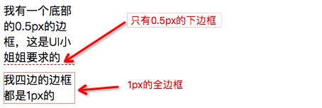
这个就特有用的一个函数了,在移动端上,UI小姐姐画出的边框线永远是0.5px,为了迎合小姐姐的需求,我们既可以使用这个来实现,使用如下:
.one-px-border-demo{
  .bottom-border{
    @include one-px-border(bottom, dashed, gold);
    width: 100px;
    margin-top: 10px;
  }
  .full-border{
    @include full-px-border(gold);
    width: 100px;
    margin-top: 10px;
  }
}
效果如下:
5、_px2rem
// 去除单位并返回数值
@function strip-units($number) {
  @return $number / ($number * 0 + 1);
}
// px转rem
@mixin px2rem($attr, $num, $base: 37.5) {
  $list: (); //存储所有转换后的值

  // 遍历所有值并转换为rem单位
  @for $i from 1 through length($num) {
    // 计算单个rem值
    $value: strip-units(nth($num, $i)) / $base * 1rem;
    // 添加到列表中
    $list: append($list, $value);
  }

  // 设置属性值
  #{$attr}:$list;
}

@function px2rem($num, $base: 37.5) {
  @return strip-units($num) / $base * 1rem;
}
这个在移动端上就更有用了,推荐等级直接五颗星!!使用这个还需要搭配工具库去计算当前页面的rem,一般都使用淘宝的flexible.js。有了这个你就需要再使用Vscode那个什么px2rem插件,老实说这个插件不好用,因为它是直接将px转换为rem,每个人配置的rem对应的px值不一定一样,所以转出来可能是错的,但是这个函数就不一样了,它是可以直接看到原始px的,所以满分推荐。使用如下:
.px-2-rem-demo{
  @include px2rem(height, 400px);
  @include px2rem(width, 200px);
  @include px2rem(padding, 5px 10px);
  margin: px2rem(10px);
}
两种使用方法都在上面写了,效果的话就不说了,谁用谁知道。
6、_center
@mixin center($position) {
  position: absolute;

  @if $position == 'vertical' {
    top: 50%;
    transform: translateY(-50%);
  }
  @else if $position == 'horizontal' {
    left: 50%;
    transform: translateX(-50%);
  }
  @else if $position == 'both' {
    top: 50%;
    left: 50%;
    transform: translate(-50%, -50%);
  }
}
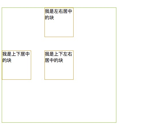
该函数是用来对某个元素使用position为绝对定位的居中法,使用如下:
.center-demo{
  // 因为center函数是使用相对定位来实现的,所以其父元素记得设置relative。
  position: relative;
  border: 1px solid yellowgreen;
  width: 400px;
  height: 400px;
  .both{
    width: 100px;
    height: 100px;
    border: 1px solid goldenrod;
    @include center(both)
  }
  .vertical{
    width: 100px;
    height: 100px;c
    border: 1px solid goldenrod;
    @include center(vertical)
  }
  .horizontal{
    width: 100px;
    height: 100px;
    border: 1px solid goldenrod;
    @include center(horizontal)
  }
}
效果如下:
7、_gradient
@mixin background-gradient($start-color, $end-color, $orientation) {
  background: $start-color;

  @if $orientation == 'vertical' {
    background: linear-gradient(to bottom, $start-color, $end-color);
  } @else if $orientation == 'horizontal' {
    background: linear-gradient(to right, $start-color, $end-color);
  } @else {
    background: radial-gradient(ellipse at center, $start-color, $end-color);
  }
}
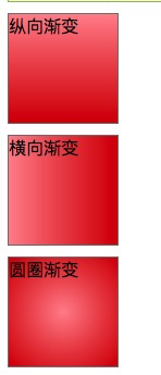
该函数可以用来做各种方向的背景渐变,使用如下:
.gradient-demo{
  .vertical{
    margin-top: 10px;
    width: 100px;
    height: 100px;
    border: 1px solid grey;
    @include background-gradient(rgba(255,146,156,1), rgba(216,0,0,1), vertical)
  }
  .horizontal{
    margin-top: 10px;
    width: 100px;
    height: 100px;
    border: 1px solid grey;
    @include background-gradient(rgba(255,146,156,1), rgba(216,0,0,1), horizontal)
  }
  .radius{
    margin-top: 10px;
    width: 100px;
    height: 100px;
    border: 1px solid grey;
    @include background-gradient(rgba(255,146,156,1), rgba(216,0,0,1), radius)
  }
}
效果如下:
8、_triangle
@mixin triangle($direction: down, $size: 5px, $color: #F96001) {
  width: 0px;
  height: 0px;
  @if ($direction == left) {
    border-top: $size solid transparent;
    border-bottom: $size solid transparent;
    border-right: $size solid $color;
  }
  @else if ($direction == right) {
    border-top: $size solid transparent;
    border-bottom: $size solid transparent;
    border-left: $size solid $color;
  }
  @else if ($direction == down) {
    border-left: $size solid transparent;
    border-right: $size solid transparent;
    border-top: $size solid $color;
  }
  @else {
    border-left: $size solid transparent;
    border-right: $size solid transparent;
    border-bottom: $size solid $color;
  }
}
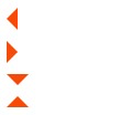
这个函数也特有用,时不时的你就需要实现一个三角形来满足UI小姐姐的需求,使用如下:
.triangle-demo{
  margin-top: 10px;
  .left{
    @include triangle(left, 10px);
    margin-bottom: 10px;
  }
  .right{
    @include triangle(right, 10px);
    margin-bottom: 10px;
  }
  .down{
    @include triangle(down, 10px);
    margin-bottom: 10px;
  }
  .up{
    @include triangle(up, 10px);
    margin-bottom: 10px;
  }
}
效果如下:
注意
上面的所有代码均没有做浏览器差异属性(vendor-prefix)的添加,这个建议统一使用插件去完成,没必要人工写一遍。如果你使用的postcss的话,可以使用autoprefixer或者postcss-preset-env
最后
该仓库会持续更新,也欢迎各位童鞋PR,一起丰富~
