Material组件提供了丰富的组件,太丰富的组件导致不知道使用哪个组件好,本文开始介绍部分Flutter的常用组件,用以实现基本的页面,以Android页面为基础,对照实现。
首先介绍Scaffold组件,Scaffold是一个路由页骨架,使用它可以很方便的拼装出一个基础页面。
Scaffold
构造函数:
Scaffold({
  Key key,
  this.appBar,
  this.body,
  this.floatingActionButton,
  this.floatingActionButtonLocation,
  this.floatingActionButtonAnimator,
  this.persistentFooterButtons,
  this.drawer,
  this.endDrawer,
  this.bottomNavigationBar,
  this.bottomSheet,
  this.backgroundColor,
  this.resizeToAvoidBottomPadding,
  this.resizeToAvoidBottomInset,
  this.primary = true,
  this.drawerDragStartBehavior = DragStartBehavior.start,
  this.extendBody = false,
  this.extendBodyBehindAppBar = false,
  this.drawerScrimColor,
  this.drawerEdgeDragWidth,
})
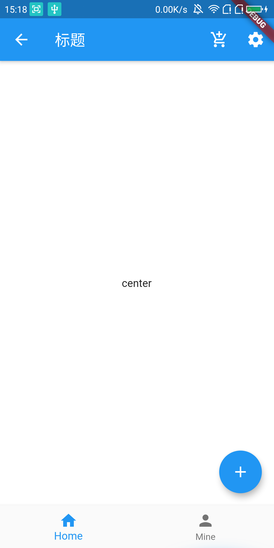
包括:appBar(导航栏),body(主体内容),drawer(抽屉),bottomNavigationBar(底部导航)
初始化,只显示Scaffold,给了一个蓝色的背景。
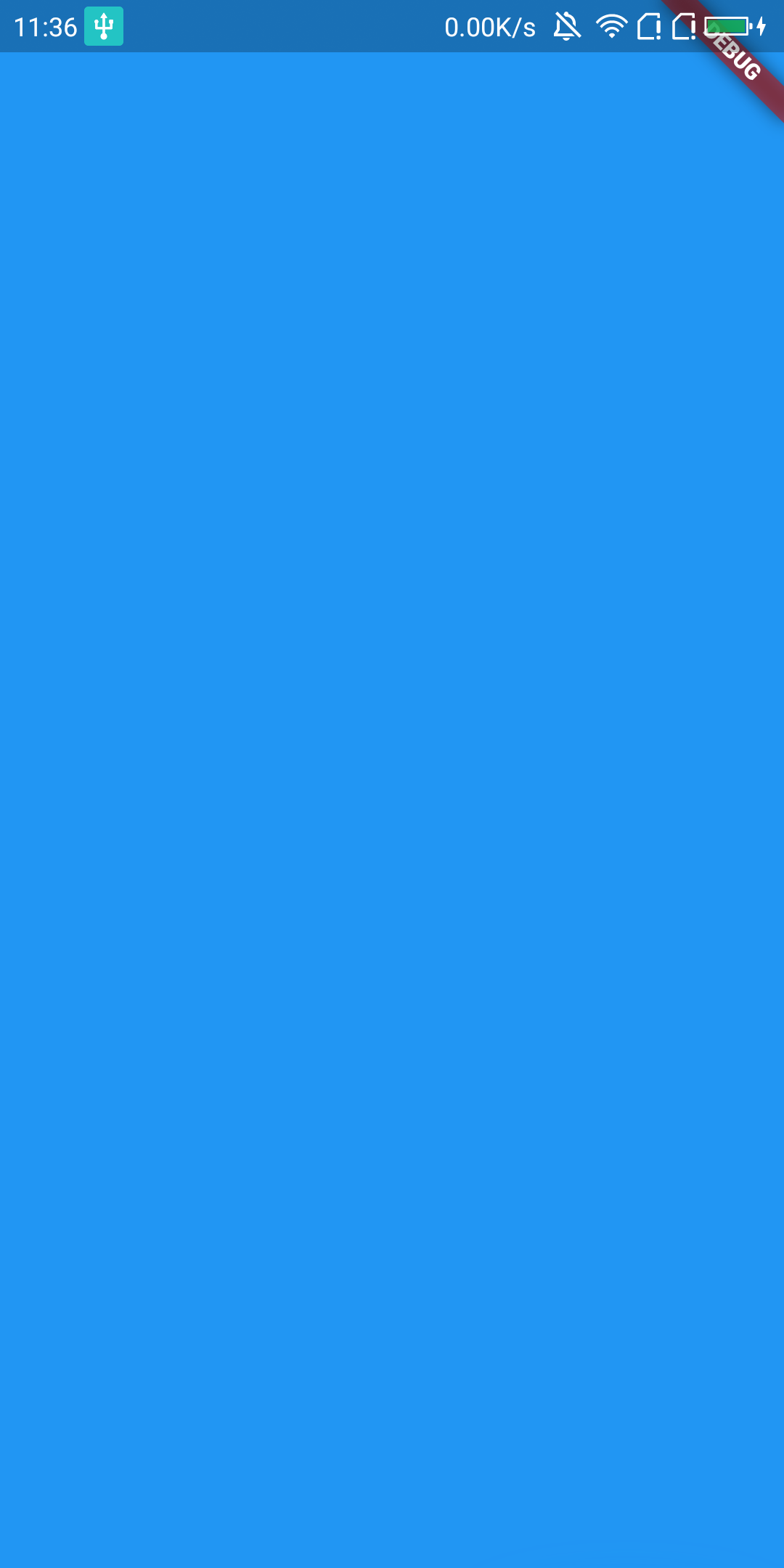
MaterialApp(
  home: Scaffold(
    backgroundColor: Colors.blue,
  ),
);
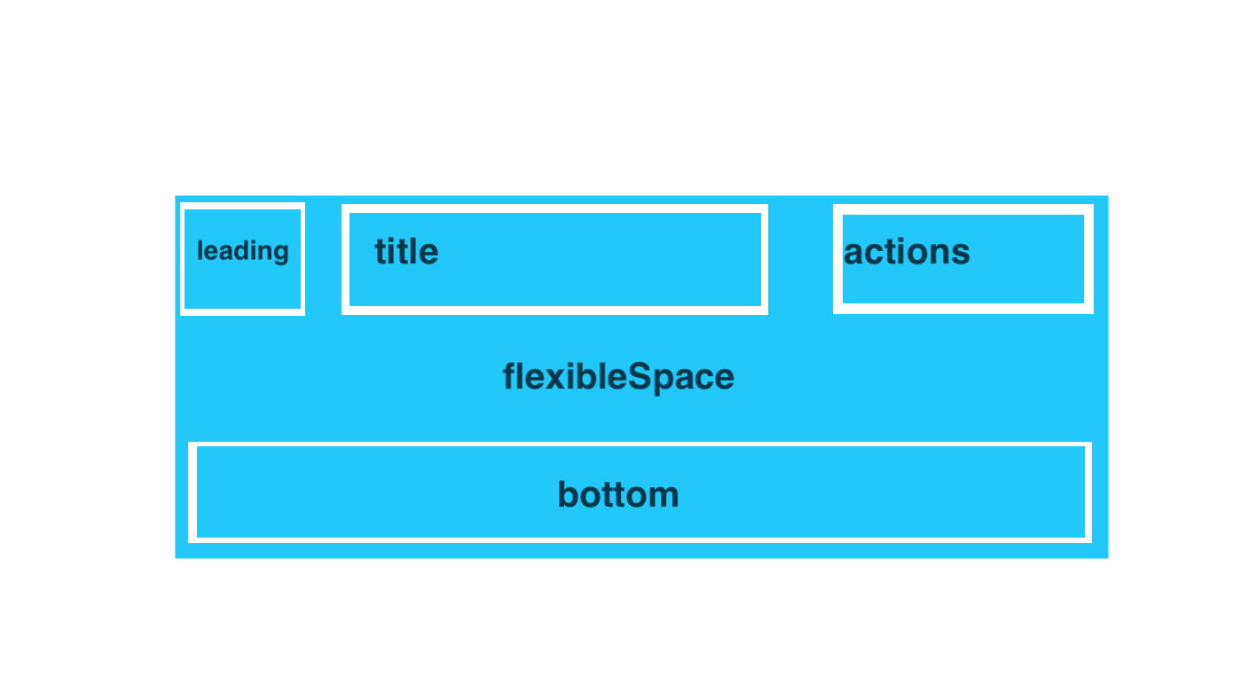
appBar:
- leading:通常用于左侧的返回上一页按钮
- title:标题
- actions:对应android的menu,选中菜单
- flexibleSpace:配合appBar实现CollapsingToolbarLayout效果,向上滑动头部折叠效果(后续会有文章实现具体效果)
- bottom:在appBar底部展示一个TabBar
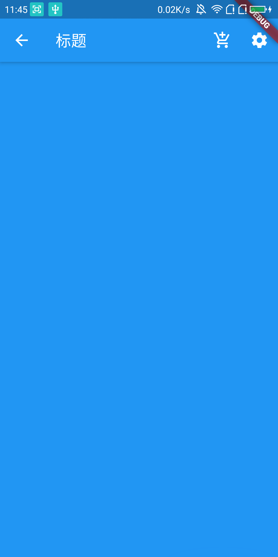
appBar: AppBar(
  leading: Icon(Icons.arrow_back),
  title: const Text('标题'),
  actions: <Widget>[
    IconButton(
      icon: Icon(
        Icons.add_shopping_cart,
        color: Colors.white,
      ),
      onPressed: null,
    ),
    IconButton(
      icon: Icon(
        Icons.settings,
        color: Colors.white,
      ),
      onPressed: null),
  ],
),
body:
scalffold的主体部分,用于展示界面的主要内容;通常使用Row,Column,ListView作为子组件,用于显示主体内容。
body: Container(
  color: Colors.white,
  child: Center(
    child: Text('center'),
  ),
),
drawer:
Scaffold的左侧滑入的抽屉效果,通常child是一个ListView,ListView中包含DrawerHeader作为头部和其他item作为选项。
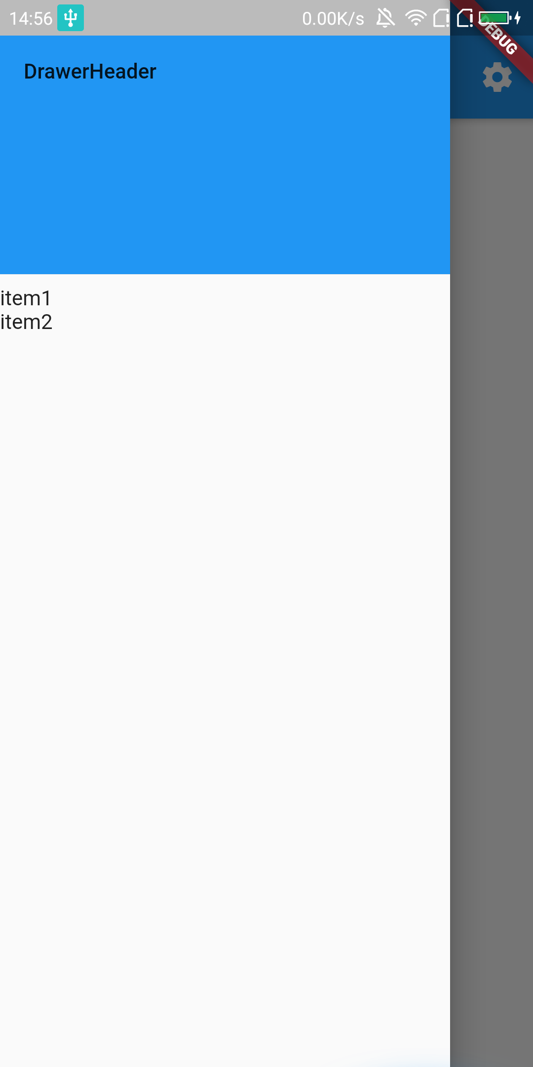
drawer: Drawer(
  child: ListView(
    children: <Widget>[
      DrawerHeader(
        child: Text(
          'DrawerHeader',
        ),
        decoration: BoxDecoration(
          color: Colors.blue,
        ),
      ),
      Text('item1'),
      Text('item2'),
    ],
  ),
),
注意,在使用Drawer的时候去掉leading,这样会点击自动添加的leading,滑出drawer,否则只能手势滑入。
bottomNavigationBar:
底部导航栏,通常包括3-5个bottomNavigationBarItem作为子组件,子组件可以包括图标和文案。
bottomNavigationBar: BottomNavigationBar(
  items: [
    BottomNavigationBarItem(
      icon: Icon(Icons.home),
      title: Text('Home'),
      backgroundColor: Colors.white,
    ),
    BottomNavigationBarItem(
      icon: Icon(Icons.person),
      title: Text('Mine'),
      backgroundColor: Colors.white),
  ],
),
这样,一个Activity的appBar,body,bottomNavigationBar,drawer都有了,基本可以满足一个页面的使用。
github:github.com/damengzai/f…
更多关注微信公众号:Flutter入门