

作用
圣杯布局和双飞翼布局用来解决两边固定宽度,中间自适应的三栏布局。
区别
这两种布局首先都要通过设置float:left浮动,和margin-left、margin-right的负值,目的是让三元素并排显示,行成三栏布局。
区别在中间盒子处理的方式。怎么做才能不把中间盒子的内容覆盖住,让其完全显示:
-
圣杯布局 是通过父元素设置
padding-left和padding-right为左右两边的盒子留空间。然后左右两盒子通过相对定位,改变left和right的值,移动后不遮挡中间div。 -
双飞翼布局 是直接在中间
div内部创建子div,用于放置内容。并且设置子div的margin-left和margin-right,为左右两个div留出位置,左右两个盒子不需要设置position:relative和right,left属性。
圣杯布局
首先给出页面结构
//middle第一个是为了实现在浏览器优先渲染。
<div class="parent">
    <div class="middle all"></div>
    <div class="left all"></div>
    <div class="right all"></div>
</div>
接下来我们先给三栏各自设置宽高,这里我们高度都用200px。因为中间栏宽度要自适应,所以我们设置为100%。
.all{
    height: 200px;
}
.middle{
    width: 100%;
    background-color: yellow;
}
.left{
    width:200px;
    background-color: red;
}
.right{
    width:100px;
    background-color: dodgerblue;
}
float属性。
.all{
    height: 500px;
    float:left;
}
.middle{
    width: 100%;
    background-color: yellow;
}
.left{
    width:200px;
    background-color: red;
}
.right{
    width:100px;
    background-color: dodgerblue;
}
.all{
    height: 200px;
    float: left;
}
.middle{
    width: 100%;
    background-color: yellow;
}
.left{
    margin-left: -100%;
    width:200px;
    background-color: red;
}
.right{
    margin-right: -100px;//100px是自身的宽度
    width:100px;
    background-color: dodgerblue;
}
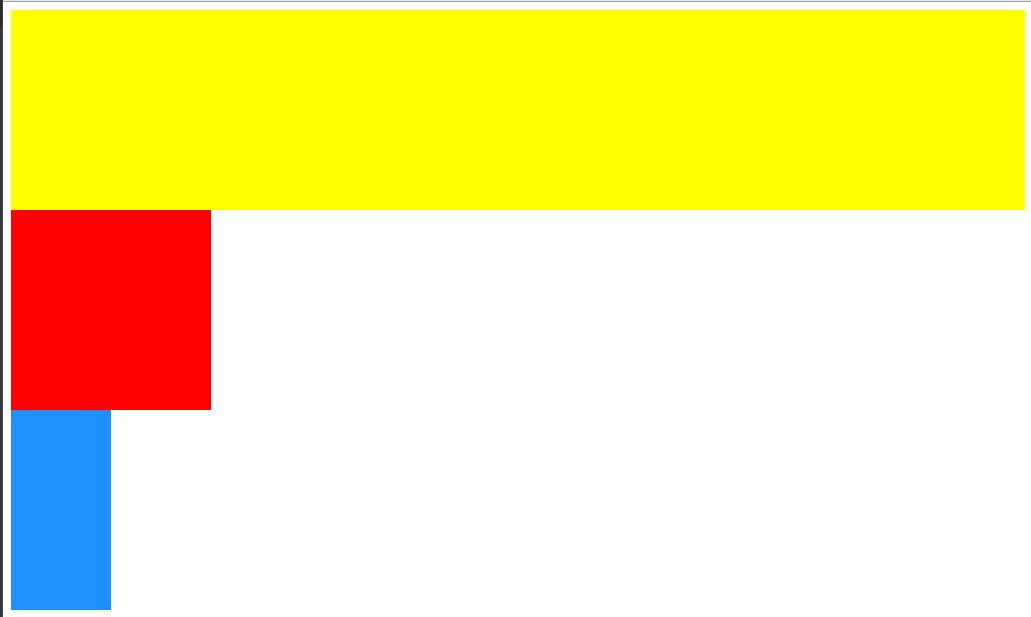
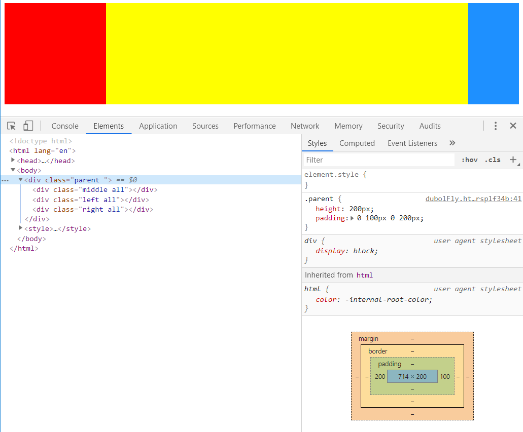
middle中加入内容后,两边的内容会被两侧栏挡住。
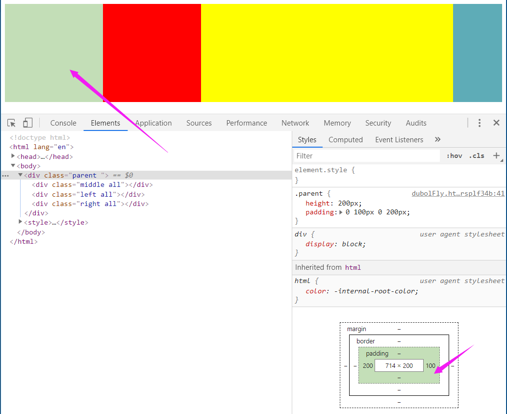
此时就需要父元素通过设置padding来给左右两边的盒子留下空间,这个空间的大小和两边的盒子大小一样:
.parent{
    height: 200px;
    padding: 0 100px 0 200px;
}
.all{
    height: 200px;
    float: left;
}
.middle{
    width: 100%;
    background-color: yellow;
}
.left{
    margin-left: -100%;
    width:200px;
    background-color: red;
}
.right{
    margin-right: -100px;
    width:100px;
    background-color: dodgerblue;
}
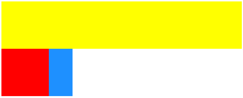
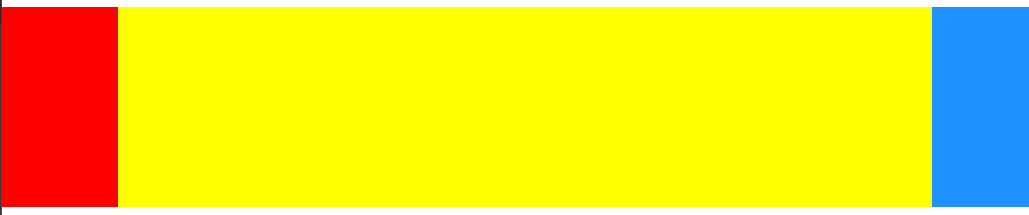
parent的padding将三个元素都挤到右面了,现在就需要为左右盒子设置position:relative,通过left和right移动位置了:
.parent{
    height: 200px;
    padding: 0 100px 0 200px;
}
.all{
    height: 200px;
    float: left;
}
.middle{
    width: 100%;
    background-color: yellow;
}
.left{
    position: relative;
    margin-left: -100%;
    left: -200px;
    width:200px;
    background-color: red;
}
.right{
    position: relative;
    margin-right: -100px;
    right: 0px;
    width:100px;
    background-color: dodgerblue;
}
总结一下圣杯布局的实现过程:
- 父元素包含三个元素,分别设置他们左浮动
- 中间的盒子宽度设置为100%,自适应,并且在三个元素的最前面显示,第一个渲染
- 左右两边使用
margin-left、margin-right的负值,使他们与中间的盒子同行,(左边:-100%,右边:-右边盒子的宽度) - 中间的盒子width:100%后,需要父元素通过padding设置左右两边空白,为左右两边的盒子留盒子同等大小的空间
- 设置左右两边position:relative,通过
left和right移动位置
双飞翼布局
双飞翼布局比较简单,我就总结一下:
- 父元素包含三个元素,分别设置他们左浮动
- 中间的盒子宽度设置为100%,自适应,并且在三个元素的最前面显示,第一个渲染
- 左右两边设置
margin-left的负值,使他们与中间的盒子同行,(左边:-100%,右边:-右边盒子的宽度) - 在中间
div内部创建子div,用于放置内容。并且设置子div的margin-left和margin-right,为左右两个div留出位置
<div class="parent ">
    <div class="middle">
        <div></div>
    </div>
    <div class="left all"></div>
    <div class="right all"></div>
</div>
.parent{
    height: 200px;
    overflow: hidden;
}
.all{
    height: 200px;
    float: left;
}
.middle{
    float: left;
    width: 100%;

}
.middle > div{
    margin: 0 100px 0 200px;//为左右两边的盒子预留空间
    height: 200px;
    background-color: yellow;
}
.left{
    margin-left: -100%;
    width:200px;
    background-color: red;
}
.right{
    margin-left:-100px;
    width:100px;
    background-color: dodgerblue;
}

学习笔记,实例是自敲。
