


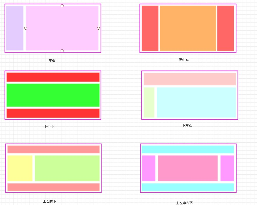
本篇文章,我将采用上述几种不同的方式,来实现下面的六种布局
1. 布局展示
2. float
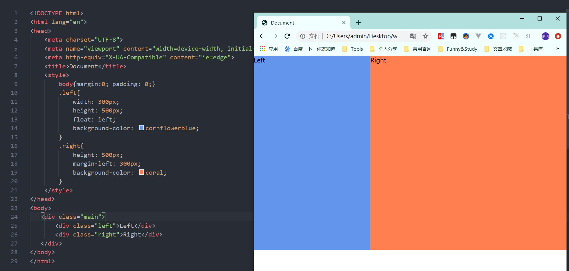
2.1 float 实现左右布局
<style>
    body{margin:0; padding: 0;}
    .left{
        width: 300px;
        height: 500px;
        float: left;
        background-color: cornflowerblue;
    }
    .right{
        height: 500px;
        margin-left: 300px;
        background-color: coral;
    }
</style>
<body>
   <div class="main">
       <div class="left">Left</div>
       <div class="right">Right</div>
   </div>
</body>
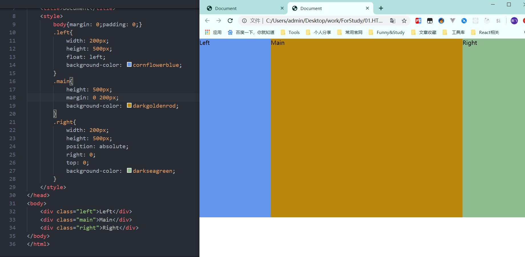
2.2 float + positon 实现左中右布局
<style>
    body{margin: 0;padding: 0;}
    .left{
        width: 200px;
        height: 500px;
        float: left;
        background-color: cornflowerblue;
    }
    .main{
        height: 500px;
        margin: 0 300px 0 200px;
        background-color: darkgoldenrod;
    }
    .right{
        width: 300px;
        height: 500px;
        position: absolute;
        right: 0;
        top: 0;
        background-color: darkseagreen;
    }
</style>
<body>
    <div class="left">Left</div>
    <div class="main">Main</div>
    <div class="right">Right</div>
</body>
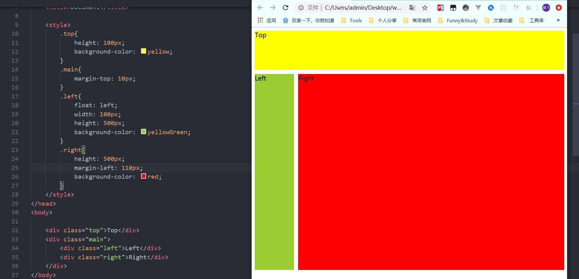
2.3 float实现 上左右布局
<style>
    .top{
        height: 100px;
        background-color: yellow;
    }
    .main{
        margin-top: 10px;
    }
    .left{
        float: left;
        width: 100px;
        height: 500px;
        background-color: yellowGreen;
    }
    .right{
        height: 500px;
        margin-left: 110px;
        background-color: red;
    }
</style>
<body>
    <div class="top">Top</div>
    <div class="main">
        <div class="left">Left</div>
        <div class="right">Right</div>
    </div>
</body>
2.4 练习
练习一: float实现上左右下布局
练习二: float实现上左中右下布局
3. Flex
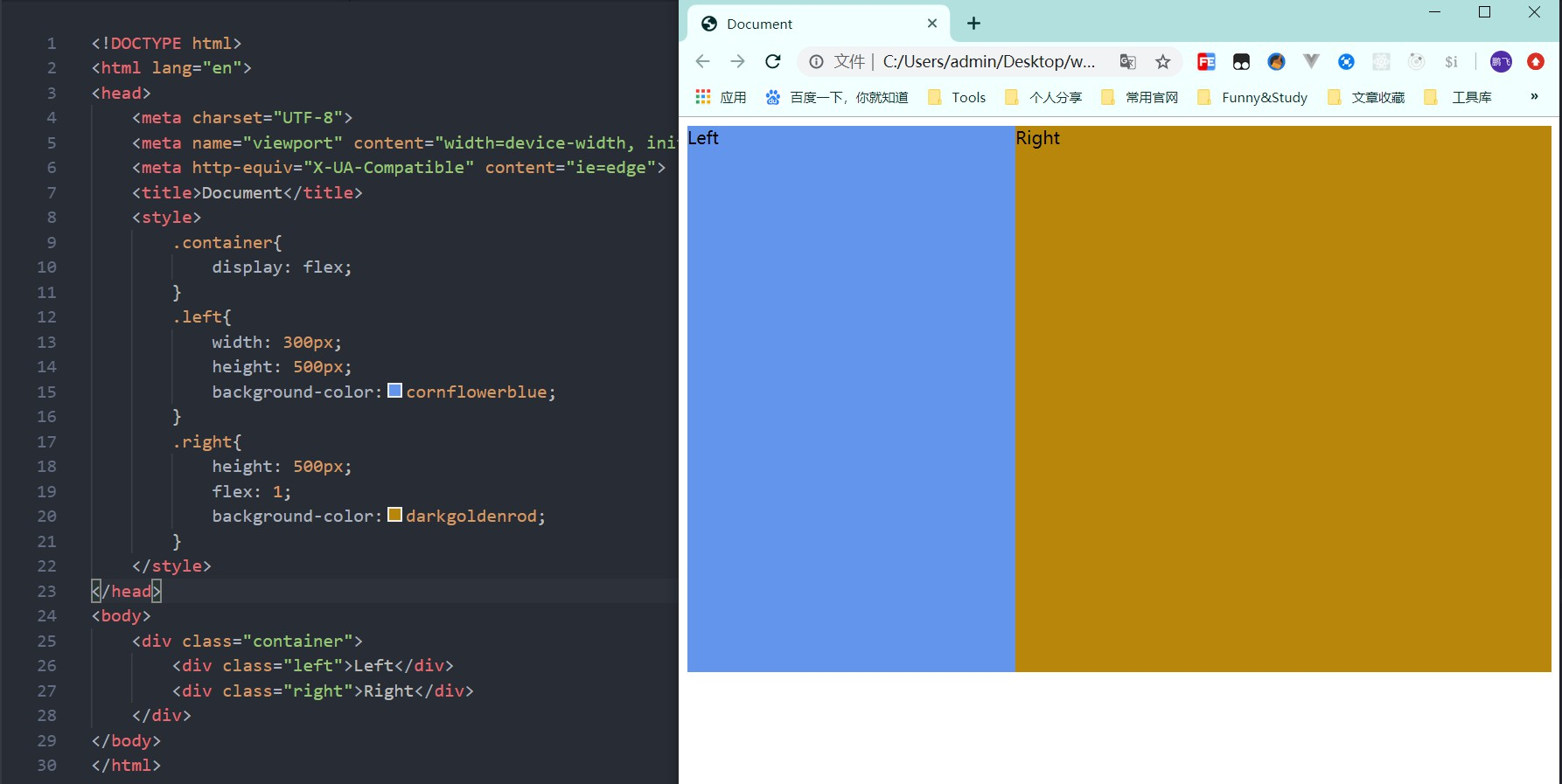
3.1 flex实现左右布局
<style>
    .container{
        display: flex;
    }
    .left{
        width: 300px;
        height: 500px;
        background-color:cornflowerblue;
    }
    .right{
        height: 500px;
        flex: 1;
        background-color:darkgoldenrod;
    }
</style>
<body>
    <div class="container">
        <div class="left">Left</div>
        <div class="right">Right</div>
    </div>
</body>
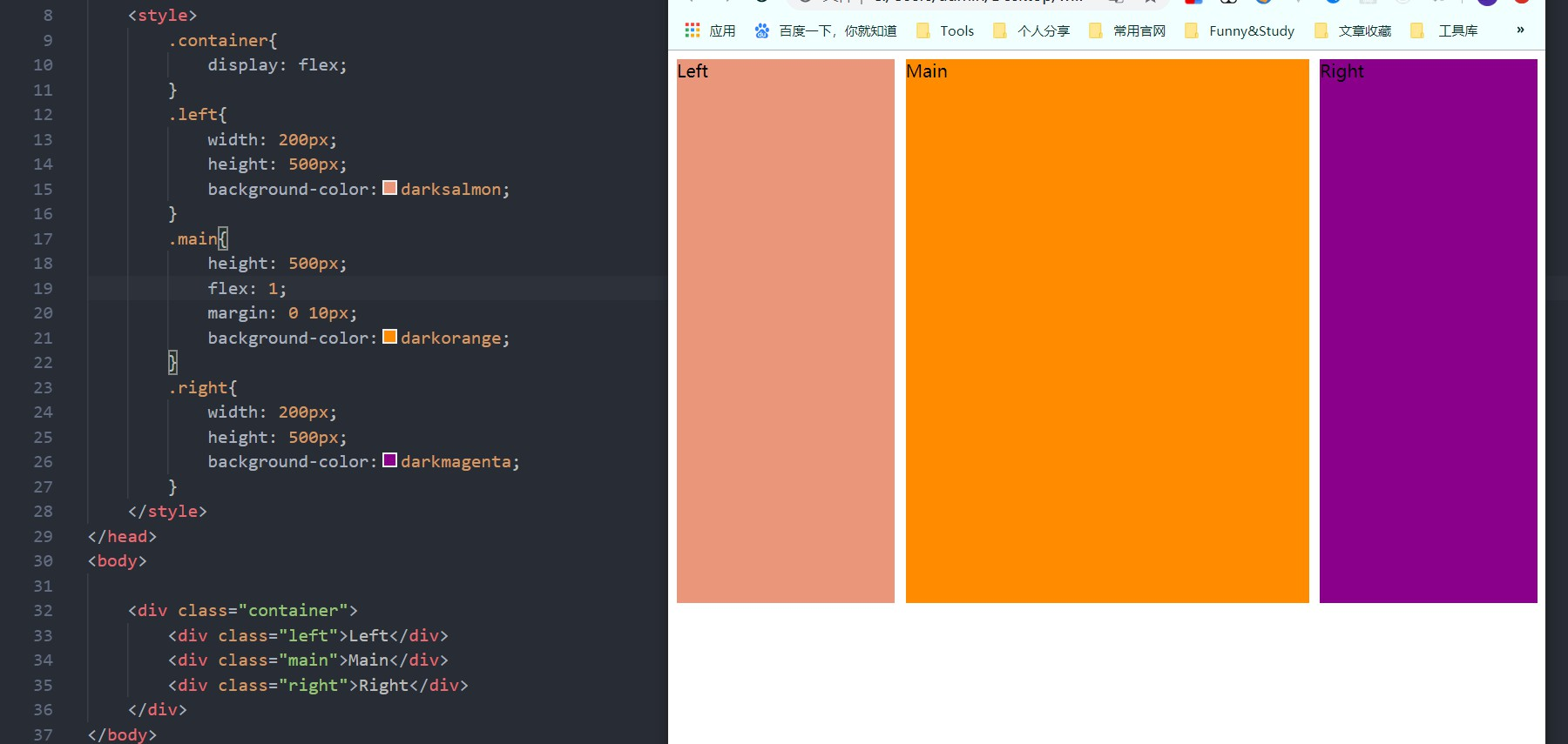
3.2 flex实现左中右布局
<style>
    .container{
        display: flex;
    }
    .left{
        width: 200px;
        height: 500px;
        background-color:darksalmon;
    }
    .main{
        height: 500px;
        flex: 1;
        margin: 0 10px;
        background-color:darkorange;
    }
    .right{
        width: 200px;
        height: 500px;
        background-color:darkmagenta;
    }
</style>
<body>
    <div class="container">
        <div class="left">Left</div>
        <div class="main">Main</div>
        <div class="right">Right</div>
    </div>
</body>
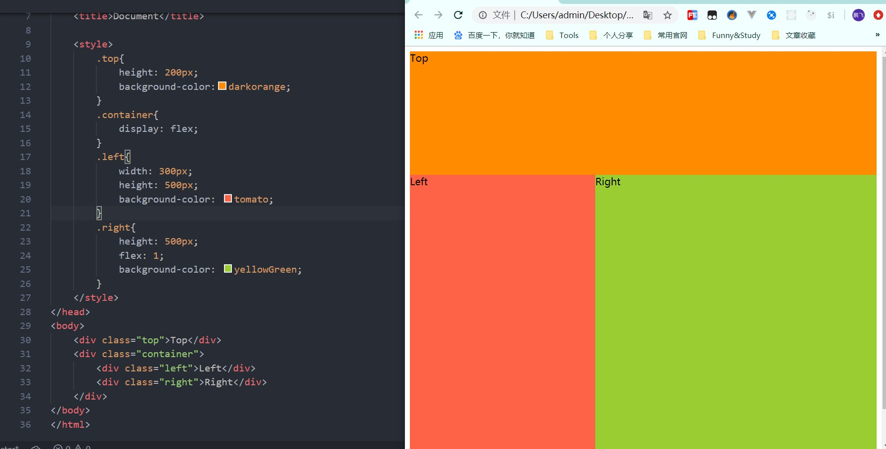
3.3 flex实现上左右布局
<style>
    .top{
        height: 200px;
        background-color:darkorange;
    }
    .container{
        display: flex;
    }
    .left{
        width: 300px;
        height: 500px;
        background-color: tomato;
    }
    .right{
        height: 500px;
        flex: 1;
        background-color: yellowGreen;
    }
</style>
<body>
    <div class="top">Top</div>
    <div class="container">
        <div class="left">Left</div>
        <div class="right">Right</div>
    </div>
</body>
3.4 练习
练习一: flex实现上左右下布局
练习二: flex实现上左中右下布局
4. 优缺点对比
4.1 float布局
优点: 简单,兼容性好
缺点: 脱离文档流,需要手动清除浮动
4.2 flex
优点: 很完美的一种布局方案
缺点: 不兼容IE8以下的浏览器
4.3 定位
优点: 快捷,方便
缺点: 脱离文档流,维护成本高,不利于拓展
5. 清除浮动的方法
常见的清楚浮动主要有如下几种方法
- 直接在最下面添加空元素块,并为空元素块添加属性 style="clear:both"
- 使用伪类,
:after