


著作权归作者所有,任何形式的转载都请联系作者获得授权并注明出处。
react.js中的组件化
容器组件 VS 展示组件
在 react 中组件化是普遍存在的,但是组件化也是分类型的,接下来将介绍容器组件与展示组件,这2者同为组件,却有着不同的功效,记住下面这段话,有助于帮你理解容器组件与展示组件:
基本原则:容器组件负责数据获取与处理;展示组件负责根据全局props展示信息
import React, { Component } from "react";
// 容器组件
export default class CommentVs extends Component {
constructor(props) {
super(props);
this.state = {
comments: []
};
}
// 生命周期函数
componentDidMount() {
setTimeout(() => {
this.setState({
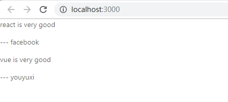
comments: [
{ body: "react is very good", author: "facebook" },
{ body: "vue is very good", author: "youyuxi" }
]
});
}, 1000);
}
render() {
return (
<div>
{this.state.comments.map((c, i) => (
<Comment key={i} data={c} />
))}
</div>
);
}
}
// 展示组件
function Comment({ data }) {
return (
<div>
<p>{data.body}</p>
<p> --- {data.author}</p>
</div>
);
}
PureComponent 组件
什么是PureComponent呢,其实就是定制化后的shouldComponentUpdate的加强Component(内部实现浅比较)
import React, { Component, PureComponent } from "react";

// shouldComponentUpdate的加强版
class PureComponentTest extends PureComponent {
    constructor(props) {
        super(props);
        this.state = {
            comments: [
                { body: "react is very good", author: "facebook" },
                { body: "vue is very good", author: "youyuxi" }
            ]
        };
    }
    shouldComponentUpdate(nextProps) {
        if (
            nextProps.data.body === this.props.data.body &&
            nextProps.data.author === this.props.data.author
        ) {
            return false;
        }
        return true;
    }

    render() {
        console.log("render");
        return (
            <div>
                <p>{this.props.body}</p>
                <p>------{this.props.author}</p>
            </div>
        );
    }
}

export default PureComponentTest;
React.PureComponent的实现原理:
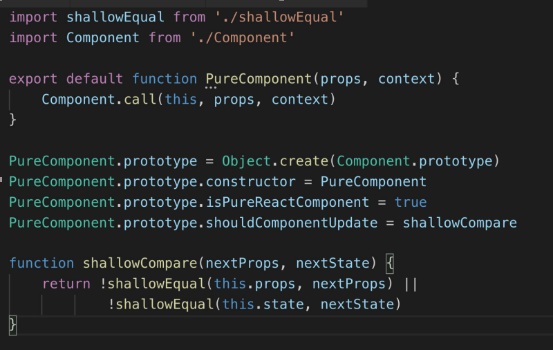
- 通过is函数对两个参数进行比较,判断是否相同,相同直接返回true:基本数据类型值相同,同一个引用对象都表示相同
- 如果两个参数不相同,判断两个参数是否至少有一个不是引用类型,存在即返回false,如果两个都是引用类型对象,则继续下面的比较;
- 判断两个不同引用类型对象是否相同,先通过Object.keys获取到两个对象的所有属性,具有相同属性,且每个属性值相同即两个对相同(相同也通过is函数完成)
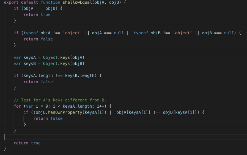
所谓的浅比较,指的就是这行代码!is(objA[keysA[i]], objB[keysA[i]])。可以看到,在比较两个对象中属性的属性值的时候,是直接采用Object.is的方式进行的比较,如果对应属性值恰好是基本类型值当然没有问题,但是如果,恰好对象中的该属性的属性值是引用类型的值,那么比较的仍旧是引用,而不是对象的外形。于是可能出现这种情况,当ObjA和objB的对象外形一致,按道理说不需要更新,但是由于其中某个相同属性的属性值是引用类型,而他们虽然外形也是一致的,但是引用不同,那么!is(objA[keysA[i]], objB[keysA[i]])仍旧会返回true,最终导致shallowEqual函数返回false(这样shouldComponentUpdate方法会返回true),从而导致组件出现无意义的更新。
那么为什么这里会采用“浅比较”呢?这其实也是出于对于性能的考量。我们都知道,在js中,对引用类型外形的比较,实际上是需要通过递归比较才能完成(深复制引用类型也需要通过递归完成)。而在组件更新判断的生命周期中不断执行递归操作去比较先后的props和state对象,毫无疑问会产生较大的性能开销。所以这里只能折中,采用浅比较的方式。当然副作用就是,仍可能出现没有必要的重新渲染(也就是两个对象的外形一致,但其中的某些属性是引用类型,这样即使引用类型属性值的外形也是一致的,浅比较依旧判定这两个对象不同,从而导致多余的重新渲染)。
React.memo 函数式组件
React.memo是 React v16.6.0 之后的版本,可以使用 React.memo 让函数式的组件也有PureComponent的功能
const Joke = React.memo(() => (
    <div>
    {/* ||如果value为空,则显示 loding*/}
    {this.props.value || 'loading...' }
    </div>
));
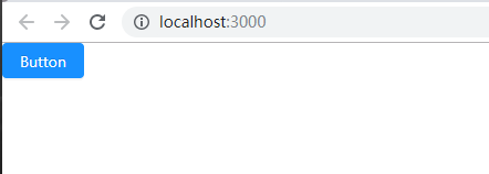
ant-design组件库的使用
首先给对应项目工程安装依赖,执行命令 npm install antd --save
简单示例,button按钮的使用
import React, { Component } from 'react'
// 导入antd 按钮组件
import Button from 'antd/lib/button'
// 导入antd 样式表
import "antd/dist/antd.css"
class ButtonTest extends Component {
    render() {
        return (<div className="App">
            {/*使用antd button 组件*/}
            <Button type="primary">Button</Button>
        </div>
        )
    }
}
export default ButtonTest
更多内容请参考ant design官方指南
按需加载的配置
你可以理解为是懒加载,就是在需要的时候才加载组件插件。配置步骤如下:
- 安装react-app-rewired取代react-scripts,这是可以扩展webpack的配置 ,类似vue.config.js
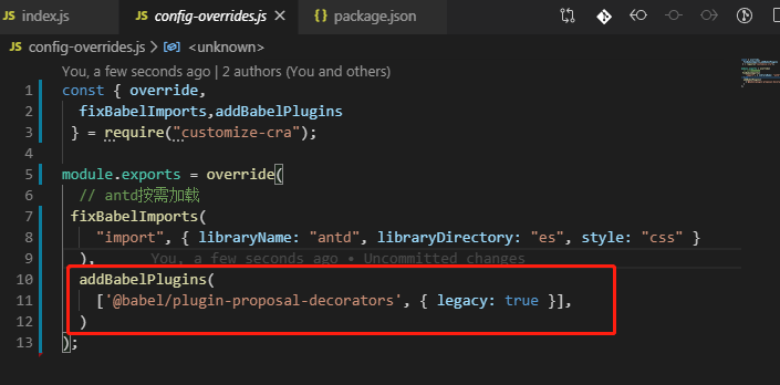
npm install react-app-rewired@2.1.5 babel-plugin-import --save npm install customize-cra less less-loader --save - 新建config-overrides.js文件,内容为
const { override, fixBabelImports,addBabelPlugins } = require("customize-cra"); module.exports = override( // antd按需加载 fixBabelImports( "import", { libraryName: "antd", libraryDirectory: "es", style: "css" } ), addBabelPlugins( ['@babel/plugin-proposal-decorators', { legacy: true }], ) ); - 修改package.json内的scripts内容如下:
"scripts": {
    "start": "react-app-rewired start",
    "build": "react-app-rewired build",
    "test": "react-app-rewired test",
    "eject": "react-app-rewired eject"
  },
同学们可以自己对着项目修改调试。
什么是高阶组件
在React里已经有了HOC(Higher-Order Components)的概念,也就是高阶组件,高阶组件其实是返回另外一个组件,产生的新的组件可以对属性进行包装,甚至重写部分生命周期。看个例子
const jpsite = (Component) => {
    const NewComponent = (props) => {
        return <Component {...props} name="开课吧高阶组件" />;
    };
    return NewComponent;
};
上面 jpsite 组件,其实就是代理了一个Component,只是给原 Component 多传递了一个name参数
高阶组件的链式调用
import React, { Component } from 'react'
import {Button} from 'antd'

const withName = (Component) => {
    const NewComponent = (props) => {
        return <Component {...props} name="开课吧高阶组件" />;
    };
    return NewComponent;
};

const withLog = Component=>{
    class NewComponent extends React.Component{
        render(){
            return <Component {...this.props} />;
        }
        componentDidMount(){
            console.log('didMount',this.props)
        }
    }
    return NewComponent
}

class App extends Component {
    render() {
        return (
            <div className="App">
            <h2>hi,{this.props.name}</h2>
            <Button type="primary">Button</Button>
            </div>
        )
    }
}

export default withName(withLog(App))
withName(withLog(App))就是链式调用的方式
高阶组件的装饰器写法
ES6装饰器可用于简化高阶组件写法,首先安装插件
npm install --save-dev @babel/plugin-proposal-decorators
然后config-overrides.js添加如下内容
import React, { Component } from "react";

// 高阶组件
const withName = Comp => {
  // 甚至可以重写组件声明周期
  class NewComponent extends Component {
    componentDidMount() {
      console.log("do something");
    }
    render() {
      return <Comp {...this.props} name="高阶组件试用介绍" />;
    }
  }

  // 假设通过某种特殊手段获取了本节课名字
  return NewComponent;
};

const withLog = Comp => {
  console.log(Comp.name + "渲染了");
  return props => <Comp {...props} />;
};

@withLog
@withName
@withLog
class Jpsite extends Component {
  render() {
    return (
      <div>
        {this.props.stage} - {this.props.name}
      </div>
    );
  }
}

export default Jpsite;
@withName
@withLog三者连在一起的写法就是装饰器写法了,效果等同于withName(withLog(App))这种链式调用的方式
组件跨层级的上下文通信
组件跨层级通信可使用Context
这种模式下的两个角色,Provider和Consumer
Provider为外层组件,用来提供数据;内部需要数据时用Consumer来读取
import React, { Component } from "react";

// 1. 创建上下文
const Context = React.createContext();

const store = {
  // 指定6611尾号用户中奖
  name: "恭喜你中到了一等奖",
  sayHi() {
    console.log(this.name);
  }
};

const withProvider = Comp => props => (
  <Context.Provider value={store}>
    <Comp {...props} />
  </Context.Provider>
);

const withConsumer = Comp => props => (
  <Context.Consumer>
    {/* 必须内嵌一个函数 */}
    {value => <Comp {...props} value={value} />}
  </Context.Consumer>
);

@withConsumer
class Inner extends Component {
  render() {
    console.log('Inner');
    return <div>{this.props.value.name}</div>;
  }
}

@withProvider
class ContextSample extends Component {
  render() {
    console.log('ContextSample');
    return <div><Inner></Inner></div>;
  }
}

export default ContextSample
React.js 新特性Hook
Hook是React16.8 的一个新增项,它可以让你在不编写 class的情况下使用 state内部状态以及其他的 React特性。
State Hook - 状态钩子
// 使用State Hook
import React, { useState } from "react";
    export default function HooksTest() {
    // useState(initialState),接收初始状态,返回一个状态变量和它的更新函数,属性名自定义
    // 声明一个叫 "count" 的 state 变量
    const [count, setCount] = useState(0);
    return (
        <div>
        <p>You clicked {count} times</p>
        {/*调用setCount修改状态count*/}
        <button onClick={() => setCount(count + 1)}>Click me</button>
        </div>
    );
}
Effect Hook - 副作用钩子
数据获取,设置订阅,以及手动更改React 组件中的 DOM, 都属于副作用。
// 使用 useEffect 副作用钩子
import React, { useState, useEffect } from "react";
    useEffect(() => {
        // Update the document title using the browser API
        document.title = `您点击了 ${count} 次`;
});
除了以上类型的Hook外,还有自定义Hook 和其他Hook,更多内容可以参考=>Hook 新特性指南
React.js 新特性Context
从之前的学习中,我们知道在一个典型的 React 应用中,数据是通过 props 属性自上而下(由父及子)进行传递的,但这种做法对于某些类型的属性而言是极其繁琐的(例如:地区偏好,UI 主题),这些属性是应用程序中许多组件都需要的。Context提供了一种在组件之间共享此类属性值的方式,而不必显式地通过组件树的逐层传递 props。
更多内容可以参考=>Context新特性指南
自己设计与实现一个组件
设计想法来源于 Ant Design Form表单
实现功能如下:
- 拥有Form表单的布局与提交功能
- FormItem收集错误信息
- Input输入框增加前缀图标
- 提供Input输入控件提供事件处理、表单校验功能
import React, { Component } from "react";
import { Icon } from "antd";

// hoc:包装用户表单,增加数据管理能力、校验
function kFormCreate(Comp) {
  return class NewComp extends Component {
    constructor(props) {
      super(props);
      this.options = {}; //字段选项设置
      this.state = {}; //各字段值
    }

    // 处理表单项输入事件
    handleChange = e => {
      const { name, value } = e.target;
      this.setState(
        {
          [name]: value
        },
        () => {
          // 数值变化后再校验
          this.validateField(name);
        }
      );
    };

    // 表单项校验
    validateField = field => {
      const rules = this.options[field].rules;
      //只要任何一项失败就失败
      const ret = rules.some(rule => {
        if (rule.required) {
          //仅验证必填项
          if (!this.state[field]) {
            // 校验失败
            this.setState({
              [field + "Message"]: rule.message
            });
            return true; // 若有校验失败,返回true
          }
        }
      });
      if (!ret) {
        // 没失败,校验成功
        this.setState({ [field + "Message"]: "" });
      }
      return !ret;
    };

    // 校验所有字段
    validate = cb => {
      const rets = Object.keys(this.options).map(field =>
        this.validateField(field)
      );
      // 如果校验结果数组中全部为true,则校验成功
      const ret = rets.every(v => v === true);
      cb(ret);
    };

    getFieldDec = (field, option, InputComp) => {
      this.options[field] = option;

      return (
        <div>
          {React.cloneElement(InputComp, {
            name: field, //控件name
            value: this.state[field] || "", //控件值
            onChange: this.handleChange, //change事件处理
            onFocus: this.handleFocus // 判断控件是否获得焦点
          })}
          {/* {this.state[field + "Message"] && (
            <p style={{ color: "red" }}>{this.state[field + "Message"]}</p>
          )} */}
        </div>
      );
    };

    //
    handleFocus = e => {
      const field = e.target.name;
      this.setState({
        [field + "Focus"]: true
      });
    };
    // 判断组件是否被用户点过
    isFieldTouched = field => !!this.state[field + "Focus"];

    getFieldError = field => this.state[field + "Message"];

    render() {
      return (
        <Comp
          {...this.props}
          getFieldDec={this.getFieldDec}
          value={this.state}
          validate={this.validate}
          isFieldTouched={this.isFieldTouched}
          getFieldError={this.getFieldError}
        />
      );
    }
  };
}

class FormItem extends Component {
  render() {
    return (
      <div className="formItem">
        {this.props.children}
        {this.props.validateStatus === "error" && (
          <p style={{ color: "red" }}>{this.props.help}</p>
        )}
      </div>
    );
  }
}

class KInput extends Component {
  render() {
    return (
      <div>
        {/* 前缀图标 */}
        {this.props.prefix}
        <input {...this.props} />
      </div>
    );
  }
}

@kFormCreate
class KFormSample extends Component {
  onSubmit = () => {
    this.props.validate(isValid => {
      if (isValid) {
        alert("校验成功,提交登录");
        console.log(this.props.value);
      } else {
        alert("校验失败");
      }
    });
  };

  render() {
    const { getFieldDec, isFieldTouched, getFieldError } = this.props;

    const userNameError = isFieldTouched("uname") && getFieldError("uname");
    const passwordError = isFieldTouched("pwd") && getFieldError("pwd");

    return (
      <div>
        <FormItem
          validateStatus={userNameError ? "error" : ""}
          help={userNameError || ""}
        >
          {getFieldDec(
            "uname",
            {
              rules: [{ required: true, message: "请填写用户名" }]
            },
            <KInput type="text" prefix={<Icon type="user" />} />
          )}
        </FormItem>
        <FormItem
          validateStatus={passwordError ? "error" : ""}
          help={passwordError || ""}
        >
          {getFieldDec(
            "pwd",
            {
              rules: [{ required: true, message: "请填写用户名" }]
            },
            <KInput type="password" prefix={<Icon type="lock" />} />
          )}
        </FormItem>

        <button onClick={this.onSubmit}>登录</button>
      </div>
    );
  }
}

export default KFormSample
扫码关注公众号,回复20191121获取本文所有源码
写作不易,如果文章对你有帮助,可否留下脚印留个赞~

