

我们已经习惯用 JavaScript 实现常见的 UI 功能组件,如手风琴、工具提示、文本截断等。但是随着 HTML 和 CSS 新特性的推出,不用再支持旧浏览器,我们可以越来越少用 JavaScript 来创建 UI 组件,更多地集中在代码的逻辑部分(验证、数据处理等)。
有些实现方案确实感觉有点剑走偏锋,也不太灵活,但它们对于小型项目里的单例组件还是有用的。为什么非得在网站里用 JavaScript(或者怀旧点用 jQuery)实现一个只用一次的手风琴组件?这就是我在给自己的移动端个人网站页脚添加手风琴组件时的思考过程。
以下就是一些可以零 JavaScript 实现的元素示例。
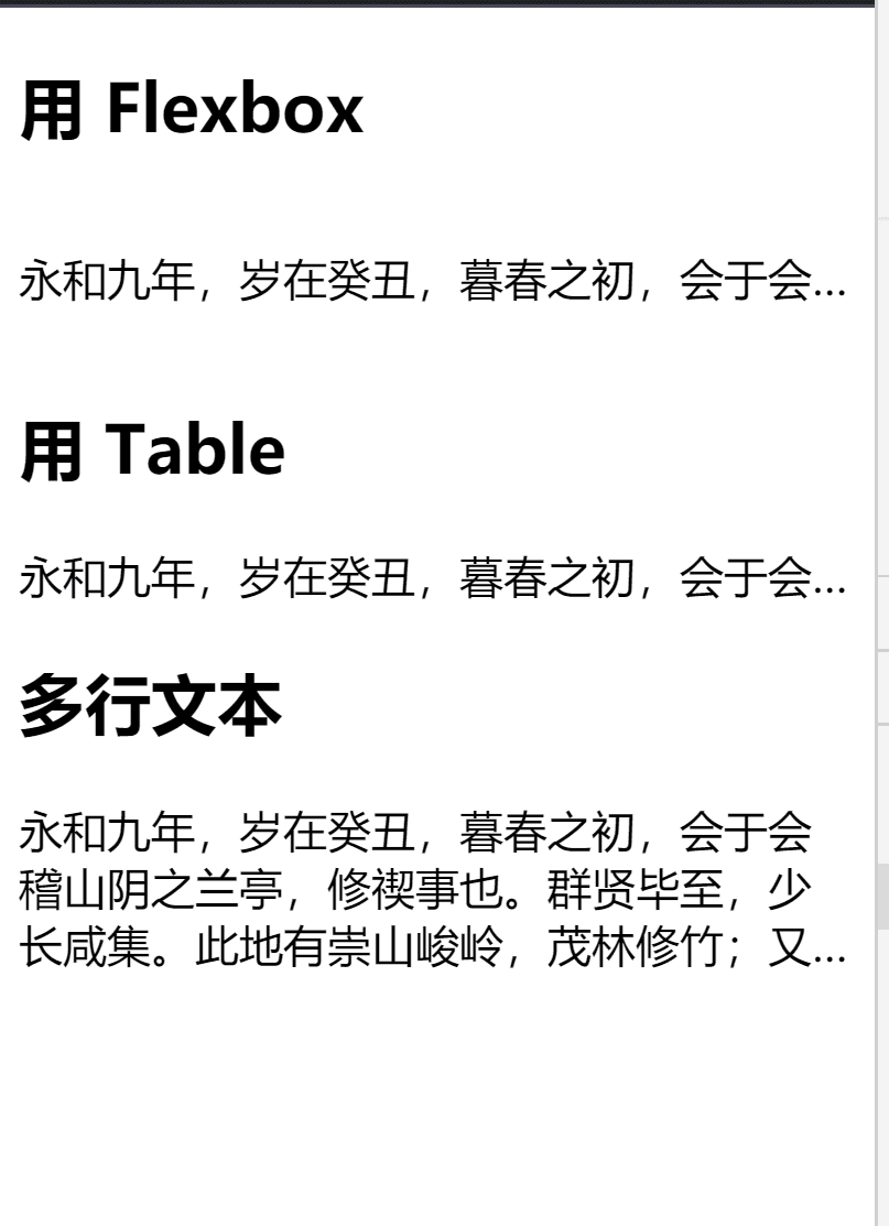
响应式文本截断
CSS 文本截断很容易实现,性能也不错,因为我们无须编辑文本的 HTML 内容,只是渲染结果。单行文本截断在旧浏览器上支持良好,而多行文本截断只在较新的浏览器上获得支持。
HTML:
<section class="flex">
  <h2>用 Flexbox </h2>
  <article class="wrapper">
    <p class="text--truncated">
      永和九年,岁在癸丑,暮春之初,会于会稽山阴之兰亭,修禊事也。群贤毕至,少长咸集。此地有崇山峻岭,茂林修竹;又有清流激湍,映带左右,引以为流觞曲水,列坐其次。虽无丝竹管弦之盛,一觞一咏,亦足以畅叙幽情。
    </p>
  </article>
</section>

<section class="table">
  <h2>用 Table </h2>
  <article class="wrapper">
    <p class="text--truncated">
      永和九年,岁在癸丑,暮春之初,会于会稽山阴之兰亭,修禊事也。群贤毕至,少长咸集。此地有崇山峻岭,茂林修竹;又有清流激湍,映带左右,引以为流觞曲水,列坐其次。虽无丝竹管弦之盛,一觞一咏,亦足以畅叙幽情。
    </p>
  </article>
</section>

<section class="multiline">
  <h2>多行文本</h2>
  <div class="wrapper">
    <p class="text--truncated">
     永和九年,岁在癸丑,暮春之初,会于会稽山阴之兰亭,修禊事也。群贤毕至,少长咸集。此地有崇山峻岭,茂林修竹;又有清流激湍,映带左右,引以为流觞曲水,列坐其次。虽无丝竹管弦之盛,一觞一咏,亦足以畅叙幽情。
    </p>
  </div>
</section>
CSS:
/* WITH FLEXBOX */
.flex .wrapper {
  display:flex;
}

.flex .text--truncated {
  white-space: nowrap;
  overflow: hidden;
  text-overflow: ellipsis;
}

/* WITH TABLE */
.table .wrapper {
  display: table;
  table-layout: fixed;
  width: 100%;
}

.table .text--truncated {
  display: table-cell;
  white-space: nowrap;
  overflow: hidden;
  text-overflow: ellipsis;
}

/* MULTI-LINE */
.multiline .text--truncated {
    overflow: hidden;
    display: -webkit-box;
    -webkit-line-clamp: 3;
    -webkit-box-orient: vertical;
}
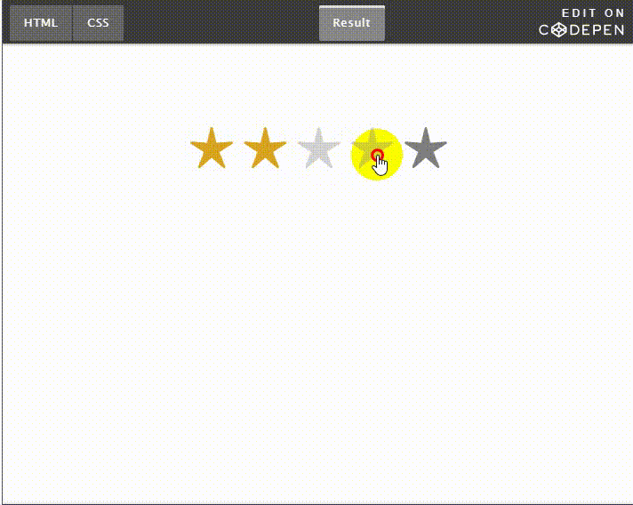
星级评分
星级评分组件是大部分调查表单的必备元素。有多种使用 CSS 来实现的方法:用背景图、JavaScript、图标等等。最方便的方法是使用图标和原生单选框。
这种实现方式的缺点是,HTML 单选按钮是倒序的(分数值从5到1),因为我们要选择被勾选的单选按钮以及它后面的所有单选按钮,不倒序的话 CSS 没法实现。~ 选择器只能选择元素后面的兄弟元素,所以只能倒过来。
这种实现非常灵活,很容易自定义。
<div class="rating">
  <input class="rating__input hidden--visually" type="radio" id="5-star" name="rating" value="5" required />
  <label class="rating__label" for="5-star" title="5 out of 5 rating"><span class="rating__icon" aria-hidden="true"></span><span class="hidden--visually">5 out of 5 rating</span></label>
  <input class="rating__input hidden--visually" type="radio" id="4-star" name="rating" value="4" />
  <label class="rating__label" for="4-star" title="4 out of 5 rating"><span class="rating__icon" aria-hidden="true"></span><span class="hidden--visually">4 out of 5 rating</span></label>
  <input class="rating__input hidden--visually" type="radio" id="3-star" name="rating" value="3" />
  <label class="rating__label" for="3-star" title="3 out of 5 rating"><span class="rating__icon" aria-hidden="true"></span><span class="hidden--visually">3 out of 5 rating</span></label>
  <input class="rating__input hidden--visually" type="radio" id="2-star" name="rating" value="2" />
  <label class="rating__label" for="2-star" title="2 out of 5 rating"><span class="rating__icon" aria-hidden="true"></span><span class="hidden--visually">2 out of 5 rating</span></label>
  <input class="rating__input hidden--visually" type="radio" id="1-star" name="rating" value="1" />
  <label class="rating__label" for="1-star" title="1 out of 5 rating"><span class="rating__icon" aria-hidden="true"></span><span class="hidden--visually">1 out of 5 rating</span></label>
</div>
CSS:
/* --- Required CSS (不可自定义) --- */

.rating {
  display: inline-flex;
  flex-direction: row-reverse;
}

/* Hiding elements in an accessible way */
.hidden--visually {
    border: 0;
    clip: rect(1px 1px 1px 1px);
    clip: rect(1px, 1px, 1px, 1px);
    height: 1px;
    margin: -1px;
    overflow: hidden;
    padding: 0;
    position: absolute;
    width: 1px;
}

/* --- Required CSS (可自定义) --- */

.rating__label {
  cursor: pointer;
  color: gray;
  padding-left: 0.25rem;
  padding-right: 0.25rem;
}

.rating__icon::before {
  content: "";
}

.rating__input:hover ~ .rating__label {
  color: lightgray;
}

.rating__input:checked ~ .rating__label {
  color: goldenrod;
}
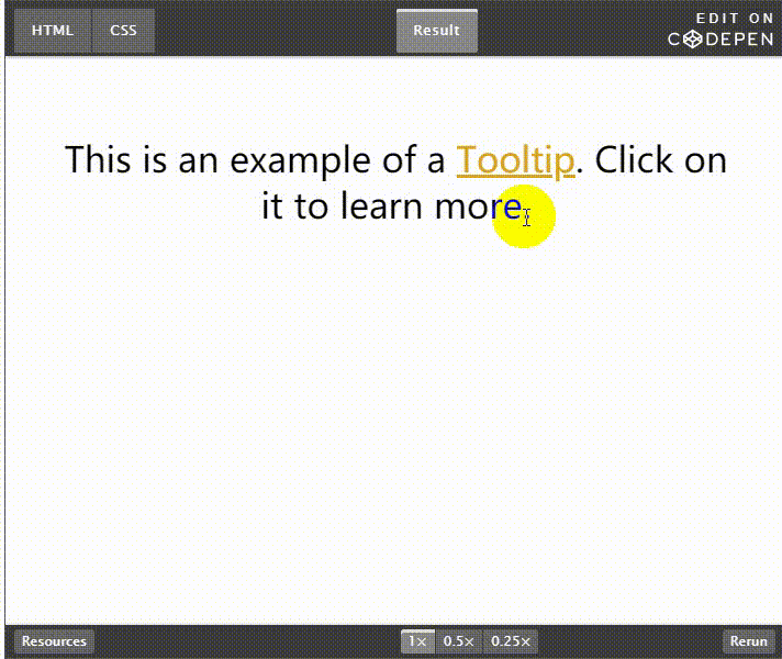
Tooltip / 下拉菜单
这是个非常灵活的元素,它的 CSS 逻辑可以同时用于 tooltips 和下拉菜单,因为两者的工作方式类似,都支持鼠标悬停和点击(或者触碰)。
这种实现方式存在的问题是,由于它的focus 样式,点击后tooltip(或者下拉菜单)会一直处于打开状态,直到用户在元素外部点击。
HTML:
<div>This is an example of a <a href="#" class="tooltip" aria-label="The tooltip or a hint is a common GUI element that describes the item it's related to.">Tooltip</a>. Click on it to learn more.</div>
CSS:
/* --- Required CSS (not customizable) --- */

.tooltip:focus::after,
.tooltip:hover::after {
  content: attr(aria-label);
  display: block;
}

/* --- Required CSS (customizable) --- */

.tooltip:focus::after,
.tooltip:hover::after {
  position: absolute;
  top: 100%;
  font-size: 1.2rem;
  background-color: #f2f2f2;
  border-radius: 0.5rem;
  color: initial;
  padding: 1rem;
  width: 13rem;
  margin-top: 0.5rem;
  text-align: left;
}

.tooltip {
  position: relative;
  color: goldenrod;
  display: inline-block;
}

.tooltip:hover::before {
    top: 100%;
    right: 0;
  left: 0;
  margin: -1rem auto 0;
  display: block;
    border: solid transparent;
    content: "";
    height: 0;
    width: 0;
    position: absolute;
    pointer-events: none;
    border-bottom-color: #f2f2f2;
    border-width: 1rem;
}
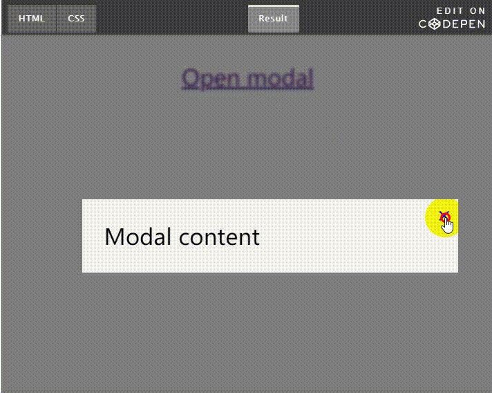
模态对话框
这个实现就有点 hacky 了,它完全依赖于URL里的查询字符串。URL 里的 Id 必须跟要打开的模态对话框元素匹配。
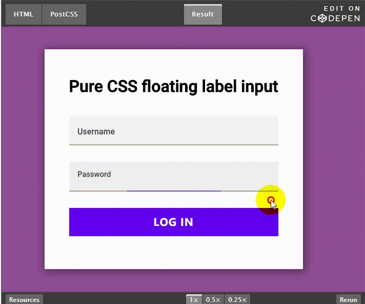
输入框标签文字浮动
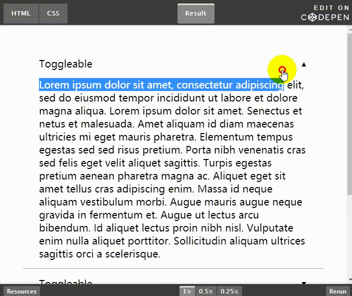
手风琴效果
最近,HTML 可以通过 <details> 和 <summary> 元素实现原生的手风琴效果了,但它的缺点是没有太多的样式选择,因此开发人员还是要自己去实现。所幸,通过利用复选框和单选框逻辑,我们可以不依赖 JavaScript 实现手风琴组件了。
这种实现方案的缺陷是,它依赖于input 元素,并且它的逻辑需要额外的 HTML 代码,但另一方面它的可访问性较好。
总结
如你所见,纯 CSS 实现方案依赖于 CSS 选择器,比如 :focus 和 :placeholder-shown ,来替代 JavaScript 逻辑代码。其中有些 CSS 方案被认为是比较 hacky 的,但是性能好,比较灵活,不依赖 JavaScript。
我在项目里使用了部一些 CSS 实现方案,避免了完全利用 JavaScript 实现视觉效果。
当然了,还有很多纯 CSS 实现方案,我只是列举了觉得比较有意思的几个。如果你还有其他方案,欢迎在评论里留言分享!
交流
欢迎扫码关注微信公众号“1024译站”,为你奉上更多技术干货。

