

1 flex布局称弹性盒子 (flex 弹性)
.box {
display: flex;
}
2 parent样式
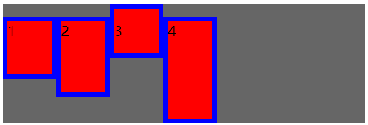
1 flex-direction 主轴方向 (direction 方向)
参数 row | row-reverse | column |column-reverse (row行 column柱)
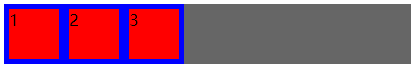
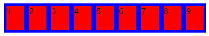
默认参数 row 横向 左->右 /* flex-direction:row; */
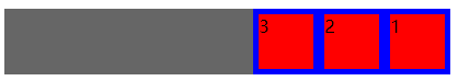
rowe-reverse 横向 右->左 /* flex-direction: row-reverse; */
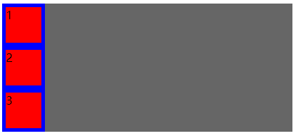
column 纵向 上->下 /* flex-direction: column; */
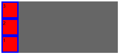
column-reverse 纵向 下->上 /* flex-direction: column-reverse; */
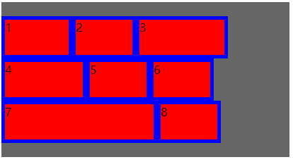
2 flex-wrap 换行
参数 nowrap | wrap | wrap-reverse
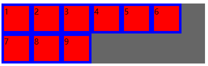
默认参数 nowrap 不换行 /* flex-wrap: nowrap; */
wrap 超出换行 /* flex-wrap: wrap; */
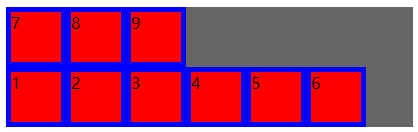
wrap-reverse 下->上 /* flex-wrap: wrap-reverse; */
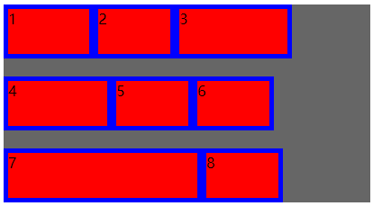
3 flex-flow ---flex-direction 和 flex-wrap 的简写
默认 row nowrap
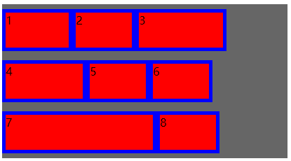
4 justify-content 横向对齐方式 (justify 使每行排列)
参数 flex-start | flex-end | center | space-between | space-around | space-evenly
(between 之间 around 环绕 evenly 均匀)
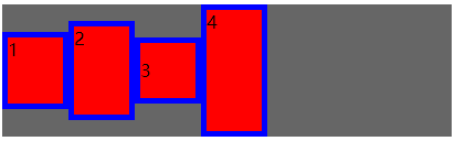
默认参数 flex-start 左对齐 /* justify-content: flex-start; */
flex-end 右对齐 /* justify-content:flex-end; */
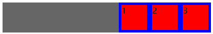
center居中 /* justify-content:center; */

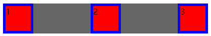
space-between 两端对齐 间距相等 /* justify-content:space-between; */
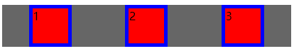
space-around 间距相同 距边框2/1间距 /* justify-content:space-around; */
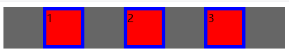
space-evenly 所有间距相同包括 /* justify-content:space-evenly; */
5 align-items 纵向单行对齐方式 (align 排列)
参数 flex-start | flex-end | center | baseline | stretch
(baseline基线 stretch拉长)
默认参数 flex-start 上对齐 /* align-items: flex-start */
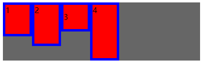
flex-end 下对齐 /* align-items:flex-end */
center 垂直居中 /* align-items:center */
baseline 第一行文字对齐 /* align-items:baseline */
strech 如果项目未设置高度 自动100% /* align-items: stretch */
6 align-content 纵向多行对齐方式
参数 flex-start | flex-end | center | space-between | space-around | stretch
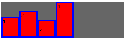
默认参数 stretch 填充满 /* align-content: stretch; */
flex-start 上对齐 /* align-content:flex-start */
flex-end 下对齐 /* align-content: flex-end; */
cneter 居中 /* align-content: center; */
space-between 上下对齐 /* align-content: space-between; */
space-around 间距相同 距边框2/1间距 /* align-content: space-around; */
3 children样式
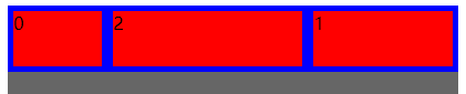
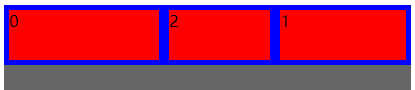
1 order 排列顺序 (order顺序)
参数 整数 越小的越靠前
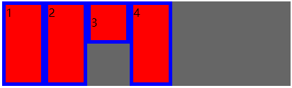
2 flex-grow 剩余空间分配 (grow扩大)
参数 数字 0宽度不变 1分配1份 2分配2份
3 flex-shrink (shrink收缩)
参数 数字 0 宽度不变 1 减小1份 2 减小2份
4 flex-basis 分配空间之前 占用的宽度 (basis基础)
参数 auto | px
