

前言
弹出对话框在日常开发中应用得十分广泛,无论是Web网页,还是App,又或者是桌面应用,都可以使用对话框实现一种较高体验性的人机交互,浏览ElementUi,我们可以看到在其组件库中,关于弹出的组件有很多:对话框、弹出框、文字提示、气泡确认框···
关于Ui库开发,个人按照ElementUi的组件种类,以Pc端为核心,创建了一套【适配VUE + LESS】的开源UI库项目,如果大家感兴趣,欢迎来GIT上踩踩
附件:
- Git - github.com/Jason9708/C…
- 开发私人UI库教程 - juejin.cn/post/684490…
本文将带来的是摸一个ElementUi对话框,从零到一让大家明白一个合格的组件是如何打造的
何为组件?
关于组件,可以分为业务组件和通用组件
- 业务组件
- 只为具体业务负责,调用方便,组件与业务耦合
- 无法迁移,扩展性差
- 通用组件
- 抽象的
UI组件,无具体功能实现 - 使用需要具体的业务代码
- 具有高复用、高可扩展性
- 抽象的
实现一个合格的组件,该如何思考?
思考功能 → 提取业务功能与基本功能 → 实现基本功能,定义业务功能接口
打造对话框组件
需求分析
根据ElementUi对话框的功能属性进行筛选,我们实现以下需求:
- 对话框显示由父组件控制,子组件实现
- 头部通过父组件传值,也可通过
slot - 具体内容与底部均通过
slot由用户自定义 - 遮罩层、body滚动、右上角按钮、主题颜色、自定义类等均可配置
- 弹窗关闭前回调、弹窗打开后回调、弹窗关闭后回调
最终效果
代码编写
文件目录
index.vue:组件文件index.less:样式表view01.vue:测试组件文件
1 - index.vue 组件文件
❗ Ps:
$slots.footer- 用于判断父组件中所使用的slot是否包括具名为footer的插槽this.$emit('update:visible', false)- 该用法需要父组件配合,在绑定visible时使用sync修饰符,实现子组件修改父组件值handleClose- 该方法当父组件有传递beforeClose且为function时,然后传递hide()作为参数并执行,这个用法实现在关闭之前进行额外操作,父组件的beforeClose函数可以接受一个参数,用于主动关闭弹窗
<template>
    <div class='cai-dialog-wrapper' ref='dialog-wrapper' v-show='visibleDialog' @click.self='handleWrapperClick'>
        <transition name="dialog-fade">
            <div ref='dialog'
                 :class="['cai-dialog',{ 'cai-dialog-dark':dark },customClass]"
                 :style='dialogSize'
                  v-if='dialogRender'
            >
                <!-- 对话框头部 -->
                <div class='cai-dialog-header'>
                    <!-- 对话框标题,可被替换 -->
                    <slot name='title'>
                        <span class='cai-dialog__title'>{{ title }}</span>
                    </slot>
                    <!-- 关闭对话框按钮 -->
                    <button
                        type='button'
                        class='cai-dialog__headerbtn'
                        aria-label='Close'
                        v-if='displayClose'
                        @click='handleClose'>
                        <i class='cai-icon-close'></i>
                    </button>
                </div>
                <!-- 对话框主体 -->
                <div class='cai-dialog-body'>
                    <slot></slot>
                </div>
                <!-- 对话框底部 -->
                <div class='cai-dialog-footer' v-if='$slots.footer'>
                    <slot name='footer'></slot>
                </div>
            </div>
        </transition>
    </div>
</template>

<script>
export default {
    name:'CaiDialog',
    data(){
        return{
            visibleDialog:false,
            dialogRender:false,
            dialogSize:{}   // body宽高用于设置居中
        }
    },
    props:{
        visible:{
            type: Boolean,
            default: false
        },
        title:{
            type: String,
            default: ''
        },
        // 关闭弹窗前的回调(接收一个参数 done())
        beforeClose: Function,
        // 是否需要遮罩层
        modal:{
            type: Boolean,
            default: true
        },
        // 是否在 Dialog 出现时将 body 滚动锁定
        lockScroll: {
            type: Boolean,
            default: true
        },
        // 是否可以通过点击 modal 关闭 Dialog
        closeOnClickModal: {
            type: Boolean,
            default: false
        },
        // 是否显示右上角关闭按钮
        displayClose:{
            type: Boolean,
            default: true
        },
        // 最大宽高
        width: String,
        height: String,
        // 主题颜色 - 高亮(默认) | 夜间
        dark:{
            type:Boolean,
            default:false
        },
        // 自定义类
        customClass: {
            type:String,
            default:''
        }
    },
    watch:{
        visible(newVal){
            if(newVal){
                this.visibleDialog = true
                this.dialogRender = true

                // 依据props修改样式
                this.changeDialogStyle()

                this.$emit('open')
            }else{
                this.visibleDialog = false
                this.dialogRender = false
                document.body.style['overflow'] = 'auto'
                this.$emit('close')
            }
        }
    },
    methods:{
        handleWrapperClick(){
            if(!this.closeOnClickModal) return
            this.handleClose()
        },
        // 处理关闭对话框,若存在beforeClose则调用
        handleClose(){
            if(typeof this.beforeClose === 'function') {
                this.beforeClose(this.hide)
            }else{
                this.hide()
            }
        },
        hide(){
            this.$emit('update:visible', false);
        },
        // 根据Props值修改Dialog样式
        changeDialogStyle(){
            // lockScroll - 实现底层禁止滚动
            if(this.lockScroll) document.body.style['overflow'] = 'hidden'
            var that = this
            this.$nextTick(() => {
                var dialogWrapperStyle = that.$refs['dialog-wrapper'].style
                var dialogStyle = that.$refs.dialog.style
                if(that.width) dialogStyle.width = that.width + 'px'
                if(that.height) dialogStyle.height = that.height + 'px'
                // 实现无遮罩层
                if(!that.modal) dialogWrapperStyle.background = 'transparent'
            })
        }
    }
}
</script>

<style lang='less' scoped>
@import './index.less';
@import '../../CaiIcon/component/index.less';   // Icon样式表,可忽略
</style>
2 - index.less 样式表
.cai-dialog-wrapper{
    position: fixed;
    top:0;
    bottom:0;
    right: 0;
    left: 0;
    overflow: auto;
    background: rgba(0,0,0,0.6);
    z-index:1999;
    // 默认样式
    .cai-dialog{
        position:absolute;
        border:1px solid rgba(247, 241, 240);
        border-radius:5px;
        color:#303952;
        padding:10px;
        left:50%;
        top:50%;
        transform:translate(-50%, -50%);
        display:flex;
        flex-direction: column;
        justify-content: space-between;
        background: rgba(247, 241, 240);
        min-width:200px;
        min-height:100px;
        overflow: auto;
        .cai-dialog-header{
            display: flex;
            justify-content: space-between;
            align-items: center;
            margin-bottom:10px;
            font-size:14px;
            .cai-dialog__title{
                font-weight: 600;
            }
            .cai-dialog__headerbtn{
                background: transparent;
                border-color: transparent;
                padding:0;
                outline:none;
                .cai-icon-close{
                    color:#303952;
                    cursor:pointer;
                    transition: all .1s linear;
                    &:hover{
                        color:#ff3f34;
                    }
                }
            }
        }
        .cai-dialog-body{
            flex:1;
        }
    }
    // 夜间模式
    .cai-dialog-dark{
        border-color:#3d3d3d;
        background: #3d3d3d;
        color:#fff;
        .cai-dialog-header{
            .cai-dialog__headerbtn{
                .cai-icon-close{
                    color:#fff;
                    cursor:pointer;
                    transition: all .1s linear;
                    &:hover{
                        color:#ef5777;
                    }
                }
            }
        }
    }

    // 进入/离开 动画
    .dialog-fade-enter-active, .dialog-fade-leave-active {
        transition: all .3s linear;
    }
    .dialog-fade-enter {
        opacity: 0;
        top:48%;
    }
}
3 - view01.vue 测试组件文件
<!--
    visible - 控制显示
    title - 弹窗标题
    beforeClose - 弹窗关闭前回调
    modal - 是否需要遮罩层
    lockScroll - 是否在 Dialog 出现时将 body 滚动锁定
    closeOnClickModal - 是否可以通过点击 modal 关闭 Dialog
    displayClose - 是否显示右上角关闭按钮
    dark - 主题颜色 - 高亮(默认) | 夜间
    customClass - 自定义类
    @open - Dialog 打开的回调
    @close - Dialog 关闭的回调

    slot {
      footer - 底部
      不具名 - 内容
    }
-->
<div style='width:310px;padding:20px;border:1px solid #DDDDDD;display:flex;flex-wrap:wrap;'>
  <cai-button @click='openDialog1'>高亮对话框</cai-button>
  <cai-dialog :visible.sync='showDialog1' closeOnClickModal width='400' height='200' title='I am Light' :before-close='handleDialogClose' @open='DialogOpen' @close='DialogClose'>
    I am a Dialog
    <span slot="footer" style='display:flex;justify-content:flex-end;'>
      <cai-button @click="showDialog1 = false">取 消</cai-button>
      <cai-button @click="showDialog1 = false">确 定</cai-button>
    </span>
  </cai-dialog>

  <cai-divider></cai-divider>

  <cai-button @click='openDialog2'>夜间对话框</cai-button>
  <cai-dialog :visible.sync='showDialog2' dark :displayClose='false' :lockScroll='false' :before-close='handleDialogClose'>
    <!-- 通过slot自定义头部 -->
    <span slot="title">
     I am Dark
    </span>
    I am a Dialog
    <span slot="footer" style='display:flex;justify-content:flex-end;'>
      <cai-button @click="showDialog2 = false">取 消</cai-button>
      <cai-button @click="showDialog2 = false">确 定</cai-button>
    </span>
  </cai-dialog>
</div>
data(){
    return{
        // Dialog
        showDialog1:false,
        showDialog2:false
    }
}

methods(){
    openDialog1(){
      this.showDialog1 = true
    },
    openDialog2(){
      this.showDialog2 = true
    },
    DialogOpen(){
      console.log('DialogOpen')
    },
    DialogClose(){
      console.log('DialogOpen')
    },
    handleDialogClose(done){
      console.log('弹窗被关闭')
      done()
    }
}
尾声
组件开源地址
该开源git是一个开源UI库项目,目前开发近20款适配Vue的UI组件,有兴趣的小伙伴给点⭐
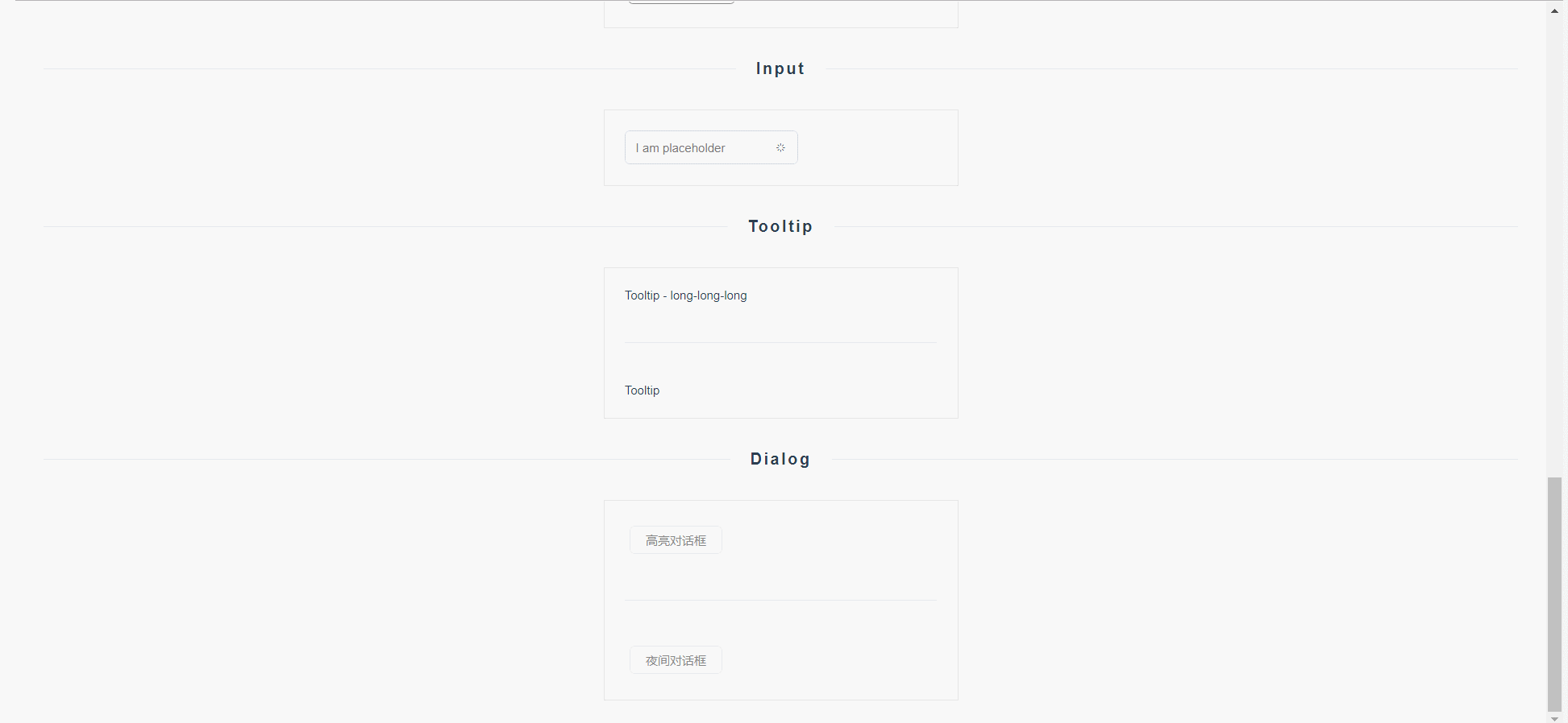
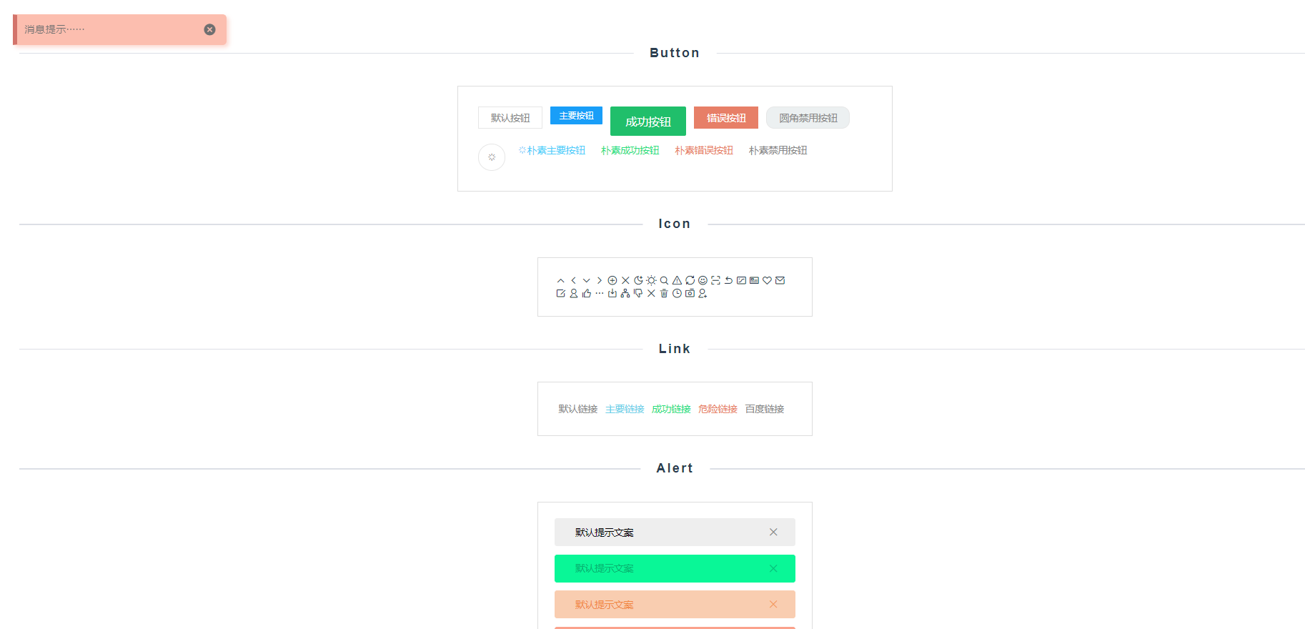
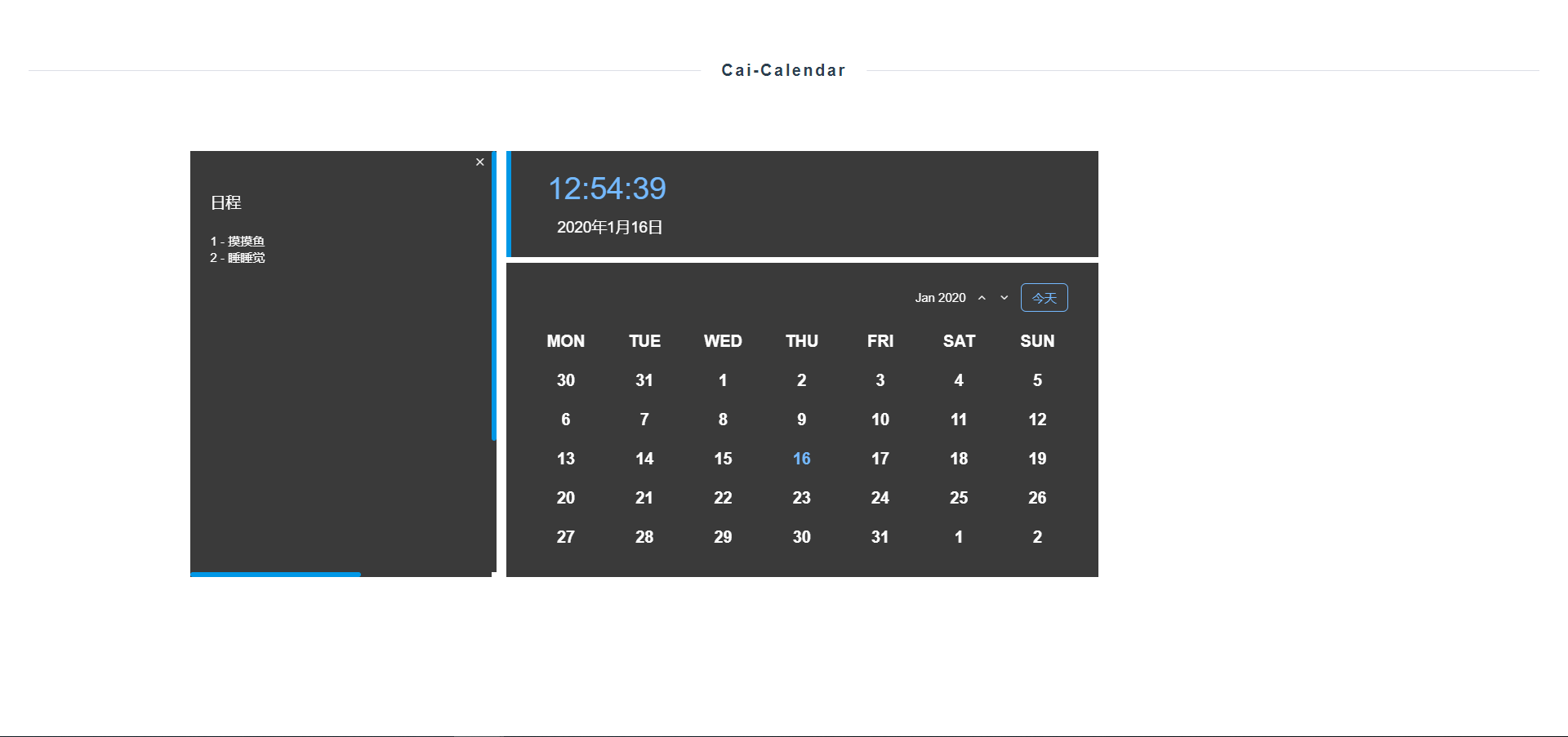
部分组件截图
