

原作者:Rachel Andrew 原文地址:www.smashingmagazine.com/2020/01/und…
在第一篇文章中,我们讲解了如何创建一个网格容器,并且介绍了一些用于构造网格的属性。只要创建了网格,你就有了很多的网格线。在这篇文章中,我们将介绍如何通过设置一些属性来对网格的子元素进行布局。 我们将包括:
- 布局属性
grid-column-start, grid-column-end, grid-row-start, grid-row-end以及它们的简写方式grid-column和grid-row。 - 如何使用
grid-area属性 - 如何通过行的名字布局
- 显式网格和隐式网格布局的区别
- 使用
span关键字 - 当使用属性进行布局以及自动布局混用时应该注意什么
基于网格线进行布局
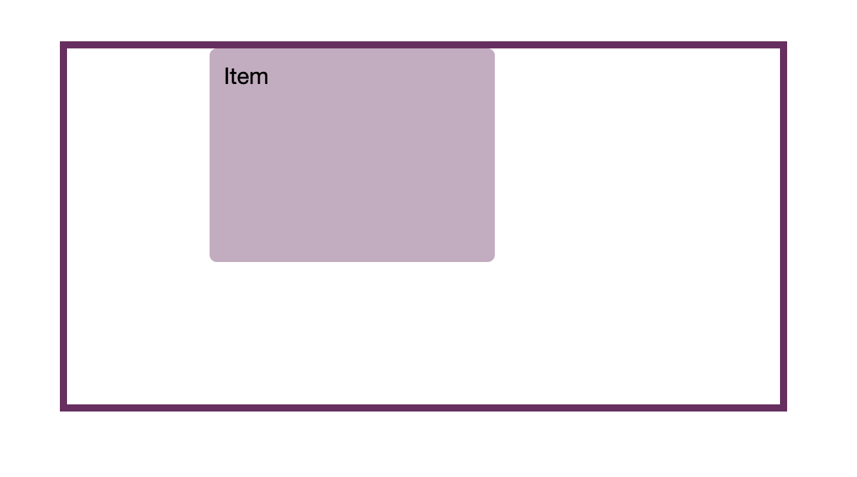
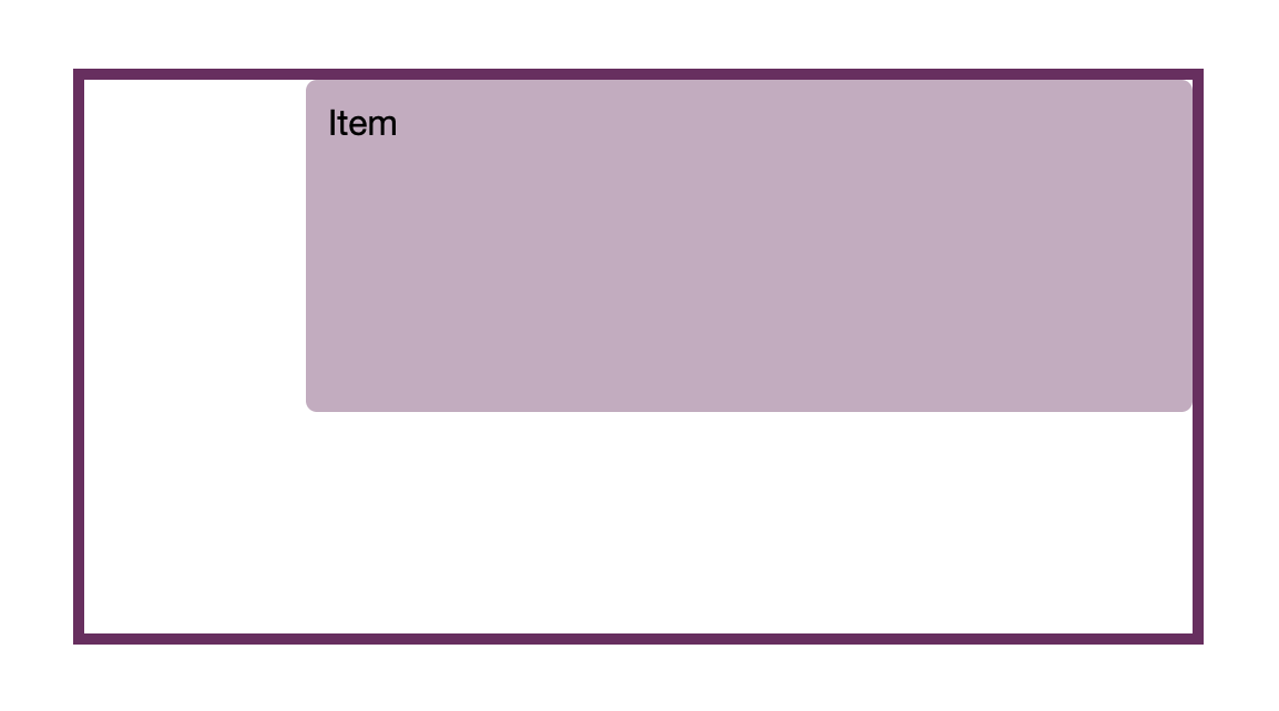
如果我们想在网格中放置一个元素,就需要定义它从哪一条网格线开始,到哪一条线结束。 所以,在一个5行5列的网格中,要让元素占据第2列第3列,以及前3行的位置,我可以使用下面的css。
.item {
  grid-column-start: 2;
  grid-column-end: 4;
  grid-row-start: 1;
  grid-row-end: 4;
}
你也可以使用简写方式,前面代表开始的网格线,后面代表结束网格线。
.item {
  grid-column: 2 / 4;
  grid-row: 1 / 4;
}
可以看下这个例子:
<div class="grid">
  <div class="item">Item</div>
</div>
body {
  padding: 50px;
  font: 1em Helvetica Neue, Helvetica, Arial, sans-serif;
}

.grid {
  border: 5px solid rgb(111,41,97);
  display: grid;
  grid-template-columns: repeat(5, 100px);
  grid-template-rows: repeat(5, 50px);
  inline-size: 500px;
}

.item {
  grid-column: 2 / 4;
  grid-row: 1 / 4;
}

.grid > * {
  background-color: rgba(111,41,97,.4);
  border-radius: 5px;
  padding: 10px;
}
注意:我们的长方体背景延伸到整个区域的原因是对齐特性的默认初始值align-self和justify-self是stretch(拉伸,占满单元格的整个宽度)。
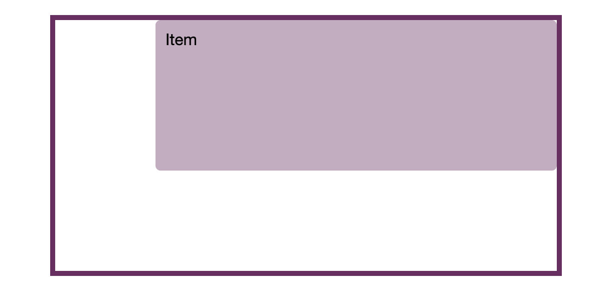
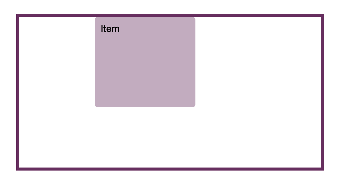
如果希望元素只占据一条轨道,你可以省略结束网格线的值。元素会默认占据一条轨道。像上一篇文章中,最后一个例子,自动放置的元素,每一项值占据一个网格单元。所以如果想要占据第2条和第3条网格线之间的区域可以这么设置。
.item {
  grid-column: 2 / 3;
}
也可以省略后面的值。
.item {
  grid-column: 2;
}
简写形式grid-area
你也可以使用grid-area设置。在后面的文章中我们会经常遇到。使用这个属性可以同时设置上面的四个值。
.item {
  grid-area: 1 / 2 / 4 / 4;
}
四个值分别代表grid-row-start, grid-column-start, grid-row-end, grid-column-end它们分别代表top, left, bottom, right。这和我们平时写css属性时有点区别。
这是因为无论使用哪种书写模式或方向,网格都以相同的方式工作,在后面我们会详细解释。而且先设置两个开始值,再设置两个结束值比描述屏幕的物理映射更加有意义。但我并不推荐使用这种方式。因为在阅读时,使用grid-column 和 grid-row这两个属性可读性更加好。
显式网格中的线
在上篇文章中我提到了显式和隐式网格。显式网格是你使用
grid-template-columns和grid-template-rows明确定义的网格。通过定义行列轨道,同时也定义了轨道之间的网格线以及网格的边框。
这些线都是有编号的。内联元素和块级元素的编号都是从1开始的。如果你使用水平的书写方式,那么上下方向来说,上面从1开始数,左右方向上,左边从1开始数。
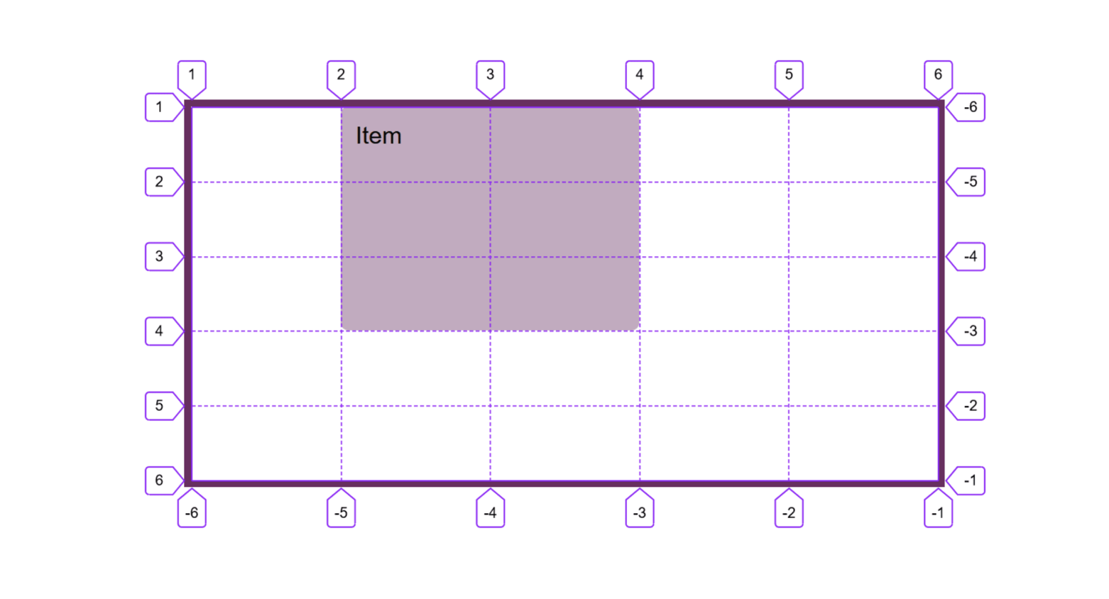
.item {
  grid-column: 1 / -1;
}
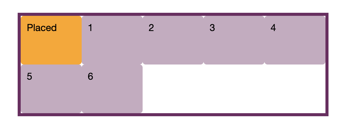
隐式网格中的线
隐式网格中的网格线,它们也是从1开始计数的。在下面的例子中,我为列轨道创建了显式网格,但当我使用grid-auto-rows属性将元素的高设为5em时,就创建了隐式的行轨道。 可以看到带有文字placed的网格项被放在了行线1到行线-1的位置。如果我们是在显式网格中使用这两个值,网格项应该占据两行的位置。但在隐式网格中,值-1会被处理为网格线2而不是网格线3。
<div class="grid">
  <div>1</div>
  <div>2</div>
  <div>3</div>
  <div>4</div>
  <div>5</div>
  <div>6</div>
  <div class="placed">Placed</div>
</div>
body {
  padding: 50px;
  font: 1em Helvetica Neue, Helvetica, Arial, sans-serif;
}

.grid {
  border: 5px solid rgb(111,41,97);
  display: grid;
  grid-template-columns: repeat(5, 100px);
  grid-auto-rows: 5em;
  inline-size: 500px;
}

.grid > * {
  background-color: rgba(111,41,97,.4);
  border-radius: 5px;
  padding: 10px;
}

.grid > .placed {
  background-color: orange;
  grid-row: 1 / -1; /* the end line is in the implicit grid so -1 does not resolve to it*/
}
根据命名的线放置项
在上一篇文章中,我提到了,除了使用网格线编号,也可以使用网格线的名字。可以将线的名字放在方括号中给对应的线命名。
.grid {
  display: grid;
  grid-template-columns: [full-start] 1fr [main-start] 2fr 2fr [main-end full-end];
}
只要你有了一些命名之后的网格线,在布局中就可以不再使用网格线编号,改为使用线的名字。
.item {
  grid-column: main-start / main-end;
}
<div class="grid">
  <div class="item">Item</div>
</div>
body {
  padding: 50px;
  font: 1em Helvetica Neue, Helvetica, Arial, sans-serif;
}

.grid {
  border: 5px solid rgb(111,41,97);
  display: grid;
  grid-template-columns: [full-start] 1fr [main-start] 2fr 2fr [main-end full-end];
  grid-template-rows: repeat(5, 50px);
  inline-size: 500px;
}

.item {
  grid-column: main-start / main-end;
  grid-row: 1 / 4;
}

.grid > * {
  background-color: rgba(111,41,97,.4);
  border-radius: 5px;
  padding: 10px;
}
当同一条线有多个名字时,可以随意使用任何一个,它们的处理效果是一样的。
当多条线有同一个名字时会发生什么
你可能会疑惑,当我给多条线定义同一个名字时会怎么样。通常在使用repeat方法定义名字时会出现这种情况。比如,在下面的例子中,我使用函数重复设定1fr 2fr模式,创建了8个列。我已经给两种网格线分别命名为sm和lg。那么每种网格线各有四条拥有同一名字的网格线。
在这种情况下,我们需要将名字和线编号一起使用。比如,我想把元素放在第二条叫sm以及第三条lg线之间,就需要使用grid-column: sm 2 / lg 3。如果不带编号,直接使用名字,默认采用第一条线。
<div class="grid">
  <div class="item">Item</div>
</div>
body {
  padding: 50px;
  font: 1em Helvetica Neue, Helvetica, Arial, sans-serif;
}

.grid {
  border: 5px solid rgb(111,41,97);
  display: grid;
  grid-template-columns: repeat(4, [sm] 1fr [lg] 2fr);
  grid-template-rows: repeat(5, 50px);
  inline-size: 500px;
}

.item {
  grid-column: sm 2 / lg 3;
  grid-row: 1 / 4;
}

.grid > * {
  background-color: rgba(111,41,97,.4);
  border-radius: 5px;
  padding: 10px;
}
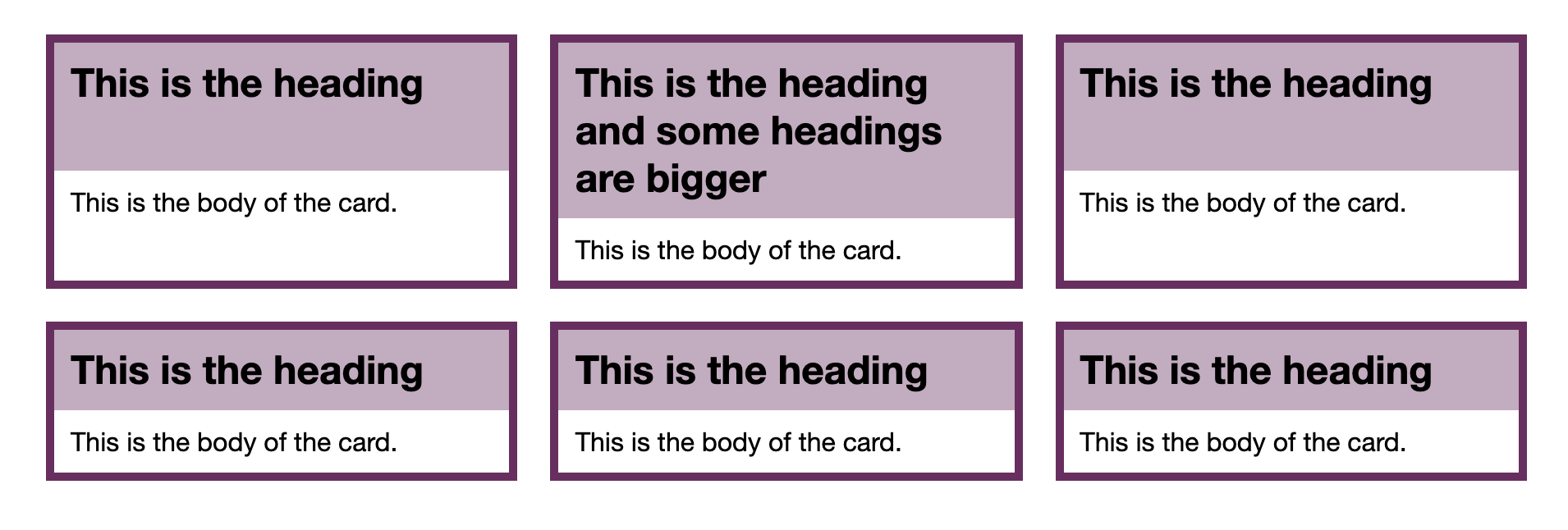
使用span关键字
有时候,我们知道某个网格项需要占据的轨道数,但你不知道它会被放在网格中的哪个位置,这样就无法通过网格线布局了。在下面的例子中,网格项是被默认放置在网格中的,但你需要修改它们占据的轨道数,而不是使用默认的占据一条轨道。你可以使用span关键字。在这个例子中,开始的网格线用auto赋值,表示它会被放在网格中的任何位置,并占据3列轨道。
.item {
  grid-column: auto / span 3;
}
因为我们有次级网格概念的支持,所以这种技术会有非常广泛的应用。例如,在卡片布局中,卡片有一个标题和主内容区域,你希望它们在卡片中彼此对齐,那么可以使每张卡片跨越两条行轨道,同时仍然允许默认的自动放置行为。每个卡片都对于它们所在的行相当于一个次级网格(包括两条行轨道)。可以看到下面这个例子。
<div class="grid">
  <article class="card">
    <h2>This is the heading</h2>
    <p>This is the body of the card.</p>
  </article>
  <article class="card">
    <h2>This is the heading and some headings are bigger</h2>
    <p>This is the body of the card.</p>
  </article>
  <article class="card">
    <h2>This is the heading</h2>
    <p>This is the body of the card.</p>
  </article>
  <article class="card">
    <h2>This is the heading</h2>
    <p>This is the body of the card.</p>
  </article>
  <article class="card">
    <h2>This is the heading</h2>
    <p>This is the body of the card.</p>
  </article>
  <article class="card">
    <h2>This is the heading</h2>
    <p>This is the body of the card.</p>
  </article>
</div>
body {
  padding: 50px;
  font: 1em Helvetica Neue, Helvetica, Arial, sans-serif;
}

.grid {
  display: grid;
  gap: 20px;
  grid-template-columns: repeat(auto-fill, minmax(250px, 1fr));
}

.card {
  border: 5px solid rgb(111,41,97);
  grid-row: auto / span 2;
  display: grid;
  gap: 0;
  grid-template-rows: subgrid;
}

.card h2 {
  background-color: rgba(111,41,97,.4);
  padding: 10px;
  margin: 0;
}

.card p {
  padding: 10px;
  margin: 0;
}
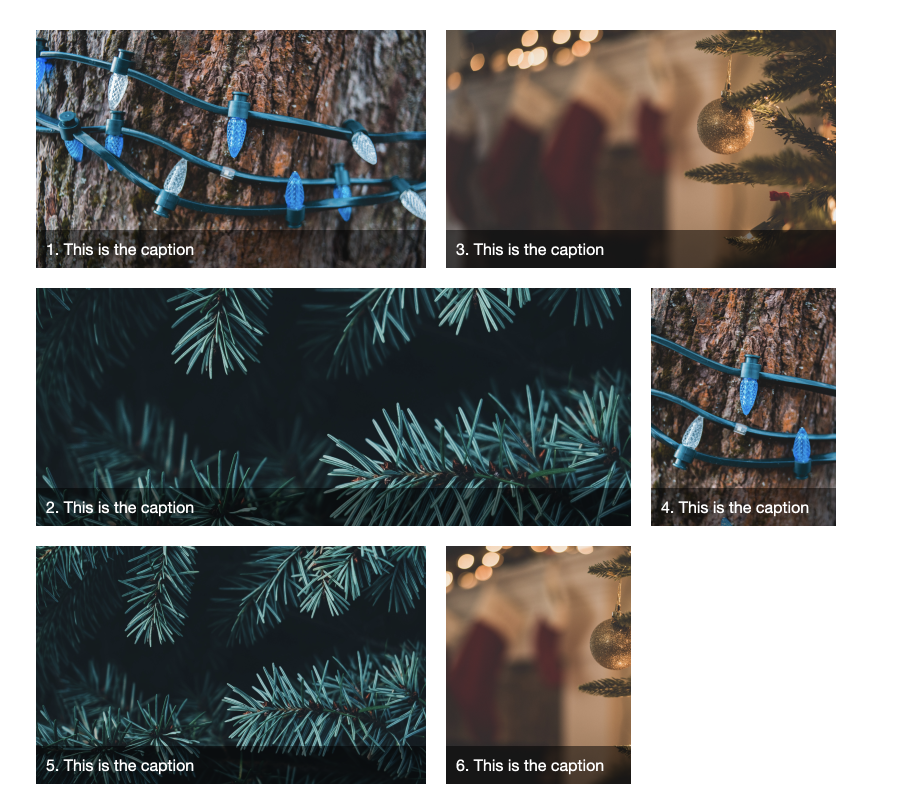
基于线布局的分层
网格会自动将内容放置在空的网格单元中,并不会把多个内容放在同一个网格单元里。 但是使用基于网格线的布局方法可以将元素放在一起。在下面的例子中,有一张占据两条行轨道的图片,以及带走caption文本的元素放置在第二条行轨道中,并给了一个半透明的背景。
<div class="grid">
  <figure>
    <img src="https://images.unsplash.com/photo-1576451930877-c838b861e9b6?ixlib=rb-1.2.1&q=85&fm=jpg&crop=entropy&cs=srgb&ixid=eyJhcHBfaWQiOjE0NTg5fQ" alt="lights">
    <figcaption>This is the caption</figcaption>
  </figure>
  <figure>
    <img src="https://images.unsplash.com/photo-1482003297000-b7663a1673f1?ixlib=rb-1.2.1&q=85&fm=jpg&crop=entropy&cs=srgb&ixid=eyJhcHBfaWQiOjE0NTg5fQ" alt="tree">
    <figcaption>This is the caption</figcaption>
  </figure>
  <figure>
    <img src="https://images.unsplash.com/photo-1482517967863-00e15c9b44be?ixlib=rb-1.2.1&q=85&fm=jpg&crop=entropy&cs=srgb&ixid=eyJhcHBfaWQiOjE0NTg5fQ" alt="bauble">
    <figcaption>This is the caption</figcaption>
  </figure>
</div>
body {
  padding: 50px;
  font: 1em Helvetica Neue, Helvetica, Arial, sans-serif;
}

img {
  max-width: 100%;
}

.grid {
  display: grid;
  gap: 20px;
  grid-template-columns: repeat(auto-fill, minmax(300px, 1fr));
}

figure {
  margin: 0;
  display: grid;
  grid-template-rows: 300px min-content;
}

figure img {
  object-fit: cover;
  width: 100%;
  height: 100%;
  grid-row: 1 / 3;
  grid-column: 1;
}

figcaption {
  grid-row: 2;
  grid-column: 1;
  background-color: rgba(0,0,0,.5);
  color: #fff;
  padding: 10px;
}
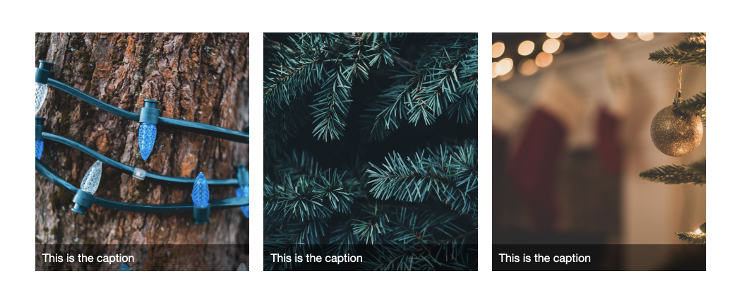
z-index试试。如果文本元素必须放在前面,那么就只能使用z-index设置更大的值,强制文本堆叠在图片上面。
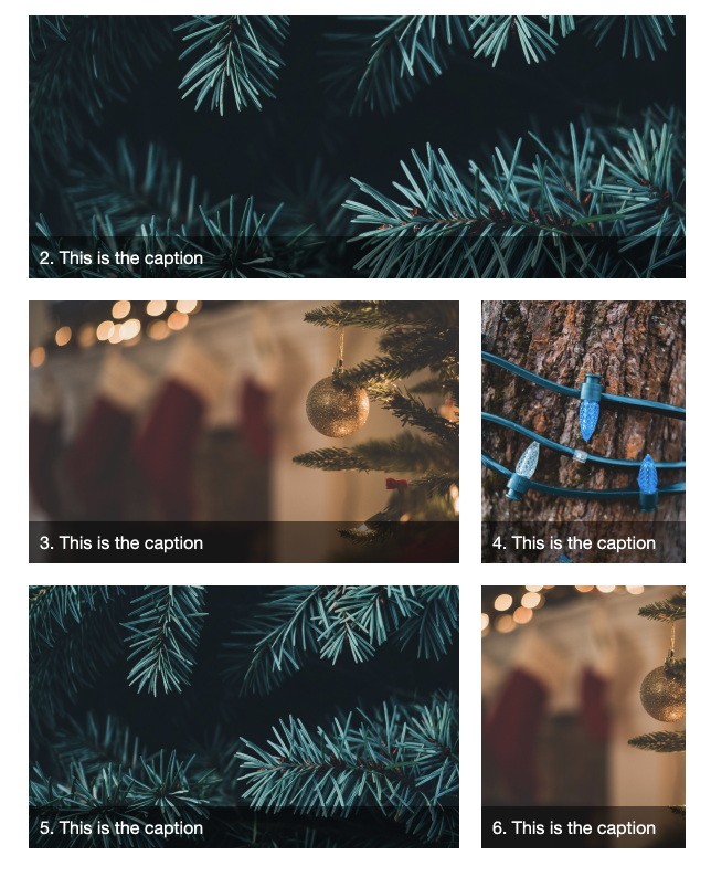
网格线的布局和自动布局混用
当基于网格线的布局和自动布局混用时,你需要小心一点。当项目中元素都是自动放置在网格中时,它们将按顺序放置在网格上,每个项目都会找到下一个可用的空白空间来放置它们自己。
<div class="grid">
  <figure>
    <img src="https://images.unsplash.com/photo-1576451930877-c838b861e9b6?ixlib=rb-1.2.1&q=85&fm=jpg&crop=entropy&cs=srgb&ixid=eyJhcHBfaWQiOjE0NTg5fQ" alt="lights">
    <figcaption>1. This is the caption</figcaption>
  </figure>
  <figure>
    <img src="https://images.unsplash.com/photo-1482003297000-b7663a1673f1?ixlib=rb-1.2.1&q=85&fm=jpg&crop=entropy&cs=srgb&ixid=eyJhcHBfaWQiOjE0NTg5fQ" alt="tree">
    <figcaption>2. This is the caption</figcaption>
  </figure>
  <figure>
    <img src="https://images.unsplash.com/photo-1482517967863-00e15c9b44be?ixlib=rb-1.2.1&q=85&fm=jpg&crop=entropy&cs=srgb&ixid=eyJhcHBfaWQiOjE0NTg5fQ" alt="bauble">
    <figcaption>3. This is the caption</figcaption>
  </figure>
  <figure>
    <img src="https://images.unsplash.com/photo-1576451930877-c838b861e9b6?ixlib=rb-1.2.1&q=85&fm=jpg&crop=entropy&cs=srgb&ixid=eyJhcHBfaWQiOjE0NTg5fQ" alt="lights">
    <figcaption>4. This is the caption</figcaption>
  </figure>
  <figure>
    <img src="https://images.unsplash.com/photo-1482003297000-b7663a1673f1?ixlib=rb-1.2.1&q=85&fm=jpg&crop=entropy&cs=srgb&ixid=eyJhcHBfaWQiOjE0NTg5fQ" alt="tree">
    <figcaption>5. This is the caption</figcaption>
  </figure>
  <figure>
    <img src="https://images.unsplash.com/photo-1482517967863-00e15c9b44be?ixlib=rb-1.2.1&q=85&fm=jpg&crop=entropy&cs=srgb&ixid=eyJhcHBfaWQiOjE0NTg5fQ" alt="bauble">
    <figcaption>6. This is the caption</figcaption>
  </figure>
</div>
body {
  padding: 50px;
  font: 1em Helvetica Neue, Helvetica, Arial, sans-serif;
}

img {
  max-width: 100%;
}

.grid {
  display: grid;
  inline-size: 800px;
  gap: 20px;
  grid-template-columns: repeat(auto-fill, minmax(160px, 1fr));
}

.grid figure:nth-child(odd) {
  grid-column: auto / span 2;
}

.grid figure:nth-child(2) {
  grid-column: auto / span 3;
}

figure {
  margin: 0;
  display: grid;
  grid-template-rows: 200px min-content;
}

figure img {
  object-fit: cover;
  width: 100%;
  height: 100%;
  grid-row: 1 / 3;
  grid-column: 1;
}

figcaption {
  grid-row: 2;
  grid-column: 1;
  background-color: rgba(0,0,0,.5);
  color: #fff;
  padding: 10px;
}
<div class="grid">
  <figure>
    <img src="https://images.unsplash.com/photo-1576451930877-c838b861e9b6?ixlib=rb-1.2.1&q=85&fm=jpg&crop=entropy&cs=srgb&ixid=eyJhcHBfaWQiOjE0NTg5fQ" alt="lights">
    <figcaption>1. This is the caption</figcaption>
  </figure>
  <figure>
    <img src="https://images.unsplash.com/photo-1482003297000-b7663a1673f1?ixlib=rb-1.2.1&q=85&fm=jpg&crop=entropy&cs=srgb&ixid=eyJhcHBfaWQiOjE0NTg5fQ" alt="tree">
    <figcaption>2. This is the caption</figcaption>
  </figure>
  <figure>
    <img src="https://images.unsplash.com/photo-1482517967863-00e15c9b44be?ixlib=rb-1.2.1&q=85&fm=jpg&crop=entropy&cs=srgb&ixid=eyJhcHBfaWQiOjE0NTg5fQ" alt="bauble">
    <figcaption>3. This is the caption</figcaption>
  </figure>
  <figure>
    <img src="https://images.unsplash.com/photo-1576451930877-c838b861e9b6?ixlib=rb-1.2.1&q=85&fm=jpg&crop=entropy&cs=srgb&ixid=eyJhcHBfaWQiOjE0NTg5fQ" alt="lights">
    <figcaption>4. This is the caption</figcaption>
  </figure>
  <figure>
    <img src="https://images.unsplash.com/photo-1482003297000-b7663a1673f1?ixlib=rb-1.2.1&q=85&fm=jpg&crop=entropy&cs=srgb&ixid=eyJhcHBfaWQiOjE0NTg5fQ" alt="tree">
    <figcaption>5. This is the caption</figcaption>
  </figure>
  <figure>
    <img src="https://images.unsplash.com/photo-1482517967863-00e15c9b44be?ixlib=rb-1.2.1&q=85&fm=jpg&crop=entropy&cs=srgb&ixid=eyJhcHBfaWQiOjE0NTg5fQ" alt="bauble">
    <figcaption>6. This is the caption</figcaption>
  </figure>
</div>
body {
padding: 50px;
font: 1em Helvetica Neue, Helvetica, Arial, sans-serif;
}
img {
max-width: 100%;
}
.grid {
display: grid;
inline-size: 800px;
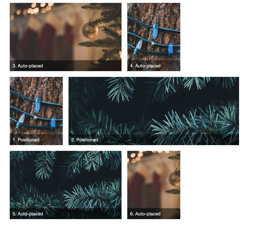
grid-auto-flow: dense;
gap: 20px;
grid-template-columns: repeat(auto-fill, minmax(160px, 1fr));
}
.grid figure:nth-child(odd) {
grid-column: auto / span 2;
}
.grid figure:nth-child(2) {
grid-column: auto / span 3;
}
figure {
margin: 0;
display: grid;
grid-template-rows: 200px min-content;
}
figure img {
object-fit: cover;
width: 100%;
height: 100%;
grid-row: 1 / 3;
grid-column: 1;
}
figcaption {
grid-row: 2;
grid-column: 1;
background-color: rgba(0,0,0,.5);
color: #fff;
padding: 10px;
}
<div class="grid">
  <figure>
    <img src="https://images.unsplash.com/photo-1576451930877-c838b861e9b6?ixlib=rb-1.2.1&q=85&fm=jpg&crop=entropy&cs=srgb&ixid=eyJhcHBfaWQiOjE0NTg5fQ" alt="lights">
    <figcaption>1. Positioned</figcaption>
  </figure>
  <figure>
    <img src="https://images.unsplash.com/photo-1482003297000-b7663a1673f1?ixlib=rb-1.2.1&q=85&fm=jpg&crop=entropy&cs=srgb&ixid=eyJhcHBfaWQiOjE0NTg5fQ" alt="tree">
    <figcaption>2. Positioned</figcaption>
  </figure>
  <figure>
    <img src="https://images.unsplash.com/photo-1482517967863-00e15c9b44be?ixlib=rb-1.2.1&q=85&fm=jpg&crop=entropy&cs=srgb&ixid=eyJhcHBfaWQiOjE0NTg5fQ" alt="bauble">
    <figcaption>3. Auto-placed</figcaption>
  </figure>
  <figure>
    <img src="https://images.unsplash.com/photo-1576451930877-c838b861e9b6?ixlib=rb-1.2.1&q=85&fm=jpg&crop=entropy&cs=srgb&ixid=eyJhcHBfaWQiOjE0NTg5fQ" alt="lights">
    <figcaption>4. Auto-placed</figcaption>
  </figure>
  <figure>
    <img src="https://images.unsplash.com/photo-1482003297000-b7663a1673f1?ixlib=rb-1.2.1&q=85&fm=jpg&crop=entropy&cs=srgb&ixid=eyJhcHBfaWQiOjE0NTg5fQ" alt="tree">
    <figcaption>5. Auto-placed</figcaption>
  </figure>
  <figure>
    <img src="https://images.unsplash.com/photo-1482517967863-00e15c9b44be?ixlib=rb-1.2.1&q=85&fm=jpg&crop=entropy&cs=srgb&ixid=eyJhcHBfaWQiOjE0NTg5fQ" alt="bauble">
    <figcaption>6. Auto-placed</figcaption>
  </figure>
</div>
body {
  padding: 50px;
  font: 1em Helvetica Neue, Helvetica, Arial, sans-serif;
}

img {
  max-width: 100%;
}

.grid {
  display: grid;
  inline-size: 800px;
  gap: 20px;
  grid-template-columns: repeat(auto-fill, minmax(160px, 1fr));
}

.grid figure:nth-child(odd) {
  grid-column: auto / span 2;
}

.grid figure:nth-child(1) {
  grid-row: 2;
  grid-column: 1;
}

.grid figure:nth-child(2) {
  grid-row: 2;
  grid-column: 2 / -1;
}

figure {
  margin: 0;
  display: grid;
  grid-template-rows: 200px min-content;
}

figure img {
  object-fit: cover;
  width: 100%;
  height: 100%;
  grid-row: 1 / 3;
  grid-column: 1;
}

figcaption {
  grid-row: 2;
  grid-column: 1;
  background-color: rgba(0,0,0,.5);
  color: #fff;
  padding: 10px;
}
收尾
这就是你需要知道的关于网格线的知识。记住,您总是有编号的网格线,无论您如何使用网格,您总是可以将一个项目从一个网格线放置到另一个网格线。我们将在以后的文章中介绍的其他方法是指定布局的替代方法,但它们是基于由编号的网格线创建的网格。
END
如果大家想要持续关注网格布局以及本系列翻译,可以关注公众号“前端记事本”,及时获得最新消息推送。

