

1、自定义布局
案例描述 根据点击的位置弹一个提示框,例如
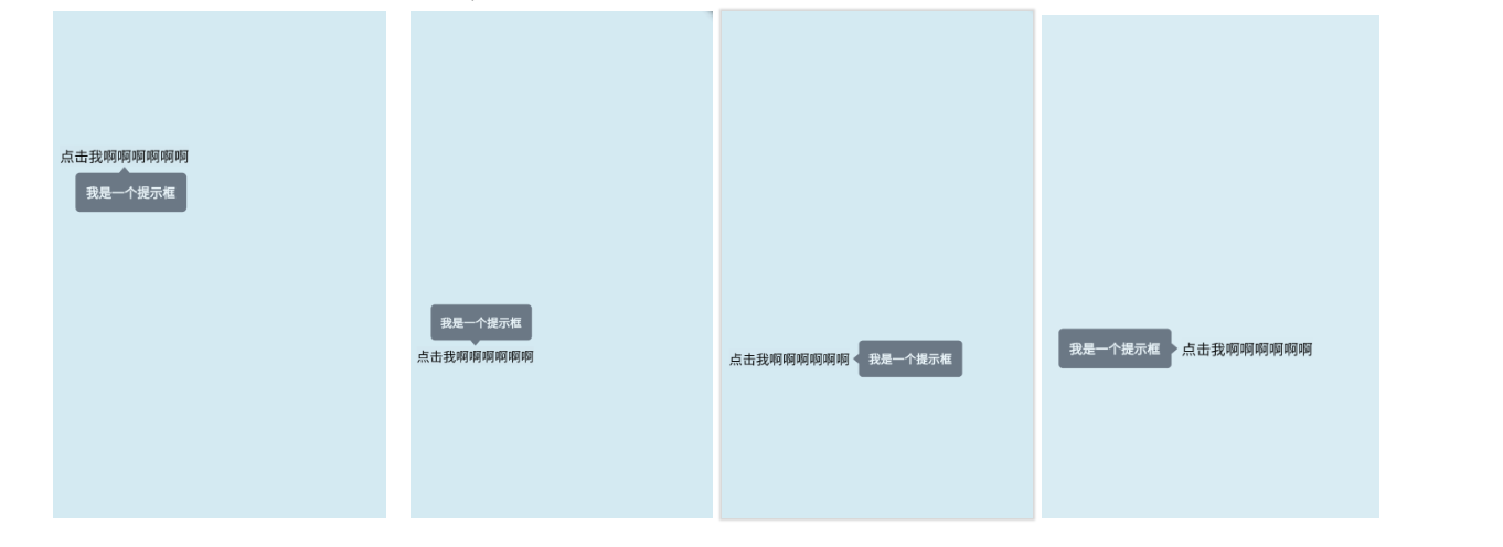
提示框的位置主要有四种情况:
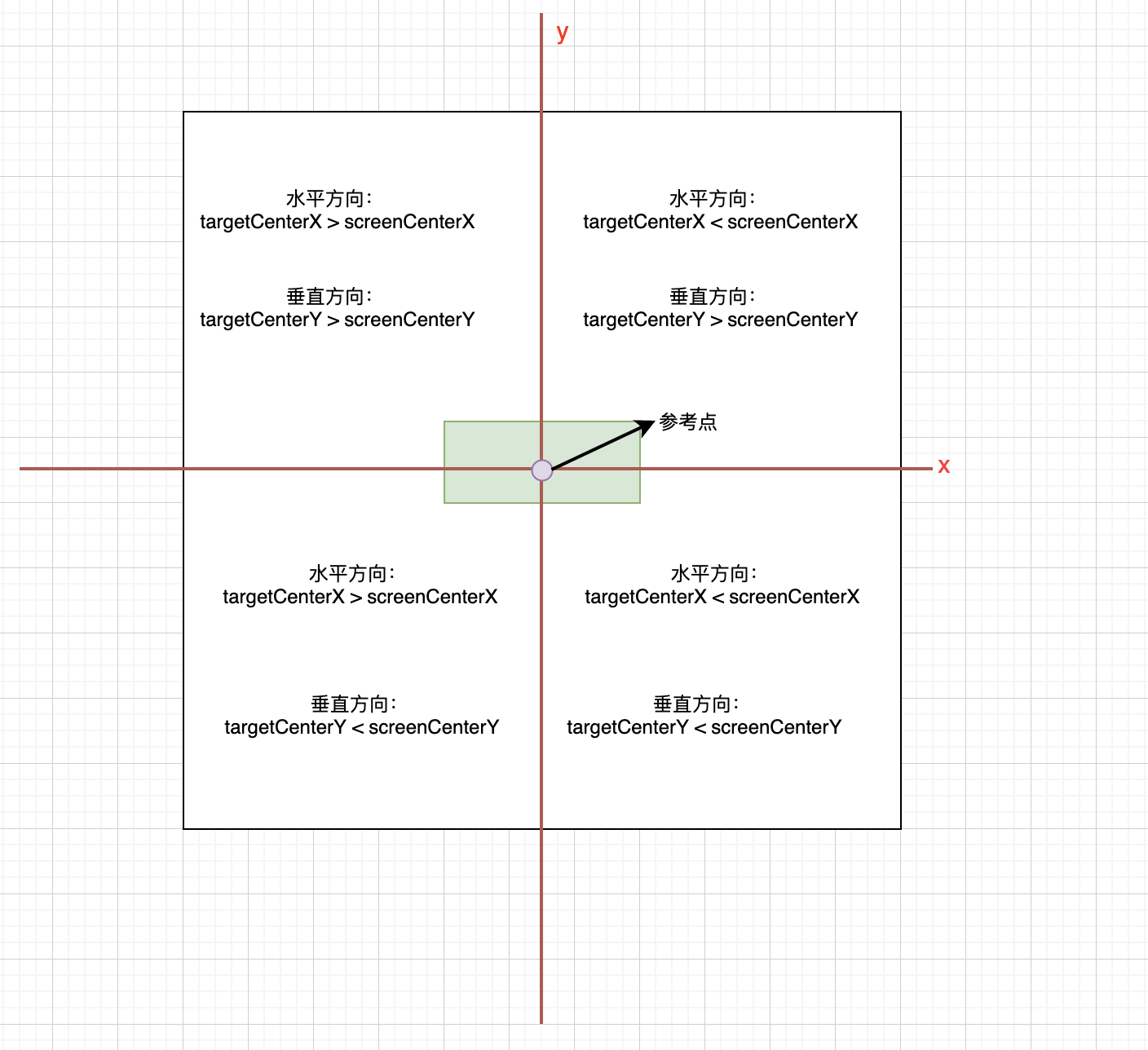
以上图的的圆点(即屏幕的中间点)为参考位置
水平方向:
显示在参考物的左边:参考物的中间点位置位于圆点的右侧,即提示框显示在参考物的左边
显示在参考物的右边:参考物的中间点位置位于圆点的左侧,即提示框显示在参考物的右边
垂直方向:
显示在参考物的下方:参考物的中间点位置位于圆点的上方,即提示框显示在参考物的下方
显示在参考物的上方:参考物的中间点位置位于圆点的下方,即提示框显示在参考物的上方
自定义提示框布局步骤 (1)点击事件触发时获取参考物的位置
showTip(BuildContext context) async
  //获取点击源
    final RenderBox box = customPopupKey.currentContext.findRenderObject();

    final Offset target = box.localToGlobal(box.size.center(Offset.zero));
    final RenderBox overlay = Overlay.of(context).context.findRenderObject();
  }
(2)判断 提示框的位置,居左,居右,居上,居下
PopupDirection popupDirection;

  if (preferVertical) {
    // 是否是垂直方向显示
    if (target.dy > overlay.size.center(Offset.zero).dy) {
      popupDirection = PopupDirection.up;
    } else {
      popupDirection = PopupDirection.down;
    }
  } else {
    // 水平方向显示
    if (target.dx < overlay.size.center(Offset.zero).dx) {
      popupDirection = PopupDirection.right;
    } else {
      popupDirection = PopupDirection.left;
    }
}
(3)重写 performLayout 函数 在performLayout 函数中返回对应节点的大小设置,返回该 renderObejct 的offset, 即位置信息, 在该例子中使用了 flutter 提供的 CustomSingleChildLayout 进行自定义布局
  delegate: _CustomSingleChildDelegate(
      target: target,
      targetBoxSize: box.size,
      offsetDistance: offsetDistance,
      preferVertical: preferVertical,
      popUpDirection: popupDirection),
  child: Container(
    padding: contentPadding,
    decoration: ShapeDecoration(
      color: bgColor,
      shape: CustomShapeBorder(
          popupDirection: popupDirection,
          targetCenter: target,
          borderRadius: _defaultBorderRadius,
          arrowBaseWidth: arrowBaseWidth,
          arrowTipDistance: arrowTipDistance,
          borderColor: borderColor,
          borderWidth: borderWidth),
    ),
    child: Text(
      message,
      style: TextStyle(
          fontSize: Adapt.px(textSize),
          color: textColor,
          decoration: TextDecoration.none),
    ),
  ),
)
(4)CustomSingleChildLayout 对应的 renderObject 重写了 performLayout方法
void performLayout() {
  size = _getSize(constraints);
  if (child != null) {
    final BoxConstraints childConstraints = delegate.getConstraintsForChild(constraints);
    assert(childConstraints.debugAssertIsValid(isAppliedConstraint: true));
    child.layout(childConstraints, parentUsesSize: !childConstraints.isTight);
    final BoxParentData childParentData = child.parentData;
    childParentData.offset = delegate.getPositionForChild(size, childConstraints.isTight ? childConstraints.smallest : child.size);
  }
}
其设置节点的 offset 是通过调用 delegate.getPositionForChild 方法,这个delegate 是由调用方自定义的,如 demo 中传入的 _CustomSingleChildDelegate,在这个类总,我们重写了 getPositionForChild 方法,根据自己的需求完成节点位置的布局
(5)_CustomSingleChildDelegate
class _CustomSingleChildDelegate extends SingleChildLayoutDelegate {

  @override
  Offset getPositionForChild(Size size, Size childSize) {
    return customPositionDependentBox(
      size: size,
      childSize: childSize,
      target: target,
      offsetDistance: offsetDistance,
      preferVertical: preferVertical,
    );
  }

  Offset customPositionDependentBox({
    @required Size size,
    @required Size childSize,
    @required Offset target,
    @required bool preferVertical,
    double offsetDistance = 0.0,
    double margin = 30.0,
  }) {
    // VERTICAL DIRECTION
    double x;
    double y;

    // 在点击位置的垂直方向显示
    if (preferVertical) {
      final bool fitsBelow = popUpDirection == PopupDirection.down;

      if (fitsBelow) {
        // 显示在底部
        y = min(target.dy + 5, size.height - margin);
      } else {
        // 显示在上方
        y = max(target.dy - childSize.height - 5, margin);
      }

      // 水平方向处理
      if (size.width - margin * 2.0 < childSize.width) {
        x = (size.width - childSize.width) / 2.0;
      } else {
        final double normalizedTargetX =
            target.dx.clamp(margin, size.width - margin);
        final double edge = margin + childSize.width / 2.0;
        if (normalizedTargetX < edge) {
          x = margin;
        } else if (normalizedTargetX > size.width - edge) {
          x = size.width - margin - childSize.width;
        } else {
          x = normalizedTargetX - childSize.width / 2.0;
        }
      }
    } else {
      // 在触发源的水平方向显示处理
      final bool fitsLeft = popUpDirection == PopupDirection.left;
      if (fitsLeft) {
        // 左边
        x = min(target.dx - childSize.width - targetBoxSize.width / 2 - 10,
            size.width - margin);
      } else {
        // 右边
        x = max(target.dx + targetBoxSize.width / 2 + 10, margin);
      }
      // 水平显示时垂直方向的处理
      if (size.height - margin * 2.0 < childSize.height) {
        y = (size.height - childSize.height) / 2.0;
      } else {
        final double normalizedTargetY =
            target.dy.clamp(margin, size.height - margin);
        final double edge = margin + childSize.height / 2.0;
        if (normalizedTargetY < edge) {
          y = margin;
        } else if (normalizedTargetY > size.height - edge) {
          y = size.height - margin - childSize.height;
        } else {
          y = normalizedTargetY - childSize.height / 2.0;
        }
      }
    }
    return Offset(x, y);
  }
}
2、自定义绘制
在上述例子中,我们完成了自定义布局,但是该例子的提示框是带有一个三角形,而且三角形的尖角方向可能随着提示框的位置而不同,可能是向上,向下,也有可能是向左,向右,这个三角形是可以根据需求自定义绘制的。
(1) 通过重新描绘提示框的边框实现
Container(
  padding: contentPadding,
  decoration: ShapeDecoration(
    color: bgColor,
    shape: CustomShapeBorder(
        popupDirection: popupDirection,
        targetCenter: target,
        borderRadius: _defaultBorderRadius,
        arrowBaseWidth: arrowBaseWidth,
        arrowTipDistance: arrowTipDistance,
        borderColor: borderColor,
        borderWidth: borderWidth),
  ),
  child: Text(
    message,
    style: TextStyle(
        fontSize: Adapt.px(textSize),
        color: textColor,
        decoration: TextDecoration.none),
  ),
)
(2) 自定义提示框的边框
/**
 * 绘制提示框边框,提示框尖角
 */
class CustomShapeBorder extends ShapeBorder {
  final Offset targetCenter;
  final double arrowBaseWidth;
  final double arrowTipDistance;
  final double borderRadius;
  final Color borderColor;
  final double borderWidth;
  final PopupDirection popupDirection;

  CustomShapeBorder(
      {this.popupDirection,
      this.targetCenter,
      this.borderRadius,
      this.arrowBaseWidth,
      this.arrowTipDistance,
      this.borderColor,
      this.borderWidth});

  @override
  EdgeInsetsGeometry get dimensions => new EdgeInsets.all(10.0);

  @override
  Path getInnerPath(Rect rect, {TextDirection textDirection}) {
    return new Path()
      ..fillType = PathFillType.evenOdd
      ..addPath(getOuterPath(rect), Offset.zero);
  }

  @override
  //绘制边框
  Path getOuterPath(Rect rect, {TextDirection textDirection}) {
    double topLeftRadius, topRightRadius, bottomLeftRadius, bottomRightRadius;

    Path _getLeftTopPath(Rect rect) {
      return new Path()
        ..moveTo(rect.left, rect.bottom - bottomLeftRadius)
        ..lineTo(rect.left, rect.top + topLeftRadius)
        ..arcToPoint(Offset(rect.left + topLeftRadius, rect.top), //绘制圆角
            radius: new Radius.circular(topLeftRadius))
        ..lineTo(rect.right - topRightRadius, rect.top)
        ..arcToPoint(Offset(rect.right, rect.top + topRightRadius), //绘制圆角
            radius: new Radius.circular(topRightRadius),
            clockwise: true);
    }

    Path _getBottomRightPath(Rect rect) {
      return new Path()
        ..moveTo(rect.left + bottomLeftRadius, rect.bottom)
        ..lineTo(rect.right - bottomRightRadius, rect.bottom)
        ..arcToPoint(Offset(rect.right, rect.bottom - bottomRightRadius),
            radius: new Radius.circular(bottomRightRadius), clockwise: false)
        ..lineTo(rect.right, rect.top + topRightRadius)
        ..arcToPoint(Offset(rect.right - topRightRadius, rect.top),
            radius: new Radius.circular(topRightRadius), clockwise: false);
    }

    topLeftRadius = borderRadius;
    topRightRadius = borderRadius;
    bottomLeftRadius = borderRadius;
    bottomRightRadius = borderRadius;

    switch (popupDirection) {
      //

      case PopupDirection.down:
        return _getBottomRightPath(rect)
          ..lineTo(
              min(
                  max(targetCenter.dx + arrowBaseWidth / 2,
                      rect.left + borderRadius + arrowBaseWidth),
                  rect.right - topRightRadius),
              rect.top)
          ..lineTo(targetCenter.dx, rect.top - arrowTipDistance) // 向下箭头
          ..lineTo(
              max(
                  min(targetCenter.dx - arrowBaseWidth / 2,
                      rect.right - topLeftRadius - arrowBaseWidth),
                  rect.left + topLeftRadius),
              rect.top) //  // 向下箭头

          ..lineTo(rect.left + topLeftRadius, rect.top)
          ..arcToPoint(Offset(rect.left, rect.top + topLeftRadius),
              radius: new Radius.circular(topLeftRadius), clockwise: false)
          ..lineTo(rect.left, rect.bottom - bottomLeftRadius)
          ..arcToPoint(Offset(rect.left + bottomLeftRadius, rect.bottom),
              radius: new Radius.circular(bottomLeftRadius), clockwise: false);

      case PopupDirection.up:
        return _getLeftTopPath(rect)
          ..lineTo(rect.right, rect.bottom - bottomRightRadius)
          ..arcToPoint(Offset(rect.right - bottomRightRadius, rect.bottom),
              radius: new Radius.circular(bottomRightRadius), clockwise: true)
          ..lineTo(
              min(
                  max(targetCenter.dx + arrowBaseWidth / 2,
                      rect.left + bottomLeftRadius + arrowBaseWidth),
                  rect.right - bottomRightRadius),
              rect.bottom)

          // 向上箭头
          ..lineTo(targetCenter.dx, rect.bottom + arrowTipDistance)
          ..lineTo(
              max(
                  min(targetCenter.dx - arrowBaseWidth / 2,
                      rect.right - bottomRightRadius - arrowBaseWidth),
                  rect.left + bottomLeftRadius),
              rect.bottom)
          ..lineTo(rect.left + bottomLeftRadius, rect.bottom)
          ..arcToPoint(Offset(rect.left, rect.bottom - bottomLeftRadius),
              radius: new Radius.circular(bottomLeftRadius), clockwise: true)
          ..lineTo(rect.left, rect.top + topLeftRadius)
          ..arcToPoint(Offset(rect.left + topLeftRadius, rect.top),
              radius: new Radius.circular(topLeftRadius), clockwise: true);

      case PopupDirection.left:
        return _getLeftTopPath(rect)
          ..lineTo(
              rect.right,
              max(
                  min(targetCenter.dy - arrowBaseWidth / 2,
                      rect.bottom - bottomRightRadius - arrowBaseWidth),
                  rect.top + topRightRadius))
          ..lineTo(rect.right + arrowTipDistance, targetCenter.dy) // 向左箭头
          ..lineTo(
              rect.right,
              min(targetCenter.dy + arrowBaseWidth / 2,
                  rect.bottom - bottomRightRadius))
          ..lineTo(rect.right, rect.bottom - borderRadius)
          ..arcToPoint(Offset(rect.right - bottomRightRadius, rect.bottom),
              radius: new Radius.circular(bottomRightRadius), clockwise: true)
          ..lineTo(rect.left + bottomLeftRadius, rect.bottom)
          ..arcToPoint(Offset(rect.left, rect.bottom - bottomLeftRadius),
              radius: new Radius.circular(bottomLeftRadius), clockwise: true);

      case PopupDirection.right:
        return _getBottomRightPath(rect)
          ..lineTo(rect.left + topLeftRadius, rect.top)
          ..arcToPoint(Offset(rect.left, rect.top + topLeftRadius),
              radius: new Radius.circular(topLeftRadius), clockwise: false)
          ..lineTo(
              rect.left,
              max(
                  min(targetCenter.dy - arrowBaseWidth / 2,
                      rect.bottom - bottomLeftRadius - arrowBaseWidth),
                  rect.top + topLeftRadius))

          // 向右箭头
          ..lineTo(rect.left - arrowTipDistance, targetCenter.dy)
          ..lineTo(
              rect.left,
              min(targetCenter.dy + arrowBaseWidth / 2,
                  rect.bottom - bottomLeftRadius))
          ..lineTo(rect.left, rect.bottom - bottomLeftRadius)
          ..arcToPoint(Offset(rect.left + bottomLeftRadius, rect.bottom),
              radius: new Radius.circular(bottomLeftRadius), clockwise: false);

      default:
        throw AssertionError(popupDirection);
    }
  }

  @override
  void paint(Canvas canvas, Rect rect, {TextDirection textDirection}) {
    Paint paint = new Paint()
      ..color = borderColor
      ..style = PaintingStyle.stroke
      ..strokeWidth = borderWidth;

    canvas.drawPath(getOuterPath(rect), paint);
  }

  @override
  ShapeBorder scale(double t) {
    return new CustomShapeBorder(
        popupDirection: this.popupDirection,
        targetCenter: this.targetCenter,
        borderRadius: this.borderRadius,
        arrowBaseWidth: this.arrowBaseWidth,
        arrowTipDistance: this.arrowTipDistance,
        borderColor: this.borderColor,
        borderWidth: this.borderWidth);
  }
}
Object > Diagnosticable > DiagnosticableTree > Widget > RenderObjectWidget > SingleChildRenderObjectWidget > CustomSingleChildLayout
3、性能优化
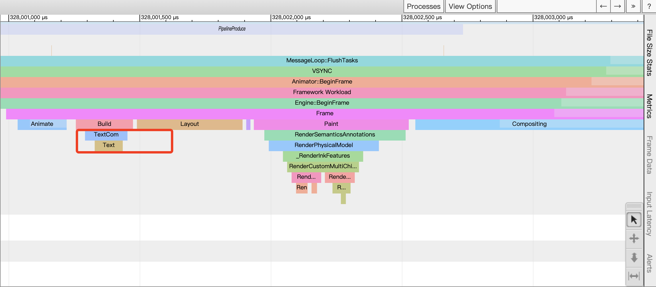
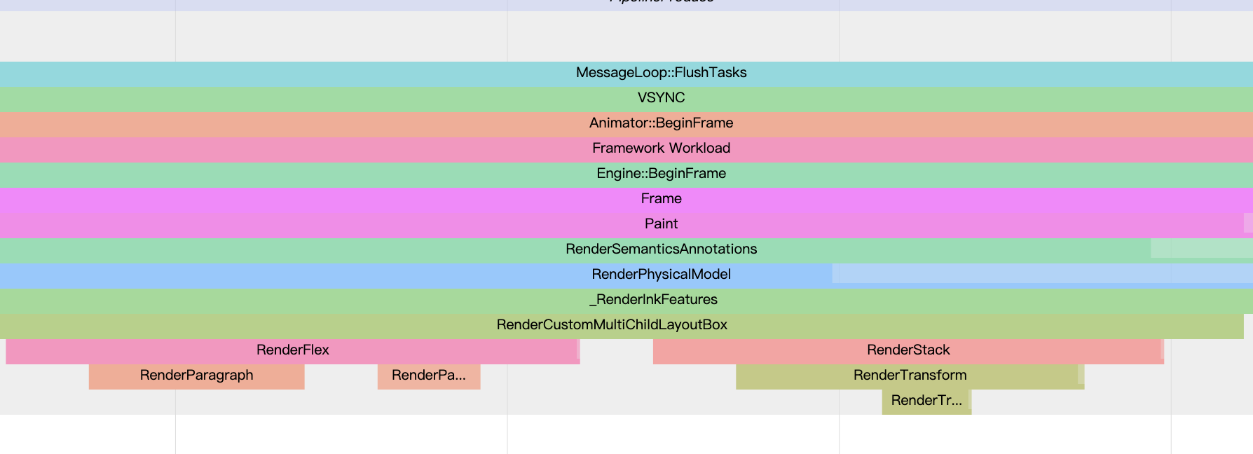
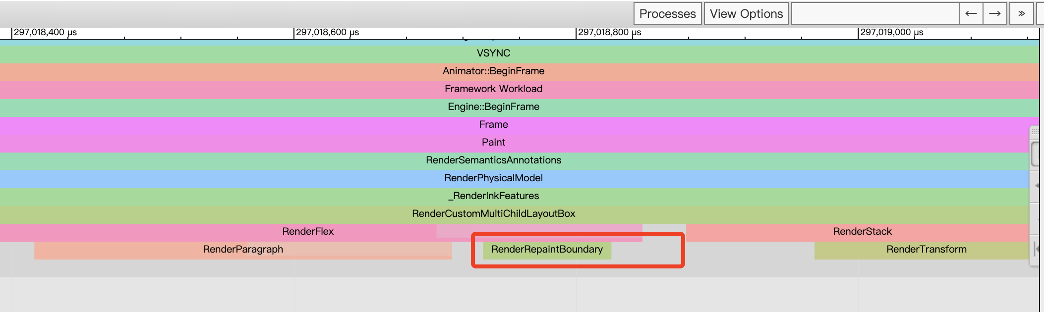
(1) devTool 工具
工欲善其事必先利其器,可以借助 devTool 打开 timeline 查看相关的绘制渲染情
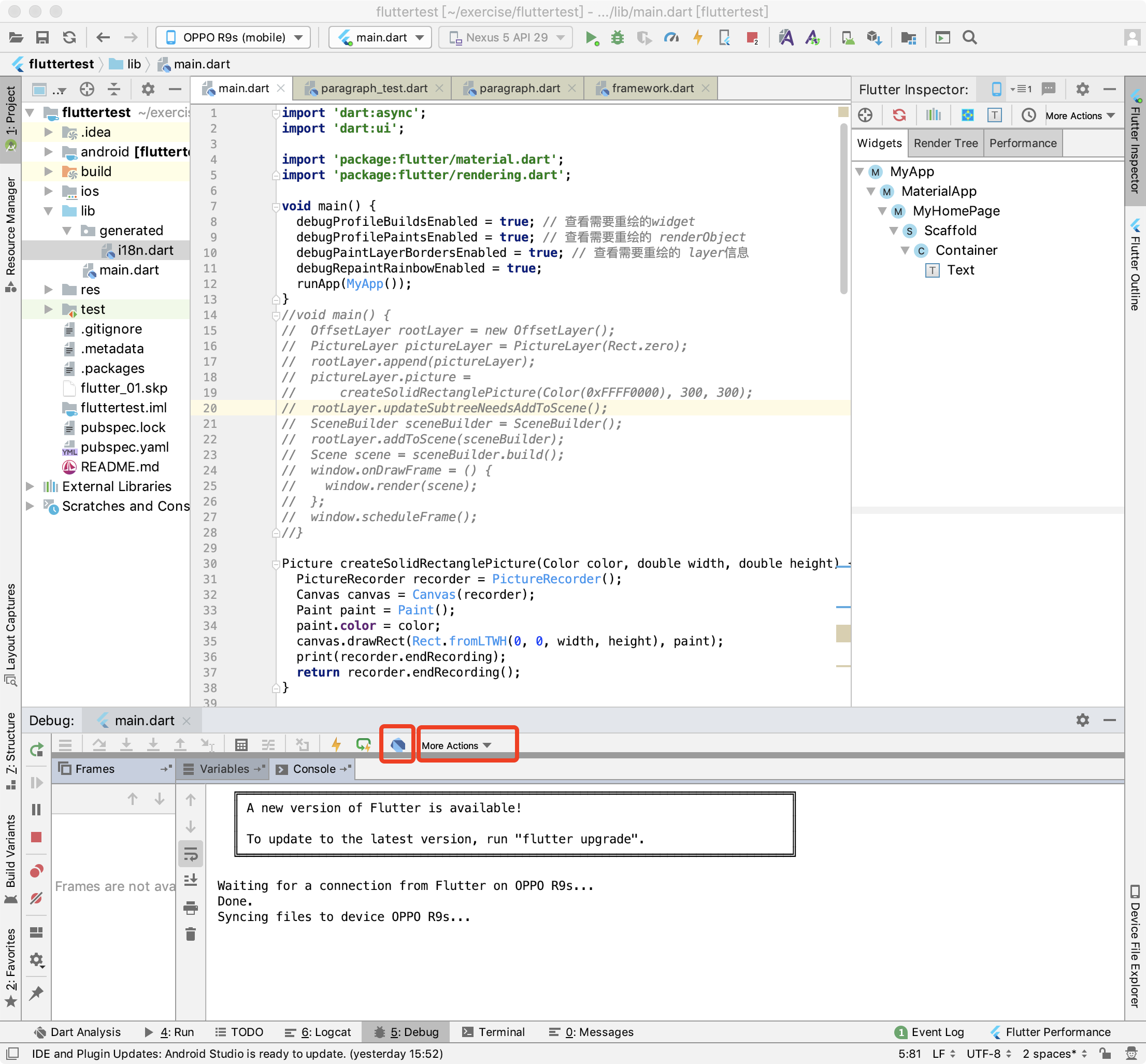
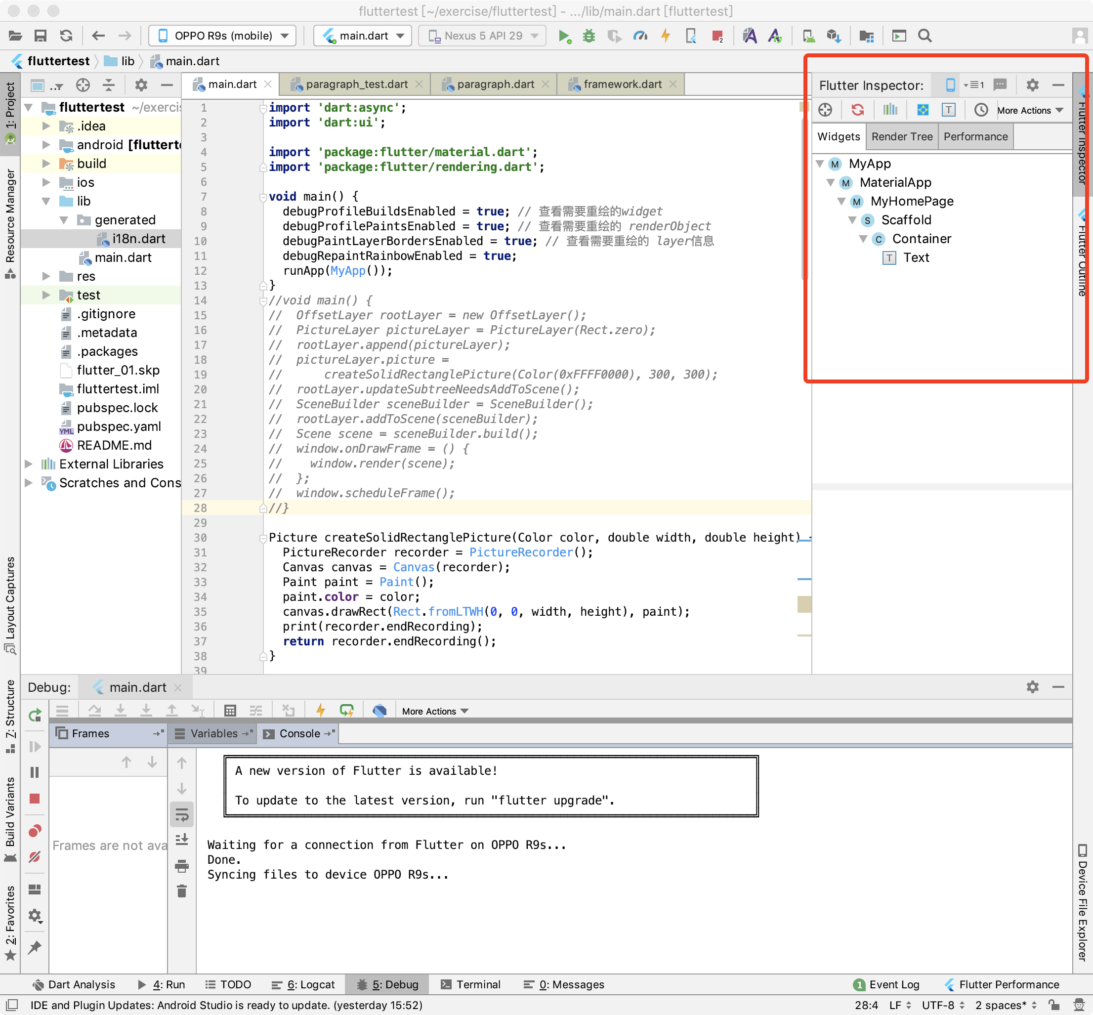
或者在 Android Studio 可以调出 Flutter Inspector
(2) 在main方法中设置以下属性值
void main() {
  debugProfileBuildsEnabled = true; // 查看需要重绘的widget
  debugProfilePaintsEnabled = true; // 查看需要重绘的 renderObject
  debugPaintLayerBordersEnabled = true; // 查看需要重绘的 layer信息
  debugRepaintRainbowEnabled = true;
  runApp(MyApp());
}
(3) 减少 rebuild 范围
class _MyHomePageState extends State<MyHomePage> {
  String name = '';
  int count = 0;
  @override
  void initState() {
    super.initState();
    Timer.periodic(
        Duration(milliseconds: 1000),
            (timer) => {
          setState(() {
            count++;
          })
        });
  }

  @override
  Widget build(BuildContext context) {
    return Scaffold(
        body: Container(
      child: Row(
        children: <Widget>[
          Container(
            child: Row(
              children: <Widget>[Text('哈哈哈1'), Text('哈哈哈3')],
            ),
          ),
          Text('哈哈哈2${count}')
        ],
      ),
    ));
  }
}
优化前:
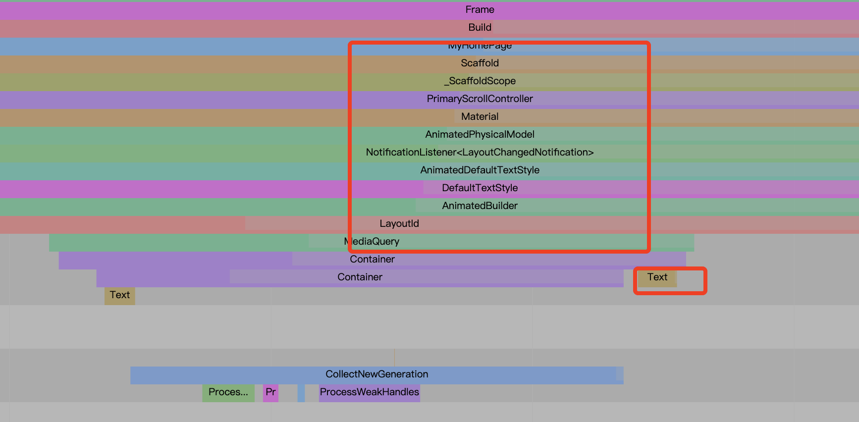
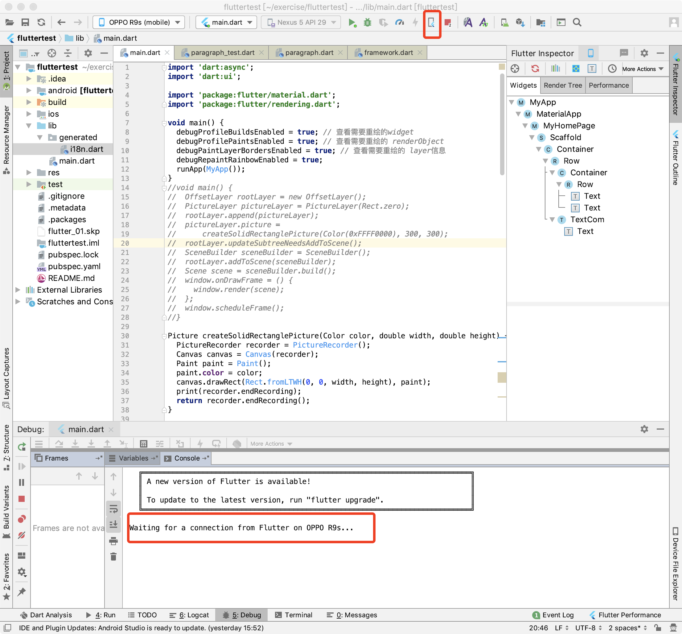
widget 每次 rebuild 都是 从根节点 Scaffold 开始遍历,但实际在这个demo 中只会实时更新 一个 text 文本
优化后: 将需要实时更新的 widget 抽离成一个组件
class TextCom extends StatefulWidget {
  @override
  State<StatefulWidget> createState() {
    return _TextComState();
  }
}

class _TextComState extends State<TextCom> {
  int count = 0;
  @override
  void initState() {
    super.initState();
    Timer.periodic(
        Duration(milliseconds: 1000),
        (timer) => {
              setState(() {
                count++;
              })
            });
  }

  @override
  Widget build(BuildContext context) {
    return Text('哈哈哈2${count}');
  }
}
重新查看 reBuild 范围,发现缩小到这个 TextWidget 组件,如下图中的 TextCom
(2) RepaintBoundary 将需要实时更新的图层隔离成一个单独的图层,在重绘时不影响其他图层的绘制
