

最近项目组在开发的时候提出了一个需求,需要让 ant-design Modal实现能够拖动的功能,研究了一番,基于 and-design Modal自己封装了一个antd-draggable-modal组件。
特性:
- 支持弹出窗居中打开
- 支持拖拽 title bar 实现拖拽
- 支持多层弹窗拖拽
实现原理
要实现 Modal 的拖拽,首先要弄清楚 Modal 的位置跟什么有关系,打开浏览器,通过F12 调试窗口可以看到,Modal 的位置跟 class 属性为 ant-modal-content 的元素有关。
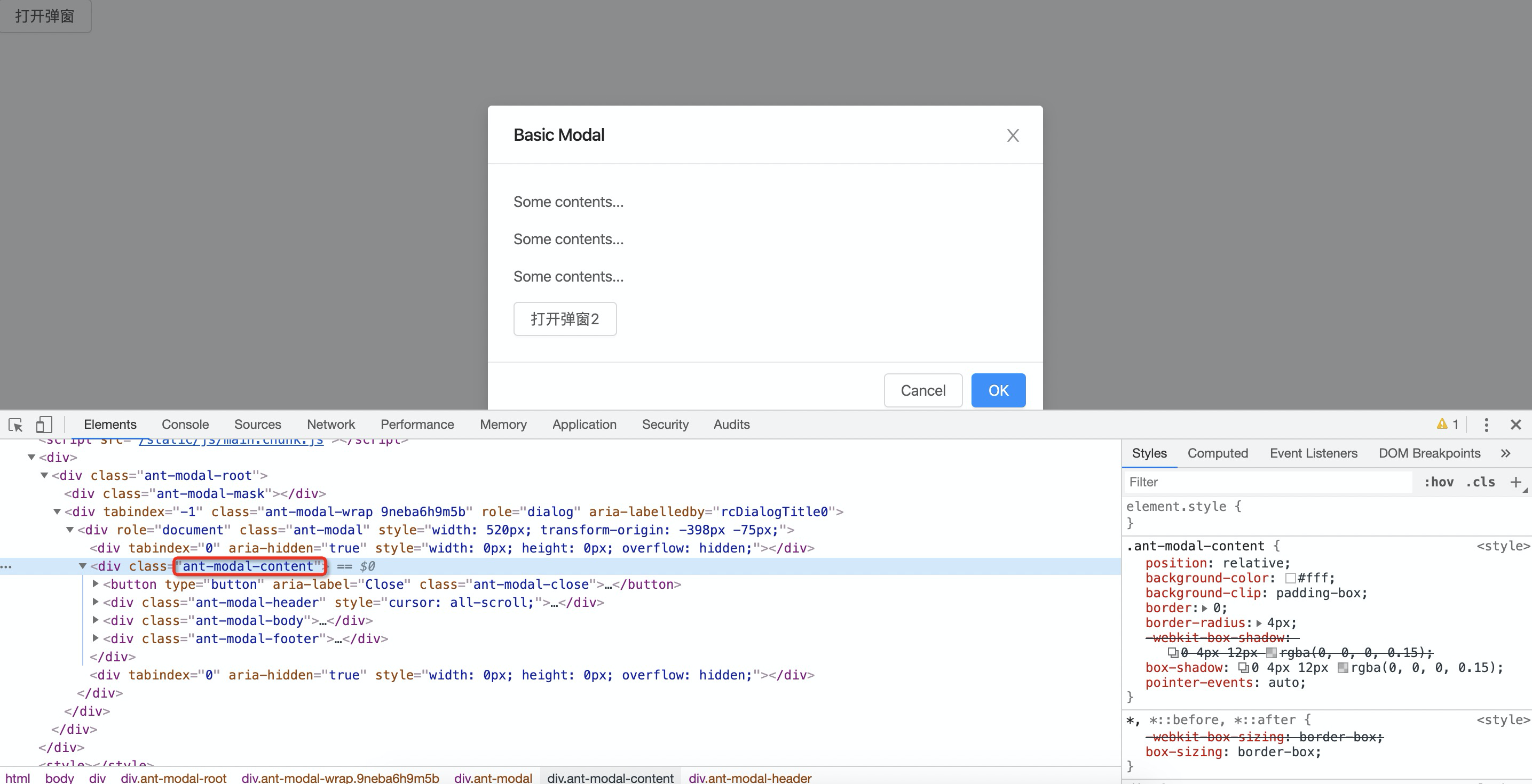
因此接下来的思路就很简单了,通过监听鼠标事件来设置 ant-modal-content 元素的 transform 属性来实现 Modal 位置的调整。
代码如下:
import React, { Component, MouseEvent } from 'react';
import AntdModal, { ModalProps } from 'antd/lib/modal';
import 'antd/es/modal/style/index.css';

export default class AntDraggableModal extends Component<ModalProps> {
  private simpleClass: string;
  private header: any;
  private contain: any;
  private modalContent: any;

  private mouseDownX: number = 0;
  private mouseDownY: number = 0;
  private deltaX: number = 0;
  private deltaY: number = 0;
  private sumX: number = 0;
  private sumY: number = 0;

  constructor(props: ModalProps) {
    super(props);
    this.simpleClass = Math.random()
      .toString(36)
      .substring(2);
  }

  handleMove = (event: any) => {
    const deltaX = event.pageX - this.mouseDownX;
    const deltaY = event.pageY - this.mouseDownY;

    this.deltaX = deltaX;
    this.deltaY = deltaY;

    this.modalContent.style.transform = `translate(${deltaX + this.sumX}px, ${deltaY + this.sumY}px)`;
  };

  initialEvent = (visible: boolean) => {
    const { title } = this.props;
    if (title && visible) {
      setTimeout(() => {
        window.removeEventListener('mouseup', this.removeUp, false);

        this.contain = document.getElementsByClassName(this.simpleClass)[0];
        this.header = this.contain.getElementsByClassName('ant-modal-header')[0];
        this.modalContent = this.contain.getElementsByClassName('ant-modal-content')[0];

        this.header.style.cursor = 'all-scroll';
        this.header.onmousedown = (e: MouseEvent<HTMLDivElement>) => {
          this.mouseDownX = e.pageX;
          this.mouseDownY = e.pageY;
          document.body.onselectstart = () => false;
          window.addEventListener('mousemove', this.handleMove, false);
        };

        window.addEventListener('mouseup', this.removeUp, false);
      }, 0);
    }
  };

  removeMove = () => {
    window.removeEventListener('mousemove', this.handleMove, false);
  };

  removeUp = () => {
    document.body.onselectstart = () => true;

    this.sumX = this.sumX + this.deltaX;
    this.sumY = this.sumY + this.deltaY;

    this.removeMove();
  };

  componentDidMount() {
    const { visible = false } = this.props;
    this.initialEvent(visible);
  }

  componentWillUnmount() {
    this.removeMove();
    window.removeEventListener('mouseup', this.removeUp, false);
  }

  render() {
    const { children, wrapClassName, ...other } = this.props;
    const wrapModalClassName = wrapClassName ? `${wrapClassName} ${this.simpleClass}` : `${this.simpleClass}`;
    return (
      <AntdModal
        {...other}
        wrapClassName={wrapModalClassName}
      >{children}</AntdModal>
    );
  }
}
在 AntDraggableModal 组件的构造函数中,随机生成一个 simpleClass 字符串,传递给 And Modal 组件的 wrapClassName 属性,这样做的目的主要有两个:
- 便于通过
simpleClass类来定位弹窗位置 - 当有多个弹窗时,可以通过
simpleClass类来区分不同的弹窗,实现多层弹窗拖拽功能
用法上需要注意的一点是:
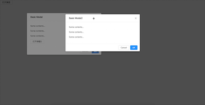
{this.state.visible && (
  <AntdDraggableModal
    title="Basic Modal"
    visible={this.state.visible}
    onOk={this.handleOk}
    onCancel={this.handleCancel}
  >
    <p>Some contents...</p>
    <p>Some contents...</p>
    <p>Some contents...</p>
    <Button onClick={() => this.setState({ visible2: true })}>打开弹窗2</Button>
  </AntdDraggableModal>
)}
必须要这么写,因为每次弹窗关闭的时候是不会自动销毁的,也就是说弹窗关闭再打开的时候我们希望弹窗的位置会重新被初始化。
总结
关于 ant-design Mmodal 的可拖拽封装就介绍到这里,组件我已经发布到 npm 上面了,感兴趣的同学欢迎安装使用,Have a nice weekend !😊更多精彩内容欢迎关注我的公众号!

