

导读
Antd的新版本来啦,你准备好了吗?走起~
相信使用过React的朋友们一定不会对Antd感到陌生,它是一个适用于React的组件库,可以帮助提高我们日常的开发工作,就在昨天,也就是2月28号,Antd更新到了V4版本,具体有什么变化呢?我们应该怎样从V3到V4进行过渡呢?请继续向下看。
- 来源: Antd官网
- 链接: ant.design/docs/react/…
从 v3 到 v4
本文档将帮助你从 antd 3.x 版本升级到 antd 4.x 版本,如果你是 2.x 或者更老的版本,请先参考之前的升级文档升级到 3.x。
一.升级准备
- 请先升级到 3.x 的最新版本,按照控制台 warning 信息移除/修改相关的 API。
- 升级项目 React 16.12.0 以上。
- 如果你仍在使用 React 15,请参考React 16 升级文档
- 其余 React 16 废弃生命周期 API 请参考 迁移导引
二. 4.0 有哪些不兼容的变化
2.1 设计规范调整
- 行高从
1.5(21px) 调整为1.5715(22px)。 - 基础圆角调整,由
4px改为2px。 - Selected 颜色和 Hovered 颜色进行了交换。
- 全局阴影优化,调整为三层阴影区分控件层次关系。
- 气泡确认框中图标的使用改变,由问号改为感叹号。
- 部分组件选中颜色统一改为
@blue-1: #E6F7FF,对应hover颜色改为@gray-2: #FAFAFA。 - 报错色色值调整,由
@red-5: #F5222D改为@red-5: #FF4D4F。 - 分割线颜色明度降低,由
#E8E8E8改为#F0F0F0。 - DatePicker 交互重做,面板和输入框分离,范围选择现可单独选择开始和结束时间。
- Table 默认背景颜色从透明修改为白色。
- Tabs 火柴棍样式缩短为和文字等长。
2.2 兼容性调整
- IE 最低支持版本为 IE 11。
- React 最低支持版本为 React 16.9,部分组件开始使用 hooks 进行重构。
2.3 移除废弃的 API
- 移除了 LocaleProvider,请使用
ConfigProvider替代。 - 移除了 Mention,请使用
Mentions替代。 - 移除了 Alert 的
iconType属性,请使用icon替代。 - 移除了 Modal.xxx 的
iconType属性,请使用icon替代。 - 移除了 Form.create 方法,
form现可由Form.useForm获取。 - 移除了 Form.Item 的
id属性,请使用htmlFor替代。 - 移除了 Typography 的
setContentRef属性,请使用ref替代。 - 移除了 TimePicker 的
allowEmpty属性,请使用allowClear替代。 - 移除了 Tag 的
afterClose属性,请使用onClose替代。 - 移除了 Card 的
noHovering属性,请使用hoverable替代。 - 移除了 Carousel 的
vertical属性,请使用dotPosition替代。 - 移除了 Drawer 的
wrapClassName属性,请使用className替代。 - 移除了 TextArea 的
autosize属性,请使用autoSize替代。 - 移除了 Affix 的
offset属性,请使用offsetTop替代。 - 移除了 Transfer 的
onSearchChange属性,请使用onSearch替代。 - 移除了 Transfer 的
body属性,请使用children替代。 - 移除了 Transfer 的
lazy属性,它并没有起到真正的优化效果。 - 移除了 Select 的
combobox模式,请使用AutoComplete替代。
2.4 图标升级
在 antd@3.9.0 中,我们引入了 svg 图标(为何使用 svg 图标?)。使用了字符串命名的图标 API 无法做到按需加载,因而全量引入了 svg 图标文件,这大大增加了打包产物的尺寸。在 4.0 中,我们调整了图标的使用 API 从而支持 tree shaking,减少 antd 默认包体积约 150 KB(Gzipped)。
旧版 Icon 使用方式将被废弃:
import { Icon, Button } from 'antd';

const Demo = () => (
  <div>
    <Icon type="smile" />
    <Button icon="smile" />
  </div>
);
4.0 中会采用按需引入的方式:
  import { Button } from 'antd';

  // tree-shaking supported
- import { Icon } from 'antd';
+ import { SmileOutlined } from '@ant-design/icons';

  const Demo = () => (
    <div>
-     <Icon type="smile" />
+     <SmileOutlined />
      <Button icon={<SmileOutlined />} />
    </div>
  );

  // or directly import
  import SmileOutlined from '@ant-design/icons/SmileOutlined';
你将仍然可以通过兼容包继续使用:
import { Button } from 'antd';
import { Icon } from '@ant-design/compatible';

const Demo = () => (
  <div>
    <Icon type="smile" />
    <Button icon="smile" />
  </div>
);
2.5 组件重构
- Form 重写
- 不再需要
Form.create。 - 嵌套字段支持从
'xxx.yyy'改成['xxx', 'yyy']。 - 迁移文档请查看此处。
- 不再需要
- DatePicker 重写
- 提供
picker属性用于选择器切换。 - 范围选择现在可以单独选择开始和结束时间。
onPanelChange在面板值变化时也会触发。- 自定义单元格样式的类名从
ant-calendar-date改为ant-picker-cell-inner。
- 提供
- Tree、Select、TreeSelect、AutoComplete 重新写
- 使用虚拟滚动。
onBlur时不再修改选中值。dropdownMatchSelectWidth不再自动适应内容宽度,请用数字设置下拉宽度。- AutoComplete 不再支持
optionLabelProp,请直接设置 Optionvalue属性。
- Grid 组件使用 flex 布局。
- Button 的
danger现在作为一个属性而不是按钮类型。 - Input、Select 的
value为undefined时改为非受控状态。 - Table 重写
- 在没有
columns时仍然会保留一列。 - 嵌套
dataIndex支持从'xxx.yyy'改成['xxx', 'yyy']。
- 在没有
<Table
  columns={[
    {
      title: 'Age',
-     dataIndex: 'user.age',
+     dataIndex: ['user', 'age'],
    },
  ]}
/>
三、开始升级
你可以手动对照上面的列表逐条检查代码进行修改,另外,我们也提供了一个 codemod cli 工具 @ant-design/codemod-v4 以帮助你快速升级到 v4 版本。
在运行 codemod cli 前,请先提交你的本地代码修改。
# 通过 npx 直接运行
npx -p @ant-design/codemod-v4 antd4-codemod src

# 或者全局安装
# 使用 npm
npm i -g @ant-design/codemod-v4
# 或者使用 yarn
yarn global add @ant-design/codemod-v4

# 运行
antd4-codemod src
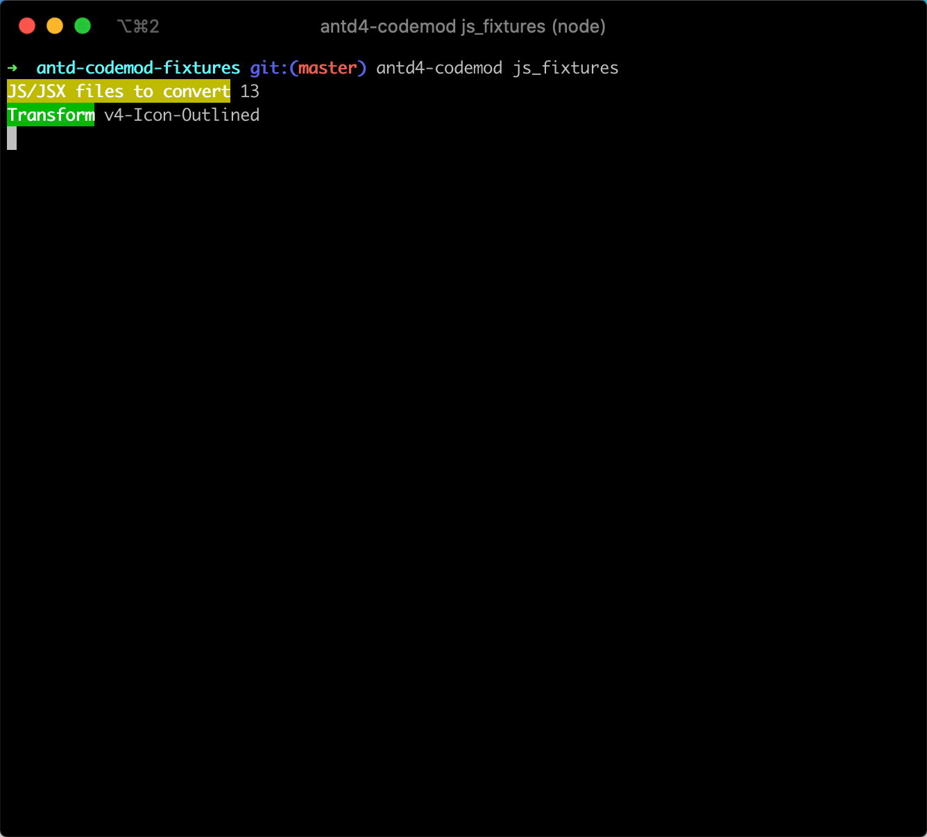
对于无法自动修改的部分,codemod 会在命令行进行提示,建议按提示手动修改。修改后可以反复运行上述命令进行检查。
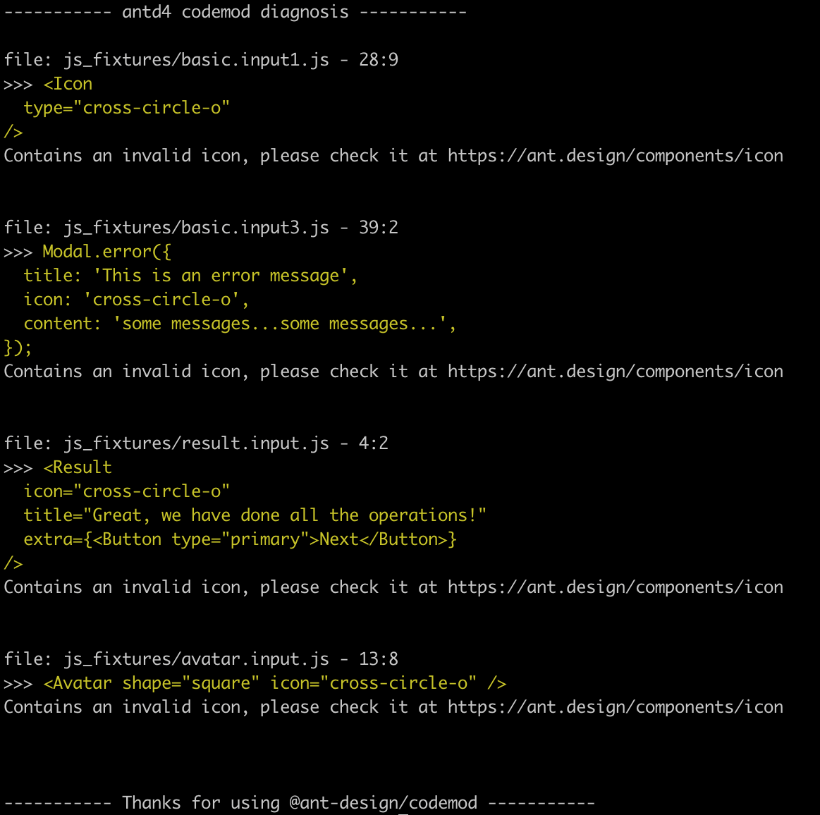
注意 codemod 不能涵盖所有场景,建议还是要按不兼容的变化逐条排查。
3.1 迁移工具修改详情
@ant-design/codemod-v4 会帮你迁移到 antd v4, 废弃的组件则通过 @ant-design/compatible 保持运行, 一般来说你无需手动迁移。下方内容详细介绍了整体的迁移和变化,你也可以参照变动手动修改。
3.2 将已废弃的 Form 和 Mention 组件通过 @ant-design/compatible 包引入
- import { Form, Input, Button, Mention } from 'antd';
+ import { Form, Mention } from '@ant-design/compatible';
+ import '@ant-design/compatible/assets/index.css';
+ import { Input, Button } from 'antd';

  ReactDOM.render( (
    <div>
      <Form>
        {getFieldDecorator('username')(<Input />)}
        <Button>Submit</Button>
      </Form>
      <Mention
        style={{ width: '100%' }}
        onChange={onChange}
        defaultValue={toContentState('@afc163')}
        defaultSuggestions={['afc163', 'benjycui']}
        onSelect={onSelect}
      />
    </div>
  );
**注意:**从
@ant-design/compatible引入的老版本 Form 组件,样式类名会从.ant-form变成.ant-legacy-form,如果你对其进行了样式覆盖,也需要相应修改。
3.3 用新的 @ant-design/icons 替换字符串类型的 icon 属性值
  import { Avatar, Button, Result } from 'antd';
+ import { QuestionOutlined, UserOutlined } from '@ant-design/icons';

  ReactDOM.render(
    <div>
-     <Button type="primary" shape="circle" icon="search" />
+     <Button type="primary" shape="circle" icon={SearchOutlined} />
-     <Avatar shape="square" icon="user" />
+     <Avatar shape="square" icon={UserOutlined} />
      <Result
-       icon="question"
+       icon={<QuestionOutlined />}
        title="Great, we have done all the operations!"
        extra={<Button type="primary">Next</Button>}
      />
    </div>,
    mountNode,
  );
3.4 将 v3 Icon 组件转换成 @ant-design/icons 中引入
- import { Icon, Input } from 'antd';
+ import { Input } from 'antd';
+ import Icon, { CodeFilled, SmileOutlined, SmileTwoTone } from '@ant-design/icons';

  const HeartSvg = () => (
    <svg width="1em" height="1em" fill="currentColor" viewBox="0 0 1024 1024">
      <path d="M923 plapla..." />
    </svg>
  );

  const HeartIcon = props => <Icon component={HeartSvg} {...props} />;

  ReactDOM.render(
    <div>
-     <Icon type="code" theme="filled" />
+     <CodeFilled />
-     <Icon type="smile" theme="twoTone" twoToneColor="#eb2f96" />
+     <SmileTwoTone twoToneColor="#eb2f96" />
-     <Icon type="code" theme={props.fill ? 'filled' : 'outlined'} />
+     <LegacyIcon type="code" theme={props.fill ? 'filled' : 'outlined'} />
      <HeartIcon />
      <Icon viewBox="0 0 24 24">
        <title>Cool Home</title>
        <path d="M10 20v-6h4v6h5v-8h3L12 3 2 12h3v8z" />
      </Icon>
      <Input suffix={<SmileOutlined />} />
    </div>,
    mountNode,
  );
3.5 将 v3 LocaleProvider 组件转换成 v4 ConfigProvider 组件
- import { LocaleProvider } from 'antd';
+ import { ConfigProvider } from 'antd';

  ReactDOM.render(
-   <LocaleProvider {...yourConfig}>
+   <ConfigProvider {...yourConfig}>
      <Main />
-   </LocaleProvider>
+   </ConfigProvider>
    mountNode,
  );
3.6 将 Modal.method() 中字符串 icon 属性的调用转换成从 @ant-design/icons 中引入
  import { Modal } from 'antd';
+ import { AntDesignOutlined } from '@ant-design/icons';

  Modal.confirm({
-  icon: 'ant-design',
+  icon: <AntDesignOutlined />,
   title: 'Do you Want to delete these items?',
   content: 'Some descriptions',
   onOk() {
     console.log('OK');
   },
   onCancel() {
     console.log('Cancel');
   },
 });
四、遇到问题
v4 做了非常多的细节改进和重构,我们尽可能收集了已知的所有不兼容变化和相关影响,但是有可能还是有一些场景我们没有考虑到。如果你在升级过程中遇到了问题,请到 GitHub issues 和 codemod Issues 进行反馈。我们会尽快响应和相应改进这篇文档。
五、总结
通过查看官方提供的更新声明我们可以看出,升级之后对我们开发者来说更加的友好,趁热,快去更新你的项目吧~~
