

ember-d3-demo
@[TOC]
ember-cli v3.16.0
node 10.16.0
0. 前言
- 它是声明式的,不是命令式的d3的第一个核心是:数据驱动的dom元素创建,把这个思想上的弯绕过来,掌握1/3了
- 它是数据处理包,不是图形绘制包d3的第二个核心是:它的大量的api,提供的是对数据的转换与处理,无论是scale、layout还是svg.line等,都仅仅是对数据的处理,和绘制图形与DOM操作没有半毛关系。把这个思想上的弯绕过来,又掌握1/3了
- 它的api通常返回的是一个函数,这个函数的具体功能,通过函数对象的方法约定。d3的javascript写法不是那么符合常人的逻辑,比如:调用d3.svg.line(),这个我们获得的是一个line函数,作用是把原始数据转化成svg的path元素的d属性需要的字符串,如果连起来写的话是这样:var nd=d3.svg.line()(data); 这样获得的nd才是可以塞给path的d属性的东西。把这个思想上的弯绕过来,又掌握1/3
以上三点转过来以后,基本算理解d3背后的思路了,大约看文档也可以独立写点东西出来了。d3的使用模式如下:
- step1:准备数据
- step2:创建dom
- step3:设置属性
作者:ciga2011 , 来源
1. 前期工作
1.1 修改项目为 Pods 目录(可选)
// config/environment.js
let ENV = {
    modulePrefix: 'ember-d3-demo',
    podModulePrefix: 'ember-d3-demo/modules',
    // ...
  };
// .ember-cli
{
  "disableAnalytics": false,
  "usePods": true
}
1.2 依赖安装
首先是可选安装 typescript
ember install ember-cli-typescript@latest && yarn add typescript@3.7.5
安装 d3, 由于上面是使用了 typescript,所以安装命令变为:
ember install ember-d3 && npm i --save @types/d3
如果没有安装 typescript 那就按照官方教程正常安装即可:
ember install ember-d3 && yarn add --save-dev d3@5.15.0
至此,关于 d3 的依赖安装完毕,如果是非 ember octane 版本,这时候可以跳过下面的说明,继续使用了。
由于octane 版本中修改了 component / controller / route 等改为类的继承与扩展。对于 component 来说就是组件的声明周期不再是 didInsertElement ,而是变成了使用 modifier .就需要多一步的安装:
ember install @ember/render-modifiers
注意:以后的 ember 版本可能会默认添加此 modifier
2. 选择元素和绑定数据
使用 d3 创建 hello world 文本。
2.1 创建 d3/hello-world 组件
修改 handlerbars :
<p class="d3-hello" {{did-insert this.hello}}></p>
修改 component 逻辑文件
import Component from '@glimmer/component';
import { action } from '@ember/object';
import {select} from 'd3-selection';
interface D3HelloWorldArgs {}
export default class D3HelloWorld extends Component<D3HelloWorldArgs> {
@action
hello() {
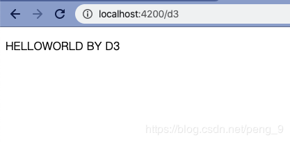
select(".d3-hello").text("HELLOWORLD BY D3")
}
}
在路由中使用此组件:
{{!-- d3 route file --}}
<h2>d3-1 helloworld</h2>
<D3::HelloWorld />
此时运行文件即可以看到:
同样的:
import Component from '@glimmer/component';
import { action } from '@ember/object';
import {select} from 'd3-selection';

interface D3HelloWorldArgs {}

export default class D3HelloWorld extends Component<D3HelloWorldArgs> {
    @action
    hello() {
        let p = select(".d3-hello").text("HELLOWORLD BY D3");

        // 修改此元素的样式
        p.attr("title","helloWorld").style("color","lightblue")
    }
}
这样就可以改变字体的 style 样式了,并为此 P 标签添加了 title 属性,虽然没有什么作用。
更多的关于 d3-selection 的 API 请查看链接。
2.2 使用 .datum() / .data() 绑定数据
同样的创建 d3/bind-data 组件。
{{!-- d3/bind-data.hbs --}}
<p class="d3-bind" {{did-insert this.dataBind}}></p>
<p class="d3-bind" {{did-insert this.dataBind}}></p>
<p class="d3-bind" {{did-insert this.dataBind}}></p>
<p class="d3-bind" {{did-insert this.dataBind}}></p>

<p class="d3-bind2" {{did-insert this.dataBind2}}></p>
<p class="d3-bind2" {{did-insert this.dataBind2}}></p>
// d3/bind-data.ts
import Component from '@glimmer/component';
import { selectAll } from 'd3-selection';
import { action } from '@ember/object';

interface D3BindDataArgs { }

const STR = "DATABIND";
const ARR = ["落霞与孤鹜齐飞","秋水共长天一色"];
export default class D3BindData extends Component<D3BindDataArgs> {
    @action
    dataBind() {
        let p = selectAll('.d3-bind');
        p.datum(STR)
        p.text(function (d, i) {
            return `✨第 ${i} 个元素绑定的值是 ${d}✨`
        })
    }
    @action
    dataBind2() {
        let ps = selectAll(".d3-bind2");
        ps.data(ARR).text(function(d) {
            return d
        })
    }
}
同样的,在路由中使用此组件:
{{!-- d3 route file --}}
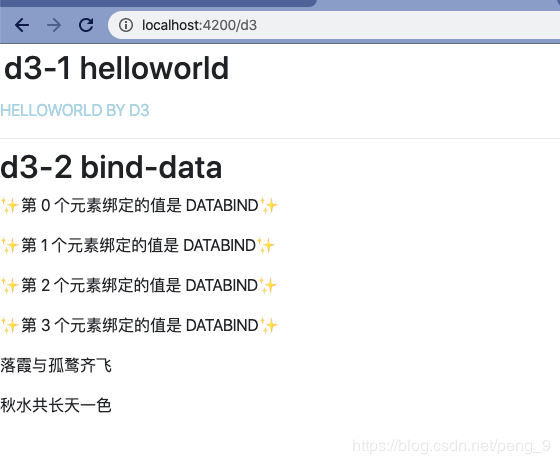
<h2>d3-1 helloworld</h2>
<D3::HelloWorld />
<div class="dropdown-divider"></div>
<h2>d3-2 bind-data</h2>
<D3::BindData />
运行程序可以看到:
3. 做一个简单的图表
先从最简单的 柱状图 开始:
涉及到 HTML 5 中的 svg
svg 包含六种基本图形:
- 矩形 rect
- 圆形
- 椭圆
- 线段
- 折线
- 多边形
另外还有一种在 icon 中比较常见的:
- 路径
画布中的所有图形,都是由以上七种元素组成。
3.1 添加画布
在上一章节中,只是简单的使用 D3 添加文本元素,而添加 svg 的代码是:
{{!-- d3/basic-histogram.hbs --}}
<h3>3.1 append svg to element</h3>
<div class="basic-svg-container" {{did-insert this.appendSvg}}></div>
// d3/basic-histogram.ts
import Component from '@glimmer/component';
import { action } from '@ember/object';
import { select } from 'd3-selection';

interface D3BasicHistogramArgs {}

export default class D3BasicHistogram extends Component<D3BasicHistogramArgs> {
    @action
    appendSvg() {
        let container = select(".basic-svg-container");
        container.append('svg')
        .attr("width",200)
        .attr("height",123.6)
        .style("background-color","orange")
    }
}
简单的向 div 元素中添加一个背景颜色为 orange 的 svg:
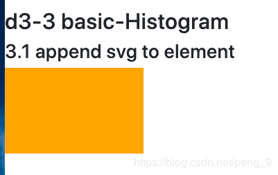
有了画布,就可以在画布上进行作图了:
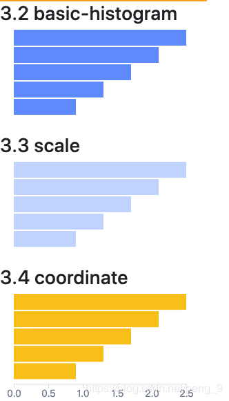
3.2 绘制简单柱状图
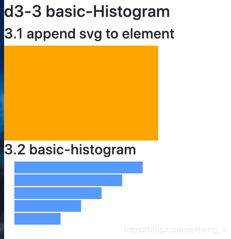
柱状图就是由一个个的 rect 元素组成:
{{!-- d3/basic-histogram.hbs --}}
<h3>3.1 append svg to element</h3>
<div class="basic-svg-container" {{did-insert this.appendSvg}}></div>
<h3>3.2 basic-histogram</h3>
<svg class="bar-container" {{did-insert this.initHistogram}}>
</svg>
// d3/basic-histogram.ts
import Component from '@glimmer/component';
import { action } from '@ember/object';
import { select } from 'd3-selection';

interface D3BasicHistogramArgs { }

const DATASET = [250, 210, 170, 130, 90];  //数据(表示矩形的宽度);
const RECTHEIGHT = 25;   //每个矩形所占的像素高度(包括空白)
export default class D3BasicHistogram extends Component<D3BasicHistogramArgs> {
    @action
    appendSvg() {
        let container = select(".basic-svg-container");
        container.append('svg')
            .attr("width", 300)
            .attr("height", 185.4)
            .style("background-color", "orange")
    }

    @action
    initHistogram() {
        const barContainer = select(".bar-container");

        barContainer
            .attr("width",300)
            .attr("heigt",185.4)
            .selectAll("rect")
            .data(DATASET)
            .enter()
            .append("rect")
            .attr("x", 20)
            .attr("y", function (d, i) {
                return i * RECTHEIGHT
            })
            .attr("width", function (d) {
                return d;
            })
            .attr("height", RECTHEIGHT - 2)
            .attr("fill", "#579AFF")

    }
}
其中,rect 元素的一些属性说明
- x 属性定义矩形的左侧位置(例如,x="0" 定义矩形到浏览器窗口左侧的距离是 0px)
- y 属性定义矩形的顶端位置(例如,y="0" 定义矩形到浏览器窗口顶端的距离是 0px)
在路由中使用此插件即可以看到:
这里需要注意的代码是:
barContainer
    .attr("width",300)
    .attr("heigt",185.4)
    .selectAll("rect")
    .data(DATASET)
    .enter()
  .append("rect")
其中 data() 方法将指定数组的数据 data 与已经选中的元素进行绑定并返回一个新的选择集,返回的新的选择集使用 update 表示: 此时数据已经成功的与元素绑定。
3.3 比例尺
在实际的绘制图表的过程中,不可能像上述那样,根据数值去直接展示长度,需要进行一步比例尺的转换。
D3 提供了相关的比例尺转化的 API 包括不限于: d3.scaleLinear 、d3.scaleOrdinal 等等。像一般简单的展示线性的比例尺的写法是:
{{! d3/basic-histogram.hbs --}}
{{! ... --}}
<h3>3.3 scale</h3>
<svg class="scale" {{did-insert this.initScale}}>
     <rect></rect>
</svg>
// d3/basic-histogram.ts
// ...
@action
initScale() {
    const dataset = [2.5, 2.1, 1.7, 1.3, 0.9];

    let linear = scaleLinear()
    .domain([0, max(dataset,null)])
    .range([0, 250]);

    const barContainer = select(".scale");

    barContainer
        .attr("width", 300)
        .attr("heigt", 185.4)
        .selectAll("rect")
        .data(dataset)
        .attr("x", 20)
        .attr("y", function (d, i) {
        return i * RECTHEIGHT
    })
        .attr("width", function (d) {
        return linear(d);
    })
        .attr("height", RECTHEIGHT - 2)
        .attr("fill", "#C2DAFF")
    // 为何重复设置 attr 见下文解释
        .enter()
        .append("rect")
        .attr("x", 20)
        .attr("y", function (d, i) {
        return i * RECTHEIGHT
    })
        .attr("width", function (d) {
        return linear(d);
    })
        .attr("height", RECTHEIGHT - 2)
        .attr("fill", "#C2DAFF");
}
// ...
展示的效果和 3.2 中的图片相同。
文中代码中的解释:
当svg 内已有元素时,会导致以后的元素不能正确显示。这是因为已经存在的元素,使用 data() 之后,如果数据个数超出已存在的元素的个数,超出的这部分称之为 enter ,元素与数据对应的这部分称之为 update。需要对 update 部分以及 enter 部分的元素分别设置各种 attr,来达到一同展示的目的。具体解释可以查看
3.4 添加坐标轴
在 d3 中有专门的坐标轴相关的 API 。
同样利用上节中相同的数据来生成图表,并添加坐标轴:
{{!-- d3/basic-histogram.hbs --}}
{{!-- ... --}}

<h3>3.4 coordinate</h3>
<svg class="coordinate" {{did-insert this.initAxes}}></svg>
// d3/basic-histogram.ts
// ...
@action
initAxes() {
    const linear = scaleLinear()
    .domain([0, max(dataset)])
    .range([0, 250]);


    let svgContainer = select(".coordinate");

    svgContainer
    // 样式放入了类中进行控制
        .selectAll("rect")
        .data(dataset)
        .enter()
        .append("rect")
        .attr("x", 20)
        .attr("y", (d, i: number) => i * RECTHEIGHT)
        .attr("width", d => linear(d))
        .attr("height", RECTHEIGHT - 2)
        .attr("fill", "#FFC400");

    const axis = axisBottom(linear)
    .ticks(7);

    svgContainer.append("g")
        .attr("class","pb-tm-axis")
        .attr("transform","translate(20,130)").call(axis)

}
// ...
// 样式文件
.coordinate {
    width: 300px;
    height: 185.4px;
}

.pb-tm-axis path,
.pb-tm-axis line {
    fill: none;
    stroke: #DFE1E6;
    shape-rendering: crispEdges;
}

.pb-tm-axis text {
    font-family: PingFangSC-Regular;
    font-size: 14px;
    color: #7A869A;
}
最后展示的效果:
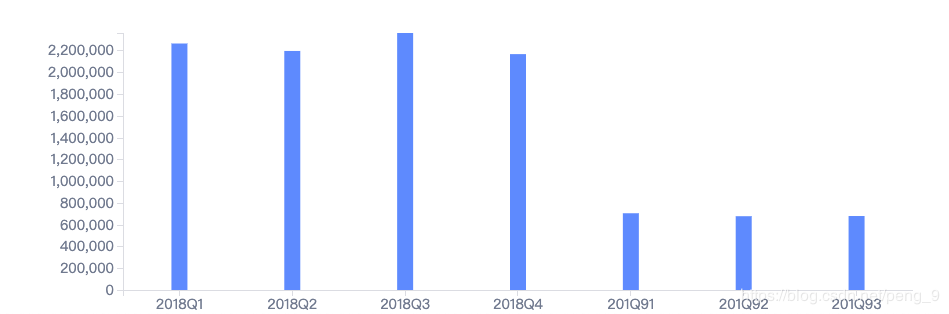
4. 完整的柱状图
具体的实现是
{{!-- d3/bp-bar.hbs --}}
<div class="bp-bar" {{did-insert this.initBar}}></div>
// d3/bp-bar.ts
import Component from '@glimmer/component';
import { action } from '@ember/object';
import { select } from 'd3-selection';
import { scaleLinear, scaleBand } from 'd3-scale';
import { max } from 'd3-array';
import { axisBottom, axisLeft } from 'd3-axis';

interface D3BpBarArgs { }

const DATASET = [
    ['2018Q1', 2263262.25, 2584466.75, "0.8757", "all", null],
    ['2018Q2', 2194822.96875, 2643496, "0.8303", "all", null],
    ['2018Q3', 2359731.25, 2770609.75, "0.8517", "all", null],
    ['2018Q4', 2165844.0625, 2914783.4375, "0.7431", "all", null],
    ['201Q91', 704715.671875, 2274136, "0.3099", "all", null],
    ['201Q92', 677539.40625, 2806879, "0.2414", "all", null],
    ['201Q93', 679346.203125, 2975934, "0.2283", "all", null]
]

export default class D3BpBar extends Component<D3BpBarArgs> {
    @action
    initBar() {
        // 声明变量
        const svgContainer = select('.bp-bar');
        const width: number = Number(svgContainer.style("width").split("p")[0])
        const height: number = Number(svgContainer.style("height").split("p")[0])
        const padding = { top: 24, right: 24, bottom: 24, left: 84 }
        const barWidth = 16;
        /**
         * 添加 svg 画布
         */
        const svg = svgContainer
            .append('svg')
            .attr("width", width)
            .attr("height", height);
        /**
         * x 轴的比例尺
         */
        let xAxisData = DATASET.map((ele: any[]): string => ele[0]);
        console.log(xAxisData)
        const xScale = scaleBand()
            .domain(xAxisData)
            .range([0, width - padding.left])
        /**
         * y 轴的比例尺
         */
        let yAxisData = DATASET.map((ele: Array<any>): number => ele[1])
        const yScale = scaleLinear()
            .domain([0, max(yAxisData)])
            .range([height - padding.top - padding.bottom, 0]);

        /**
         * 定义坐标轴
         */
        let xAxis = axisBottom(xScale);
        let yAxis = axisLeft(yScale);

        /**
         * 添加柱状图
         */
        svg.selectAll('rect')
            .data(DATASET)
            .enter()
            .append('rect')
            .classed('bp-bar-rect', true)
            .attr("transform", `translate(${padding.left},${ padding.top})`)
            .attr('x', (d) => {
                return xScale(d[0]) + xScale.bandwidth() / 2 - barWidth / 2
            })
            .attr('y', (d) => yScale(d[1]))
            .attr('width', barWidth + "px")
            .attr('height', (d) => height - padding.top - padding.bottom - yScale(d[1]))
            .text((d: any) => d[4]);

        /***
         * 添加坐标轴
         */
        svg.append('g')
            .classed('x-axis', true)
            .attr("transform", "translate(" + padding.left + "," + (height - padding.bottom) + ")")
            .call(xAxis);

        svg.append("g")
            .classed('y-axis', true)
            .attr("transform", "translate(" + padding.left + "," + padding.top + ")")
            .call(yAxis);

    }
}
5. 添加 transition 以及交互
直愣愣的图表需要一些动态效果来使其变得更生动。交互则可以让图表表达更具体的信息。
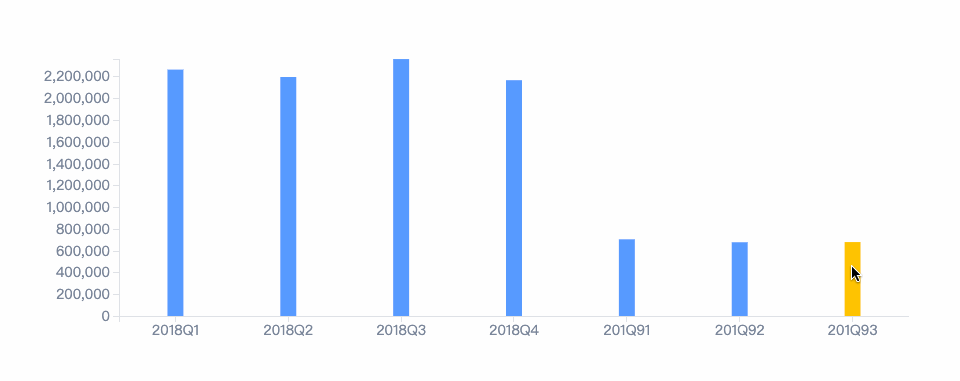
5.1 transition 的添加
transition 等动画在 d3 中添加是很容易的,和 css3 中的动画大相径庭。以上面的柱状图为例。
我们想要的效果就是在第一次加载柱状图的时候能有一个从底至上的一个动画效果。
// d3/bp-bar.ts
// 。。。
/**
 * 添加柱状图
 */
	// svg.selectAll('rect')
	//     .data(DATASET)
	//     .enter()
	//     .append('rect')
	//     .classed('bp-bar-rect', true)
	//     .attr("transform", `translate(${padding.left},${ padding.top})`)
	//     .attr('x', (d) => {
	//         return xScale(d[0]) + xScale.bandwidth() / 2 - barWidth / 2
	//     })
	//     .attr('y', (d) => yScale(d[1]))
	//     .attr('width', barWidth + "px")
	//     .attr('height', (d) => height - padding.top - padding.bottom - yScale(d[1]))
	//     .text((d: any) => d[4]);

/**
 * 为柱状图添加动画
 */
const t = transition()
	.ease();

svg.selectAll('rect')
    .data(DATASET)
    .enter()
    .append('rect')
    .classed('bp-bar-rect', true)
    .attr("transform", `translate(${padding.left},${padding.top})`)
    .attr('x', (d) => {
    	return xScale(d[0]) + xScale.bandwidth() / 2 - barWidth / 2
	})
    .attr('y', height - padding.bottom-24) // 24 为x坐标轴的高度
    .attr('width', barWidth + "px")
    .attr('height',0)
    .transition(t)
    .duration(4000)
    .attr('y', (d) => yScale(d[1]))
    .attr('height', (d) => height - padding.top - padding.bottom - yScale(d[1]))
    .text((d: any) => d[4]);
// 。。。
主要的代码是 transition() 这一行开始,在此行之前的状态与之后的状态通过此 API 进行动态展示。在此例子中将每个 rect 元素的 y 以及 height 经过 4000 ms 进行改变。
5.2 交互
svg.selectAll('rect')
    .on('mouseover', function (d, i: number) {
    	// 保证修改的元素的 fill 不是在 class 中
    	// 而是通过 attr('fill',value) 定义的
        select(this).attr("fill", "#FFC400")
    })
    .on('mouseout', function (d, i) {
        select(this)
            .transition()
            .duration(1000)
            .attr("fill", "#579AFF")
})
上述交互的意图就是简单的更换柱状图的颜色。所以当前柱状图的 fill 不能够再写在样式类中,需要通过 attr 写在当前。
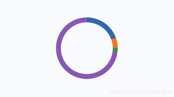
6. layout - 饼图
6.1 layout
在学习饼图之前需要对 d3 中的 layout 有一定的了解。d3 的 layout 与 css 的 layout 是截然不同的两个概念。
官方文章中对 layout 的定义:
Layout functions sets up and modifies data so that it can be rendered in different shapes. The layout functions don't do the drawing of the shapes.
大概意思就是 layout 函数设置以及修改数据以便其可以适用于不同的图形中。layout 函数不参与绘制图形。
有了这层的概念,就可以来看 layout 用于 饼图上的实例了。
6.2 饼图
创建一个新的 component
ember g component d3/bp-pie
在其 handlebars 文件中:
<div class="bp-pie" {{did-insert this.initPie}}></div>
与之前的组件大致相似。
那其逻辑文件则是:
// d3/bp-pie.ts
import Component from '@glimmer/component';
import { action } from '@ember/object';
import { select } from 'd3-selection';
import { tracked } from '@glimmer/tracking';
import { pie, arc } from 'd3-shape';
import { schemeCategory10 } from 'd3-scale-chromatic';

interface D3BpPieArgs {
    data: string | number[]
    // data: [
    //     ["癫痫竞品1", 2575385.5, null, "0.1952"],
    //     ["开浦兰", 679346.1875, null, "0.0515"],
    //     ["癫痫竞品2", 279866.65625, null, "0.0212"],
    //     ["维派特", 0, null, "0.0000"],
    //     ["其他竞品", 9662320.65625, null, "0.7322"]
    //   ]
}

export default class D3BpPie extends Component<D3BpPieArgs> {
    @tracked data = this.args.data
    get layoutData() {
        const pieLayout = pie()
            // 设置如何从数据中获取要绘制的值
            .value((d: any) => d[1])
            // 设置排序规则 (null 表示原始排序)
            .sort(null)
            // 设置第一个数据的起始角度 (默认为 0)
            .startAngle(0)
            // 设置弧度的终止角度,(默认 2*Math.PI)
            // endAngle - startAngle 为 2 π 则表示一个整圆
            .endAngle(2 * Math.PI)
            // 弧度之间的空隙角度(默认 0)
            .padAngle(0);
        return pieLayout(this.data)
    }
    @action
    initPie() {
        const container = select('.bp-pie');
        // 声明变量
        const width: number = Number(container.style("width").split("p")[0])
        const height: number = Number(container.style("height").split("p")[0])
        const innerRadius = 84
        const outerRadius = 100
        // 生成 svg
        let svg = container.append('svg')
            .attr("width", width)
            .attr("height", height)

        const pieData = this.layoutData
        // 基础 rect 设置
        let arcins = arc()
            .innerRadius(innerRadius)
            .outerRadius(outerRadius);

        // hover 状态 rect 的设置
        let arcOver = arc()
            .innerRadius(innerRadius)
            .outerRadius(outerRadius + 15);

        svg.selectAll('path.arc')
            .data(pieData)
            .enter()
            .append('path')
            .attr("transform", "translate(" + (width / 2) + "," + (height / 2) + ")")
            .attr('fill', (d: any, i: number) => schemeCategory10[i])
            .classed('arc', true)
            .attr('d', arcins);

        svg.selectAll('path.arc')
            .on('mouseover', function () {
                select(this)
                    .transition()
                    .duration(1000)
                    .attr('d', arcOver)
            })
            .on('mouseout', function () {
                select(this)
                    .transition()
                    .duration(100)
                    .attr('d', arcins)
            })
    }
}
使用到 layout 的是在 layoutData 属性上,使用的是 layout 的 pie() 函数。其中每行均有说明。返回的 pieLayout(this.Data) 的格式为:
[{
	"data": ["癫痫竞品1", 2575385.5, null, "0.1952"],
	"index": 0,
	"value": 2575385.5,
	"startAngle": 0,
	"endAngle": 1.2261668298428863,
	"padAngle": 0
}, {
	"data": ["开浦兰", 679346.1875, null, "0.0515"],
	"index": 1,
	"value": 679346.1875,
	"startAngle": 1.2261668298428863,
	"endAngle": 1.5496103535766053,
	"padAngle": 0
}, {
	"data": ["癫痫竞品2", 279866.65625, null, "0.0212"],
	"index": 2,
	"value": 279866.65625,
	"startAngle": 1.5496103535766053,
	"endAngle": 1.6828576715695005,
	"padAngle": 0
}, {
	"data": ["维派特", 0, null, "0.0000"],
	"index": 3,
	"value": 0,
	"startAngle": 1.6828576715695005,
	"endAngle": 1.6828576715695005,
	"padAngle": 0
}, {
	"data": ["其他竞品", 9662320.65625, null, "0.7322"],
	"index": 4,
	"value": 9662320.65625,
	"startAngle": 1.6828576715695005,
	"endAngle": 6.283185307179586,
	"padAngle": 0
}]
可以看到,获得的数组中每个 item 都是一个对象,用来描述每一个弧度(rect)。其中包括:
- 原始数据
data - 数据下标
index - 根据 value() 方法设置的需要展示的值
value - 本 rect 的开始角度
startAngle - 本 rect 的结束角度
endAngle - 与其后 rect 的间隙角度大小
padAngle
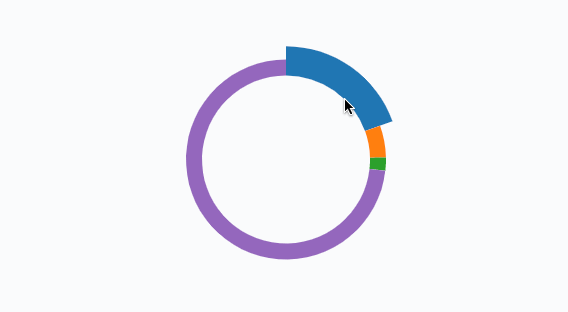
添加的事件展示出的动态效果即:
6.3 折线图
6.3.1 单折线
创建一个组件来展示折线图:
ember g component d3/bp-line
同样的修改 hbs 文件:
<div class="bp-line" {{did-insert this.initLine}}></div>
先直接来 ts 的代码:
import Component from '@glimmer/component';
import { action } from '@ember/object';
import { select } from 'd3-selection';
import { scaleBand, scaleLinear } from 'd3-scale';
import { axisBottom, axisLeft } from 'd3-axis';
import { max } from 'd3-array';
import { line, curveCatmullRom } from 'd3-shape';

interface D3BpLineArgs {
    data: any[]
    /**
     * 单折线数据示例
     */
    //  [
    //     ['2018Q1', 2263262.25, 2584466.75, "0.8757", "all", null],
    //     ['2018Q2', 2194822.96875, 2643496, "0.8303", "all", null],
    //     ['2018Q3', 2359731.25, 2770609.75, "0.8517", "all", null],
    //     ['2018Q4', 2165844.0625, 2914783.4375, "0.7431", "all", null],
    //     ['201Q91', 704715.671875, 2274136, "0.3099", "all", null],
    //     ['201Q92', 677539.40625, 2806879, "0.2414", "all", null],
    //     ['201Q93', 679346.203125, 2975934, "0.2283", "all", null]
    // ]
    width: number
    height: number
    layout: any // TODO用于控制 div 的布局 {h:**,w:**,x:**,y:**}
}

export default class D3BpLine extends Component<D3BpLineArgs> {
    private width: number | string = "100%"
    private height: number | string = "100%"
    // 动画函数
    private tweenDash() {
        let l = this.getTotalLength(),
            i = interpolateString("0," + l, l + "," + l);
        return function (t:any) { return i(t); };
    }
    @action
    initLine() {
        const dataset = this.args.data
        const container = select(".bp-line")
        this.width = parseInt(container.style("width"))
        this.height = parseInt(container.style("height"))
        const padding = {
            top: 24,
            right: 24,
            bottom: 24,
            left: 24
        }
        const svg = container.append('svg')
            .attr("width", this.width)
            .attr('height', this.height)
            .style('background-color', "#fafbfc");

        const yScale = scaleLinear()
            .domain([0, max(dataset.map((ele: any[]) => ele[1]))])
            .range([this.height - padding.top - padding.bottom, 0]);

        const yAxis = axisLeft(yScale)

        svg.append('g')
            .classed('y-axis', true)
            .call(yAxis)

        // 动态获取y坐标轴的宽度
        const yAxisWidth: number = svg.select('.y-axis').node().getBBox().width;

        svg.select(".y-axis")
            .attr("transform", `translate(${padding.left + yAxisWidth},${padding.top})`)


        // 最后绘制 x 坐标轴,可以根据y轴的宽度动态计算 x轴所占的宽度
        const xScale = scaleBand()
            .domain(dataset.map((ele: any[]) => ele[0]))
            .range([padding.left, this.width - padding.right - yAxisWidth])

        const xAxis = axisBottom(xScale)
        svg.append('g')
            .classed('x-axis', true)
            .attr("transform", `translate(${yAxisWidth},${this.height - padding.bottom})`)
            .call(xAxis);

        const lineLayout = line().x((d: any) => xScale(d[0]))
            .y((d: any) => yScale(d[1]))
            // 添加弯曲度
            // https://bl.ocks.org/d3noob/ced1b9b18bd8192d2c898884033b5529
            // 上述链接展示参数的不同,线条会有怎样的变化
            .curve(curveCatmullRom.alpha(0.5))

		// 单折线的数据展示方式-1
        /**
         svg.append('g')
             .append('path')
             .classed('line-path', true)
             .attr('transform', `translate(${padding.left + yAxisWidth},${padding.top})`)
             .attr('d', lineLayout(dataset))
             .attr('fill', 'none')
             .attr('stroke-width', 2)
             .attr('stroke', '#FFAB00');
        */
        // 单折线的数据展示方式-2
        svg.append("path")
            .datum(dataset)
            .classed('line-path', true)
            .attr('transform', `translate(${padding.left + yAxisWidth},${padding.top})`)
            .attr("d", lineLayout)
            .attr('fill', 'none')
            .attr('stroke-width', 2)
            .attr('stroke', '#FFAB00');

        // 添加初始动画
        svg.select('.line-path')
            .transition()
            .duration(4000)
            .attrTween("stroke-dasharray", this.tweenDash);
        let circles = svg.append('g')
            .selectAll('circle')
            .data(dataset)
            .enter()

        circles.append('circle')
            .attr('r', 3)
            .attr('transform', function (d) {
                return 'translate(' + (xScale(d[0]) + padding.left + yAxisWidth) + ',' + (yScale(d[1]) + padding.top) + ')'
            })
            .attr('stroke', '#FFAB00')
            .attr('fill', 'white')
            .on('mouseover', function () {
                select(this)
                    .transition()
                    .duration(600)
                    .attr('r', 6)
            })
            .on('mouseout', function () {
                select(this)
                    .transition()
                    .duration(600)
                    .attr('r', 3)
            })

    }
}
绘制方法大相径庭。无非是画坐标轴,设置折线展示的数据,以及添加其他样式或动画效果等。
这里有几点需要注意的地方:
最后的成果展示:
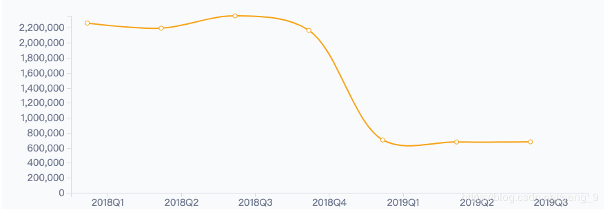
⚠️注意因数据格式与代码耦合严重,后期要修改折线数据结构。
如果细心观察的话,会发现其实每个点和 x 轴坐标上的点并不是对齐的,这是因为我们在创建 x 轴坐标轴的时候,选择的是 scaleBand 的方式:
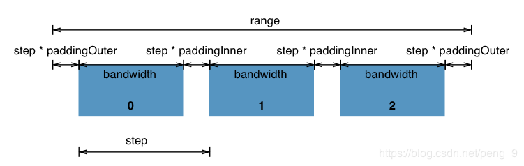
通过上图我们可以得知为什么会出现这样的问题,如果还是使用此方法创建坐标轴,那就需要移动 1/2 的 bandWidth 的宽度,来使其对齐:
相关代码:
// 。。。
// 单折线的数据展示方式-1
/**
	svg.append('g')
		.append('path')
		.classed('line-path', true)
		.attr('transform', `translate(${yAxisWidth+xScale.bandwidth()/2},${padding.top})`)
             .attr('d', lineLayout(dataset))
             .attr('fill', 'none')
             .attr('stroke-width', 2)
             .attr('stroke', '#FFAB00');
        */
// 单折线的数据展示方式-2
svg.append("path")
    .datum(dataset)
    .classed('line-path', true)
    .attr('transform', `translate(${ yAxisWidth+xScale.bandwidth()/2},${padding.top})`)
    .attr("d", lineLayout)
    .attr('fill', 'none')
    .attr('stroke-width', 2)
    .attr('stroke', '#FFAB00');
//。。。
circles.append('circle')
    .attr('r', 3)
    .attr('transform', function (d) {
    return 'translate(' + (xScale(d[0]) +xScale.bandwidth()/2 + yAxisWidth) + ',' + (yScale(d[1]) + padding.top) + ')'
})
    .attr('stroke', '#FFAB00')
    .attr('fill', 'white')
主要注意 transform 属性的改变。
6.3.2 多折线
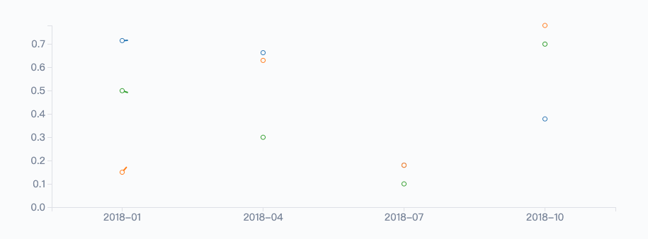
实际效果:
不多说,直接上代码:
import Component from '@glimmer/component';
import { action } from '@ember/object';
import { select } from 'd3-selection';
import { scaleBand, scaleTime, scaleLinear } from 'd3-scale';
import { axisBottom, axisLeft } from 'd3-axis';
import { max, min } from 'd3-array';
import { line, curveCatmullRom } from 'd3-shape';
import { interpolateString } from 'd3-interpolate';
import { schemeCategory10 } from 'd3-scale-chromatic';
// import { timeMonth } from 'd3-time';
// import { timeFormat } from 'd3-time-format'

interface D3BpMultiLinesArgs {
    data: any[]
    /**
     * 多折线数据示例
     */
    // [[
    //     {label:'2018-01', name:"开浦兰",value:0.715,count: 2300, other:0.0000},
    //     {label:'2018-04', name:"开浦兰",value:0.663,count: 2400, other:0.0000},
    //     {label:'2018-07', name:"开浦兰",value:0.18,count: 2300, other:0.0000},
    //     {label:'2018-10', name:"开浦兰",value:0.3788,count: 2300, other:0.0000}
    // ],
    // [
    //     {label:'2018-01', name:"癫痫竞品1",value:0.15,count: 2100, other:0.0000},
    //     {label:'2018-04', name:"癫痫竞品1",value:0.63,count: 2400, other:0.0000},
    //     {label:'2018-07', name:"癫痫竞品1",value:0.18,count: 200, other:0.0000},
    //     {label:'2018-10', name:"癫痫竞品1",value:0.78,count: 300, other:0.0000}
    // ],
    // [
    //     {label:'2018-01', name:"维派特",value:0.5,count: 100, other:0.0000},
    //     {label:'2018-04', name:"维派特",value:0.3,count: 400, other:0.0000},
    //     {label:'2018-07', name:"维派特",value:0.1,count: 2500, other:0.0000},
    //     {label:'2018-10', name:"维派特",value:0.7,count: 3100, other:0.0000}
    // ]]
    width: number
    height: number
    layout: any // TODO用于控制 div 的布局 {h:**,w:**,x:**,y:**}
}
interface D3BpMultiLinesArgs { }

export default class D3BpMultiLines extends Component<D3BpMultiLinesArgs> {
    private width: number | string = "100%"
    private height: number | string = "100%"
    // 动画函数
    private tweenDash() {
        let l = this.getTotalLength(),
            i = interpolateString("0," + l, l + "," + l);
        return function (t: any) { return i(t); };
    }
    @action
    initLine() {
        const dataset = this.args.data
        const container = select(".bp-multiline")
        this.width = parseInt(container.style("width"))
        this.height = parseInt(container.style("height"))
        const padding = {
            top: 24,
            right: 24,
            bottom: 24,
            left: 24
        }
        const svg = container.append('svg')
            .attr("width", this.width)
            .attr('height', this.height)
            .style('background-color', "#fafbfc");

        const yScale = scaleLinear()
            .domain([0, max(dataset.flat().map((ele: any[]) => ele['value']))])
            .range([this.height - padding.top - padding.bottom, 0]);

        const yAxis = axisLeft(yScale)

        svg.append('g')
            .classed('y-axis', true)
            .call(yAxis)

        // 动态获取y坐标轴的宽度
        const yAxisWidth: number = svg.select('.y-axis').node().getBBox().width;

        svg.select(".y-axis")
            .attr("transform", `translate(${padding.left + yAxisWidth},${padding.top})`)

        // 最后绘制 x 坐标轴,可以根据y轴的宽度动态计算 x轴所占的宽度
        /**
         * 为了 scaleTime
            let xLabel = dataset[0].map((ele: any) => ele['label'])
            let minXvalue = new Date(min(xLabel))
            let maxXvalue = new Date(max(xLabel))
         */

        const xScale = scaleBand()
            .domain(dataset[0].map((ele: any[]) => ele['label']))
            // 为了 scaleTime
            // .domain([minXvalue, maxXvalue])
            .range([padding.left, this.width - padding.right - yAxisWidth]);

        const xAxis = axisBottom(xScale)
        // 为了 scaleTime
        // .ticks(timeMonth.every(3))
        // .tickFormat(timeFormat("%YQ%q"))

        svg.append('g')
            .classed('x-axis', true)
            .attr("transform", `translate(${yAxisWidth},${this.height - padding.bottom})`)
            .call(xAxis);

        const lineLayout = line().x((d: any[]) => xScale(d['label']))
            .y((d: any) => yScale(d['value']))
            .curve(curveCatmullRom.alpha(0.5))

        // 多折线的数据展示方式-1
        dataset.forEach((data: any, index: number) => {
            svg.append("path")
                .datum(data)
                .classed('line-path', true)
                .attr('transform', `translate(${yAxisWidth + xScale.bandwidth() / 2},${padding.top})`)
                .attr("d", lineLayout)
                .attr('fill', 'none')
                .attr('stroke-width', 2)
                .attr('stroke', () => schemeCategory10[index]);

            let circles = svg.append('g')
                .selectAll('circle')
                .data(data)
                .enter()

            circles.append('circle')
                .attr('r', 3)
                .attr('transform',  (d:any) =>`translate( ${xScale(d['label']) +  yAxisWidth+xScale.bandwidth() / 2},${yScale(d['value']) + padding.top})`)
                .attr('stroke', schemeCategory10[index])
                .attr('fill', 'white')
                .on('mouseover', function () {
                    select(this)
                        .transition()
                        .duration(600)
                        .attr('r', 6)
                })
                .on('mouseout', function () {
                    select(this)
                        .transition()
                        .duration(600)
                        .attr('r', 3)
                })
        })
        // TODO 其他展现形式
        // svg.selectAll('path')
        //     .data(dataset)
        //     .enter()
        //     .append('path')
        //     .classed('.line-path', true)
        //     .attr('d',  (d:any)=>lineLayout(d))
        //     .attr('transform', `translate(${padding.left + yAxisWidth},${padding.top})`)
        //     .style('stroke', d => 'red')
        //     .style('stroke-width', 2)
        //     .style('fill', 'transparent')// 单折线的数据展示方式-1
        /**
         svg.append('g')
             .append('path')
             .classed('line-path', true)
             .attr('transform', `translate(${padding.left + yAxisWidth},${padding.top})`)
             .attr('d', lineLayout(dataset))
             .attr('fill', 'none')
             .attr('stroke-width', 2)
             .attr('stroke', '#FFAB00');
        */
        // 添加初始动画
        svg.selectAll('.line-path')
            .transition()
            .duration(4000)
            .attrTween("stroke-dasharray", this.tweenDash);

    }
}
主要是数据格式进行了一些修改。
还尝试使用了 scaleTime 来生成 x 轴。
