

视频演示地址:mp.weixin.qq.com/s/GHS7BdVZy…
index.html
<!DOCTYPE html>
<html lang="en">
<head>
<meta charset="UTF-8">
<meta name="viewport" content="width=device-width, initial-scale=1.0">
<meta http-equiv="X-UA-Compatible" content="ie=edge">
<link href="./style.css" rel="stylesheet">
<title>CSS 波浪文本动画特效</title>
<link>
</head>
<body>
<!-- 关注公众号《CSS特效世界》定期分享CSS特效 -->
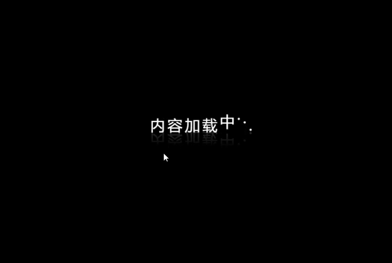
<div class="wavy">
<span style="--i:1">内</span>
<span style="--i:2">容</span>
<span style="--i:3">加</span>
<span style="--i:4">载</span>
<span style="--i:5">中</span>
<span style="--i:6">.</span>
<span style="--i:7">.</span>
<span style="--i:8">.</span>
</div>
</body>
</html>
style.css
*{
  margin: 0;
  padding: 0;
  font-family: "微软雅黑"
}

body{
  display: flex;
  align-items: center;
  justify-content: center;
  min-height: 100vh;
  background: #000;
}

.wavy{
  position: relative;
  -webkit-box-reflect: below -12px linear-gradient(transparent, rgba(0, 0, 0, 0.2))
}

.wavy span{
  position: relative;
  display: inline-block;
  color: #fff;
  font-size: 2em;
  animation: animate 1s ease-in-out infinite;
  animation-delay: calc(.1s*var(--i))
}

@keyframes animate{
  0%{
    transform: translateY(0px)
  }
  20%{
    transform: translateY(-24px)
  }
  40%, 100%{
    transform: translateY(0px)
  }
}
文章每周持续更新,可以微信搜索「 CSS特效世界 」第一时间阅读和催更(比博客早一到两篇哟)
