

1.画折线图
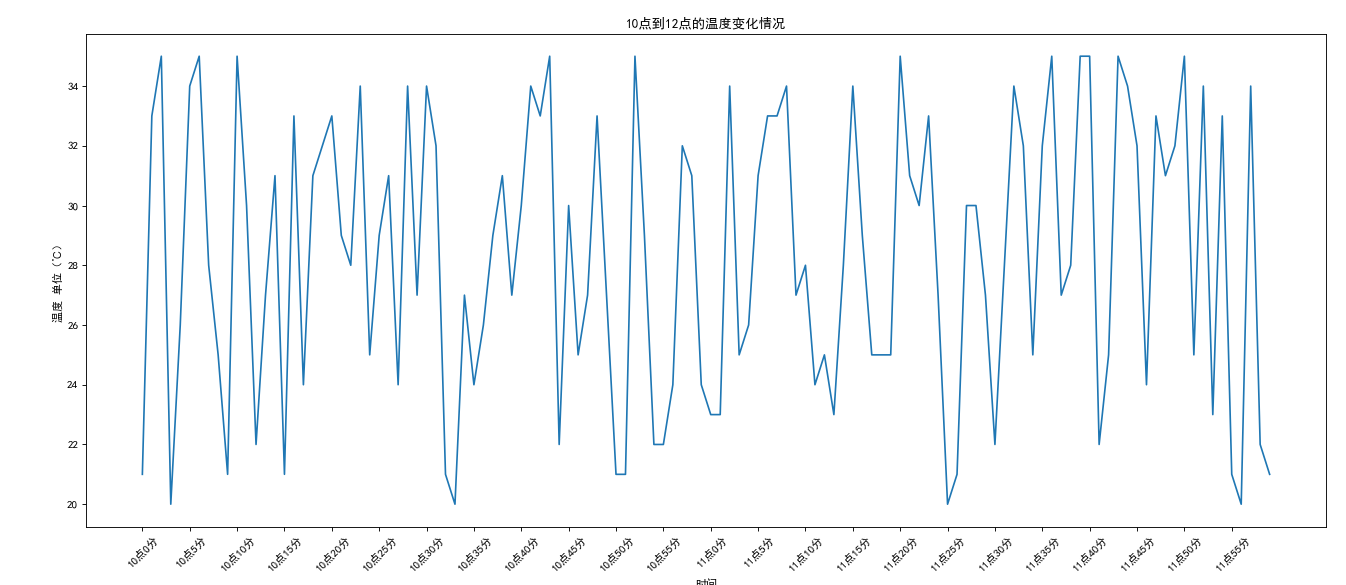
如果列表a表示10点到12点的每一分钟的气温,如何绘制折线图观察每分钟气温的变化情况?
a= [random.randint(20,35) for i in range(120)]
#from pylab import *#搞中文字体
import random
from matplotlib import pyplot as plt

#mpl.rcParams['font.sans-serif']=['SimHei']#搞中文字体
random.seed(10)
y = [random.randint(20,35) for i in range(120)]
x = range(0,120)
plt.figure(figsize=(20,8),dpi=80)
plt.plot(x,y)

_x_ticks = ["10点{}分".format(i) for i in x if i<60]
_x_ticks += ["11点{}分".format(i-60) for i in x if i>=60]#加一个列表

plt.xticks(x[::5],_x_ticks[::5],rotation=45)#数字和字符串一一对应,且长度相同
#rotation让字符串旋转

#添加描述信息
plt.xlabel("时间")
plt.ylabel("温度 单位(℃)")
plt.title("10点到12点的温度变化情况")
plt.show()

#配置中文字体的第二种方法,
# 路径:C:\Users\Administrator\AppData\Local\Programs\Python\Python37-32\lib\site-packages\matplotlib\mpl-data\matplotlibrc
#大概194行和206行,去掉font.family和font.sans-serif的注释,并再font.sans-serif后面加SimHei
2.画散点图
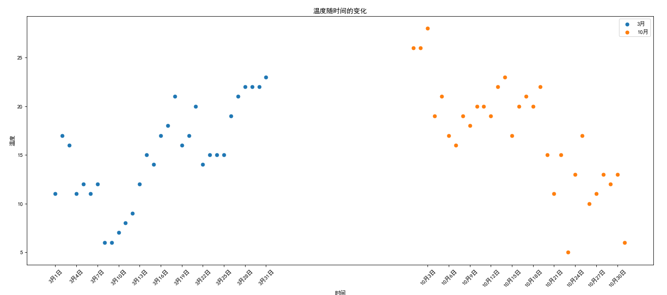
假设通过爬虫你获取到了北京2016年3,10月份每天白天的最高气温(分别位于列表a,b),那么此时如何寻找出气温和随时间(天)变化的某种规律?
a = [11,17,16,11,12,11,12,6,6,7,8,9,12,15,14,17,18,21,16,17,20,14,15,15,15,19,21,22,22,22,23]
b = [26,26,28,19,21,17,16,19,18,20,20,19,22,23,17,20,21,20,22,15,11,15,5,13,17,10,11,13,12,13,6]
from matplotlib import pyplot as plt
y_3 = [11,17,16,11,12,11,12,6,6,7,8,9,12,15,14,17,18,21,16,17,20,14,15,15,15,19,21,22,22,22,23]
y_10 = [26,26,28,19,21,17,16,19,18,20,20,19,22,23,17,20,21,20,22,15,11,15,5,13,17,10,11,13,12,13,6]
x_3 = range(1,32)
x_10 = range(52,83)

#设置图形大小
plt.figure(figsize=(20,8),dpi=80)

#绘制散点图
plt.scatter(x_3,y_3,label='3月')
plt.scatter(x_10,y_10,label='10月')


#调整x轴的刻度
_x = list(x_3)+list(x_10)
_xtick_lables = ['3月{}日'.format(i) for i in x_3]
_xtick_lables += ['10月{}日'.format(i-51) for i in x_10]
plt.xticks(_x[::3],_xtick_lables[::3],rotation=45)

plt.xlabel('时间')
plt.ylabel('温度')
plt.title('温度随时间的变化')

plt.legend()
plt.show()
3.画条形图
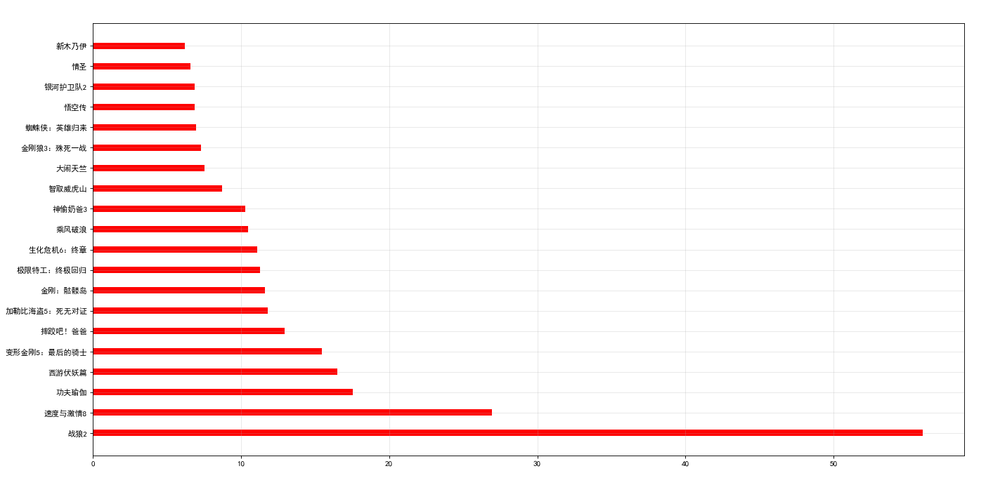
假设你获取到了2017年内地电影票房前20的电影(列表a)和电影票房数据(列表b),那么如何更加直观的展示该数据?
a = ["战狼2","速度与激情8","功夫瑜伽","西游伏妖篇","变形金刚5:最后的骑士","摔跤吧!爸爸","加勒比海盗5:死无对证","金刚:骷髅岛","极限特工:终极回归","生化危机6:终章","乘风破浪","神偷奶爸3","智取威虎山","大闹天竺","金刚狼3:殊死一战","蜘蛛侠:英雄归来","悟空传","银河护卫队2","情圣","新木乃伊",]
b=[56.01,26.94,17.53,16.49,15.45,12.96,11.8,11.61,11.28,11.12,10.49,10.3,8.75,7.55,7.32,6.99,6.88,6.86,6.58,6.23] 单位:亿
from matplotlib import pyplot as plt
plt.figure(figsize=(20,10),dpi = 80)
a = ["战狼2","速度与激情8","功夫瑜伽","西游伏妖篇","变形金刚5:最后的骑士","摔跤吧!爸爸","加勒比海盗5:死无对证","金刚:骷髅岛","极限特工:终极回归","生化危机6:终章","乘风破浪","神偷奶爸3","智取威虎山","大闹天竺","金刚狼3:殊死一战","蜘蛛侠:英雄归来","悟空传","银河护卫队2","情圣","新木乃伊"]
b=[56.01,26.94,17.53,16.49,15.45,12.96,11.8,11.61,11.28,11.12,10.49,10.3,8.75,7.55,7.32,6.99,6.88,6.86,6.58,6.23]
plt.barh(range(len(a)),b,height=0.3,color='red')
plt.grid(alpha=0.3)
plt.yticks(range(len(a)),a)
plt.show()
4.画直方图
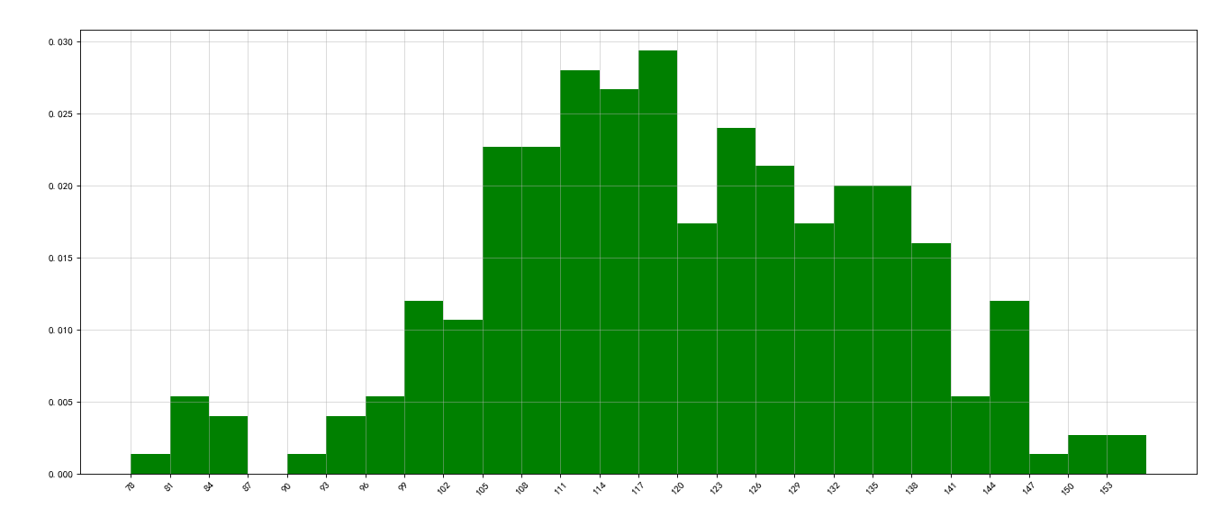
假设你获取了250部电影的时长(列表a中),希望统计出这些电影时长的分布状态(比如时长为100分钟到120分钟电影的数量,出现的频率)等信息,你应该如何呈现这些数据?
a=[131, 98, 125, 131, 124, 139, 131, 117, 128, 108, 135, 138, 131, 102, 107, 114, 119, 128, 121, 142, 127, 130, 124, 101, 110, 116, 117, 110, 128, 128, 115, 99, 136, 126, 134, 95, 138, 117, 111,78, 132, 124, 113, 150, 110, 117, 86, 95, 144, 105, 126, 130,126, 130, 126, 116, 123, 106, 112, 138, 123, 86, 101, 99, 136,123, 117, 119, 105, 137, 123, 128, 125, 104, 109, 134, 125, 127,105, 120, 107, 129, 116, 108, 132, 103, 136, 118, 102, 120, 114,105, 115, 132, 145, 119, 121, 112, 139, 125, 138, 109, 132, 134,156, 106, 117, 127, 144, 139, 139, 119, 140, 83, 110, 102,123,107, 143, 115, 136, 118, 139, 123, 112, 118, 125, 109, 119, 133,112, 114, 122, 109, 106, 123, 116, 131, 127, 115, 118, 112, 135,115, 146, 137, 116, 103, 144, 83, 123, 111, 110, 111, 100, 154,136, 100, 118, 119, 133, 134, 106, 129, 126, 110, 111, 109, 141,120, 117, 106, 149, 122, 122, 110, 118, 127, 121, 114, 125, 126,114, 140, 103, 130, 141, 117, 106, 114, 121, 114, 133, 137, 92,121, 112, 146, 97, 137, 105, 98, 117, 112, 81, 97, 139, 113,134, 106, 144, 110, 137, 137, 111, 104, 117, 100, 111, 101, 110,105, 129, 137, 112, 120, 113, 133, 112, 83, 94, 146, 133, 101,131, 116, 111, 84, 137, 115, 122, 106, 144, 109, 123, 116, 111,111, 133, 150]

from matplotlib import pyplot as plt
import math

a=[131,  98, 125, 131, 124, 139, 131, 117, 128, 108, 135, 138, 131, 102, 107, 114, 119, 128, 121, 142, 127, 130, 124, 101, 110, 116, 117, 110, 128, 128, 115,  99, 136, 126, 134,  95, 138, 117, 111,78, 132, 124, 113, 150, 110, 117,  86,  95, 144, 105, 126, 130,126, 130, 126, 116, 123, 106, 112, 138, 123,  86, 101,  99, 136,123, 117, 119, 105, 137, 123, 128, 125, 104, 109, 134, 125, 127,105, 120, 107, 129, 116, 108, 132, 103, 136, 118, 102, 120, 114,105, 115, 132, 145, 119, 121, 112, 139, 125, 138, 109, 132, 134,156, 106, 117, 127, 144, 139, 139, 119, 140,  83, 110, 102,123,107, 143, 115, 136, 118, 139, 123, 112, 118, 125, 109, 119, 133,112, 114, 122, 109, 106, 123, 116, 131, 127, 115, 118, 112, 135,115, 146, 137, 116, 103, 144,  83, 123, 111, 110, 111, 100, 154,136, 100, 118, 119, 133, 134, 106, 129, 126, 110, 111, 109, 141,120, 117, 106, 149, 122, 122, 110, 118, 127, 121, 114, 125, 126,114, 140, 103, 130, 141, 117, 106, 114, 121, 114, 133, 137,  92,121, 112, 146,  97, 137, 105,  98, 117, 112,  81,  97, 139, 113,134, 106, 144, 110, 137, 137, 111, 104, 117, 100, 111, 101, 110,105, 129, 137, 112, 120, 113, 133, 112,  83,  94, 146, 133, 101,131, 116, 111,  84, 137, 115, 122, 106, 144, 109, 123, 116, 111,111, 133, 150]

#设置组距
bin_width = 3
num_bins = int((max(a)-min(a))/bin_width)#分为几组
plt.figure(figsize=(20,8),dpi=80)
plt.hist(a,num_bins,density=1,color='green')#density是否绘制频率直方图,默认频数

plt.xticks(list(range(min(a),(min(a)+num_bins*bin_width)))[::bin_width],rotation=45)
plt.grid(alpha=0.5)
plt.show()
| 图表 | 语句 |
|---|---|
| 折线图 | plt.plot() |
| 散点图 | plt.bar() |
| 条形图 | plt.scatter() |
| 直方图 | plt.hist |
