

前言
前几天某个群友在群里问了一道面试题,就是关于一个自适应的正方形布局的困惑,先贴上代码。我其实很长一段时间没有写 CSS 了,对于里面的一些细节也比较模糊了,因此决定重拾 CSS,来重新捋一捋这题目中的一些知识点。(本文大多采用的讲解方式为 w3 的 CSS 标准 + MDN,如果对标准比较熟悉的大神请跳过这篇文章)
通过标准分析有什么好处?最权威的解答,能够少走弯路,不会出错。
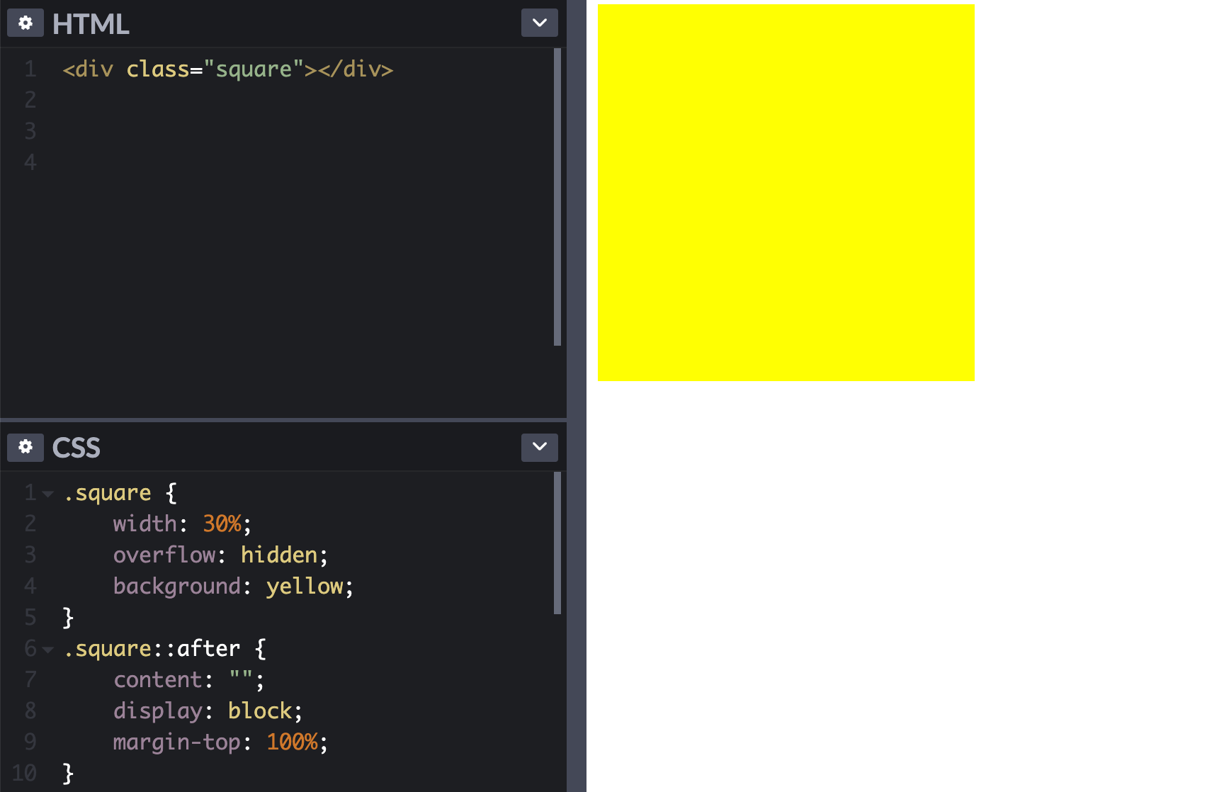
代码:
<style>
.square {
    width: 30%;
    overflow: hidden;
    background: yellow;
}
.square::after {
    content: "";
    display: block;
    margin-top: 100%;
}
</style>
<div class="square"></div>
上面的实现看似简单,但是我们去深究,大约会冒出以下三个问题。
-
::after伪元素有什么特殊的魔法吗? -
margin-top:100%为什么能够自适应宽度? -
overflow:hidden在这里是什么作用?
因此我们会按照上述疑问来逐一讲解。
本文所有 demo 都存放于 github.com/hua1995116/…
::after 伪元素有什么特殊的魔法吗?
::after
说到 ::after 那就需要说到伪元素,我们先来看看伪元素的定义吧。
伪元素(Pseudo elements)表示文档的抽象元素,超出了文档语言明确创建的那些元素。
再来看看 ::after 的特性:
When their computed content value is not none, these pseudo-elements generate boxes as if they were immediate children of their originating element, and can be styled exactly like any normal document-sourced element in the document tree.
根据描述来看,当伪元素 content 不为 none 的时候,我们可以把他们当做正常的元素一样来看待。
因此我们的示例转化为更加通俗易懂的样子。
<style>
.square1 {
  width: 30%;
  background: red;
  overflow: hidden;
}
.square1-after {
  margin-top:100%;
}
</style>
<div class="square1">
  <div class="square1-after"></div>
</div>
既然说到了伪元素,我们也顺便回顾一下伪类(Pseudo classes),他们的语法非常类似,却是水和水银的关系。
伪类
是添加到选择器的关键字,指定要选择的元素的特殊状态。
: 单冒号开头的为伪类,代表形态为 :hover。
/* 所有用户指针悬停的按钮 */
button:hover {
  color: blue;
}
伪元素
表示文档的抽象元素,超出了文档语言明确创建的那些元素。(因为它们并不局限于适应文档树,所以可以使用它们来选择和样式化文档中不一定映射到文档树结构的部分。)
:: 双冒号开头的为伪元素,代表形态为 ::after。
伪元素是应用于元素
/* 每一个 <p> 元素的第一行。 */
p::first-line {
  color: blue;
  text-transform: uppercase;
}
伪类和伪元素区别
通过上述,我们可能大致理解了但是对于一些看上去用途很相似的伪类和伪元素还是有点迷糊。
关键区别: 是否创建了一个超出文档树以外的元素。
我们乍一看 ::first-line 的效果不是和 :first-child 一样嘛?来举一个例子。
// pseudo-elements.html
<style>
        p::first-line {
            color: blue;
        }
</style>
<div>
    <p>
        This is a somewhat long HTML
        paragraph that will be broken into several
        lines.
    </p>
</div>
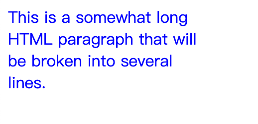
// pseudo-classes.html
<style>
        p:first-child {
            color: blue;
        }
</style>
<div>
    <p>
        This is a somewhat long HTML
        paragraph that will be broken into several
        lines.
    </p>
</div>

像我刚才所说乍一看,两种效果是一样的。但是他们真的一样么?当然不是!我们给他们加上宽度。
p {
	width: 200px;
}
::first-line的形态
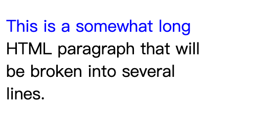
在真实的渲染中我们可以理解为
<p><p::first-line>This is a somewhat long</p::first-line> HTML paragraph that will be broken into several lines.</p>
但是我们在真实的 DOM Tree 是看不到的。这一点规范中也说明了,因为它们并不单单适用于文档树,所以使用它们来选择和样式化文档不一定映射到文档树。
Since they are not restricted to fitting into the document tree, they can be used to select and style portions of the document that do not necessarily map to the document’s tree structure.
:first-child的形态
小结
至此我们搞清楚了我们的第一个问题, ::after没有魔法,在本题可以将它当成正常的元素,并且我们搞清楚了伪元素和伪类的区别。
margin-top:100% 为什么能够自适应宽度?
现在我们已经将这个示例转化成一个比较简单的形态,没有过多的知识。
<style>
.square1 {
  width: 30%;
  background: red;
  overflow: hidden;
}
.square1-after {
  margin-top:100%;
}
</style>
<div class="square1">
  <div class="square1-after"></div>
</div>
然后我们来看看这个margin-top: 100%,看上去他相对于了父元素的 width 值来进行计算的。那么我们来看看 margin-top 到底是怎么计算的。
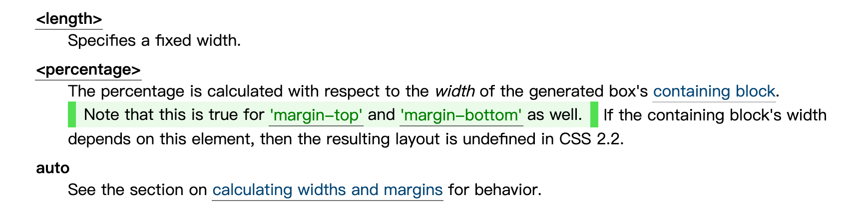
可以看到 margin-top 主要有三种形态。第一种是固定值,第二种为百分比,第三种为 auto,这里我们主要来看下 百分比的计算。
通过上述的描述,可以知道margin-top margin-bottom margin-left margin-right 百分比的长度是由当前元素的包含块的宽度来决定的。
包含块(Containing blocks)
那么什么是包含块(Containing blocks)呢?
The position and size of an element's box(es) are sometimes calculated relative to a certain rectangle, called the containing block of the element.
元素盒子的位置和大小有时是相对于某个矩形计算的,称为元素的包含块。
上述的描述有点拗口,我们大致只需要知道它就是一个矩形的块。下面重要的来了,包含块是怎么确定的?(developer.mozilla.org/zh-CN/docs/…
确定一个元素的包含块的过程完全依赖于这个元素的 position 属性:
- 如果 position 属性为
static、relative或sticky,包含块可能由它的最近的祖先块元素(比如说inline-block, block 或 list-item元素)的内容区的边缘组成,也可能会建立格式化上下文(比如说 a table container, flex container, grid container, 或者是 the block container 自身)。 - 如果 position 属性为
absolute,包含块就是由它的最近的 position 的值不是static(也就是值为fixed,absolute,relative或sticky)的祖先元素的内边距区的边缘组成。 - 如果 position 属性是
fixed,在连续媒体的情况下(continuous media)包含块是 viewport ,在分页媒体(paged media)下的情况下包含块是分页区域(page area)。 - 如果 position 属性是absolute 或fixed,包含块也可能是由满足以下条件的最近父级元素的内边距区的边缘组成的:
- A
transformorperspectivevalue other thannone - A
will-changevalue oftransformorperspective - A
filtervalue other thannoneor awill-changevalue offilter(only works on Firefox). - A
containvalue ofpaint(例如:contain: paint;)
- A
注意,以下所有例子的视口宽度都为 594px
Case1
第一种情况,就是我们的例子的情况,当前元素的 position 没有填写,默认为 static 。因此满足第一种情况,取它最近的祖先元素,也就是包含块为 container.
<style>
.container {
  width: 30%;
}
.inner {
  margin-top:100%;
}
</style>
<div class="container">
  <div class="inner"></div>
</div>
因此inner的 margin-top = 父元素container = 窗口宽度(594px) * 30% = 178.188px。
Case2
当前元素为 position:absolute, 因此获取的最近的一个 position 非 static 的元素
<style>
.outer {
    width: 500px;
  	position: relative;
}
.container {
    width: 30%;
}
.inner {
    position: absolute;
    margin-top: 100%;
}
</style>
<div class="outer">
  <div class="container">
    <div class="inner"></div>
  </div>
</div>
这个时候inner 的 margin-top = outer 的宽度(500px)* 100% = 500px。
Case3
当前元素为 position:fixed ,此时的包含块为视口。
<style>
.outer {
    width: 500px;
  	position: relative;
}
.container {
    width: 30%;
}
.inner {
    position: absolute;
    margin-top: 100%;
}
</style>
<div class="outer">
  <div class="container">
    <div class="inner"></div>
  </div>
</div>
因此这个时候 margin-top = viewport 的宽度(594px)* 100% = 594px。此时是无关父元素,以及无关外层position 的设置的。
Case4
在 case2 和 case 3 的基础上,会有一些特例影响包含块的寻找。主要就以下4种情况
- A
transformorperspectivevalue other thannone - A
will-changevalue oftransformorperspective - A
filtervalue other thannoneor awill-changevalue offilter(only works on Firefox). - A
containvalue ofpaint(例如:contain: paint;)
我举一个 transform 例子来讲解。
<style>
.outer {
    width: 500px;
  	position: relative;
}
.container {
    width: 30%;
  	transform: translate(0, 0);
}
.inner {
    position: fixed;
    margin-top: 100%;
}
</style>
<div class="outer">
  <div class="container">
    <div class="inner"></div>
  </div>
</div>
这个时候我们的计算又发生了变化,此时包含块又变成了 container .
margin-top = 父元素container = 窗口宽度(594px) * 30% = 178.188px。
小结
所以对于我们一开始的问题,就是我们的 Case1,采取的就是最近的父元素。所以 margin-top 就是 父元素 square1 的宽度,因此实现了一个自适应的正方形。
对于 position 的不同形态,对于布局状态的影响,一般在我们入门 css 的时候就学了,但是可能没有那么仔细去了解每种情况,也可能不知道他的名词,叫做包含块,这次我们对它进行了梳理,这一节就这样结束,继续看!
overflow:hidden 在这里是什么作用?
假如我们把 overflow:hidden 去了。
<style>
.square1 {
  width: 30%;
  background: red;
}
.square1-after {
  margin-top:100%;
}
</style>
<div class="square1">
  <div class="square1-after"></div>
</div>
我们可以看到以上执行完显示出现的画面为一篇空白。此时我们就要引出了我们的最后一个概念就是,边距坍塌(Collapsing margins) .
边距塌陷(Collapsing margins)
在CSS中,两个或多个框(可能是也可能不是兄弟)的相邻边距可以合并形成一个边距,称为边距塌陷。
不会发生边距坍塌的情况
-
根节点元素
-
水平边距(
Horizontal margins)不会崩溃 -
如果具有间隙的元素的顶部和底部相邻,他会与后续同级的元素边距一起坍塌,但是不会与父元素底部的一起坍塌(If the top and bottom margins of an element with clearance are adjoining, its margins collapse with the adjoining margins of following siblings but that resulting margin does not collapse with the bottom margin of the parent block.)
-
父子元素,父元素有非0的
min-height且有auto的height,父子元素都含有margin-bottom,此时margin-bottom不会发生边距坍塌。 -
在不同BFC(块级格式上下文)
对于以上,可能对于情况3和情况4会比较疑惑,所以举例子如下。
case3
<style>
.case {
            width: 200px;
            background-color: yellow;
        }

        .container {
            background-color: lightblue;
            margin-bottom: 70px;
            padding-top: 0.01px;
        }

        .preface {
            float: left;
            height: 58px;
            width: 100px;
            border: 1px solid red;
        }

        .one .intro {
            clear: left;
            margin-top: 60px;
        }

        .two .intro {
            clear: left;
            margin-top: 59px;
            margin-bottom: 20px;
        }
</style>
<div class="case one">
        <div class="container">
            <div class="preface">
                lorem ipsum
            </div>
            <div class="intro"></div>
        </div>
        after
    </div>
    <hr>
    <div class="case two">
        <div class="container">
            <div class="preface">
                lorem ipsum
            </div>
            <div class="intro"></div>
        </div>
        after
    </div>
在 Firefox 和 IE 下的效果(谷歌失效,原因可能和谷歌浏览器实现有关,暂未深追。)
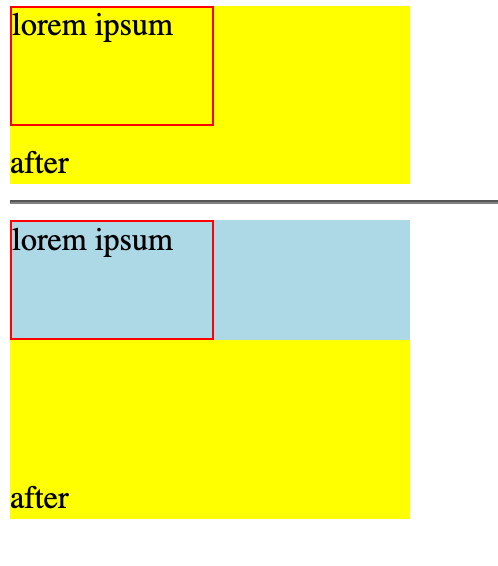
可以看到如果在在没有 clearance 的情况下,父元素底部是会随着子元素一起坍塌的,但是如果中间有 clearance 的情况下,父元素的底部则不会坍塌。
case4
<style>
  .case2 {
    min-height: 200px;
    height: auto;
    background: red;
    margin-bottom: 20px;
  }

  .case2-inner {
    margin-bottom: 50px;
  }
</style>
<div class="case2">
  <div class="case2-inner"></div>
</div>
<div>为了看间距效果</div>
效果:
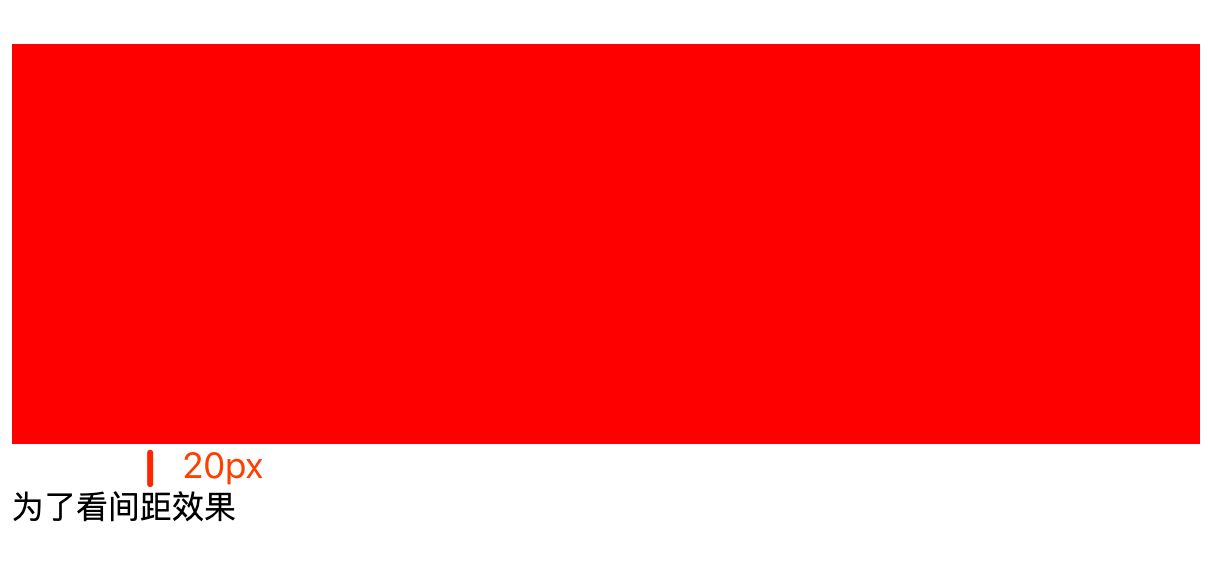
可以看到这种情况下,父子元素下边距并不会发生边距坍塌。
会发生边距坍塌
发生边距坍塌需要满足2个前提
1.是 block 盒子模型,在同一个 BFC。
2.两个元素之间没有行内元素,没有 clearance ,没有 padding,没有border。
然后以下几种情况会发生边距坍塌。
- 盒子的上边距和第一个流入子元素的上边距
- 盒子的下边距和同级后一个流入元素的上边距
- 如果父元素高度为“auto”,最后一个流入子元素的底部距和其父元素的底部距
- 某个元素没有建立新的 BFC,并且 min-height 和 height 都为 0,同时含有 margin-top 和 margin-bottom.
- 如果'min-height'属性为零,并且框没有顶部或底部边框,也没有顶部或底部填充,并且框的'height'为0或'auto',并且框不包含边距,则框自身的边距会折叠 行框,其所有流入子页边距(如果有的话)都会崩溃。
补充: 如果'min-height'属性为零,并且框没有顶部或底部border,也没有顶部或底部padding,并且元素的'height'为0或'auto',并且没有行内元素,则元素自身的所有边距坍塌,包括其所有流入子元素的边距(如果有的话)都会坍塌。
这里有几个问题要解释一下 1.什么是流入子元素,2. 是什么 clearance
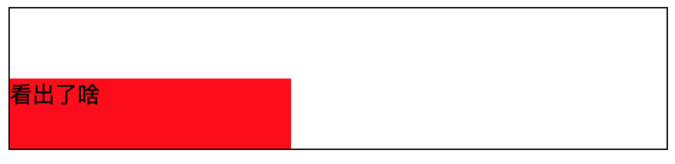
1.流入元素
流入元素需要用的反向来进行介绍,有流入元素,就有流出元素,以下情况为流出元素。
- floated items。浮动的元素
- items with
position: absolute(includingposition: fixedwhich acts in the same way)。通过设置position属性为absolute或者fixed的元素 - the root element (
html)根元素
除了以上情况的元素,叫做流入元素。
<style>
body {
border: 1px solid #000;
}

.case2 {
width: 200px;
height: 50px;
background: red;
}

.case2-inner {
margin-top: 50px;
height: 0;
}

.float {
float: left;
}
</style>
<div class="case2">
<div class="float"></div>
<div class="case2-inner">看出了啥</div>
</div>
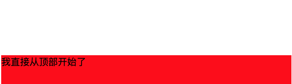
2.clearance
当某个元素有clear 非 none 值 并且盒子实际向下移动时,它叫做 clearance。
case1
<style>
.case1 {
            height: 50px;
            background: red;
            margin-top: 100px;
        }

        .case1-inner {
            margin-top: 50px;
        }
</style>
<div class="case1">
        <div class="case1-inner">我直接从顶部开始了</div>
    </div>
case2
<style>
.case2 {
height: 150px;
background: red;
}
.case2-inner1 {
margin-bottom: 50px;
}
.case2-inner2 {
margin-top: 20px;
}
</style>
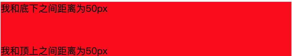
<div class="case2">
<div class="case2-inner1">我和底下之间距离为50px</div>
<div class="case2-inner2">我和顶上之间距离为50px</div>
</div>
case3
<style>
.case3 {
height: auto;
background: red;
margin-bottom: 10px;
}
.case3-inner {
margin-bottom: 50px;
}
</style>
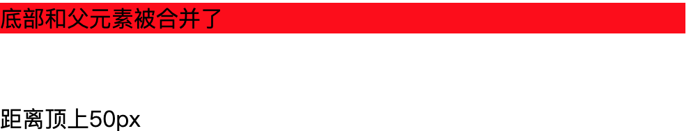
<div class="case3">
<div class="case3-inner">底部和父元素被合并了</div>
</div>
<div>距离顶上50px</div>
case4
<style>
.case4 {
height: 200px;
background: red;
}
.case4-inner {
margin-top: 20px;
margin-bottom: 30px;
}
</style>
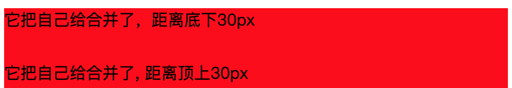
<div class="case4">
<p>它把自己给合并了,距离底下30px</p>
<div class="case4-inner"><span style="clear: both;"></span></div>
<p>它把自己给合并了, 距离顶上30px</p>
</div>
边距塌陷如何解决
通用型
1.改变盒子模型(非 block 模型)
2.创建新的 BFC
限制型
查看刚才不会发生高度坍塌的情况
边距塌陷如何计算
1.当两个或更多边距坍塌时,当边距全为正数的时候,结果页边距宽度是边距塌陷宽度的最大值。
2.当边距全为负数的时候,取最小值。
3.在存在负边距的情况下,从正边距的最大值中减去负边距的绝对值的最大值。 (-13px 8px 100px叠在一起,则边距塌陷的值为 100px - 13px = 87px)
如果转为算法就是以下代码
// AllList 所有坍塌边距
function computed(AllList) {
  const PositiveList = AllList.filter((item) => item >= 0);
  const NegativeList = AllList.filter((item) => item <= 0);
  const AllPositive = AllList.every((item) => item >= 0);
  const AllNegative = AllList.every((item) => item <= 0);
  if (AllNegative) {
    return Math.min(...AllList);
  } else if (AllPositive) {
    return Math.max(...AllList);
  } else {
    const maxPositive = Math.max(...PositiveList);
    const minNegative = Math.min(...NegativeList);
    return maxPositive + minNegative;
  }
}
小结
通过上面对边距坍塌的理解,我们可以很快得出,我们的自适应正方形中的例子,子元素的 margin-top 和 父元素的 margin-top 发生了坍塌,因此可以新建一个 BFC 来消除这个问题。而 overflow:hidden 就是会形成一个 新的 BFC 。BFC详见 developer.mozilla.org/zh-CN/docs/…
总结
通过上面的解析,我们终于把这一道小小的面试题,进行了全方位的剖析。每一个问题都对应着一个知识块。
-
::after伪元素有什么特殊的魔法吗? -> 伪元素(Pseudo elements) -
margin-top:100%为什么能够自适应宽度? -> 包含块 (Containing blocks) -
overflow:hidden在这里是什么作用? -> 边距塌陷(Collapsing margins)
想不到小小的面试题,居然可以牵扯出这么多的知识,所以我们在面对一些面试题的时候,例如实现一个自适应的正方形布局,别单单看有几种方式能够实现,解决方法永远会随着时间的推进,变得越来越多,那我们能做的就是以不变应万变(当然规范也是相对的,也可能会变,只是概率低)去理解剖析这些方法背后的用到的知识。
相信如果你把以上搞懂了,面试官对你深层次的灵魂追问,你也能对答如流了。注意本文的一些专有名词,我都用英文多次标注,这也许未来会对你有所帮助。
稳住,我们能赢!嘻嘻嘻,最后,如果你对题目的理解一时间比较迷茫,欢迎加群提问,本文也是基于群友的问题,展开了一系列的讲解。
参考链接
stackoverflow.com/questions/2…
stackoverflow.com/questions/2…
developer.mozilla.org/zh-CN/docs/…
关注
欢迎关注公众号 「秋风的笔记」,主要记录日常中觉得有意思的工具以及分享开发实践,保持深度和专注度。

也可以扫码加我微信好友,进交流群。

