

有这样一个问题。
请说说你知道的所有web布局方式?
一般来说,有以下这些布局方法:
- 浮动
float:left|right - inline-block
display:inline-block - flexible box
display:flex - grid
display:grid - 绝对、相对定位
position:absolute|relative - 表格
<table>或display:table - 使用框架布局
bootstrap、Pure.css等

有小伙伴就要说,这也太多了吧,我应该怎么选择?
别急,下面我们就开始逐一分析各种方法在web自适应布局下的使用姿势,最后做个总结。
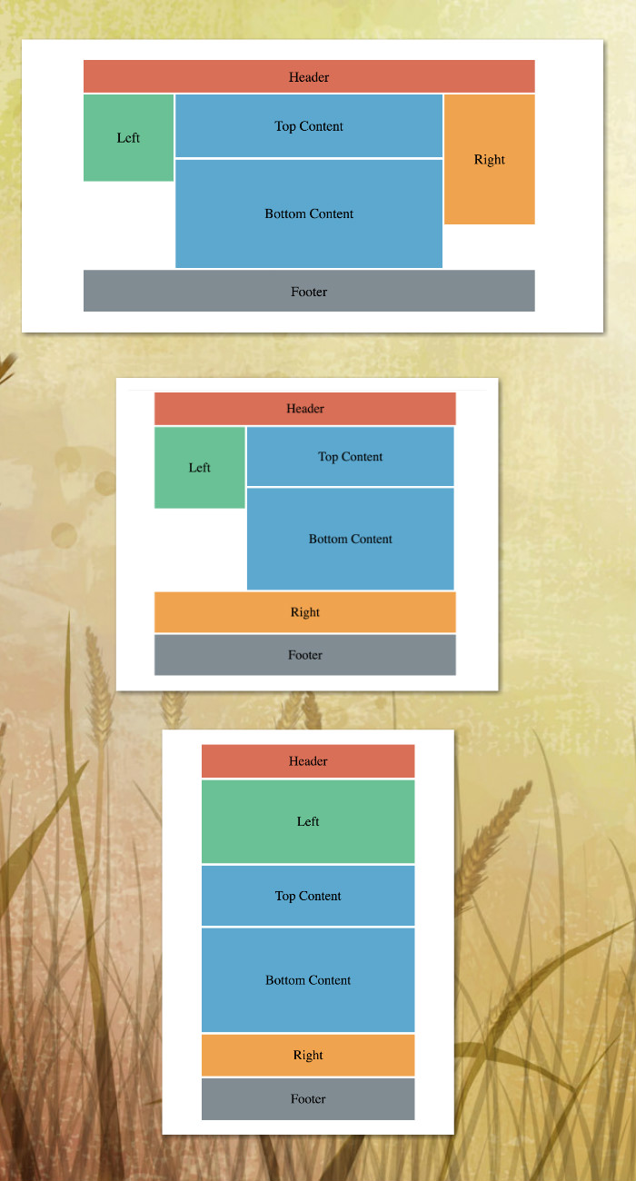
本文的所有例子使用了同一种三栏布局。源代码点我
- 大尺寸 width > 1024px
- 中尺寸 768px < width < 1024px
- 小尺寸 width < 768px
1. 浮动布局 float:left|right
最常用的布局方式之一,设置了float的元素脱离了文档流。需要注意在使用过浮动后,需要清除浮动,从而避免影响后面的非浮动元素。
HTML
<div class="rwd-header">Header</div>
<div class="rwd-content">
  <div class="rwd-content-left">Left</div>
  <div class="rwd-content-body">
    <div class="rwd-content-bodyTop">Top Content</div>
    <div class="rwd-content-bodyBottom">Bottom Content</div>
  </div>
  <div class="rwd-content-right">Right</div>
</div>
<div class="rwd-footer">Footer</div>
普通的html布局,一个header,一个footer,中间是三栏式布局。
关键css
.rwd-content-left,
.rwd-content-body,
.rwd-content-right {
  float: left;
}
给中间的三栏都设上浮动。
.rwd-content::after {
  content: "";
  clear: both;
  display: block;
}
清除浮动
.rwd-content-left {
  width: 20%;
  height: 200px;
}

.rwd-content-body {
  width: 60%;
}

.rwd-content-right {
  height: 300px;
  width: 20%;
}
元素的宽度都是百分比。因为没有内容高度给死了,日常应用时多用auto,让里面的内容撑开高度。
@media查询
当@media的查询条件满足时,应用{}中的样式。
screen就是指电脑屏幕,还有print指打印页面。 MDN @media
@media做的事完全可以用javascript代替,用js添加一个class或者直接用js修改css属性。优点是浏览器全兼容,缺点就是用了js。
@media only screen and (max-width: 1024px) {
  .rwd-content-left {
    width: 30%;
  }
  .rwd-content-body {
    width: 70%;
  }
  .rwd-content-right {
    width: 100%;
  }
}

@media only screen and (max-width: 768px) {
  [class*="rwd-content-"] {
    width: 100%;
  }
}
中尺寸屏幕要把right挤下去,只要让left和content加起来等于100%,后面的东西就自动换行了。
小尺寸用了css选择器,把所有rwd-content-开头的class宽度都设成100%。
2. inline-block display:inline-block
HTML
<div class="rwd-header">Header</div>
<div class="rwd-content"
  ><div class="rwd-content-left">Left</div
    ><div class="rwd-content-body"
    ><div class="rwd-content-bodyTop">Top Content</div
    ><div class="rwd-content-bodyBottom">Bottom Content</div
  ></div
  ><div class="rwd-content-right">Right</div>
</div>
<div class="rwd-footer">Footer</div>
html和浮动布局的一样,为了避免空白字符压缩(white space collapse)的问题,写法略有变化。
关键css
.rwd-content-left,
.rwd-content-body,
.rwd-content-right {
  display: inline-block;
  vertical-align: top;
}
对我们这个布局,只是把float:left改成这两句。
自适应的代码也和float一样,不重复贴了。
Float vs. Inline-block
两者都是很常用的布局方式。
-
如果需要垂直居中,使用inline-block。
-
inline-block有空白字符压缩的问题。
-
使用float,注意要清除浮动。
-
没有特别推荐用哪种,看个人习惯。
如何调整float或inline-block布局中元素的顺序?
比如我在小尺寸的时候,想把content放最上面,left和right都挤下去,怎么做呢?
float和inline-block布局没有纯css的方法,要用js把dom扣出来,往后面放,flexbox和grid布局都可以很好地解决这个问题。
3. flexible box display:flex
HTML
<div class="rwd-header">Header</div>
<div class="rwd-content">
  <div class="rwd-content-left">Left</div>
  <div class="rwd-content-body">
    <div class="rwd-content-bodyTop">Top Content</div>
    <div class="rwd-content-bodyBottom">Bottom Content</div>
  </div>
  <div class="rwd-content-right">Right</div>
</div>
<div class="rwd-footer">Footer</div>
html还是一样。
看css前先说说flex基础。
* flexbox两分钟不完全指北
flexbox布局说白了就是点菜。先想好要吃什么,然后点必选菜,最后点可选菜,爱点不点。
先想要吃什么,还是用之前的例子。header和footer不用管,需要布局一个这样的东西:

然后点必选菜,有下面几个必选菜要点:
1). flex-direction, 选水平方向从左到右,选flex-direction: row
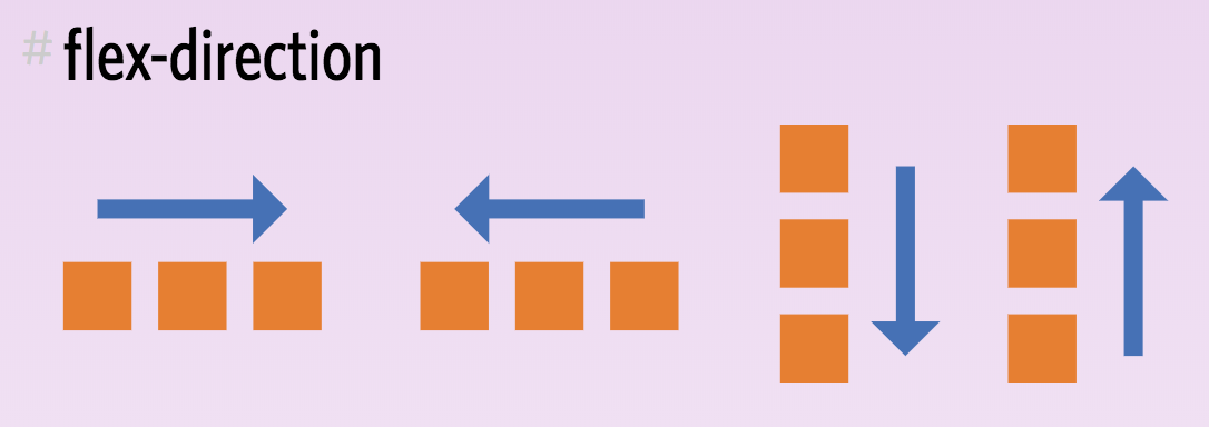
.container {
  flex-direction: row | row-reverse | column | column-reverse;
}
2). flex-wrap,我们是单行布局,不要换行,选flex-wrap: nowrap
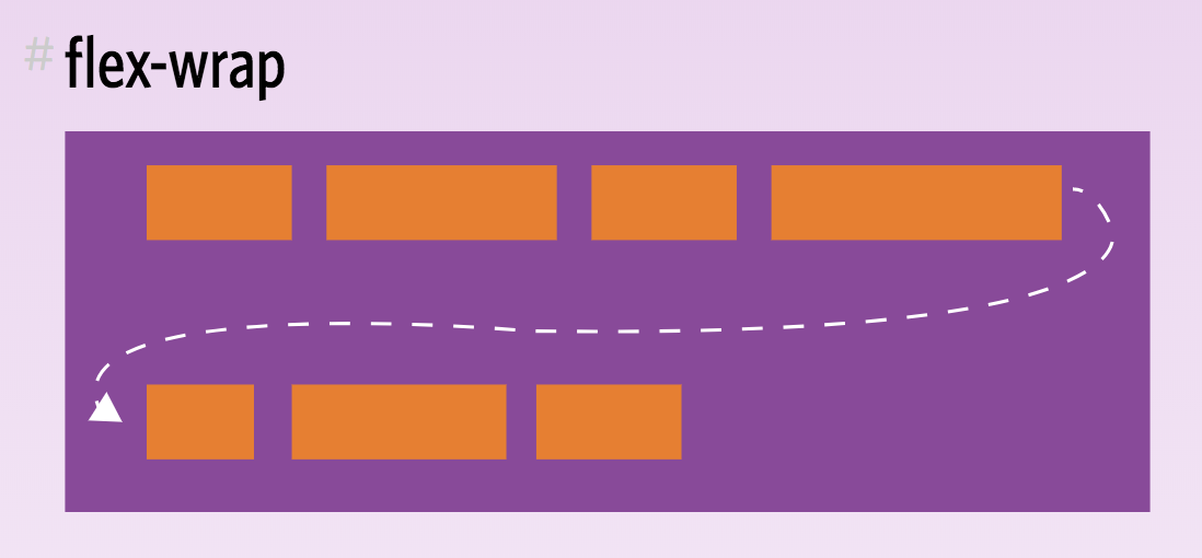
.container{
  flex-wrap: nowrap | wrap | wrap-reverse;
}
3). justify-content,如果水平方向有空间,怎么分配,选space-between
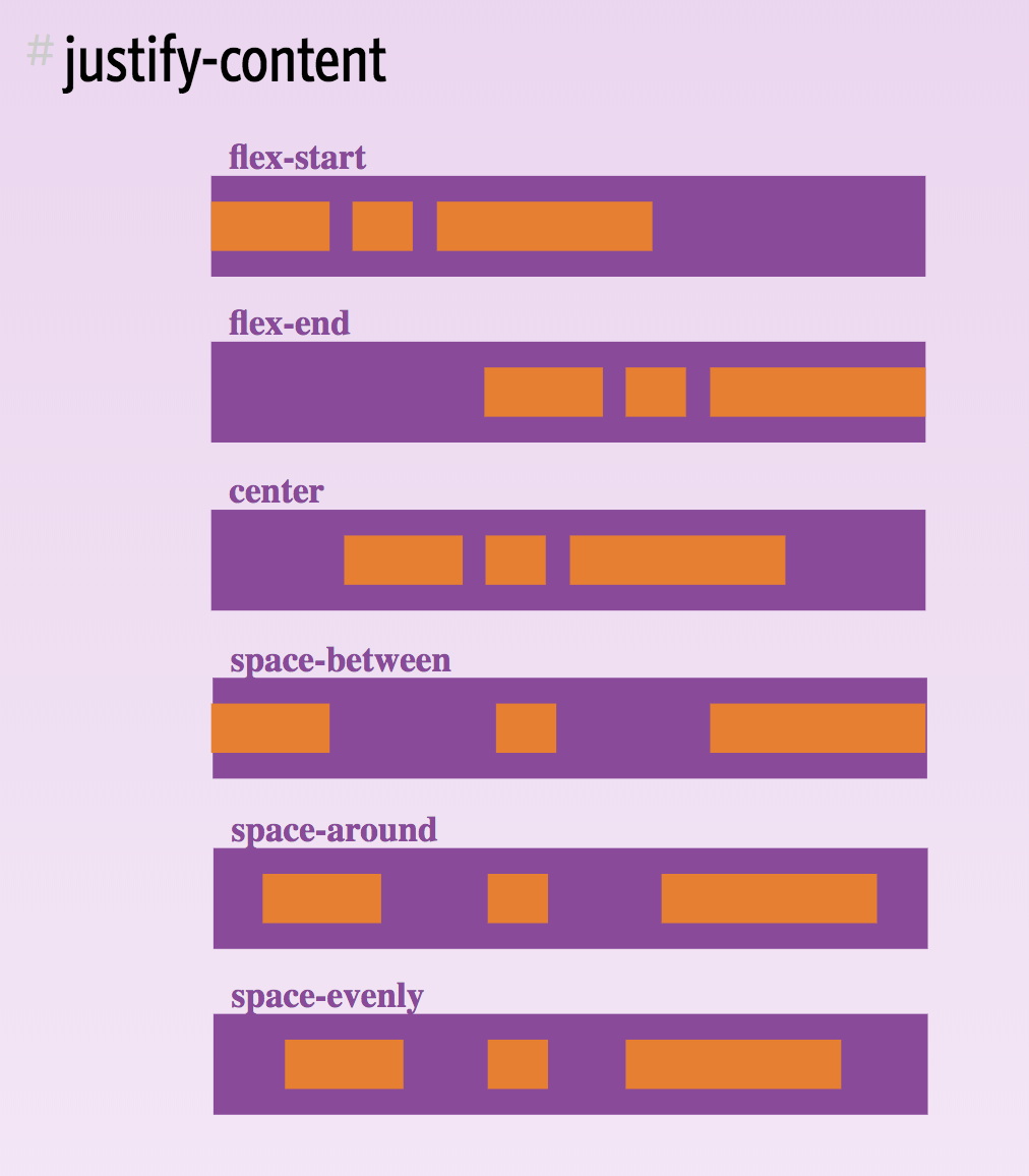
.container {
  justify-content: flex-start | flex-end | center | space-between | space-around | space-evenly;
}
4). 垂直方向怎么布局,选align-items: flex-start
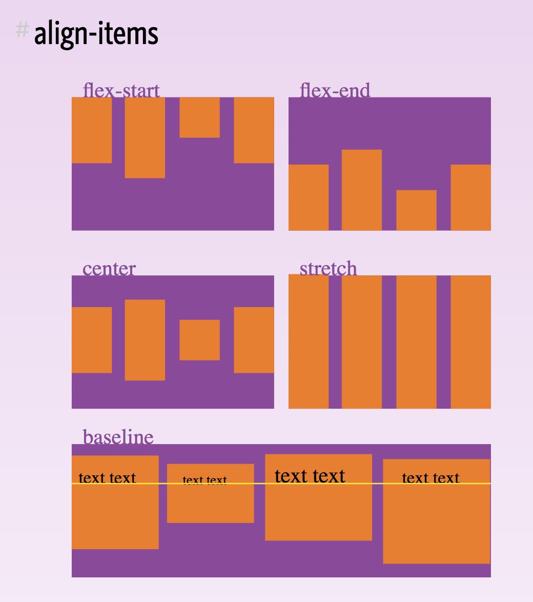
.container {
  align-items: flex-start | flex-end | center | baseline | stretch;
}
5). align-content,多行布局怎么分配空间,我们是单行布局,不存在的
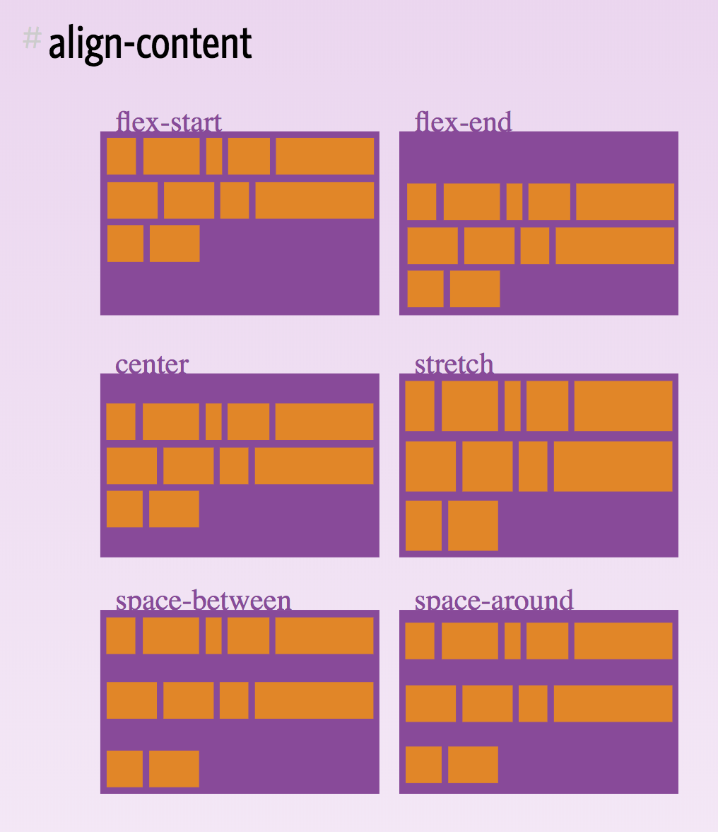
.container {
  align-content: flex-start | flex-end | center | space-between | space-around | stretch;
}
选好这5个之后,再加上display: flex;,往flex容器上一写,就完事了。
可以偷懒的地方: 上面5种属性,第一个值是默认值,如果选了第一个,这个属性可以不用写。
最后的可选菜比较常用的是可以调整flex子项(flex item)的顺序(order),单独改变某个子项的布局等。
详细教程点这里: flexbox中文教程[1] A Guide to Flexbox[2]
关键css
.rwd-content {
  display: flex;
  justify-content: space-between;
  align-items: flex-start;
}
flex容器(container)属性如前文所说。
@media only screen and (max-width: 1024px) {
  .rwd-content {
    flex-wrap: wrap;
  }
  .rwd-content-left {
    width: 30%;
  }
  .rwd-content-body {
    width: 70%;
  }
  .rwd-content-right {
    width: 100%;
  }
}

@media only screen and (max-width: 768px) {
  [class*="rwd-content-"] {
    width: 100%;
  }
}
自适应布局时,设flex-wrap: wrap;,其他一样。
Flexbox vs. Float/Inline-block
- 如果浏览器没问题,flexbox可以替代(或者替代大多数)float和inline-block。
- 相比float,flexbox解决了垂直居中的问题。
- 相比float/inline-block,flexbox多了垂直布局的方式,可以使容器中的内容等高,还可以改变内容的顺序。
- flexbox就像名字一样,非常灵活,同一种布局都可以用多种方式实现。
- flexbox的缺点是需要记的属性比较多,小部分浏览器支持不好。
4. grid布局 display:grid
HTML
<div class="rwd-grid">
  <div class="rwd-header">Header</div>
  <div class="rwd-content-left">Left</div>
  <div class="rwd-content-bodyTop">Top Content</div>
  <div class="rwd-content-bodyBottom">Bottom Content</div>
  <div class="rwd-content-right">Right</div>
  <div class="rwd-footer">Footer</div>
</div>
grid的特点就是为所欲为,dom的顺序无所谓,只要放在grid容器下就可以。
看css之前还是先说说grid基础。
* grid两分钟+两分钟不完全指北
2个两分钟因为一般grid有两种使用方式:
1). 网格项(grid item)起个名字,在网格容器(grid container)上定义好网格布局并且通过名字指定好所有网格项的位置。
2). 网格容器只定义布局,每个网格项在使用的时候,自行选择放到哪个(或哪几个)网格中。
不管哪种方式,只要会划线,你就掌握了grid布局。把想要的布局画出来,然后用线分割开。
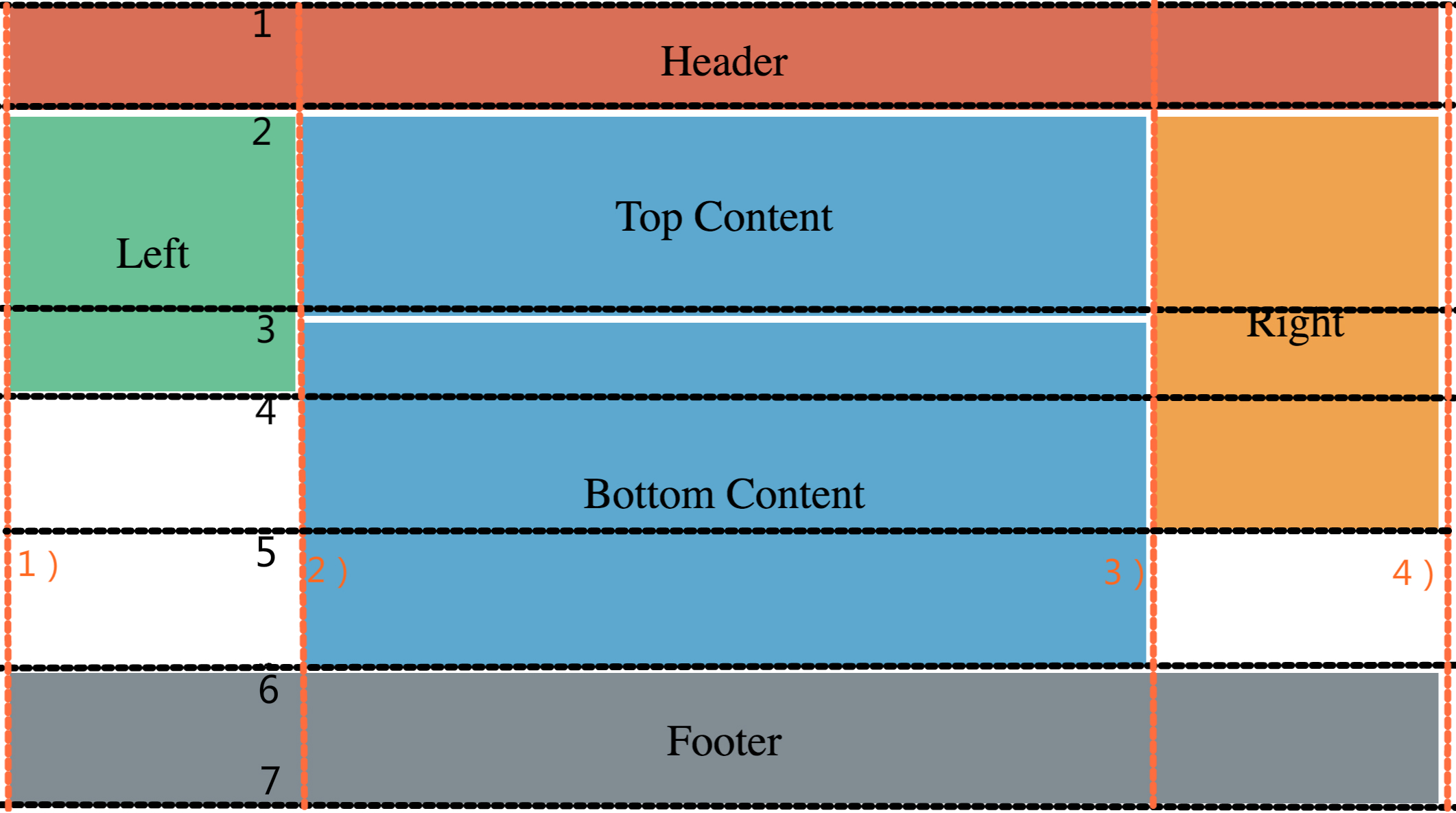
横向1 ~ 7的黑线和纵向1) ~ 4)的红线都叫网格线。
网格线包围的一个或多块矩形区域叫网格区块。
第一种grid布局方式:
.rwd-grid {
  display: grid;
  grid-gap: 5px;
  width: 100%;
  grid-template-areas: "header header header"
                        "left   top    right"
                        "left   bottom right"
                        ".      bottom right"
                        ".      bottom ."
                        "footer footer footer";
  grid-template-rows: 80px 150px 50px 100px 100px 100px;
  grid-template-columns: 20% 60% 20%;
}

.rwd-header {
  grid-area: header;
}
.rwd-content-left {
  grid-area: left;
}
.rwd-content-bodyTop {
  grid-area: top;
}
.rwd-content-bodyBottom {
  grid-area: bottom;
}
.rwd-content-right {
  grid-area: right;
}
.rwd-footer {
  grid-area: footer;
}
网格项(grid item)用grid-area属性起个名字。
网格容器(grid container)上三个主要属性要设置:
grid-template-areas: 就是一张地图,和我们划线分割的图布局一样,.表示空白。
grid-template-rows: 设置行上的高度,不设置的话为auto。除了固定数字,百分比还有fr。
grid-template-rows: repeat(3, 1fr)就是三等分的意思。
grid-template-columns: 设置列的宽度。
自适应布局就是重画地图。
@media only screen and (max-width: 1024px) {
  .rwd-grid {
    grid-template-areas: "header header"
                          "left   top"
                          "left   bottom"
                          ".      bottom"
                          "right  right"
                          "footer footer";
    grid-template-rows: 80px 150px 50px 200px 100px 100px;
    grid-template-columns: 30% 70%;
  }
}

@media only screen and (max-width: 768px) {
  .rwd-grid {
    grid-template-areas: "header"
                          "left"
                          "top"
                          "bottom"
                          "right"
                          "footer";
    grid-template-rows: 80px 200px 150px 250px 100px 100px;
    grid-template-columns: 100%;
  }
}
第二种grid布局方式:
.rwd-grid {
  display: grid;
  grid-gap: 5px;
  margin: 5px 0;
  width: 100%;
  grid-template-rows: 80px 150px 50px repeat(3, 100px);
  grid-template-columns: 20% 60% 20%;
}
网格容器上只要设置grid-template-rows和grid-template-columns。网格项在用的时候,自行设置需要放的地方。有很多种设置方式。
.rwd-header {
  grid-column-start: 1;
  grid-column-end: 4;
  grid-row-start: 1;
  grid-row-end: 2;
}
四个属性,分别是行、列的开始和结束。这边的序号指的是网格线,参照之前图中横向的黑色网格线和纵向的红色网格线。
参照图,应该好理解。
相当于:
.rwd-header {
  grid-column: 1 / 4;
  grid-row: 1 / 2;
}
简写成两个属性,<开始> / <结束>。
相当于:
.rwd-header {
  grid-column: 1 / span 3;
  grid-row: 1;
}
span 3指的是经过了3个网格;如果网格项只跨越了1格,可以省略设置结束位置的网格线。
相当于:
.rwd-header {
  grid-area: 1 / 1 / 2 / 4;
}
网格线上左下右的顺序,不同于margin和padding的上右下左。
当然你可以别管这么多乱七八糟的,看我自适应布局:
@media only screen and (max-width: 1024px) {
  .rwd-grid {
    grid-template-rows: 80px 150px 50px 200px 100px 100px;
    grid-template-columns: 30% 70%;
  }

  .rwd-header {
    grid-area: 1 / 1 / 2 / 3;
  }
  .rwd-content-left {
    grid-area: 2 / 1 / 4 / 2;
  }
  .rwd-content-bodyTop {
    grid-area: 2 / 2 / 3 / 3;
  }
  .rwd-content-bodyBottom {
    grid-area: 3 / 2 / 5 / 3;
  }
  .rwd-content-right {
    grid-area: 5 / 1 / 6 / 3;
  }
  .rwd-footer {
    grid-area: 6 / 1 / 7 / 3;
  }
}
详细教程点这里: 网格中基于线的定位[3] 和这里 网格模板区域[4]
Grid vs. Flexbox
- flexbox是单方向的,横向或者纵向,grid是二维的。
- grid就是可以为所欲为,甚至和html的顺序没有关系,只要扔到grid容器里就可以。
- grid能做到flexbox做不到的事,反之亦然。如果浏览器支持,最好结合两者使用。
- grid适合布局大的骨架,flexbox适合布局局部。
- grid的最大缺点是浏览器支持不是很好。
- grid另一个缺点是,如果要往现有的布局里加一点或者删一点东西,基本就是重画了,其实也不算缺点,因为重画很快。
- grid不适合复杂的布局,因为网格线太多我头晕。
- grid小技巧,用chrome和firefox的调试工具查看grid容器可以看到网格,光看代码要疯。
5. 绝对、相对定位 position:absolute|relative
相当常用,特别是各种特效里都会用到。
对于自适应布局,就自己算top和left吧。
6. 表格 <table>或display:table
个人认为表格布局比较适用于表格(看上去是废话,但并不是)。
如果是一般的页面布局,就不要用table了。Why not use tables for layout in HTML?[5]
关于表格的自适应,看这里:Responsive table layout[6]
7. 使用框架布局 bootstrap、Pure.css等
所谓万变不离其宗,用框架布局也是使用了上面所说的原理,这边就不再细说各种框架。
* IE盒模型
推荐给所有元素加上border-box;。
* {
  box-sizing: border-box;
}
IE盒模型的宽度和高度包括了padding和border,这样对于百分比的布局比较好控制,不会出现加起来超过100%而换行的情况。
* 尽量不使用固定高度、宽度
在自适应的布局中少用或者不用固定的高度、宽度,使用百分比, auto或calc()。
* viewport
<meta name="viewport" content="width=500, initial-scale=1">
viewport主要用于手机自适应布局,因为现在手机分辨率越来越高,web上的1px到手机上未必就是1px,用这个meta让手机的px和web的px保持一致。
具体解释在这里: viewport meta[7]
说到这里,看完的同学应该都明白了web自适应布局常见的套路。

当碰到某个酷炫的自适应页面的时候至少不会说: 这个怎么实现的?还有这种操作?
最后总结一下:
自适应布局需要注意的事:
- 使用IE盒模型box-sizing: border-box
- 不要用固定宽高,使用百分比, auto或calc()
- @media是自适应布局利器
- 手机上要设置meta viewport
- 关于各种布局的选择: 在浏览器支持的情况下,页面的大框架推荐用grid布局。定好架子后,局部布局推荐用flex。 float和inline-block浏览器支持好,但各有缺点。
那么有同学就要问,是不是只要学flex和grid就行了?对不起,所有都要学(就是这么可怕)。各种布局都有他们的使用场景。并且你也拦不住别人用,都需要看懂是吧。只能说要与时俱进,路漫漫其修远兮,吾将上下而求索。
参考资料
[1] Flex布局教程 - http://www.ruanyifeng.com/blog/2015/07/flex-grammar.html
[2] A Complete Guide to Flexbox - https://css-tricks.com/snippets/css/a-guide-to-flexbox/
[3] CSS网格中基于线的定位 - https://developer.mozilla.org/zh-CN/docs/Web/CSS/CSS_Grid_Layout/Line-based_Placement_with_CSS_Grid
[4] 网格模板区域 - https://developer.mozilla.org/zh-CN/docs/Web/CSS/CSS_Grid_Layout/Grid_Template_Areas
[5] Why not use tables for layout in HTML? - https://stackoverflow.com/questions/83073/why-not-use-tables-for-layout-in-html
[6] Responsive table layout - http://allthingssmitty.com/2016/10/03/responsive-table-layout/
[7] Using the viewport meta tag to control layout on mobile browsers - https://developer.mozilla.org/en-US/docs/Mozilla/Mobile/Viewport_meta_tag
[8] Responsive Web Design - https://www.w3schools.com/css/css_rwd_intro.asp
[9] Can I use - https://caniuse.com/
