

前言
本文用于记录在使用andt相关组件时的采坑合集,挖掘一下组件的能力边界
Form使用指南
1. 双向绑定数据到this.props.form
关键词: getFieldDecorator
使用getFieldDecorator包装过的字段会自动和表单进行双向绑定,并且只有getFieldDecorator包装过得字段才会有
getFieldsValue getFieldValue setFieldsValue 等demo:
<FormItem
  {...formItemLayout}
  label='name'}
>
  {getFieldDecorator('name', {})(
    <Input />
  )}
</FormItem>
字段name这时会与this.props.form.name双向绑定,不需要onChange去显式地控制值,在submit的时候,所有包装过得字段都会出现在form的属性里。
不过如果想实现表单的联动,只能通过onChange和this.props.form.setFieldsValue去控制别的字段,个人觉得不够优雅,如果能与state直接绑定会清爽很多。
注意:
- 一个 Form.Item 建议只放一个被 getFieldDecorator 装饰过的 child,当有多个被装饰过的 child 时,
helprequiredvalidateStatus无法自动生成。 2.2.0之前,只有当表单域为 Form.Item 的子元素时,才会自动生成helprequiredvalidateStatus,嵌套情况需要自行设置。- 不能再用value/defaultValue来设置表单的值,只能用initialValue设置。
- 不能装饰纯组件,毕竟是修饰器。。。
2. 将表单数据与上层组件交互
关键词:mapPropsToFields, onFieldsChange, onValuesChange
mapPropsToFields: 把父组件的属性映射到表单项上(可用于把 Redux store 中的值读出)
onFieldsChange: 当
Form.Item 子节点的值发生改变时触发,可以把对应的值转存到 Redux storedemo:
@Form.create({
  mapPropsToFields(props) {
    // 使用上层组件的scope的值作为表单的数据
    const { scope } = props;

    return {
      nickname: Form.createFormField({
        value: scope.nickname,
      }),
      phone: Form.createFormField({
        value: scope.phone,
      }),
      address: Form.createFormField({
        value: scope.address,
      }),
      agreement: Form.createFormField({
        value: scope.agreement,
      }),
    };
  },
  onValuesChange(props, values) {
    // 将表单的变化值回填到上层组件的scope中
    props.onFormChange(values);
  },
})
这样就提供了与上层组件交互的能力,对于数据在store中的场景很有用。
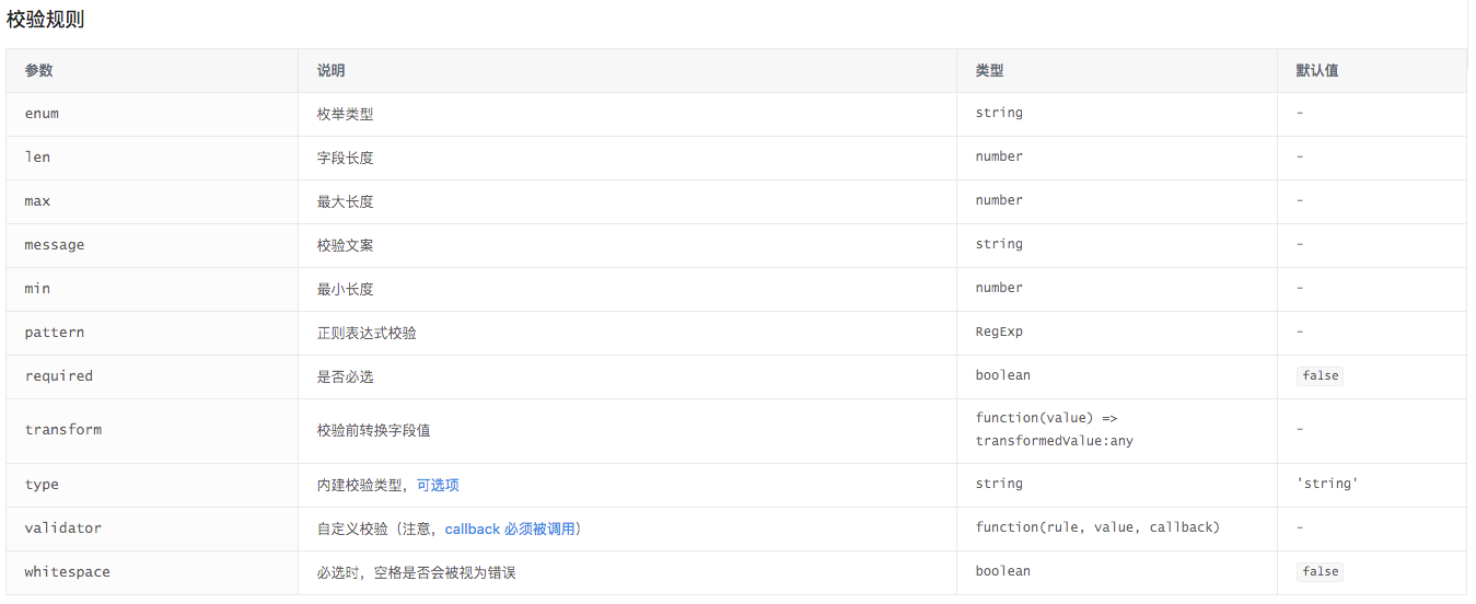
3. 丰富的校验
关键词: rules
<FormItem
  {...formItemLayout}
  label='text'
  extra={this.confirmNode()}
>
  {getFieldDecorator('subscribe', {
    initialValue: subscribe,
    rules: [{
      required: true,
      message: ‘message’,
    }],
  })(
    <Receiver subscribe={subscribe} onReceiverChange={this.onReceiverChange} />
  )}
</FormItem>
可以使用现有的校验规则方便地设置字段的规则
4. 自定义校验
关键词: validateFields/validateFieldsAndScroll
demo:
checkFormConfig = (rule, value, cb) => {
    if (value.length === 0) {
      cb('规则不能为空');
    }
}
...
<FormItem >
  {getFieldDecorator('config', {
    initialValue: 'init value',
    rules: [{
      validator: this.checkFormConfig,
    }],
  })(
    <RuleConfig
      alarmConfig={alarmConfig}
    />
  )}
</FormItem>
value为字段的值,cb为出错时显示的校验信息,但是cb必须调用
5. 自定义组件
关键词:受控模式
value或其它与 valuePropName 的值同名的属性。onChange事件或 trigger 的值同名的事件。
在表单里使用自定义组件要遵循上面的约定。
注意: 在对自定义组件使用校验时,需要注意范围,因为antd把出错组件的所有输入框都会加上validator-error样式,甚至下拉框都会有提醒
6. 自定义组件的表单域嵌套
如果你的组件中只有一个表单元素,那么你可以像上述所说的直接使用,但是组件中包含子组件,就不能在外层使用FormItem了。
...
<FormItem>
</FormItem>
<Parent /> //不用在Parent外面包装Item,在实际使用input的地方使用

class Parent extend PureComponent {
    render () {
        return <Child />
    }
}

class Child extend PureComponent {
    render () {
        <FormItem> // 在实际的输入上加Item
          {
            getFieldDecorator('continuous', {
              initialValue: continuous,
              rules: [
                {
                  required: true,
                  message: 'please input u continuous',
                },
                {
                  validator: this.validate,
                },
              ],
            })(
                // 绝对不用在这里包裹div,不然就接收不到change
                <Select
                  onChange={this.onChangeContinuous}
                >
                  {continuousList}
                </Select>
            )
          }
        </FormItem>
    }
}
如果是map出来的子组件,需要确定getFieldDecorator的id不一样,不然所有的id绑定一个值
7. 获取自定义组件的值
比如自定义组件是这个 <MyComponent />
class MyComponent extends PureComponent {
    constructor(){
        super();
        this.state = {
            receiverList: [],// 受控属性
        }
    }

    onReceiverChange = receiverList => {
        this.setState({ receiverList });

        // 用于Form的回调
        if (this.props.onChange) {
          this.props.onChange(receiverList);
        }
    }

    render() {
        const receiverList = this.state.receiverList;

        return (
            <Input onChange={this.onReceiverChange} value={receiverList}/>
        );
    }
}
Form中这样写就好:
...
<Form>
    <Form.Item>
    {getFieldDecorator('receiverList', {
        rules: [{
            required: true,
            message: 'Please input name!',
        }],
    })(
          <Receiver receiverList />
    )}
    </Form.Item>
</Form>
receiverList就是自定义组件中的受控属性。现在自定义组件中的受控属性已经赋值给了form.receiverList,也可以受Form的rule控制了,是不是很棒~
神坑:如果是表单元素呢,例如select之类的,绝对不要在外面写div
<Form>
    <Form.Item>
    {getFieldDecorator('receiverList', {
        rules: [{
            required: true,
            message: 'Please input name!',
        }],
    })(
      //<div> 绝对不要在这里加div,否则不能获取select的change事件!!!!!
      <Select>
        <Option value=1>1</Option>
      </Select>
    )}
    </Form.Item>
</Form>
ToolTip使用指南
1. 点击事件冒泡
demo:
<Popconfirm
  title={intl.find('alarm.attributes.sureToDelete')}
  trigger="click"
  onClick={this.onDelete(alarmId)}
>
  <Icon
    type="delete"
  />
</Popconfirm>
一个非常常见的例子,点击icon弹出popconfirm。
可是, 当点击图表,会发现popconfirm一闪而过,直接执行了onDelete事件,为什么呢?
<Popconfirm
  title={intl.find('alarm.attributes.sureToDelete')}
  trigger="click"
  onConfirm={this.onDelete(alarmId)} // 使用正确的监听函数
>
  <Icon
    type="delete" onClick={evt => {
      evt.stopPropagation(); // 阻止事件冒泡
    }}
  />
</Popconfirm>
2. popconfirm嵌套问题
如果你的设计稿是存在popconfirm的嵌套关系,长得像下面一样:
<Popover
  placement="bottomRight"
  content={content}
  trigger="click"
  visible={this.state.visible}
  onVisibleChange={this.handVisibleChange}
  overlayClassName="xri-alarm-config-popover"
>
  <i
    className={`${alarms.length > 0 && alarms[0].alarmObject.status === 'NORMAL' ?
      'alarm-config-icon_useable' : 'alarm-config-icon'} feature-icon`}
    title={intl.find('charts.wrapHead.alarmConfig.title')}
    onClick={this.changVisible}
  />
</Popover>

content:
<Popconfirm
  title='title'
  onConfirm={this.onConfirm}
  onCancel={this.onCancel}
  okText='ok'
  cancelText='取消'
  visible={this.isShowPopConfirm(index)}
  getPopupContainer={this.getPopupContainer}
  onVisibleChange={this.handVisibleChange}
  overlayClassName="xri-alarm-popconfirm-sync"
>
  <Tooltip title={intl.find('alarm.edit')} trigger="hover">
    <span className="icon" onClick={this.checkSync(item, index)}>
      <Icon type="edit"/>
    </span>
  </Tooltip>
</Popconfirm>
你会发现,当你点击内层popconfirm时,居然把外层所有的tooltip类控件都关掉了,真是太神奇了。。。
试着去阻止内层事件的冒泡,这样上层的组件就不会响应事件了,完美的构思,合情合理,nice
但是,居然没用,好吧,上大招,源码解决一切。
在rc-toolTip的文档里有非常重要的一个描述
Function returning html node which will act as tooltip container. By default the tooltip attaches to the body. If you want to change the container, simply return a new element.
底层的re-trigger这样写着:
getContainer = () => {
const { props } = this;
const popupContainer = document.createElement('div');
// Make sure default popup container will never cause scrollbar appearing
// https://github.com/react-component/trigger/issues/41
popupContainer.style.position = 'absolute';
popupContainer.style.top = '0';
popupContainer.style.left = '0';
popupContainer.style.width = '100%';
const mountNode = props.getPopupContainer ?
props.getPopupContainer(findDOMNode(this)) : props.getDocument().body;
mountNode.appendChild(popupContainer);
return popupContainer;
}
也就是说,所有基于tooltip的组件默认是以body作为父组件的,这也就是为什么阻止了冒泡外层组件仍然会受影响的原因,当触发visibleChange时,所有的组件都响应了,所以解决思路:改变父级关系,其实re-tigger提供了更改默认父级的API,antd也将这个API提供给开发,那就是
getPopupContainer,更改父级关系后,你的visible事件就不会影响其他组件了,但是要注意class, 因为层级发生变化,所以css的结构需要相应的该调整。upload使用指南
1. 检测文件

提供了上传前检测的机会,可以做文件数,文件类型,文件大小等检测。
function beforeUpload(file, fileList) {
  const isJPG = file.type === 'image/jpeg';
  const isLt2M = file.size / 1024 / 1024 < 2;
  const isGteMax = fileList.length > 3;

  if (!isJPG) {
    message.error('You can only upload JPG file!');
  }

  if (!isLt2M) {
    message.error('Image must smaller than 2MB!');
  }

  if(isGteMax) {
    message.error('Image count smaller than 4');
  }

  return isJPG && isLt2M && isGteMax;
}

...
<Upload
    className="avatar-uploader"
    name="avatar"
    showUploadList={false}
    action="//jsonplaceholder.typicode.com/posts/"
    beforeUpload={beforeUpload}
    multiple=true
    onChange={this.handleChange}
>
    <Button>upload</Button>
</Upload>
2. 手动上传
upload默认是选中了文件直接上传的,如果想完成一些业务逻辑后手动上传,可以利用beforeUpload返回false后,手动上传文件,使用new FormData();
ps: FormData
import { Upload, Button, Icon, message } from 'antd';
import reqwest from 'reqwest';

class Demo extends React.Component {
  state = {
    fileList: [],
    uploading: false,
  }

  handleUpload = () => {
    const { fileList } = this.state;
    const formData = new FormData();
    fileList.forEach((file) => {
      formData.append('files[]', file);
    });

    this.setState({
      uploading: true,
    });

    // You can use any AJAX library you like
    reqwest({
      url: '//jsonplaceholder.typicode.com/posts/',
      method: 'post',
      processData: false,
      data: formData,
      success: () => {
        this.setState({
          fileList: [],
          uploading: false,
        });
        message.success('upload successfully.');
      },
      error: () => {
        this.setState({
          uploading: false,
        });
        message.error('upload failed.');
      },
    });
  }

  render() {
    const { uploading } = this.state;
    const props = {
      action: '//jsonplaceholder.typicode.com/posts/',
      onRemove: (file) => {
        this.setState(({ fileList }) => {
          const index = fileList.indexOf(file);
          const newFileList = fileList.slice();
          newFileList.splice(index, 1);
          return {
            fileList: newFileList,
          };
        });
      },
      beforeUpload: (file) => {
        this.setState(({ fileList }) => ({
          fileList: [...fileList, file],
        }));
        return false;
      },
      fileList: this.state.fileList,
    };

    return (
      <div>
        <Upload {...props}>
          <Button>
            <Icon type="upload" /> Select File
          </Button>
        </Upload>
        <Button
          className="upload-demo-start"
          type="primary"
          onClick={this.handleUpload}
          disabled={this.state.fileList.length === 0}
          loading={uploading}
        >
          {uploading ? 'Uploading' : 'Start Upload' }
        </Button>
      </div>
    );
  }
}

ReactDOM.render(<Demo />, mountNode);
3. 自定义上传行为
需要自定义长传行为时,主要利用customRequest,去实现自定义的默认上传动作
/* eslint no-console:0 */
import React from 'react';
import ReactDOM from 'react-dom';
import Upload from 'rc-upload';
import axios from 'axios';

const uploadProps = {
  action: '/upload.do',
  multiple: false,
  data: { a: 1, b: 2 },
  headers: {
    Authorization: '$prefix $token',
  },
  onStart(file) {
    console.log('onStart', file, file.name);
  },
  onSuccess(ret, file) {
    console.log('onSuccess', ret, file.name);
  },
  onError(err) {
    console.log('onError', err);
  },
  onProgress({ percent }, file) {
    console.log('onProgress', `${percent}%`, file.name);
  },
  customRequest({
    action,
    data,
    file,
    filename,
    headers,
    onError,
    onProgress,
    onSuccess,
    withCredentials,
  }) {
    // EXAMPLE: post form-data with 'axios'
    const formData = new FormData();
    if (data) {
      Object.keys(data).map(key => {
        formData.append(key, data[key]);
      });
    }
    formData.append(filename, file);

    axios
      .post(action, formData, {
        withCredentials,
        headers,
        onUploadProgress: ({ total, loaded }) => {
          onProgress({ percent: Math.round(loaded / total * 100).toFixed(2) }, file);
        },
      })
      .then(({ data: response }) => {
        onSuccess(response, file);
      })
      .catch(onError);

    return {
      abort() {
        console.log('upload progress is aborted.');
      },
    };
  },
};

const Test = () => {
  return (
    <div
      style={{
        margin: 100,
      }}
    >
      <div>
        <Upload {...uploadProps}>
          <button>开始上传</button>
        </Upload>
      </div>
    </div>
  );
};

ReactDOM.render(<Test />, document.getElementById('__react-content'));
结尾
目前总结了 Form,ToolTip, Upload的能力边界,希望对大家有用~
