

我的上一篇博客中记录了Flutter基础和一些常用的Widgets,这一篇中主要记录Flutter常用的一些布局,希望自己在记录的同时能温故知新,同时给初学者一些帮助。
Flutter布局容器
在Android开发中,我们使用xml文件写布局,有诸如LinearLayout、RelativeLayout、ConstraintLayout等布局方式,在ReactNative或WEEX开发中,我们使用的布局方式都是基于前端的flex布局,无论是Android还是RN或者WEEX,他们的布局特点都是代码和布局是分开的,而在Flutter开发中,布局比较另类一点,因为逻辑代码和布局代码都写在一起了,都是使用Dart来写。
说到布局就不得不说到容器,不论使用原生或者RN、WEEX这类跨平台移动开发方式,布局都会涉及到容器,比如原生Android开发中,LinearLayout是个布局,同时是一个可以包含多个子组件的容器,在RN开发中,<View>是一个组件,同时也是可以包含多个子组件的容器,在WEEX开发中<div>也是一个可以包含多个子组件的容器。
Flutter中的布局容器主要分为两类:只能包含一个子Widget的布局容器和可以包含多个子Widget的容器,下面分别说明其用法。
包含单个子Widget的布局容器
Center组件
Center组件中的子组件会居中显示。Center组件会尽可能的大,如果你不给它设置任何约束。下面是Center组件的使用方法:
import 'package:flutter/material.dart';

main() {
  runApp(new MyApp());
}

class MyApp extends StatelessWidget {
  @override
  Widget build(BuildContext context) {
    return new MaterialApp(
      title: "Test",
      home: new Scaffold(
        appBar: new AppBar(
          title: new Text("Test")
        ),
        body: new Center(
          child: new Text("hello world")
        ),
      ),
    );
  }
}
Container组件
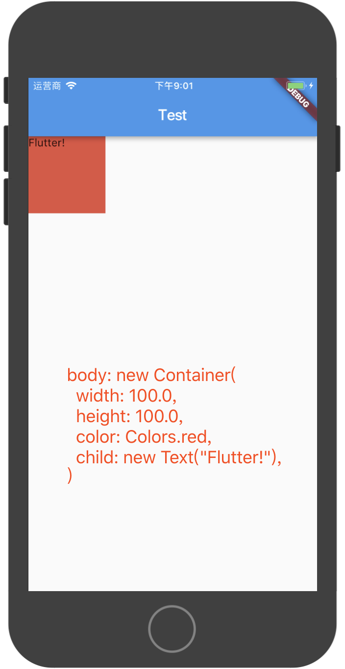
Container是使用非常多的一个布局容器,关于Container容器的显示规则,有如下几条:
- 如果Container中没有子组件,则Container会尽可能的大
- 如果Container中有子组件,则Container会适应子组件的大小
- 如果给Container设置了大小,则Container按照设置的大小显示
- Container的显示规则除了跟自身约束和子组件有关,跟它的父组件也有关
下面的代码展示了Container的用法:
import 'package:flutter/material.dart';

main() {
  runApp(new MyApp());
}

class MyApp extends StatelessWidget {
  @override
  Widget build(BuildContext context) {
    return new MaterialApp(
      title: "Test",
      home: new Scaffold(
        appBar: new AppBar(
          title: new Text("Test")
        ),
        body: new Container(
          width: 100.0,
          height: 100.0,
          color: Colors.red,
          child: new Text("Flutter!"),
        )
      ),
    );
  }
}
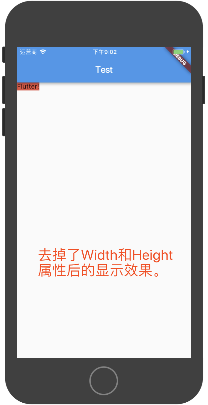
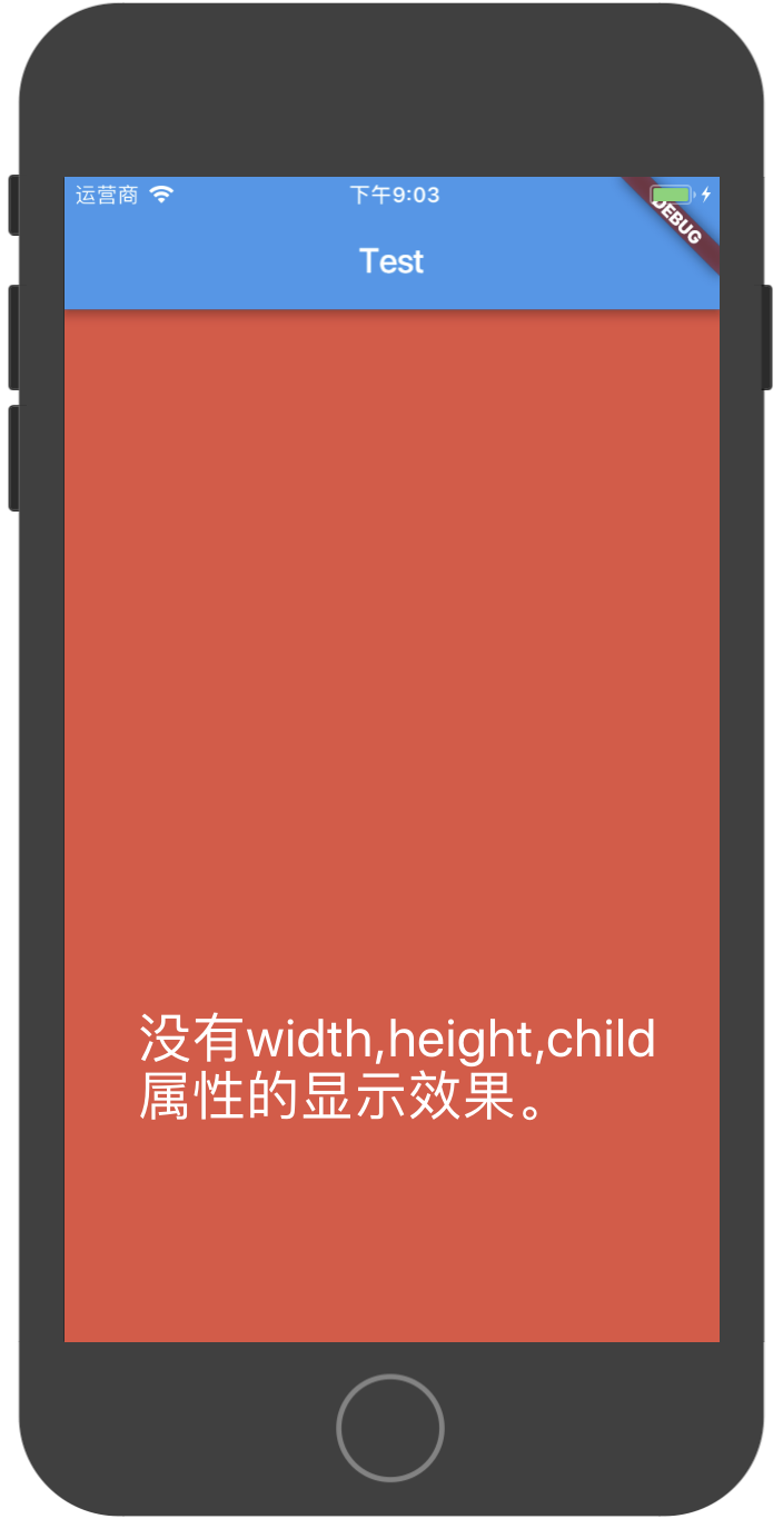
如果我们分别注释掉上面Container代码中的width/height、child属性,显示出的界面就会有所不同:
Container还可以设置内边距和外边距,如下代码所示:
body: new Container(
  // 设置外边距都为20.0
  margin: const EdgeInsets.all(20.0),
  // 设置内边距,4个边分别设置
  padding: const EdgeInsets.fromLTRB(10.0, 20.0, 30.0, 40.0),
  width: 100.0,
  height: 100.0,
  color: Colors.red,
  child: new Text("Flutter!"),
)
Padding组件
Padding组件专门用于给它的子组件设置内边距,用法比较简单:
new Padding(
  padding: new EdgeInsets.all(8.0),
  child: const Card(child: const Text('Hello World!')),
)
Align组件
Align组件用于将它的子组件放置到确定的位置,比如下面的代码展示了将Text组件放置到100*100的容器的右下角:
new Container(
  width: 100.0,
  height: 100.0,
  color: Colors.red,
  child: new Align(
    child: new Text("hello"),
    alignment: Alignment.bottomRight,
  ),
)
Alignment类中有如下一些静态常量:
  /// The top left corner.
  static const Alignment topLeft = const Alignment(-1.0, -1.0);

  /// The center point along the top edge.
  static const Alignment topCenter = const Alignment(0.0, -1.0);

  /// The top right corner.
  static const Alignment topRight = const Alignment(1.0, -1.0);

  /// The center point along the left edge.
  static const Alignment centerLeft = const Alignment(-1.0, 0.0);

  /// The center point, both horizontally and vertically.
  static const Alignment center = const Alignment(0.0, 0.0);

  /// The center point along the right edge.
  static const Alignment centerRight = const Alignment(1.0, 0.0);

  /// The bottom left corner.
  static const Alignment bottomLeft = const Alignment(-1.0, 1.0);

  /// The center point along the bottom edge.
  static const Alignment bottomCenter = const Alignment(0.0, 1.0);

  /// The bottom right corner.
  static const Alignment bottomRight = const Alignment(1.0, 1.0);
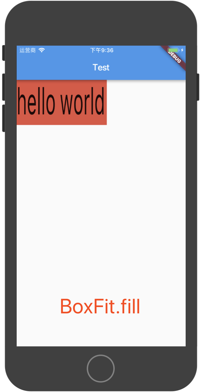
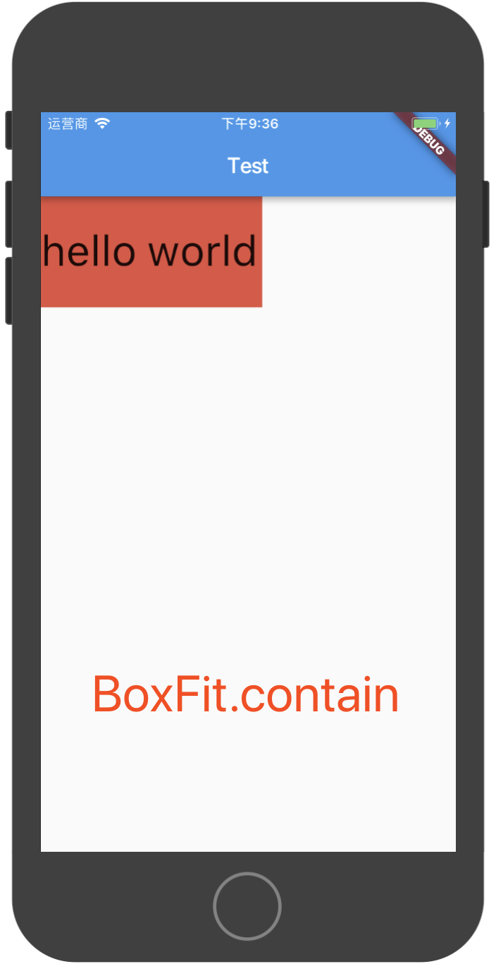
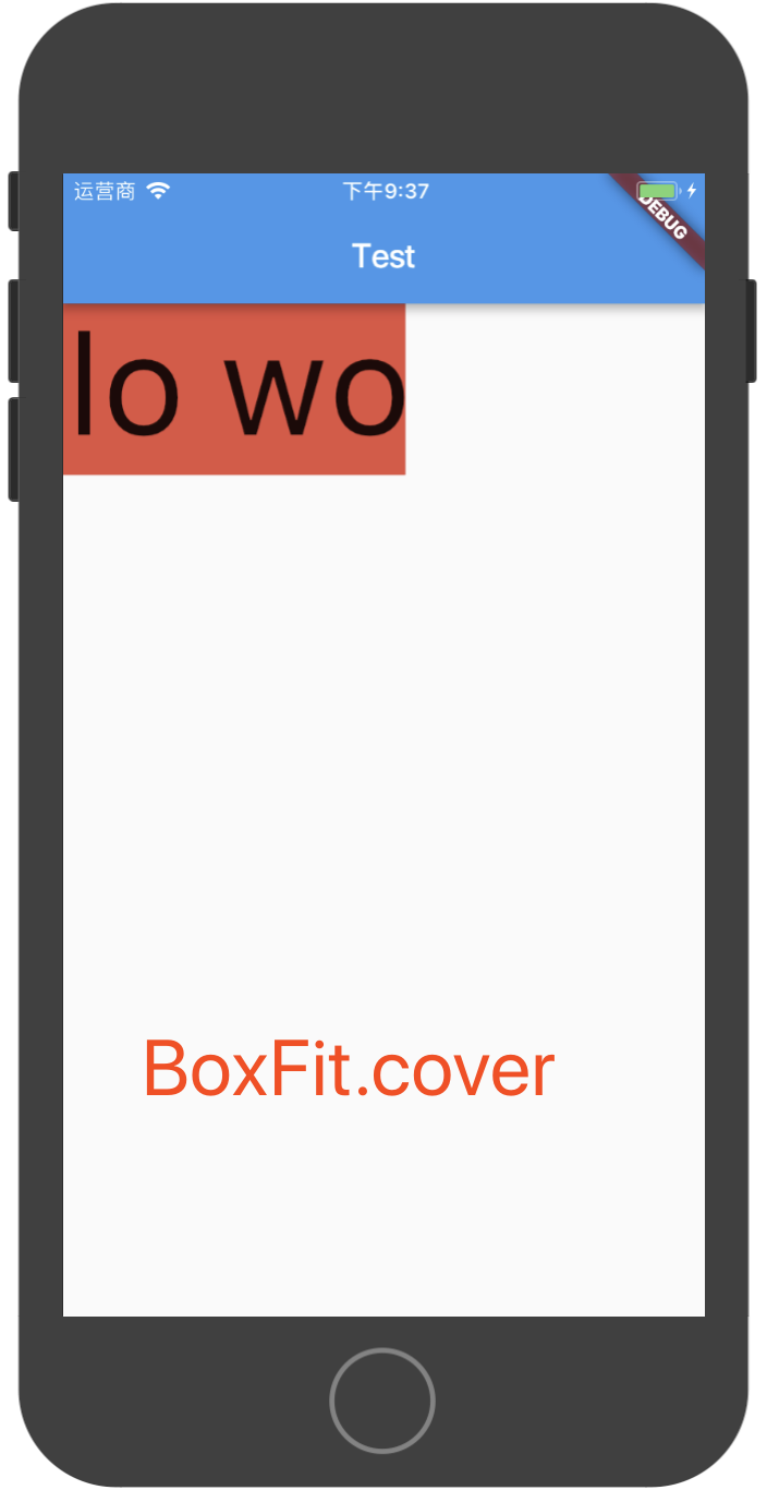
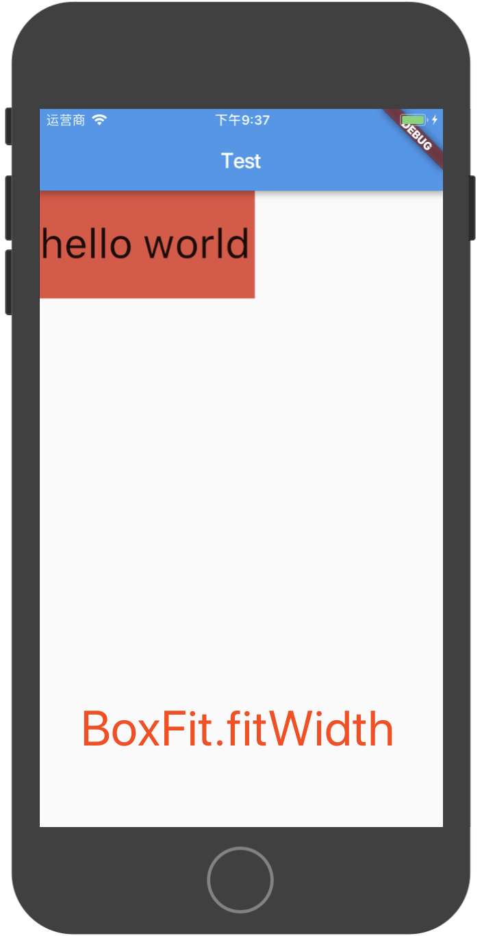
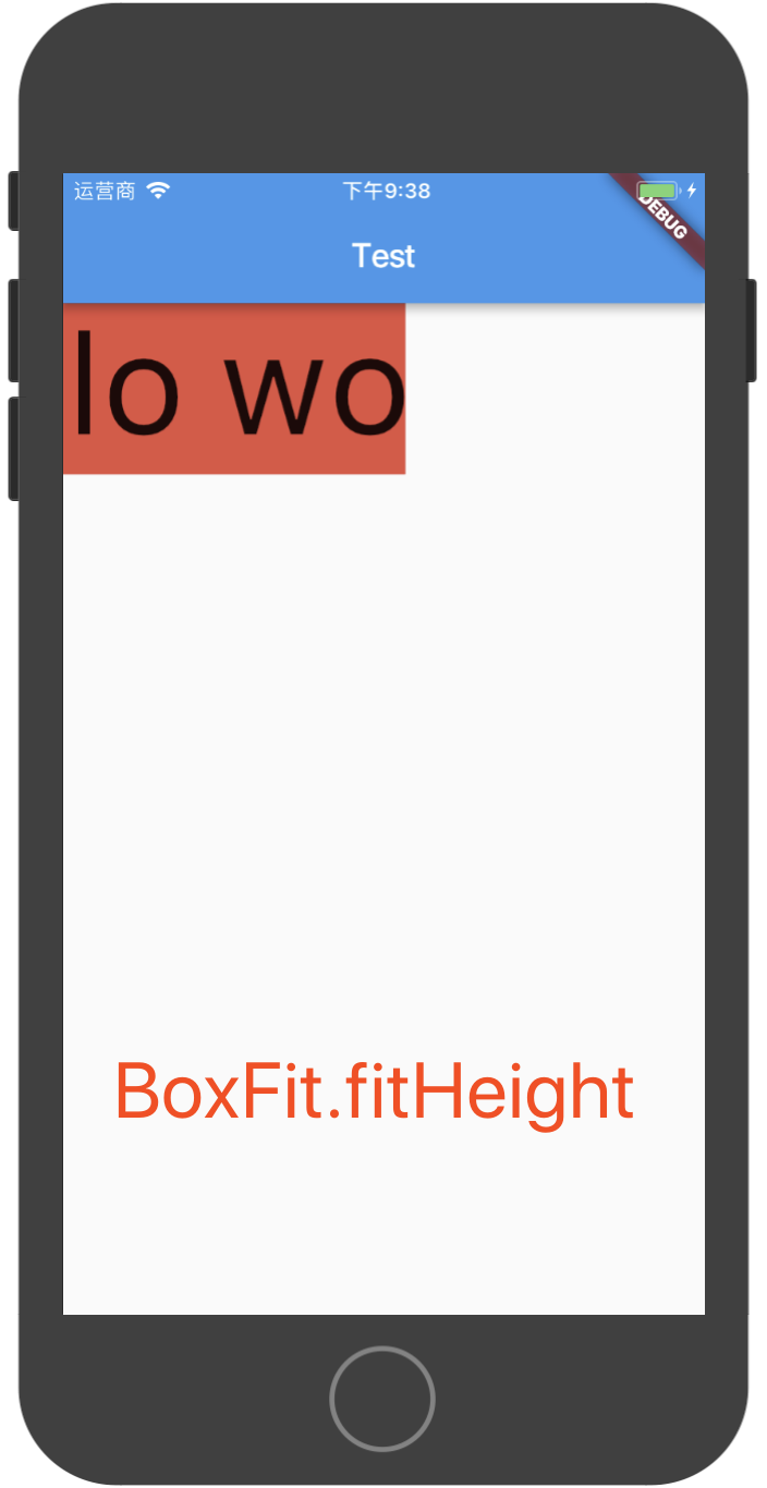
FittedBox组件
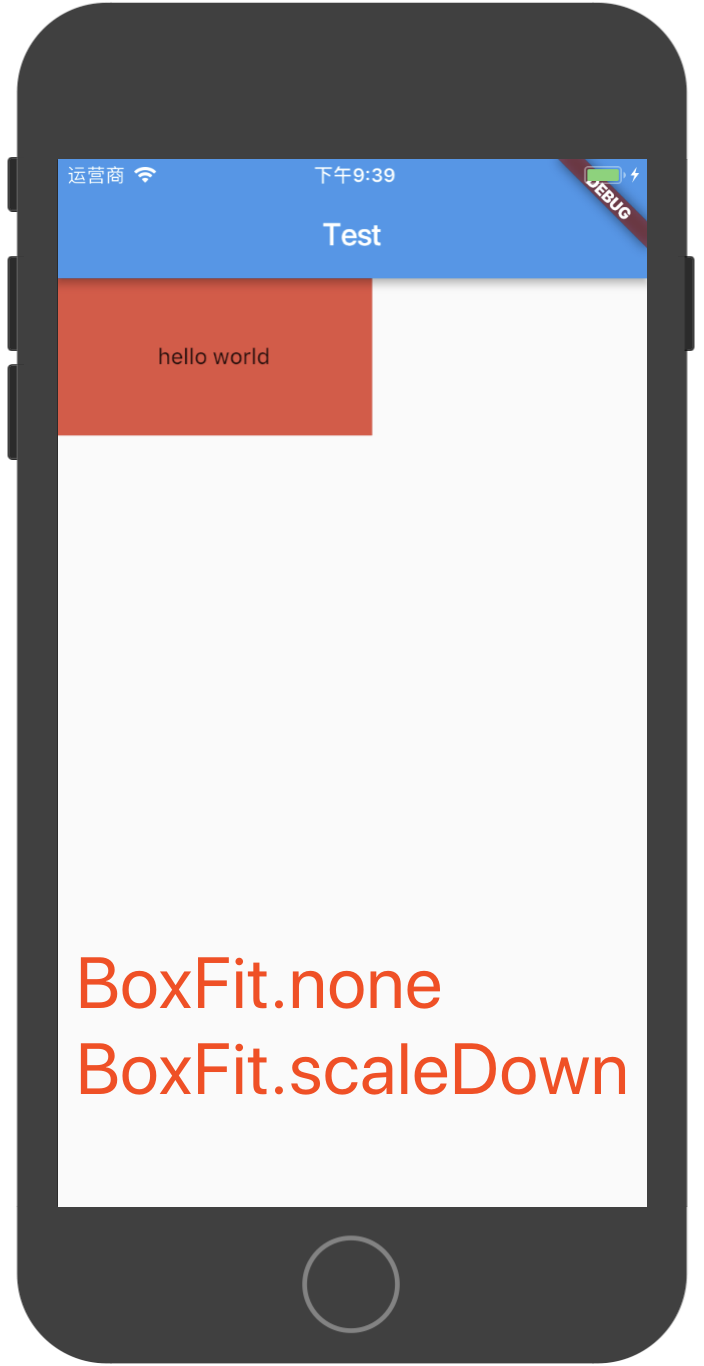
FittedBox组件根据fit属性来确定子组件的位置,fit属性是一个BoxFit类型的值,BoxFit是个枚举类,取值有如下几种:
enum BoxFit {
  fill,
  contain,
  cover,
  fitWidth,
  fitHeight,
  none,
  scaleDown,
}
在我的上一篇博文中,在说到Image组件时,已有对于这几种BoxFit类型的介绍,这里再用一段代码和截图来直观说明上面几种BoxFit,在下面的代码中,我们在大小为200*100的Container中放置一个Text,使用FittedBox来控制Text的不同显示状态:
new Container(
  width: 200.0,
  height: 100.0,
  color: Colors.red,
  child: new FittedBox(
    child: new Text("hello world"),
    fit: BoxFit.fill,
  )
)
当fit取不同值时,上面的代码运行结果如下图所示:
AspectRatio组件
AspectRatio组件用于让它的子组件按一定的比例显示,下面是示例代码:
class MyApp extends StatelessWidget {
  @override
  Widget build(BuildContext context) {
    return new MaterialApp(
      title: "Test",
      home: new Scaffold(
        appBar: new AppBar(
          title: new Text("Test")
        ),
        body: new AspectRatio(
          // Container组件按16:9(width / height)显示
          aspectRatio: 16.0 / 9.0,
          child: new Container(
            color: Colors.red,
          ),
        )
      ),
    );
  }
}
如果将aspectRatio设置为1.0,则Container显示为正方形。(注意,Dart中/代表除法运算,不是取整运算,使用~/做取整运算)
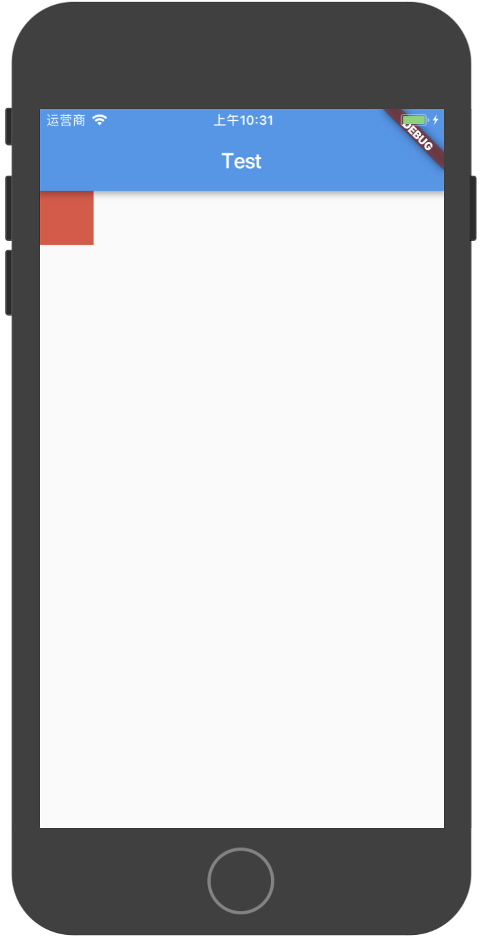
ConstrainedBox组件
ConstrainedBox组件用于给它的子组件强制加上一些约束,比如下面的代码:
class MyApp extends StatelessWidget {
  @override
  Widget build(BuildContext context) {
    return new MaterialApp(
      title: "Test",
      home: new Scaffold(
        appBar: new AppBar(
          title: new Text("Test")
        ),
        body: new ConstrainedBox(
          constraints: const BoxConstraints.expand(width: 50.0, height: 50.0),
          child: new Container(
            color: Colors.red,
            width: 200.0,
            height: 200.0,
          )
        )
      ),
    );
  }
}
在上面的代码中,我们给Container设置了长宽都为200,但是Container被ConstrainedBox组件包裹了,而且ConstrainedBox设置了约束constraints: const BoxConstraints.expand(width: 50.0, height: 50.0),由于ConstrainedBox的约束是强制性的,所以最后Container显示出的大小是50而不是200,如下图所示:
IntrinsicWidth & IntrinsicHeight
这两个组件的作用是将他们的子组件调整到组件本身的宽度/高度。
这个类是非常有用的,例如,当宽度/高度没有任何限制时,你会希望子组件按更合理的宽度/高度显示而不是无限的扩展。
LimitedBox组件
LimitedBox是一个当其自身不受约束时才限制其大小的容器。
如果这个组件的最大宽度是没有约束,那么它的宽度就限制在maxWidth。类似地,如果这个组件的最大高度没有约束,那么它的高度就限制在maxHeight。
Offstage组件
Offstage组件用于显示或隐藏它的子组件,如下代码所示:
new Offstage(
  offstage: false, // true: 隐藏, false: 显示
  child: new Text("hello world"),
)
OverflowBox & SizedOverflowBox
OverflowBox组件它给它的子组件带来不同的约束,而不是从它的父组件中得到,可能允许子组件溢出到父组件中。
SizedOverflowBox组件是一个指定大小的组件,它的约束会传递给子组件,子组件可能溢出。
SizedBox组件
SizedBox是一个指定了大小的容器。
如果指定了SizedBox的大小,则子组件会使用SizedBox的大小,如果没有指定SizedBox的大小,则SizedBox会使用子组件的大小。如果SizedBox没有子组件,SizedBox会按它自己的大小来显示,将nulls当作0。
new SizedBox(
  // 如果指定width和height,则Container按照指定的大小显示,而不是Container自己的大小,如果没有指定width和height,则SizedBox按照Container的大小显示
  width: 50.0,
  height: 50.0,
  child: new Container(
    color: Colors.red,
    width: 300.0,
    height: 300.0,
  ),
)
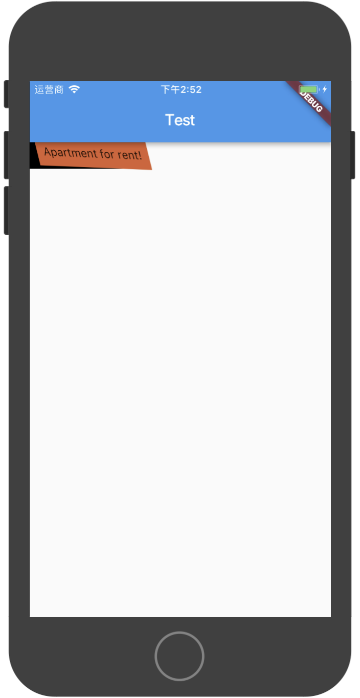
Transform组件
Transform用于在绘制子组件前对子组件进行某些变换操作,比如平移、旋转、缩放等。
示例代码如下:
new Container(
  color: Colors.black,
  child: new Transform(
    alignment: Alignment.topRight,
    // 需要导包:import 'dart:math' as math;
    transform: new Matrix4.skewY(0.3)..rotateZ(-math.pi / 12.0),
    child: new Container(
      padding: const EdgeInsets.all(8.0),
      color: const Color(0xFFE8581C),
      child: const Text('Apartment for rent!'),
    ),
  ),
)
运行效果如下图:
包含多个子Widget的布局容器
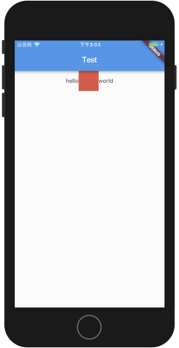
Row组件
Row组件字面理解就是代表一行,在一行中可以放入多个子组件。
下面是示例代码:
import 'package:flutter/material.dart';

main() {
  runApp(new MyApp());
}

class MyApp extends StatelessWidget {
  @override
  Widget build(BuildContext context) {
    return new MaterialApp(
      title: "Test",
      home: new Scaffold(
        appBar: new AppBar(
          title: new Text("Test")
        ),
        body: new Row(
          mainAxisAlignment: MainAxisAlignment.center,
          children: <Widget>[
            new Text("hello"),
            new Container(
              width: 50.0,
              height: 50.0,
              color: Colors.red,
            ),
            new Text("world")
          ],
        )
      ),
    );
  }
}
在模拟器上运行的效果如下图:
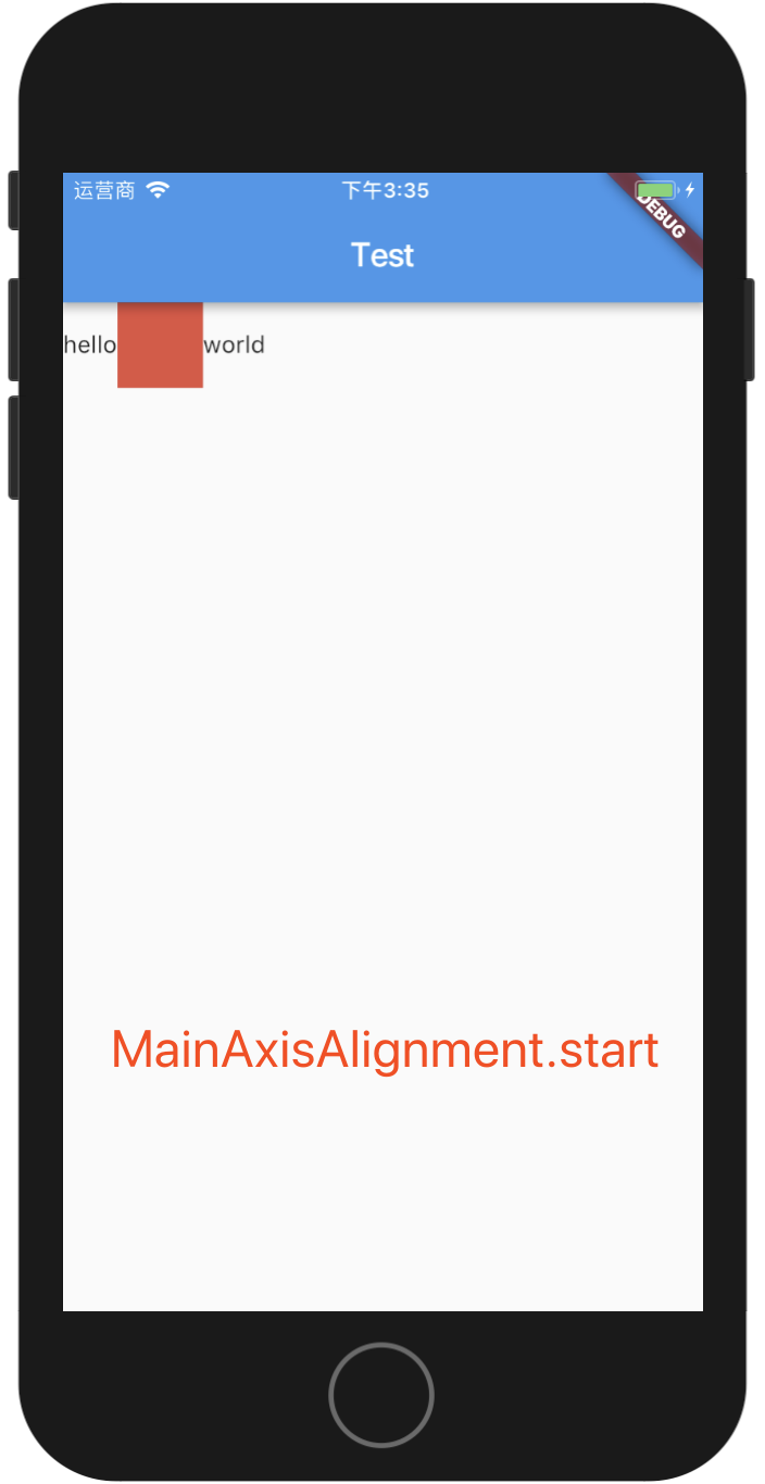
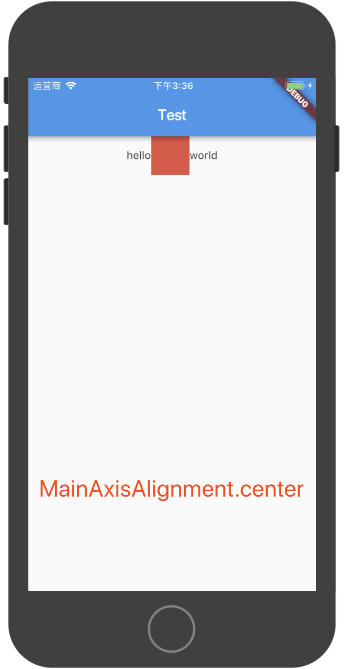
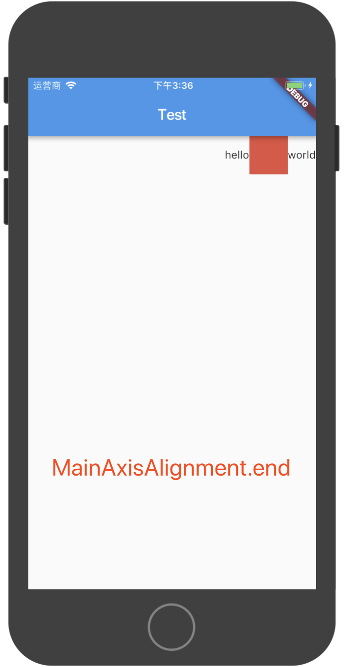
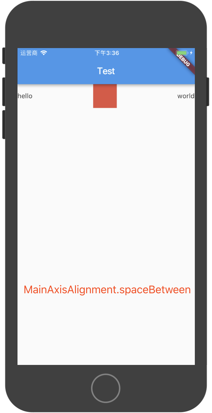
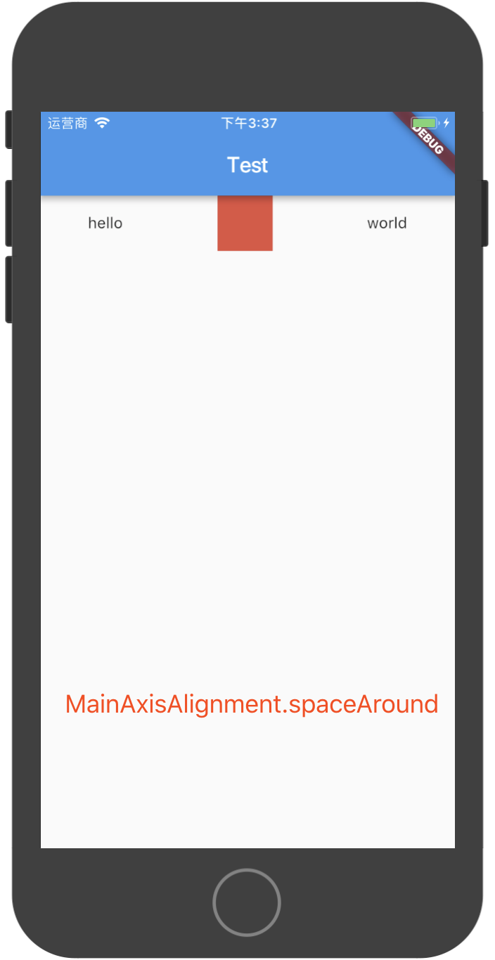
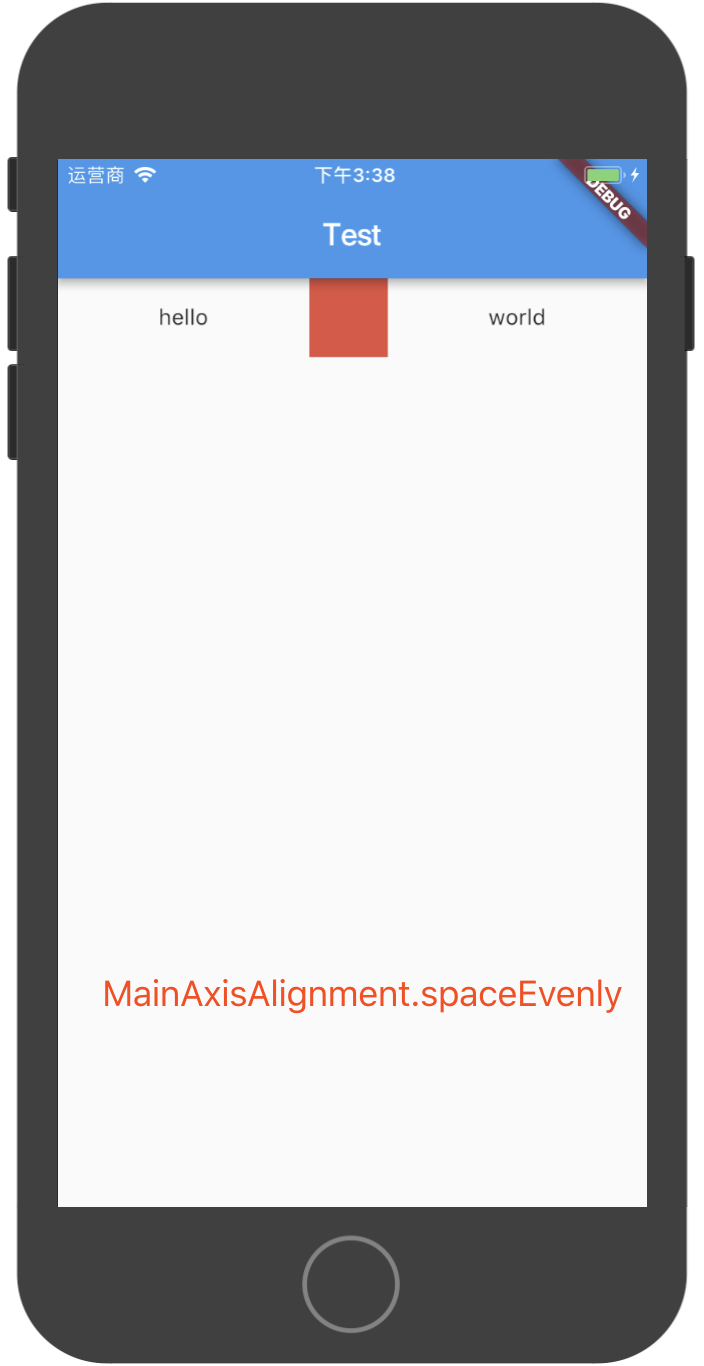
Row组件的构造方法中,children参数是一个数组,表示可以有多个子组件,mainAxisAlignment表示Row中的子组件在主轴(Row组件主轴表示水平方向,交叉轴表示垂直方向,Column组件主轴表示垂直方向,交叉轴表示水平方向)上的对齐方式,可以有如下几个取值:
MainAxisAlignment.startMainAxisAlignment.centerMainAxisAlignment.endMainAxisAlignment.spaceBetweenMainAxisAlignment.spaceAroundMainAxisAlignment.spaceEvenly
关于上面几个取值,用如下几个图来说明:
Column组件
Column组件表示一列,可以在一列中放入多个组件,如下代码所示:
class MyApp extends StatelessWidget {
  @override
  Widget build(BuildContext context) {
    return new MaterialApp(
      title: "Test",
      home: new Scaffold(
        appBar: new AppBar(
          title: new Text("Test")
        ),
        body: new Column(
          children: <Widget>[
            new Text("hello"),
            new Text("world"),
            new Text("nihao~")
          ],
        )
      ),
    );
  }
}
Column和Row组件一样,可以通过MainAxisAlignment或者CrossAxisAlignment来设置主轴和交叉轴的对齐方式,这里不再赘述。
Stack组件
Stack组件类似于Android中的FrameLayout,其中的子组件是一层层堆起来的,并不像Row或者Column中的子组件,按水平或垂直方向排列,下面用代码说明:
class MyApp extends StatelessWidget {
  @override
  Widget build(BuildContext context) {
    return new MaterialApp(
      title: "Test",
      home: new Scaffold(
        appBar: new AppBar(
          title: new Text("Test")
        ),
        body: new Stack(
          children: <Widget>[
            new Container(
              width: 100.0,
              height: 100.0,
              color: Colors.red,
            ),
            new Container(
              width: 30.0,
              height: 30.0,
              color: Colors.green,
            )
          ],
        )
      ),
    );
  }
}
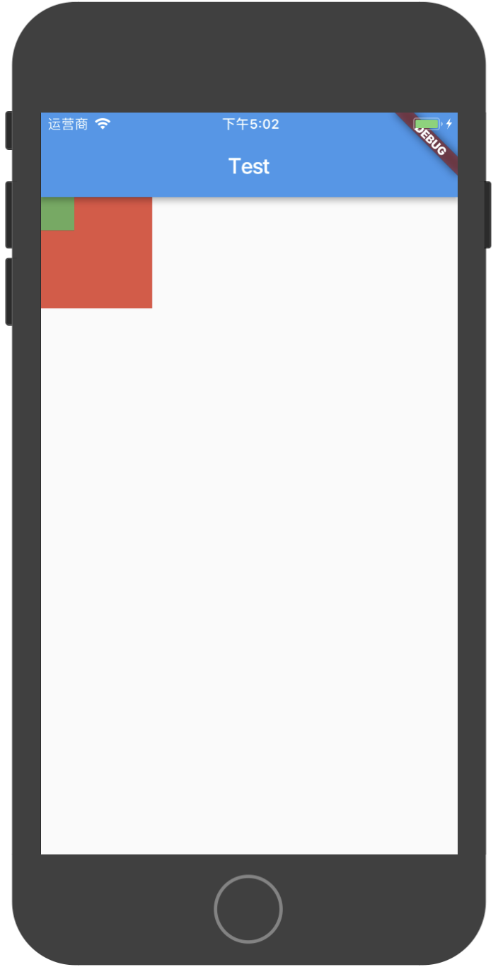
在上面的Stack组件中,放入了两个Container,其中第一个Container是100x100大小,第二个Container是30x30大小,在模拟器上运行效果如下图:
IndexedStack组件
IndexedStack用于根据索引来显示子组件,index为0则显示第一个子组件,index为1则显示第二个子组件,以此类推,下面用代码说明:
new IndexedStack(
  index: 1,
  children: <Widget>[
    new Container(
      width: 100.0,
      height: 100.0,
      color: Colors.red,
      child: new Center(
        child: new Text("index: 0", style: new TextStyle(fontSize: 20.0),),
      ),
    ),
    new Container(
      width: 100.0,
      height: 100.0,
      color: Colors.green,
      child: new Center(
        child: new Text("index: 1", style: new TextStyle(fontSize: 20.0),),
      ),
    )
  ],
)
IndexedStack的构造方法中有个index属性,上面的index属性为1,则显示的是children数组中的第2个元素(绿色方块),如果index改为0,则显示的是第1个元素(红色方块),如果index的大小超过了children数组的长度,则会报错。
Table组件
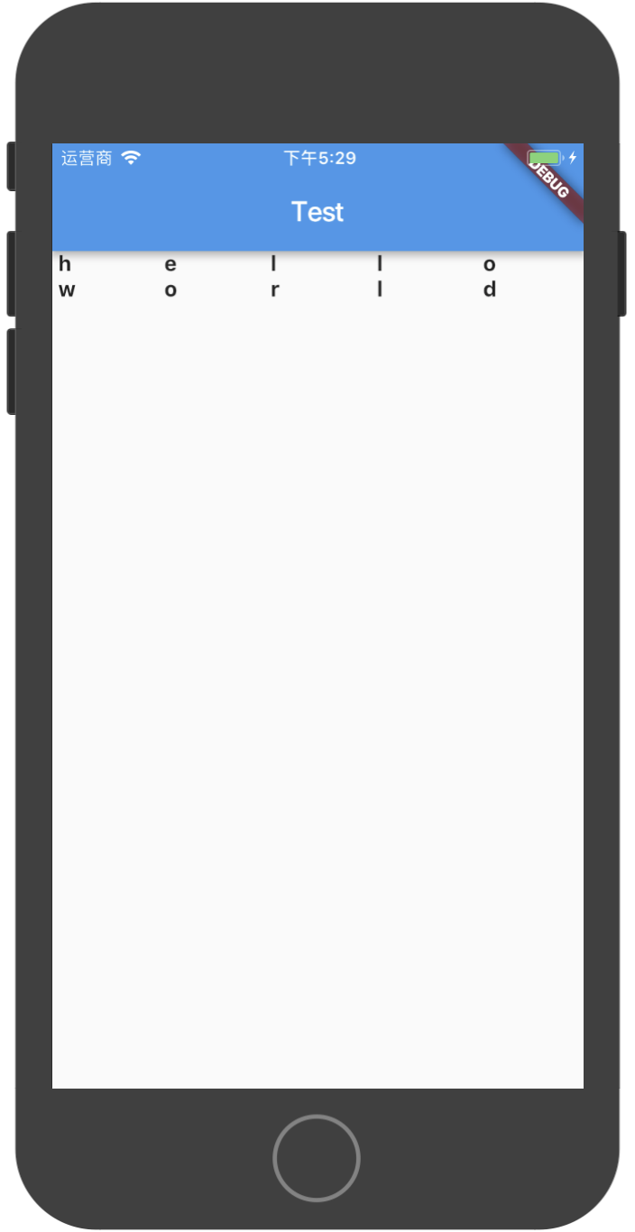
Table组件用于显示多行多列的布局,如果只有一行或者一列,使用Row或者Column更高效。下面用一段代码展示Table的用法:
class MyApp extends StatelessWidget {

  // 生成Table中的数据
  List<TableRow> getData() {
    var data = [
      "hello",
      "world"
    ];
    List<TableRow> result = new List<TableRow>();
    TextStyle style = new TextStyle(fontSize: 15.0, fontWeight: FontWeight.bold);
    for (int i = 0; i < data.length; i++) {
      String str = data[i];
      List<Widget> row = new List();
      for (int j = 0; j < str.length; j++) {
        row.add(new Text(" ${str[j]} ", style: style));
      }
      result.add(new TableRow(
        children: row
      ));
    }
    return result;
  }

  @override
  Widget build(BuildContext context) {
    return new MaterialApp(
      title: "Test",
      home: new Scaffold(
        appBar: new AppBar(
          title: new Text("Test")
        ),
        body: new Table(
          children: getData()
        )
      ),
    );
  }
}
在模拟器中运行上面的代码效果如下图:
Wrap组件
Wrap组件可以在水平或垂直方向上多行显示其子组件,下面是示例代码:
class MyApp extends StatelessWidget {

  @override
  Widget build(BuildContext context) {
    return new MaterialApp(
      title: "Test",
      home: new Scaffold(
        appBar: new AppBar(
          title: new Text("Test")
        ),
        body: new Wrap(
          spacing: 5.0, // 水平方向上两个子组件的间距
          runSpacing: 20.0, // 两行的垂直间距
          children: <Widget>[
            new Text("hello"),
            new Text("hello"),
            new Text("hello"),
            new Text("hello"),
            new Text("hello"),
            new Text("hello"),
            new Text("hello"),
            new Text("hello"),
            new Text("hello"),
            new Text("hello"),
            new Text("hello"),
            new Text("hello"),
            new Text("hello"),
            new Text("hello"),
            new Text("hello"),
            new Text("hello"),
            new Text("hello"),
            new Text("hello"),
          ],
        )
      ),
    );
  }
}
模拟器上运行效果如下图:
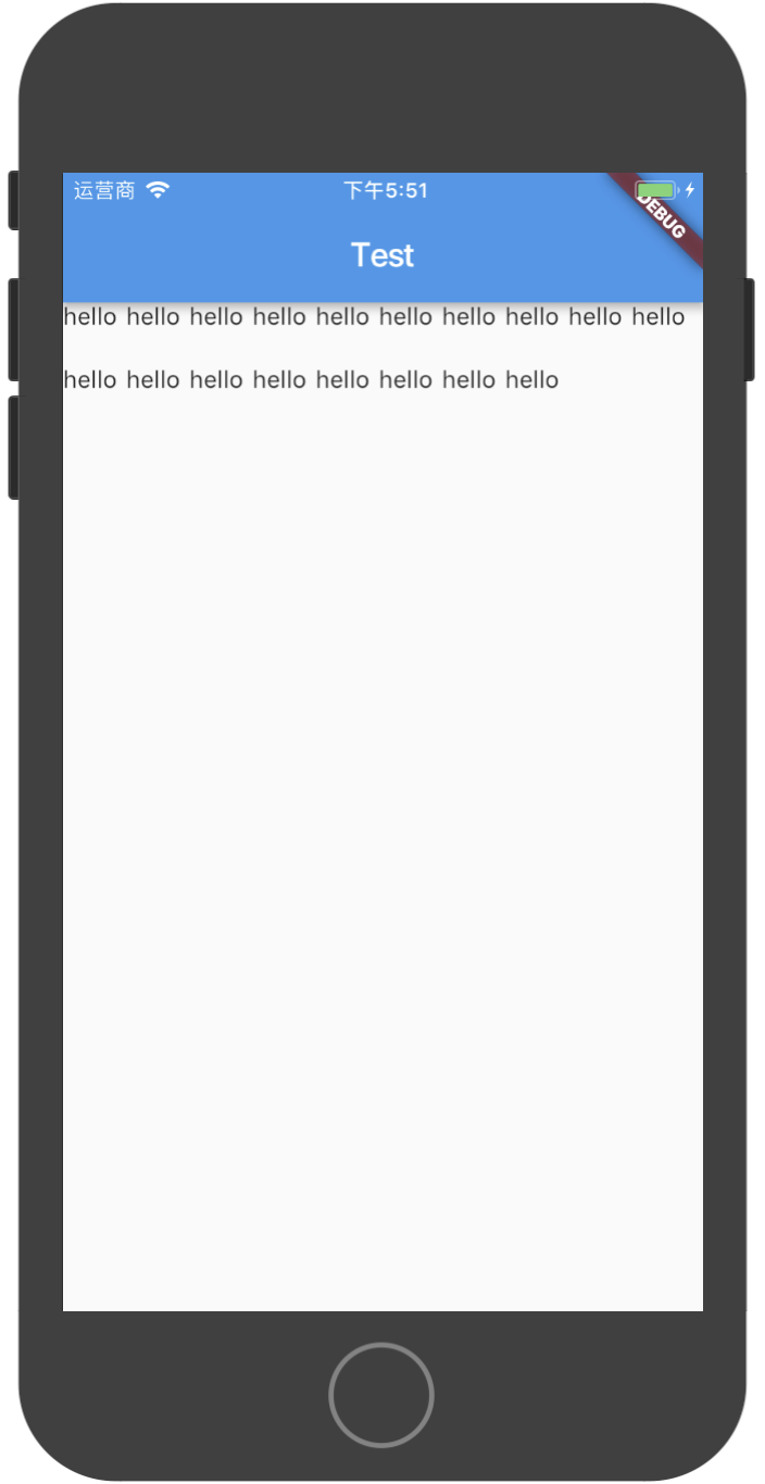
如果你把上面代码中的Wrap换成Row,你会发现Row中的子组件超过屏幕宽度后,不会自动换行显示。
ListView组件
ListView是一个非常常用的组件,在移动端,基本上大多数页面都需要使用ListView来显示数据,关于ListView的基本使用方法,在上一篇中已有记录。
后记
本篇记录的是Flutter开发中常用的一些布局,如果有移动开发经验,这些知识做类比学习应该很容易掌握,即使不怎么熟悉,通过查看文档也可以找到详细用法,感谢Flutter中文网对官方英文的翻译,我在学习Flutter的过程中,也参考了很多Flutter中文网的内容,希望大家能一起学习,一起进步,一起愉快地使用Flutter!
我的开源项目
- 基于Google Flutter的开源中国客户端,希望大家给个Star支持一下,源码:
- 基于Flutter的俄罗斯方块小游戏,希望大家给个Star支持一下,源码:
| 上一篇 | 下一篇 |
|---|---|
| 从0开始写一个基于Flutter的开源中国客户端(3) ——初识Flutter & 常用的Widgets |
从0开始写一个基于Flutter的开源中国客户端(5)—— App整体布局框架搭建 |
