

先说一下我的需求吧,因为我们的小程序是嵌套了webview。 点击webview里面的项目,点的层级太深,用户后退很麻烦。然后pm又找了一个自定义的导航的小程序,发现别人可以,然后我就开始研究。
小程序自定义导航栏开发注意点与参考文档
- 开一个项目采集设备的screenHeight,windowHeight,pixelRatio等信息到一个数据库中
- 微信提供这样一个数据库便于计算,或者微信优化自定义标题栏(譬如通知栏可以改变颜色但不要算在自定义范围内,给出胶囊宽高到通知栏距离到右侧屏幕边框距离等相关参数)
非自定义导航栏高度怎么计算?
- wx.getSystemInfo 和 wx.getSystemInfoSync 获取机器信息
- screenHeight - windowHeight 计算标题栏高度
- 标题栏高度
- 'iPhone': 64,
- 'iPhone X': 88,
- 'android': 68
—— 不完全统计(ip6 , ip5 , ip6p , ipx , 小米mix2 , 小米5等综合了开发工具提供的数据和真机数据)所得
配置
    "window": {
        "navigationBarBackgroundColor": "#fff",
        "navigationBarTextStyle": "black",
        "backgroundColor": "#fff",
        "navigationStyle": "custom"
    },
这里navigationStyle 配置修改之后就只剩一个胶囊按钮,也就意味着所有页面的导航都的自定义实现,你可以选择模版或者组件来开发,这里我是选择用的组件开发。
然后定义导航的各个数值,我是在app。js 里面定义的
        title_height: "64",
        statusbarHeight: "24",
        titleIcon_height: "32",
        titleIcon_width: "87",
        title_top: "24",
        title_text: "xxx", // iphone X + 24
        prefix: 24
组件
wxml的代码
<view>
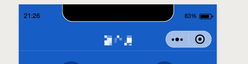
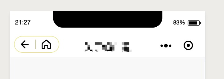
<view class="title" style="height:{{title_height}}px;padding-top:{{statusbarHeight}}px;background-color:{{isIndex?'#175dc6':'#fff'}}">
<view class="title_text" style="color:{{isIndex?'#fff':'#000'}}">{{title_text}}</view>
<view wx:if="{{isShow}}" class="title_icon" style="top:{{title_top}}px;height:{{titleIcon_height}}px;width:{{titleIcon_width}}px;background-color:{{isIndex?'#175dc6':'#fff'}}">
<image bindtap="_goBack" class="floatL" src="/img/fanhui_icon.png"></image>
<view class="floatL"></view>
<image bindtap="_goHome" src="/img/home_icon.png"></image>
</view>
</view>
<view style='height:{{title_height}}px;'></view>
</view>wxss的代码
.title {  width: 100%;  background-color: #175dc6;  box-sizing: border-box;  position: fixed;  transform: translateZ(0);  z-index: 999990;}
.title_text {  text-align: center;  font-size: 37rpx;  color: #fff;  line-height: 44px;}
.title_icon {  background-color: #175dc6;  position: fixed;  top: 54rpx;  left: 16rpx;  border-radius: 64rpx;  box-sizing: border-box;  border: 0.5px solid #ebe48e;  display: flex;}
.title_icon image {  height: 20px;  width: 20px;  padding-top: 5px;  display: inline-block;  overflow: hidden;}
.title_icon view {  height: 18px;  border-left: 1px solid #bfb973;  margin-top: 6px;}
.floatL {  float: left;}
.title_icon image:nth-of-type(1), .title_icon image:nth-of-type(2) {  padding-right: 10px;  padding-bottom: 10px;  padding-left: 10px;}
js的代码
const app = getApp();
Component({
    properties: {
        isShow: { // 是否显示后退按钮
            type: String,
            value: "1"
        },
        isIndex: { // 是否主页
            type: Boolean,
            value: false,
        },
        title_height: { //
            type: String,
            value: app.config.title_height,
        },
        titleIcon_height: {
            type: String,
            value: app.config.titleIcon_height,
        },
        titleIcon_width: {
            type: String,
            value: app.config.titleIcon_width,
        },
        statusbarHeight: {
            type: String,
            value: app.config.statusbarHeight,
        },
        title_top: {
            type: String,
            value: app.config.title_top,
        },
        title_text: {
            type: String,
            value: app.config.title_text,
        },
    },
    methods: {
        _goBack: function() {
            wx.navigateBack({
                delta: 1
            });
        },
        _goHome: function() {
            wx.switchTab({
                url: "/pages/index/index"
            });
            }
        }
})
这样组件就写好了 只需要在你每个页面里面用这个组件传不同的值就可以了。
应用
<header isIndex="true" title_text="首页" isShow=""></header> 在首页的wxml应用。
json 文件里面的配置
        "navigationBarTitleText": "啦啦啦",
        "navigationBarBackgroundColor": "#175dc6",
        "usingComponents": {
                "header": "/components/layout/header/header"
        }
效果如图
适配上可能会有点问题,希望大神有更好的解决方案,告诉我哟。
一步步记录自己的踩坑历程~我要做到我技术不是最好的,但我给你总结的小程序的东西是最简单粗暴的哈哈哈
谢谢 评论区的小伙伴 提醒:客户端 6.7.2 版本开始,navigationStyle: custom 对 <web-view> 组件无效。
我的博客
🎉 送我一朵小发发~
这个代码的排版我服了,懒得搞了,我会发到博客上让大家看的。
还有一些我总结的小程序的笔记分享 送给写小程序的你~
