

这里有一份简洁的前端知识体系等待你查收,看看吧,会有惊喜哦~如果觉得不错,恳求star哈~
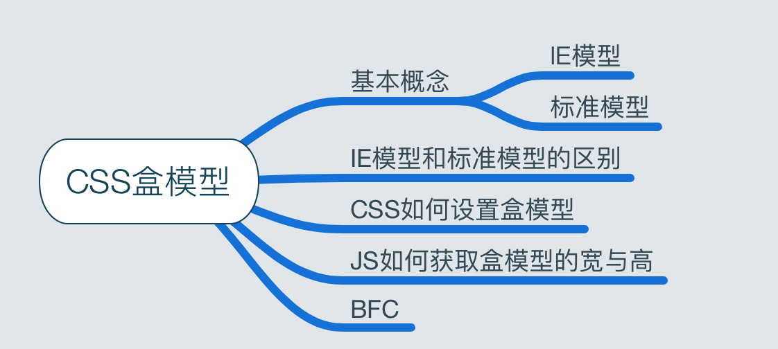
课程思维导图
Q:CSS盒模型是什么?
盒子模型包括:content、padding、margin、border
Q:标准模型和IE模型的区别?
- 标准模型的宽高为content的宽高
- IE模型的宽高包括border
Q:CSS如何设置这两种模型?
- 标准模型:box-sizing:content-box
- IE模型:box-sizing:border-box
Q:JS如何设置/获取盒模型对应的宽高
dom.style.width/height:内联样式的宽高
dom.currentStyle.width/height:渲染后的最终宽高(IE)
window.getComputedStyle(dom).width/height:DOM标准,不支持IE
dom.getBoundingClientRect().width/height:计算元素的绝对位置(视窗左顶点为起点,含left/right/height/width)
Q:BFC是什么,讲一下原理?
块级格式化上下文
Q:BFC布局规则是?
- 内部的Box会在垂直方向,一个接一个地放置。
- Box垂直方向的距离由margin决定。属于同一个BFC的两个相邻Box的margin会发生重叠
- BFC的区域不会与float box重叠。
- BFC就是页面上的一个隔离的独立容器,容器里面的子元素不会影响到外面的元素。反之也如此。
- 计算BFC的高度时,浮动元素也参与计算
Q:哪些元素会生成BFC?
- float不为none
- position不为static/relative
- display的值为inline-block、table-cell、table-caption
- overflow的值不为visible
- 根元素
Q:BFC的使用场景有哪些?
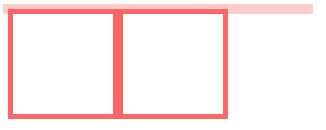
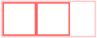
一、自适应两栏布局
<style>
    body {
        width: 300px;
        position: relative;
    }

    .aside {
        width: 100px;
        height: 150px;
        float: left;
        background: #f66;
    }

    .main {
        height: 200px;
        background: #fcc;
    }
</style>
<body>
    <div class="aside"></div>
    <div class="main"></div>
</body>

BFC的区域不会与float box重叠。
我们可以通过通过触发main生成BFC, 来实现自适应两栏布局。
.main {
    overflow: hidden;
}
当触发main生成BFC后,这个新的BFC不会与浮动的aside重叠。因此会根据包含块的宽度,和aside的宽度,自动变窄。效果如下:

二、清除内部浮动
<style>
    .par {
        border: 5px solid #fcc;
        width: 300px;
    }

    .child {
        border: 5px solid #f66;
        width:100px;
        height: 100px;
        float: left;
    }
</style>
<body>
    <div class="par">
        <div class="child"></div>
        <div class="child"></div>
    </div>
</body>
计算BFC的高度时,浮动元素也参与计算
为达到清除内部浮动,我们可以触发par生成BFC,那么par在计算高度时,par内部的浮动元素child也会参与计算。
.par {
    overflow: hidden;
}
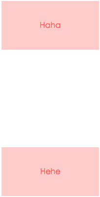
三、防止垂直 margin 重叠
<style>
    p {
        color: #f55;
        background: #fcc;
        width: 200px;
        line-height: 100px;
        text-align:center;
        margin: 100px;
    }
</style>
<body>
    <p>Haha</p>
    <p>Hehe</p>
</body>
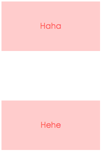
Box垂直方向的距离由margin决定。属于同一个BFC的两个相邻Box的margin会发生重叠
我们可以在p外面包裹一层容器,并触发该容器生成一个BFC。那么两个P便不属于同一个BFC,就不会发生margin重叠了。
<style>
    .wrap {
        overflow: hidden;
    }
    p {
        color: #f55;
        background: #fcc;
        width: 200px;
        line-height: 100px;
        text-align:center;
        margin: 100px;
    }
</style>
<body>
    <p>Haha</p>
    <div class="wrap">
        <p>Hehe</p>
    </div>
</body>
其实以上的几个例子都体现了BFC布局规则第五条:
BFC就是页面上的一个隔离的独立容器,容器里面的子元素不会影响到外面的元素。反之也如此。
