

以下图形会大量用到边框和伪类及transform属性
1. 三角形
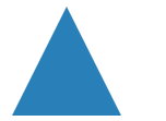
 .top-triangle {
            width: 0;
            border-bottom: 100px solid #2980B9;
            border-left: 50px solid transparent;
            border-right: 50px solid transparent;
        }

.topleft-triangle {
            width: 0;
            border-top: 100px solid #2980B9;
            border-right: 100px solid transparent;
        }
2. 箭头

.arrow {
            position: relative;
            width: 0;
            border-right: 100px solid #2980B9;
            border-top: 100px solid transparent;
            transform: rotate(15deg) translateX(300px);
        }

        .arrow::after {
            content: '';
            position: absolute;
            border: 0 solid transparent;
            border-top: 30px solid #2980B9;
            border-radius: 200px 0 0 0;
            width: 120px;
            height: 120px;
            top: -120px;
            left: -99px;
            transform: rotate(45deg)
        }
3.梯形
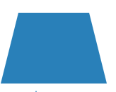
.trapezoid {
            width: 0;
            border-bottom: 100px solid #2980B9;
            border-left: 25px solid transparent;
            border-right: 25px solid transparent;
            width: 100px;
        }
4. 六角形

.star-six {
            width: 0;
            position: relative;
            border-bottom: 80px solid #2980B9;
            border-left: 50px solid transparent;
            border-right: 50px solid transparent;
            transform: translateX(100px)
        }

        .star-six::after {
            content: '';
            position: absolute;
            border-top: 80px solid #2980B9;
            border-left: 50px solid transparent;
            border-right: 50px solid transparent;
            left: -50px;
            top: 25px;
        }
5. 五角星
五角星被分解为三个三角形(其他分解方式也可以实现)

.star-five {
            margin: 50px 0;
            position: relative;
            color: #2980B9;
            width: 0px;
            border-right: 50px solid transparent;
            border-bottom: 35px solid #2980B9;
            border-left: 50px solid transparent;
            transform: rotate(35deg);
        }

        .star-five::before {
            border-bottom: 40px solid #2980B9;
            border-left: 15px solid transparent;
            border-right: 15px solid transparent;
            position: absolute;
            top: -22.5px;
            left: -30px;
            content: '';
            transform: rotate(-35deg);
        }

        .star-five::after {
            content: '';
            position: absolute;
            width: 0px;
            border-right: 50px solid transparent;
            border-bottom: 35px solid #2980B9;
            border-left: 50px solid transparent;
            transform: rotate(-70deg);
            top: 0;
            left: -50px;
        }
6. 五边形
分为上三角和梯形
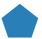
.pentagon {
            position: relative;
            width: 80px;
            border-top: 67px solid #2980B9;
            border-left: 23px solid transparent;
            border-right: 23px solid transparent;
            transform: translate(100px)
        }

        .pentagon::before {
            position: absolute;
            content: '';
            width: 0;
            border-bottom: 50px solid #2980B9;
            border-left: 63px solid transparent;
            border-right: 63px solid transparent;
            top: -117px;
            left: -23px;
        }
7.六边形
分为上梯形和下梯形

.hexagon {
            position: relative;
            width: 60px;
            border-bottom: 50px solid #2980B9;
            border-left: 33px solid transparent;
            border-right: 33px solid transparent;
            transform: rotate(90deg);
        }

        .hexagon::before {
            content: '';
            position: absolute;
            width: 60px;
            border-top: 50px solid #2980B9;
            border-left: 33px solid transparent;
            border-right: 33px solid transparent;
            top: 50px;
            left: -33px
        }
8. 心形
分为两个长方形

.heart {
            position: relative;
            width: 50px;
            height: 80px;
            border-radius: 50px 50px 0 0;
            background-color: #2980B9;
            transform: translate(200px) rotate(-45deg);
        }

        .heart::before {
            content: '';
            position: absolute;
            width: 50px;
            height: 80px;
            border-radius: 30px 30px 0 0;
            background-color: #2980B9;
            transform: rotate(90deg);
            top: 15px;
            left: 15px
        }
9.八卦图
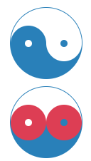
.yin-yang {
            position: relative;
            width: 100px;
            height: 50px;
            border: 1px solid #2980B9;
            border-bottom: 50px solid #2980B9;
            border-radius: 50%
        }

        .yin-yang::after {
            position: absolute;
            content: "";
            width: 10px;
            height: 10px;
            border-radius: 50%;
            border: 20px solid #2980B9;
            top: 25px;
            background: #fff;

        }

        .yin-yang::before {
            position: absolute;
            content: '';
            width: 10px;
            height: 10px;
            border-radius: 50%;
            background-color: #2980B9;
            border: 20px solid #fff;
            top: 25px;
            left: 50px;
            /* z-index: 99; */
        }
10. 月亮

.moon {
            width: 80px;
            height: 80px;
            border-radius: 50%;
            box-shadow: 15px 15px 0 0 #2980B9;
        }
