- Flutter和Dart系列文章和代码GitHub地址
Flutter一切皆Widget的核心思想, 为我们提供了两种主题风格CupertinoApp: 一个封装了很多iOS风格的小部件,一般作为顶层widget使用MaterialApp: 一个封装了很多安卓风格的小部件,一般作为顶层widget使用, 下面我们先看下这个Widget
MaterialApp
这里我们先看看MaterialApp的构造函数和相关函数
const MaterialApp({
    Key key,
    // 导航主键, GlobalKey<NavigatorState>
    this.navigatorKey,
    // 主页, Widget
    this.home,
    // 路由
    this.routes = const <String, WidgetBuilder>{},
    // 初始化路由, String
    this.initialRoute,
    // 构造路由, RouteFactory
    this.onGenerateRoute,
    // 为止路由, RouteFactory
    this.onUnknownRoute,
    // 导航观察器
    this.navigatorObservers = const <NavigatorObserver>[],
    // widget的构建
    this.builder,
    // APP的名字
    this.title = '',
    // GenerateAppTitle, 每次在WidgetsApp构建时都会重新生成
    this.onGenerateTitle,
    // 背景颜色
    this.color,
    // 主题, ThemeData
    this.theme,
    // app语言支持, Locale
    this.locale,
    // 多语言代理, Iterable<LocalizationsDelegate<dynamic>>
    this.localizationsDelegates,
    // flutter.widgets.widgetsApp.localeListResolutionCallback
    this.localeListResolutionCallback,
    // flutter.widgets.widgetsApp.localeResolutionCallback
    this.localeResolutionCallback,
    // 支持的多语言, Iterable<Locale>
    this.supportedLocales = const <Locale>[Locale('en', 'US')],

    // 是否显示网格
    this.debugShowMaterialGrid = false,
    // 是否打开性能监控,覆盖在屏幕最上面
    this.showPerformanceOverlay = false,
    // 是否打开栅格缓存图像的检查板
    this.checkerboardRasterCacheImages = false,
    // 是否打开显示到屏幕外位图的图层的检查面板
    this.checkerboardOffscreenLayers = false,
    // 是否打开覆盖图,显示框架报告的可访问性信息 显示边框
    this.showSemanticsDebugger = false,
    // 是否显示右上角的Debug标签
    this.debugShowCheckedModeBanner = true,
})
需要注意的几点
- 如果
home首页指定了,routes里面就不能有'/'的根路由了,会报错,/指定的根路由就多余了 - 如果没有
home指定具体的页面,那routes里面就有/来指定根路由 - 路由的顺序按照下面的规则来:
- 1、如果有
home,就会从home进入 - 2、如果没有
home,有routes,并且routes指定了入口'/',就会从routes的/进入 - 3、如果上面两个都没有,或者路由达不到,如果有
onGenerateRoute,就会进入生成的路由 - 4、如果连上面的生成路由也没有,就会走到
onUnknownRoute,不明所以的路由,比如网络连接失败,可以进入断网的页面
- 1、如果有
routes
- 声明程序中有哪个通过
Navigation.of(context).pushNamed跳转的路由 - 参数以键值对的形式传递
key:路由名字value:对应的Widget
routes: {
  '/home': (BuildContext content) => Home(),
  '/mine': (BuildContext content) => Mine(),
},
initialRoute
- 初始化路由, 当用户进入程序时,自动打开对应的路由(home还是位于一级)
- 传入的是上面
routes的key, 跳转的是对应的Widget(如果该Widget有Scaffold.AppBar,并不做任何修改,左上角有返回键)
routes: {
  '/home': (BuildContext content) => Home(),
  '/mine': (BuildContext content) => Mine(),
},
initialRoute: '/mine',
onGenerateRoute
当通过Navigation.of(context).pushNamed跳转路由时,
在routes查找不到时,会调用该方法
onGenerateRoute: (RouteSettings setting) {
  return MaterialPageRoute(
    settings: setting,
    builder: (BuildContext content) => Text('生成一个路由')
  );
},
onUnknownRoute
未知路由, 效果跟onGenerateRoute一样, 在未设置onGenerateRoute的情况下, 才会去调用onUnknownRoute
onUnknownRoute: (RouteSettings setting) {
  return MaterialPageRoute(
    settings: setting,
    builder: (BuildContext content) => Text('这是一个未知路由')
  );
},
navigatorObservers
- 路由观察器,当调用
Navigator的相关方法时,会回调相关的操作 - 比如
push,pop,remove,replace是可以拿到当前路由和后面路由的信息 - 获取路由的名字:
route.settings.name
// navigatorObservers: [HomeObserver()],

// 继承NavigatorObserver
class HomeObserver extends NavigatorObserver {
  @override
  void didPush(Route route, Route previousRoute) {
    super.didPush(route, previousRoute);

    // 获取路由的名字
    print('name = ${route.settings.name}');
    // 获取返回的内容
    print('reaule = ${route.currentResult}');
  }
}
builder
如果设置了这个参数, 那么将会优先渲染这个builder, 而不会在走路由
builder: (BuildContext content, Widget widget) => Text('builder'),
title
- 设备用于识别用户的应用程序的单行描述
- 在
Android上,标题显示在任务管理器的应用程序快照上方,当用户按下“最近的应用程序”按钮时会显示这些快照 - 在
iOS上,无法使用此值。来自应用程序的Info.plist的CFBundleDisplayName在任何时候都会被引用,否则就会引用CFBundleName - 要提供初始化的标题,可以用
onGenerateTitle
CupertinoApp
用于创建iOS风格应用的顶层组件, 相关属性和MaterialApp相比只是少了theme和debugShowMaterialGrid, 其他属性都一样, 如下所示
const CupertinoApp({
    Key key,
    this.navigatorKey,
    this.home,
    this.routes = const <String, WidgetBuilder>{},
    this.initialRoute,
    this.onGenerateRoute,
    this.onUnknownRoute,
    this.navigatorObservers = const <NavigatorObserver>[],
    this.builder,
    this.title = '',
    this.onGenerateTitle,
    this.color,
    this.locale,
    this.localizationsDelegates,
    this.localeListResolutionCallback,
    this.localeResolutionCallback,
    this.supportedLocales = const <Locale>[Locale('en', 'US')],
    this.showPerformanceOverlay = false,
    this.checkerboardRasterCacheImages = false,
    this.checkerboardOffscreenLayers = false,
    this.showSemanticsDebugger = false,
    this.debugShowCheckedModeBanner = true,
})
使用示例如下
return CupertinoApp(
  title: 'Cupertino App',
  color: Colors.red,
  home: CupertinoPageScaffold(
    backgroundColor: Colors.yellow,
    resizeToAvoidBottomInset: true,
    navigationBar: CupertinoNavigationBar(
      middle: Text('Cupertino App Bar'),
      backgroundColor: Colors.blue,
    ),
    child: Center(
      child: Container(
        child: Text('Hello World'),
      ),
    ),
  ),
);
CupertinoPageScaffold
一个iOS风格的页面的基本布局结构。包含内容和导航栏
const CupertinoPageScaffold({
    Key key,
    // 设置导航栏, 后面会详解
    this.navigationBar,
    // 设置内容页面的背景色
    this.backgroundColor = CupertinoColors.white,
    // 子widget是否应该自动调整自身大小以适应底部安全距离
    this.resizeToAvoidBottomInset = true,
    @required this.child,
})
navigationBar
const CupertinoNavigationBar({
    Key key,
    //导航栏左侧组件
    this.leading,
    //是否显示左边组件, 好像无效
    this.automaticallyImplyLeading = true,
    //是否显示中间组件, 好像无效
    this.automaticallyImplyMiddle = true,
    //导航栏左侧组件的右边的文本, 好像无效
    this.previousPageTitle,
    // 导航栏中间组件
    this.middle,
    // 导航栏右侧组件
    this.backgroundColor = _kDefaultNavBarBackgroundColor,
    // 设置左右组件的内边距, EdgeInsetsDirectional
    this.padding,
    //左侧默认组件和左侧组件右边文本的颜色
    this.actionsForegroundColor = CupertinoColors.activeBlue,
    this.transitionBetweenRoutes = true,
    this.heroTag = _defaultHeroTag,
})
使用示例
return CupertinoApp(
  title: 'Cupertino App',
  color: Colors.red,
  debugShowCheckedModeBanner: false,
  home: CupertinoPageScaffold(
    backgroundColor: Colors.yellow,
    resizeToAvoidBottomInset: true,
    navigationBar: CupertinoNavigationBar(
      leading: Icon(Icons.person),
      automaticallyImplyLeading: false,
      automaticallyImplyMiddle: false,
      previousPageTitle: '返回',
      middle: Text('Cupertino App Bar'),
      trailing: Icon(Icons.money_off),
      border: Border.all(),
      backgroundColor: Colors.white,
      padding: EdgeInsetsDirectional.fromSTEB(10, 10, 10, 10),
      actionsForegroundColor: Colors.red,
      transitionBetweenRoutes: false,
      heroTag: Text('data'),
    ),
    child: Center(
      child: Container(
        child: Text('Hello World'),
      ),
    ),
  ),
);
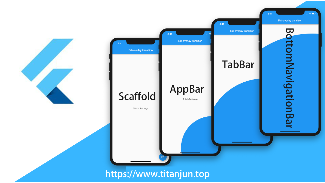
Scaffold
Scaffold通常被用作MaterialApp的子Widget(安卓风格),它会填充可用空间,占据整个窗口或设备屏幕Scaffold提供了大多数应用程序都应该具备的功能,例如顶部的appBar,底部的bottomNavigationBar,隐藏的侧边栏drawer等
const Scaffold({
    Key key,
    // 显示在界面顶部的一个AppBar
    this.appBar,
    // 当前界面所显示的主要内容Widget
    this.body,
    // 悬浮按钮, 默认在右下角位置显示
    this.floatingActionButton,
    // 设置悬浮按钮的位置
    this.floatingActionButtonLocation,
    // 悬浮按钮出现消失的动画
    this.floatingActionButtonAnimator,
    // 在底部呈现一组button,显示于[bottomNavigationBar]之上,[body]之下
    this.persistentFooterButtons,
    // 一个垂直面板,显示于左侧,初始处于隐藏状态
    this.drawer,
    // 一个垂直面板,显示于右侧,初始处于隐藏状态
    this.endDrawer,
    // 出现于底部的一系列水平按钮
    this.bottomNavigationBar,
    // 底部的持久化提示框
    this.bottomSheet,
    // 背景色
    this.backgroundColor,
    // 重新计算布局空间大小
    this.resizeToAvoidBottomPadding = true,
    // 是否显示到底部, 默认为true将显示到顶部状态栏
    this.primary = true,
})
appBar
设置导航栏, 接受一个抽象类PreferredSizeWidget, 这里使用其子类AppBar进行设置, 后面会详解
floatingActionButton
- 设置一个悬浮按钮, 默认在右下角位置显示, 这里使用
FloatingActionButton设置 FloatingActionButton是Material设计规范中的一种特殊Button,通常悬浮在页面的某一个位置作为某种常用动作的快捷入口, 后面会详解
floatingActionButtonLocation
设置悬浮按钮的位置, 接受一个抽象类FloatingActionButtonLocation
// 右下角, 距离底部有一点距离, 默认值
static const FloatingActionButtonLocation endFloat = _EndFloatFabLocation();
// 中下方, 距离底部有一点距离
static const FloatingActionButtonLocation centerFloat = _CenterFloatFabLocation();
// 右下角, 距离底部没有间距
static const FloatingActionButtonLocation endDocked = _EndDockedFloatingActionButtonLocation();
// 中下方, 距离底部没有间距
static const FloatingActionButtonLocation centerDocked = _CenterDockedFloatingActionButtonLocation();
FloatingActionButton
在Material Design中,一般用来处理界面中最常用,最基础的用户动作。它一般出现在屏幕内容的前面,通常是一个圆形,中间有一个图标, 有以下几种构造函数
const FloatingActionButton({
    Key key,
    this.child,
    // 文字解释, 按钮呗长按时显示
    this.tooltip,
    // 前景色
    this.foregroundColor,
    // 背景色
    this.backgroundColor,
    // hero效果使用的tag,系统默认会给所有FAB使用同一个tag,方便做动画效果
    this.heroTag = const _DefaultHeroTag(),
    // 未点击时阴影值,默认6.0
    this.elevation = 6.0,
    // 点击时阴影值,默认12.0
    this.highlightElevation = 12.0,
    // 点击事件监听
    @required this.onPressed,
    // 是否为“mini”类型,默认为false
    this.mini = false,
    // 设置阴影, 设置shape时,默认的elevation将会失效,默认为CircleBorder
    this.shape = const CircleBorder(),
    // 剪切样式
    this.clipBehavior = Clip.none,
    // 设置点击区域大小的样式, MaterialTapTargetSize的枚举值
    this.materialTapTargetSize,
    // 是否为”extended”类型
    this.isExtended = false,
})
mini
- 是否为
mini类型,默认为false FloatingActionButton分为三种类型:regular,mini,extendedregular和mini两种类型通过默认的构造方法实现, 只有图片- 大小限制如下
const BoxConstraints _kSizeConstraints = const BoxConstraints.tightFor(
  width: 56.0,
  height: 56.0,
);

const BoxConstraints _kMiniSizeConstraints = const BoxConstraints.tightFor(
  width: 40.0,
  height: 40.0,
);

const BoxConstraints _kExtendedSizeConstraints = const BoxConstraints(
  minHeight: 48.0,
  maxHeight: 48.0,
);
isExtended
- 是否为
extended类型, 设置为true即可 - 除此之外, 还可以使用
extended构造函数创建该类型
FloatingActionButton.extended({
    Key key,
    this.tooltip,
    this.foregroundColor,
    this.backgroundColor,
    this.heroTag = const _DefaultHeroTag(),
    this.elevation = 6.0,
    this.highlightElevation = 12.0,
    @required this.onPressed,
    this.shape = const StadiumBorder(),
    this.isExtended = true,
    this.materialTapTargetSize,
    this.clipBehavior = Clip.none,
    // 设置图片
    @required Widget icon,
    // 设置文字
    @required Widget label,
})
从参数上看差异并不大,只是把默认构造方法中的child换成了icon和label,不过通过下面的代码可以看到,传入的label和icon也是用来构建child的,不过使用的是Row来做一层包装而已
AppBar
AppBar是一个Material风格的导航栏,它可以设置标题、导航栏菜单、底部Tab等
AppBar({
    Key key,
    // 导航栏左侧weidget
    this.leading,
    // 如果leading为null,是否自动实现默认的leading按钮
    this.automaticallyImplyLeading = true,
    // 导航栏标题
    this.title,
    // 导航栏右侧按钮, 接受一个数组
    this.actions,
    // 一个显示在AppBar下方的控件,高度和AppBar高度一样,可以实现一些特殊的效果,该属性通常在SliverAppBar中使用
    this.flexibleSpace,
    // 一个AppBarBottomWidget对象, 设置TabBar
    this.bottom,
    //中控件的z坐标顺序,默认值为4,对于可滚动的SliverAppBar,当 SliverAppBar和内容同级的时候,该值为0,当内容滚动 SliverAppBar 变为 Toolbar 的时候,修改elevation的值
    this.elevation = 4.0,
    // 背景颜色,默认值为 ThemeData.primaryColor。改值通常和下面的三个属性一起使用
    this.backgroundColor,
    // 状态栏的颜色, 黑白两种, 取值: Brightness.dark
    this.brightness,
    // 设置导航栏上图标的颜色、透明度、和尺寸信息
    this.iconTheme,
    // 设置导航栏上文字样式
    this.textTheme,
    // 导航栏的内容是否显示在顶部, 状态栏的下面
    this.primary = true,
    // 标题是否居中显示,默认值根据不同的操作系统,显示方式不一样
    this.centerTitle,
    // 标题间距,如果希望title占用所有可用空间,请将此值设置为0.0
    this.titleSpacing = NavigationToolbar.kMiddleSpacing,
    // 应用栏的工具栏部分透明度
    this.toolbarOpacity = 1.0,
    // 底部导航栏的透明度设置
    this.bottomOpacity = 1.0,
})
leading
导航栏左侧weidget
final Widget leading;

// 示例
leading: Icon(Icons.home),
actions
导航栏右侧按钮, 接受一个数组
final List<Widget> actions;

// 示例
actions: <Widget>[
    Icon(Icons.add),
    Icon(Icons.home),
],
brightness
状态栏的颜色, 黑白两种
// 状态栏白色
brightness: Brightness.dark,
// 状态栏黑色
brightness: Brightness.light,
iconTheme
设置导航栏上图标的颜色、透明度、和尺寸信息
const IconThemeData({this.color, double opacity, this.size})

// 示例
iconTheme: IconThemeData(color: Colors.white, opacity: 0.56, size: 30),
TabBar
- 在
AppBar中通过bottom属性来添加一个导航栏底部tab按钮组, 接受一个PreferredSizeWidget类型 PreferredSizeWidget是一个抽象类, 这里我们使用TabBar
class TabBar extends StatefulWidget implements PreferredSizeWidget {
  const TabBar({
    Key key,
    // 数组,显示的标签内容,一般使用Tab对象,当然也可以是其他的Widget
    @required this.tabs,
    // TabController对象
    this.controller,
    // 是否可滚动
    this.isScrollable = false,
    // 指示器颜色
    this.indicatorColor,
    // 指示器高度
    this.indicatorWeight = 2.0,
    // 指示器内边距
    this.indicatorPadding = EdgeInsets.zero,
    // 设置选中的样式decoration,例如边框等
    this.indicator,
    // 指示器大小, 枚举值TabBarIndicatorSize
    this.indicatorSize,
    // 选中文字颜色
    this.labelColor,
    // 选中文字样式
    this.labelStyle,
    // 文字内边距
    this.labelPadding,
    // 未选中文字颜色
    this.unselectedLabelColor,
    // 未选中文字样式
    this.unselectedLabelStyle,
  })
}

// Tab的构造函数
const Tab({
    Key key,
    // 文本
    this.text,
    // 图标
    this.icon,
    // 子widget
    this.child,
})
效果如下
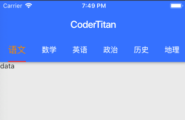
相关代码如下
void main(List<String> args) => runApp(NewApp());

class NewApp extends StatefulWidget {

  @override
  State<StatefulWidget> createState() {
    // TODO: implement createState
    return App();
  }
}

class App extends State<NewApp> with SingleTickerProviderStateMixin {
  List tabs = ['语文', '数学', '英语', '政治', '历史', '地理', '物理', '化学', '生物'];
  TabController _tabController;

  @override
  void initState() {
    super.initState();
    _tabController = TabController(initialIndex: 0, length: tabs.length, vsync: this);
  }

  @override
  Widget build(BuildContext context) {
    return MaterialApp(
        home: Scaffold(
            appBar: AppBar(
              title: Text('CoderTitan'),
              backgroundColor: Colors.blueAccent,
              brightness: Brightness.dark,
              centerTitle: true,
              bottom: TabBar(
                controller: _tabController,
                tabs: tabs.map((e) => Tab(text: e)).toList(),
                isScrollable: true,
                indicatorColor: Colors.red,
                indicatorWeight: 2,
                indicatorSize: TabBarIndicatorSize.label,
                labelColor: Colors.orange,
                unselectedLabelColor: Colors.white,
                labelStyle: TextStyle(fontSize: 18, color: Colors.orange),
                unselectedLabelStyle: TextStyle(fontSize: 15, color: Colors.white),
              ),
            ),
            body: TabBarView(
              controller: _tabController,
              children: tabs.map((e) {
                return Container(
                  alignment: Alignment.center,
                  child: Text(e, style:TextStyle(fontSize: 50)),
                );
              }).toList(),
            ),
        ),
        debugShowCheckedModeBanner: false,
    );
  }
}
BottomNavigationBar
- 在
Scaffold中有一个属性bottomNavigationBar用于设置最底部的tabbar导航栏 - 使用
Material组件库提供的BottomNavigationBar和BottomNavigationBarItem两个Widget来实现Material风格的底部导航栏
BottomNavigationBar({
    Key key,
    // 子widget数组
    @required this.items,
    // 每一个item的点击事件
    this.onTap,
    // 当前选中的索引
    this.currentIndex = 0,
    // 类型
    BottomNavigationBarType type,
    // 文字颜色
    this.fixedColor,
    // 图片大小
    this.iconSize = 24.0,
})
items
包含所有子Widget的数组
final List<BottomNavigationBarItem> items;

const BottomNavigationBarItem({
    // 未选中图片
    @required this.icon,
    // 标题
    this.title,
    // 选中的图片
    Widget activeIcon,
    // 背景色
    this.backgroundColor,
})
参考文献
欢迎您扫一扫下面的微信公众号,订阅我的博客!